This color is Sherwin-Williams' most popular neutral, and for good reason - how to decorate with 'Agreeable Grey'
This neutral shade is a best-seller for all the right reasons - here's how to use it in your space


The Livingetc newsletters are your inside source for what’s shaping interiors now - and what’s next. Discover trend forecasts, smart style ideas, and curated shopping inspiration that brings design to life. Subscribe today and stay ahead of the curve.
You are now subscribed
Your newsletter sign-up was successful
Neutrals are a timeless paint idea. There's something innately comforting and cozy about a creamy hue that swathes a room, but with some many to choose from, finding the right shade can be an overwhelming task.
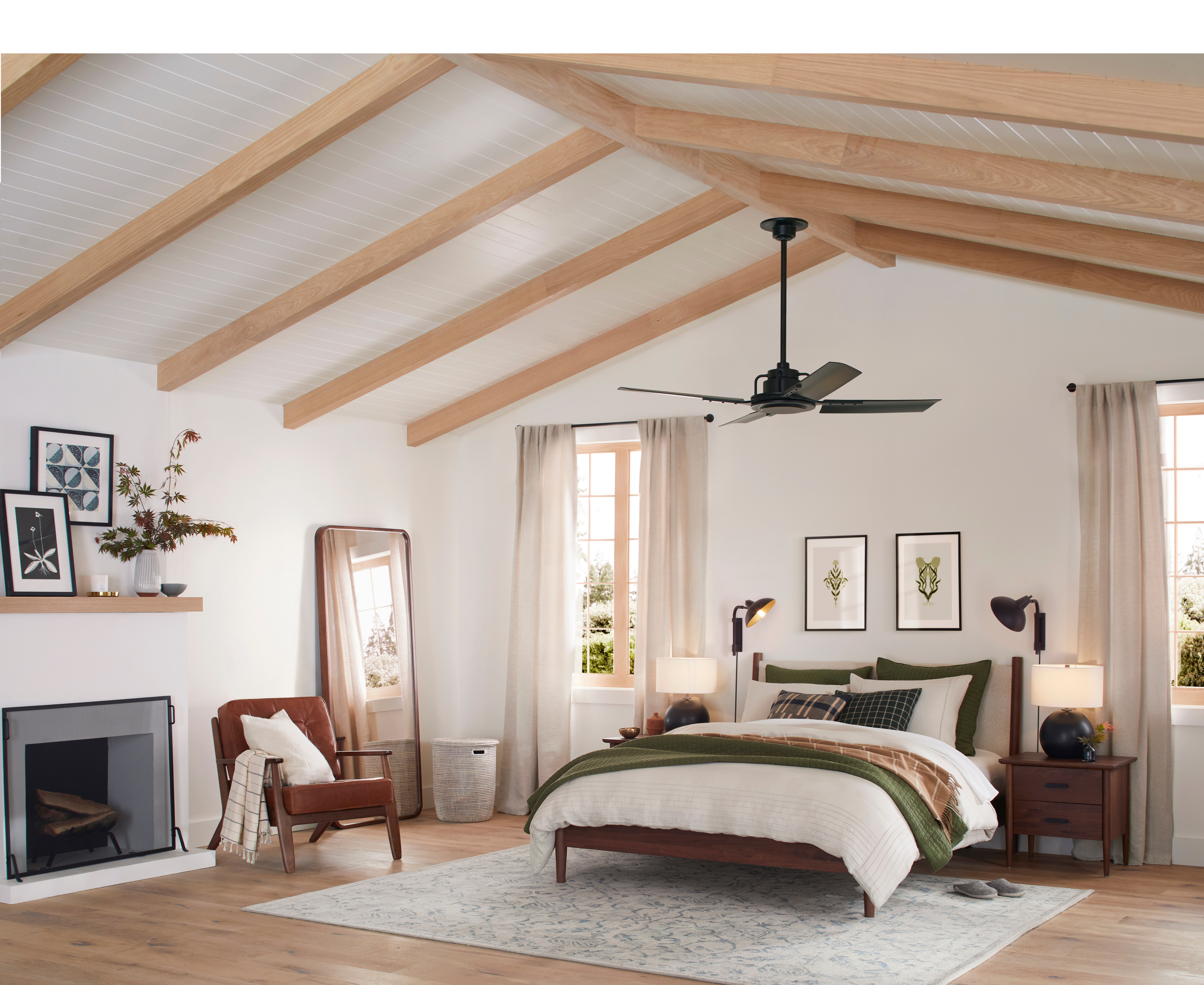
To cut through the noise we asked renowned paint brand Sherwin-Williams for their most popular neutral shade, and while it might not be the most groundbreaking color, 'Agreeable Grey' ticks all the right boxes. It's one of the best neutrals for every space; it's bright without being too stark, warm enough to add a subtle softness, and the perfect blank canvas for the rest of your decorating ideas. If you're searching for a versatile next off-white, it's an ideal alternative to the divisive magnolia.
This color may have won the popularity contest and be super easy to use already, but to give you some inspiration for your next paint idea we caught up with Sherwin-Williams' color expert to find out more. Here's what she had to say.
What color is Agreeable Grey?
'Agreeable grey has been the fan favorite for the last few seasons,' says Sue Wadden, Director of Color Marketing at Sherwin-Williams. 'Characterized as a soft, warm grey, it’s a super usable and reliable neutral.'
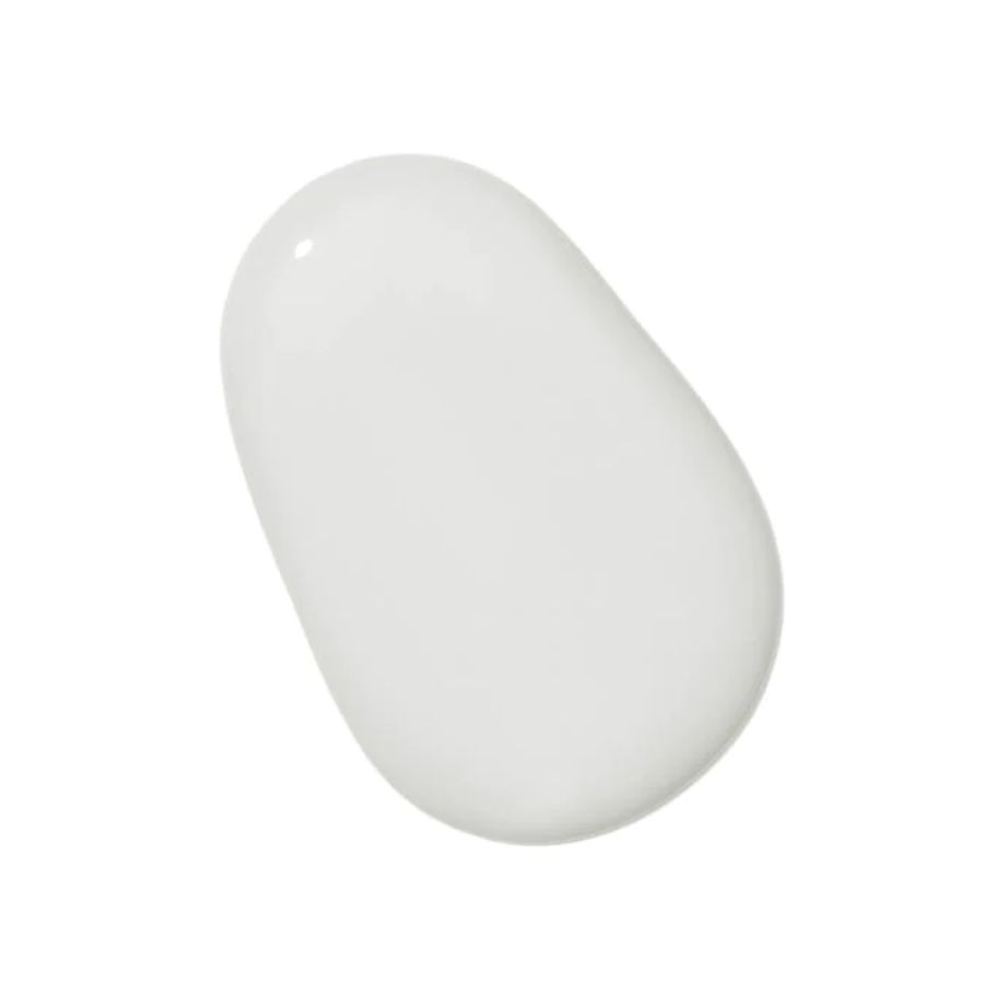
One glance and it's easy to see why. The grey mania that dominated the 2010s may be subsiding, but this greige tone modernizes the idea with its gentler feel. The shade is super versatile and easy to use, so we can see how it could transform many areas of your home as part of a neutral color scheme, or as a foundation for pops of color.
Unlike some neutrals this shade doesn't pull too warm or cool either - it's a timeless hue that acts as the perfect neutral backdrop for any interior space. Warm neutrals are on the rise, and this color is an interesting variation.
Why is Agreeable Grey so popular?

Agreeable grey is one of those colors that doesn't look like much in the tin but has a powerful impact once it covers your walls. The understated warmth adds comfort and depth that creates a cocooning feel, making it one of the best light colors for living rooms. 'It's a timeless neutral that doesn't lean too cool or creamy, so it acts as the perfect neutral backdrop for any interior space,' says Sue. Its ability to blend into any space or aesthetic is certainly a reason this color is a firm favorite.
The Livingetc newsletters are your inside source for what’s shaping interiors now - and what’s next. Discover trend forecasts, smart style ideas, and curated shopping inspiration that brings design to life. Subscribe today and stay ahead of the curve.
How should you decorate with Agreeable Grey?
Agreeable grey can be used in almost any room of the home, no matter what your personal preference. 'It's the ideal backdrop for many design styles, as it provides a clean and fresh aesthetic,' notes Sue.
Light neutrals like this one are brilliant at making a space appear larger than it is, especially when used to envelope both walls and ceiling, making it a great paint trick for small rooms. As Sue explains: 'By using this shade, homeowners can make a room look more spacious and maximize natural light, which is why I particularly love using it on ceilings.'
Depending on your style you could pair it with a number of different shades, too. 'For a sophisticated look, I recommend pairing with a dark shade like Perle Noir, a deep purple that feels almost black,' Sue says. 'For a clean but more playful vibe, I would pair it with our 2024 Color of the Year Upward, a light and breezy blue, but it can go well with almost any shade.'
However you decide to decorate, Sue urges you not to be afraid of bringing in other colors. 'While neutrals are a great safe choice for homeowners, an all-white interior can sometimes look a bit too frigid and color is a great way to add personality to a space,' she explains. Try a white living room idea to get you started on decorating with these popular hues, then add bursts of color through details like trim or painted furniture.
Can't buy Sherwin-Williams? Try our other favorite neutrals

Formerly a news writer for Livingetc, Amy completed an MA in Magazine Journalism at City, University of London, and has experience writing for Women’s lifestyle publications across arts, culture, and beauty. She has a particular love for the minimalist aesthetic mixed with mid-century furniture, especially combining unique vintage finds with more modern pieces. Her previous work in luxury jewellery has given her a keen eye for beautiful things and clever design, that plays into her love of interiors. As a result, Amy will often be heard justifying homeware purchases as 'an investment', wise words to live by.


