12 Colorful Living Room Ideas That Still Feel Elevated and Curated, Not Chaotic
Colorful doesn't have to mean scream-in-your-face — it can still (and arguably should) feel calming, curated, and considered. Here's how to do it

Hugh Metcalf
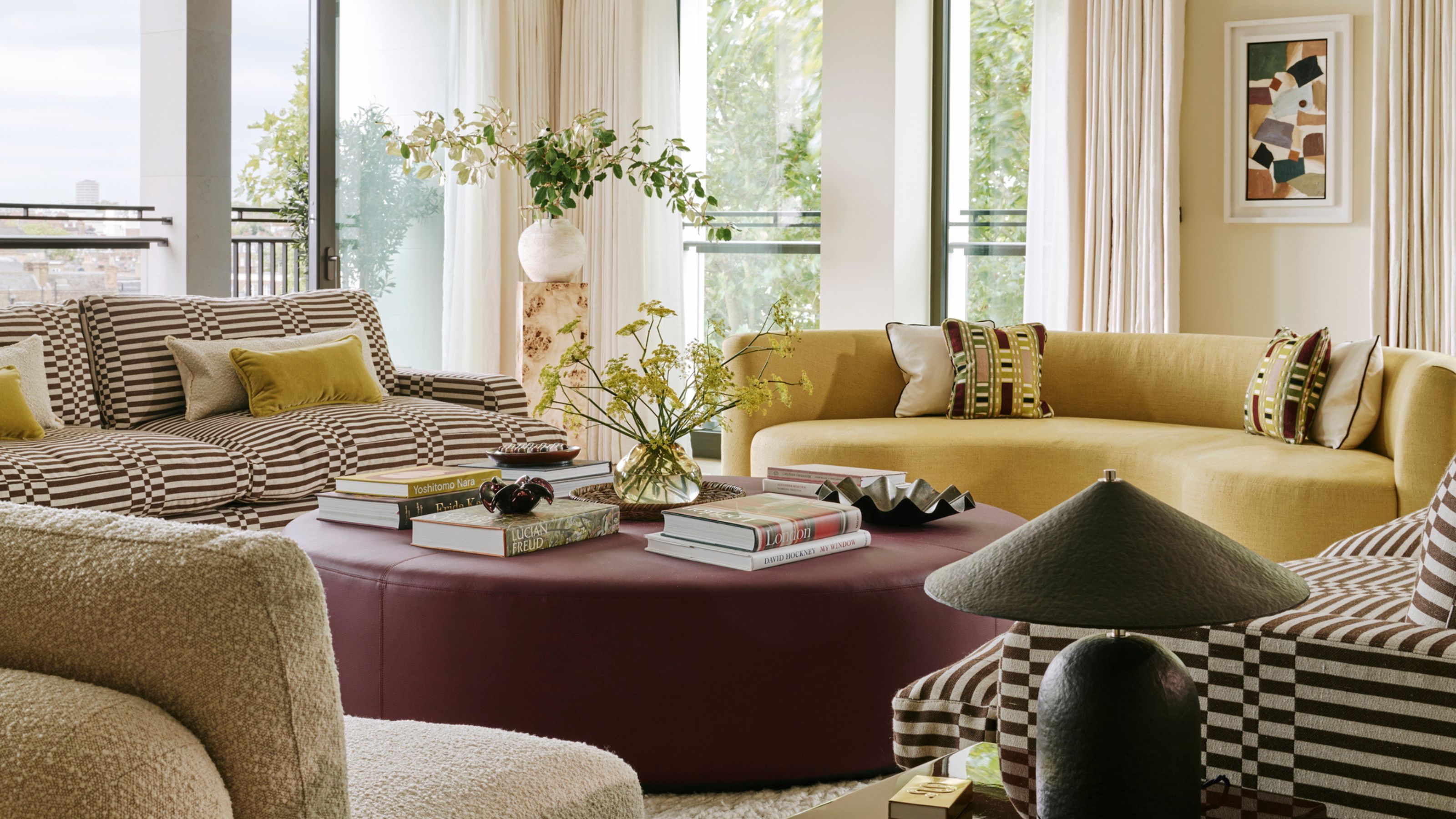
As a social zone in the home, you may be surprised to discover how colorful living room ideas can change the way you engage with the space. A vibrant palette can energize, harmonize, and revitalize a space — taking it from a simple room, to somewhere you look forward to spending time in.
Of course, when coming up with lively living room color ideas, it's worth weighing up how you want to use the space. If it's somewhere for reading, relaxing, and retreating to, perhaps selecting a more moody, calming color would be better. For spaces you want to entertain, engage, and feel energized in, a bit of color (or a whole heap of it) can make all the difference.
But curating colorful living room ideas takes skill. It can very easily tip over into the realm of chaos if proportions, lighting, and balance aren't considered. So, to inspire you, but also show you how it's done, we've found 12 colorful living room ideas by designers, which we've shared below.
1. Build Your Scheme Around a Piece of Furniture
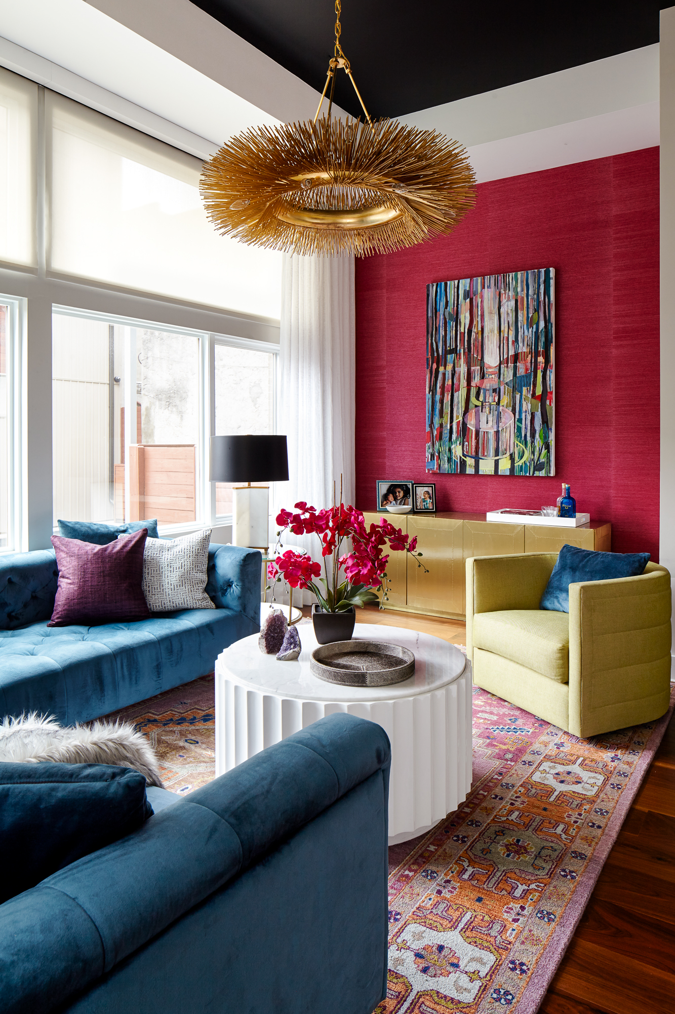
Sometimes the best place to start a colorful scheme is with something you've already got.
With colorful living room ideas, sometimes the hardest thing is knowing where to start — but the answer might already be in front of you (literally).
"For this project, the client approached us to design the living room of their new home using an existing turquoise velvet sectional that they had purchased," shares interior designer Alexis Pew, of Kaminski + Pew.
"With such a bold color filling most of the floor plan, we chose to complement and balance it with equally rich tones of fuchsia, orange, eggplant, and gold. The colors are unified through a traditional woven area rug and focal wall art."
Alexis Pew is partner and interior designer at award-winning Philadelphia-based architecture and interior design firm, Kaminski + Pew. With years of experience working on residential homes and teaching interior design, she knows how to create spaces that people feel comfortable in, even if they're colorful.
2. Let Your Artwork Do the Hard Work
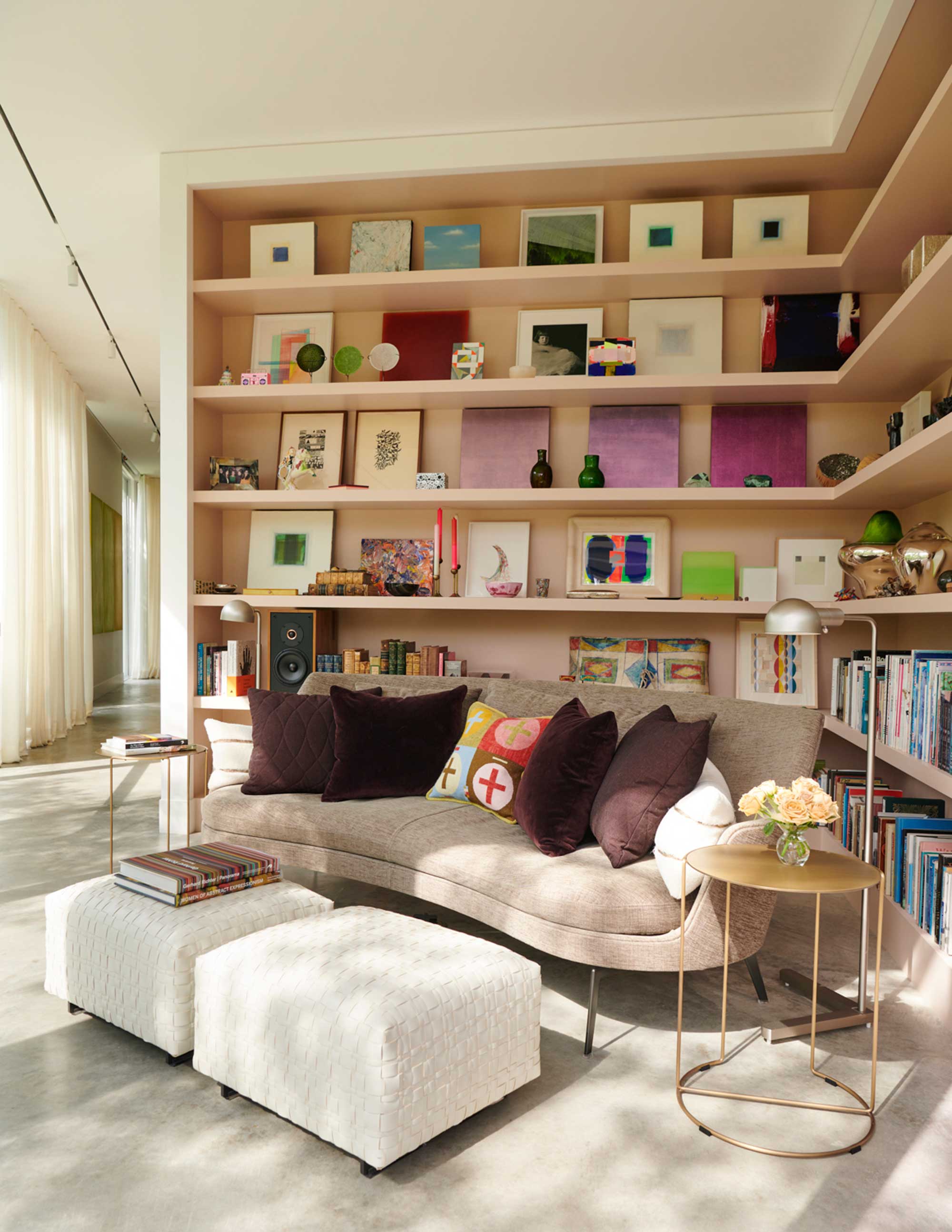
Committing to color can be daunting, which makes something like artwork an easier avenue to introduce it through.
Art is a natural way to introduce color, and with the right curation, you can even make a relatively neutral space feel colorful. That's what happened in the living room corner above, designed by Jennifer Mobley and Bill Bloomfield, founders of architecture and design studio Mobley Bloomfield, in collaboration with Dillon Kyle Architects.
The Livingetc newsletters are your inside source for what’s shaping interiors now - and what’s next. Discover trend forecasts, smart style ideas, and curated shopping inspiration that brings design to life. Subscribe today and stay ahead of the curve.
To bring a bit of character to the space, where the owner's art collection is displayed on shelves, like an alternative gallery wall. "The shelves were designed for a growing collection of art and objects," Jennifer and Bill explain. "They were designed and engineered so that the shelves would be uninterrupted with no vertical separation for maximum flexibility."
Crafted from wood, the shelves have been finished in a rich, saturated shade of pink from Farrow & Ball, called 'Setting Plaster' — adding further color to the living space.
3. Anchor a Colorful Scheme With a Solid Rug
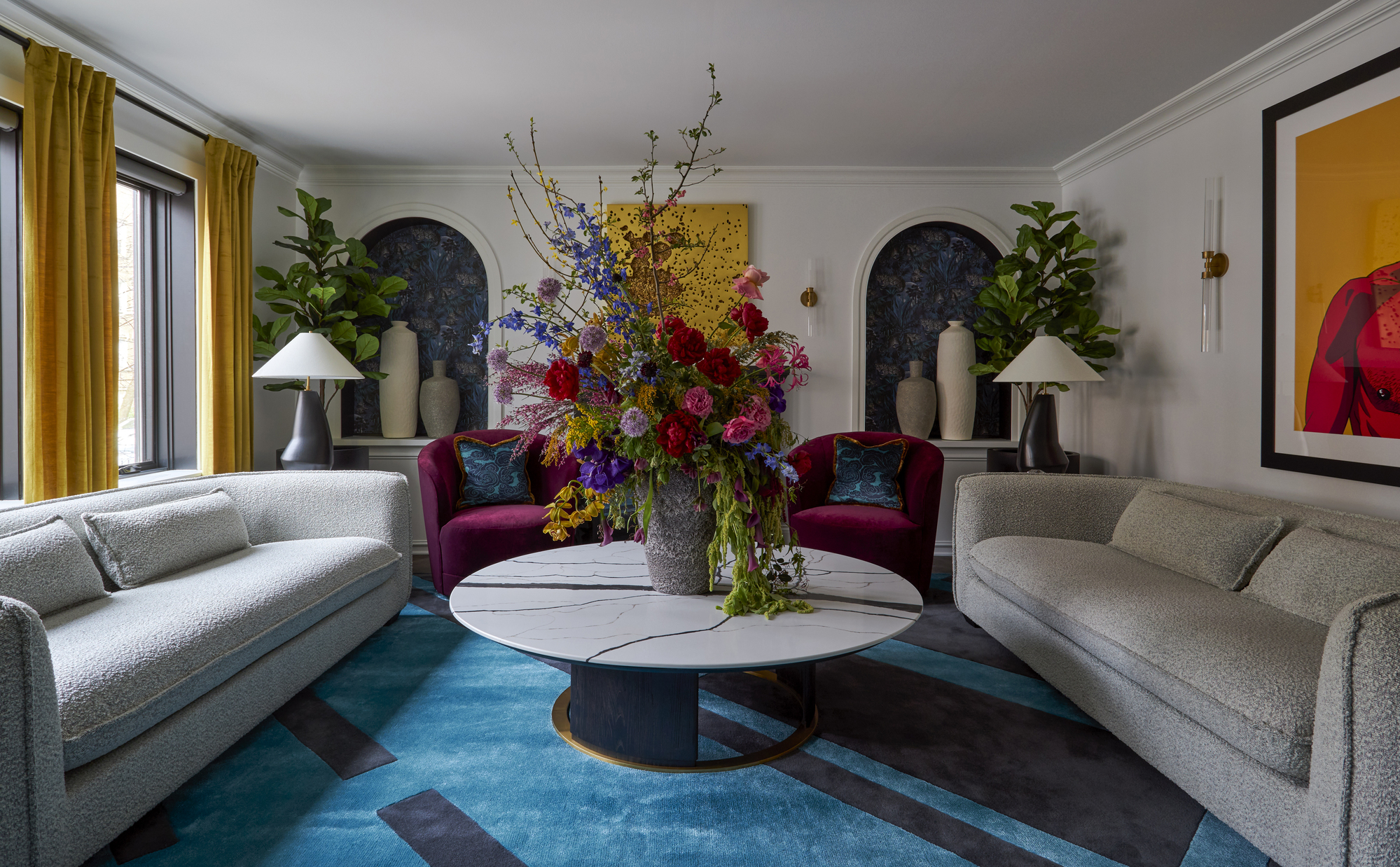
Using color to anchor and ground a space helps ensure it doesn't overwhelm the space.
"A brightly colored rug is an excellent way to introduce color into a living room because it creates instant visual impact, and serves as a strong focal point that energizes without overwhelming," explains interior designer Mark Schubert, principal of Phillip Harrison Interiors.
The best rugs work to anchor the furniture layout, while creating a bold, expressive space that balances sophistication with a playful vibrancy, as seen in this colorful living room.
"Other elements like the yellow velvet drapes, jewel-toned chairs, and large-scale floral arrangement were layered in to echo and amplify the color story, creating a dynamic yet cohesive palette," Mark adds. "The overall effect is a curated blend of modern luxury and artistic flair, where each piece contributes to a harmonious but statement-making whole."
4. Use Pattern to Accentuate the Colors
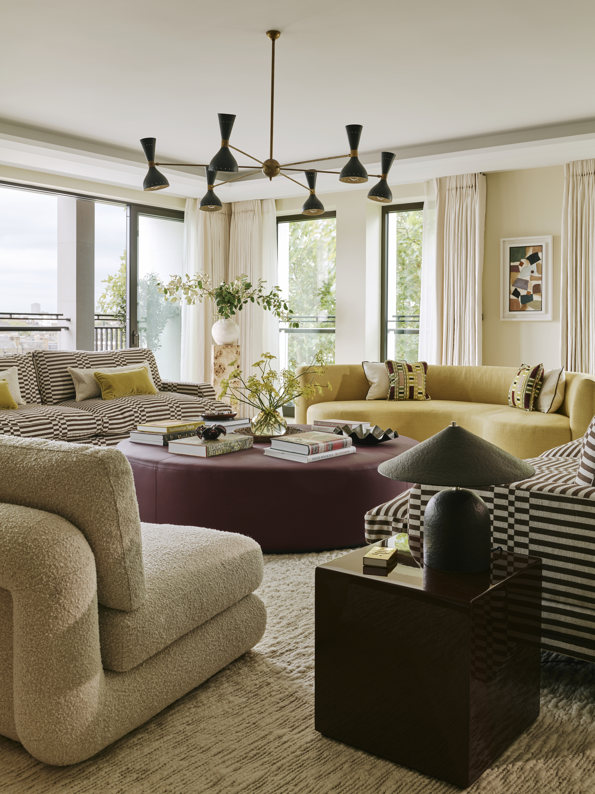
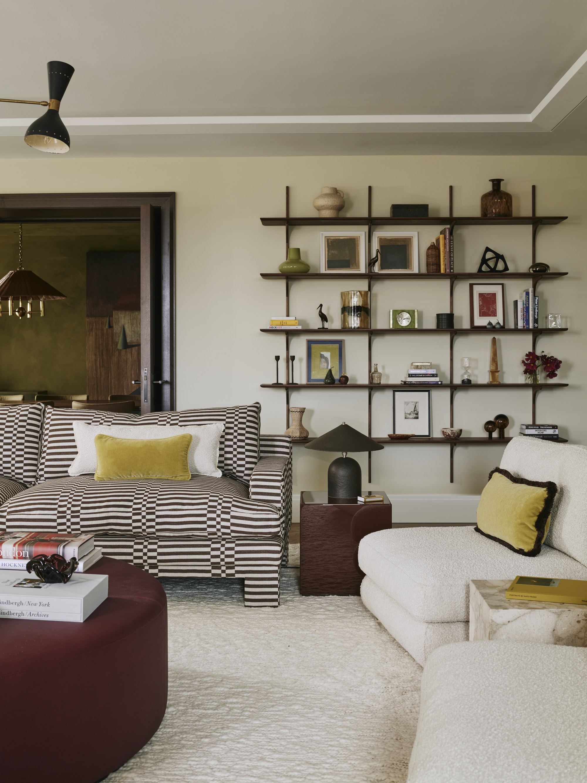
Patterns play a powerful role in the way colors interact and pop in a room.
"Pattern, even in more subtle places, can be hugely impactful within an interiors scheme," says interior designer Angelica Squire, principal of Studio Squire. "Whether it’s a cushion or a lampshade or a full-blown sofa, it’s brings in another dimension to simply using flat, plain materials."
If the idea of color and pattern clashing in your living room makes you hesitant, Angelica suggests starting by teaming patterns with solid fabrics. But, "For something bolder, consider adding a small scale and big scale pattern within a room scheme."
5. Steal Your Palette from a Colorful Piece of Furniture
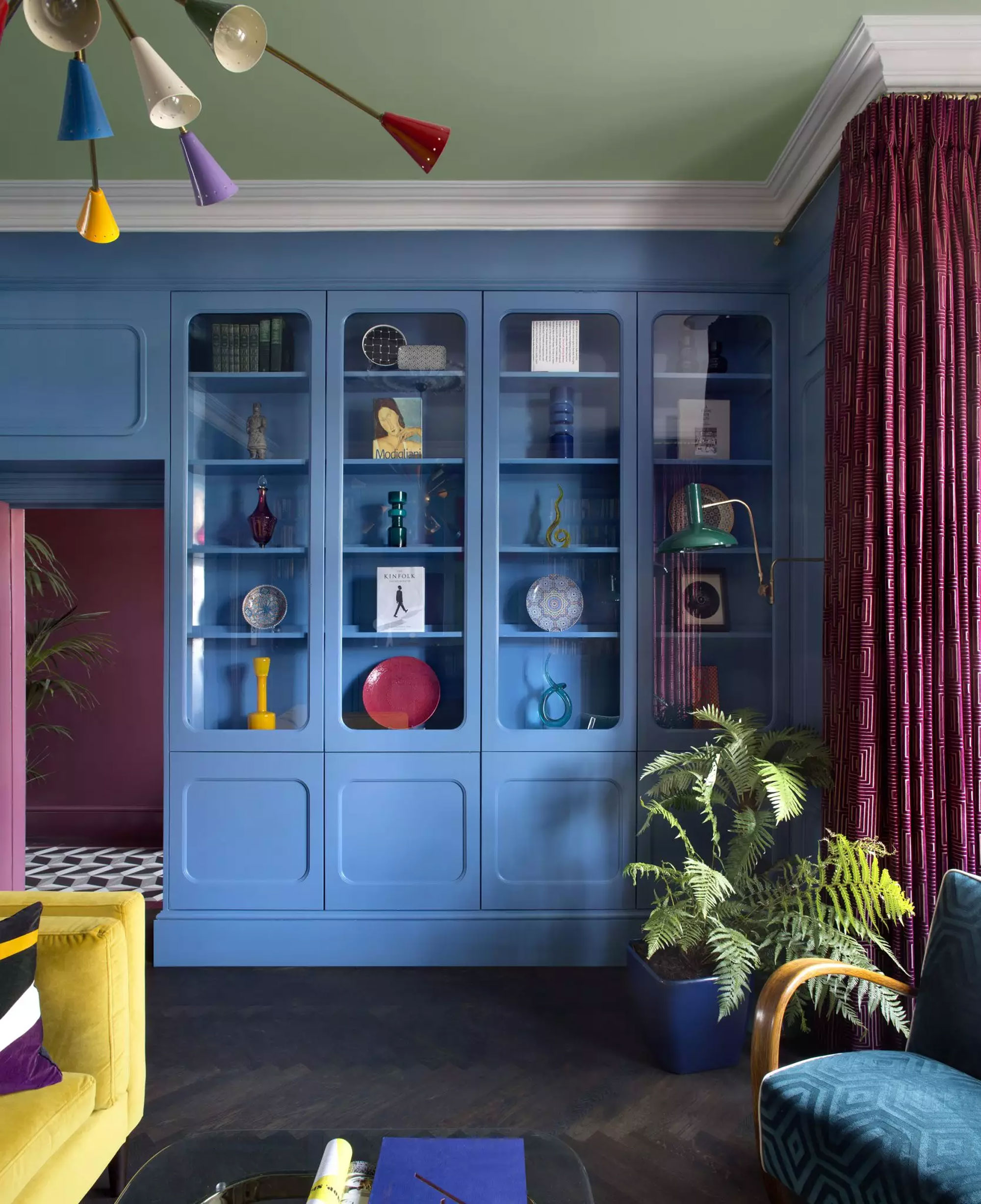
Not sure how to find complementary tones? Furniture designers have already done it for you.
If you don't have an interior designer to help you masterfully layer colors in a living room, there are ways around it — like taking inspiration from furniture and product designs.
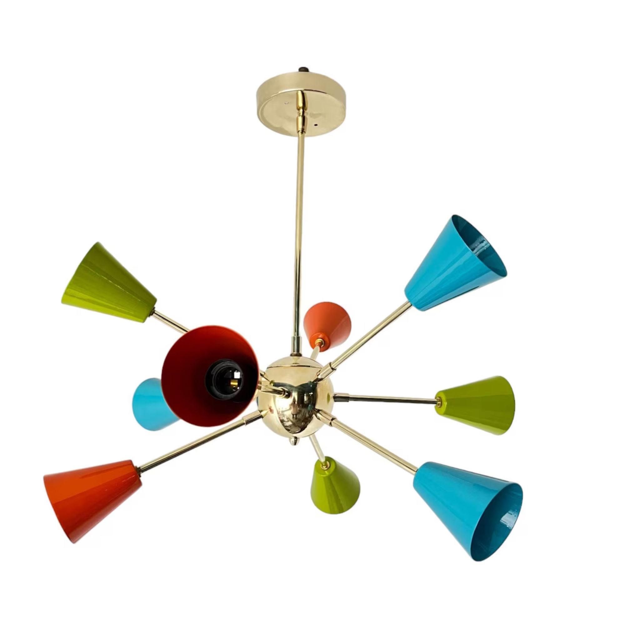
In this colorful living room, interior designer Roisin Lafferty drew her palette from a colorful Sputnik-style pendant light, which helps hold the entire scheme together.
"It was really about taking an artistic approach and looking at how paintings and bold artwork can manage to merge and combine so many different colors and tones," explains Roisin. "We wanted to bring that playfulness to a space and apply an almost painterly approach. There is a deliberate graphicness to the design with influence from artist Joseph Albers as well as the contrasting primary colors in the vintage Italian Sputnik light fitting we sourced as the centerpiece."
6. Start with a Classic Color Combination
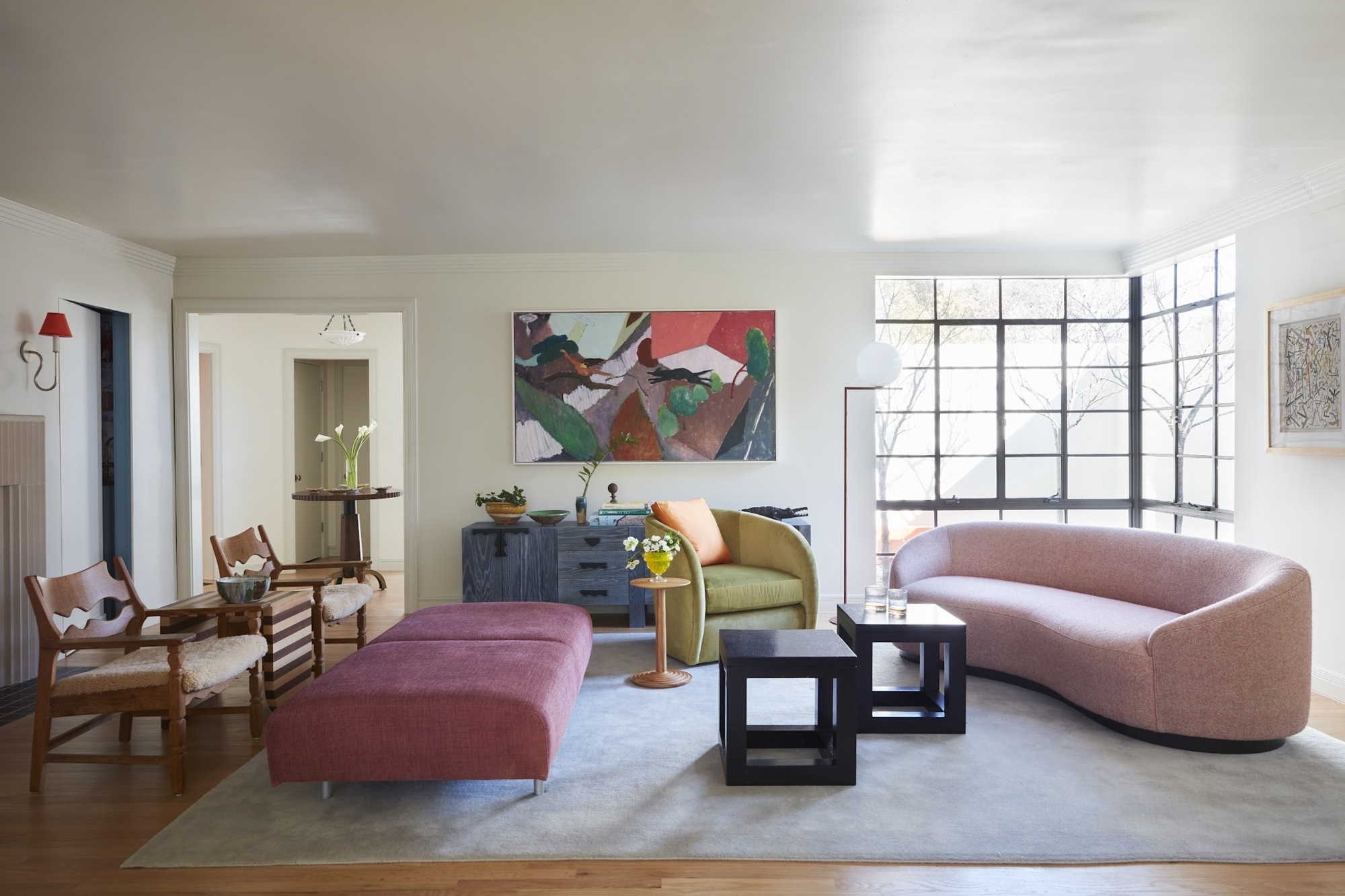
Sticking with what you already know in terms of complementary colors is a fool-proof plan to coming up with colorful living room ideas.
Getting a bit creative with colorful living room ideas doesn't have to mean reinventing the (color) wheel. Start with a scheme you know works — like the fact that pink and green go together perfectly. Then, you can build from there.
In the colorful living room above, designed by Avery Cox, varying shades of pink accents punctuate the space — the sofa, daybed, pillow, and in the artwork — while touches of green balance it out, ensuring it doesn't feel overly feminine. From there, the gray-blue rug, blue console and colorful artwork on the wall come together to create a multi-colored scheme that feels evenly-weighted, not overwhelming.
Each pairing works individually, but together they form a well-rounded triadic color scheme that has more dimension (and color) than a simple two-tone scheme.
7. Be Bold and Clash Colors
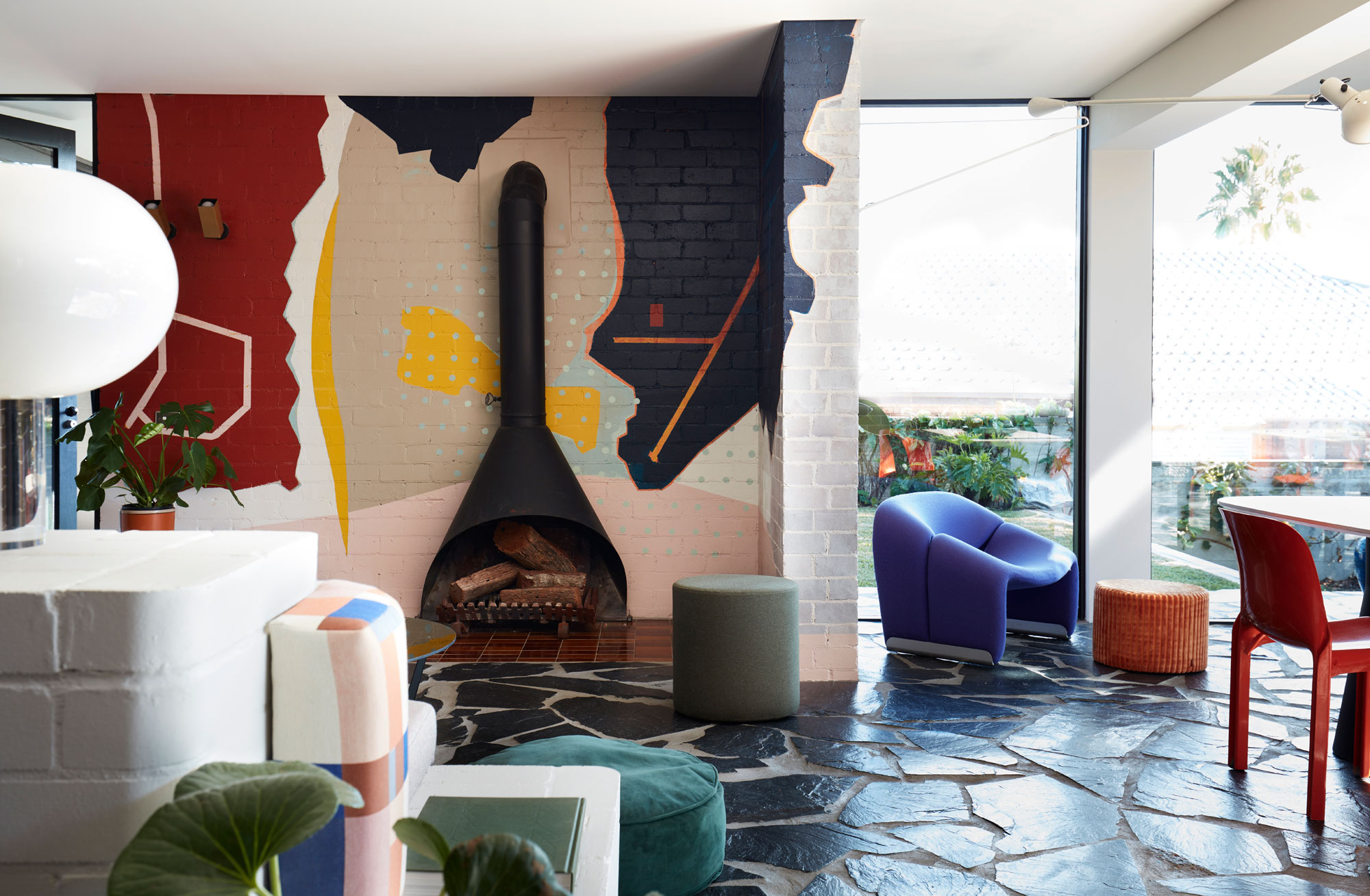
But sometimes it pays to be bold and brave — opting for a striking contrasting palette is sure to make a statement in your space.
Oftentimes, the best colorful living room ideas are the boldest, and bravest. This was the case for this 1960s home designed by YSG Studio, where colors used for a wall mural and furnishings clash, but in a complementary way.
"This project is an ‘all in’ commitment to self-expression as the owners wholeheartedly wanted to embrace their fearless love of color which plays a pivotal role with contrasting quiet and bold schemes," explains interior designer Yasmine Ghoniem, founder of YSG Studio.
"Whilst it influenced color selections for furniture, it didn’t dictate them as I never fall for ‘matchy-matchy’ conclusions," Yasmine adds. "I’m an avid believer in complementary clashes. The quiet tones — warm shades of white and mushroom pinks — are the base neutral shades holding everything together to create harmony, whilst the brighter and deeper shades draw attention to the living areas and modular hero decor items."
When it comes to color, no one knows how to play with it better in interiors that Yasmine Ghoniem, founder and pricipal at YSG Studio. She, and her team, have won multiple awards for their bravery and boldness when it comes to 'palette play', expertly layering spaces with bold motifs, texture, and colors.
8. Combine Colorful Elements with White Walls
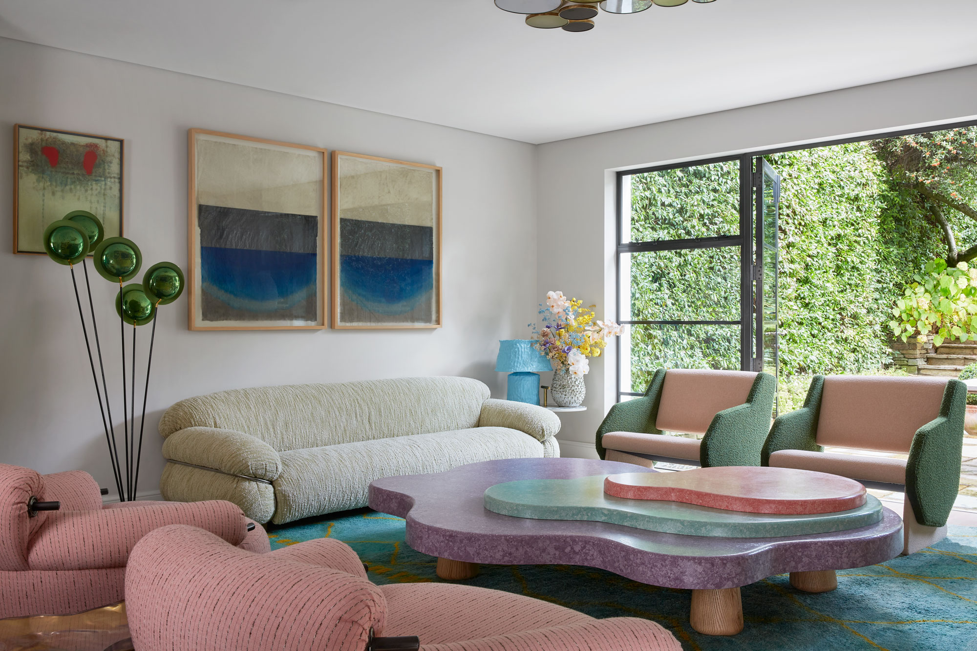
Colorful living rooms don't always have to bold — a softer palette can have just as much impact.
Colorful living room ideas don't have to be big commitments. Painting or papering your walls isn't the only way to inject a space with color. Starting with a neutral base and furnishing is a great way to experiment with new palettes, and it won't overwhelm the room.
You should, however, be wary of how much color contrast occurs when using white walls as a backdrop. "If you have white walls and you buy yourself a red sofa, all you’re going to see in that room is the red sofa because the contrast between the two is so high," explains Dagny Thurmann-Moe, creative director of KOI Colour Studio.
Opting for lighter tones that create less contrast makes for a scheme that's easier to tie together, as well as being design-forward. In this colorful living room, Korner Interiors showcases a grown-up approach to decorating with pastels against a white-walled room.
"Bold color combinations are one of the most effective ways to get your attention, but too much of a bold color can overwhelm the details of the space," says Katie Paulsen, interior designer at Maestri Studio. "Playing with that balance and incorporating textures and patterns can create a color combination that is truly effective."
9. Take a Minimalist Approach to a Colorful Living Room
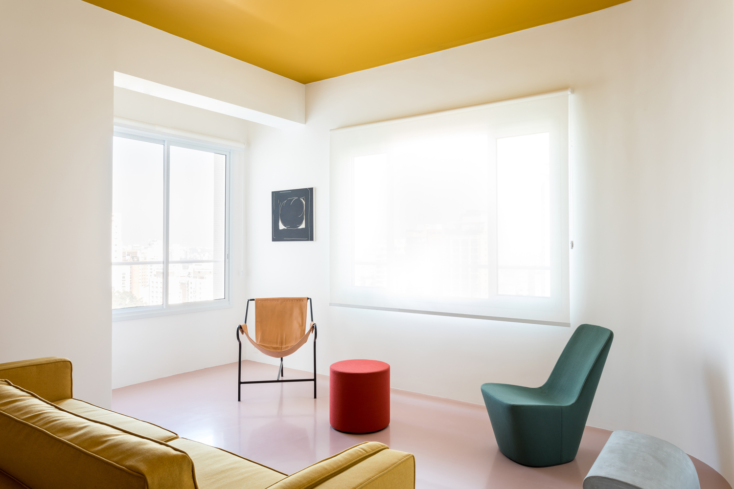
Colorful living room ideas also don't have to be maximalist in style — you can approach color in a more minimalist way, too.
Don't confuse the two: while most will automatically associate a colorful interior with a maximalist aesthetic, that doesn't always have to be the case.
There's a concept known as 'colorful minimalist' that embraces all the hallmarks of the minimalist interior design — clean lines, lack of clutter, and a high sense of curation — but with color incorporated into the scheme, as seen in these color palettes for minimalist living rooms.
"There’s the cliché of minimalism where it’s cold, spare and severe; devoid of art, color, buoyancy and texture — the elements you actually want to live with," says interior designer Greg Natale. "But minimalist architecture can be an amazing canvas for expression."
10. Make the Color Contrast More Unexpected
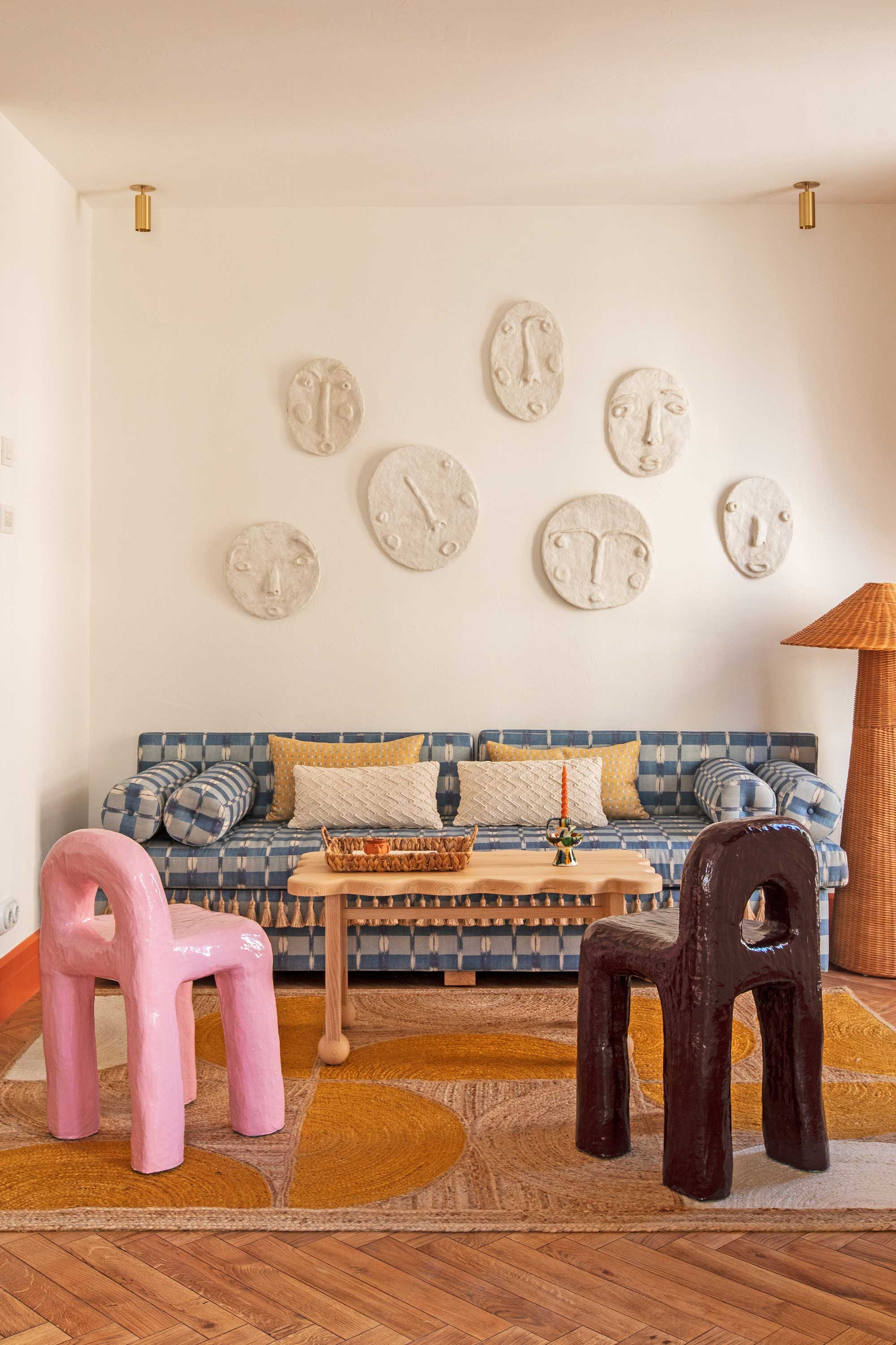
It's often the one 'unexpected' element in a space that makes the biggest impact — especially when it comes to color.
Often, the more unexpected and surprising the color contrast, the more colorful it can seem. "While the base and accent colors usually follow traditional theoretical rules, and can be categorized as split complementary, triangular, analogue, etc., the contrast color can be the rule breaker," explains Dagny Thurmann-Moe, creative director of KOI Colour Studio.
In the design of the Montesol Experimental Hotel in Ibiza, shown above, designer Dorothee Meilichzon created spaces with bohemian beach vibes at their core, and by injecting a playful pastel pink into the rooms, she's created a living room that feels new, fresh, and, most importantly, colorful.
11. Opt for a Colorful Wall Covering in Your Living Space
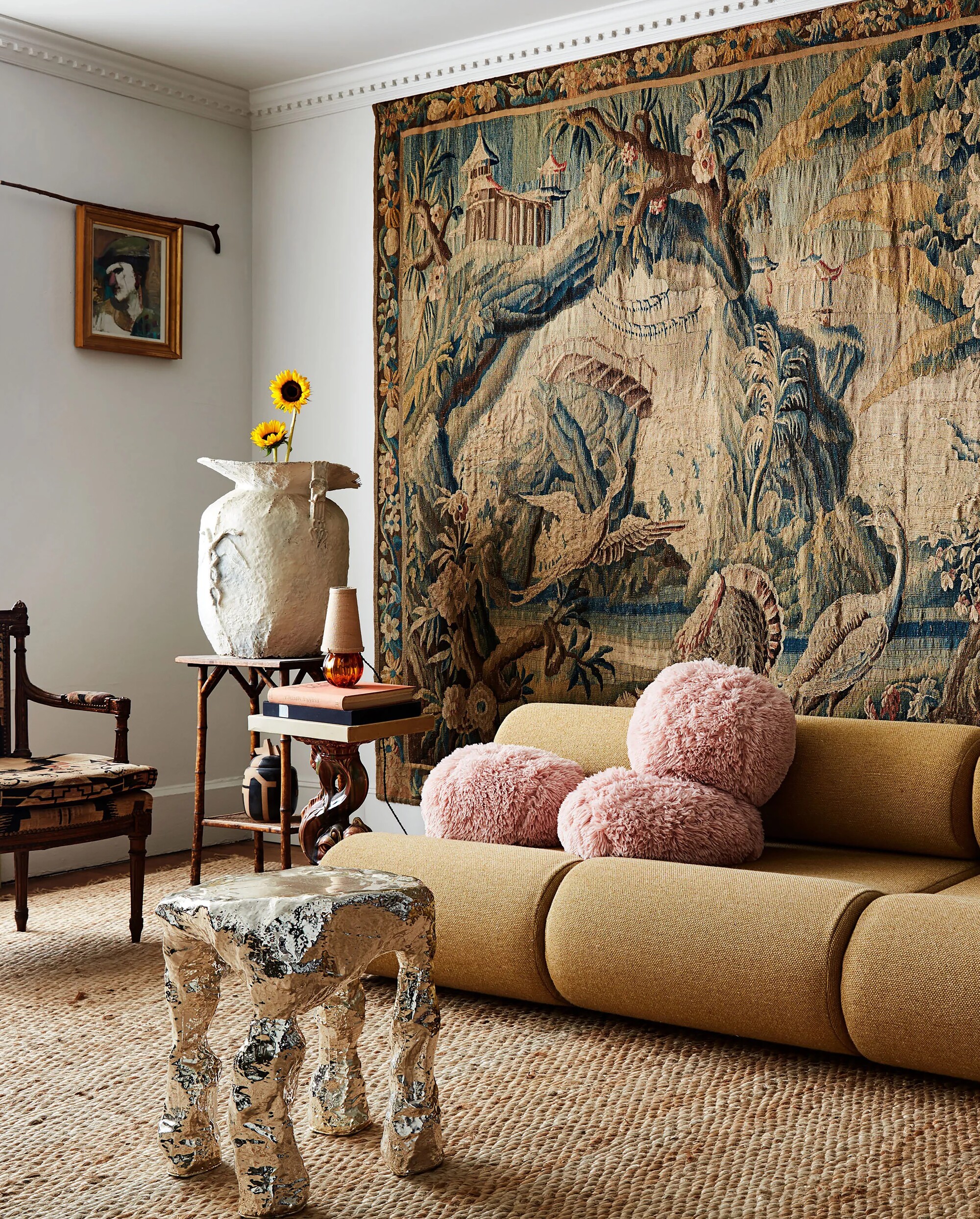
One single choice for your walls — be that wallpaper, a hanging, or piece or art — can carry a lot of the 'colorful' load in a living space.
It's almost a cheat way to approach colorful living room ideas, because all the work is done for you in one swift application, but, of course, choosing a colorful wall covering is a wonderful way to set the color scheme for your living space.
It could be wallpaper, a wall mural idea, or even tapestry, like shown in the living space above, but either way, it's a simple way to make maximum impact and introduce a range of different colors into your living space.
Choosing to go all out on the walls and keeping your furniture and decor neutral means that your scheme will be easily adaptable should you wish to change it up in a similar way in the future, too.
12. Try a Colorful, Yet Tonal Color Palette
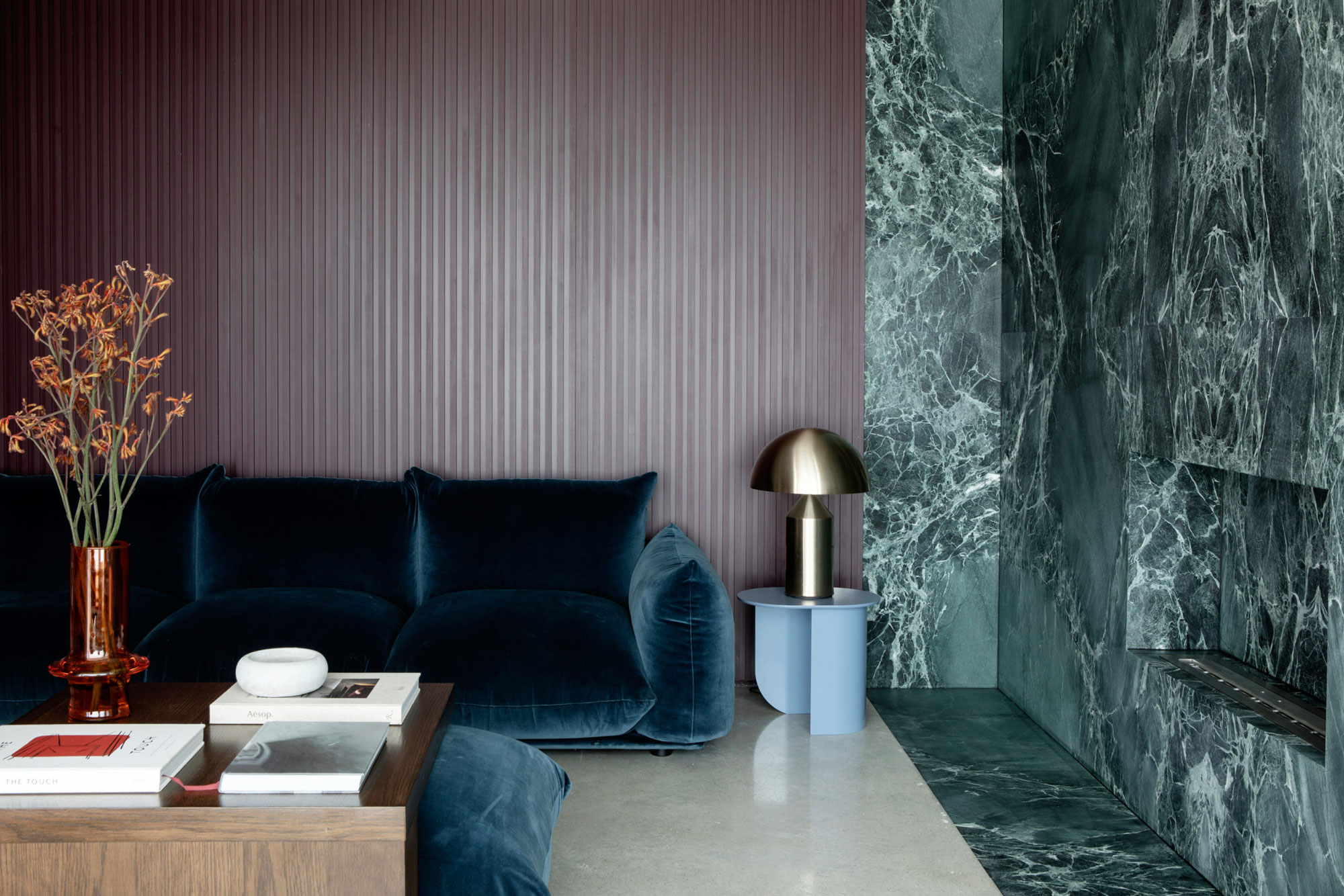
Colorful doesn't have to mean chaotic — you can keep the space feeling tonal, but still give it complexity and depth of color.
Tonal color schemes are made up of neighboring hues on the color wheel that have a natural affinity when used together. Depending on how granular you want to go, a tonal color scheme could be made of different tones of the same color or similar shades.
In this purple and green living room design by Róisín Lafferty, tonal greens, blues, and purples create a space that's big on color but still feels restful to the eye.
"We wanted to exude a sense of opulence and rich sophistication, and wanted the richness of color to be created with natural stone," explains the designer. "By using natural materials as the key color insertion, we have created a home that hinges on color but manages to be timeless and full of character."
And the key to rounding out this space, ensuring it feels dynamic rather than flat? A pop of contrasting color with the orange, a shade that sits on the opposite side of the color wheel, and timber accents. "As well as the stone being the color center point, rich timber tones deliberately contrast and intensify depth," Roisin says.
FAQs
Can colorful living room ideas be calming?
Absolutely. While most people will assume that a colorful space equals a chaotic, energetic one, that doesn't always have to the case. It really all depends on the colors you're introducing in the space.
For a more delicate colorful living room idea, why not try playing with pastel shades, or varying shades of different, more neutral earth tones, as a way to bring energy and excitement to your space, but in a less in-your-face manner.
Living rooms, being lively spaces, are one of the best areas of the home to experiment with colorful palettes.
Not sure where to start? Why not select one shade from the latest color trends, do a bit of research to discover its complements and what shades contrast best with it, and go from there.

Emma is the Interiors Editor at Livingetc. She formerly worked on Homes To Love, writing about all things design for some of Australia’s top interior publications, including Australian House & Garden and Belle. Before that, she produced content for CULTIVER, where she found an appreciation for filling your home with high-quality, beautiful things. At Livingetc, Emma explores the big design questions — from styling to colors, interior trends, and home tours. She’s travelled to Copenhagen for 3daysofdesign, to Paris for Déco Off and Maison&Objet, and has attended design events in London, including WOW!house and Clerkenwell Design Week. Outside of work, you’ll find her elbow-deep at an antique store, moving her sofa for the 70th time, or mentally renovating every room she walks into.
- Hugh MetcalfEditor

