How to Decorate With Little Greene’s ‘Livid’ - 3 Ways to Use This On-Trend Hue Inside your Home
Designers share their tips on how you can use this attractive shade of forest green throughout your space


The Livingetc newsletters are your inside source for what’s shaping interiors now - and what’s next. Discover trend forecasts, smart style ideas, and curated shopping inspiration that brings design to life. Subscribe today and stay ahead of the curve.
You are now subscribed
Your newsletter sign-up was successful
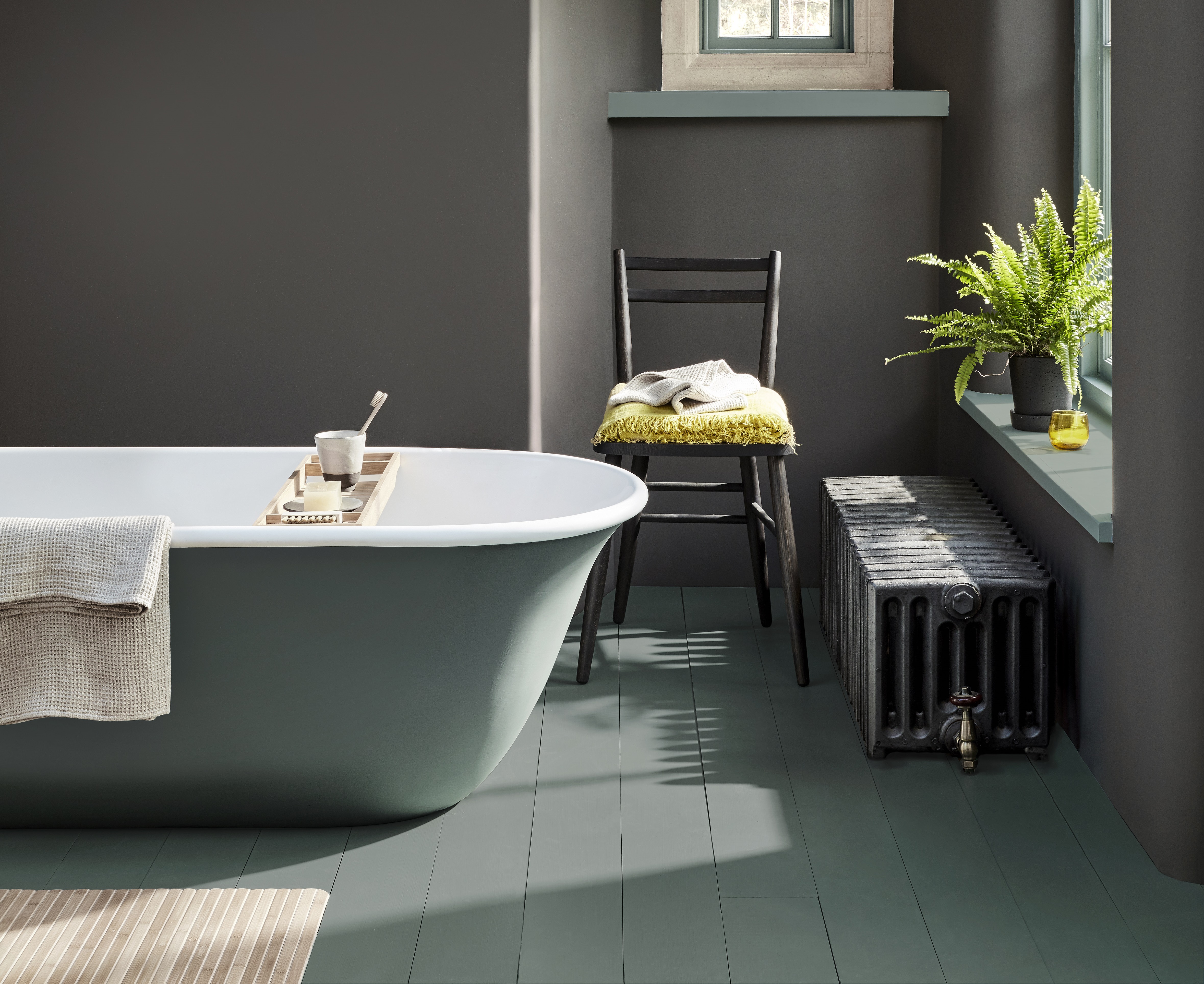
Forest green has probably been one of the trendiest colors of 2023, and Little Greene's iconic shade 'Livid' - a restful, muted shade of blue-green - is the perfect hue if you want to take it to your walls. It will look at home in virtually any space too, since this versatile shade of regal green seems to go with anything.
If, however, you want a bit of guidance when it comes to incorporating this paint idea into your home, we've asked designers to offer some insights. Here, we talk to professional designers who share their thoughts on how to make the best use of this color throughout your space.
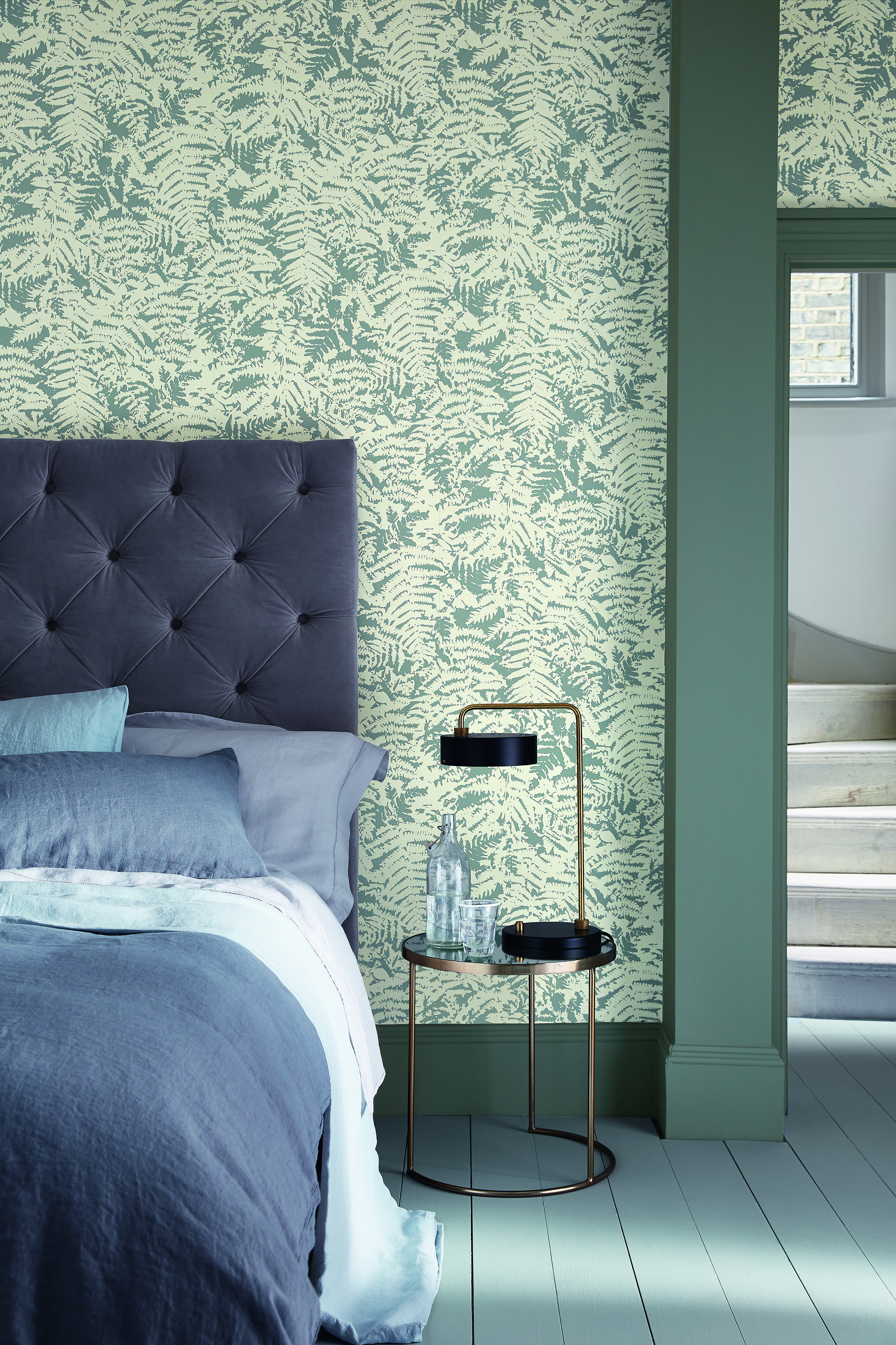
1. Woodwork in a Bedroom

Green is the color that reminds you of nature and all its beauty. Using Little Greene's Livid in your house will automatically give a pleasant, aesthetic vibe. ‘Shades of green sit comfortably in any interior scheme because of their connection with the natural environment and our longing to bring the outdoors inside,’ says Ruth Mottershead, Creative Director Little Greene.
You could use this shade in a color drenched scheme, across walls and woodwork, for a wrap-around feel. This will create a restful living space or bedroom, that will bring comfort to the home and a wonderfully evocative and cocooning ambience.
Or, rather than paint the walls and ceiling the same color, why not just paint your woodwork (skirting, and door and window trim) in Livid green to use the shade as a bold accent? 'Livid is also a brilliant color to add as a contrast to neutral shades, such as creams and soft whites, or combine with darker colors such as browns, blacks, cherry reds, and ochre, for a more dramatic and richly enveloping feel,' adds Ruth. 'Tempered with black, its blues range from pink to green and as such is a versatile and restful color, sitting somewhere between blue, green, and greys.'
2. Cabinets in the Kitchen
As the heart of the home, your kitchen should be a highlight, so you want it to stand out from the crowd. Incorporating Livid alongside a neutral color palette is a perfect combination for this convivial space, so consider painting your walls green and keeping your cabinetry cream or beige.
‘This shade is extremely versatile and works well with a neutral palette, so it’s good for those who want to introduce color in a muted way without being too loud,’ says Manuela Hamilford of Hamilford Designs. ‘I love using earthy shades, and granite and wood would complement the color, making it the perfect choice for the kitchen.’
The Livingetc newsletters are your inside source for what’s shaping interiors now - and what’s next. Discover trend forecasts, smart style ideas, and curated shopping inspiration that brings design to life. Subscribe today and stay ahead of the curve.
Manuela has another color suggestion to pair it up with, too. ‘We recently decorated a beautiful Edwardian home with a green and pink master bedroom and I would suggest people consider using this green with a pink hu,' she says. 'A dusty pink will warm the green and create a serene and pretty space.' Why not punctuate your Livid green cabinets with pink cabinet knobs to make a real statement with this iconic color pairing?
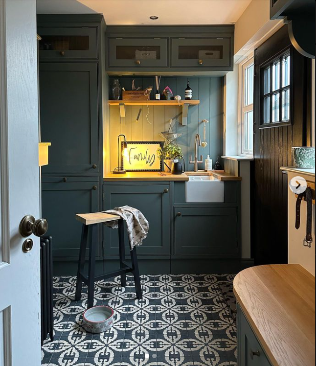
3. Walls in Utility Room

Gill Karaiskos, who regularly posts her interiors on Instagram, has also used this shade in several of her rooms. She wanted to have a bold color in her house, which makes it perfect for a utility room, a space that's not used too frequently. ‘I've used it in my utility room and kitchen,' she says. 'I've paired it with Slaked Lime, also from Little Greene.'
‘I think Livid is such a versatile color it would work well with lots of different interior styles,' she adds. 'I also love the way it changes with the light from green to blue or gray on dark winter evenings.’
Now you have all the inspiration you need to start using this color, so give it a shot and don't be afraid to experiment - you really can't go wrong with this versatile shade!
Try these similar shades from our other favorite paint brands

Devangi is currently pursuing an MA in Magazine Journalism from City, University of London and aspires to be a lifestyle journalist after finishing the course. As an up-and-coming talent in the industry, she has quickly adapted to the world of interior design and reports on all the latest news and trends.


