New Paint Collection by Cassandra Ellis

If you've been scouring the web for a wall colour that's the one – not too light, not too dark, calm and restful but also warm and comforting, then we may have found your perfect match.
From deep, dark tones that envelop you like a warm hug, to lighter and uplifting shades, the debut paint collection by furniture designer Cassandra Ellis features 18 intensely pigmented colours that cocoon you on these colder days.Perfect timing.
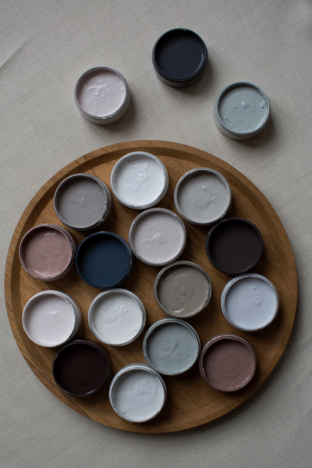
Soft and shrouding,the colours are deeply rooted in the natural world – think linens, stone, ash, aubergine, ripe fruits, winter landscapes – and even woolly jumpers and a nice cup of tea.
Article continues belowThe neutral and restful palette consists of soft whites, faded pinks, pale greys and a few flourishes of deep, dark tones,thedelicate feminine and soft masculine shades complement each other in a flirtatious harmony.
These luminous colours can be an enveloping backdrop for any home, whether it's softening a contemporary apartment, or injecting some energy into a more classic home.
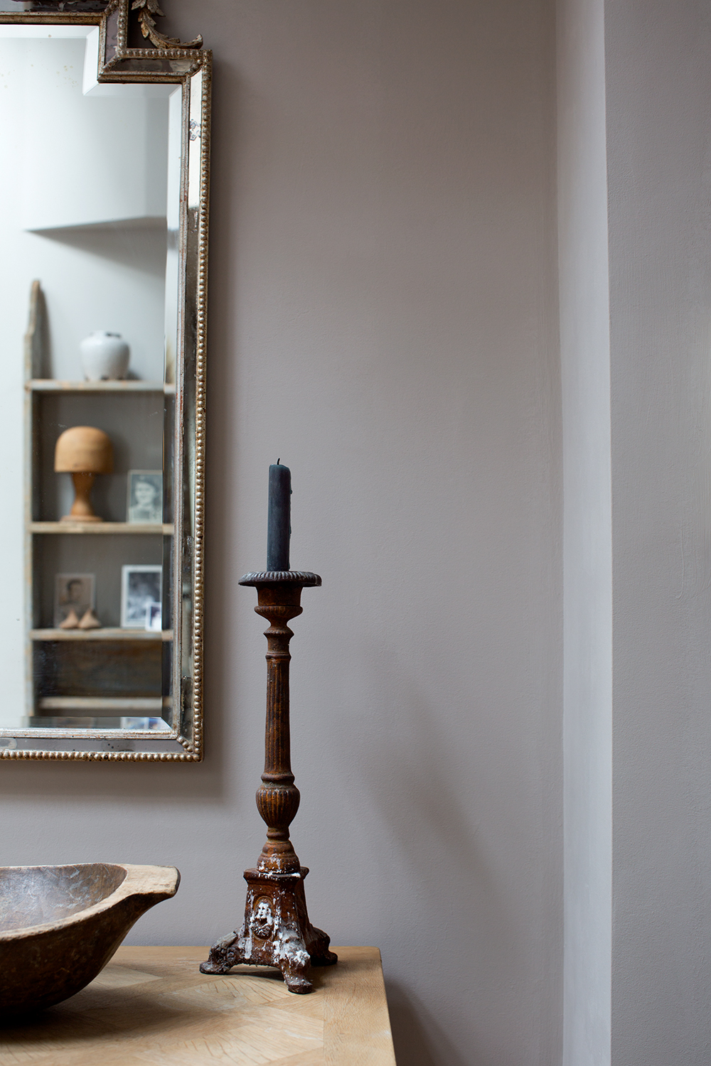
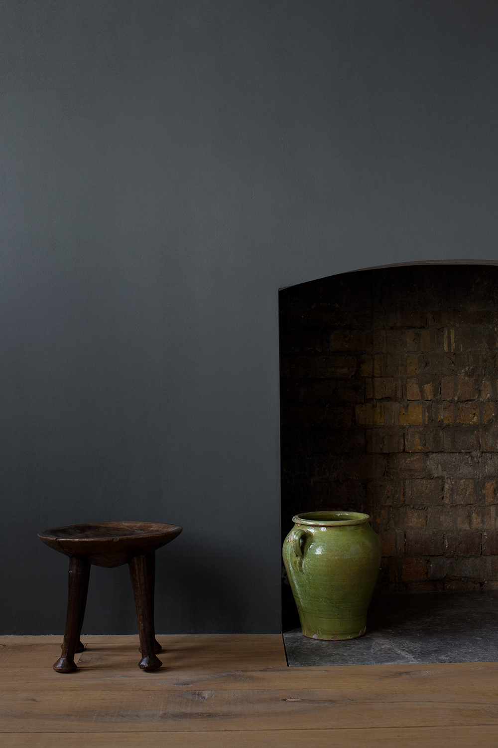
Divided into four groups; Whites, Pales, Mediums and Darks, the palette ranges from Pure White;the whitest white possible, with subtle undertones toAged Black; a soft, chalky and faded black, reminiscent of antique silk, ancient doorways or scorched Japanese Tea Houses.
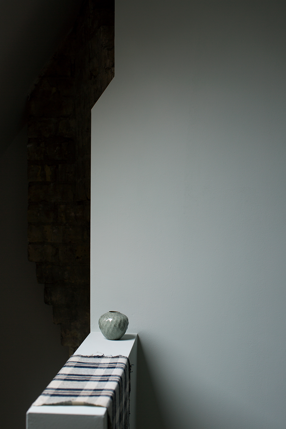
In between, you'll find quiet and calm colours likeSeafoam; a calm, restorative and uplifting greeny-blue, andFaded Blossom; an ethereal pale faded pink.
The Livingetc newsletters are your inside source for what’s shaping interiors now - and what’s next. Discover trend forecasts, smart style ideas, and curated shopping inspiration that brings design to life. Subscribe today and stay ahead of the curve.
In the mediums you have earthy and smokey shades likeMouse Grey; a soft, quiet and enveloping grey-brown, and Tea Rose; a dusty, enterre and warm smoky pink.
The dark palette draws you in with Fallen Plum; a dark burnt purplethat is rich and evocative, and Bitter Chocolate;a beautifully dark bitter brown, like of very old wooden panelling.
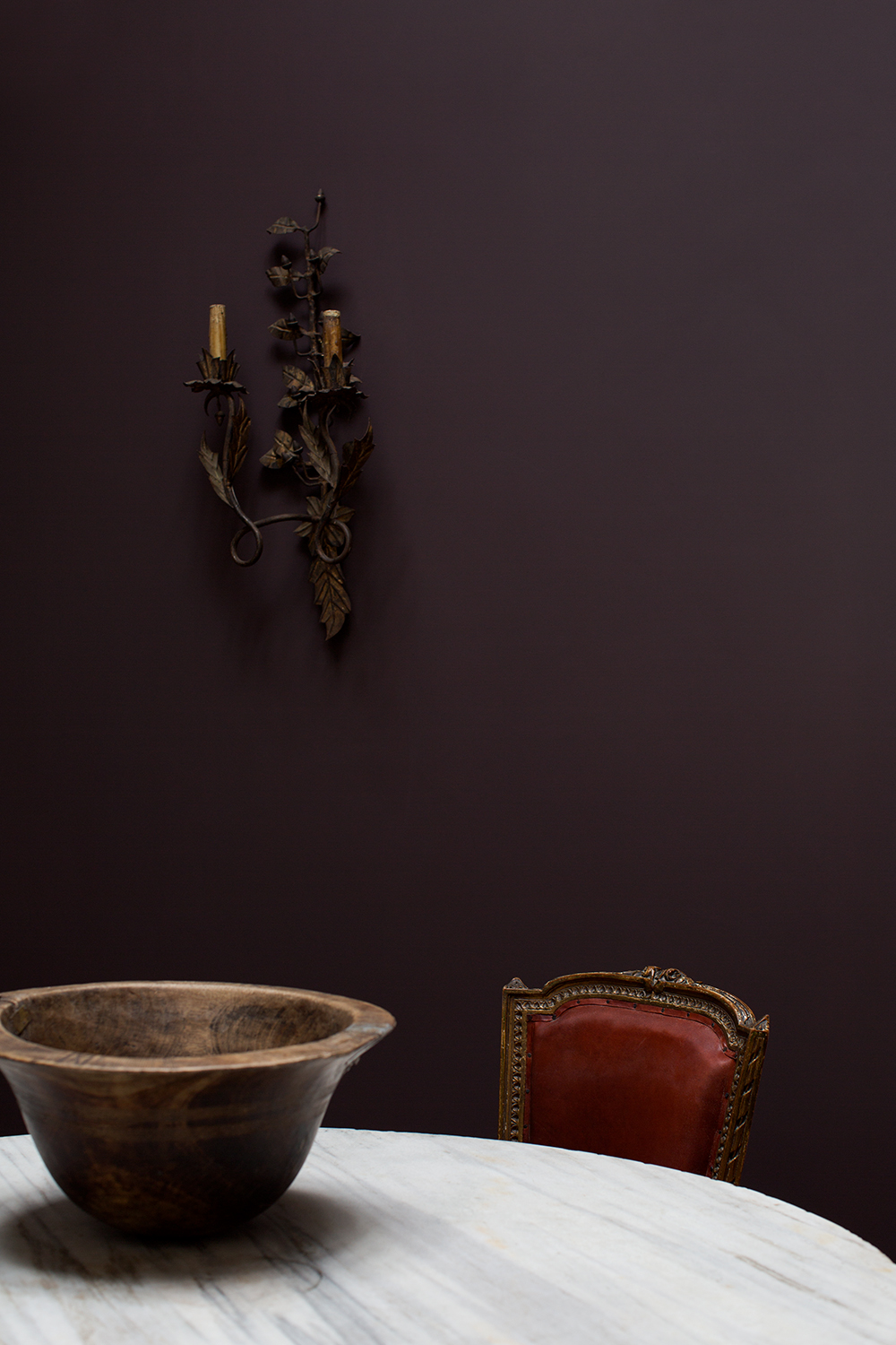
On her collection, Cassandra explains“I believe colour should be part of the fabric of your home. That’s why they’ve all been mixed to be quiet, calm and enveloping. I’ve produced a tightly edited range of colours that can be used alone or together, without any of them being overwhelming or attention-seeking. For me, it’s about making an uplifiting backdrop to life – they should wrap around you.”
At £95 a pot they don't come cheap, but its warming palette may be just what we need to see us though to spring…

Lotte is the former Digital Editor for Livingetc, having worked on the launch of the website. She has a background in online journalism and writing for SEO, with previous editor roles at Good Living, Good Housekeeping, Country & Townhouse, and BBC Good Food among others, as well as her own successful interiors blog. When she's not busy writing or tracking analytics, she's doing up houses, two of which have features in interior design magazines. She's just finished doing up her house in Wimbledon, and is eyeing up Bath for her next project.