Sorry, Sherwin-Williams, We’ve Already Chosen OUR 2025 Color Crush!
You don't paint your whole home in one color, so why settle for just one Color of the Year when you can have a complete capsule?

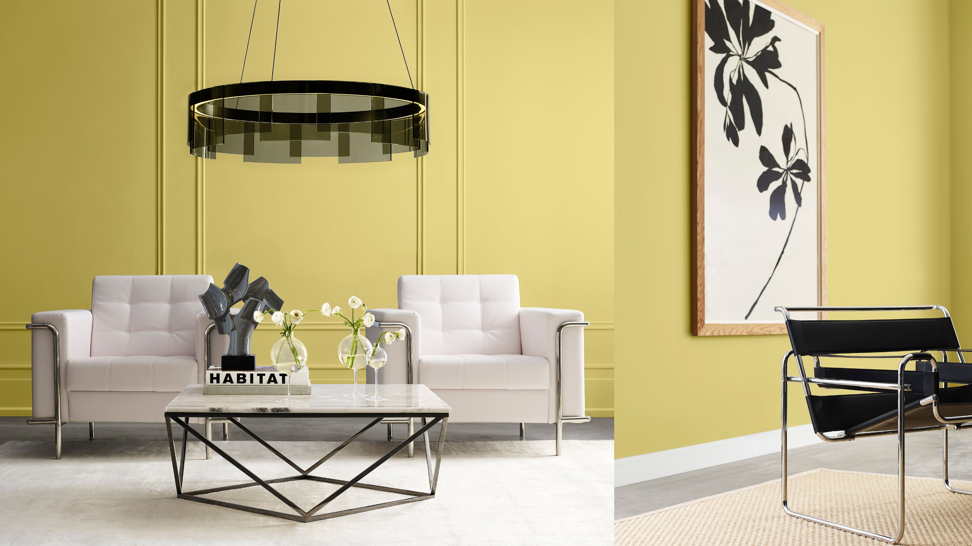
Safe to say, there has already been a fair few announcements regarding the predicted color of the year for 2025. And it's understandable that it can get quite confusing when each brand is backing a different shade. That's precisely why heritage paint company Sherwin-Williams' has decided to shake things up this year, announcing not just one color of the year, but a complete capsule.
Sue Wadden, the director of color at Sherwin-Williams, says the repeated announcements are what inspired the company to expand the color conversation and create their 2025 Color Capsule of the Year. "Our capsule gives people more options, which is the expansion that Color of the Year needs," she explains. "If you love a color, great, but we want to give people a way to explore how to use color within their homes."
The capsule features nine unique shades that layer well together and represent where Sherwin-Williams' believes color is headed next year. So without further ado, let's take a look.
Article continues belowWhat is Sherwin-Williams' 2025 Color Capsule of the Year?

The hardest part of finding the best paint colors for your home, is working out whether the different shades you pick will complement each other and your existing furnishings. Sue explains that the color capsule reads like a full palette of colors that can be used cohesively throughout the whole home. "It shows the typical homeowner how a designer might coordinate trending colors and use them in a space," she says.
Revival, trim and ornamentation, and the resurgence of vintage interiors like Art Deco design have all influenced the creation of Sherwin-Williams' 2025 Color Capsule. "We talked a lot about the return to the classic, but we do not want this to be mistaken as 'old' or 'stuffy'," adds Sue. "These colors are reimagined timeless shades that we hope will push people to understand how to creatively style the core, trend-forward colors we have curated in this capsule."
And these are the colors.

Price: Free color chip sample
Deep blues of this nature highlight the vintage-inspired paint colors we are seeing rise in popularity. Rain cloud is the perfect way to bring modernity and classic design. It is the shade for those of us who love a moment of blue, but want a color that feels a touch moodier and stylish.
Price: $7.90/sample, Was: $11.29
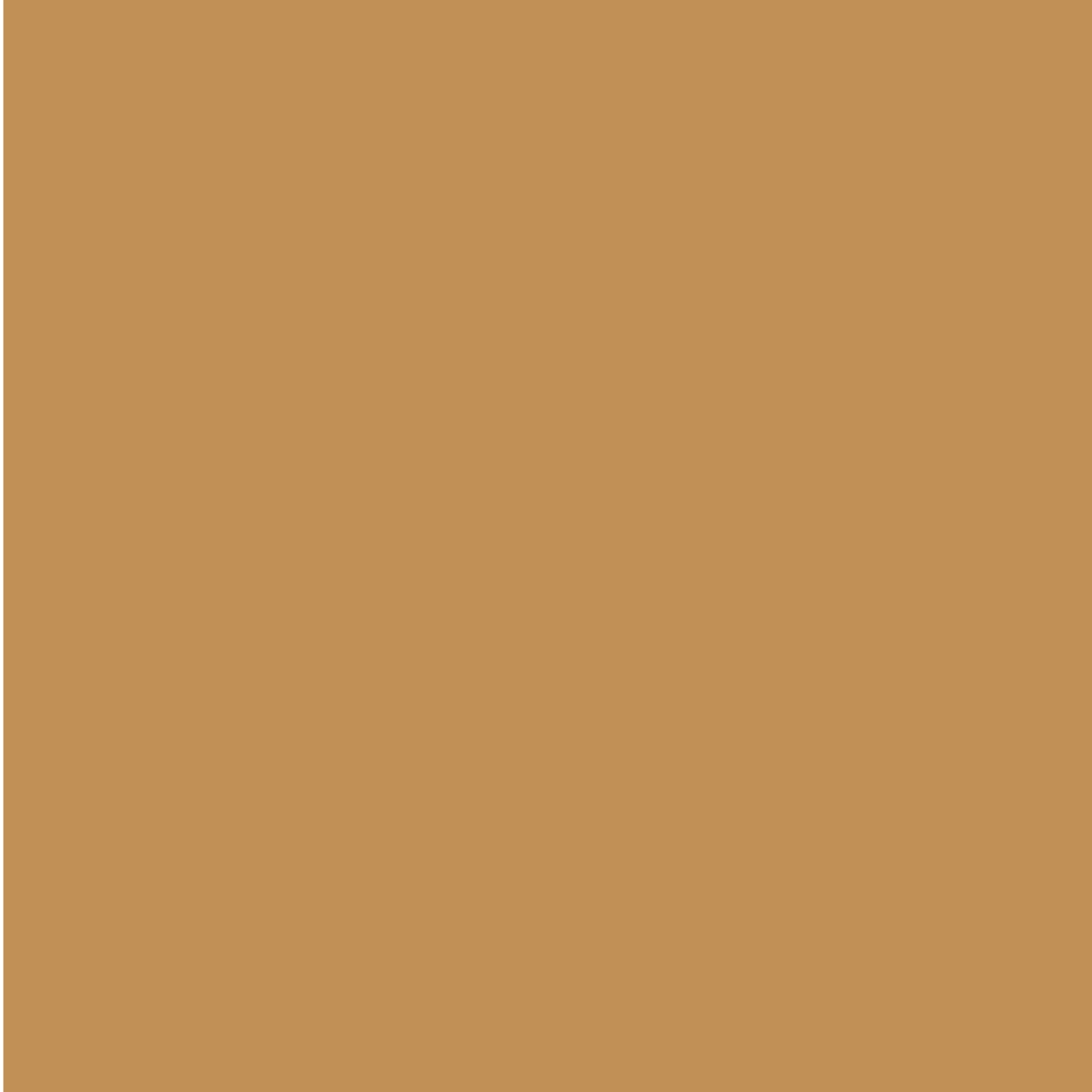
This cinnamon-dusted, golden hie is from Sherwin-Williams' Wellspring Palette and makes the perfect color pop to their new capsule. Once again, it has a bright, vintage look while still feeling contemporary. I can see Bosc pear being used for subtle moments, like trim or throw pillows.

Price: $3.95/peel and stick sample
Sun-bleached is for those of us who love the look of a bright white but still want something a little warmer. Sherwin-Williams describes it as a white that is "perfectly poised between warm and cool, an adaptable and airy light shade that ventures beyond a basic beige or taupe."

Price: Free color chip sample
A deep, rich color like Clove is a must in any interior palette. Sue says "It is almost as dark as black but keeps the warmth of solid brown. I love this as an alternative shade to create a stark contrast in a room." They also make lovely stand-alone moments. I would love to see Clover used in a bold color-drenching moment somewhere like a half-bath.

Price: $3.95/peel and stick sample
This brilliantly bright white is from Sherwin-Williams' Designer Color Collection. It is a neutral that they say "is an eternal favorite among design professionals for a light and spacious final result." Everyone needs a dependable bright white like White Snow.

Price: $7.90/sample, Was: $11.29
This Chartreuse shade feels totally nostalgic to me. Sherwin Williams describes it as "a historic color that has never been more relevant." I could not agree more. With everyone running back to joyful colors, this shade would work beautifully as an eye-catching moment of color pop.

Price: $3.95/peel and stick sample
Malabar is a sandy beige shade that feels instantly comfortable and inviting. With neutrals, you want something that does not come across as cold or bland. The warmth in this color steers well clear of that fear and would pair as a perfect contrast to bolder colors like Clove or Rain Cloud. A double-drenching moment between Malabar and a harmonious color would be a very stylish route to go.

Price: $7.90/sample, Was: $11.29
And last, but certainly not least, we have Mauve Finery. Purples have been everywhere this year, but this lilac shade feels yet to be seen. It is a bright pastel while still being muted enough to feel sophisticated and relaxing. Sherwin-Williams says "Its dreamy quality adorns a space with a refreshing appeal as a wall color or an accent hue." I would love to see this color-drenching a living room or even in the bedroom.

Another highlight of announcement is Sherwin-Williams' partnership with New York City-based creative agency East Olivia, who have conceptualized a series of "forever floral" arrangements inspired by the colors from the capsule.
The Livingetc newsletters are your inside source for what’s shaping interiors now - and what’s next. Discover trend forecasts, smart style ideas, and curated shopping inspiration that brings design to life. Subscribe today and stay ahead of the curve.
Incorporating new paint shades into your home is all well and good, but sometimes it is fun to pull in colors from our palettes beyond just the walls.
Our Favorite Color from the Capsule
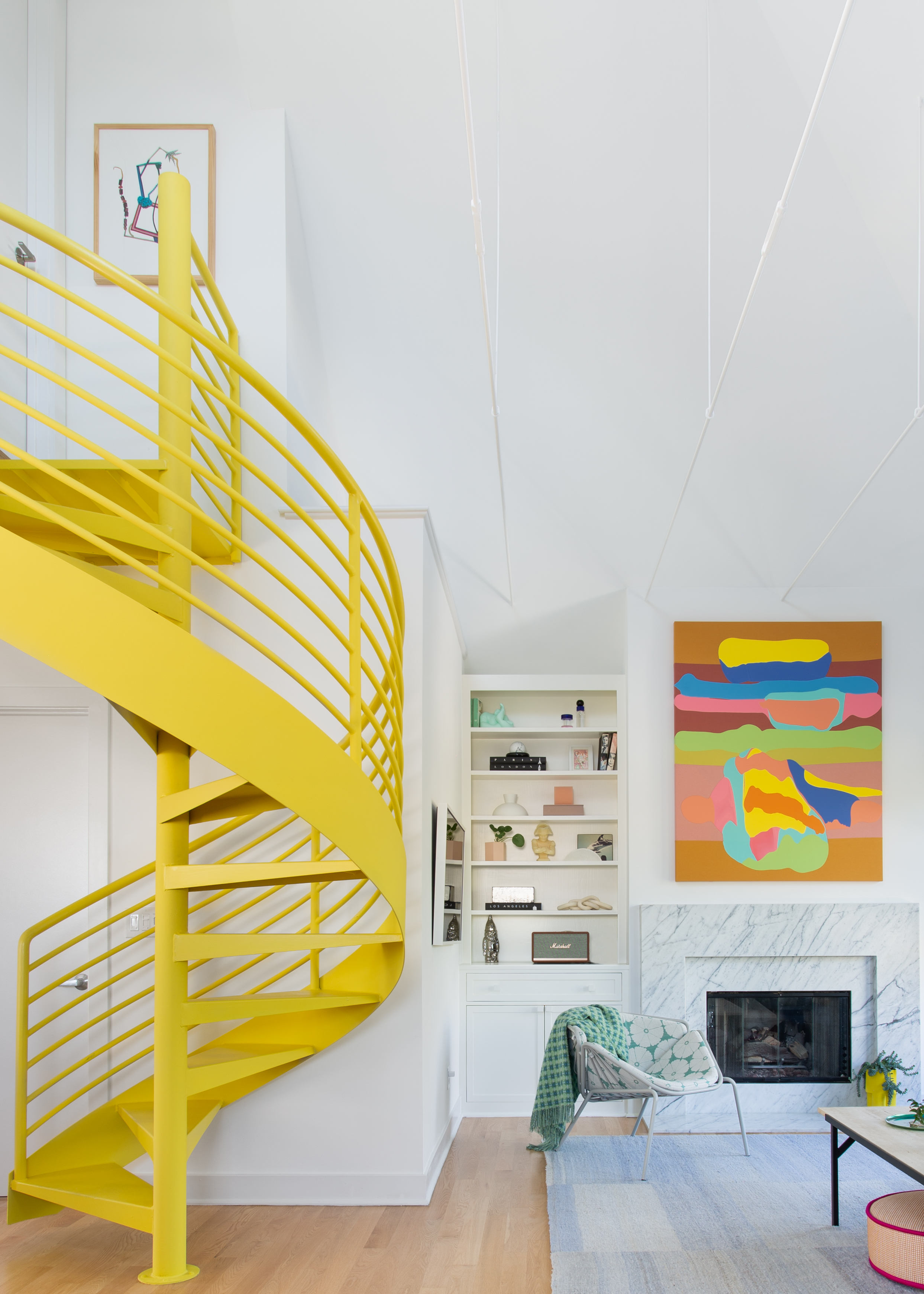
While Sherwin Williams may not have wanted to pick a single favorite from the palette, I must admit there was one shade that caught my eye instantly. 'Chartreuse' is a color that feels nostalgic to me — it reminds me of my old, beloved J.Crew bubble skirt in a similar shade. And with nostalgic and vintage inspiration dominating color trends this year, this canary yellow shade absolutely fits the bill.
Interior designer Regan Baker, principal of Regan Baker Design, says these "sunny yellow shades serve as a focal point and embrace the unexpected." Including playful touches helps to elevate a room, creating striking moments and showcasing your personal style.
It's not always easy to do with a shade like 'Chartreuse' though, and Regan stresses the importance of grounding a bright color like this by "incorporating a range of subtle textures or organic elements."
I think yellow in all its forms — whether bright like 'Chartreuse' or more closely aligned with Bosc Pear — is one to look out for as we approach 2025. You can start small by incorporating it in small details like home decor, or an armchair, or a statement staircase like in the room designed by Regan above.
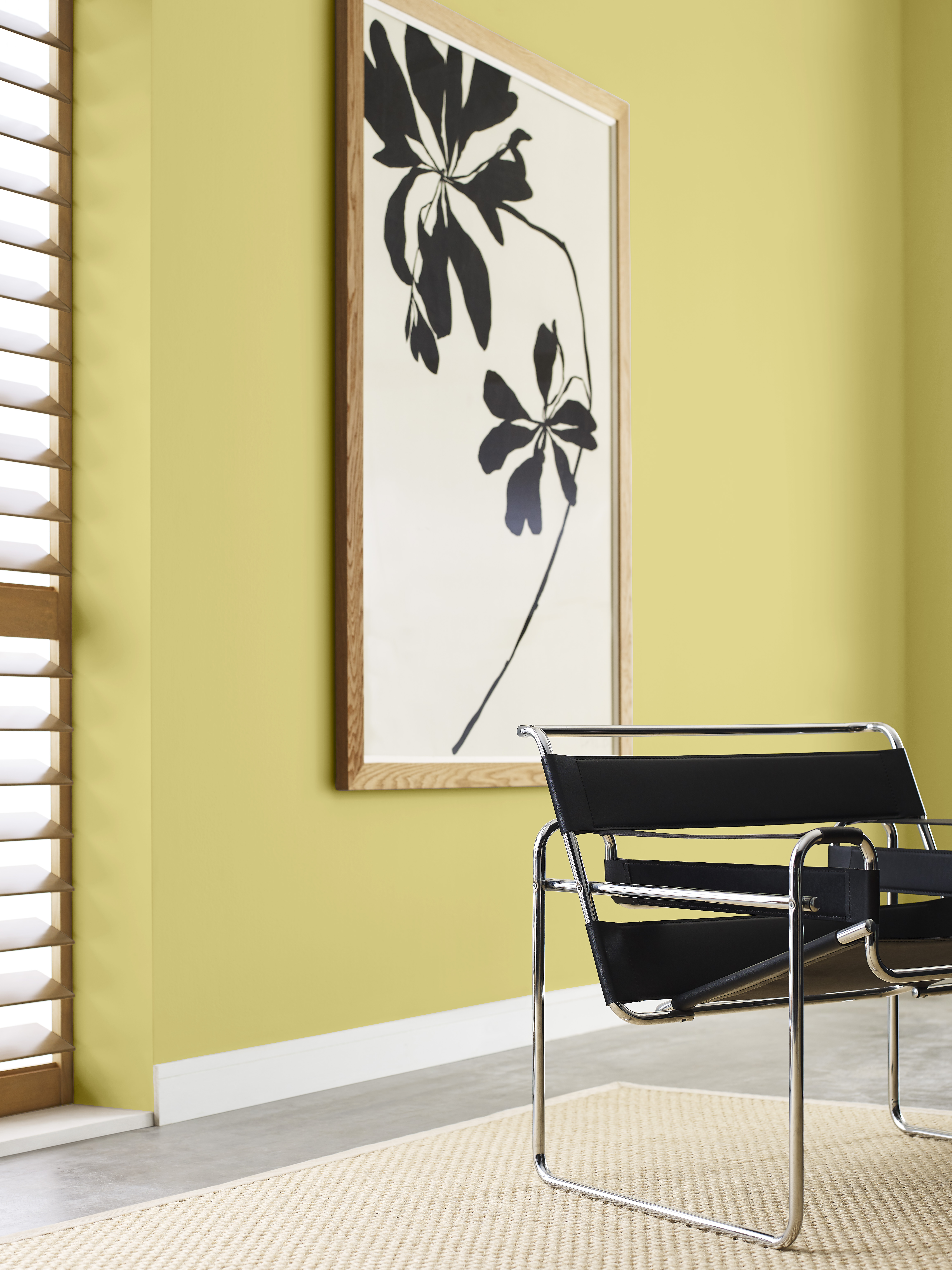
Sherwin-Williams' 2025 Color Capsule of the Year offers a wonderful mix of dependable, warm neutrals and reimagined pops of familiar colors. Will you be taking inspiration from the collection?

Olivia Wolfe is a Design Writer at Livingetc. She recently graduated from University of the Arts London, London College of Communication with a Masters Degree in Arts and Lifestyle Journalism. In her previous experience, she has worked with multiple multimedia publications in both London and the United States covering a range of culture-related topics, with an expertise in art and design. At the weekends she can be found working on her oil paintings, reading, or antique shopping at one of London's many vintage markets.
