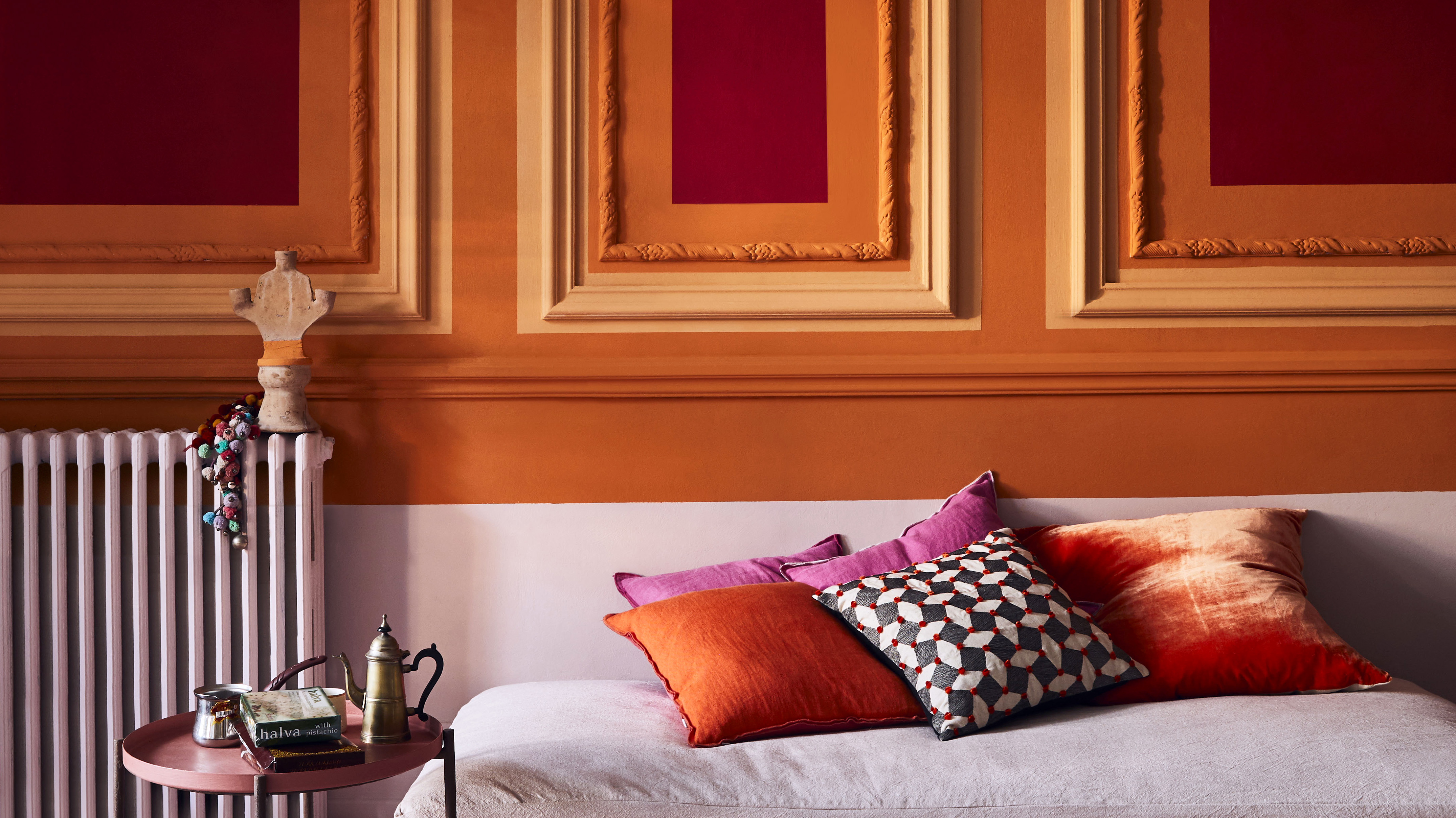
Lucinda Chambers shares the unconventional way to test paint samples like a designer
The co-founder of luxe fashion label Colville has a unique way of playing with paint – and it’s changed the way we decorate


Designer Lucinda Chambers has a way with color. Beyond her vibrant lifestyle, the fashion director has blessed London’s most prestigious boutiques with her extraordinary palette, courtesy of her co-founded label, Colville. While the world admires her colorful curations from the runway, we’re narrowing our adoration to the walls of a slightly more personal setting, her home.
When sharing her painted wall ideas with Livingetc, Lucinda discussed the hues that bless her interiors – and her unorthodox paint sample tip – which will shape the way we experiment with color in our modern homes. Here, Lucinda shares her expert advice.

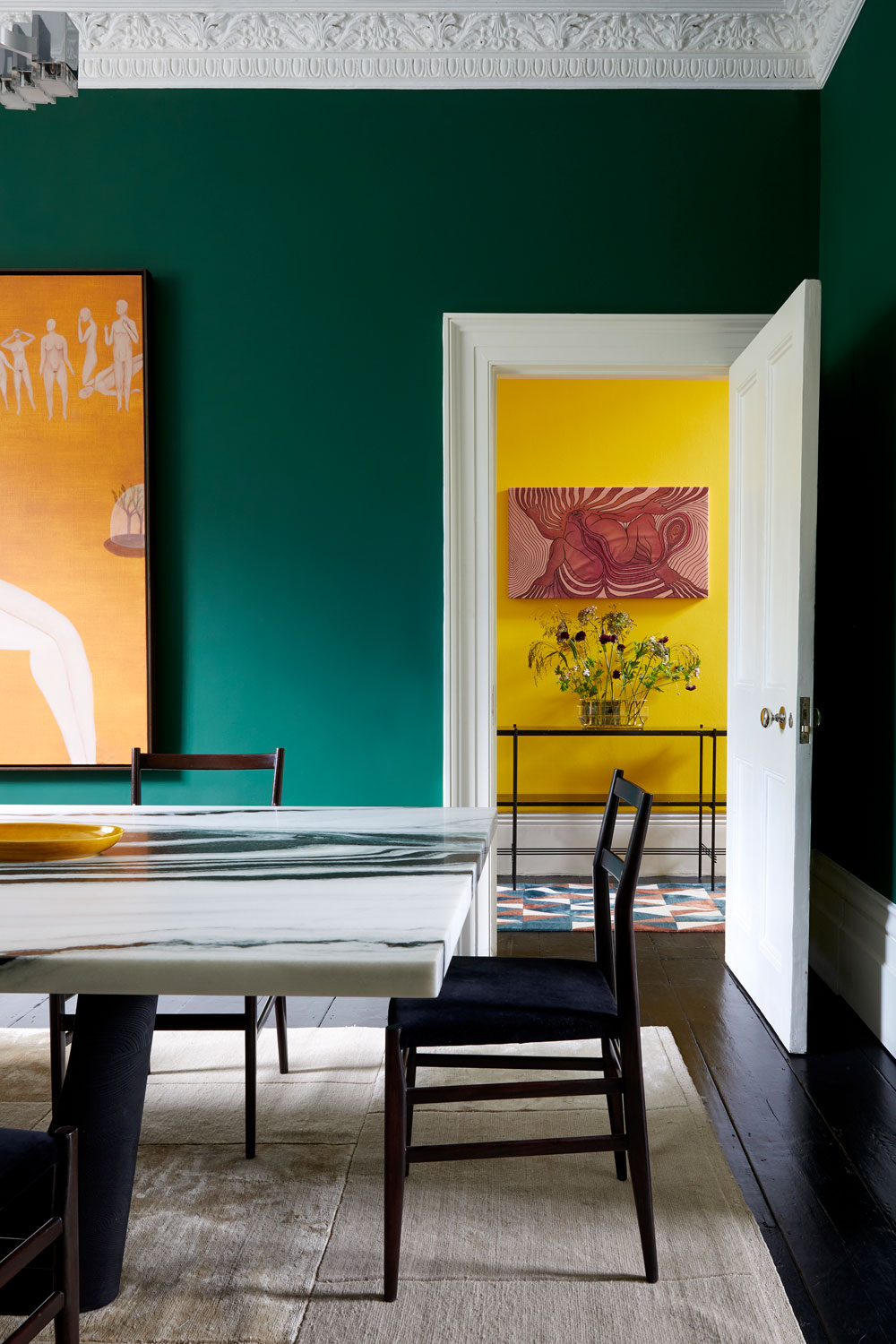
‘I always test colors by painting large swatches on the wall to get a true feel for each. I then take a piece of art that I particularly love and hang it nearby. Suddenly, I’ve got an exciting color conversation going on,’ she announces.
Article continues belowFor an equally exciting injection of color beyond the rich hues of your favorite artwork, Lucinda shares her most trusted combinations that will make your surfaces sing.
‘In a great color combination, the colors don’t just work together; they speak to each other. For example, khaki with red is a winning pairing for me. Brown and blue also work effortlessly as a team,’ Lucinda explains.

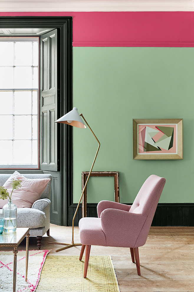
‘In our family room, I’ve painted the picture rail Shadow White by Farrow & Ball (below) to create a dividing line between the vibrant red below (Firefly by Little Greene) and the electric yellow above (Mister David by Little Greene). I think to have a surface and not to paint it is a wasted opportunity! Whether it’s a door frame, skirting board, or dado or picture rail, it’s always an excellent excuse to add another color to the mix, in my opinion.’
Lucinda’s paint sample tip is naturally stylish and oh-so exclusive, but what do other interior experts suggest? Celebrated designer Kelly Hoppen has similarly shared her surprising paint sample advice, which may also adjust how you think about color testers.
The Livingetc newsletters are your inside source for what’s shaping interiors now - and what’s next. Discover trend forecasts, smart style ideas, and curated shopping inspiration that brings design to life. Subscribe today and stay ahead of the curve.

Shadow White by Farrow & Ball
‘The problem is, people, tend to paint [samples] on a wall, but because the color changes so much in your room depending on night or day – you actually need to paint it on a piece of paper. Then you can see the different tones you’re going to have when it’s night time and when it’s day time,’ Kelly announces.
‘If you’ve got a lot of natural light, then it’s brilliant to have something a little bit darker or more colorful. If you want that cozy feeling, it doesn’t really matter,’ she adds.
Armed with Lucinda and Kelly’s home decor ideas, we’ll never look at sample pots in the same way again.

Megan is the Head of Celebrity Style News at Homes & Gardens. She first joined Future Plc as a News Writer across their interiors titles, including Livingetc and Real Homes, before becoming H&G's News Editor in April 2022. She now leads the Celebrity/ News team.
Before joining Future, Megan worked as a News Explainer at The Telegraph, following her MA in International Journalism at the University of Leeds. During her BA in English Literature and Creative Writing, she gained writing experience in the US whilst studying in New York. Megan also focused on travel writing during her time living in Paris, where she produced content for a French travel site.
Megan currently lives in London, where she relocated from her hometown in Yorkshire. In her home, she experiments with interior design trends and draws inspiration from the home decor ideas she observes in her everyday work life. Her favorite pieces include her antique typewriter and her expansive collection of houseplants. When she isn’t writing, she is browsing London’s coffee shops and bookstores to add to her ever-growing library, taking over the open shelving in her apartment.