This Designer's Ratio Rule for Balanced Rooms Will Help You Create the Perfect Focal Point
Use this rule to make your spaces so harmonious they look like they're taken straight out of a showroom

The Livingetc newsletters are your inside source for what’s shaping interiors now - and what’s next. Discover trend forecasts, smart style ideas, and curated shopping inspiration that brings design to life. Subscribe today and stay ahead of the curve.
You are now subscribed
Your newsletter sign-up was successful
Creating a perfectly balanced space is easier said than done. From your furniture placement to the way you hang artwork, everything in a room has to work in tandem if you want a cohesive space with a clear focal point.
Luckily, we came across a design principle that seems to be the answer to this decor problem. This rule of interior design is super easy to follow and it makes rooms look perfectly put together. We also reached out to a couple of experts and it appears that this is a rule they've employed for a while now. So instead of spending any more time in the dark, let's get into what this design principle entails and how to make it work in your home.
A post shared by Meredith Hayden (@wishbonekitchen)
A photo posted by on
The rule of odds for an artfully planned out space
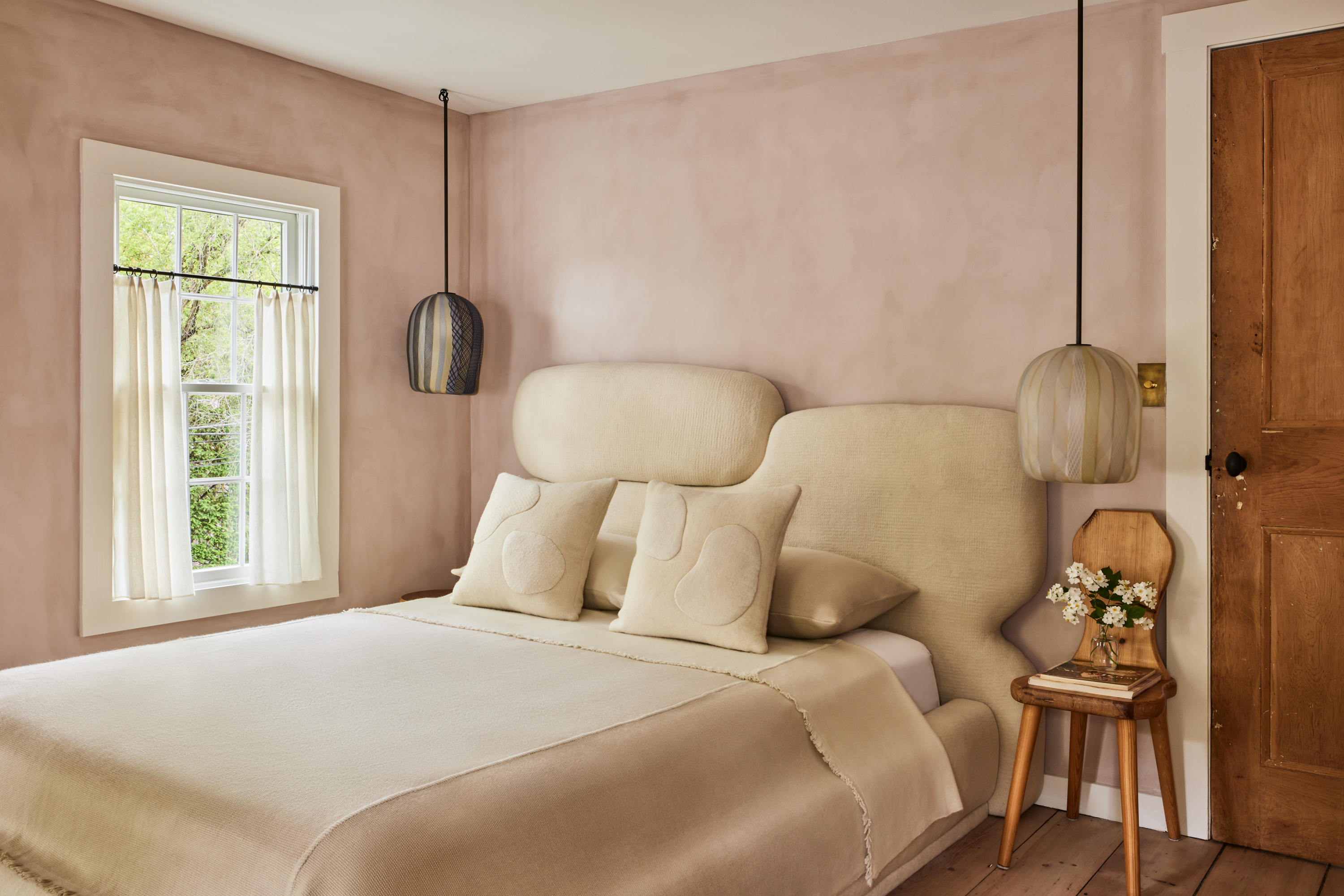
Digital creator Meredith Hayden (@wishbonekitchen) is known for her time cheffing it up as a private summer chef in the Hamptons and her delightful dinner party videos. So when we came across this video of her talking about the layout of her bedroom, we were pleasantly surprised.
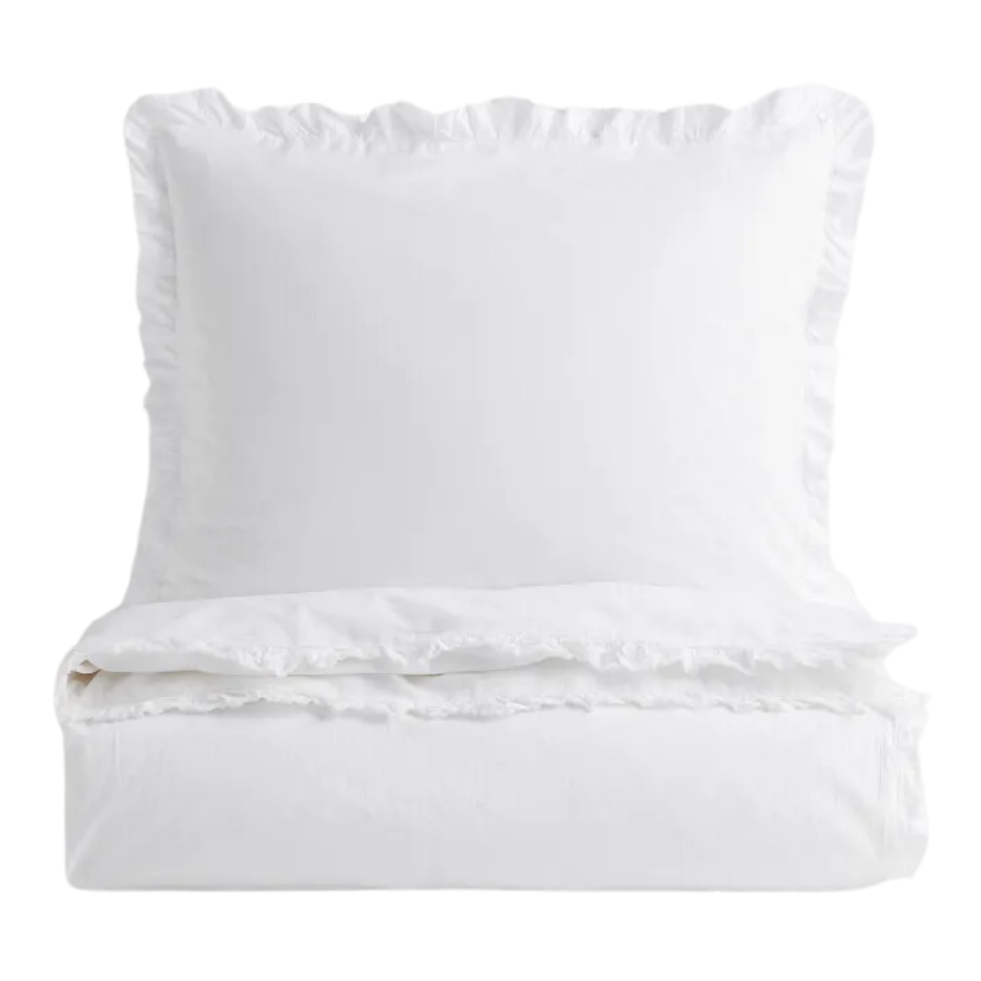
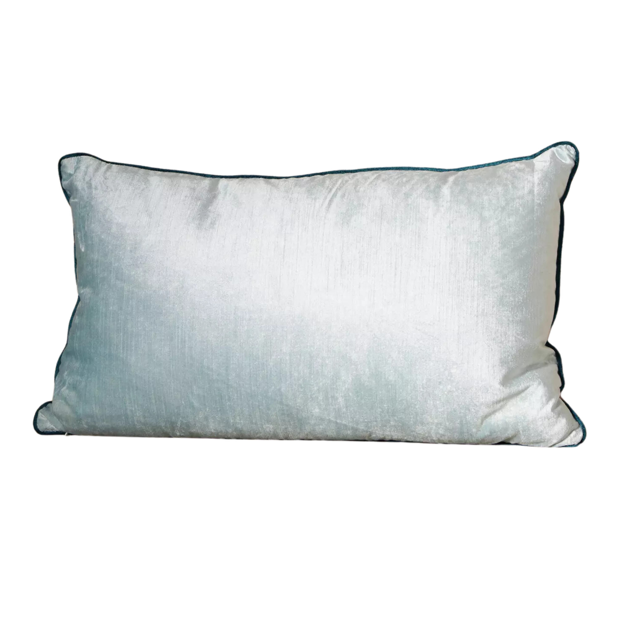
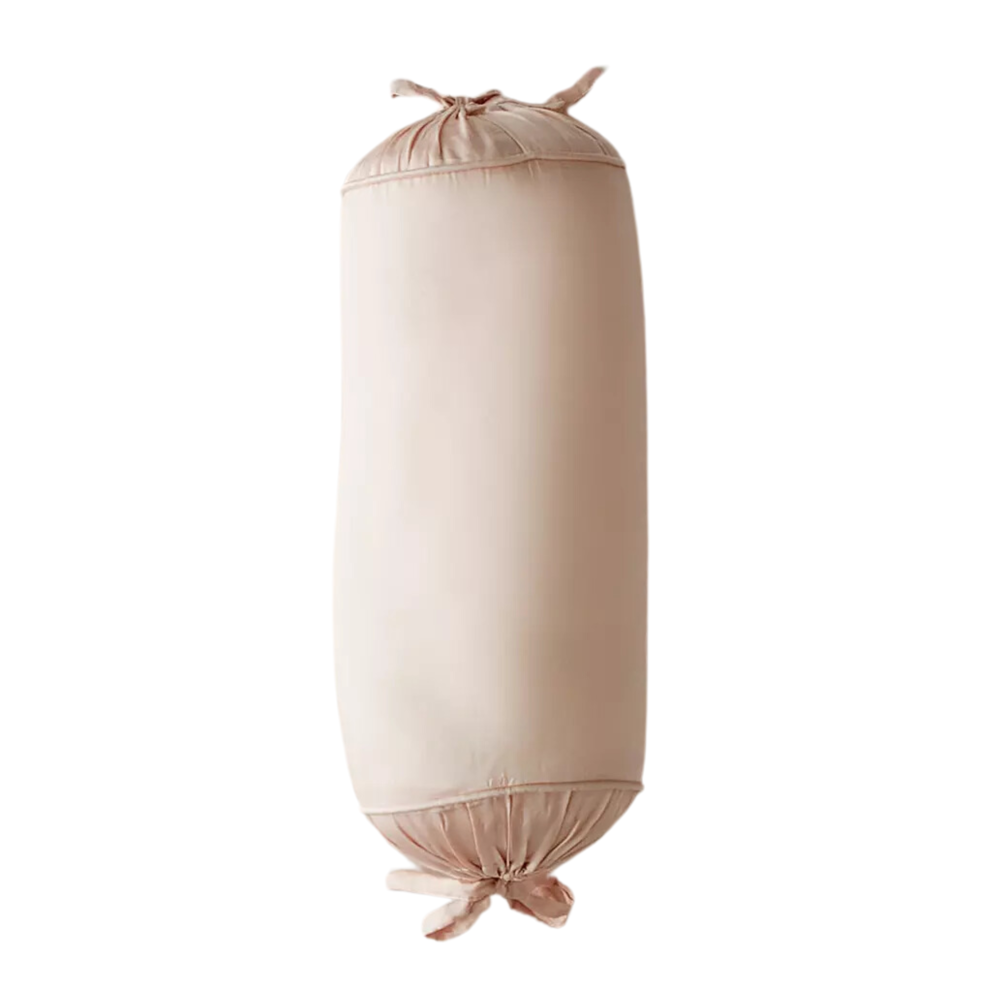
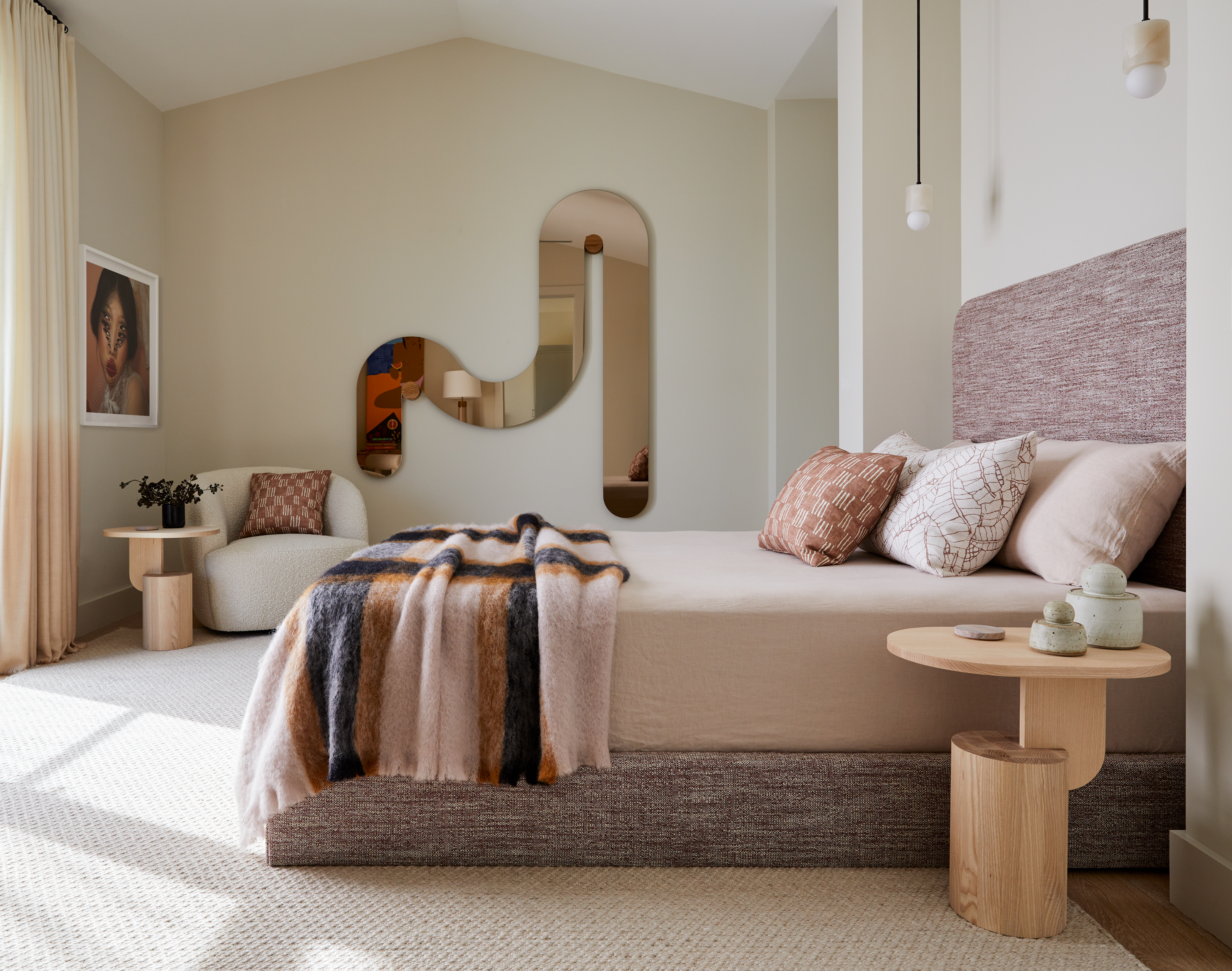
Article continues belowIn the reel above, Meredith explains that her bedroom design trick is to play around with the number of things in her space. For example, she points out that she used to feature one piece of art above her headboard, two pillows on her bed, and two nightstands on each side. However, to switch things up and elevate the factor of visual intrigue, she points out that she switched things up by introducing three pillows for a more appealing flow of sight.
Curious to know more about this rule and how to map out the numbers in a space, we consulted our experts and found that there's a rule very similar to this one that has been an industry go-to for years now. In fact, we'd even consider it one of the golden rules for good living rooms.
According to Isy Jackson, founder of Cheltenham Interiors, the rule of odds, is frequently used but rarely discussed in detail. 'This rule suggests that odd numbers of items in a space are more visually engaging and dynamic than even numbers,' she says.
'The rule of odds is a proven principle whereby odd numbers create balance in interior design and visual interest, naturally drawing our brains to them,' she explains. 'Odd numbers provide a central focal point, making arrangements harmonious and complete.'
To apply the rule of odds, Isy recommends confidently grouping items in three, five, or seven sets. 'This principle can be used for various elements in a room, such as pillows, artwork, and decorative accessories,' she notes. 'For instance, you might place two more oversized pillows at the back, with a smaller, contrasting pillow in front.'
The Livingetc newsletters are your inside source for what’s shaping interiors now - and what’s next. Discover trend forecasts, smart style ideas, and curated shopping inspiration that brings design to life. Subscribe today and stay ahead of the curve.
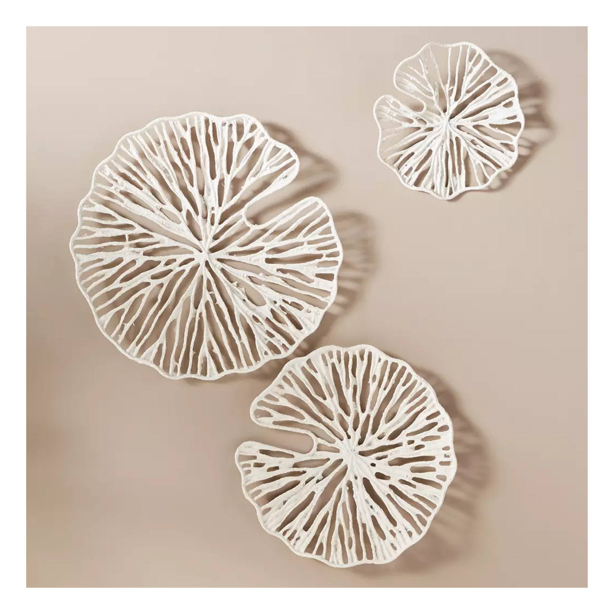
Isy explains that this follows the rule of odds while adding layers and textures, making the bed look better overall. 'Similarly, if you have a headboard, consider hanging three pieces of artwork above it instead of two,' she says. 'This trio naturally draws attention and creates a balanced composition.'
So if you've been wondering how many pillows to have on your bed or how much art you should hang on the wall, measure it against the rest of the numerical elements surrounding the space.
Does this design rule extend beyond the bedroom?
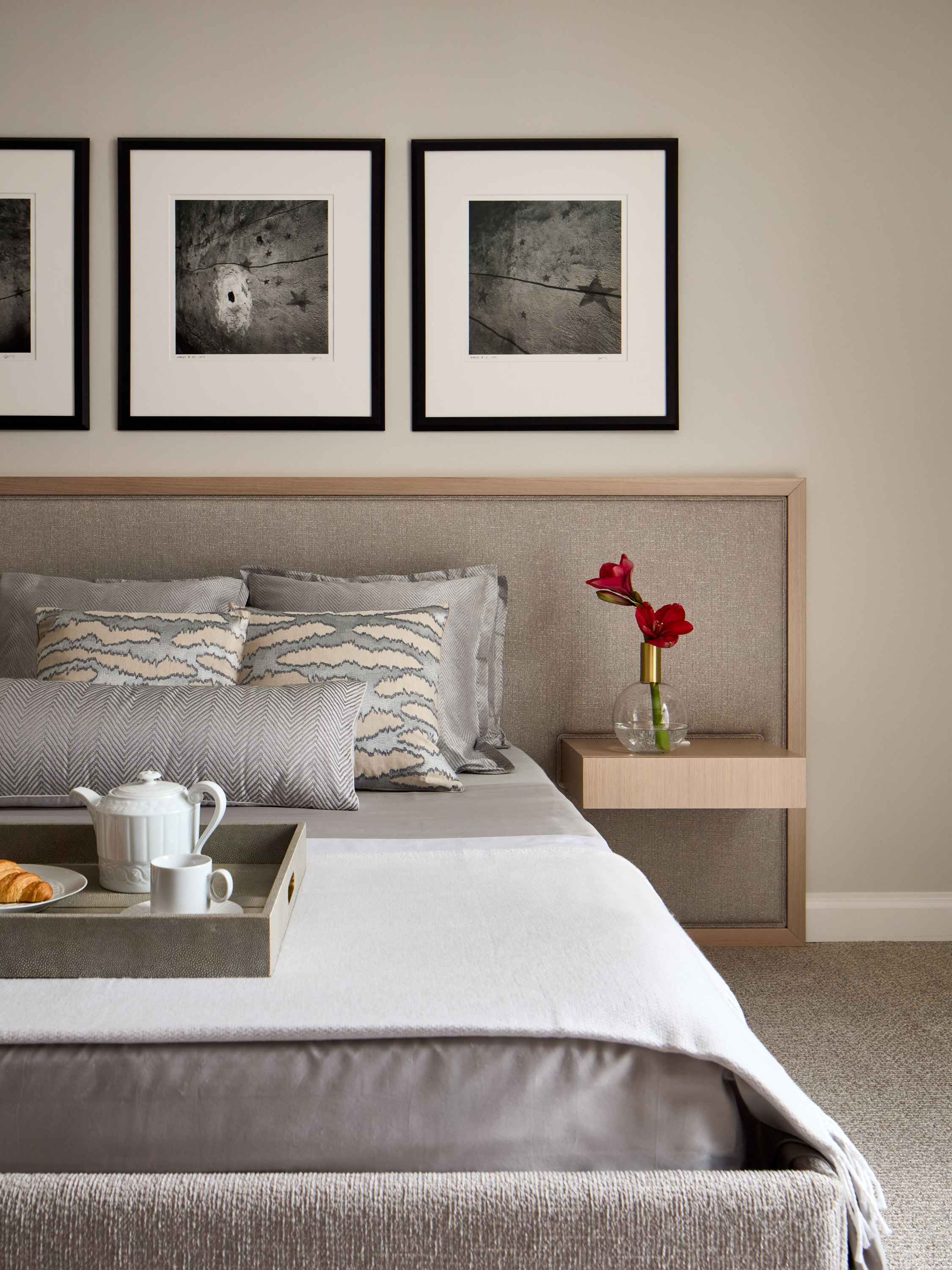
Interior designer Leah Bolger finds that design principles like the rule of odds are easily efficient across all living spaces. 'These numerical guidelines can be repeated over and over, and the possibilities are endless,' she says. 'By applying these basic harmonies, the design principles of rhythm, scale, contrast, and balance fall into place and help to create a beautiful and thoughtful homescape.'
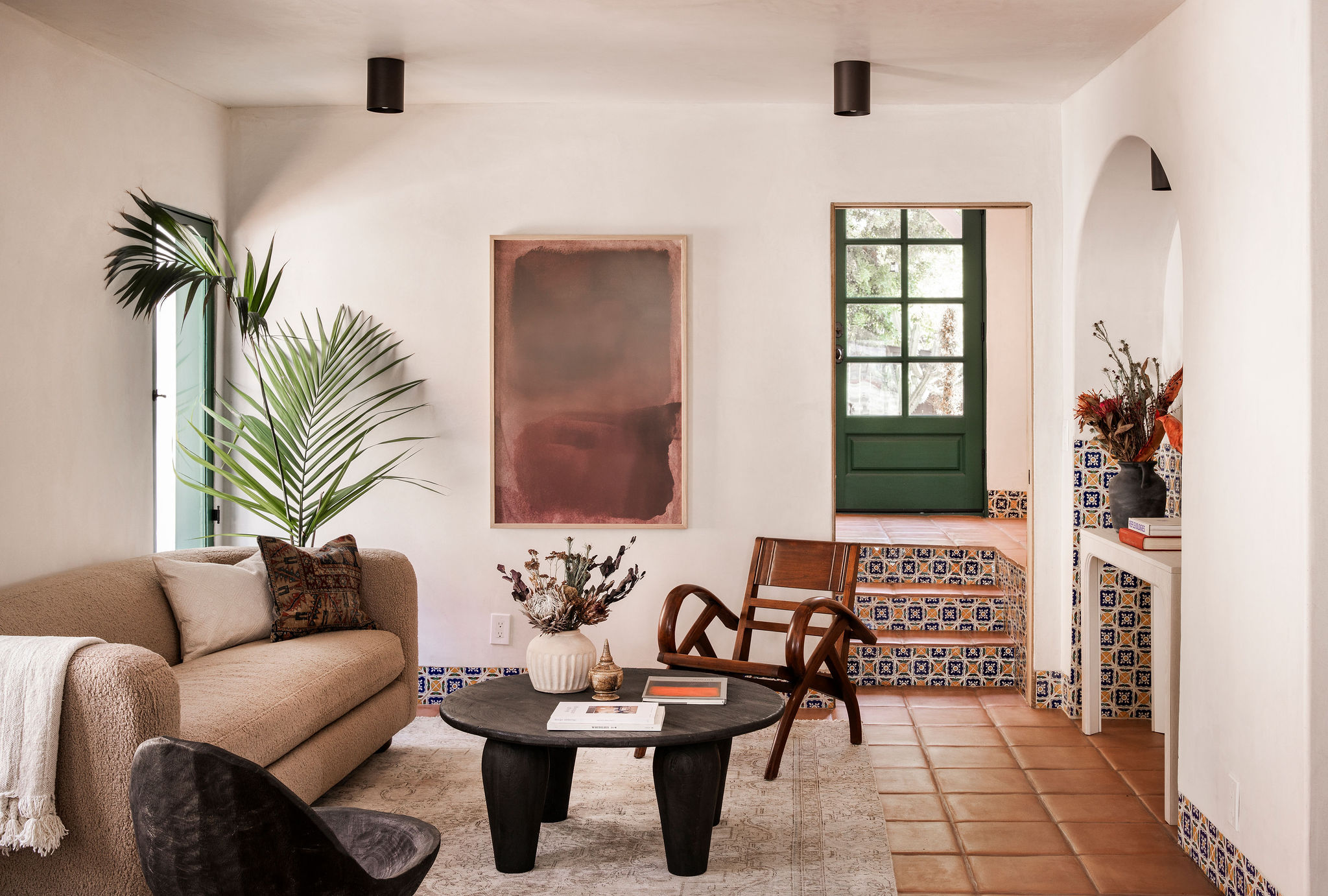
Isy echoes Leah's advice on the appliance of the principle outside the bedroom and encourages interior enthusiasts to experiment with the rule across a home. 'For a design-forward living room, try grouping three different objects, such as a book, a candle, and a small plant on a coffee table,' she says.
Similarly, when creating a gallery wall, Isy suggests using an odd number of frames to make the arrangement feel curated and less formulaic, adding character and personality to the space.
Even with minimalistic elements of decor like vases and shelves, Isy finds that this rule is a quickfire way to assemble a well-thought-out space.
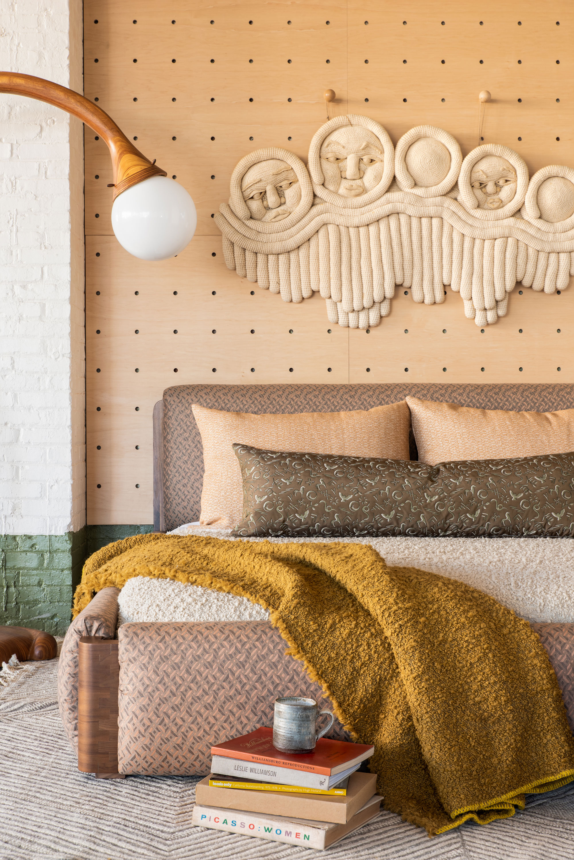
Isy's top tip when it comes to the rule of odds is to start small and give yourself the creative freedom to experiment with textures, shapes, and sizes for a personalized living space.
Trends may come and go, but these strategic principles will live on forever. They're tried and true and no matter your aesthetic, these rules are perfectly applicable to any space. So if you feel like your room is looking a touch off-kilter and you're not sure what's wrong, perhaps it's just the numbers that are out of whack. In such cases, test out the rule of odds and watch as it transforms your space into a harmonious sanctuary bound by design. We have a feeling that this is the kind of math you'll enjoy doing.

Amiya is a Home Wellness Writer at Livingetc. She recently graduated with a Masters Degree in Magazine Journalism from City, University of London, and has lent her words to beauty, fashion, and health sections of lifestyle publications including Harper’s Bazaar and Women’s Health. Her experience as a research analyst has equipped her with an eye for emerging trends. When she’s off the clock, she can be found reading, listening to music, or overanalyzing her latest Co-Star update.
