Architect and designer Cristina Celestino warns against decorating with these specific colors
The expert shares her esteemed color insight – including which surprising shades to avoid

Cristina Celestino is a master of shapes and functions, but now she is influencing our color choices, too. The Italian-born architect and designer is renowned for her unrivaled ability to create a cocktail of European design and contemporary styles – but how can we mirror this ambiance throughout our modern homes?
The secret to a chic palette is simple if you follow Cristina's advice and avoid two specific colors at all costs. In her discussion with Livingetc, Cristina revealed all.
The colors to avoid – according to Cristina Celestino
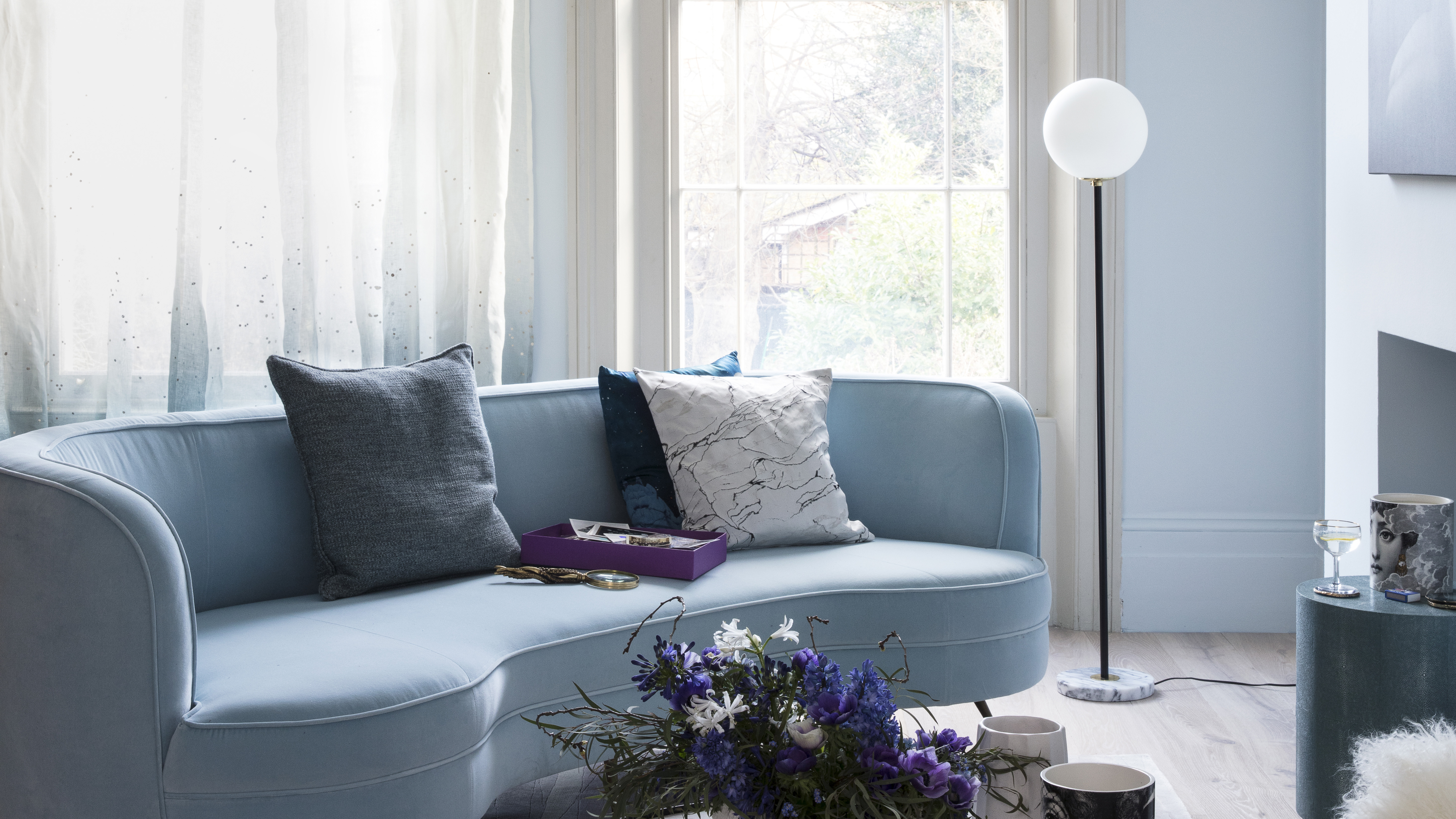
'I don't like violet or cold blue,' Cristina declares. 'These colors don't make me feel good, so I don't wear them, live with them or use them in my work.'
Article continues below 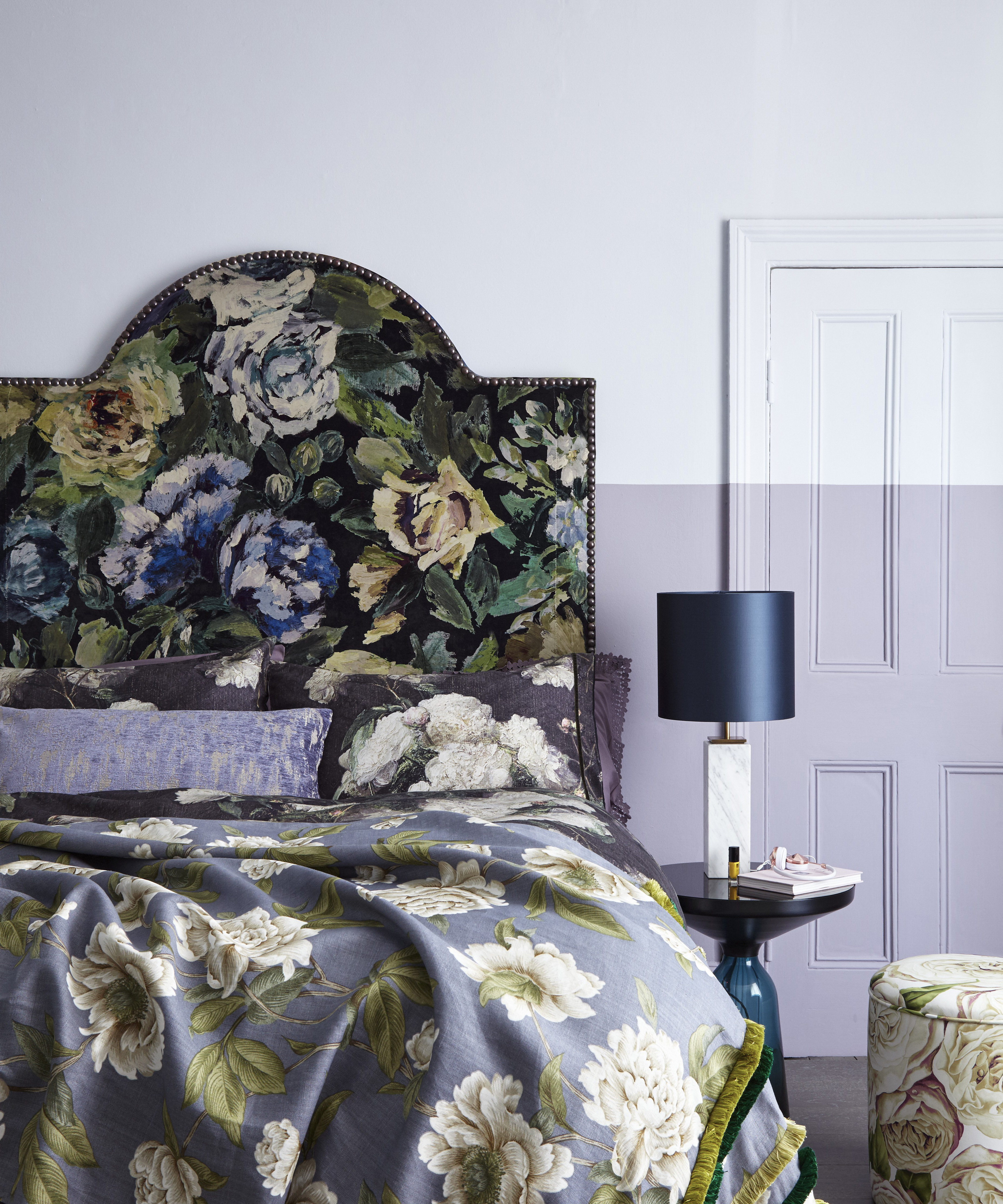
See: Painted wall ideas – have some fun with your walls with these creative paint ideas
But are there ever any exceptions to injecting these hues across our walls and throughout our home decor? Sometimes. But Cristina urges us to tread carefully and only use these colors in certain exceptions. 'These kinds of colors must be used with great caution and are only suitable for certain destinations or for very specific moods,' she says.
However, Cristina's expert advice didn't stop there. Following her warnings, she offered her top tip for accentuating other hues and showcasing them in the most stylish way possible.
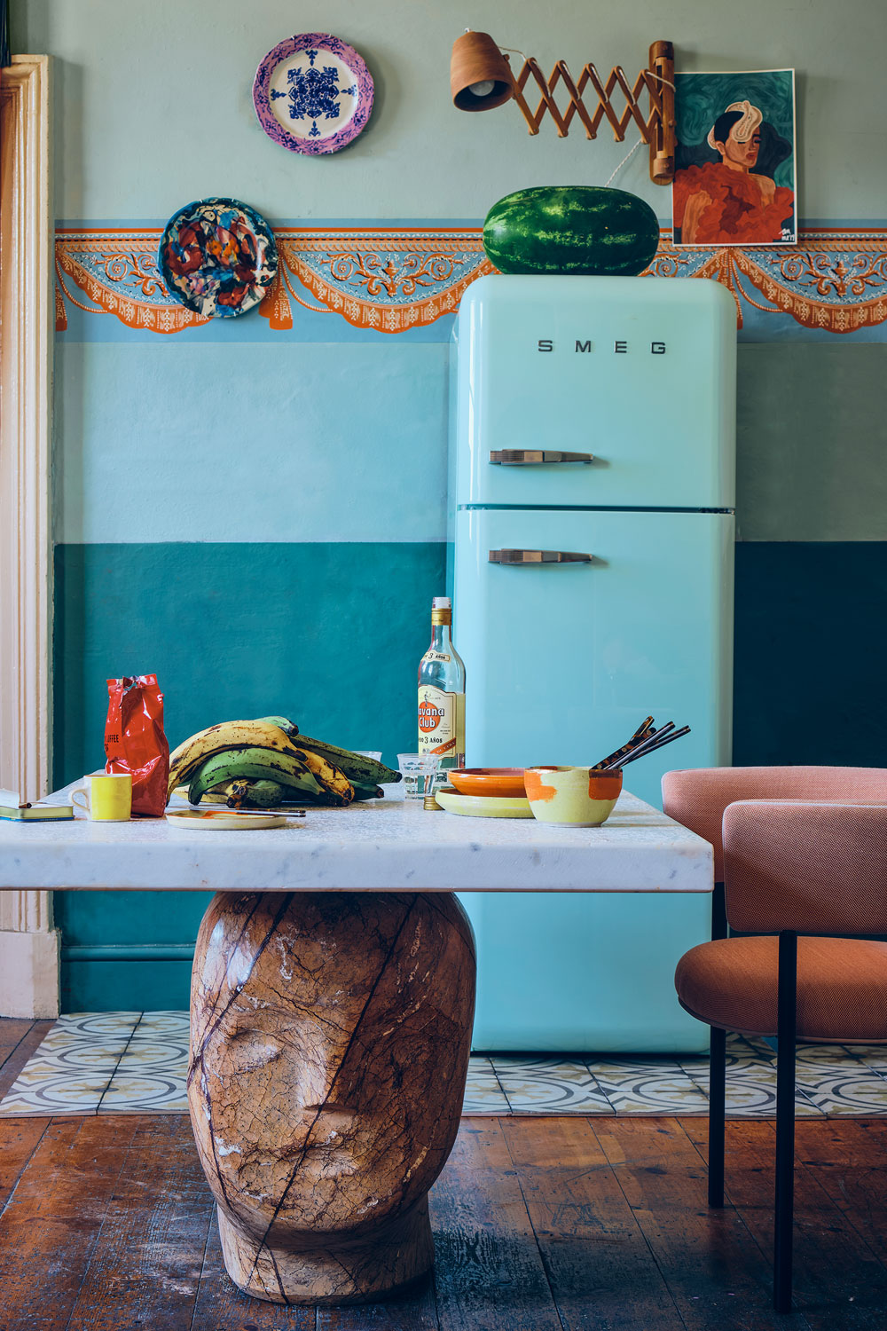
'My top tip for using color is not to have everything in the same shade. When I receive a color request from a client (for example, The Pink Closet boutique in Ravello where pink is the predominant color), I play with the color, using it in many different shades and materials to avoid a banal, monochromatic interior,' Cristina adds.
The Livingetc newsletters are your inside source for what’s shaping interiors now - and what’s next. Discover trend forecasts, smart style ideas, and curated shopping inspiration that brings design to life. Subscribe today and stay ahead of the curve.
What are the exceptions?
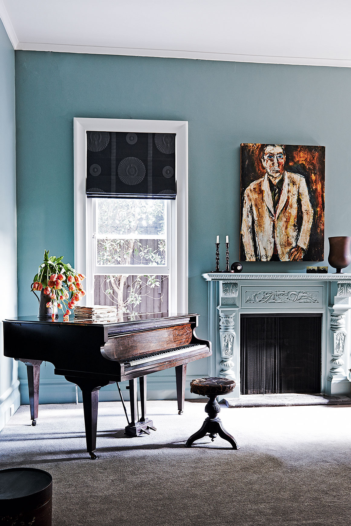
As Cristina confesses, there is always an exception to every rule. But when is it acceptable to use cold blues and lilacs in our scheme? Color expert and Creative Director Little Greene, Ruth Mottershead, suggests that colder blues work particularly well in 'west and east-facing rooms,' where the shades appear to change dramatically as the sun changes position throughout the day.
'Here neutrals with a cool, blue, or green undertone will help to create balance and will appear more subdued and restful in the evening light,' Ruth suggests.
See: Bedroom color ideas: 24 paint colors with impact
She continues, hinting that some cold blues will also work in north-facing rooms 'where colors tend to appear consistently flatter and cooler than they would do [if they were] bathed in natural light.' However, like Cristina, Ruth urges us to approach the hues with extreme thoughtfulness and caution.
'Paler blues and greens may appear cold but experiment with stronger green-blues such as Air Force Blue or Canton for a warming impact,' Ruth adds.
Are the days of lilac and cold blue interiors numbered? Only time will tell.

Megan is the Head of Celebrity Style News at Homes & Gardens. She first joined Future Plc as a News Writer across their interiors titles, including Livingetc and Real Homes, before becoming H&G's News Editor in April 2022. She now leads the Celebrity/ News team.
Before joining Future, Megan worked as a News Explainer at The Telegraph, following her MA in International Journalism at the University of Leeds. During her BA in English Literature and Creative Writing, she gained writing experience in the US whilst studying in New York. Megan also focused on travel writing during her time living in Paris, where she produced content for a French travel site.
Megan currently lives in London, where she relocated from her hometown in Yorkshire. In her home, she experiments with interior design trends and draws inspiration from the home decor ideas she observes in her everyday work life. Her favorite pieces include her antique typewriter and her expansive collection of houseplants. When she isn’t writing, she is browsing London’s coffee shops and bookstores to add to her ever-growing library, taking over the open shelving in her apartment.