You can use paint to totally change the feeling of a space. When picking shades, start by considering how you would like to feel in each room. The bathroom, for example, is a space for relaxation so look to warm colors as you don’t want to feel cold in there.
By getting the palette right, you will transform how you behave in a room - does it relax you, or energize you, or uplift you? Here are a few simple suggestions for picking the paint shades that will make sure your home is right for you.
1. Pick the perfect neutral

It is more important than ever to create a relaxing home environment, and neutrals bring a sense of serenity and calm. We’re seeing a shift towards the warmer tones within the neutral palette.

Colors like Little Greene’s Portland Stone and Rolling Fog – both warm neutrals – can be paired with clean whites for a sophisticated contrast or provide a backdrop to bold colour highlights. A move away from grey is definitely on the cards over the next 12 months. These comforting tones can also be used in an all-over scheme for a cocooning feel.
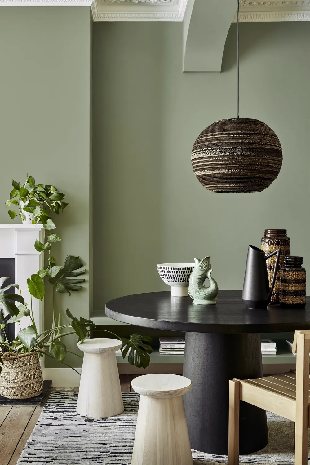
2 Focus on earthy tones
Re:mix Sage Green on the walls by Little Greene
I believe the perfect design is what you feel comfortable with. Color
is something you will live with every day; it’s a much more considered choice than buying a dress you may wear a couple of times.
As we are all spending more time at home and connecting with our natural environment, we’re focusing more on creating a sanctuary, looking to those more muted, earthy tones that evoke calm and tranquillity. Greens are still really popular for us as they feel very secure, which is how you should feel within your home.
3. Update the woodwork

Woodwork trim in Livid by Little Greene
For a simple transformation, update existing woodwork, such as skirting boards, door frames and windowsills. These small details can make a big impact on your final scheme and are the perfect place to be adventurous with color.
Wooden furniture is also a good place to start if you’re looking for a smaller project. Use bold, bright shades to create a colour highlight using Little Greene's Intelligent ASP primer and Intelligent Satinwood, a durable, hard-wearing finish.
4. Pay attention to the ceiling

Walls, woodwork and ceiling (just seen) in Chocolate Color by Little Greene
Colour blocking works well for creating a contemporary scheme. Don’t forget about the ceiling – it is often painted white out of habit but this has a big impact on the way that the room will feel.
To create a focal point to draw the eye, paint the ceiling a contrasting color. For the illusion of space, simply paint the walls and ceiling in the same shade to extend the walls upwards. This works particularly well in narrow hallways that may be lacking in natural light. To lower the ceiling and create a more intimate setting, simply extend the shade on the ceiling down to the dado rail to draw the eye downwards.
5. Look to warmth in whites

Walls in Slake Lime Mid by Little Greene
Another way of using color is by opting for white shades with different undertones. I’d personally never use Brilliant White as it contains a lot of blue. This makes a scheme feel very cold and, in my opinion, it is too powerful for most spaces.
Warm whites can work well in north-facing rooms where the light is cooler, while cool whites are best for south-facing ones. Artificial light can impact hugely on the end result; for example, if you have a yellow light, be aware that if you choose a warm white, it will make the room feel even warmer.