
Choosing the right paint colors for small rooms can sometimes feel overwhelming. In general, you can choose light or dark hues for a bijou room, but there a few colors that should be avoided for small spaces.
Hues with grey undertones are colors to avoid in a small living room, while some strong shades, like bright red, can work to overwhelm a small space.
Discover the worst paint colors for small spaces below, and the colors to make a room feel bigger that you should be reaching for instead.

What are the worst paint colors for small spaces?
Whether you're looking for color ideas for small kitchens or the best colors for small bedrooms, knowing the worst paint colors for small spaces will save you time in your search and make sure you're going in the right direction.
Our experts have highlighted five colors to avoid in small spaces below to give you a head start.
1. Brilliant white

You might think it's the obvious choice, but brilliant white should be avoided in small rooms, say experts.
Even though it has the highest light-reflecting quality of any shade, it can leave a space feeling sterile.
'Many people opt to use bright whites in small rooms, with the aim of making the space feel larger,' says Ruth Mottershead, Creative Director, Little Greene.
'However, brilliant white can often be quite stark, with the opposite effect of creating harsh lines for the eye.'
Off-whites or pale neutrals are a better choice. Ruth says: 'Using light neutrals in a tonal scheme will create a softer environment. If there is a lot of natural light, then using soft, light tones will make a smaller room feel more spacious.'
Helen Shaw of Benjamin Moore, says brilliant white is a color to avoid in north facing rooms in particular.
She explains: 'North facing rooms can feel a little cool if entirely coated in a bright white, especially if they are small, so opting for a white with a yellow or red undertone will add a hint of warmth and compensate for the lack of natural light.'
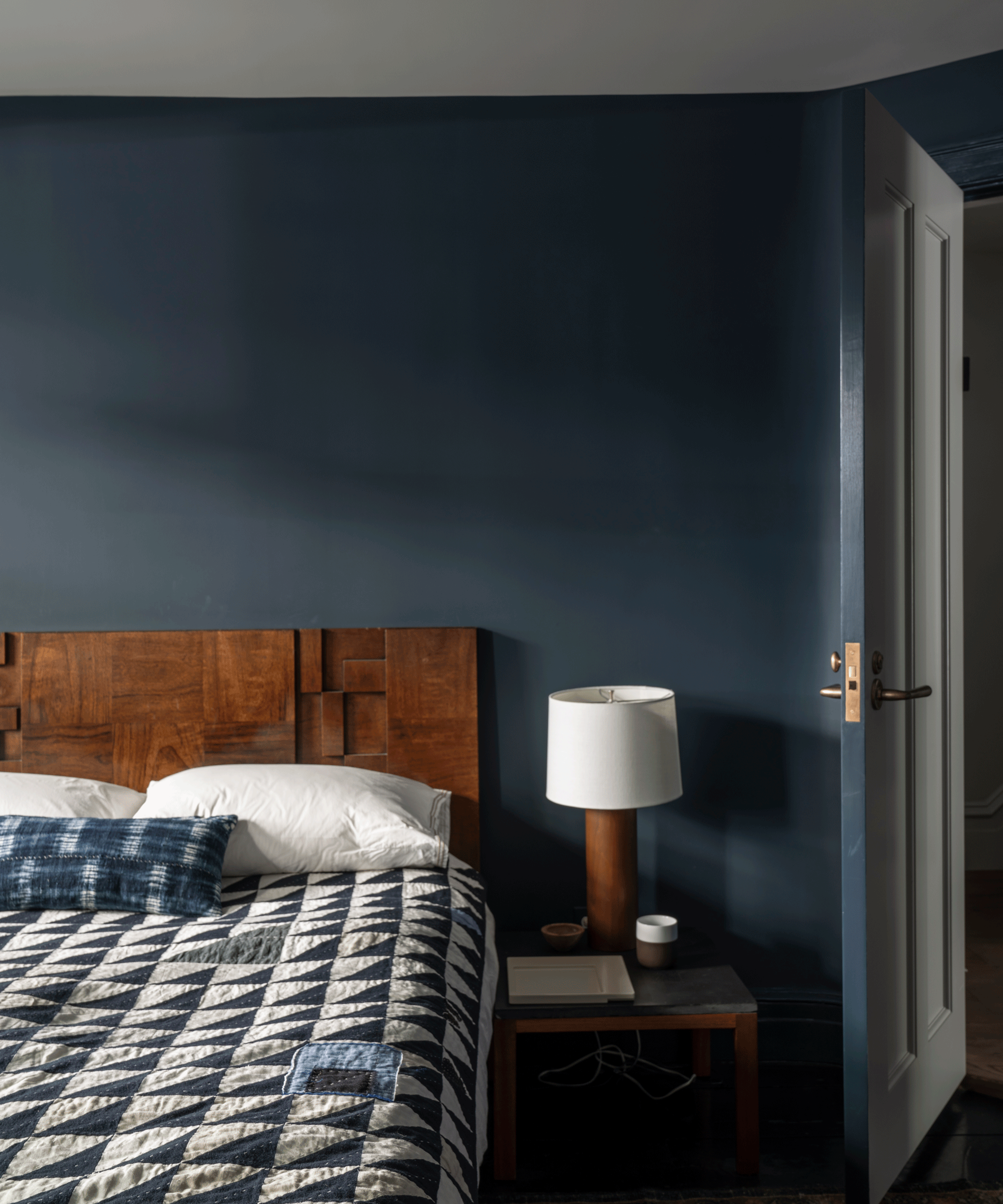
2. Black

You can absolutely use rich, dark colors in a small room - but pure dark black can drown a small space.
'If you have a small, dark room, why not embrace it, and play to its strengths,' says Helen Shaw.
'Avoid choosing boring, over-used colors and incorporate rich, bold paint to create instant character, taking a small space from drab to stylish.
'Dark hues can cleverly absorb the light of a space, making the division between walls appear blurred to add depth and dimension to a room.'
Saturated, rich shades of warming brown, like Benjamin Moore Night Owl (seen above), Sherwin Williams Sealskin, Farrow & Ball London Clay, and Little Greene Chocolate Color will all work well in a small space and are also trending paint colors for 2024.
3. Bright red

A bright red hue can be too strong for a small space, creating an environment that could feel too stimulating or stressful.
If you want to add a rich hue, try a softer red instead, like a warm terracotta. Farrow & Ball Red Earth or Benjamin Moore Cinnamon are both lovely options.
'Red is quite often a strong vibrant color, that can sometimes overpower small spaces,' says Helen.
'For a more understated look, opt for warmer sun-baked brick shade to provide a muted quality that brings depth and elegance. These more earthy colors blend beautifully with brown, taupe and wood.'
4. Blue with grey undertones
'Smaller spaces highlight the cooler undertones, so if you want the room to look brighter avoid colors with grey undertones, like some blues,' says Helen Shaw.
'By its very nature, blue is a cool color, particularly a blue with grey undertones. If you want to opt for a blue in a small space, warm things up with a blue that has green undertones, like Benjamin Moore Palladian Blue or Wedgewood Gray.'
Farrow & Ball's Hague Blue (above) is another good option for a blue with a green undertone that will add dark drama to a small space while keeping it warm and cozy.
5. Greige

Greige is another color that has grey undertones, so is likely to be too cool for most small spaces.
'Instead of reaching for a cool hue like greige in a small space, try corals and pink peaches - they're are perfect for making a design statement yet create a rich, warm welcoming feeling.'
What colors make a small room look bigger?
'As a rule of thumb, lighter colors tend to make a space feel bigger, while darker colors tend to advance and bring the wall towards you making a room feel smaller,' says Benjamin Moore's Helen Shaw.
Off-white is the perfect hue to make a small room look bigger, says Kelly Hopter, of Kelly Hopter Interiors.
She says: 'A creamy off-white is a great way to make the room feel airy but still warm and inviting. Benjamin Moore Swiss Coffee OC-45 is a beautiful option - it definitely has more "body" than a white and a sophisticated, almost historic feel to it. It works beautifully especially with warm color palettes - browns, beiges, taupes.'
However, this doesn't mean that you can't embrace dark colors in small rooms.
Deeper colors can 'blur the boundaries' between walls and ceilings, especially when everything is painted in the same color, known as color drenching.
'Be brave and go for a dark or bolder color to make a small room look bigger,' says Patrick O’Donnell, International Brand Ambassador, Farrow & Ball. 'These shades can imbue a magical quality in a room, especially when they are used primarily in the evening.
'Don’t fight the constrictions of restricted space, by playing to the limitations of the room, choose a mid to dark tone and maximize coziness by applying it all over the walls, ceiling and woodwork for a rich, cocooning feel.
'Although bolder colors can feel like they ‘advance’ towards you, color drenching will blur the boundaries where the wall meets the ceiling, and create the illusion of more space.'