These Paint Colors Are "Overused" According to Experts — Here's What They Suggest Instead for More Original Interiors
These colors are best avoided if you want to stay on trend for 2024, according to those in the know, and what to choose instead
When it comes to paint colors, it’s true that there will always be a high level of subjectivity and if a color works for you and makes you happy in your home, then by all means carry on using it. In terms of trends, however, there are certain tones that we’ve seen so much lately that they’re going out of favor and designers are now moving away from for 2024.
While you’ll always find certain shades of any color that can have a timeless appeal, there are some that our experts advise it’s best to steer clear of if what you’re looking to achieve is a modern home scheme. We’re leaving behind the concept of basic, cool, and a bit characterless, or those tones that are oversaturated, and moving towards bolder, more colorful, and much warmer instead. Here’s what to let go of in 2024, to make room for more exciting color trends.
1. Gray
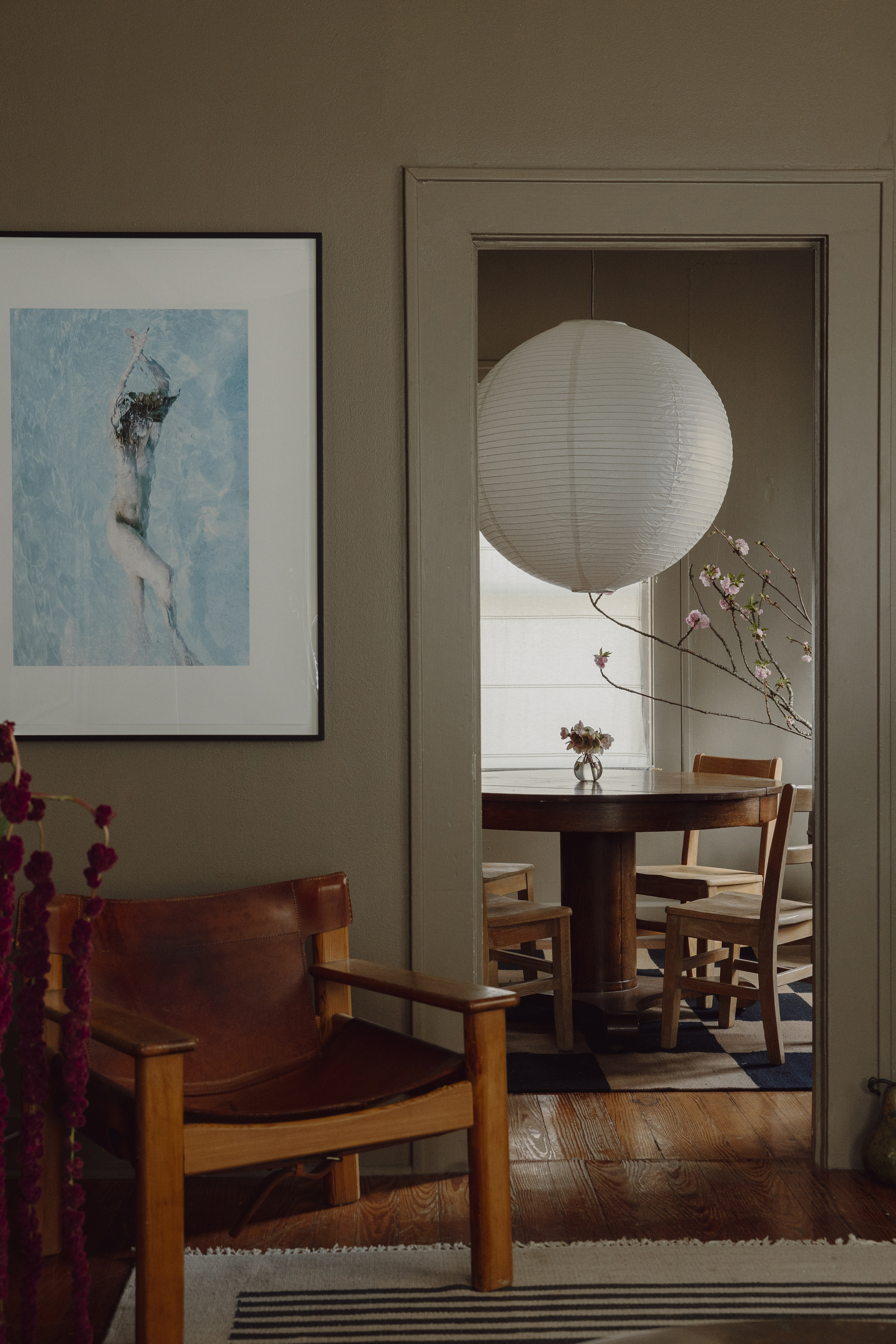
Try instead: Warmer dark brown tones are on the rise to replace deep grays.
‘Say goodbye to the grays! The world is looking for a sunnier outlook,’ interior designer Megan Healy tells me. Gray is a tone that has been overutilized in homes, and it's led to designers looking in different directions for neutrals.
Article continues belowWhile there are some tones that will remain timeless, such as a deep charcoal, or warmer, stone grays, designers want to see us let go of grays and move on to more earth tones that create a cozier feel. ‘We’re going to see a lot less greys than other years,’ says Emily Kantz, color expert at Sherwin Williams. ‘Homeowners are looking for more organic environments instead and going for warm whites with wooden accents to give their homes an airy feel,’ she adds.
Livingetc.com's editor, Hugh Metcalf, agrees. 'Charcoal and graphite grays were once ubiquitous, but we've definitely seen the oversaturation of them at one point that's meant people hardly use them at all anymore. As replacements, we've been seeing dark browns used a lot more.'
'However, I'm coming back around to grays,' the editor says. 'We're seeing a stealth return of grays in chameleon colors like near-blacks and gray-ish blues — these things are cyclical, so I don't expect people to sleep on gray in all forms for too long!'
2. Greige
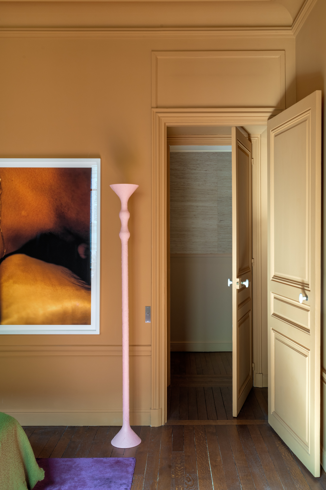
Try instead: A sunnier version of greige fits better with 2024's joyful decorating mood.
The first replacement for gray, when it first fell out of favor, was a color we've come to know as "greige" — a warmer version of gray that still feels cool and minimalist. However, we’ve seen it done so many times that it’s ceased to excite or surprise. If what you’re after, however, is a muted interior that can be accented with other colors where needed, you’d be right to stick to it; however, experts urge you to be bold and look beyond the beige aesthetic.
The Livingetc newsletters are your inside source for what’s shaping interiors now - and what’s next. Discover trend forecasts, smart style ideas, and curated shopping inspiration that brings design to life. Subscribe today and stay ahead of the curve.
‘Beige and bland is going out of style for 2024,’ says Betsy Smith, a paint expert from Graphenstone. ‘As we increasingly pair back our lives and look to make more sustainable, thoughtful choices, color becomes even more important and has an increasing role to play in elevating our environments. Colors are confident and purposeful, derived from nature and juxtaposed in playful combinations to bring a sense of joy to spaces,’ adds the expert.
If you're still looking for neutrals, pale tones of your favorite colors are being used a lot more to create a soft base for a bolder accent, or even consider a beige color with more yellow undertones, rather than gray ones. This feeds into the butter yellow trend — a slightly more joyful and colorful interpretation of the classic beige scheme.
3. Sage green

Try instead: Pale blues have come through as the surprising color trend of the year
The time has now come to let go of green as the all-round color for every single room in the home. Yes, we are looking at nature for inspiration, and designers are loving that natural look, but we have to admit it: green’s been overdone a little bit don’t you think? It’s true that few other colors will replace the power of a dark, deep green to create a timeless interior, and we’re not talking getting rid of it completely, just using it more mindfully and with a clear intention that goes beyond trends.
Betsy thinks that green will be replaced by blue in 2024. ‘Blue is increasingly replacing greens in the interior as an alternative hue to satisfy our desire to remain connected to the natural world, partially driven by the trend and popularity of wild swimming and the healing properties of water,’ says the expert. Expect to see more effortless, watery pale tints combined with fluid shapes and shiny reflective finishes - polished stones, glass & lustrous metals,‘ she adds. Look no further than pale blue as one of the biggest color trends of the year that will prove to be a fresh alternative to green.
4. Cool white

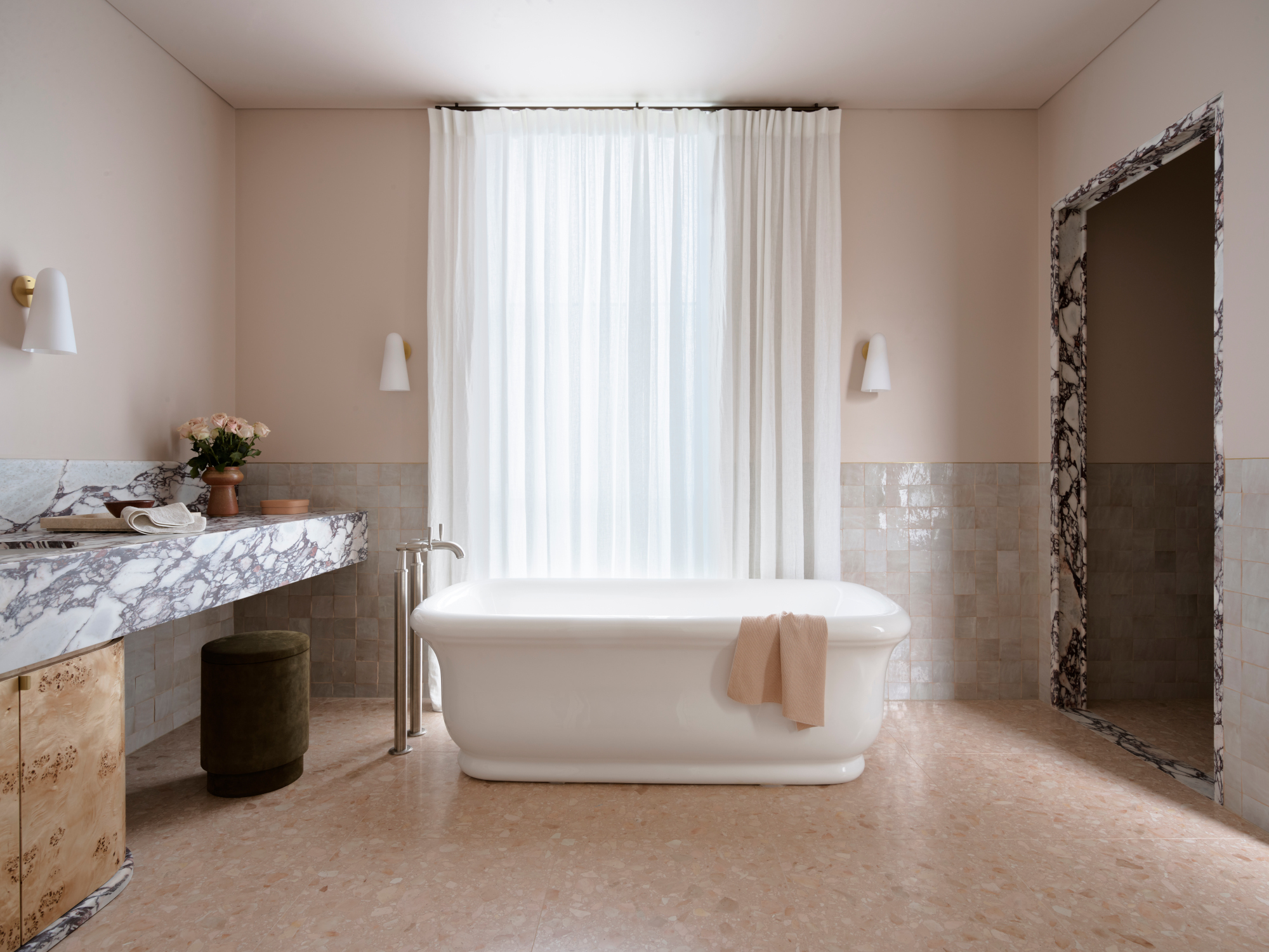
Try instead: This bathroom's powdery pink walls makes a subtle difference, and is much cozier than a cold white
There are few other colors that divide the experts’ opinions like white. On the one hand you’ll have the minimalists who think white is the ultimate classic, and on the other you’ll have the maximalists who can’t think of anything more, well… uninspiring. Take the balanced approach and the best of both worlds. Steer clear of pure brilliant whites, or those with grey undertones, and if you are going to go for a white for the bright look, choose something warmer, with a red or yellow undertone, or even go for the trendiest replacement for white: pink!
‘Instead, paint your walls in a soft shade of blush or plaster pink. It’s a much easier color to live with than white and has more personality than beige or gray – while still maintaining a neutral tone,’ interior designer Matthew Williamson tells me. There are even plenty of minimalist ways of decorating with pink if that’s more your style, just avoid going back to basic white.
Raluca formerly worked at Livingetc.com and is now a contributor with a passion for all things interior and living beautifully. Coming from a background writing and styling shoots for fashion magazines such as Marie Claire Raluca’s love for design started at a very young age when her family’s favourite weekend activity was moving the furniture around the house ‘for fun’. Always happiest in creative environments in her spare time she loves designing mindful spaces and doing colour consultations. She finds the best inspiration in art, nature, and the way we live, and thinks that a home should serve our mental and emotional wellbeing as well as our lifestyle.
