The 5 most luxe shades of grey, chosen by designers because they will instantly elevate your home
Introduce your home to these sophisticated tones and uplift the look and feel of any room with just a slice of the right grey

The Livingetc newsletters are your inside source for what’s shaping interiors now - and what’s next. Discover trend forecasts, smart style ideas, and curated shopping inspiration that brings design to life. Subscribe today and stay ahead of the curve.
You are now subscribed
Your newsletter sign-up was successful
Everybody loves grey and for good reason. This quiet yet characterful tone has become the 'it' neutral. Whatever tone of grey you choose – warm or cool – can work wonderfully in any style of interior, and is a great choice for layering shade upon shade.
While nobody requires any more convincing to choose grey for the home, when it comes to making it luxurious, certain specific shades work particularly well. We spoke to leading designers to understand which shades of grey, and undertones can help design a home that looks timeless and always on point. Pick these winning tones, that look inherently stylish, and what's better – several colors go with grey so you'll never feel limited.
1. Charcoal grey
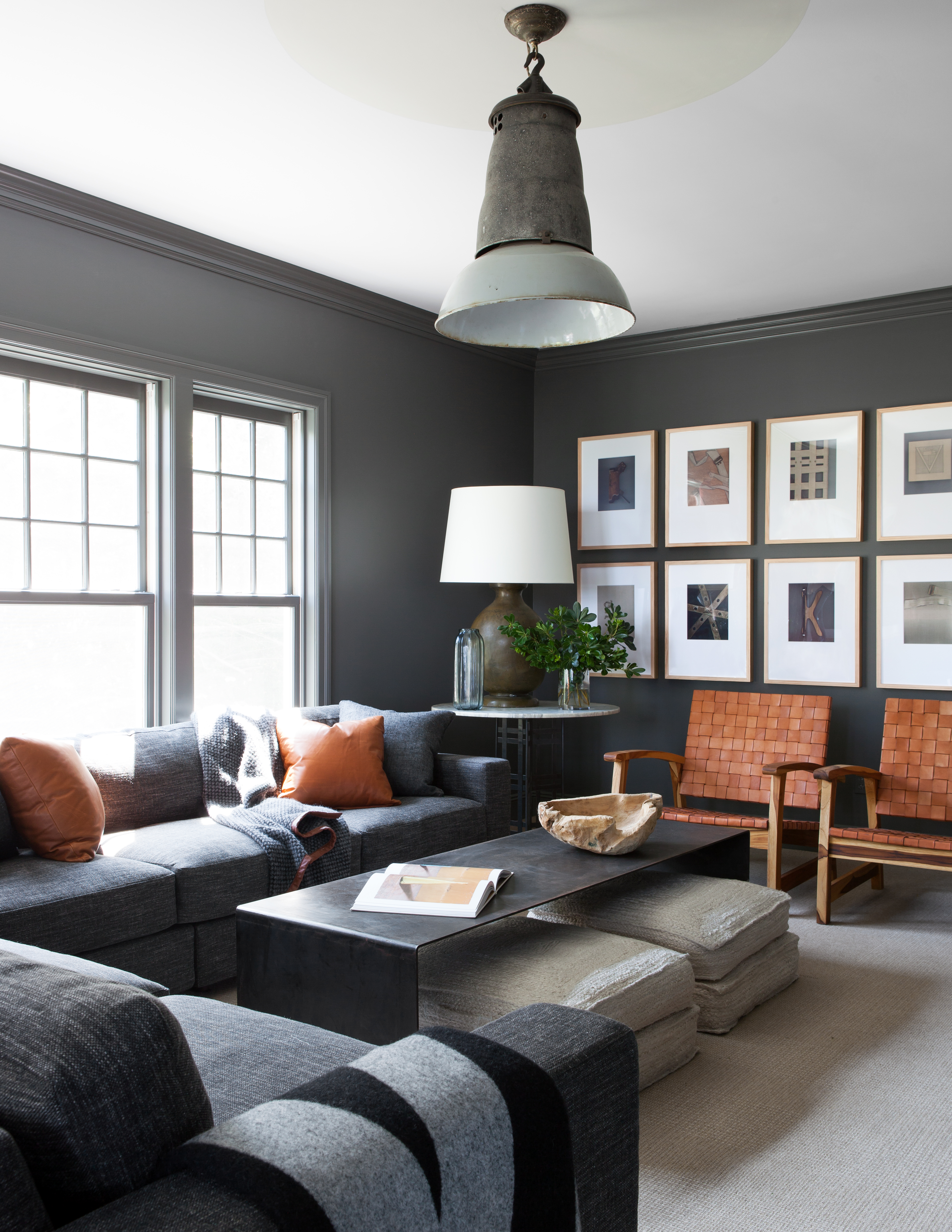
While charcoal grey is neutral, it's also a statement. This bold hue is more modern than its neutral cousins like beige or cream but less dramatic than black. This tone works as the perfect complement to most colors, especially bright whites, warm citrus hues, and pinks. And because this is a warm neutral, it works great with natural materials like wood, marble, and plants.
For a more luxurious and bold grey living room, a great way to use this tone would be by painting entire walls or even the ceiling in this hue. This will give the room a cocooning effect, creating a jewel-box effect.
'I've always loved Kendall Charcoal by Benjamin Moore,' says Dan Mazzarini, principal and creative director at BHDM Design + ARCHIVE by Dan Mazzarini. 'It's a cocooning color. Think chunky knit cashmere sweater that makes you want to curl up and read (or nap). I've used it in libraries, hearth rooms, and bedrooms and it's unanimously loved by clients. Don't be afraid of the dark – the outcome is cozy, soft, and almost velvety in appearance. I highly recommend a flat finish for that nice toasty feel.'
2. Light grey
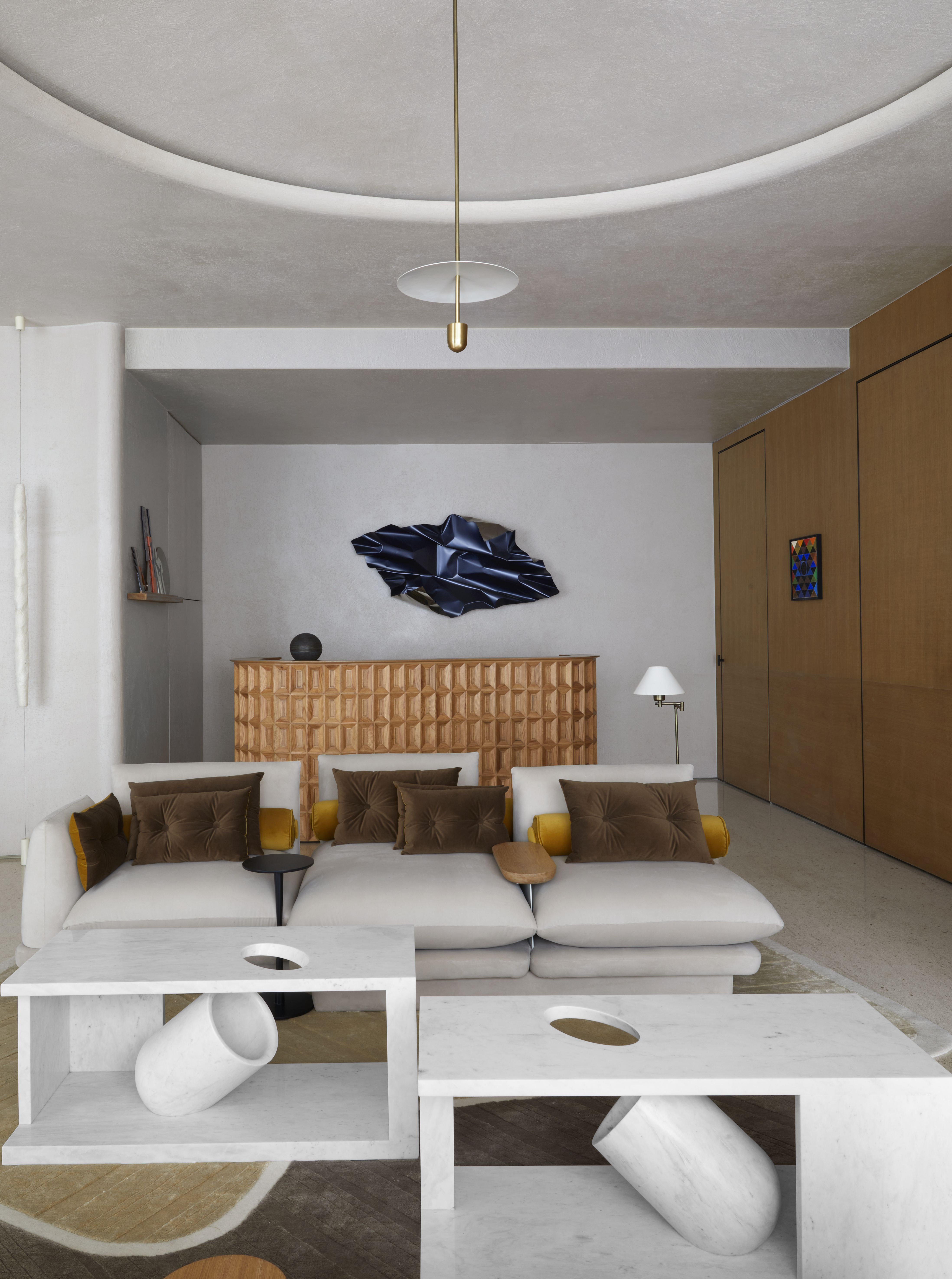
A more muted, lighter grey allows a room to breathe, feel airy, and sometimes even appear larger than it is. It gives warmth to a room and contrasts well with white trim and joinery. And depending on the lighting, it can appear cooler. Plus, several colors go with light grey, meaning, it opens up the opportunity to create any style of interior – a cozy, understated one with lighter hues, or a super luxurious one with bold contrasts.
'Nothing beats a luxurious grey paint color for your walls, especially one that reads as a bright neutral on a sunny day and darkens to a subtle warm shade at night,' says Julia Mack, founder of Julia Mack Design. 'My longstanding favorite is Benjamin Moore Silver Satin, OC-26 (sometimes called 856) in an eggshell finish. It pairs beautifully with Superwhite semi-gloss trim but plays equally well with other similar colors (including OC-27, OC-28, and OC-29). Oftentimes I recommend using two or even three in different locations in one large room.'
The Livingetc newsletters are your inside source for what’s shaping interiors now - and what’s next. Discover trend forecasts, smart style ideas, and curated shopping inspiration that brings design to life. Subscribe today and stay ahead of the curve.
'The mix of greys adds a beautiful depth, allowing other important items in your room to stand out and take center stage,' says Julia. 'It is subtle, sophisticated, and more modern than its beige counterparts.'
3. Textured grey
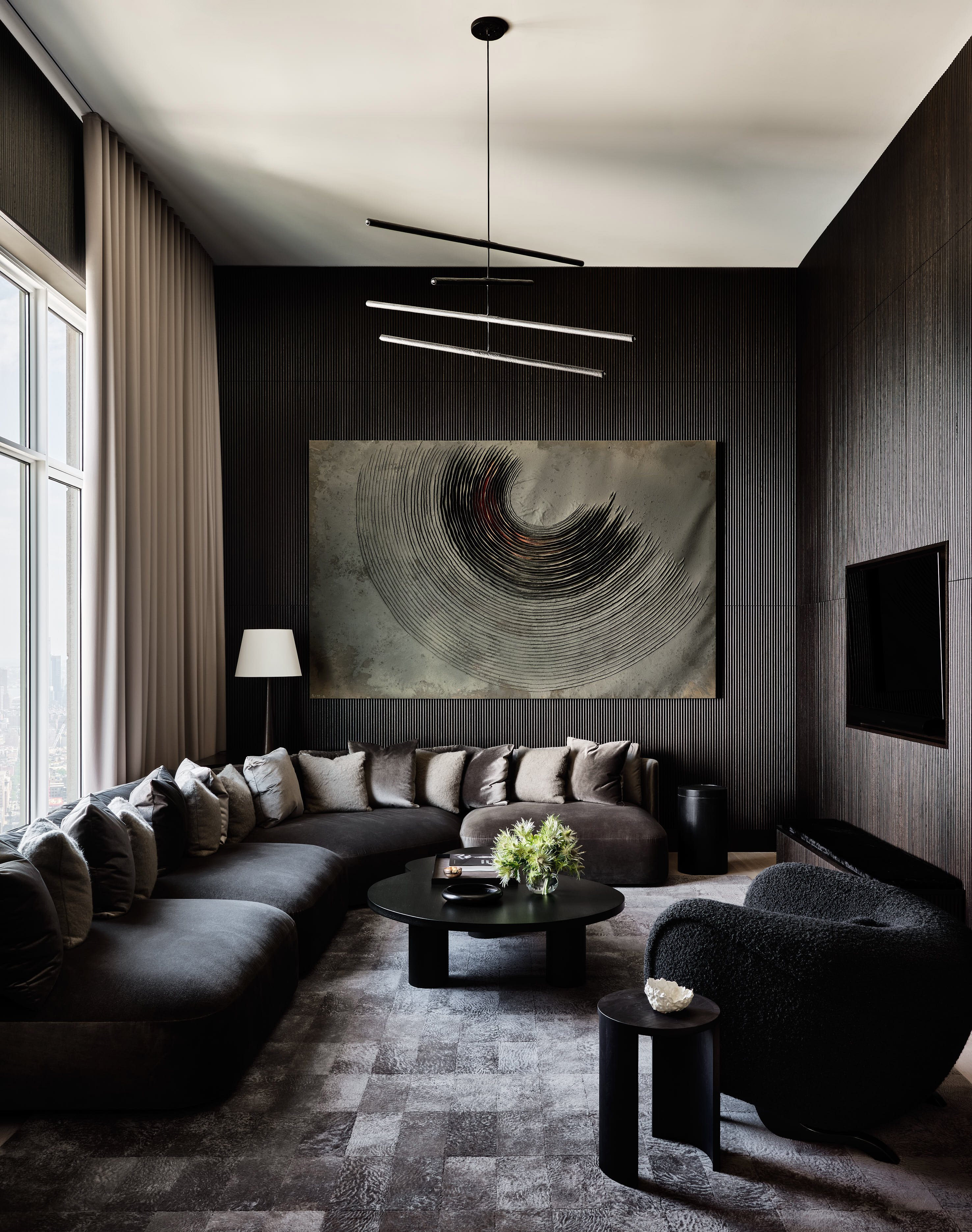
Grey in any room offers a sense of peaceful formality but if you want to add a little movement to the design, consider grey in textures. This could be via textured paints (think limewash) or used across shaggy rugs or knitted pillows. Choose the deep tone and lift it with texture and tactility for a cozy grey living room or bedroom. The space will feel more luxurious and comfortable.
'The client loved a monochromatic approach, so each room has an immersive feeling to it,' says Andrew Kotchen, founding principal of Workshop APD. 'In this media room, they can close the drapes and experience a deep and dark environment to watch movies & TV. Warm undertones of grey make it feel more inviting and cozy, but overall, this room is about texture. Paneling & millwork on the two dark grey walls, the velvet sofa, boucle pillows, faux fur rug, and the deep raked texture of the art all have their depth.'
4. Pewter grey
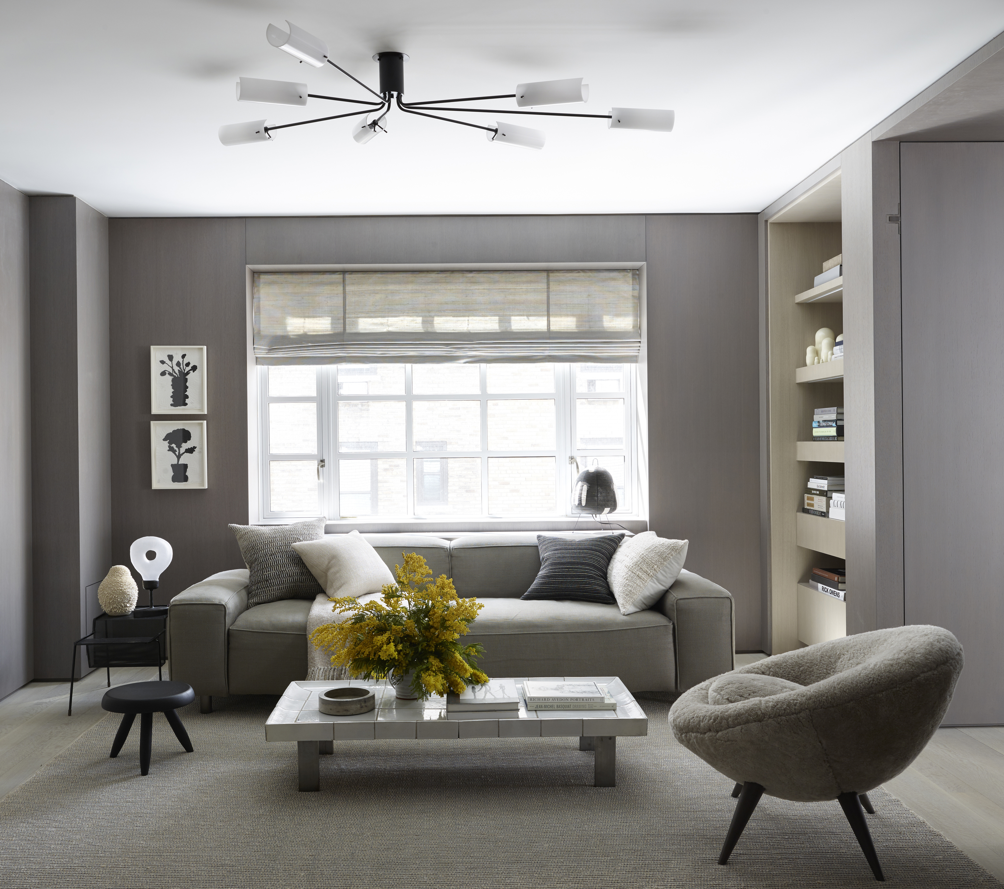
Greys with a touch of metallic tend to have a very crisp, almost icy look to them. They work wonderfully with bright whites in formal rooms and with blues and beiges. Many times these can be treated like a light blue or a cool beige. If you're wondering how to decorate with jewel tones, a nice backdrop color can always be a pewter grey.
'When choosing a shade of grey to make a room look luxurious, it's essential to consider the undertones and the overall design of the space,' says Nick Cryer, founder of Berkeley Place. 'Cool-toned greys tend to create a sophisticated and calming ambiance, which can contribute to a luxurious feel. We find our clients gravitating towards a pewter grey, as this mid-tone grey provides a balanced and refined look, working well with both traditional and contemporary styles.'
'Do keep in mind the type of paint finish, as it can significantly impact the overall luxuriousness of a room,' says Nick. 'When selecting paint finishes, it's crucial to consider the lighting conditions in the room. A higher sheen finish may highlight imperfections on the walls, so it's essential to ensure the walls are properly prepared and smooth before applying any paint.'
A good paint option would be Pewter 2121-30 from Benjamin Moore or Pewter Cast from Sherwin Williams.
5. Grey with blue undertones
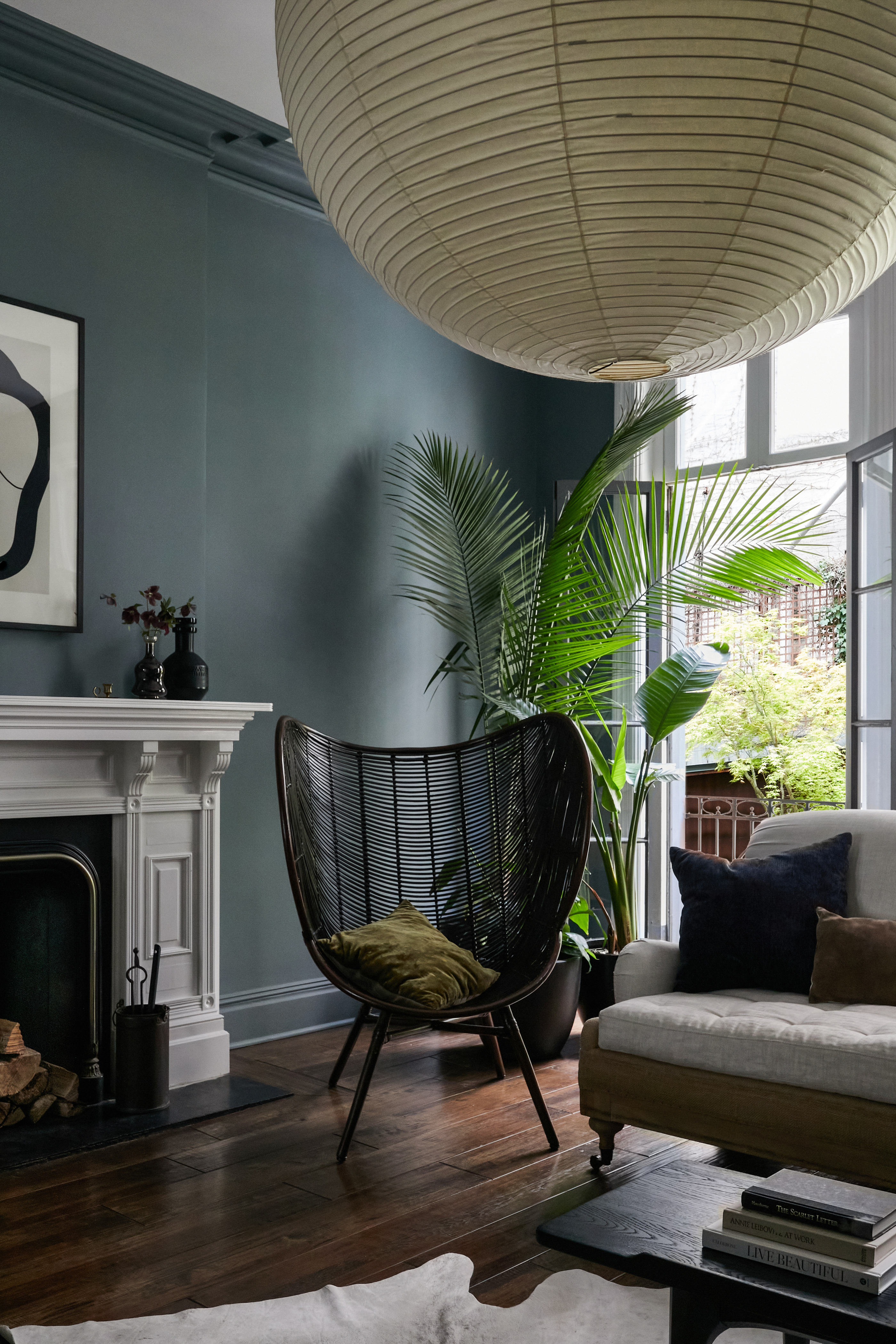
For some, a pure grey can feel a little too cold, and blue too common. But put them together in the right combination and you have a color that is stylish, sophisticated, and soothing. A grey bedroom, kitchen, or living room with a strong blue undertone can create a sanctuary-like interior, which feels welcoming and calming, and also luxurious. This tone looks great with shining accessories like a crystal chandelier, silver mirror, and glass lamp.
'I love using darker greys to create a sense of drama and opulence,' says Grace King, design director of Studio Rey. 'Paint and Paper Library has some great greys to consider like Squid Ink, which is a blue-grey that would work well in a moody bedroom or snugly layered with textural fabrics in dark tones and small doses of bright burnt orange accessories.'
What shade of grey goes with everything?
While almost all shades of grey – be it dark, mid-tone, or light – go with most colors, a grey that looks closest to a muted or neutral tone works best with every interior and imaginable shade. Consider Agreeable Gray from Sherwin Williams, which has a beige undertone. Or Collingwood OC-28 from Benjamin Moore, with lightly cool undertones. You could also choose Skimming Stone from Farrow & Ball, which has white and light tones.

Aditi Sharma Maheshwari started her career at The Address (The Times of India), a tabloid on interiors and art. She wrote profiles of Indian artists, designers, and architects, and covered inspiring houses and commercial properties. After four years, she moved to ELLE DECOR as a senior features writer, where she contributed to the magazine and website, and also worked alongside the events team on India Design ID — the brand’s 10-day, annual design show. She wrote across topics: from designer interviews, and house tours, to new product launches, shopping pages, and reviews. After three years, she was hired as the senior editor at Houzz. The website content focused on practical advice on decorating the home and making design feel more approachable. She created fresh series on budget buys, design hacks, and DIYs, all backed with expert advice. Equipped with sizable knowledge of the industry and with a good network, she moved to Architectural Digest (Conde Nast) as the digital editor. The publication's focus was on high-end design, and her content highlighted A-listers, starchitects, and high-concept products, all customized for an audience that loves and invests in luxury. After a two-year stint, she moved to the UK and was hired at Livingetc as a design editor. She now freelances for a variety of interiors publications.

