Designers Pick the Colors That Make You Feel More Comfortable - and How to Use Them
Color is the key to comfort! Here are six shades to cozy up your home, hand-picked by the designers
The Livingetc newsletters are your inside source for what’s shaping interiors now - and what’s next. Discover trend forecasts, smart style ideas, and curated shopping inspiration that brings design to life. Subscribe today and stay ahead of the curve.
You are now subscribed
Your newsletter sign-up was successful
Color is undoubtedly a key component of any interior and its transformative effects have long been recorded. The psychology behind our favorite hues goes someway to explaining why some shades speak to us more than others, with light and brighter colors seen as more inviting and uplifting in contrast to their darker counterparts. As we seek to create interiors that help us feel comforted, it can be easy to consider just the textural elements – investing in a fluffy rug or softly upholstered sofa. While those ingredients are important, color can be a game changer.
On the surface, we may just recognize whites and creams as comforting choices but there is more to this discussion. Soaking your walls or ceiling in your favorite color can encourage feelings of nostalgia and comfort but can also make an impactful experience for your guests, reiterating the color is also a choice of personal preference. With reems of paint, fabric, and paper libraries to choose from, it can be difficult to know which hues to stick to and which to steer clear of.
We’ve discussed the dialogue of color and comfort with interior designers from across the globe to make your life a little easier. From natural green tones to muted and mesmerizing peaches, each shade brings something different to the table and helps you that much more at home. Here are the designers' favorite paint colors for walls and top shades for decorative accents.
1. CREATE A SOFT SPACE WITH ROSE PINK
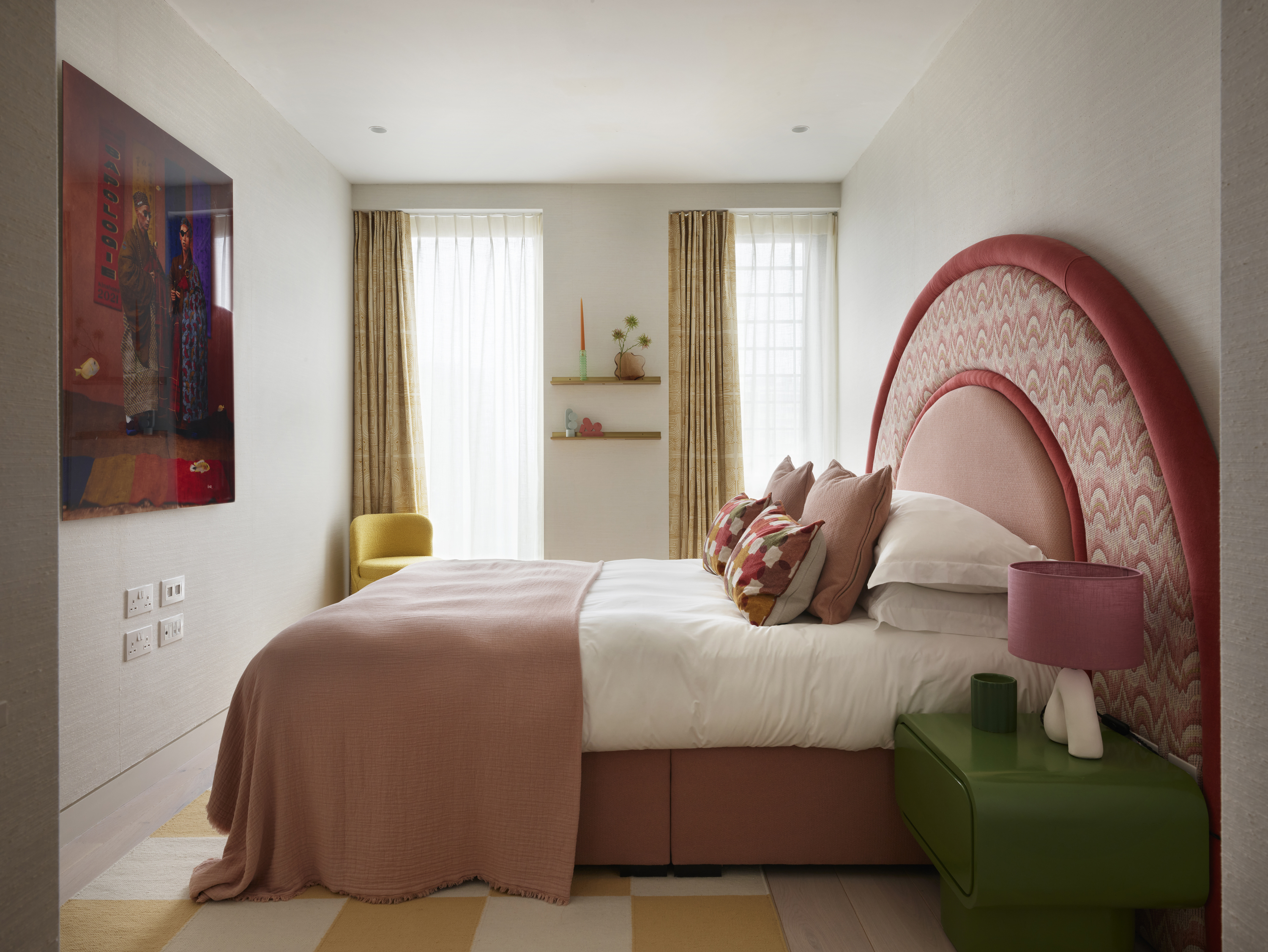
Pink has had many celebratory moments in the last few years, from Pantone’s announcement of Millennial Pink back in 2017 to the Barbie-mania that filled 2023.
A shade renowned for its femininity, pink comes in many forms from crisp fuchsia tones to soft dusky roses. If you’re seeking comfort in your home, looking to the latter may be the way to go. This delicate hue is masterfully executed in London-based studio, Owl Design’s Arc project.
Coral accents play up the charm of the muted pink but also blend beautifully with the palette of sunshine yellows and leafy greens. The result is a bedroom that feels inviting and soft to the touch but retains joy and reverence. Founders of the contemporary studio, Sophie van Winden and Simone Gordon say, 'muted tones instantly create a feeling of calm and comfort, whether that be soft peach, pale green, or, as we have used here in this bedroom, dusky pink.'
For those wanting a more enveloping scheme, an ember-like brown tone would be a great choice that complements the warmth of the pink.
The Livingetc newsletters are your inside source for what’s shaping interiors now - and what’s next. Discover trend forecasts, smart style ideas, and curated shopping inspiration that brings design to life. Subscribe today and stay ahead of the curve.
2. ADD WARMTH WITH A SOFT BROWN
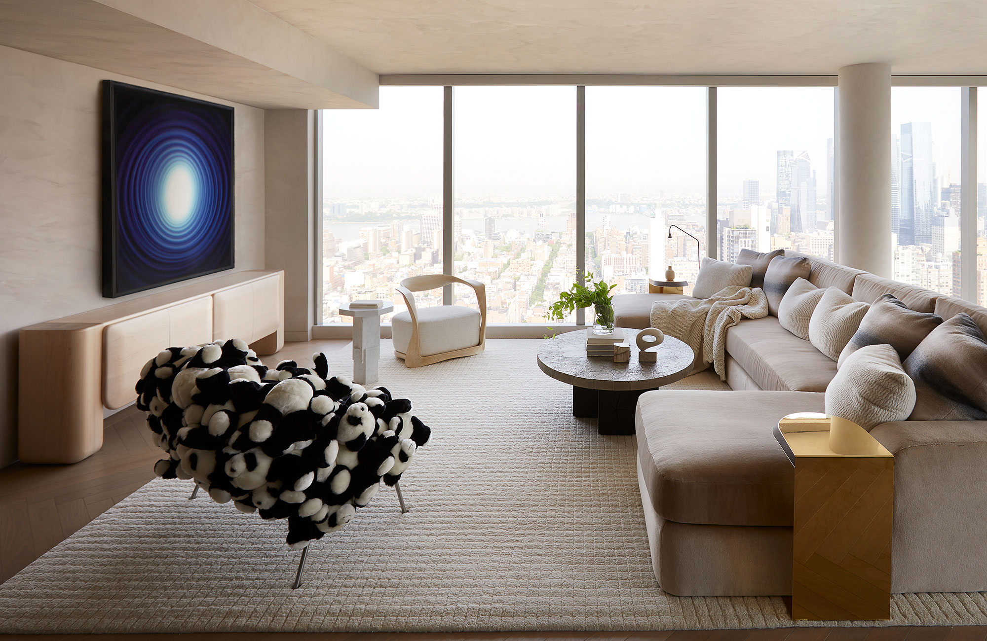
Set high up in the sky, this New York apartment designed by San Francisco-based interior designer, Heather Hilliard brings together modernity, elegance, and comfort.
Contemporary buildings can prove to be a challenge when considering comfort, especially those that are elevated as you don’t benefit from the grounding effects of the landscape.
The key here is to play to the strengths of your space as Hilliard so brilliantly demonstrated. With a soothing almond-like brown as the centerpiece of her scheme, the room has a cocoon-like effect that softens the cityscape. 'Most warm color schemes bring a sense of comfort,' says Heather Hilliard.
'Here, we wanted to bring in some warmth to a space, so we wrapped the room in neutrals with soft brown undertones, which make it feel cozy despite the floor-to-ceiling windows with panoramic views.'
3. INTRODUCE A TOUCH OF GREEN
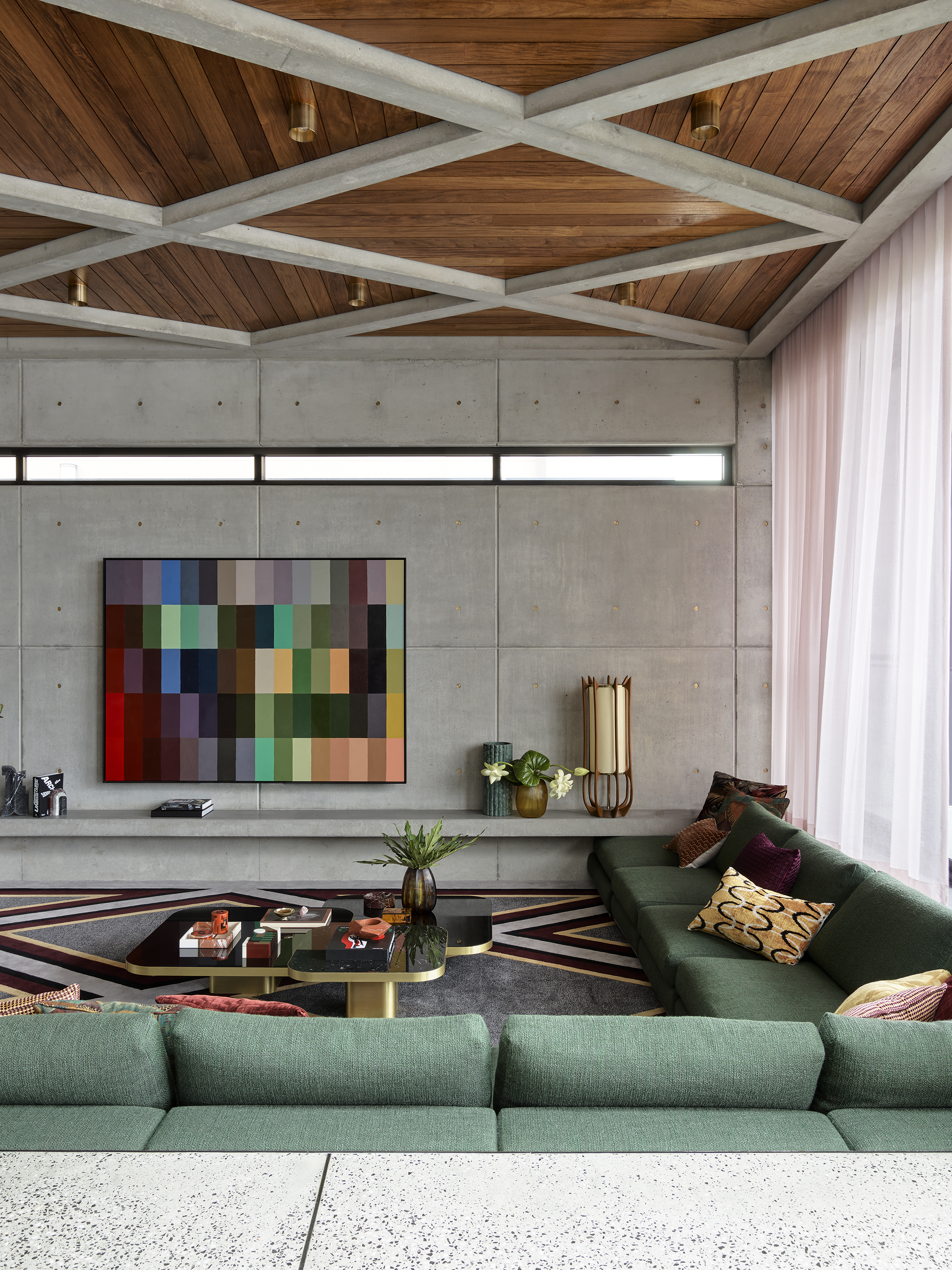
Biophilic and a color inextricably connected to nature, it makes complete sense that green can make a home feel more inviting.
In his Kyle Bay house project, designer Greg Natale balances the architectural concrete walls with a calming hunter green. The hue is a smart choice as it complements the cool undertone of the concrete but still brings warmth to the room whilst reconnecting it to the landscape that sits just outside the window.
'Green has a calming effect and provides a sense of security. Reupholster your soft seating with green fabric for a lounge room that feels comfortable, safe, and serene. Green is a natural color, and so you can keep it subtle by adding a few green cushions or take it further and reupholster an entire sofa in green fabric without it overpowering the space,' explains award-winning interior designer, Greg Natale.
Remember to consider balance within your interior, our brains enjoy symmetry and order so factoring that into your design choices is another way to ensure your final result is cohesive and comforting.
4. MAKE AN INVITING ESCAPE WITH BLACK
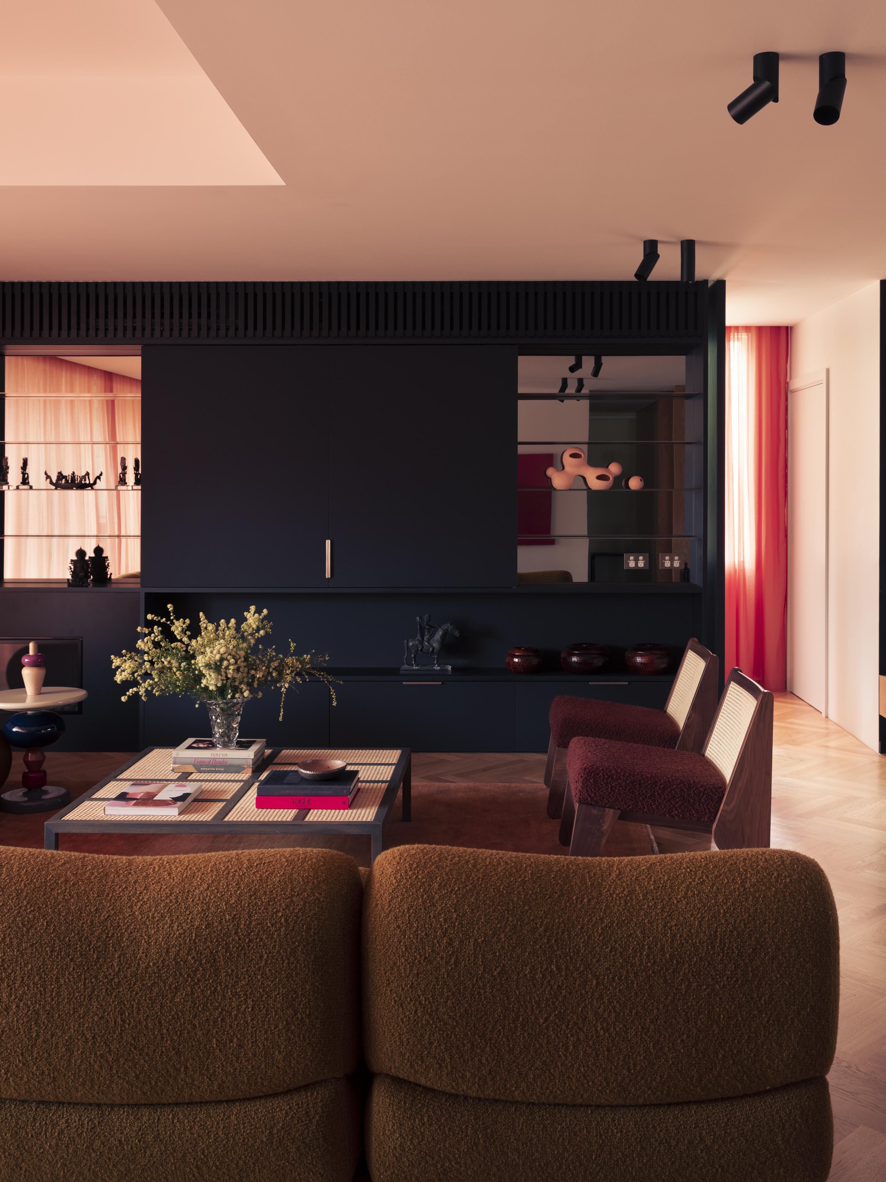
Black does get a bad reputation when it comes to interiors, for many this inky hue can feel a bit drastic. However, designers are disrupting the norm and showcasing how this dark hue can actually form a comforting and classic interior.
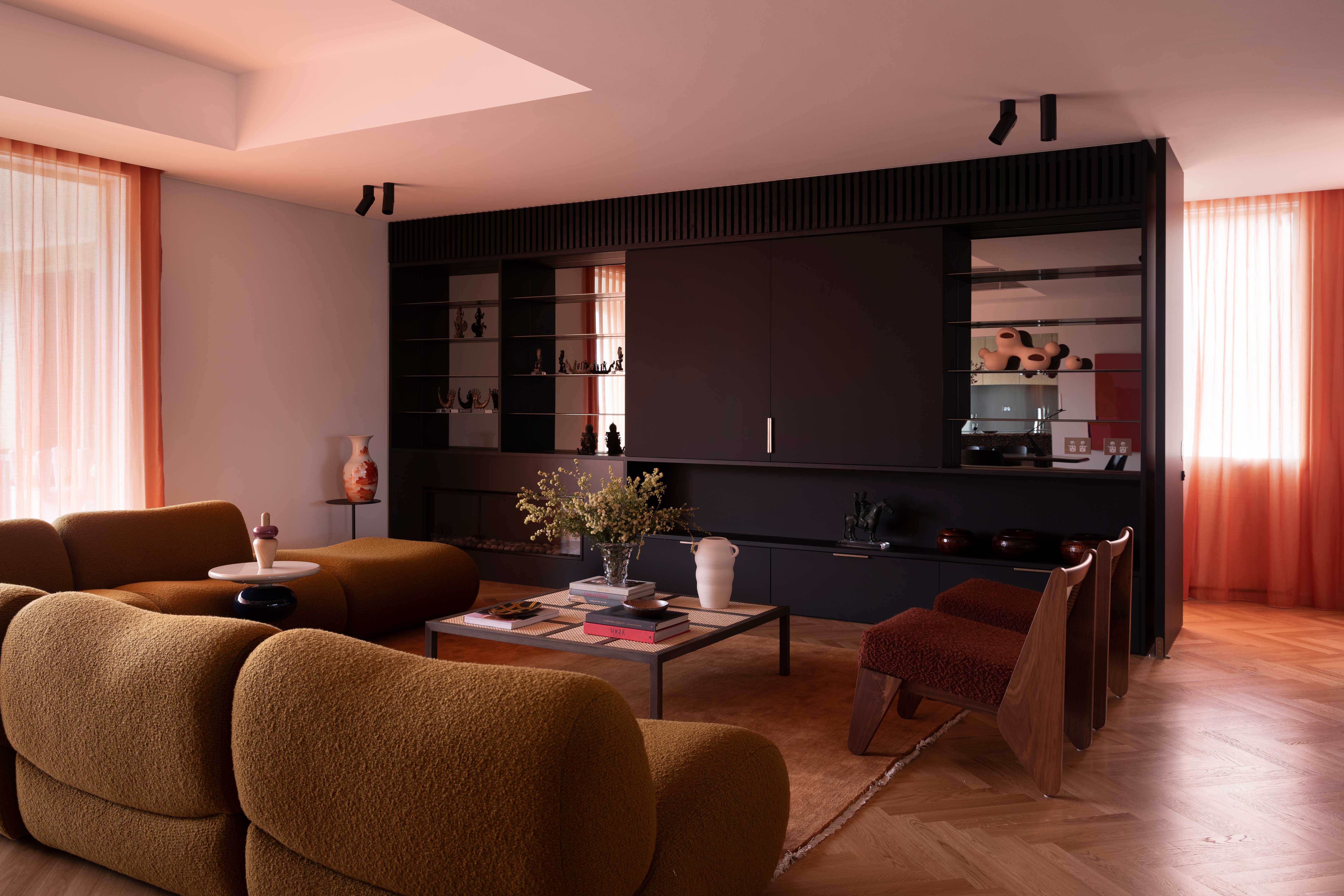
Australian interior design firm, Studio Prineas brought the romanticism and structure of black into their Doria apartment project and in doing so, showcased the beauty and ease of this dark hue with a striking black living room.
The joinery is complemented by warmer complements of peach, burgundy, and olive – all of which work to imbue the room with an elegant comfort. 'The energy of our clients’ art collection is balanced with the layered approach to color, texture, and form,' explains Eva-Marie Prinea, principal of Studio Prineas.
'Comforting hues are further invited into the space through the use of blackened joinery which integrates the fireplace and television, and a stretch of smoked mirror cabinetry that reflects the room’s veil of peach-toned curtains; dramatically washing the interior with a warming tint of light,' says Eva-Marie.
Taking the same approach for your project, consider how your colors work not just individually but evoke comfort collectively too.
5. TAKE COMFORT IN EARTHY BROWNS
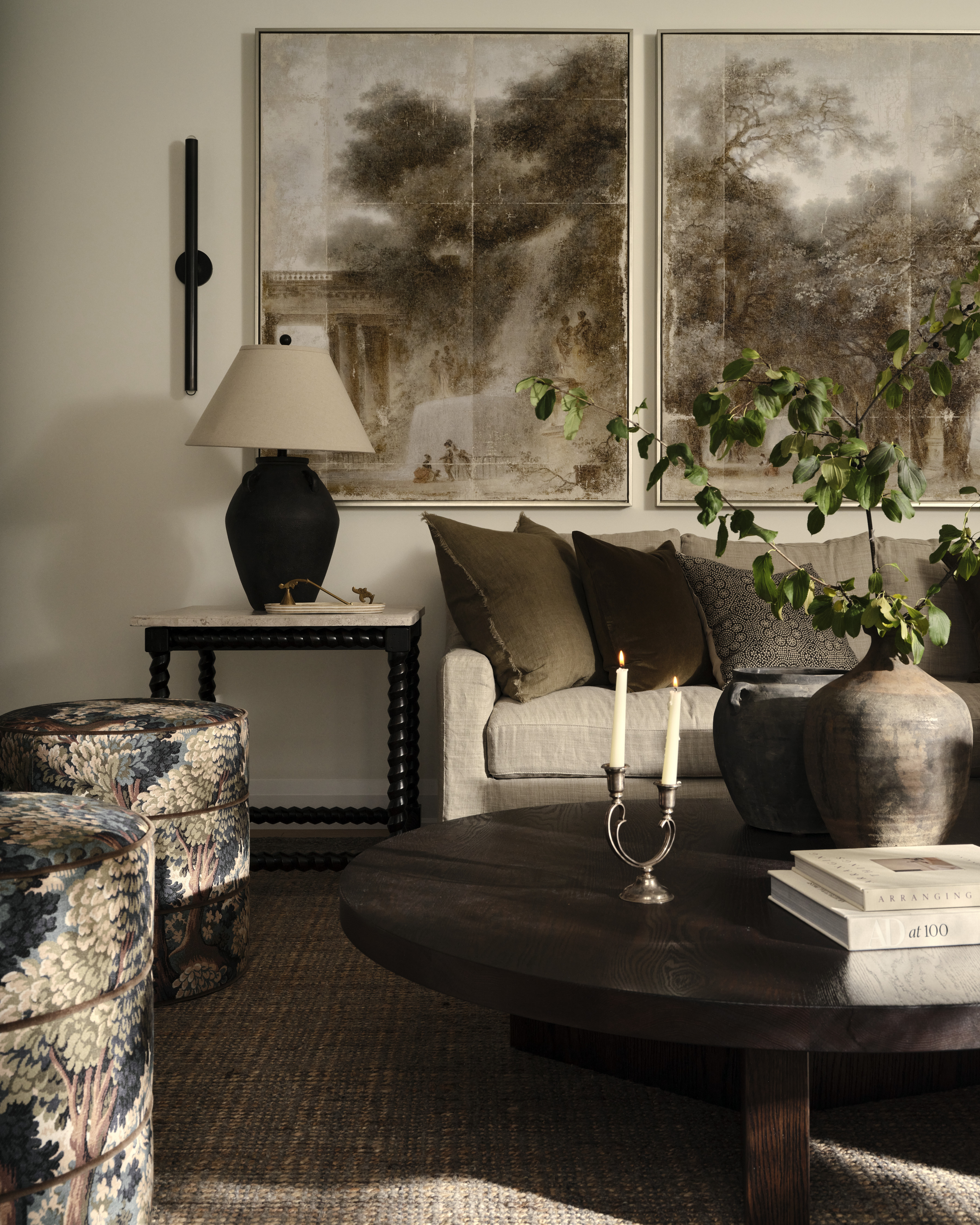
Neutrals are firmly within the comfort zone but that doesn’t mean a lackluster interior. Opting for a darker espresso tone in your scheme can elevate the sense of contrast whilst still feeling in balance with the rest of the room.
These chocolate brown tones bring all the structure of their more cool-toned inky hues but blend beautifully with your trademark comforting colors, be they ecru or eggshell.
In her Oak House project, interior designer Tiffany Leigh makes the case for these natural shades of rich brown, proving that they can be an anchoring force for your furniture and lighting but also lend a gentle touch to your upholstery and accessories.
'For me, comfort is rooted in a connection to nature. Deep, earthy paint colors, browns and greens evoke the same sense of groundedness, bringing a calming feeling to any space,' shares Tiffany Leigh of Tiffany Leigh Design.
6. SOOTH THE SENSES WITH OFF-WHITE
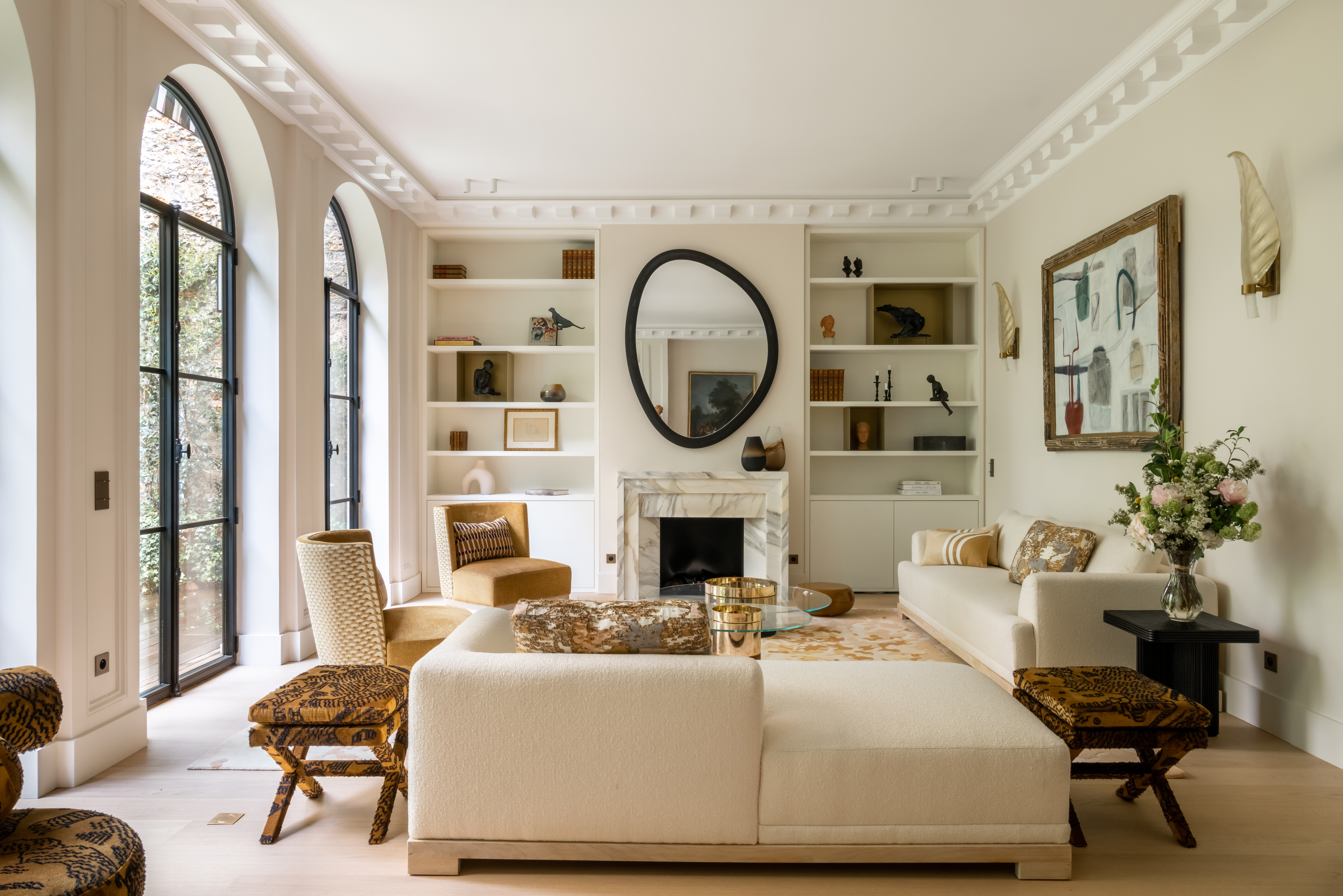
This delicious hue has been a favorite for designers and design enthusiasts for years and it’s easy to understand why.
With its subtle warmth, it feels less sterile and harsh than crisp ivory tones but still reflects plenty of light around the room. As shown in this project from Santillane Design, the cream upholstery, and walls create a smooth and serene canvas for the darker mustard and black accents.
'In this project, the idea was to bring in light because the living room is on the ground floor and therefore not very bright. I wanted to bring in more light, so I worked with shades of white: off-white for the walls, all-white for the ceiling, and lacquered white for the bookcases, which adds structure and substance, as does the Calamata marble fireplace in beige, grey and gold, which adds warmth and a cozy feel.
The carpet by Sibylle de Tavernost is also warm, with shades of endowed white and even pink or bronze repeated in the cushions.
'All these mixtures of soft tones and materials, such as the velvet in the armchairs, add warmth,' reveals founder, Santillane de Chanaleilles.
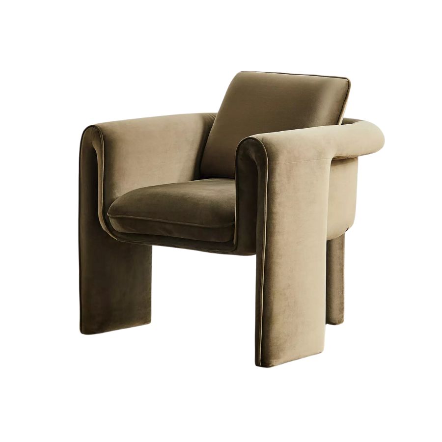
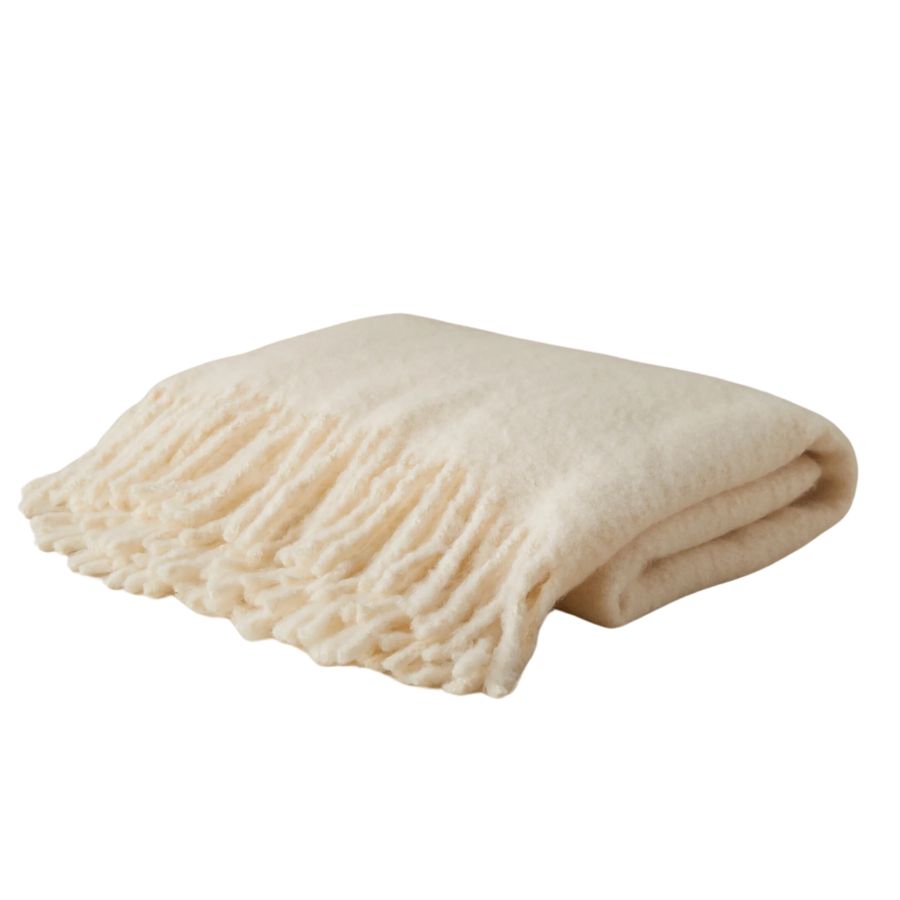
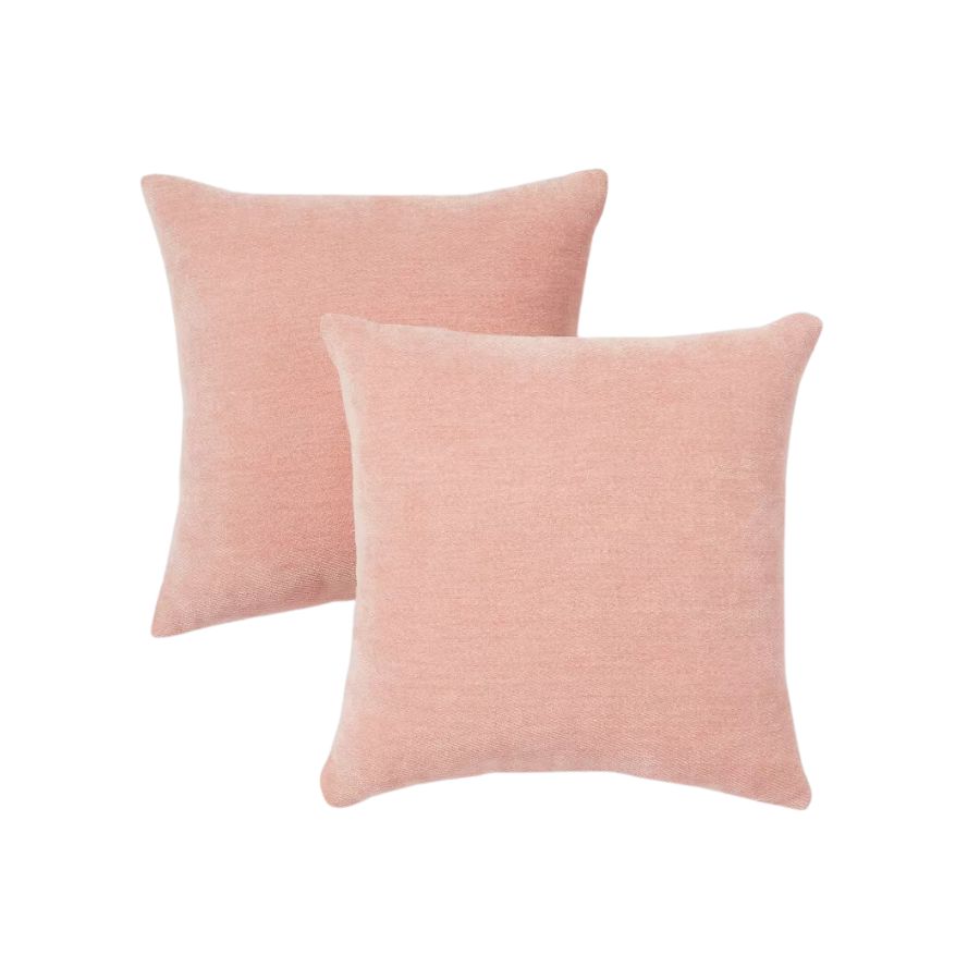
3 buys to bring color and comfort to your home
Writer and design expert Faaizah Shah is the founder of The Interiors Consultancy. She has worked with designers such as Staffan Tollgard and design houses such as Sanderson to help them understand and communicate their narratives. She is known for crafting engaging stories and imaginative content, and understanding great decor from her years alongside some of the best creatives in the industry. She is also a contributor to Livingetc.
