Colorful floors are the joyful design trend our homes need right now – here's how 6 designers embraced 6 different colors
These color floors are going to change the look and feel of your home, and also give a refreshing boost to your mood

The Livingetc newsletters are your inside source for what’s shaping interiors now - and what’s next. Discover trend forecasts, smart style ideas, and curated shopping inspiration that brings design to life. Subscribe today and stay ahead of the curve.
You are now subscribed
Your newsletter sign-up was successful
Bolder, deeper and more vivid tones are taking over interiors, but does that extend to our floors? We tend to make decisions when it comes to flooring that are more timeless, but home decor is a brave new world right now, where people aren't afraid to make a big decision. There's a lot more focus on building an interior design scheme from the ground up, using the floor tones to build and base a color palette on. Floors are no longer just a muted, background entity.
If you’re looking for a seismic shift in your interior design, or want to add a touch of elegance, height, or energy, we suggest you take a look at these floor types drenched in the most grounding color concepts.

Aditi is an experienced homes writer and editor. She has written hundreds of articles for various international titles helping readers make the best home design choices, and spends her days interviewing interiors industry experts to bring the latest ideas to her readers. For this piece she spoke to the world's best designers to find out trending colors for the floors.
1. Red
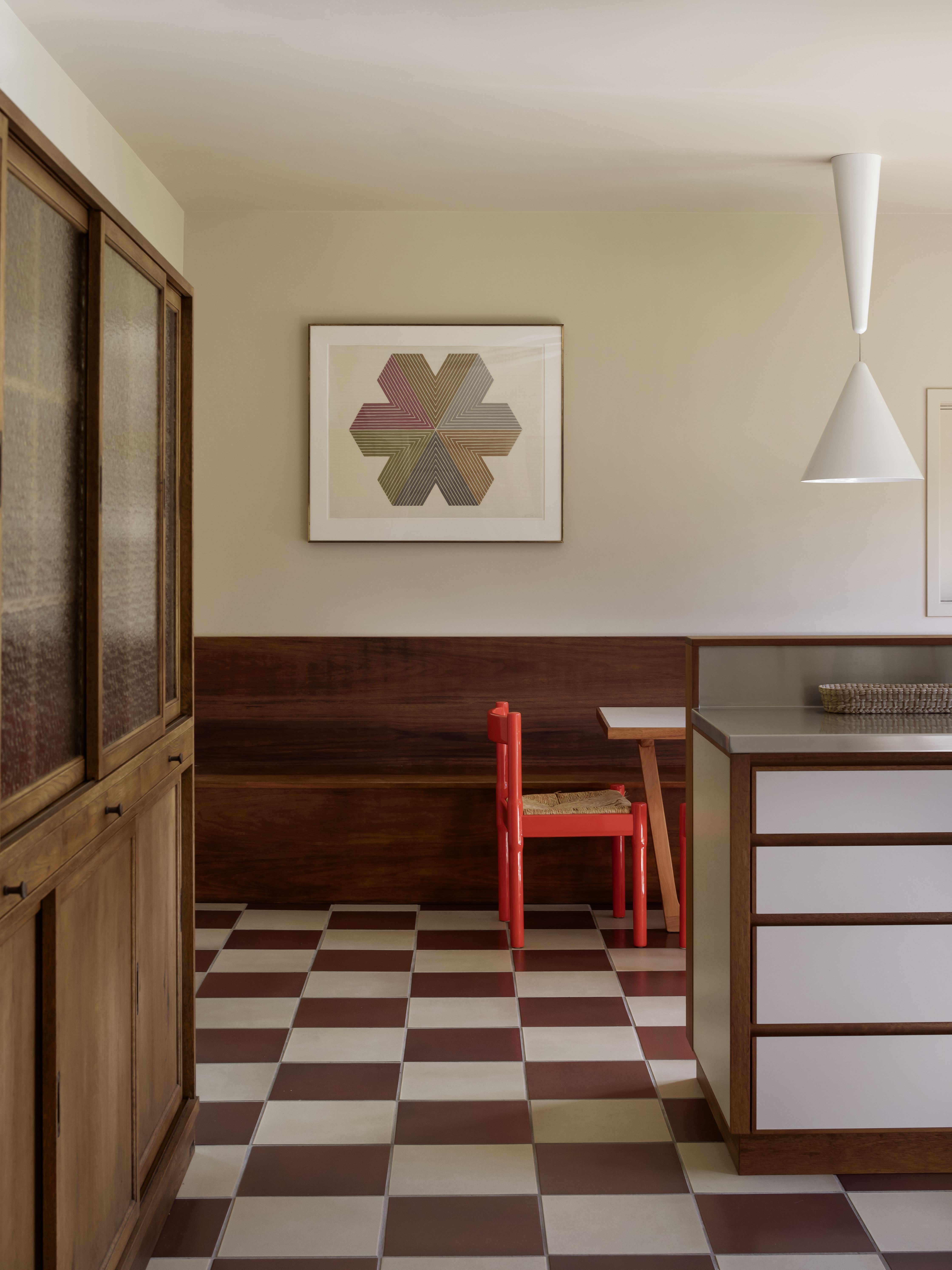
Consider a deep red which will give your interiors an edge along with a touch of warmth. Warm tones like these tell a story and reflect your tastes. Deep red tones look fabulous with wood so you may want to include a lot of teak or pine wood furniture in the space. This tone is also perfectly accented with brassware.
A great way to enhance the color of the flooring is through tile patterns. If checkerboard flooring feels too '50s diner to you, you may want to rethink. Sure, this pattern has a retro quality to it, but it can look equally elegant and modern when painted in the right tones.
'The design intention was to balance out the parquet wooden flooring that travels through the rest of this house in the same checker pattern but in a new material palette which was tiled,' says Katie Lockhart, founder of Katie Lockhart Ltd.
2. Pink
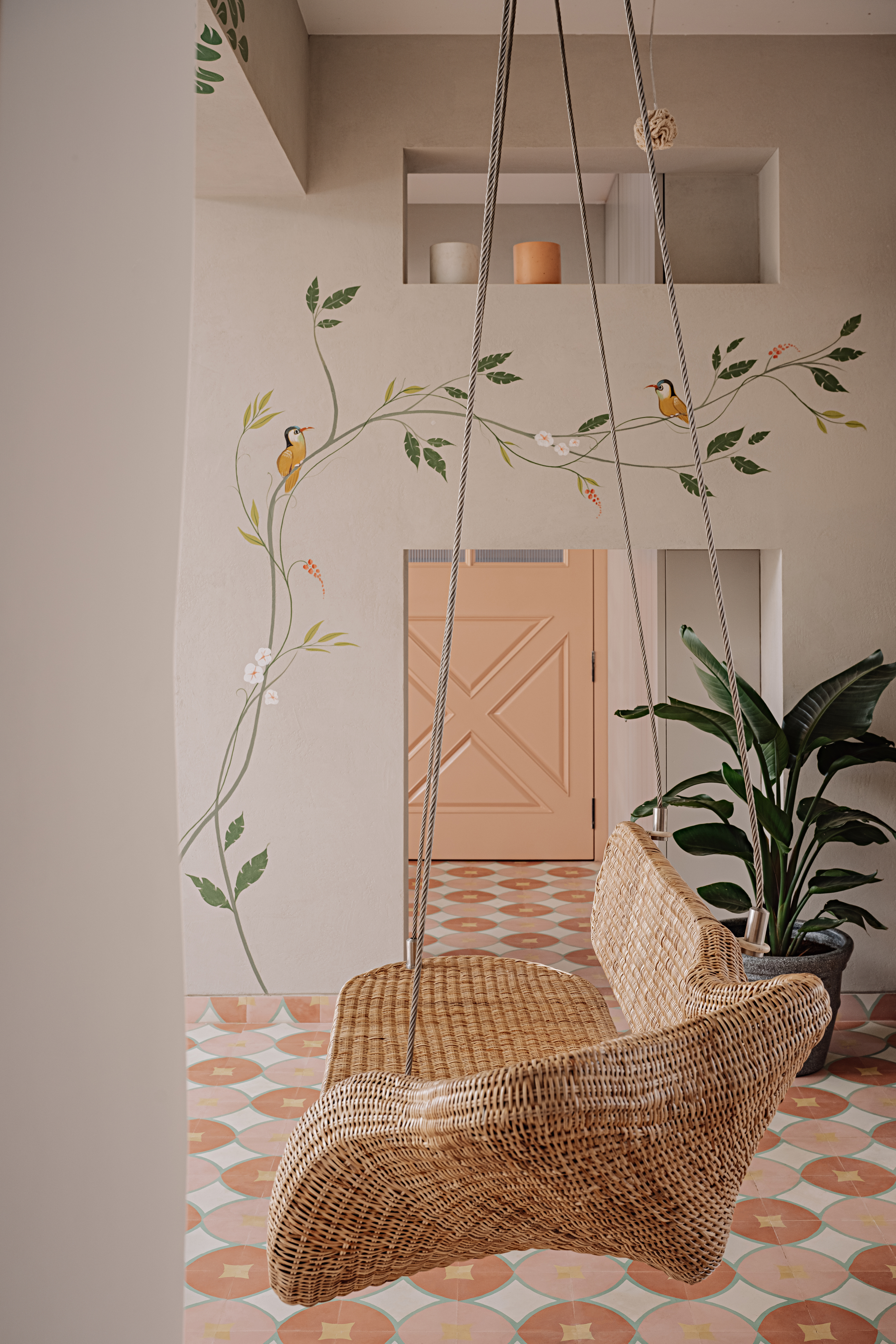
Pink is a timeless color and one that is universally loved. It hasn't gone out of style and is still a big interior design staple. Wall paints aside, consider floor paint in this shade, and introduce a splash of color with interesting patterns.
There are several shades to choose from, depending on the vibe you want to create. A light pink flooring will create an airy, breezy vibe. A darker color will add depth.
The Livingetc newsletters are your inside source for what’s shaping interiors now - and what’s next. Discover trend forecasts, smart style ideas, and curated shopping inspiration that brings design to life. Subscribe today and stay ahead of the curve.
Interestingly, when the flooring is stained or painted an unusual color and used throughout the home, it becomes neutral. It may seem counterintuitive, but when you use unusual tones across large surfaces, the less out-of-the-ordinary they become.
'This is the entertainment floor, where the idea was to keep things bright, light, and fun yet understated,' says Kumpal Vaid, founder of Purple Backyard. 'We decided to do these cement patterned tiles to provide a change of materiality from stones and marbles yet keeping it elegant, and the colors were a fresh take on using nudes and blush tones as neutral colors rather than the usual whites, browns, and blacks.'
3. Teal

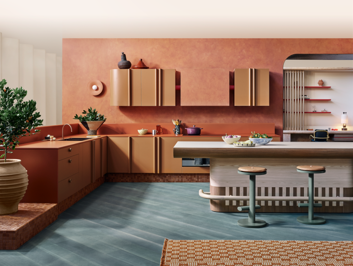
For an impactful home, the floor is a good place to put saturated color. A hefty hue taken in from overhead is less dramatic than surrounding your peripheral vision with it. While strong colors on walls can compress the room, the same used on wood or laminate flooring can lift the visual height of the space and make the entire room look like the home's focal point.
'Presented with the entire Laminex Colour Collection, we chose to feature the latest solid-color decors together with timeless classics and authentic woodgrains,' says Yasmine Ghoniem, founder of YSG Studio. 'We aimed to immortalize a mood by capturing the essence of ‘afternoon delight’ – that warm, cozy time of day when the sun filters into the home and there’s nowhere else you’d rather be because the world seems to stop in that golden moment. Enhancing the nature of filtered sensations emanating within, a diagonally laid Eucalypt green-stained timber floor visually expands the kitchen’s dimensions.'
4. Orange
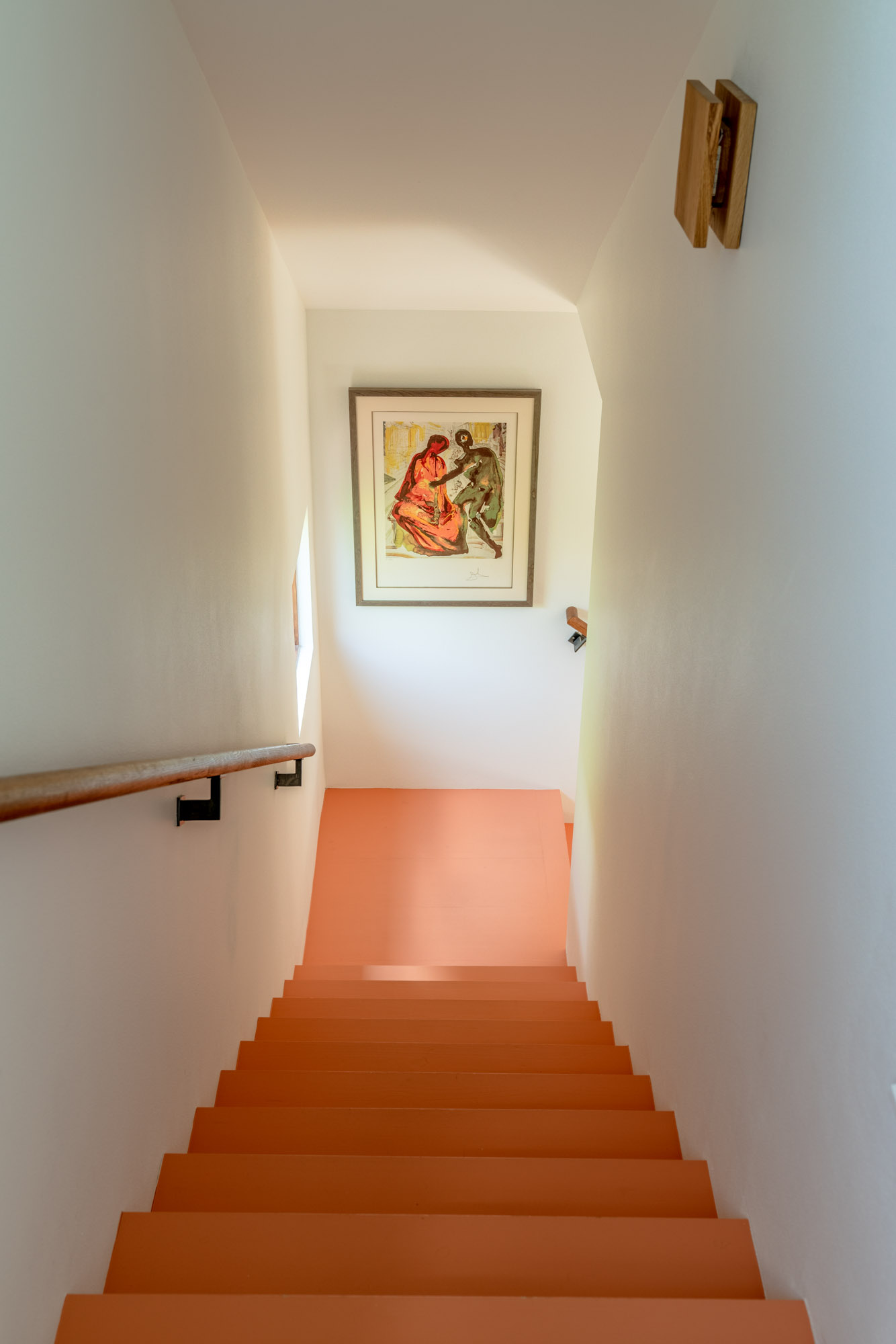
Using a bold floor color is particularly effective in a stand-alone space like a painted staircase or one that is more like a 'destination', where you’ve arrived to enjoy artwork, fine furniture, or a place where you go to read. A lively and energetic color will instantly make this room or space like a jewel box in the home, and give it its personality.
'In this home, the painted stairs reduce the cost while accenting the homeowner’s art collection, adding a fresh touch,' says Elizabeth Baird, founder of Elizabeth Baird Architecture & Design. 'The varied materials and colors, incorporating many styles and eras, draw not only from the client's tastes but also from the eclectic vibes of nearby South Congress.'
5. Black
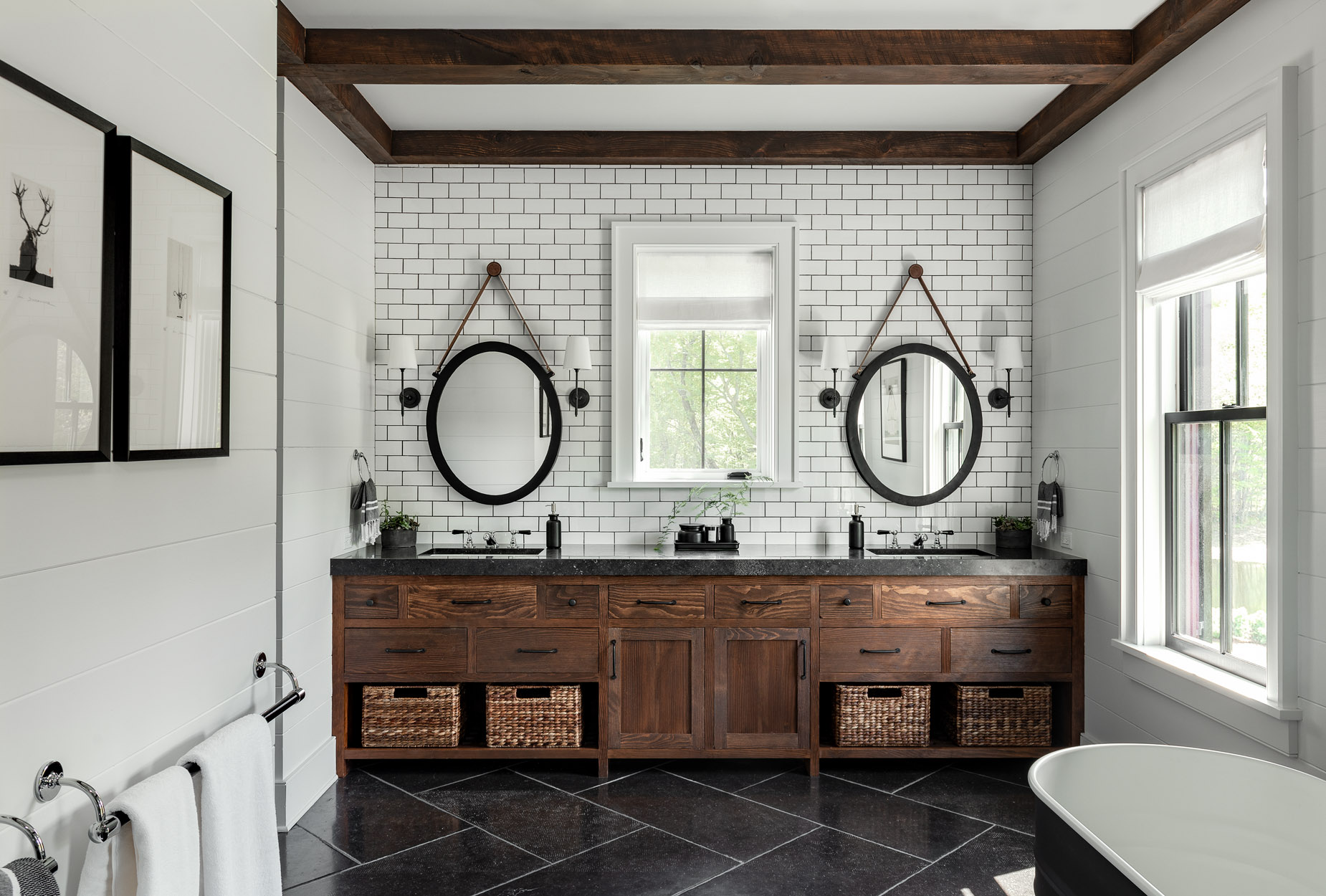
For a sophisticated and luxurious space, consider black flooring that will look as stylish today as it will decades down the road.
Staining wood in black adds a feeling of warmth to your room, making a statement without taking away from the existing decor. When it comes to kitchen or bathroom tile ideas, polished black wood can be used to lift other tones in the room such as brass faucets, crystal chandeliers, and more.
While a matt paint color is best suited to most spaces, you could consider utilizing a high gloss paint that will allow the light to bounce off the paint and give the space depth.
6. Green
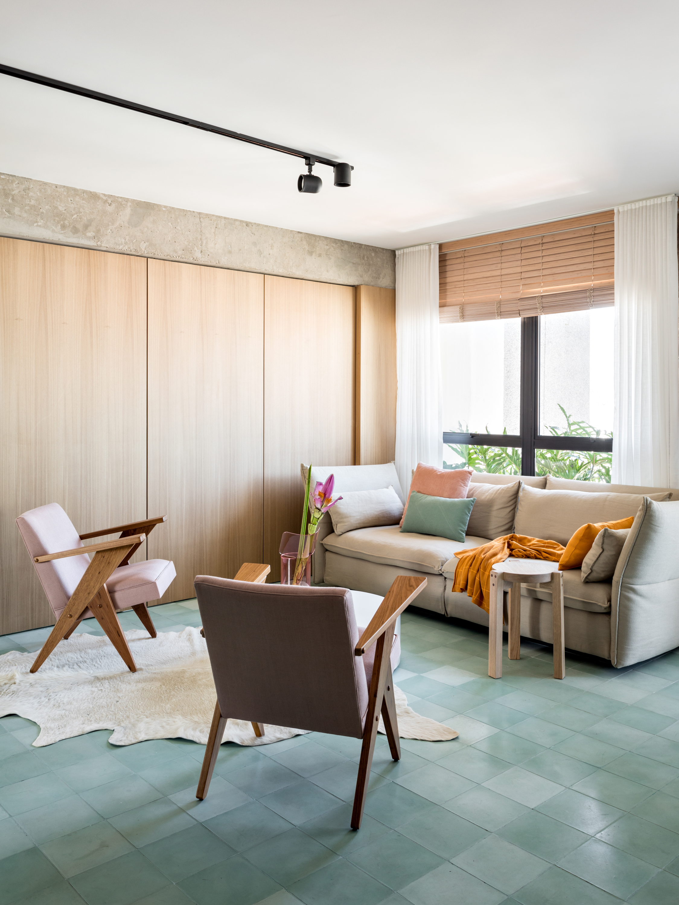
Use a soft, aqua green to quieten the room. Sometimes furniture, artwork, and more can create a visual distraction and clutter, and take away from the calm you want in a room. Soft-toned flooring can make a small room feel more open and open it up to present a feeling of stillness. Consider this tone for a small study, the living room, or hallway floor ideas.
'The inspiration was to create a vintage atmosphere, referencing the 60s and 70s, without giving up the contemporary language of the space,' says Nildo Jose, founder of NJ+ Arquitetura. 'That's why the choice for the green hydraulic tiles. We chose furniture and decorative pieces that made a good mix of contemporary with the vintage language of the 60s and 70s, in addition to tones in the pieces that combined with the tone of the floor, for example, the pink tones with the light green tone of the floor.'
Should a floor color be light or dark?
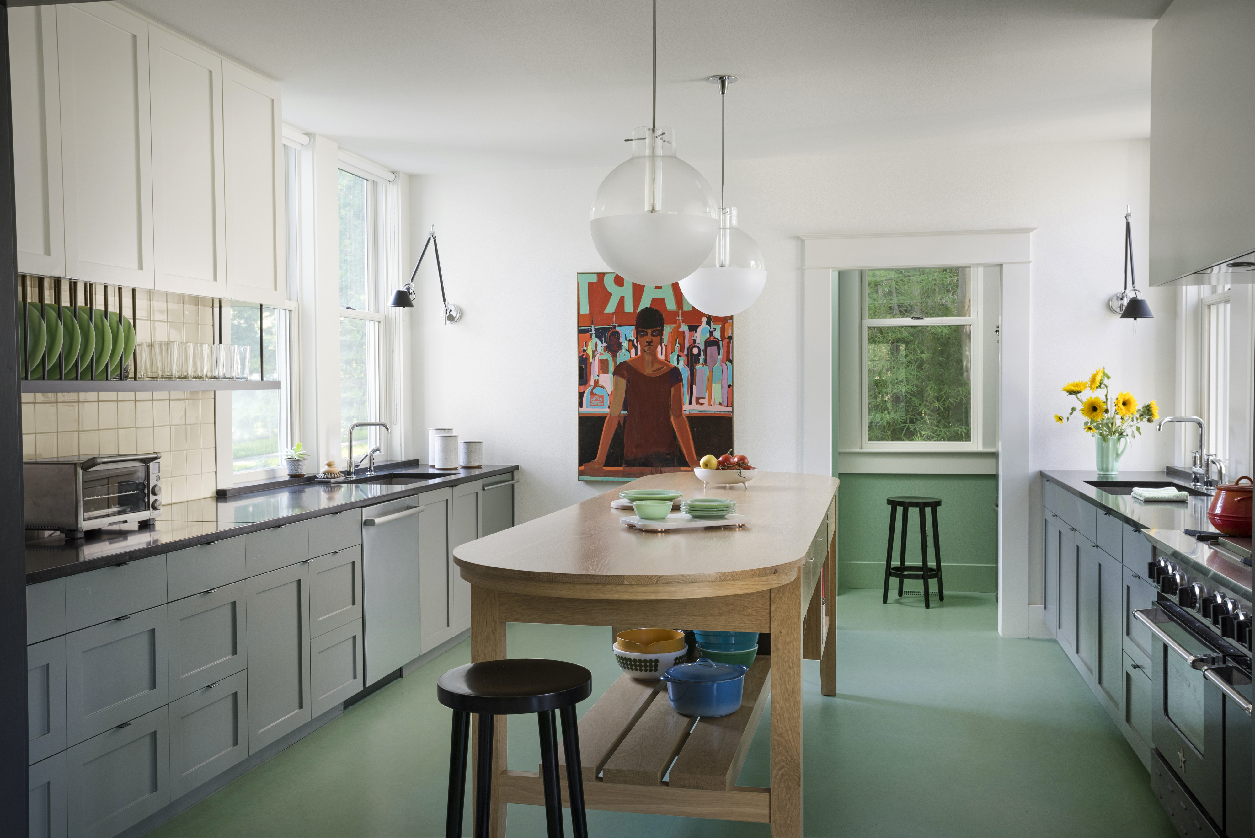
This depends on several factors: the size of the room, the natural light there in the space, and the paint finish. Usually, the best wood floor color or tile color is darker tones as they are better suited to larger rooms and open floor plans. The color helps tie in a large space together and contracts the large footprint into a more visually compact space.
Also, darker tones work best in a room that is naturally lit and has plenty of windows. This will disallow a space from feeling too closed in.
Lighter floor colors are best for small spaces that need a little pick-me-up. Soft tones make a space feel bigger than it is, and add natural airiness to a space.

Aditi Sharma Maheshwari started her career at The Address (The Times of India), a tabloid on interiors and art. She wrote profiles of Indian artists, designers, and architects, and covered inspiring houses and commercial properties. After four years, she moved to ELLE DECOR as a senior features writer, where she contributed to the magazine and website, and also worked alongside the events team on India Design ID — the brand’s 10-day, annual design show. She wrote across topics: from designer interviews, and house tours, to new product launches, shopping pages, and reviews. After three years, she was hired as the senior editor at Houzz. The website content focused on practical advice on decorating the home and making design feel more approachable. She created fresh series on budget buys, design hacks, and DIYs, all backed with expert advice. Equipped with sizable knowledge of the industry and with a good network, she moved to Architectural Digest (Conde Nast) as the digital editor. The publication's focus was on high-end design, and her content highlighted A-listers, starchitects, and high-concept products, all customized for an audience that loves and invests in luxury. After a two-year stint, she moved to the UK and was hired at Livingetc as a design editor. She now freelances for a variety of interiors publications.