Sorry If You've Got a White Ceiling, but They're Now Outdated — This Is the One Ceiling Color Designers Wish More People Would Be Brave Enough to Try
It's grounding, calming, and much more visually interesting than white, according to these color experts


People often default to white ceilings. And yes, a plain white ceiling is unobtrusive and safe, but it doesn't add anything to the design of your room. A ceiling painted a bold color or the same color as the walls, on the other hand, shifts the entire mood of the space. And right now, designers are looking to tried-and-true blue to add character up above.
Blue defies trends — it's one of the oldest and most popular colors. "Blue is the color most closely associated with the mind," color expert and director of design at Lick, Tash Bradley, tells me. "Softer, paler shades especially have a shorter wavelength of light, which helps create the illusion of height. There's a reason we talk about 'blue sky thinking.' Looking up at a soft blue ceiling naturally makes a space feel more open, calm, and expansive."
When you think about it, a blue ceiling is the oldest trick in the book. It nods to the natural environment while still making an interesting statement. And while the interior design world is currently leaning towards warm browns, bold pops, and bright colors, blue as a ceiling color feels as unexpected as it does timeless.
What Shades of Blue Works Best for a Ceiling?
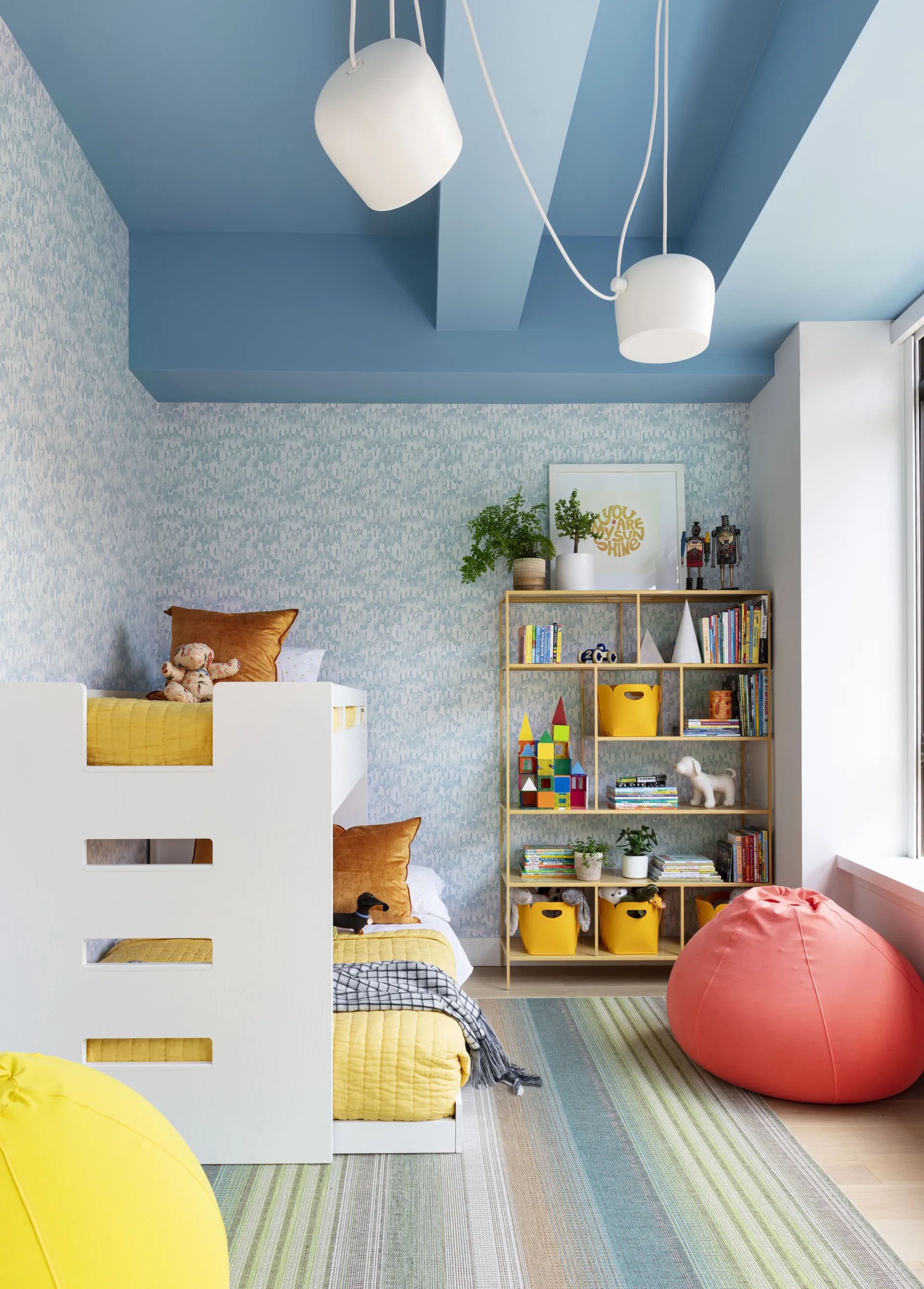
This warm, soft blue instantly makes this kid's room feel so much calmer and more inviting.
"I think people often overlook blue ceilings because they worry blue will feel cold," says Tash Bradley. Or they worry decorating with blue can feel dated, in the way an overly traditional home or on-the-nose nautical theme can. "But that's only true of cooler, icy blues," adds Tash. Warm or slightly green-based blues feel incredibly soft and welcoming, and "work beautifully in every room orientation, from north-facing spaces to sunny south-facing rooms," says Tash.
Tash particularly likes a soft, warm blue. "It's something I've tried and tested in my own home; I have Lick's Blue 15 on my ceiling, but Blue 08 and Blue 03 are beautiful alternatives too," she shares. These warm, soft blues will feel inviting and are relatively easy painted ceiling ideas to incorporate, as ceiling color doesn't have to be dramatic to make a difference.
"Even going one shade warmer or softer than white can make a room feel more finished," adds interior designer and Behr Paint ambassador, Sabrina Soto.


Tash Bradley is a color expert, color psychologist, and the director of design at Lick, a UK-based paint company. Tash has long been working in the creative industry; first as a professional artist, and then in marketing. In the last 10 years, she has specialized in color and interior design, working alongside her mother in property development and home decoration, as well as studying interior design at the University of Arts London.

This dark blue ceiling is dominant and bold, but not too intense when paired with the natural light and vertical wood paneling, which draws the eye upward.
However, you can also opt for a more dramatic blue. For something with a high-contrast impact. Try a deep color like navy blue, sailor blue, or midnight blue, "especially in a dining room, powder room, bedroom, or media space," says Sabrina.
This will instantly feel moodier and atmospheric, but keep in mind that darker colors tend to work better with a color-drenched technique.


When it comes to choosing the right shade of blue for your ceiling, Tash's biggest tip is "to choose a blue with a warm undertone and keep it fairly soft."
And perhaps, more importantly, when it comes to blue paint colors to avoid on your ceiling, "Avoid anything too bright or overly saturated, as it can start to dominate the room," she adds.
Techniques for Painting a Ceiling Blue

A slightly different shade of blue in a tonal drench can be incredibly captivating, like in this entryway.
When painting a ceiling blue, there are a few tips and tricks to keep in mind. You either want the paint to make your space feel expansive or cocooning and cozy.
"The aim is for the ceiling to elevate the space quietly, adding depth, personality and a sense that every surface has been thoughtfully considered, rather than immediately drawing all the attention to itself," says Tash.
Color drenching can be a surprisingly easy introduction to ceiling color. "When the ceiling matches the walls in a color like blue, the room stops feeling like it has hard edges," shares Sabrina. "It feels enveloping and architectural, almost like you're standing inside the color instead of just looking at it."

Sabrina Soto is an interior designer, podcast and television host, author, and Behr Paint ambassador. Sabrina has enjoyed extensive exposure as a host and designer on various HGTV shows, including The High Low Project, Design Star, and Get It Sold. And she recently launched her own talk show, The Sabrina Soto Show (now airing on Hulu, Disney+, and Amazon).

A dark blue color drenched in a room that gets some natural light is captivating, yet still calming.
This approach works beautifully in most rooms, but it's not universal. For instance, "It doesn't work as well in a room with very low ceilings and very little natural light if you're using a dark color, since drenching in that case can make the space feel like it's closing in on you rather than cocooning you," Sabrina says.
It also tends to be less effective in a room with a lot of architectural detail you want to highlight, like an ornate ceiling medallion or millwork. Drenching tends to flatten those details into the background instead of letting them stand out.
In those cases, Sabrina recommends "using the ceiling color as contrast so the detail still gets its moment." A separate moment for ceiling color also creates a general sense of visual interest. "I especially love a pop of blue in bedrooms or bathrooms, where you're naturally looking up at the ceiling as you relax," she adds.
"Warm blues have a wonderfully soothing quality that helps create a restful atmosphere, making them the perfect colors for sleep," adds Tash. They're equally brilliant in a home office, encouraging a sense of clarity and calm — this mood association can be explained in part due to sensory-conscious paint colors, if you are interested in building your palette that way.
"I've even used a sky blue on the ceiling in my son's playroom, paired with warm white on the walls and woodwork, and it completely transforms the room," shares Tash.

This blue-green ceiling adds a vibrant pop of color while still adding a relaxed atmosphere to the room.
"I always recommend testing the color on the ceiling itself, not just the wall," says Tash. Light hits the ceiling differently, so a color can read darker, cooler, or warmer once it's overhead. Finish matters too. "I usually go flat or matte on ceilings because it hides imperfections and keeps things soft," adds Tash.
Painting a ceiling blue is rewarding, but you want to avoid making any painting mistakes — it's a tricky spot to have to retouch after all.
For more inspiration like this, be sure to subscribe to the Livingetc newsletter, and if you like the idea of building a room around a blue ceiling, but need help, why not book a Style consultation with the Design Lab by Livingetc team.
