5 best paint colors for a small entryways - designer-approved palettes
As the first space guests see, getting entryway design right is important. Here designers tell us which paint colors pack a punch even in smaller entryways
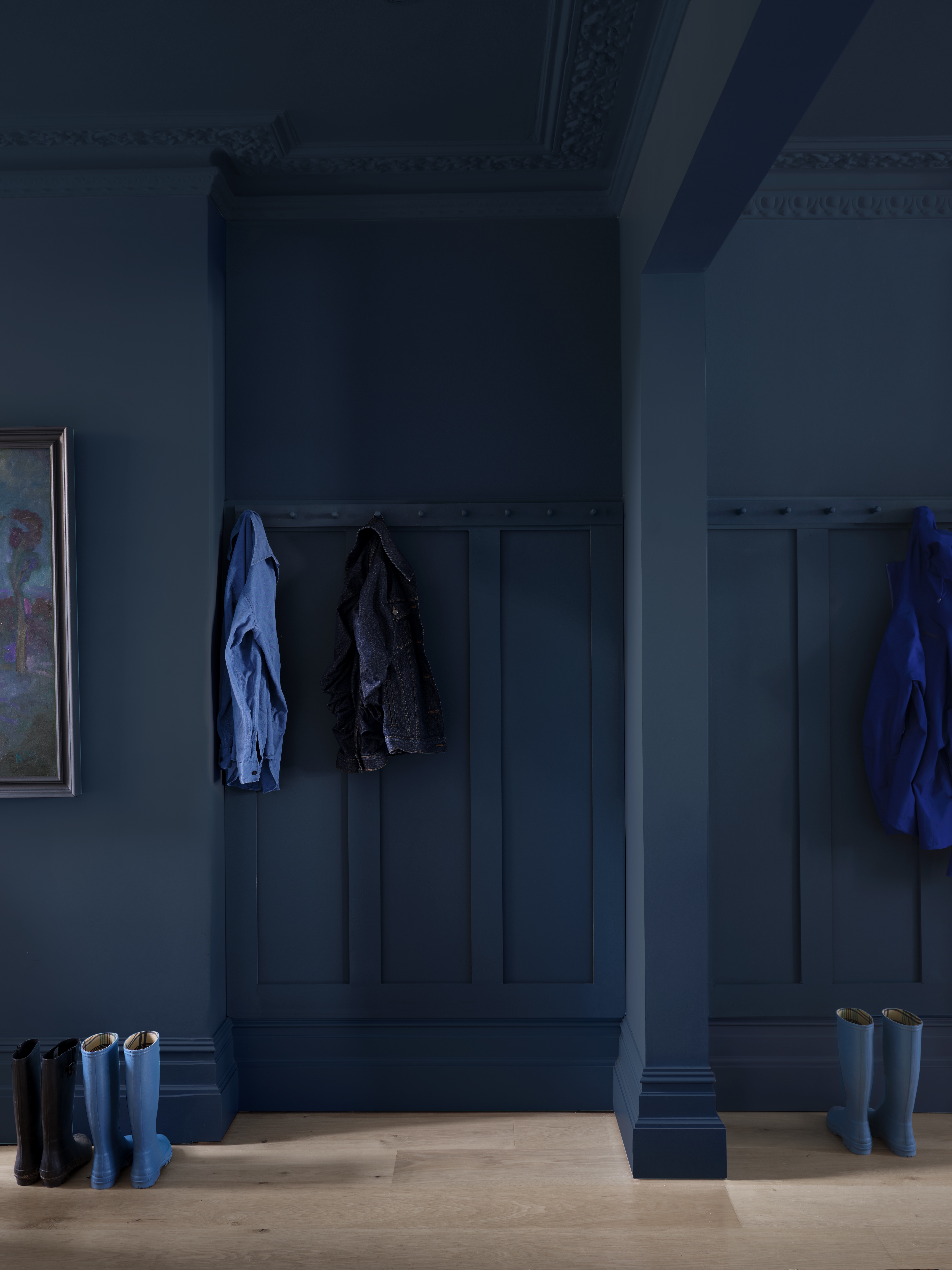
Whether you seek to make a statement or create a feeling of entry into a tranquil haven, entryway design should be considered carefully if you want your home to make a good first impression. This is especially true of small entryway spaces or those which purely feel like a through-route if they have lots of doors running off them.
Devin Shaffer at Decorilla says: 'I'm the type of designer that loves to encourage clients to be daring and go bold with their spaces and believe it or not most clients are on board with this, but only if it's a small space in their home.' But equally you can choose to go minimalist in this space to draw your eye to the adjoining rooms. Here designers tell us what paints they use to optimise the impact of a well-designed entryway.
1. COLOR 165 BY JH WALL PAINTS
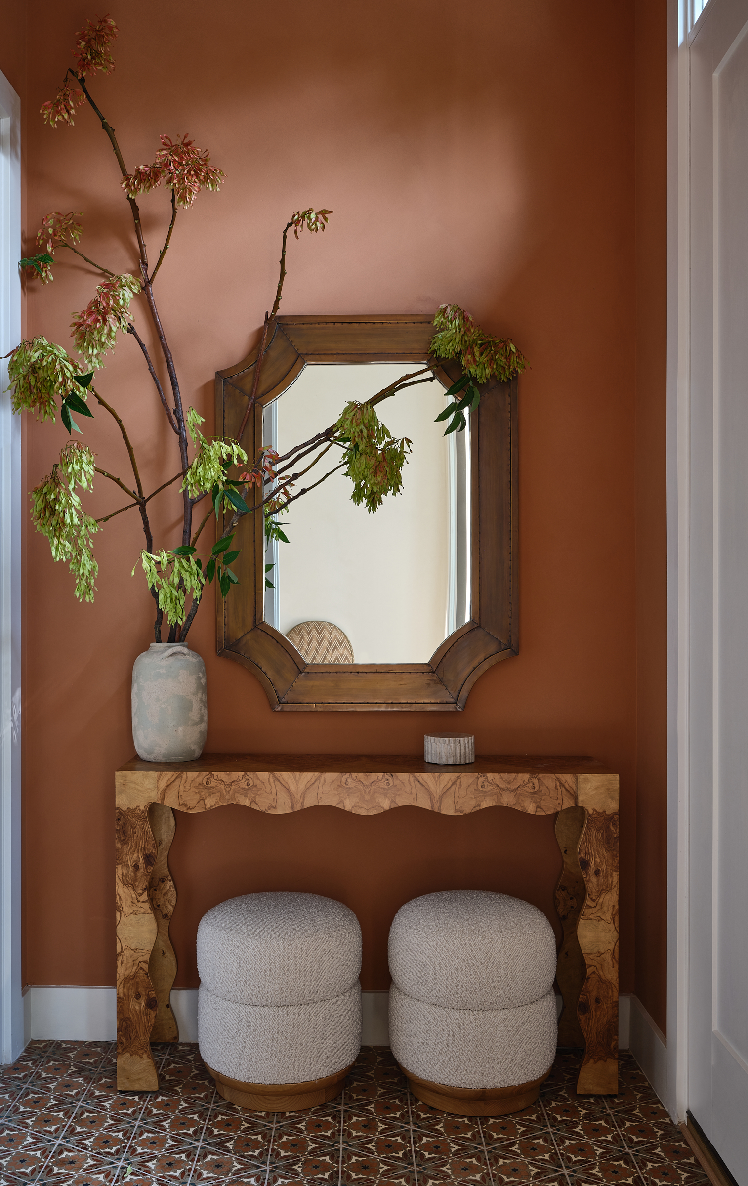
As we head into fall, opting for earthy tones are going to ensure your small entryway feels cozy and never poky. The warm terracotta shade is not only a warm and inviting color but since it feels like a neutral, can be accessorized throughout the year at minimal extra cost.
Jacqueline Gonçalves of Moksa Studio in Los Angeles shows us the impact this shade can have in this small entryway in a Brooklyn home from her portfolio. She says: 'The wall color is a leather limewash from JH Wall Paint color 165, which pulls beautifully from the tile.' Creating this sense of consistency is a great trick for optimising the visual impact of the smallest entryways.
This shade also works well from a practical standpoint. Gonçalves tells us: 'The leather lime finish is durable to withstand getting banged with shoes and items moving in and out.'
See more of JH Wall Paints' Color 165 here.
2. OVAL ROOM BLUE BY FARROW AND BALL
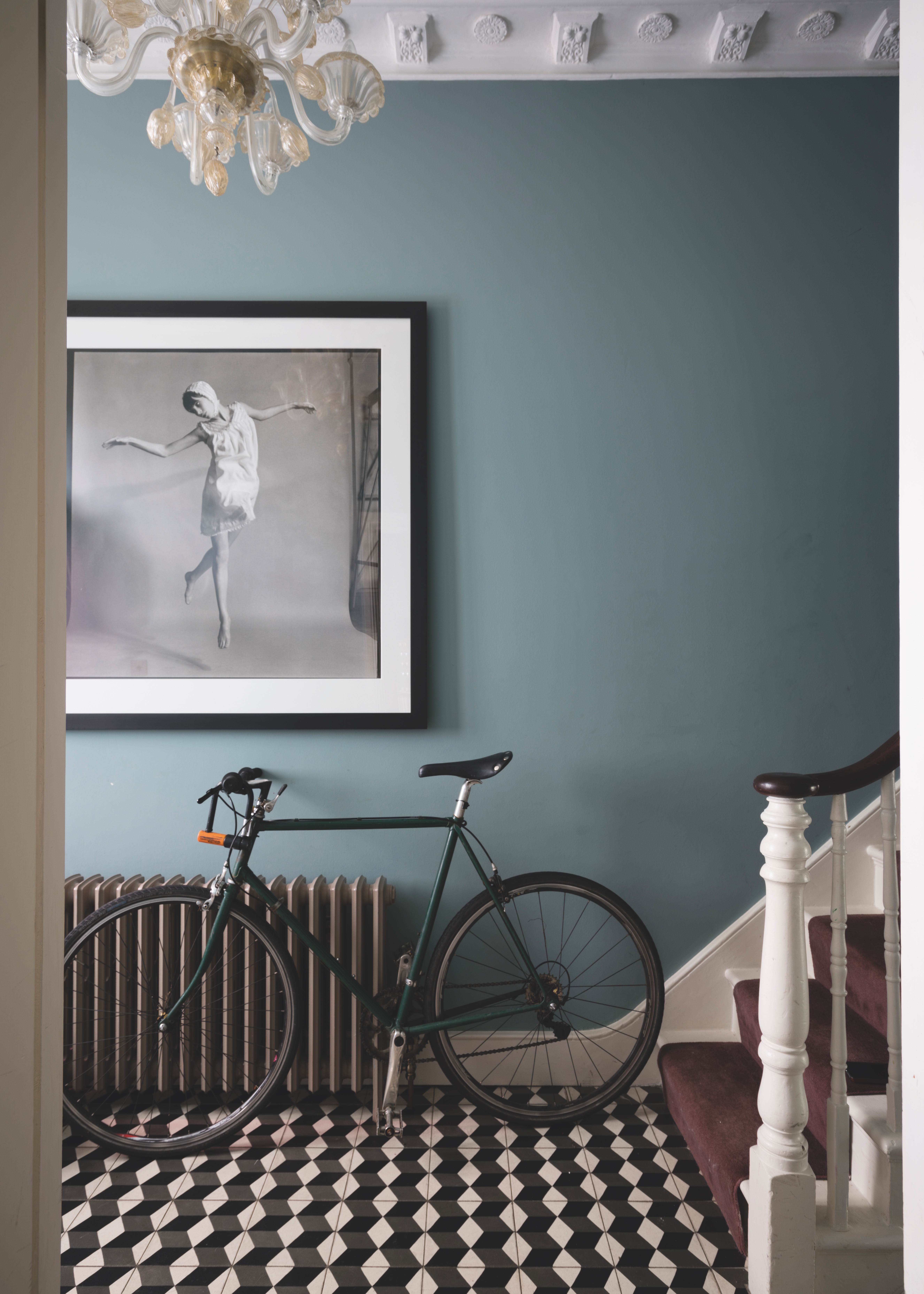
A common misconception with designing small entryways is that you should avoid color altogether. In fact, the best colors for small entryways create an ambience that draws you in. Farrow and Ball's Oval Room Blue is perfect for this. Patrick O'Donnell, Farrow and Ball's Brand Ambassador, says 'entryways are often highly deliberated over when it comes to choosing paint colors. None more so than small spaces where you may be particularly limited by lack of light and space. Narrow entryways can feel cold and cramped, but by selecting the right shades, will be transformed to a space with its own personality.'
The Livingetc newsletters are your inside source for what’s shaping interiors now - and what’s next. Discover trend forecasts, smart style ideas, and curated shopping inspiration that brings design to life. Subscribe today and stay ahead of the curve.
O'Donnell tells us 'for a small entryway, using a mid-toned blue such as Oval Room Blue will create a calming and welcoming entrance, that doesn’t feel at all chilly. With a hint of green, and a dash of black running through it, Oval Room Blue has enough depth to hold its own in a smaller space.'
Order a sample of Oval Room Blue by Farrow and Ball here
3. POINTING BY FARROW AND BALL
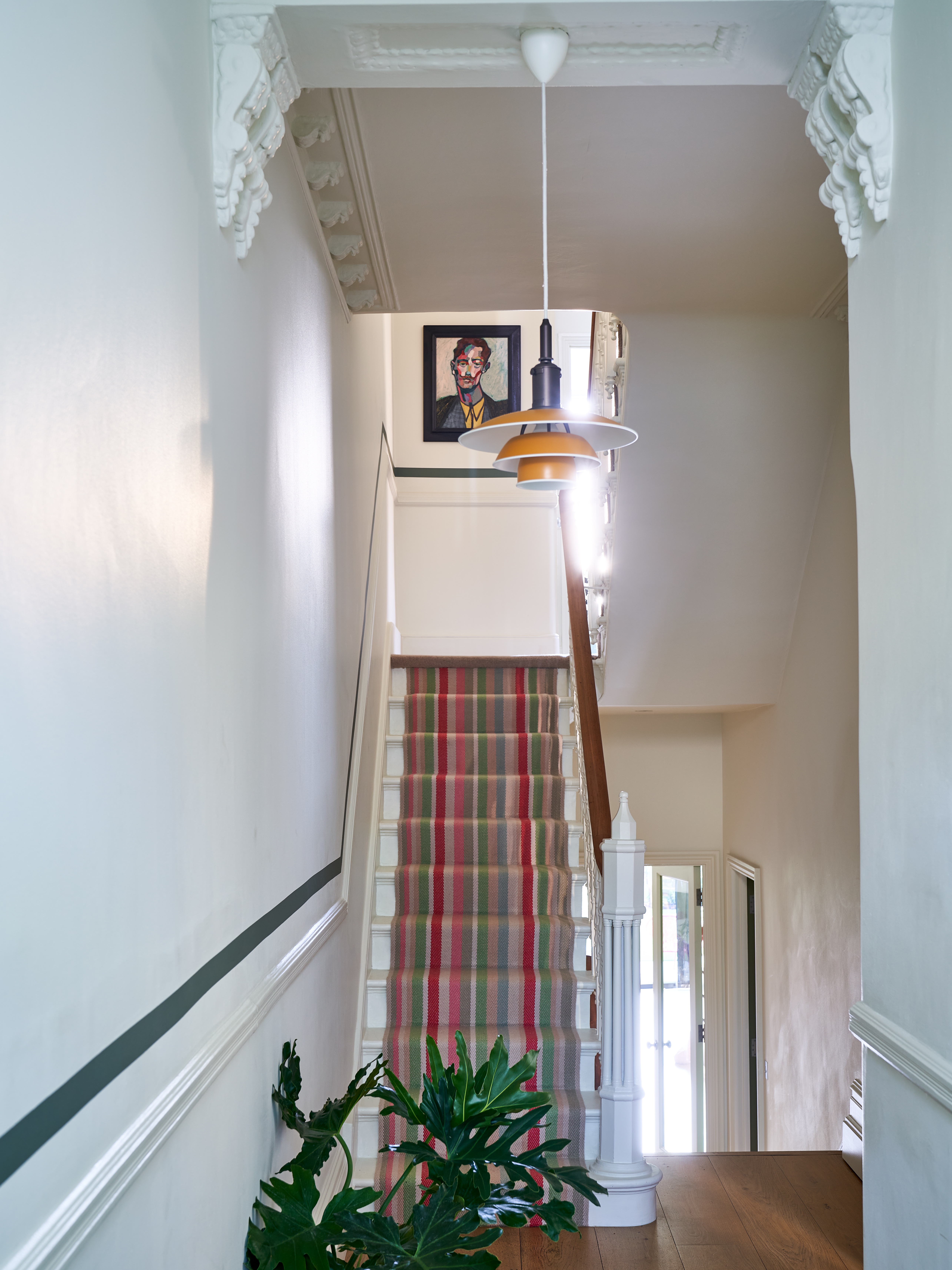
On the flipside, O'Donnell tells us that covering every surface in your entryway with a light color has the power to widen even the most narrow of entryways. 'Whether a small entryway is light and airy, or dark and cool, selecting the right neutral to use across the walls, ceiling and woodwork can be transformative,' O'Donnell says. 'Choose a neutral with a little dose of yellow or red through them, to introduce an element of softness and gentle warmth.'
For this purpose, O'Donnell recommends Farrow and Ball's Pointing, saying: 'Pointing has this warm undertone which will bounce light around the space, and elongate and heighten the walls, especially when used over all surfaces.'
Order a sample of Pointing by Farrow and Ball here.
4. HAGUE BLUE BY FARROW AND BALL

If you are brave enough to go for a dark, moody entryway O'Donnell can recommend the beautiful Hague Blue paint by Farrow and Ball and says to leave fears of a shade as deep as this at the front door. (Check out our gallery of Hague Blue living rooms for more inspiration.)
'Selecting a darker than you dare shade for the walls and woodwork, such as Hague Blue in Dead Flat, will not be as enclosing as might first appear,' O'Donnell says. 'Venturing towards the darker end of the spectrum embraces the limitations of natural light that many entryways suffer from, and creates a spectacularly dramatic impression and also provides a wonderful backdrop for pictures and photographs.'
Order a sample of Hague Blue by Farrow and Ball here.
5. IRONSIDE BY DUTCH BOY PAINTS
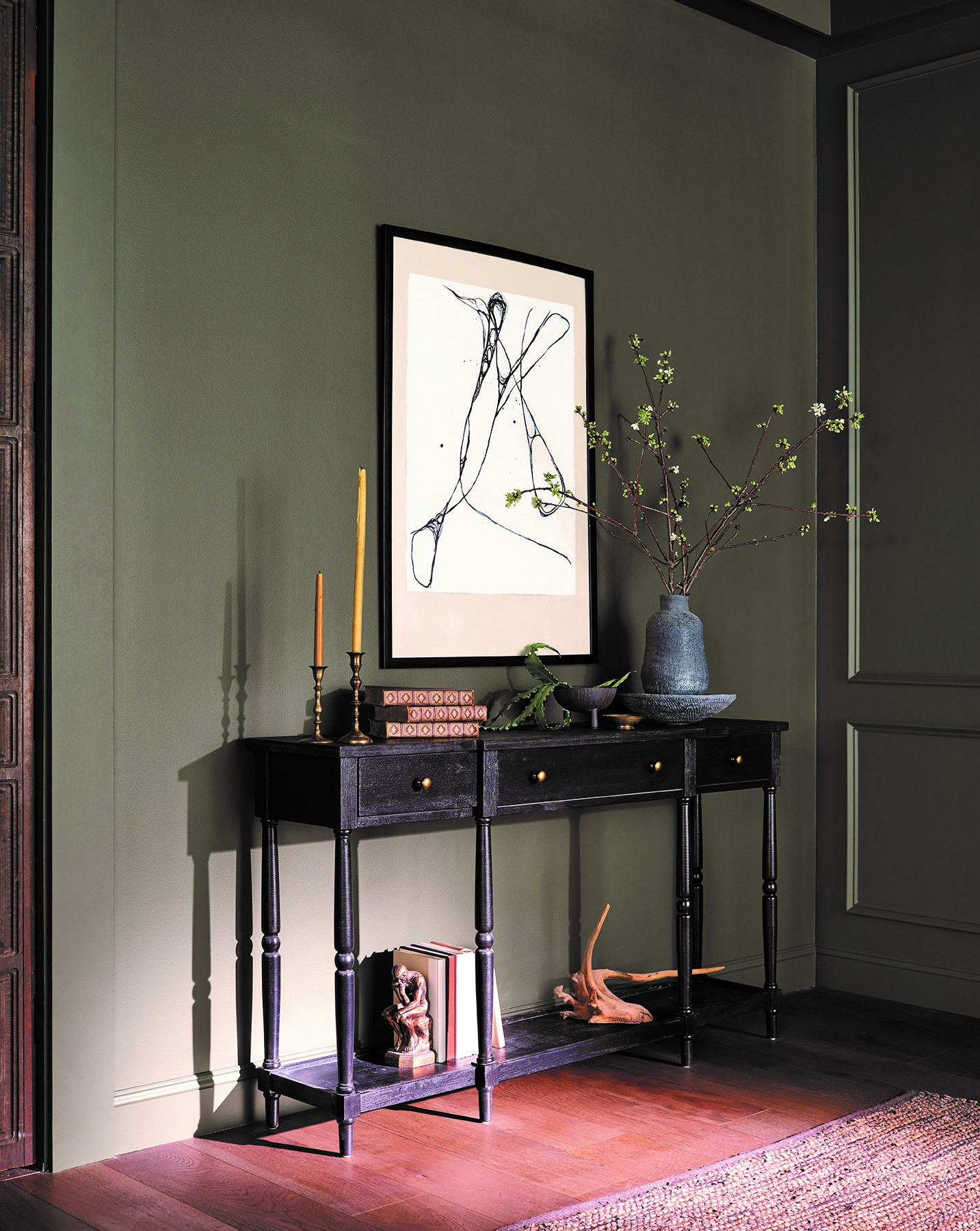
A similarly dark and impactful shade is Dutch Boy® Paint's 2024 Color of the Year - Ironside. Ashley Banbury, Interior Designer at Dutch Boy® Paints, tells us Ironside is 'a deep comfortable shade with olive green undertones' making it perfect in 'rooms that have a place for a sideboard and displaying your favorite décor and art'.
Like Gonçalves' warm terracotta recommendation, an earthy tone like olive can act as a neutral so can cope with being used a backdrop to a small space with accessories or a piece of statement furniture.
Though there is variation in our designers' recommended paint colors, ultimately decide whether you want your entryway to feel dark and moody or bright and expansive, as this can help you choose not only the color, but the shade which will offer your guests that first sense of what your home has to offer.
Katie is a freelance lifestyle writer who has recently finished an MA in Magazine Journalism at City, University of London. Before writing for Livingetc, Katie has gained bylines with The Caterer and The Telegraph and has interned at several lifestyle magazines including Grazia and Red. When not scrolling through Pinterest for interior design inspiration, Katie can be found writing about women's issues, trying out new beauty trends for her blog or seeing a West End show.