What Kitchen Color Should I Choose? 12 Ideas That Feel Right for Schemes in 2025
Transform your cooking space with these modern and unexpected color ideas for kitchens

The Livingetc newsletters are your inside source for what’s shaping interiors now - and what’s next. Discover trend forecasts, smart style ideas, and curated shopping inspiration that brings design to life. Subscribe today and stay ahead of the curve.
You are now subscribed
Your newsletter sign-up was successful
With the right kitchen color ideas, you can completely transform your space — no major renovations or expensive decor updates required. The power of color knows no bounds; it can energize and personalize a room while also changing the entire mood and vibe of the space. Gone are the days of the kitchen being relegated to dull neutrals only. As home decor becomes more experimental, designers are now embracing bold, punchy hues for a space that’s no longer just utilitarian.
Better yet, there’s the vast range of tones to choose from. Those seeking a more restrained, minimalist aesthetic might opt for soft shades like light gray, salmon, or ivory — colors that offer a subtle sense of freshness. Others who want a modern kitchen full of personality can explore a richer palette: think chartreuse, red, purple, black, navy blue, or jewel-toned greens.
Ready to transform your cooking space? Dive into these delectable tones and start designing.
Article continues below1. Yellow
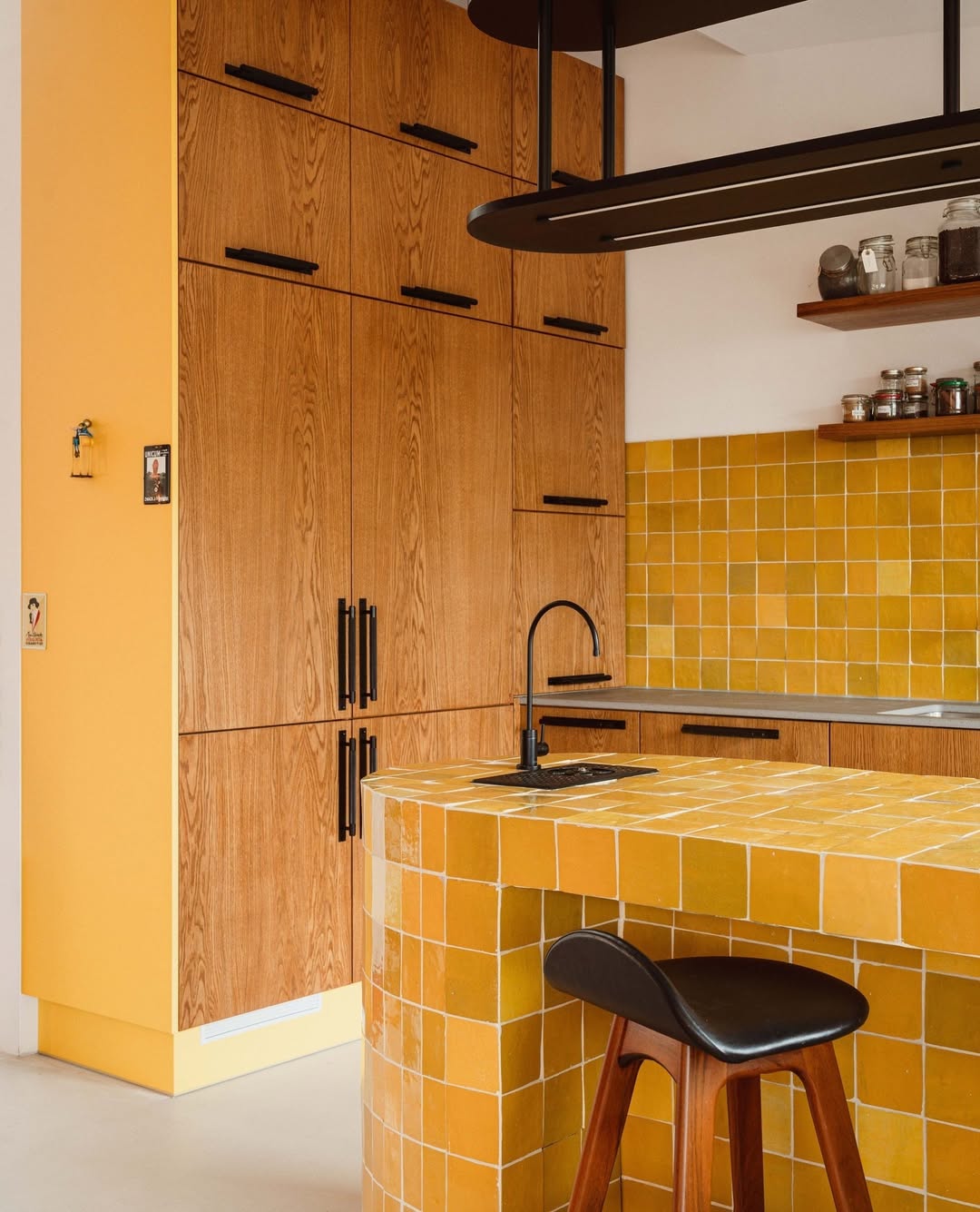
Drenching a space in a bright shade like yellow feels less intimidating when you consider your entire material palette.
Wondering if a yellow kitchen is worth it? Designers say yes — it brings a dose of sunshine to your kitchen year-round. Plus, there are many colors that go with yellow, making it a cheerful and versatile hue to play with.
For those who want to fully embrace this tone, it can be used across multiple surfaces — think walls, kitchen cabinets, islands, and more. But if you'd prefer to tone down its visual impact, even small doses — like yellow accents in decor or grout lines — can make a big difference.
“Introducing yellow by painting just one cupboard is a nice toe in the water — especially if you have muted colors in the rest of the room,” advises Helen Parker, creative director of deVOL. “But going for a full kitchen in butter yellow is my suggestion. As I always say, if you’re going to go for something, then commit fully to it.
"If you’re feeling less brave and prefer a more classic look, butter yellow walls are a good starting point — perhaps paired with soft, creamy yellow cabinets and wooden countertops for an understated, gentle effect. Many people use yellow with white and cream, terracotta floors, and dark wooden worktops — it has that authentic, under-the-stairs charm.”
The Livingetc newsletters are your inside source for what’s shaping interiors now - and what’s next. Discover trend forecasts, smart style ideas, and curated shopping inspiration that brings design to life. Subscribe today and stay ahead of the curve.
2. Gray
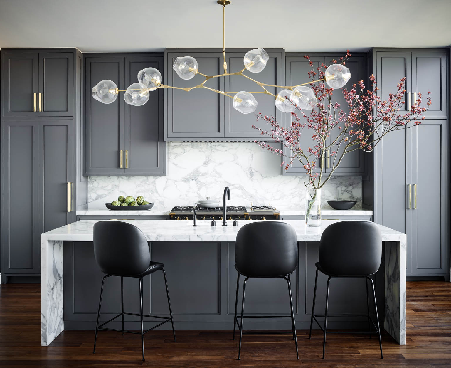
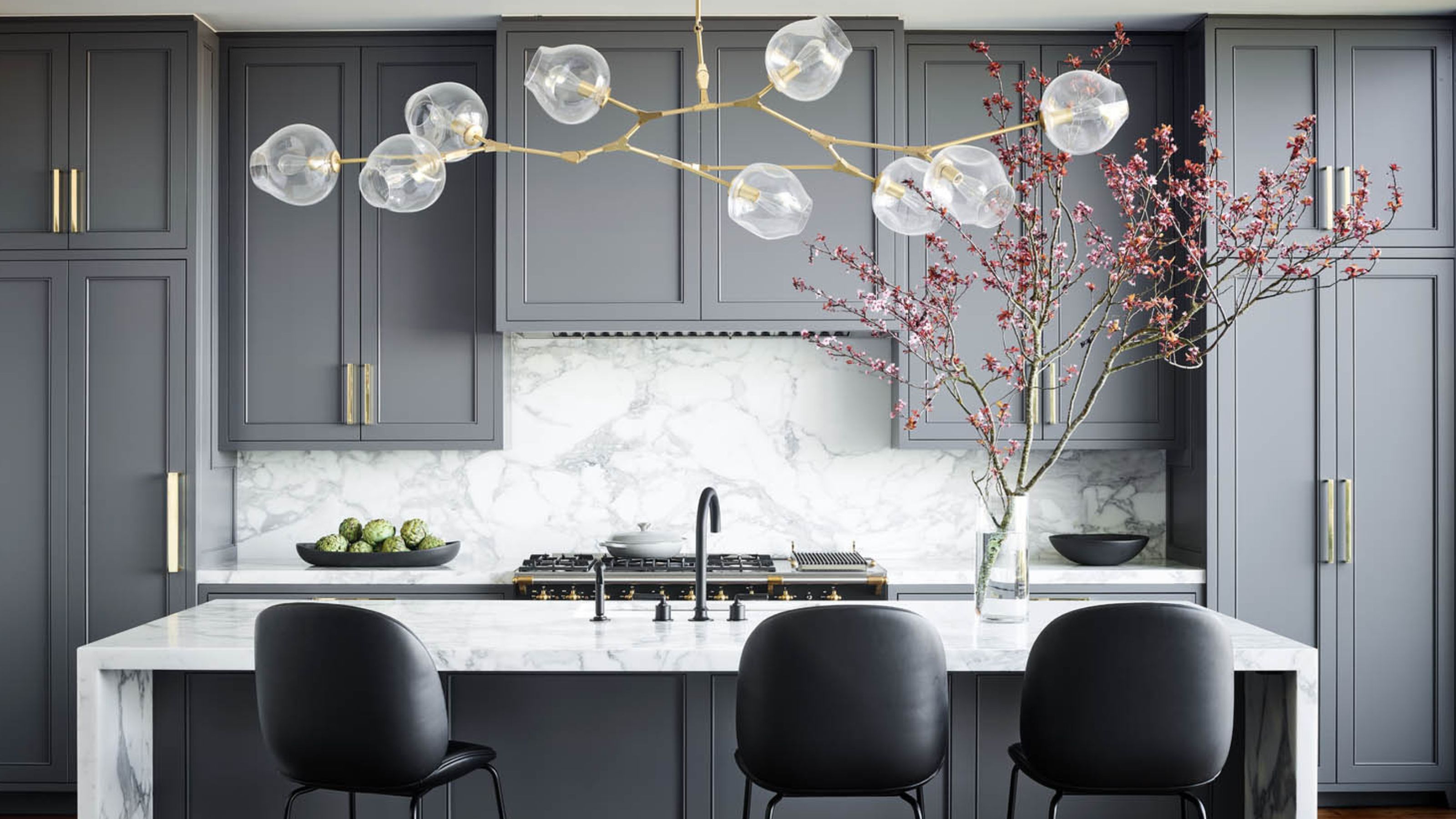
For a moody, calm and restrained kitchen, there is no better hue than a mid-tone gray.
There’s no denying it — gray has been, and will continue to be, a popular neutral hue in homes. A gray kitchen — whether light, charcoal, or mid-tone — can add warmth to the space while offering the perfect contrast to bolder hues like red, orange, or yellow.
It’s also an ideal choice for kitchens in hotter climates, as the lighter variations help keep the space feeling cool and breezy.
“We see homeowners really drawn to warm tones for their kitchens — these colors look equally good on walls and cabinets, and they work beautifully in any sheen,” says Hannah Goldberg of Hannah Charlotte Interiors. “Colors like gray also help hide stains better.”

Looking for a paint with a subtle blue cast reminiscent of a classic suit? The Gray Pinstripe is the perfect tone — it lends a sophisticated vibe to interiors, plays beautifully with natural light, and pairs with a range of other hues. Consider using it in a matte or satin finish for kitchen cabinets.

Farrow & Ball's Down Pipe — named after its traditional use on downpipes and guttering — is a dark, lead gray that offers a sleek, modern edge. It works beautifully on both cabinets and walls. For kitchens and bathrooms, opt for a modern emulsion finish — it's washable, mold-resistant, and built to handle high-humidity areas with ease.
3. Black
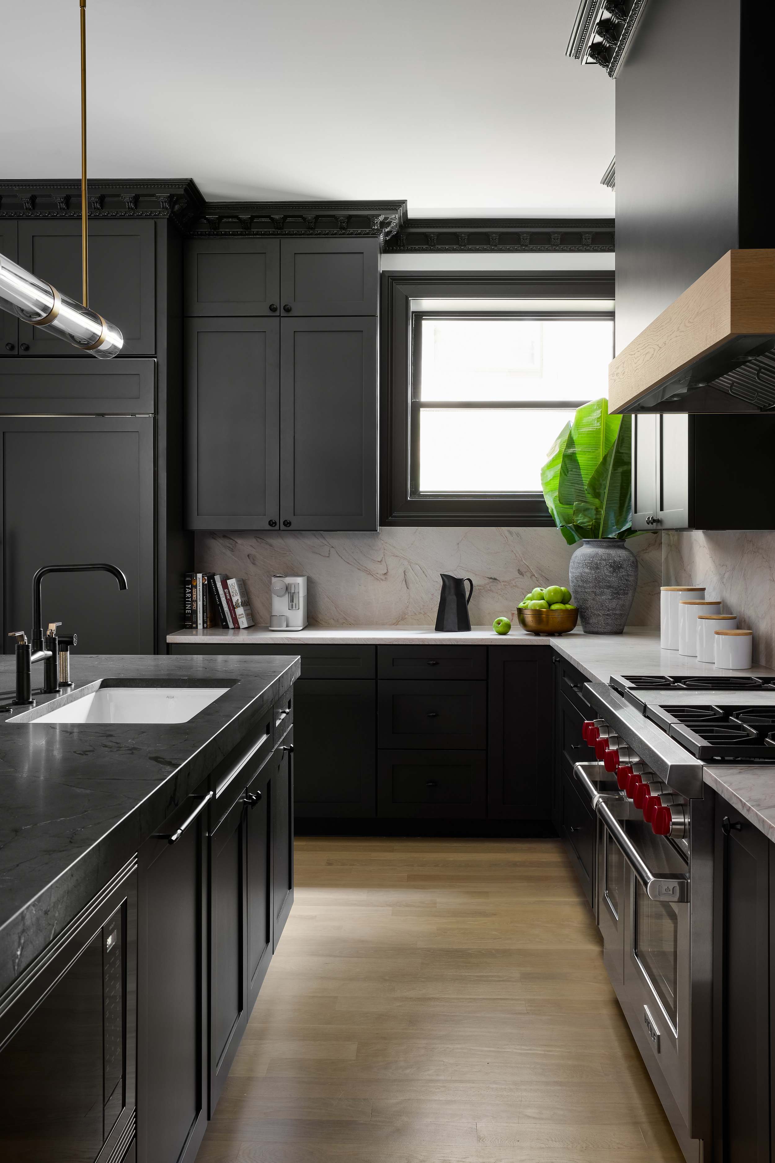
Love the idea of a black kitchen? Go all out and paint the cabinets, counters and even hardware in this striking tone.
Wwhen it comes to decorating our homes, many of us still shy away from using black as more than just an accent color. But in today’s modern interiors, black is increasingly taking center stage — especially in spaces with ample natural light. When used thoughtfully, this tone can feel crisp, dramatic, and elegant.
All-black kitchens aside, you might also consider a two-tone kitchen approach — pairing black with a lighter shade such as white, blush pink, or soft gray to avoid a one-dimensional look. Black also complements wood beautifully, creating a space that feels earthy and inviting.
“This kitchen was designed with a dark tone to evoke a sense of refined drama and timeless sophistication — where bold contrast meets everyday function, creating a luxurious space that feels both grounded and unforgettable,” shares Mark Schubert, founder and principal designer of Phillip Harrison Interiors.

Design has always been a large part of Mark's life. Throughout his formative years, Mark dabbled in multiple mediums of art and design such as photography, sculpture, graphic design, culinary arts, and floral design; through this culmination of experiences, Mark brings a new perspective, pushing the limits and boundaries before him to his projects, and his creative limits within the built environment, throwing any rules out of the window.
4. Burgundy
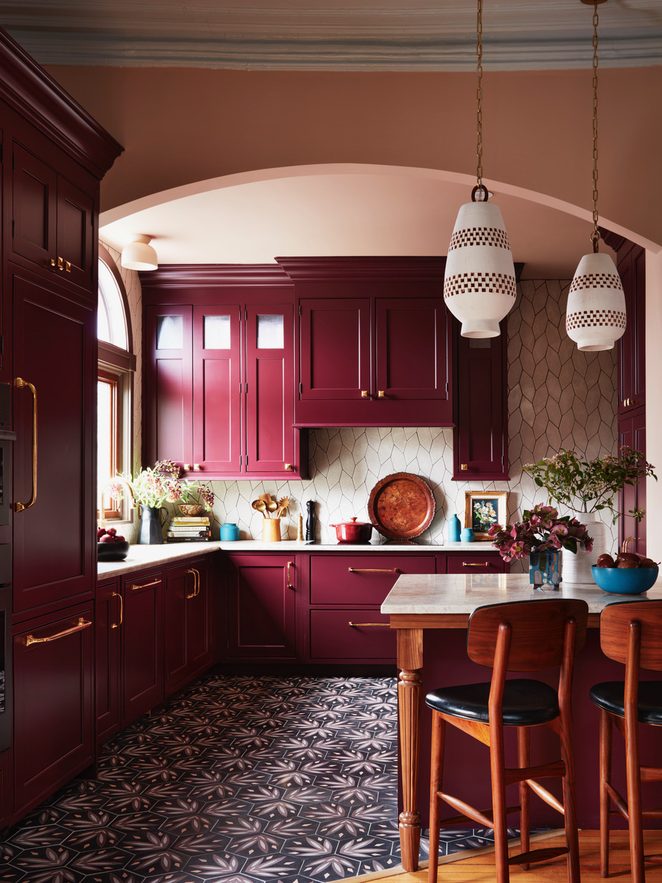
Give your kitchen a luscious, eye-catching look with a burgundy color palette.
Does the burgundy color trend call out to you, too? Many designers — and increasingly, homeowners — are slowly but surely falling in love with this rich, luscious hue. Not only is it on-trend, but it also brings a bold sense of personality to any space.
Once reserved for accent moments in formal rooms, burgundy has now found its way confidently into kitchens — from kitchen countertops and walls to backsplashes — proving that this deep red has serious staying power.
“My clients — a musician with a particular love for Latin jazz, and a nurse — wanted a kitchen with soul, full of personality and spirit,” explains Cecilia Casagrande of Casagrande Studio. “After showing them patterned cement tiles with a Caribbean feel, the rich burgundy of Brinjal by Farrow & Ball, and warm walnut wood, the choice was clear — we used the color for the cabinetry, paired with terracotta pendants, creamy tile, and stone counters for our jazzy clients.”

Cecilia Casagrande founded her interior design and build firm, Casagrande Studio, in 2015 with a mission to guide clients toward comfort, warmth, and functionality. Specializing in historic home design, Cecilia is known for her thoughtful use of color and pattern — often blending family heirlooms and antique pieces into her spaces. Her optimistic, approachable design style continues to deeply resonate with clients seeking homes that feel both personal and timeless.
5. Navy Blue
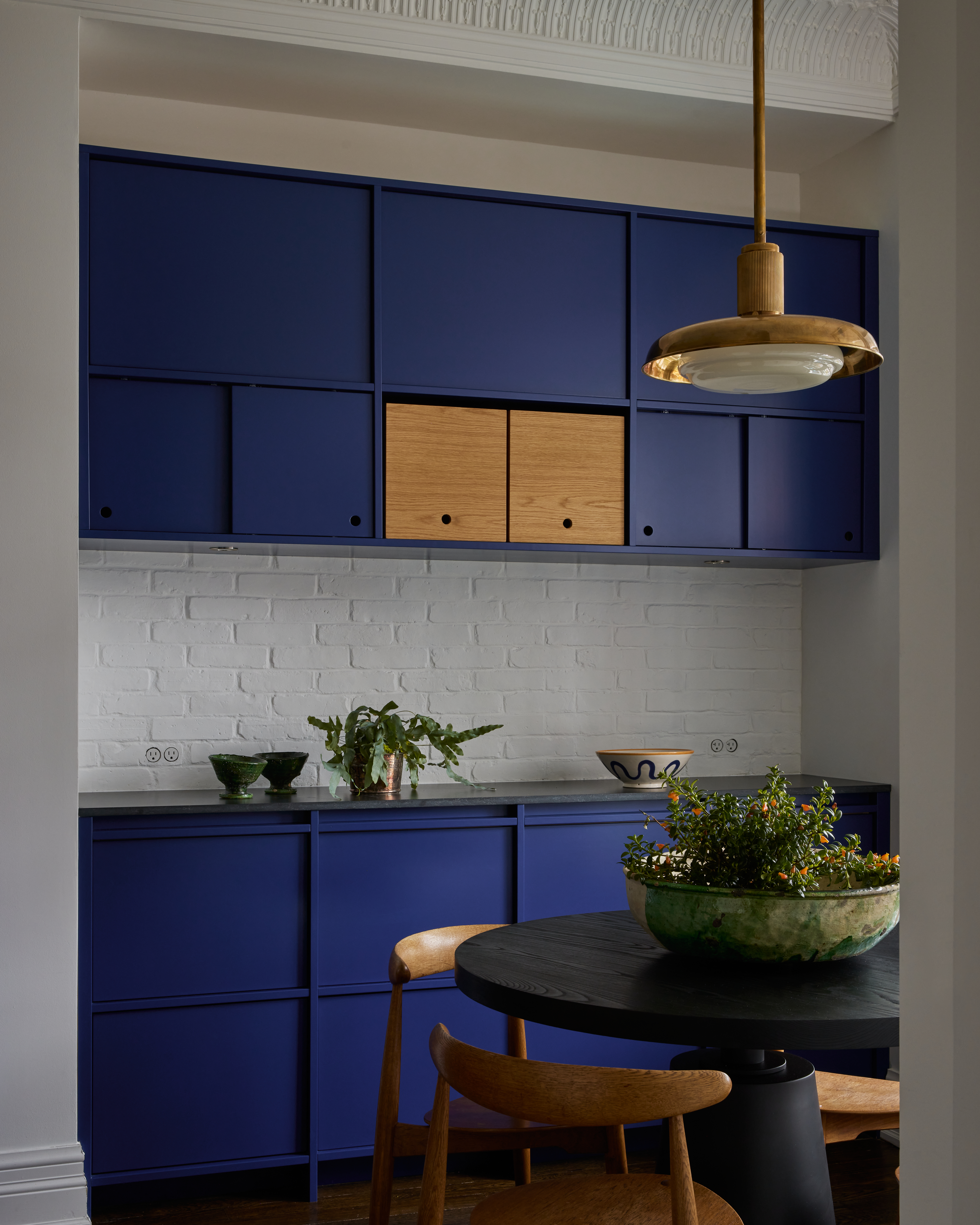
For a timelessly sophisticated look, consider decorating with navy blue in the kitchen, and introduce wood elements to warm up the visuals.
Navy blue is re-emerging as a key color in mainstream home decor — and not because of its nautical roots. This deep, versatile hue carries a smart, sophisticated vibe that feels anything but themed.
Blue kitchens — whether expressed through upholstery, painted furniture finishes, or even fixtures — have a grounded quality and an undeniable charm. Sam Sacks of her eponymous studio paired this tone with crisp white walls to create a subtle yet striking contrast.
“This is my second project for this client,” she shares. “Our previous collaboration came right after my visit to Yves Saint Laurent’s Majorelle Gardens in Marrakesh, where we agreed that Yves Klein blue would be a visual thread throughout the home — and we doubled down on it here. I played up the contradictions — deeply modern fronts are set inside traditional face frames, the backsplash is painted brick (not original), and it meets a lamb’s tongue plaster crown (also not original!). It was all about a series of very carefully weighted contrasts.”
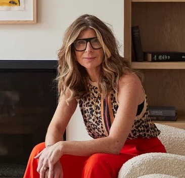
Sam Sacks Design marries fierce creativity with top-tier business acumen, offering a strong creative vision and a wealth of experience. A former magazine editor and consummate storyteller, Sam Sacks' work reflects a deep understanding of her client’s needs, paired with a fundamental knowledge of architectural history, and backed by wild inspiration.

Looking for a strong blue to elevate your kitchen interiors? Consider Hague Blue — named after the richly painted woodwork often seen in Dutch design. This deep, luxurious shade brings drama and pairs especially well with crisp whites and warm wood accents.

Rhapsody, one of the most expensive-looking shades of blue, and named for its meaning of passionate expression, is a rich, deep navy that sets the stage for a strikingly contemporary kitchen. Ideal for spacious, open-plan layouts, this bold hue also complements the charm of period homes, adding depth and sophistication with ease.
6. Emerald Green
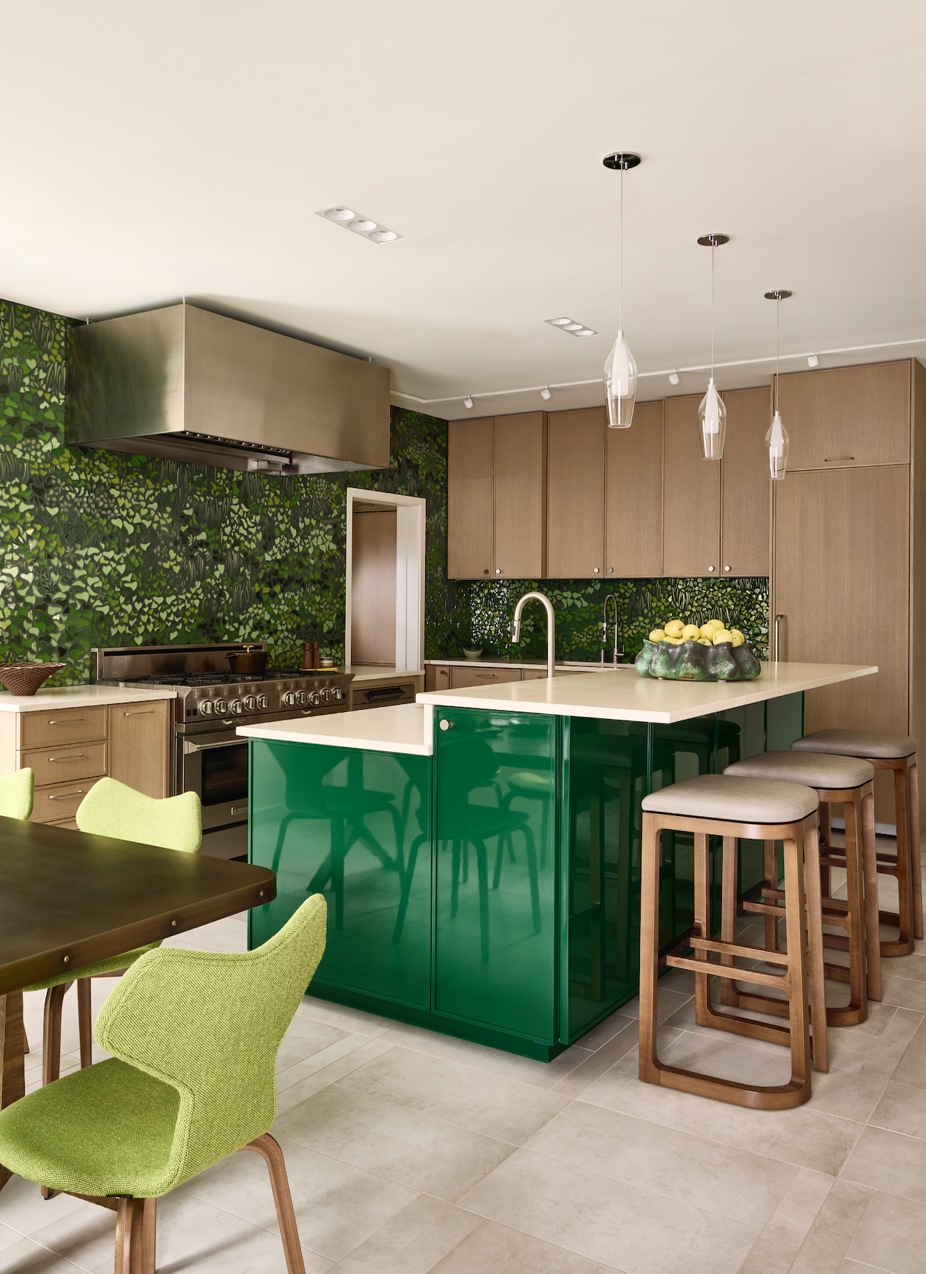
Give your kitchen a jewel-box effect by decorating with emerald green.
A green kitchen naturally pulls the outdoors in, but an emerald green one adds a regal, jewel-like richness to the space that few other colors can match.
“The room’s color scheme was inspired by its proximity to nature,” says Frank Webb, co-founder of White Webb. “The dining table sits in a corner of the room with windows that fully retract to the outer edges, offering an uninterrupted view of the greenery outside. As an extension of that view, we used a gorgeous New Ravenna mosaic in a leafy pattern to create a bridge between inside and out. A glossy emerald green island adds even more punch, serving as a glimmering anchor in the space.”
Want to enhance the color even further? Accenting emerald green with crisp white creates a fresh, clean aesthetic.

A design partnership between a classicist (Matthew White) and a modernist (Frank Webb), White Webb understands the value of blending different perspectives to create beautiful interiors that feel timeless and anything but ordinary. For over two decades, they have built a reputation for artfully mining their clients’ design DNA and delivering stunning residences that reflect the homeowners’ unique style.
7. Olive Green
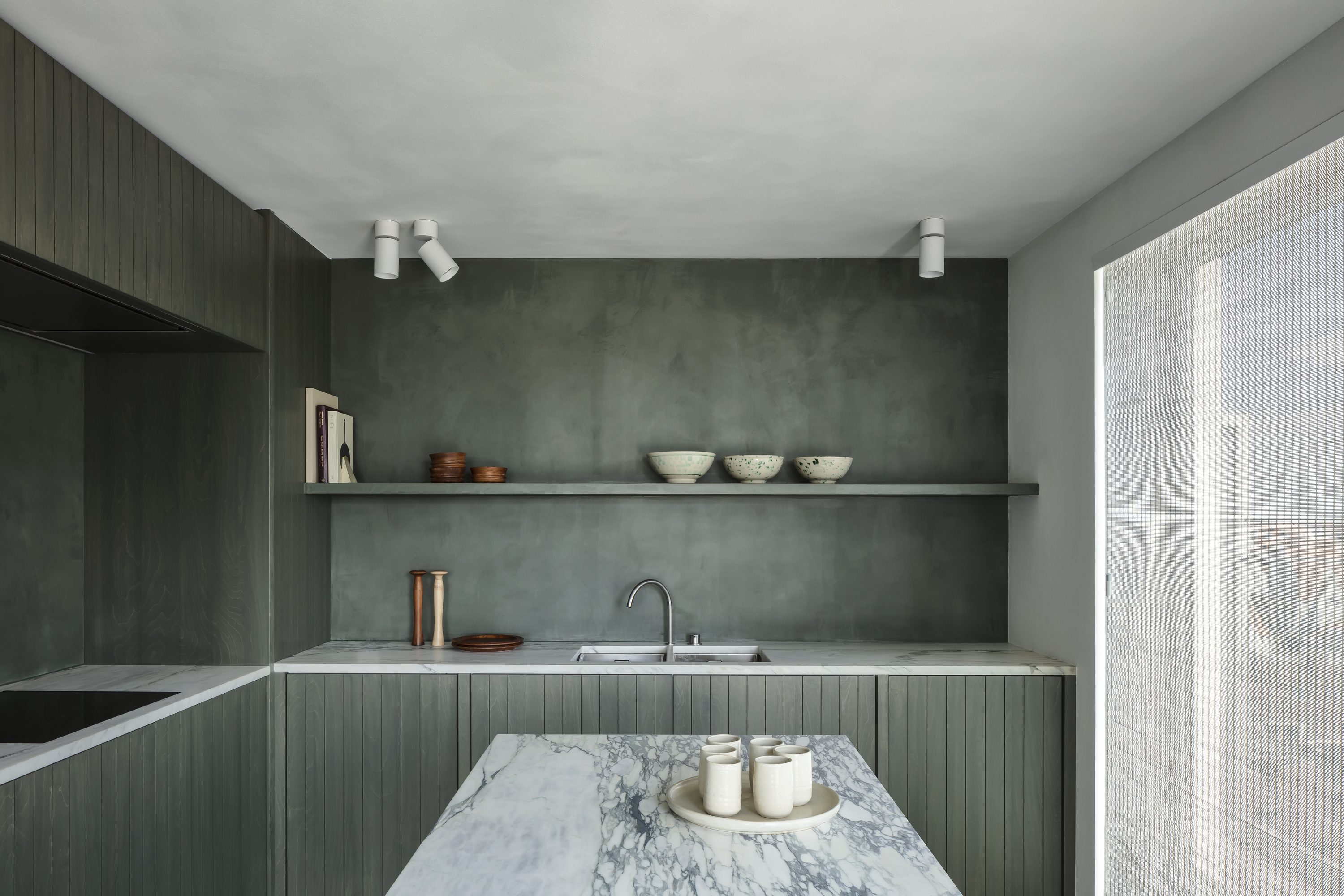
Design a deeply calming kitchen with an olive green palette — make it even more soothing with limewash paint.
Olive green kitchen cabinets and walls carry a charming retro appeal, adding warmth and personality to the space.
“The kitchen is finished in limewash, which creates a calming effect thanks to its acoustic properties and moisture-regulating qualities — it keeps the room from becoming too humid or too dry, which is also very healthy,” says Thomas Geldof of Max Luciano Geldof. “We used natural stone by Eggermont Natuursteen — a white marble with a green vein — for the perfect combination.”
Plus, several colors go with olive green, making it a versatile base color. If the space starts to feel too “muddy,” try soft pink, pale yellow, or even turquoise to freshen up the palette.
8. Light Blue
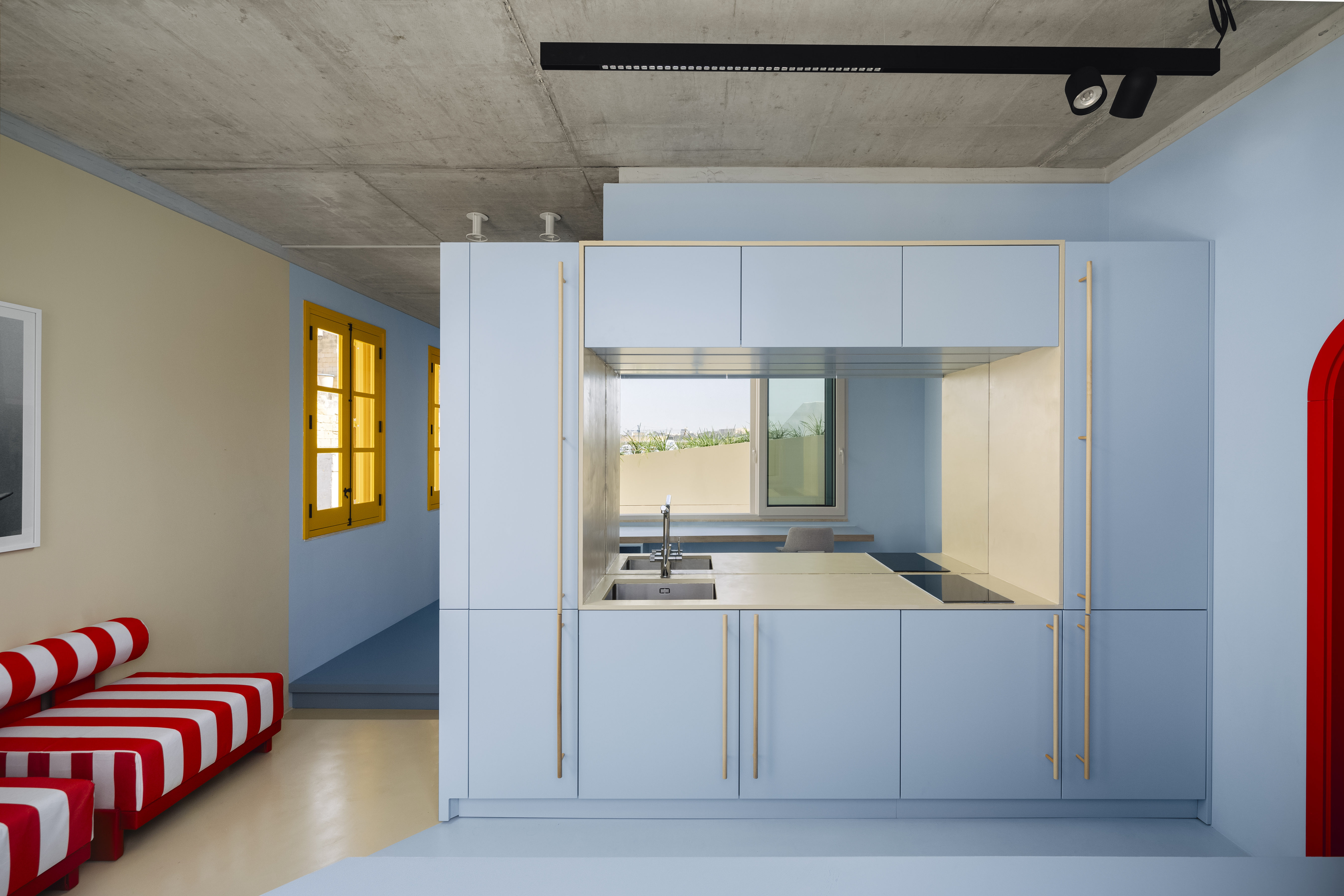
Bring the soothing essence of clear skies and calm waters into your kitchen with a light blue color scheme.
Light blue kitchens have an inherently calming, airy vibe, evoking clear skies and tranquil waters. It’s a wonderful tone to try in an open kitchen that receives plenty of natural light.
In this home designed by Studio NiCHE, the color was used to reinforce a feeling of immersion. “The blue was used to echo the endless Mediterranean sky — creating an enveloping, calming spatial experience,” explains Martina Fenech Adami of Studio NiCHE. “I wanted to establish a seamless dialogue between the interior and exterior, ensuring a natural continuity that merges both environments.”
On walls, light blue has a softening effect, making it a great candidate for color drenching. It works beautifully as a neutral backdrop in eclectic, mid-century-inspired, and modern interiors spaces alike.
9. Pink
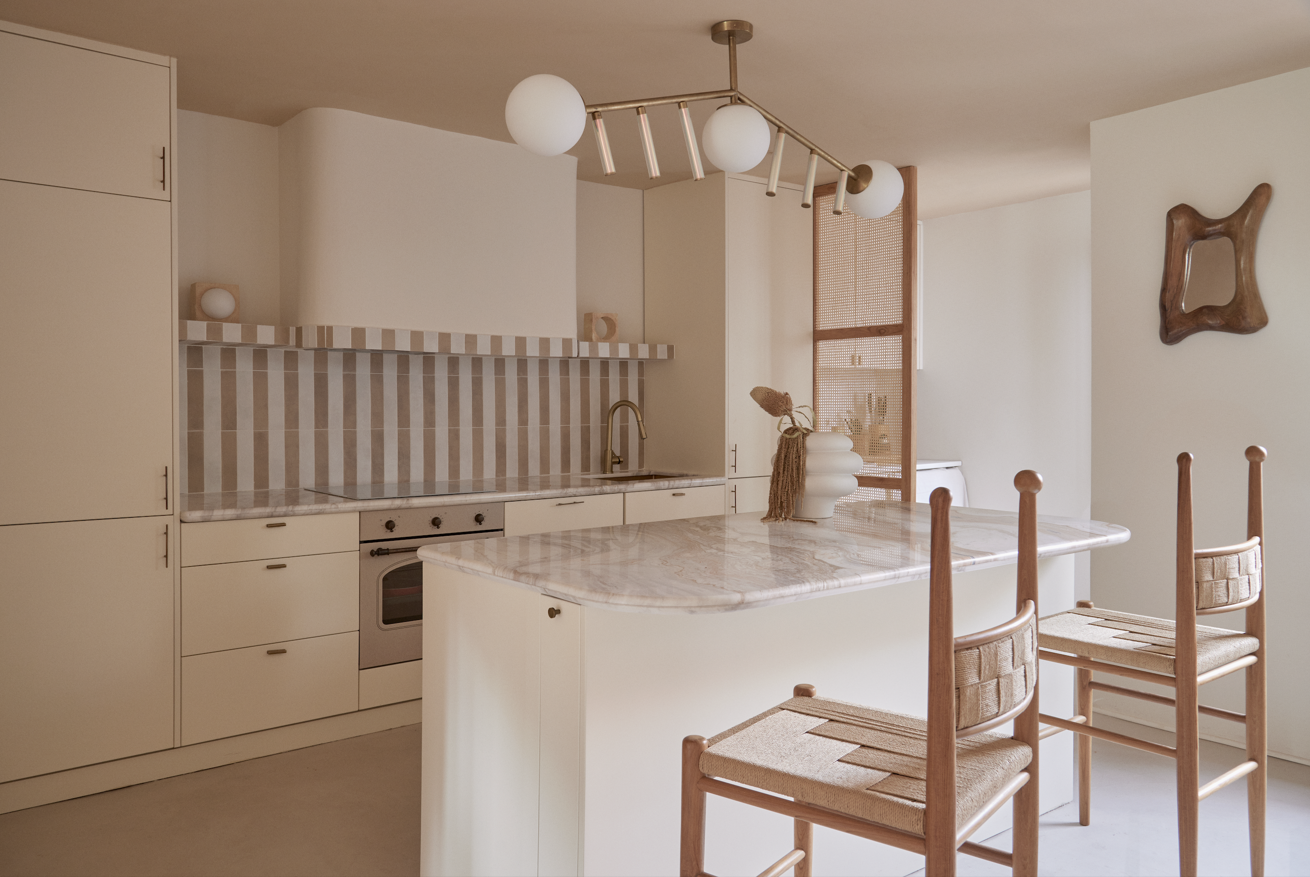
Nothing says elegant and modern than a salmon kitchen color scheme.
Tired of gray and cream in your kitchen, but still want something soothing, with a slightly cheerier twist? Consider a pink kitchen. This rosy hue is growing in popularity among homeowners and designers, and with so many shades of pink available today, there’s never been a better time to experiment — and get a little bold — with your kitchen design.
“The color scheme was designed with a clear premise — to convey a sense of naturalness, warmth, and simplicity, in tune with the values of the owners and their fashion brand,” says Patricia Bustos of Patricia Bustos Studio. “Chromatically, the palette evokes noble and organic materials. The color scheme responds to both an aesthetic and emotional intention — to evoke calmness and character through the humility of craftsmanship.”

An entrepreneur by spirit, passionate and creative by nature, Patricia has felt a calling for design for as long as she can remember. She combines a strong analytical and business-oriented mindset with artistic talents that span fashion design, art, and decoration. A painter and furniture designer by vocation, she currently runs her own interior design studio, where she develops projects for private residences, hotels, restaurants, offices, and retail spaces. Her work has been featured in some of the world’s most prestigious interior design publications and has earned notable industry accolades.
10. Brown
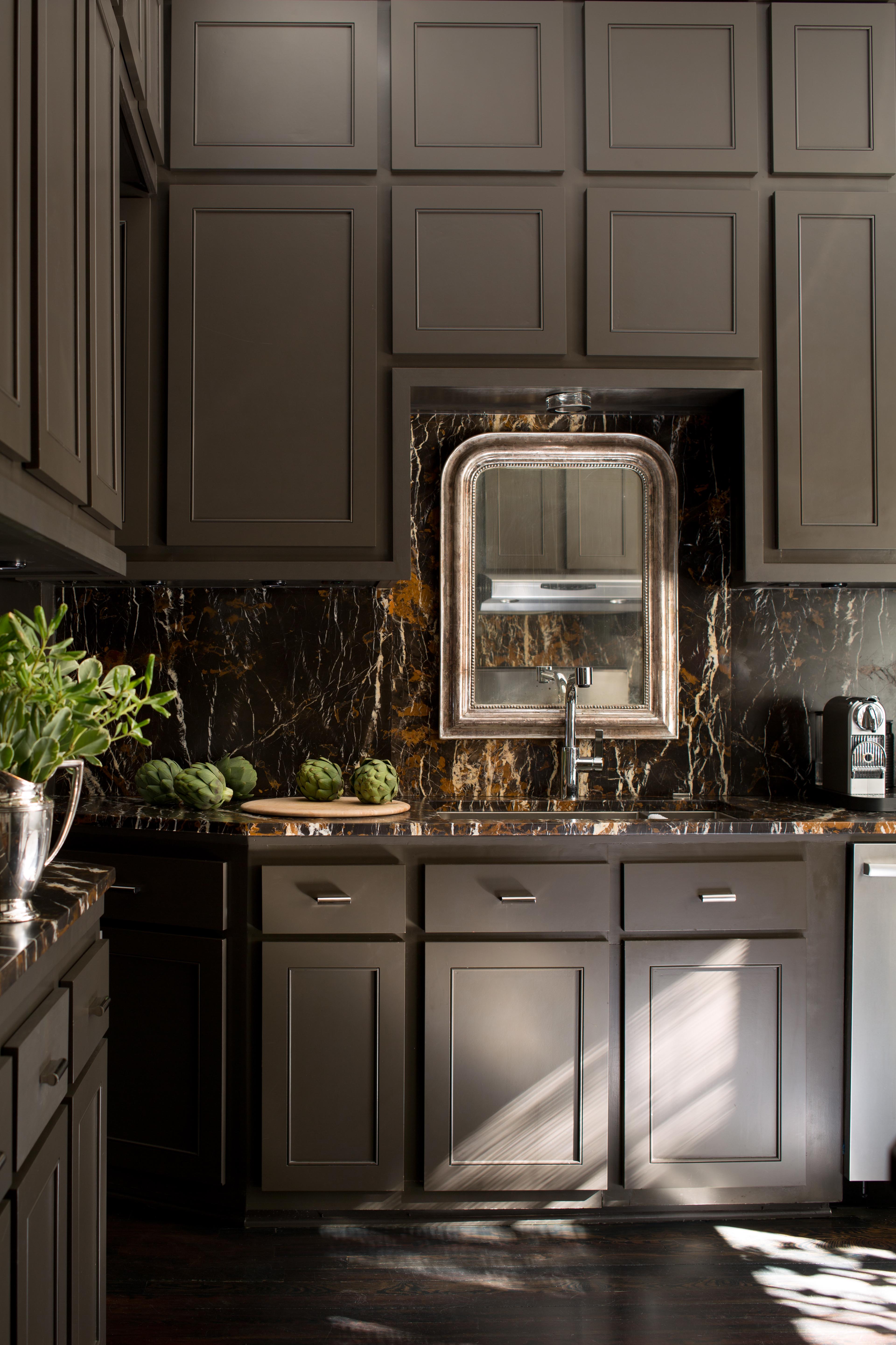
Create a modern, earthy space with a brown kitchen color palette for a sophisticated kitchen color idea.
Warm colors have been making a comeback in home design in recent years, and once-overlooked brown is now one of the most sought-after tones for interiors. Especially well-suited to kitchens, brown pairs beautifully with a range of other colors. Brown kitchen decor represents low-key luxury — a wonderfully restrained yet sophisticated scheme.
“Brown can be a versatile color, making it a great option for kitchens where you’re often working with multiple hard surfaces that aren’t changing,” says Arianna Barone of Benjamin Moore.
“Design elements like tile, countertops, flooring, and hardware should all be taken into consideration when choosing paint colors," Arianna continues. "Since brown is considered relatively neutral, it’s a great alternative to gray or black. Brown can feel more grounding and earthy — or more sophisticated and luxurious — depending on what you pair it with.”
11. Red
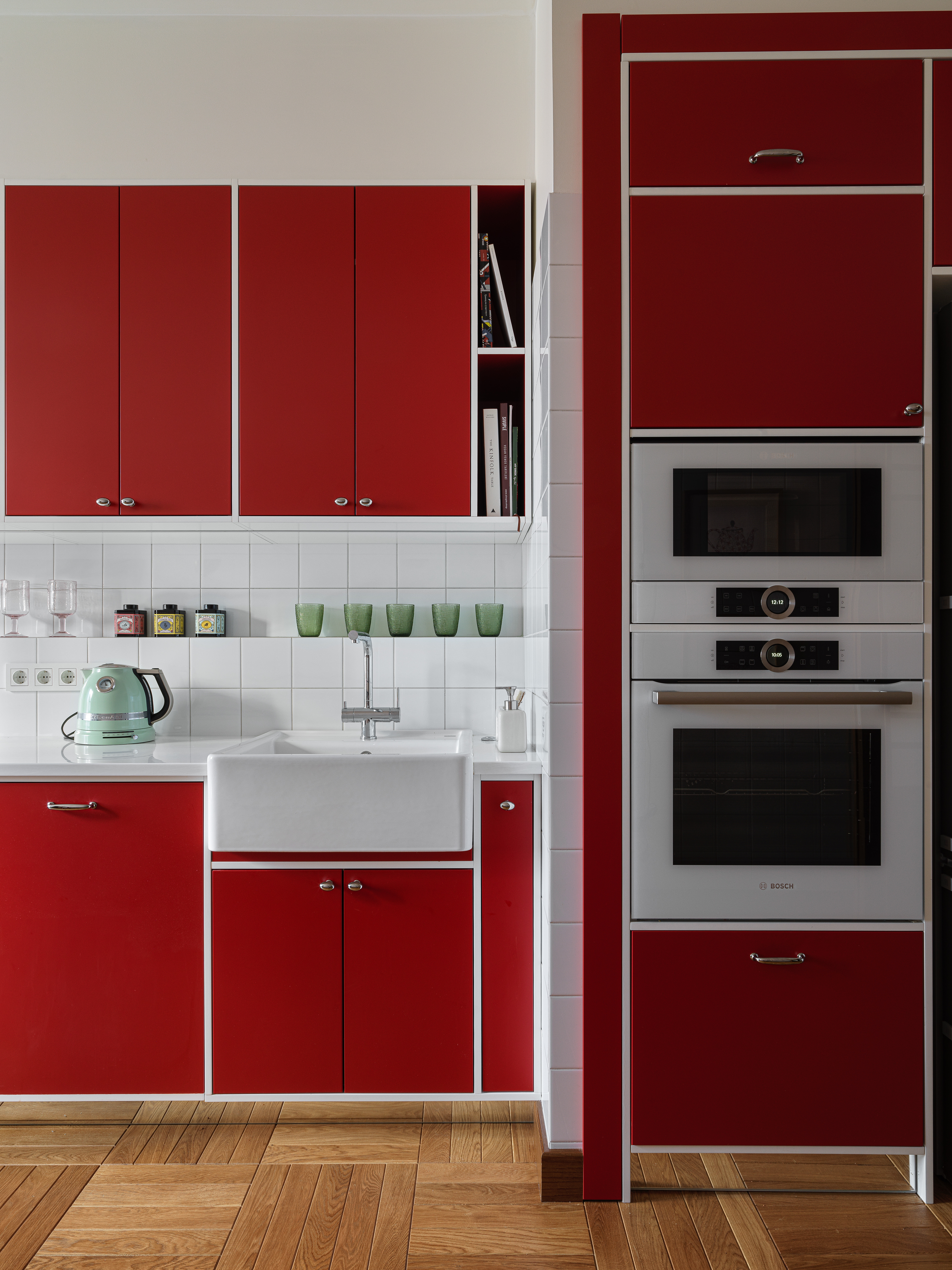
Want to design a kitchen that's the talk of the town? There's no better kitchen color than red.
Agreed, this powerful primary hue might not be for everyone, but trust us, a red kitchen won’t be forgotten easily. Especially if your kitchen doubles as a space for entertaining, red can be a bold and unforgettable choice.
When used wisely, it brings an abundance of love, passion, and warmth. Balance it out with white, cream, or light gray to create a strong yet liveable aesthetic that stands the test of time.
“In this kitchen, we decided to add a splash of red and used non-standard tiles to make the narrow space more enjoyable,” says Elina Musakulov, co-founder of Sdelaemremont. “The bold tone is offset by white walls, and this combination brings a sense of freshness and purity.”
12. Gold
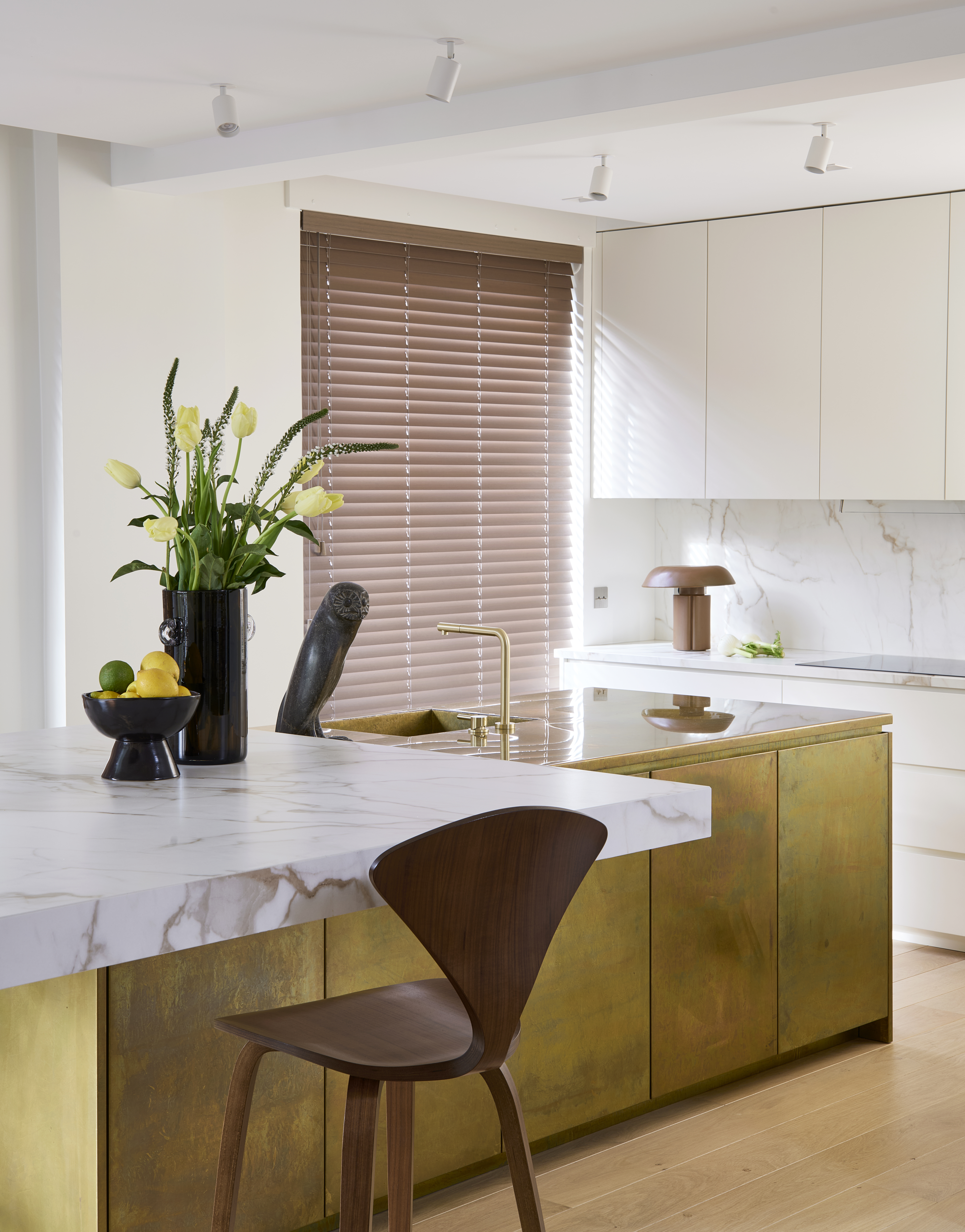
A royal kitchen color idea — gold will add a sophisticated, and "expensive" touch to the kitchen with gold and brass accents.
Let the Midas touch take over your kitchen with gold and brass accents — from accessories and tiles to paint. This is a kitchen color you won’t get tired of anytime soon.
A perfect example is this space by Thibaut Picard Architecte, which demonstrates how to use jewel tones in a balanced way, creating a sense of grandeur without going over the top.
“For this kitchen, we opted for a pared-down design centered around a majestic central brass island,” shares Thibaut Picard of Thibaut Picard Architecte. “A cantilevered marble top appears to levitate above it, serving as a dining table.”
FAQs
What Are the Best Kitchen Colors for Small and Large Kitchens?
In compact kitchens, light and breezy shades such as powder blue, light yellow, soft pink, or warm white can make the space feel more open and inviting. Reflective surfaces and semi-gloss finishes further brighten the room.
For larger kitchens, deeper tones like forest green, navy, or wine red add character and sophistication, especially when paired with natural wood. Two-tone color schemes or full-saturation approaches work well too, adding depth and visual interest to the expansive layout.
Selecting the right kitchen colors can transform the mood, function, and feel of your space. Whether you lean toward soft neutrals or bold, dramatic hues, balance is key for an appealing, colorful kitchen.
Let light, layout, and personality guide your palette for a kitchen that truly feels like home. And for a little more color inspo, the latest color trends should do the trick.

Aditi Sharma Maheshwari started her career at The Address (The Times of India), a tabloid on interiors and art. She wrote profiles of Indian artists, designers, and architects, and covered inspiring houses and commercial properties. After four years, she moved to ELLE DECOR as a senior features writer, where she contributed to the magazine and website, and also worked alongside the events team on India Design ID — the brand’s 10-day, annual design show. She wrote across topics: from designer interviews, and house tours, to new product launches, shopping pages, and reviews. After three years, she was hired as the senior editor at Houzz. The website content focused on practical advice on decorating the home and making design feel more approachable. She created fresh series on budget buys, design hacks, and DIYs, all backed with expert advice. Equipped with sizable knowledge of the industry and with a good network, she moved to Architectural Digest (Conde Nast) as the digital editor. The publication's focus was on high-end design, and her content highlighted A-listers, starchitects, and high-concept products, all customized for an audience that loves and invests in luxury. After a two-year stint, she moved to the UK and was hired at Livingetc as a design editor. She now freelances for a variety of interiors publications.
