Behind the Design: Frieda Gormley of House of Hackney on the story of how her classic Palmeral print came to be
The Palmeral design from House of Hackney launched a maximalist movement. Here's how it came to be

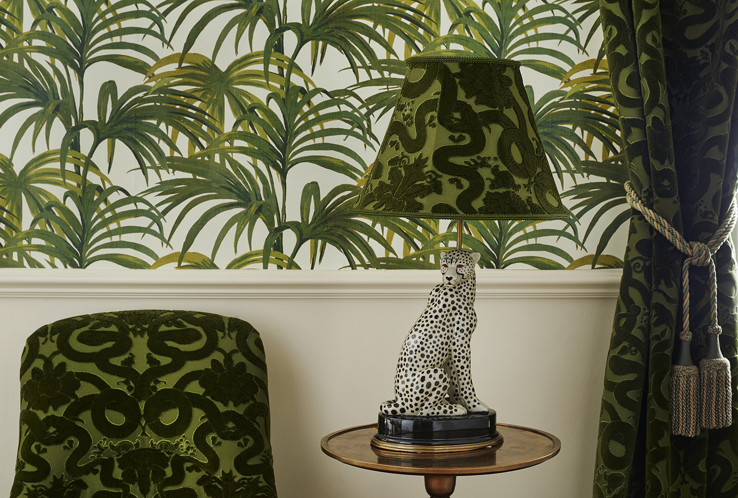
The House of Hackney Palmeral print is an iconic piece of modern interior design. Created in 2012 when Frieda and Javvy Gormley's business was just a year old, it came at a time when maximalism was only beginning to take hold. It was an era of flamingo motifs, poodle-shaped coffee tables (yes, really) and, fuelled by the can-do attitude that was borne of necessity after the recession, fledgling brand House of Hackney helped give the movement some class.
Now, the pair have fans all over the world and are continuing to design fantastic patterns and pieces. Here, in Frieda's own words, is how the Palmeral print came to be.
My husband Javvy and I launched House of Hackney in 2011 on a bit of a whim – doing up our home (in Hackney) was the catalyst as we couldn’t find the type of wallpapers that we wanted to decorate with. We felt that after ten years of minimalism and austerity that we didn’t want to be in a white box anymore, we very much wanted to surround ourselves with colour and a sense of nostalgia.
Bringing the outdoors into the home was really important to us as we had very little outdoor space. The late 2000s was the time when people were into the trend of indoor plants – we wanted to do it through print. It was the era when Ikea was having a big moment with its disposable identikits, and on the other end of the spectrum were the luxury fabrics and wallpapers at Design Centre Chelsea Harbour – as much as we valued the artistry, quality and heritage of those designs, they were too close to our parents’ living rooms.
So we left our jobs – I was working in fashion buying and Javvy in product design – and started this crazy ride! As a couple, I knew Javvy and I would make a good professional team, although we needed to put a few boundaries in place – stop checking emails in bed and don’t mention work after six o’clock!
We had just had our first child, so I call those years the baby stage, because it was the baby stage of the children, and baby stage of the business. It was a tough and humbling phase because it was so hand to mouth.
Frieda Gormley
Our first collection had quite a Victoriana mood – dark and decorative – and then came Pameral in 2012. We had just had our first child, so I call those years the baby stage, because it was the baby stage of the children, and baby stage of the business. It was a tough and humbling phase because it was so hand to mouth. The brand was completely integrated with our lives, the team was just myself, Javvy and one other and between us we wore every hat in the business, dealing with the orders, the purchasing, the customers, the shipping…
The brand was built on word of mouth, and slowly, slowly it took. We were using our home as a showroom as we couldn’t afford a shop – it was the House of Hackney – and we decorated three rooms downstairs in different patterns so people could visit by appointment. We had this magical front of house and an incredibly shabby back of house – it was very much smoke and mirrors!
The Livingetc newsletters are your inside source for what’s shaping interiors now - and what’s next. Discover trend forecasts, smart style ideas, and curated shopping inspiration that brings design to life. Subscribe today and stay ahead of the curve.
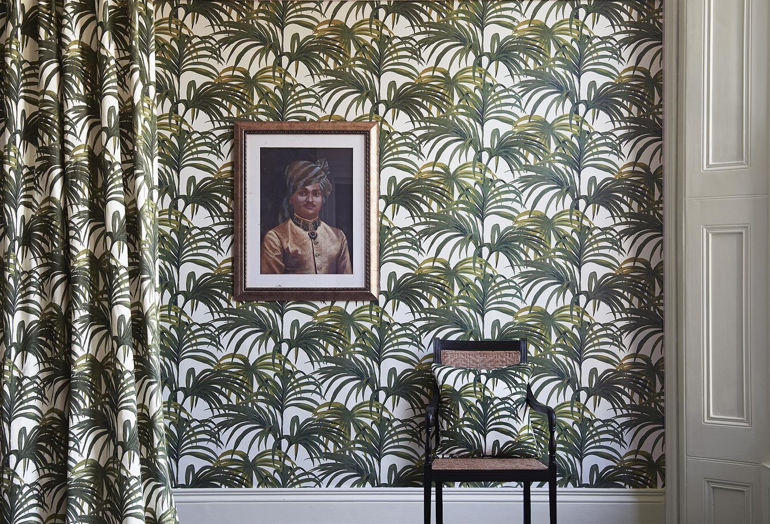
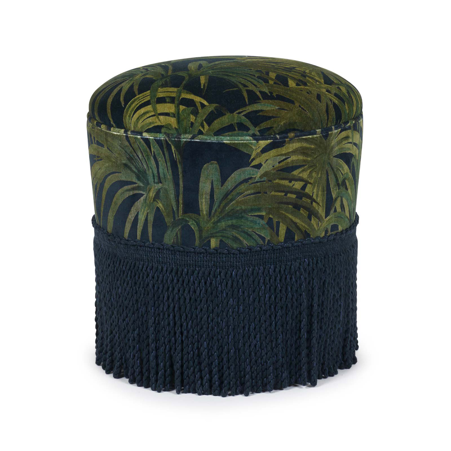
Palmeral was inspired by a patio print textile from 1950s America, a painterly palm design which I saw framed on the wall of an office. It had been there for donkeys’ years going completely unnoticed but it just really resonated with me, I thought it was so beautiful in its simplicity, it felt nostalgic but exotic. I find that inspiration usually comes from flashes of the everyday. Javvy drew it up and I designed the colours, those really verdant greens.
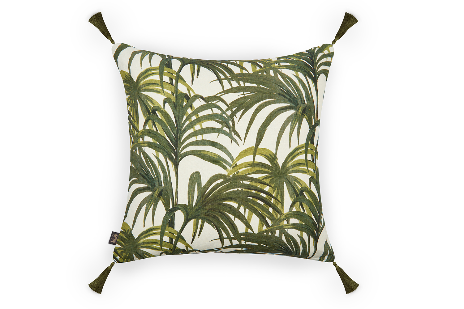
Buy this Palmeral cushion by House of Hackney from Liberty, here
It became the print that lured in the minimalists. It was quite a step away from our original Victoriana look. House of Hackney was, and is, a backlash to the white wall, and the relative simplicity of Palmeral bridged the gap between minimalist and maximalist. Our designs were such brave propositions that people needed a bit of handholding to go from a white wall to something more interesting. Our movement was not about the feature wall, it was about all four walls, very much the full shebang – the feature wall thing had been done in the early 2000s, although of course lots of people did Palmeral feature walls as their entry point into the world of wallpaper ideas. People were getting bolder, almost getting the bug, decorating spaces like the bathroom or the downstairs loo, and as a next step going for the full room.
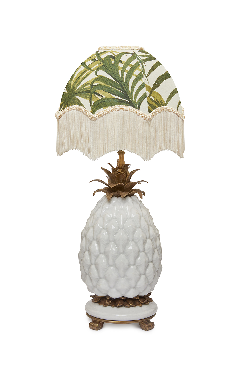
Buy the Palemeral lampshade from House of Hackney, here
We were pretty much the first brand to launch the big palm movement, which became a massive print trend and ultimately got copied mercilessly
Frieda Gormley
We initially launched Palmeral as wallpaper, which we always did back then as we needed to get positive feedback before extending the collection, because it was all so cash intensive and we couldn’t afford to make a wrong move with a print. Then fabric came once we got such a glorious reaction – people absolutely loved it – then cushions and lampshades. By that time, Liberty had taken a chance on us and given us a space where we displayed it, and globally it went into Lane Crawford and Bergdorf Goodman.
Palmeral spoke to a phenomenally wide audience and brought in customers from all around the world. I always remember the late publisher and philanthropist Felix Dennis did a whole feature on his home in Mustique with it. It was being used in beach huts, Scandi cabins, and everything in between. It went everywhere and suited so many different backdrops. It was really exciting to see.
We were pretty much the first brand to launch the big palm movement, which became a massive print trend and ultimately got copied mercilessly (and ended up on a lot of high street clothing). We had to run a campaign which said ‘there is only one Palmeral’, because it was being copied so often! We had a bit of fun with it.
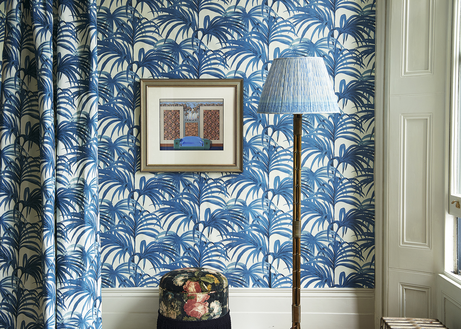
It came in a light Ecru colourway, as well as the darker Midnight & Green. It was during that moment when all of London was painting their homes in the Stiffkey Blue, the Farrow & Ball inky, navy colour, so the deeper shades fitted really well into that as an urban scheme.
Before we started the brand, we spent a year travelling around the UK knocking on doors to find manufacturers, it was like a wild goose chase because we didn’t know any of the supply base. We just followed the map of where textiles had traditional been made and were very happy to find those artisan factories still in operation! Our fabric is printed in Lancashire, our furniture made in Loughborough, lampshades are handmade in Wales and we only use British velvet. The wallpaper is made in Sweden because its imbued with so much colour, and the only digital printer at the time that had the capability to produce it was a printer in Sweden, the Swedes do it so well.
Palmeral widened our audience quite quickly, and its success signaled that it was time to get a showroom, so we moved into our Shoreditch shop at the end of 2013. Our first window was decorated in Palmeral, and we had the team dressed head to toe in it and we even created a Palmeral taxi for the launch.
The first customer through the shop door was actually Biba founder Barbara Hulanicki, I remember her loving Palmeral. The story of Biba was such a huge inspiration to us, bringing that magic and otherworldliness into retail, so it was amazing that she was literally the first person at our front door.
Palmeral really put the brand on the map and opened up the market for us, I’m very grateful to it. The design gets called ‘iconic’ a lot, and I always laugh because it feels too young to be iconic, but I’ll take it! People call themselves House of Hackney addicts – I think the addiction started with Palmeral.
See the full House of Hackney range here
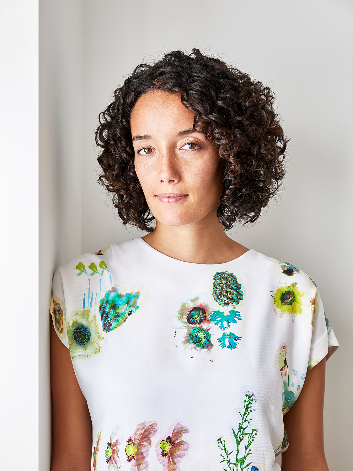
Amy Moorea Wong is a color authority and contemporary interior design writer who has specialized in all things decorating for over a decade. Amy is Livingetc magazine’s Colour Expert, Interiors Editor at The Glossary magazine and a Contributing Editor at Homes & Gardens magazine, and she frequently contributes to an array of global publications to share her insights on interior design zeitgeist. Her book Kaleidoscope: Modern Homes in Every Colour explores a collection of cool colorful homes fizzing with creativity, surprises, and inspiration.
