Should I paint an entryway light or dark? Here’s what the experts suggest
Set the tone by painting your hallway a comforting color that suits the rest of your home. We asked the experts what they think

The Livingetc newsletters are your inside source for what’s shaping interiors now - and what’s next. Discover trend forecasts, smart style ideas, and curated shopping inspiration that brings design to life. Subscribe today and stay ahead of the curve.
You are now subscribed
Your newsletter sign-up was successful
Entryways act as a lens for how we interpret the rest of a home. An entryway should create a warm welcome and feel inviting but according to the experts, is the best way to achieve this to paint a hallway light or dark?
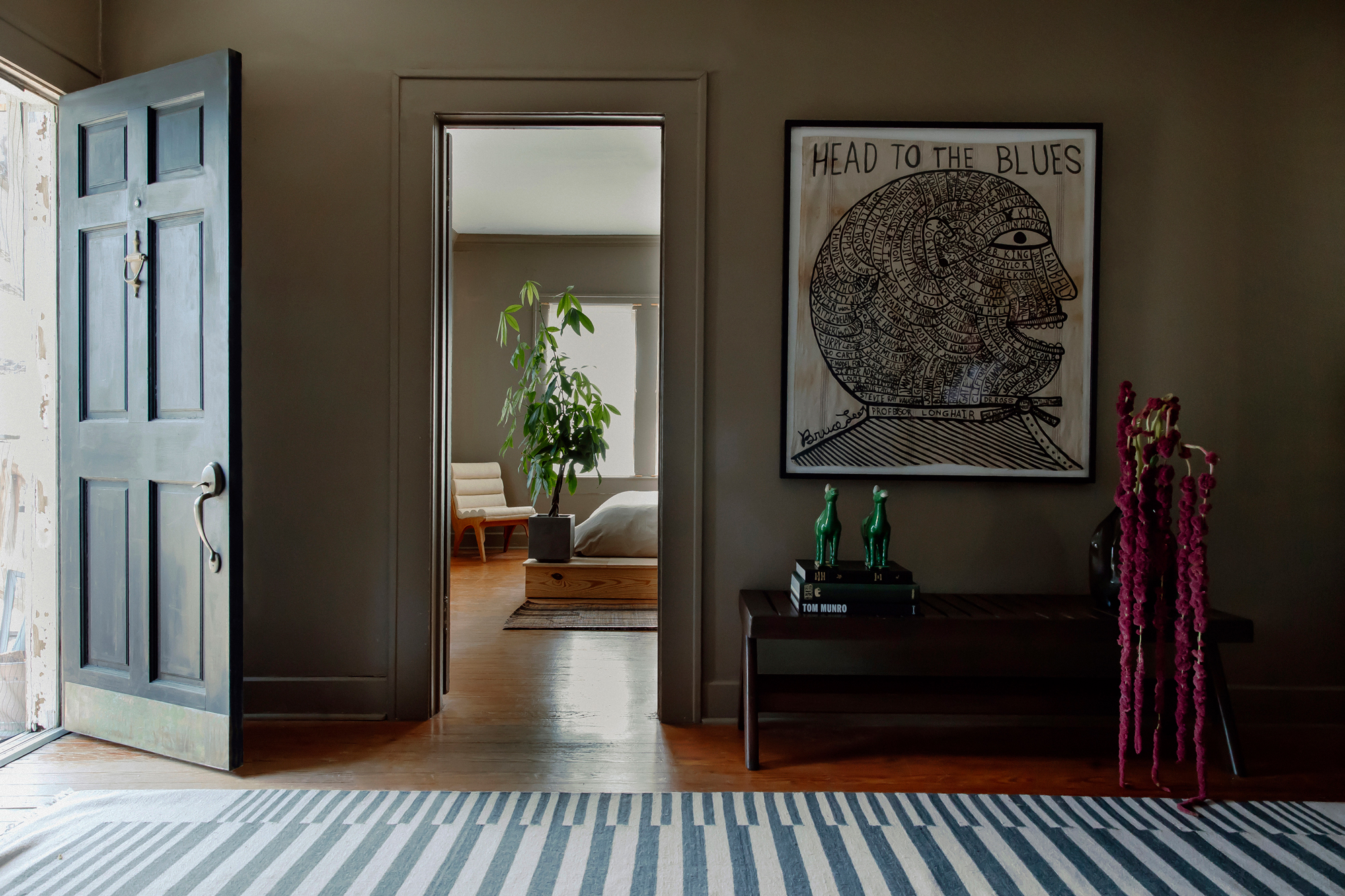
Like most interior design decisions, this is likely to be dependant on many factors. If your home boasts a darker color palette then painting an entryway dark may look more cohesive. Alternatively, if your entryway lacks space and grandeur, keeping things light and bright perhaps will make more design sense.
Considering the practicalities of a space will only get you so far. How do you want your entryway to feel and what desired affect do you want it to have on you and your guests? We spoke to experts who make their light or dark suggestions.
1. Consider the space
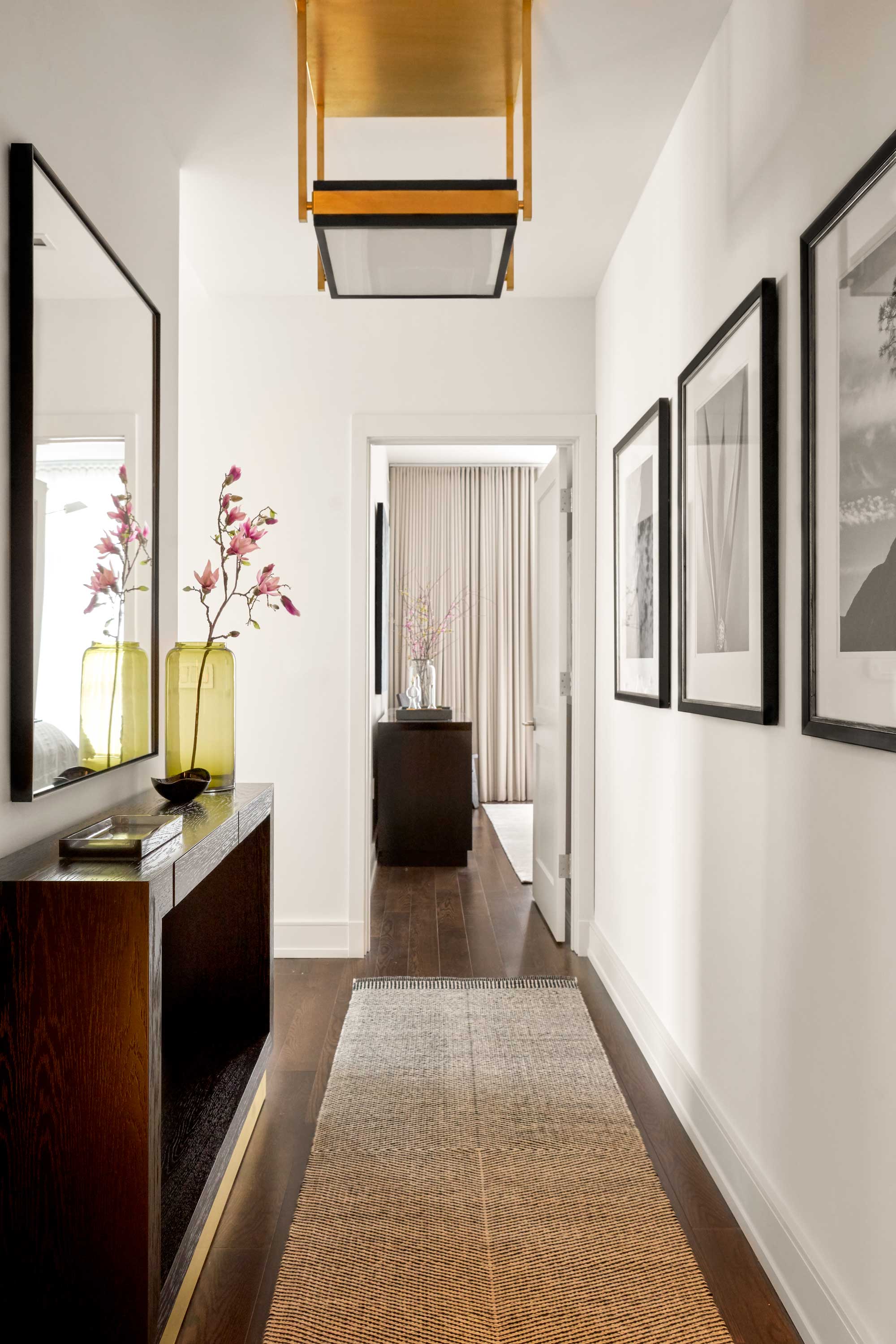
There isn’t a straight forward answer to whether or not entryways should be painted light or dark, this design decision should take multiple things into account. For example, the square footage of your hallway, how tall the ceilings are and what you want to occupy the space.
Emma Bestley, Creative Director and co-founder of innovative paint brand YesColours explains that ‘choosing the best color for your entyway can depend on the size, shape and amount of natural daylight which is available within the space. The entryway should be a welcoming room which encourages you to feel energised but also relaxed’.
Taking this into account, if there is a lack of space and natural light in a small entryway then painting it in a light shade would help it appear bigger and more open, while a dark color can make it feel cozy and welcoming. If there is space in abundance, a darker shade may make a grander statement, but a light color can feel classic and easy.
2. Calming with color
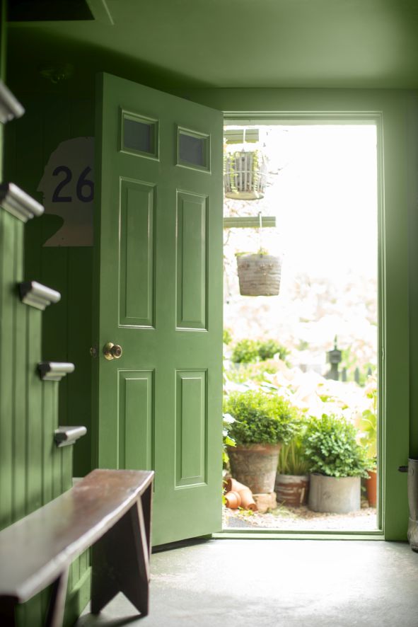
For color enthusiasts, it may not be as simple as painting an entryway light or dark, but finding the best color for entryways, too. Emma Bestley says ‘a warm bright color such as peach, yellow or green is a great option to add a little vigor. For a comforting, immersive feeling consider opting for a deeper more saturated shade of blue, green or burgundy. If you drench the entire space, you instantly create a cocooning atmosphere’.
The Livingetc newsletters are your inside source for what’s shaping interiors now - and what’s next. Discover trend forecasts, smart style ideas, and curated shopping inspiration that brings design to life. Subscribe today and stay ahead of the curve.
Try to make your entryway feel cohesive with the spaces that follow on from it. Rather than choosing a color that is unrelated to the rest of your home, choose a lighter or darker shade of a color you’ve already used to help the space flow.
3. Think practically
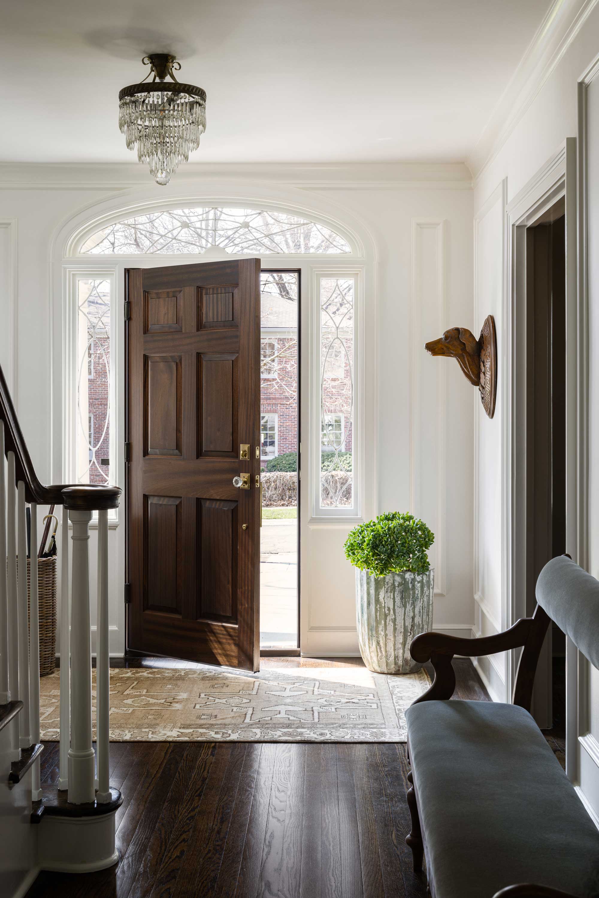
When designing a space, the first thing to be considered should be what is it going to be used for and what functions will be performed there. Elizabeth Bennett, Partner at Kobel + Co says ‘we are team light and bright for sure! Anytime you have a hallway, you have an opportunity for function or a little personality. In the hallway pictured above we added an antique bench and an antique pair of carved dog heads--great conversation starter and the perfect place to perch’.
As well as deciding on the color palette based on function, it’s important to note that the entryway is a high-traffic area. Emma insists ‘making sure you use a wipeable high-quality matt finish paint is key. Using a durable eggshell on wooden staircases and skirting boards will help to keep these frequently used surfaces smarter for longer, plus the higher sheen level will add interest to the space and enable natural light to reflect, creating a bright and airy entrance’.
4. Cool contrast
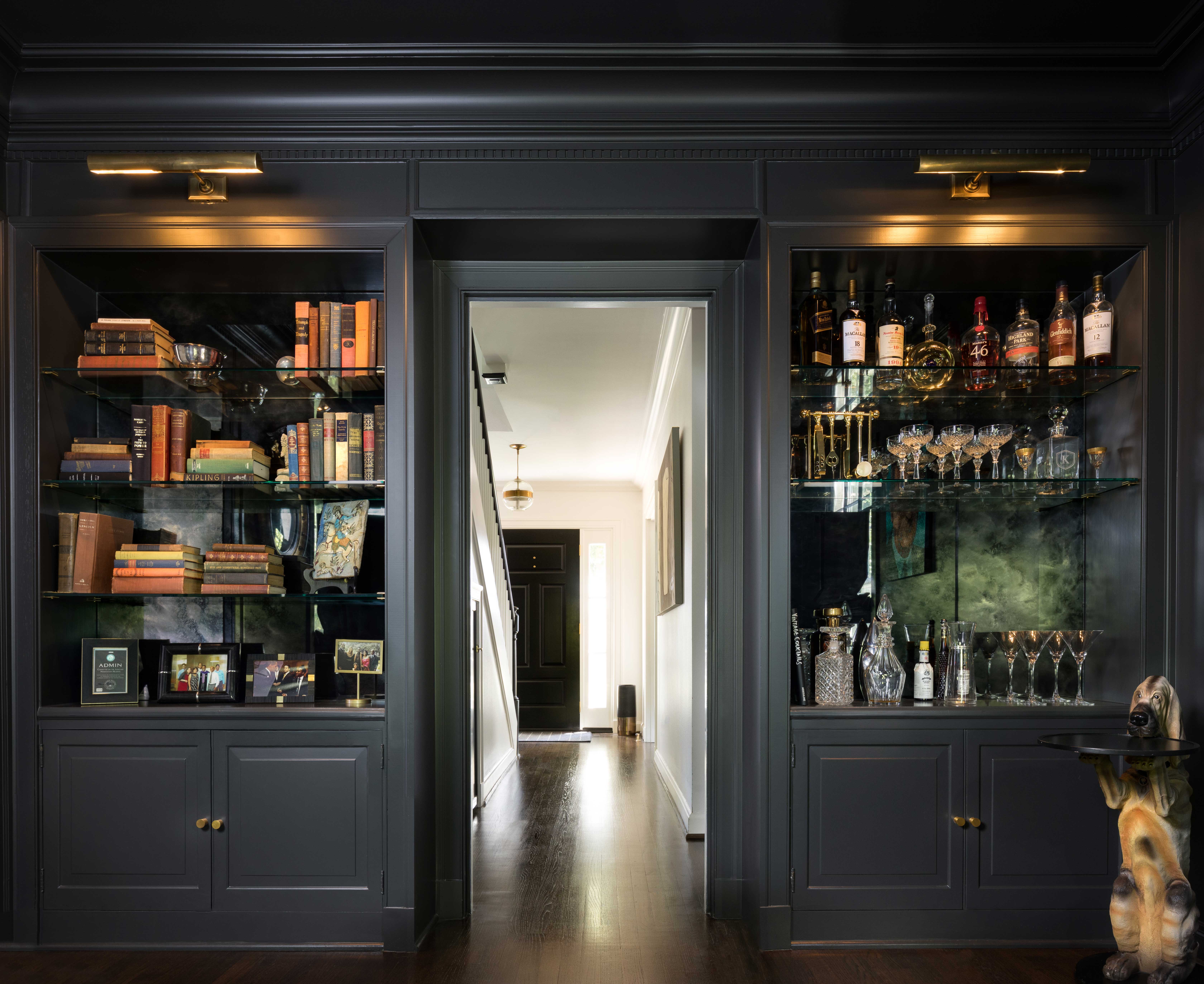
If you’re a dark interiors enthusiast but are hesitant to commit to a dark entryway, creating a contrast between light and dark is a clever design tactic for creating a bold statement. Marie Flanigan from Marie Flanigan Interiors agrees and states ‘a light entryway can always be beautifully accented by darker tones to create additional interest’.
If your hallway leads on to a living area that already boasts a dark color scheme, painting your entryway a bright white will create a stark juxtaposition that won’t take away from the drama, but will instead add to it.

Becca Cullum-Green is a freelance interiors content creator and stylist. She fell in love with interiors when she landed her first job as an editorial assistant at a leading UK homes magazine fresh out of university. You can find her renovating her 19th-century cottage in the Suffolk countryside, consciously trying not to paint every wall with Farrow and Ball’s ‘Pitch Black’. Her signature style is a mix of modern design with traditional characteristics. She has previously worked for House Beautiful, Grand Designs, Good Housekeeping, Red, Good Homes and more.
