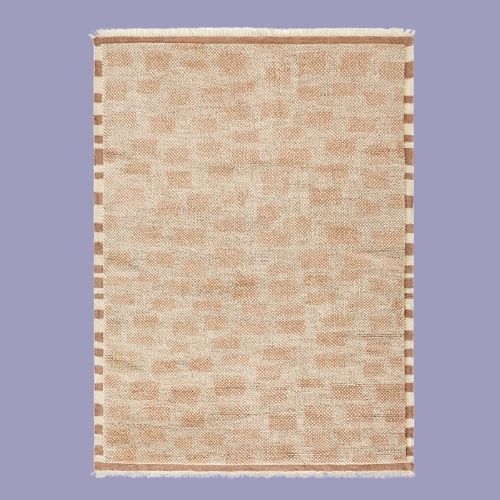
3 Rug Colors Designers Say to Definitely Avoid in a Living Room — They're Not Practical, and Can Create a "Visual Void"
From stark colors to shades that are too light, there are certain rug colors that anchor and ones to avoid — here's the difference

The Livingetc newsletters are your inside source for what’s shaping interiors now - and what’s next. Discover trend forecasts, smart style ideas, and curated shopping inspiration that brings design to life. Subscribe today and stay ahead of the curve.
You are now subscribed
Your newsletter sign-up was successful
Choosing the color of your living room rug is no easy feat. A dark red may be an alluring trend to tie together your fashionable pieces, while a light off-white is always a dependable base, but either color will affect the room as a whole, and not always for the better. So, as you conjure up your floor covering plans, there are certain rug colors to avoid in your living space, according to designers.
When choosing a rug color in a living room, it's less about avoiding specific palettes and more about ensuring your choice brings the rest of your room to life. "A living room rug, like a sofa, creates a huge visual anchor, so you want to choose a color or pattern that promotes harmony, not unrest," explains Maria O'Brien, VP of design at Ruggable.
There are a few shades that typically lean mostly toward the latter. To make things easier, I've narrowed down the biggest offenders to a streamlined list of three living room rug colors to avoid — and, of course, what designers recommend you do instead in 2026.
Article continues below1. Black
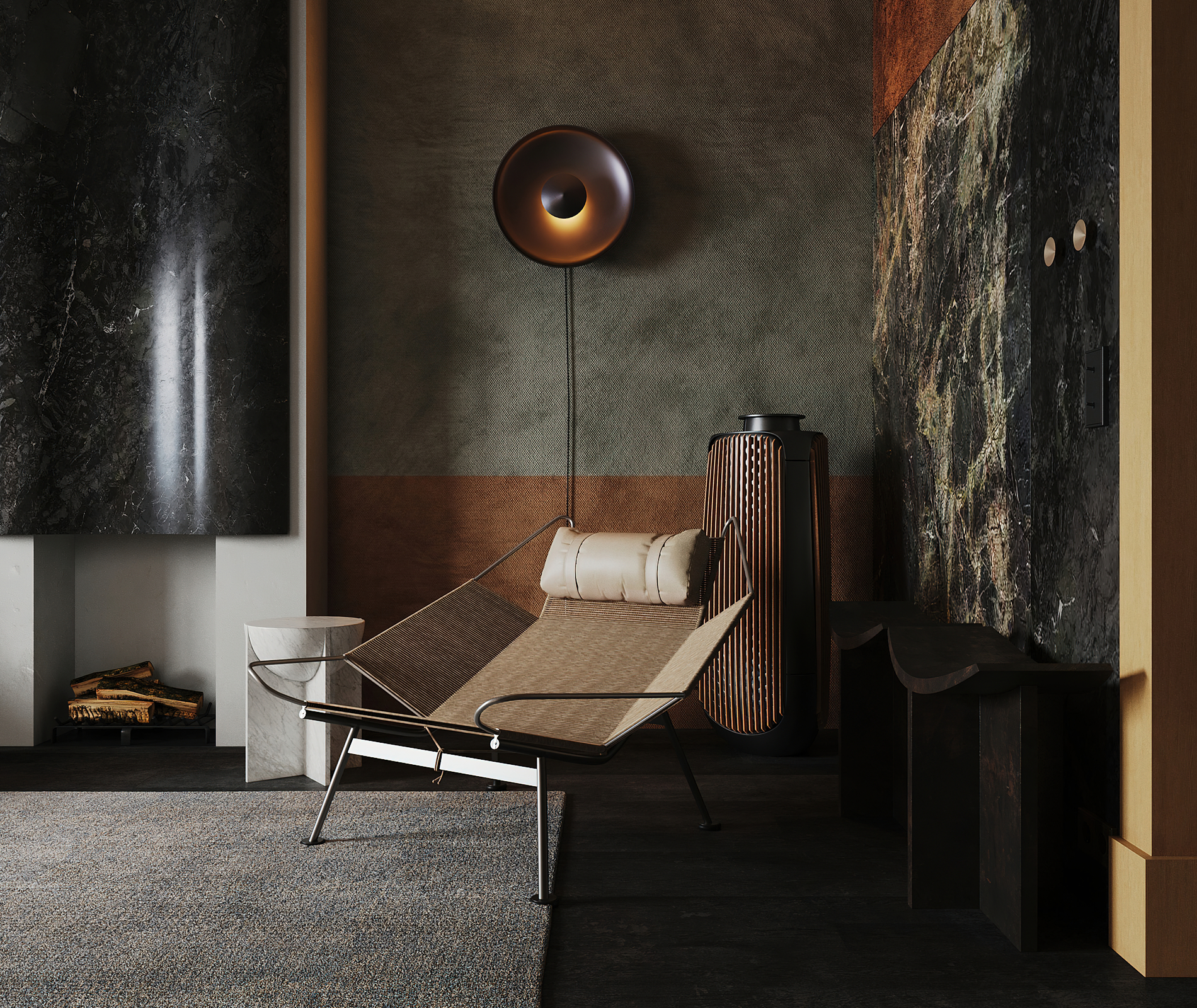
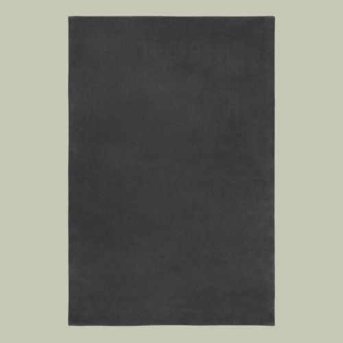
DO INSTEAD: Go for an off-black or charcoal rug to ground the room rather than making it feel too dark and overwhelming.
As a rug should complement your individual living room style, there aren't many strict 'no-go' colors or rug trends to steer clear of — it always depends on the room, the light, and the atmosphere you want to create.
That said, "I tend to avoid pure, jet-black rugs in living rooms," says Malin Glemme, founder and creative director of LAYERED. "A completely black rug can read almost like a visual void, absorbing light and creating a heavy feeling in the space."
Practicality speaking, just as white rugs often show dirt quickly, pure black also tends to show dust and wear very clearly. So, what should you do instead in 2026?
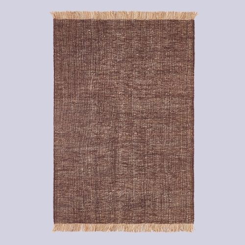
Contemporary color trends favor bold oxblood and aubergine hues, and sometimes a shade as dark as Obsidian Heart works, too. So, if you really want a dark rug, Malin suggests "softer versions such as off-black or charcoal tones, which give depth and elegance without feeling flat or harsh."
The Livingetc newsletters are your inside source for what’s shaping interiors now - and what’s next. Discover trend forecasts, smart style ideas, and curated shopping inspiration that brings design to life. Subscribe today and stay ahead of the curve.

Malin Glemme is a Scandinavian designer with a background in fashion. Malin Glemme's desire to find a sustainably made designer rug of premium quality led her to create her own brand, LAYERED, in 2015. Since then, Malin has strived for LAYERED to be at the forefront of global interior design by continuing to make authentic, hand-knotted rugs.
2. Intensely Saturated Colors
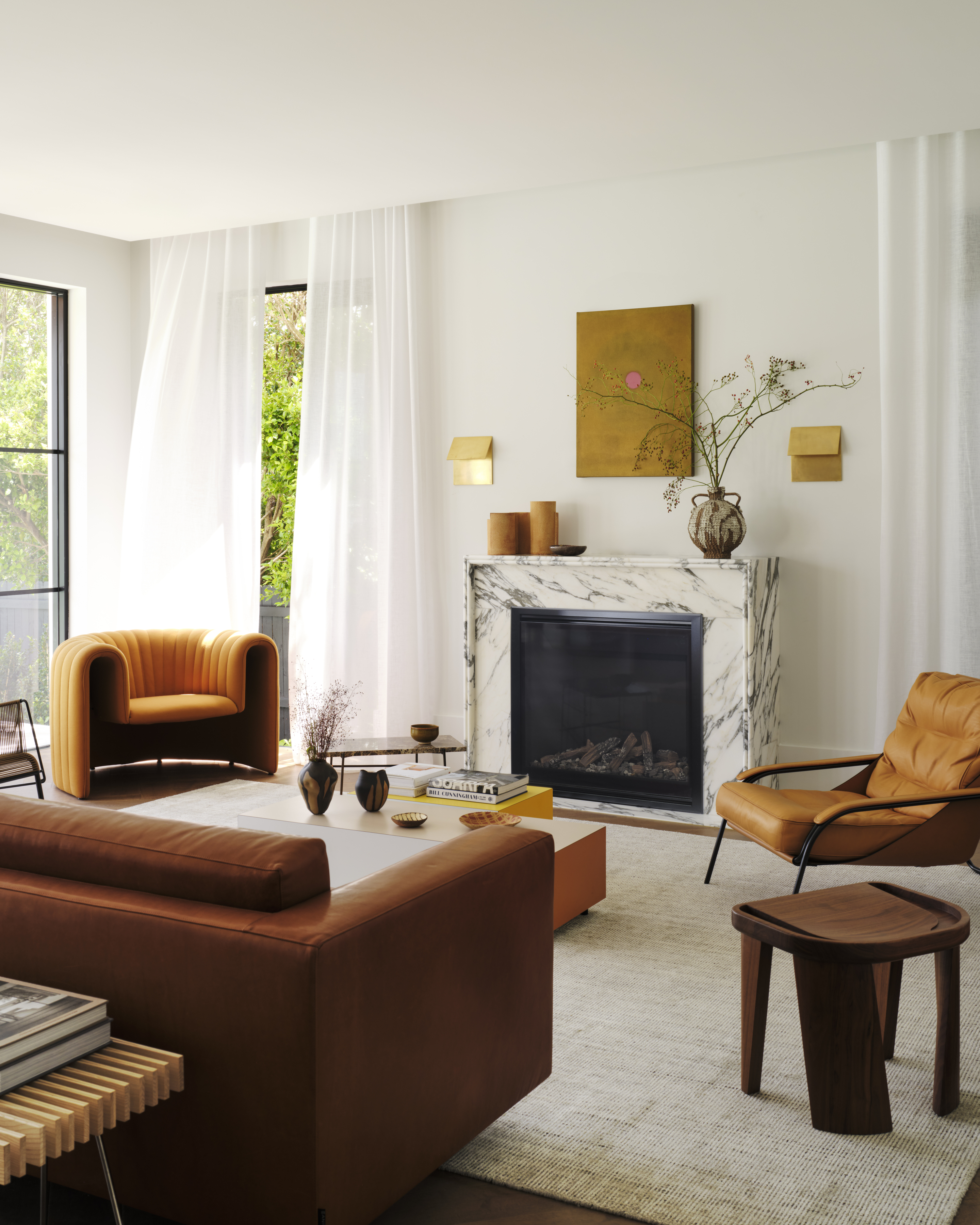
DO INSTEAD: Sometimes it's easier to let the rug act as an anchor and save the more saturated colors for accents around the room.
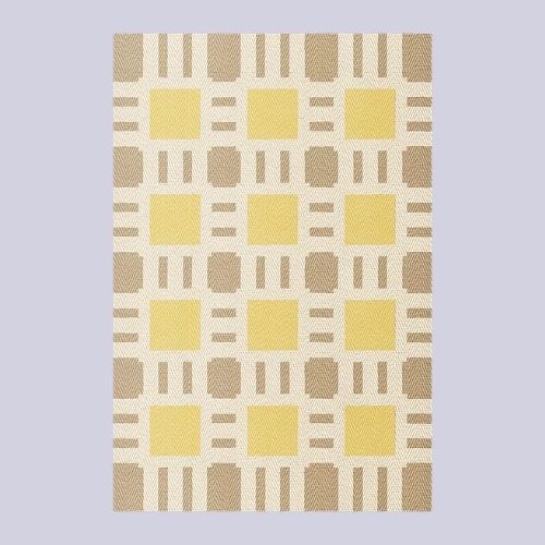
Just like with pure black rugs, Malin says, "Very intense, highly saturated colors — like bright orange or strong yellow — can also be challenging on larger surfaces." While living rooms are generally a safe place to test out your more daring design ideas, doing so with larger items, like a rug, can quickly become overpowering.
"High contrast colors often work better as smaller accents through cushions, artwork, or decorative details rather than as the foundation of a room," says Malin. "In a living space, where you spend a lot of time, balance and longevity are important."
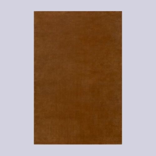
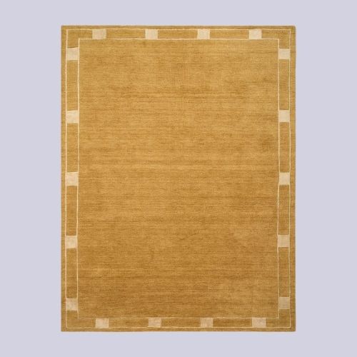
That said, you can still opt for a bold rug color if it's balanced with the color palette in the space, or, alternatively, it's wiser to opt for the same color in a more muted variation. For instance, a deep caramel over a bright orange, or an earthy ochre rather than sunshine yellow.
3. Light, Solid Colors
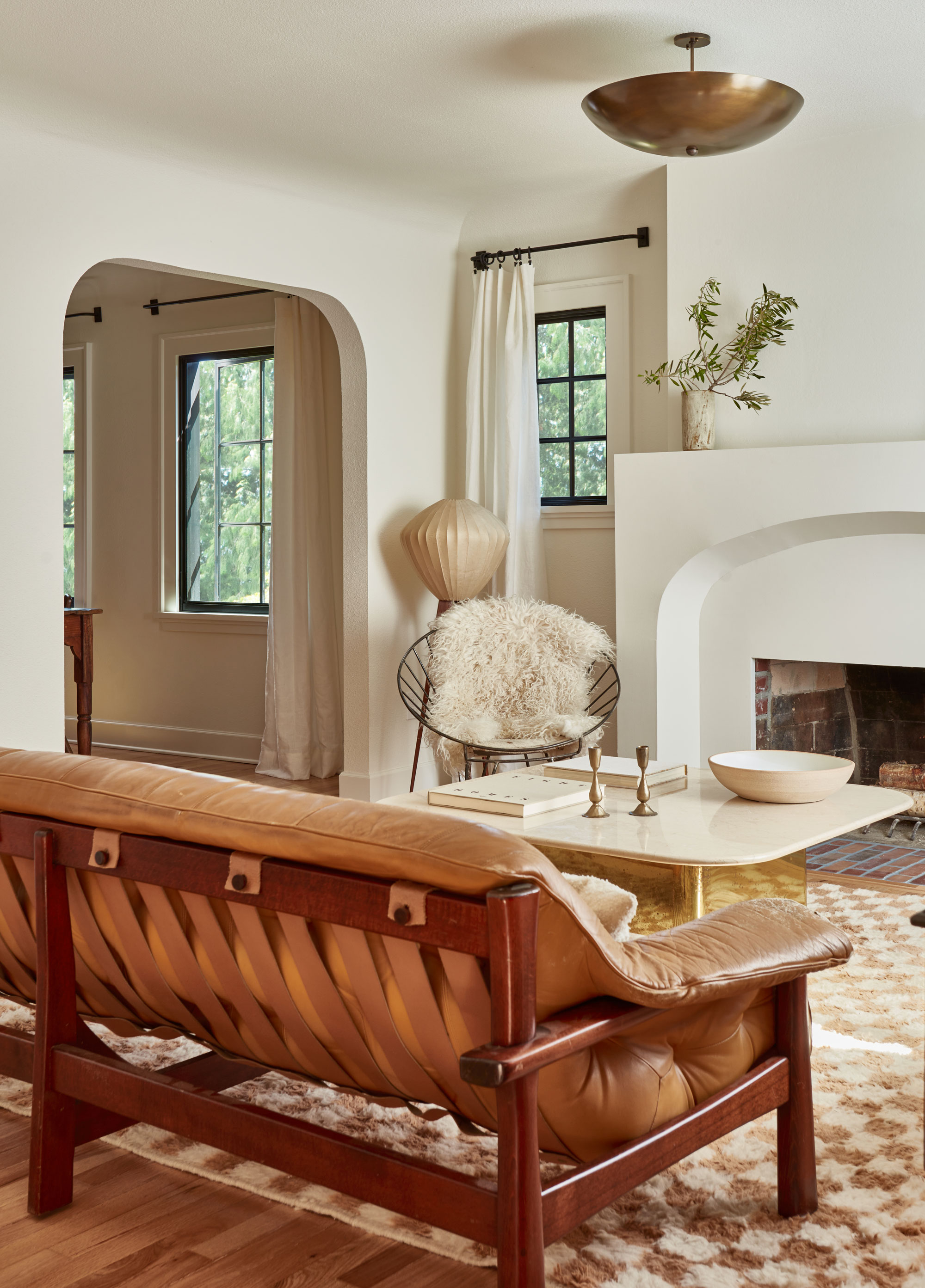
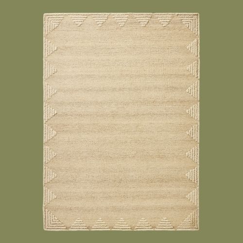
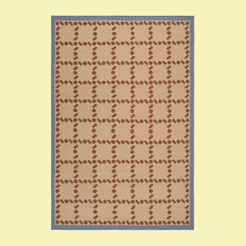
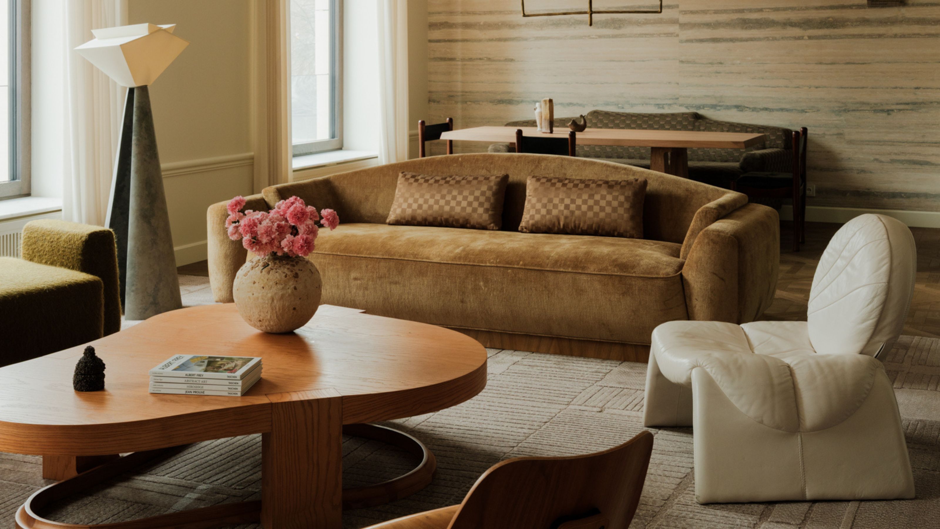
DO INSTEAD: Try to pick colors that have a little grace when it comes to stains in high-traffic areas, like the living room — patterns are also a good idea.
Though a light, neutral rug is always a dependable choice style-wise, it doesn't come without warning. "If you have a large family, young children, and several pets, living with very pale colors can be challenging," admits Ruggable's Maria O'Brien. It's all about how you place them and how often you clean your rug. "Investing in a washable rug is the best case scenario," she adds.
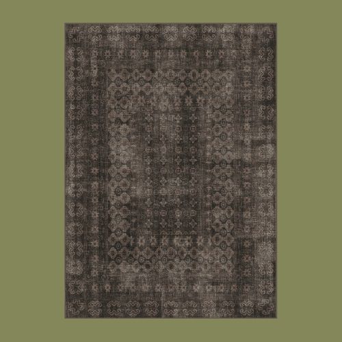
If calming, light colors are your preference, then "tranquil patterns that work as textures in softened neutral tones will bring a peaceful feel to your living room and can help balance too light a rug," adds Maria. A patterned rug can make a light color more interesting and adaptable to daily wear and tear.
Maria O’Brien is the vice president of global design at Ruggable. Maria is an expert on all things concerning current rug trends and designs.
"Think of a living room rug as the emotional base of the room," says Malin. "Choose a tone that connects with at least one other element — curtains, upholstery, or wood tones — and layer textures rather than relying only on color contrast. This creates depth and makes the space feel more considered and inviting."
And of course, avoid any of these rug colors that may make your living room less practical. For more tips, be sure to subscribe to the Livingetc newsletter.

Olivia Wolfe is a Design Writer at Livingetc. She recently graduated from University of the Arts London, London College of Communication with a Masters Degree in Arts and Lifestyle Journalism. In her previous experience, she has worked with multiple multimedia publications in both London and the United States covering a range of culture-related topics, with an expertise in art and design. At the weekends she can be found working on her oil paintings, reading, or antique shopping at one of London's many vintage markets.
