The 5 Questions Interior Designers Get Asked the Most About Choosing a Wall Color
It turns out some color concerns are universal. Here, leading designers share the questions they get asked the most, along with their expert answers
If you’re anxious about choosing a new color for your walls, you’re not alone. In fact, it’s likely others have had the same questions and doubts as you many times before. Knowing some basic interior design tricks can make the process less intimidating and help you trust your instincts.
'We find most people have strong feelings about color, which makes sense since color is so evocative,' says Annie Ritz, Principal Designer at And And And Studio. 'As designers, we love to play with color and find even the most color averse client will warm up when they understand how a certain color plays into a larger design scheme.'
To help you pick paint ideas for walls with confidence, we asked leading designers to share their answers to five of the most commonly asked questions on color.
1. “Is it too dark?”
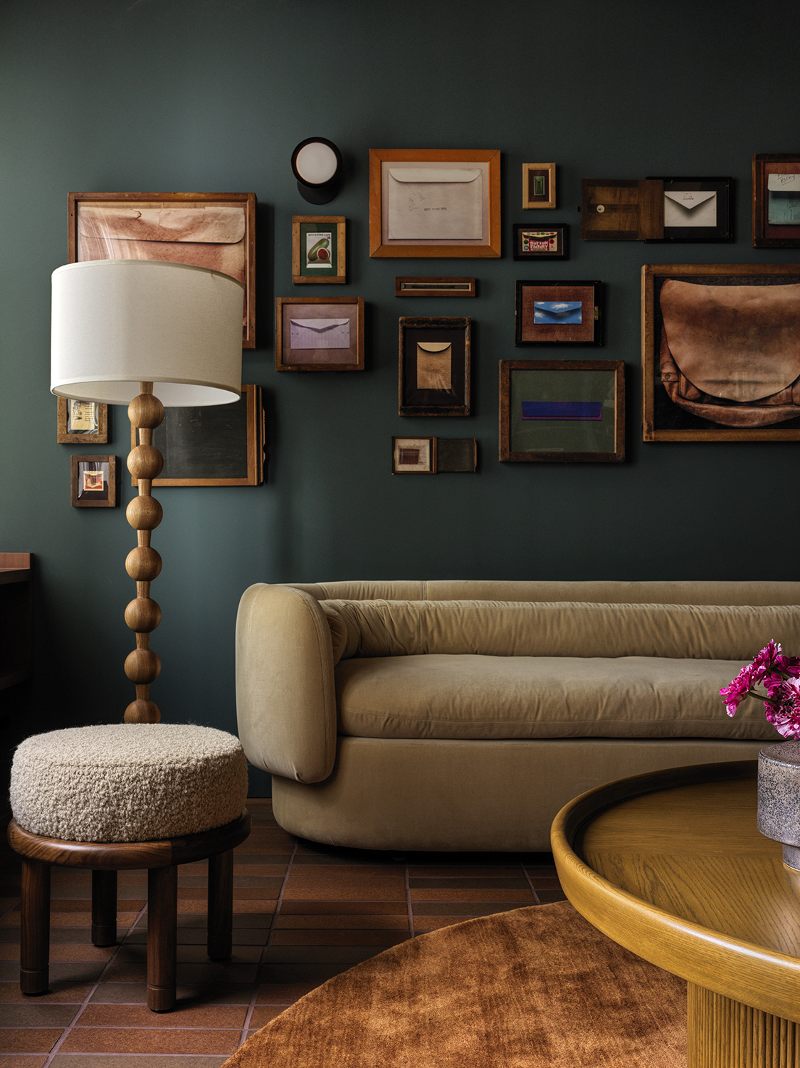
According to And And And Studio’s Annie Ritz, the question “Is it too dark?” is one that comes up a lot. And it makes sense—drenching your space in deep teal is always going to take more guts than choosing an off-white.
But the answer to the question at hand all depends on the type of vibe you’re aiming to create.
In the living room above, Ritz explains that 'it’s intended to be a dark and rich space, that’s part of how we created the cozy mood.'
Is a dark color going to make a dark room look smaller? Perhaps, but if you’re also after a look that’s warm and cocooning, a dark color could be just right. On the other hand, if you want your space to feel fresh, airy and expansive, you may want to choose a lighter hue.
The Livingetc newsletters are your inside source for what’s shaping interiors now - and what’s next. Discover trend forecasts, smart style ideas, and curated shopping inspiration that brings design to life. Subscribe today and stay ahead of the curve.
2. “Will it end up looking dated?”
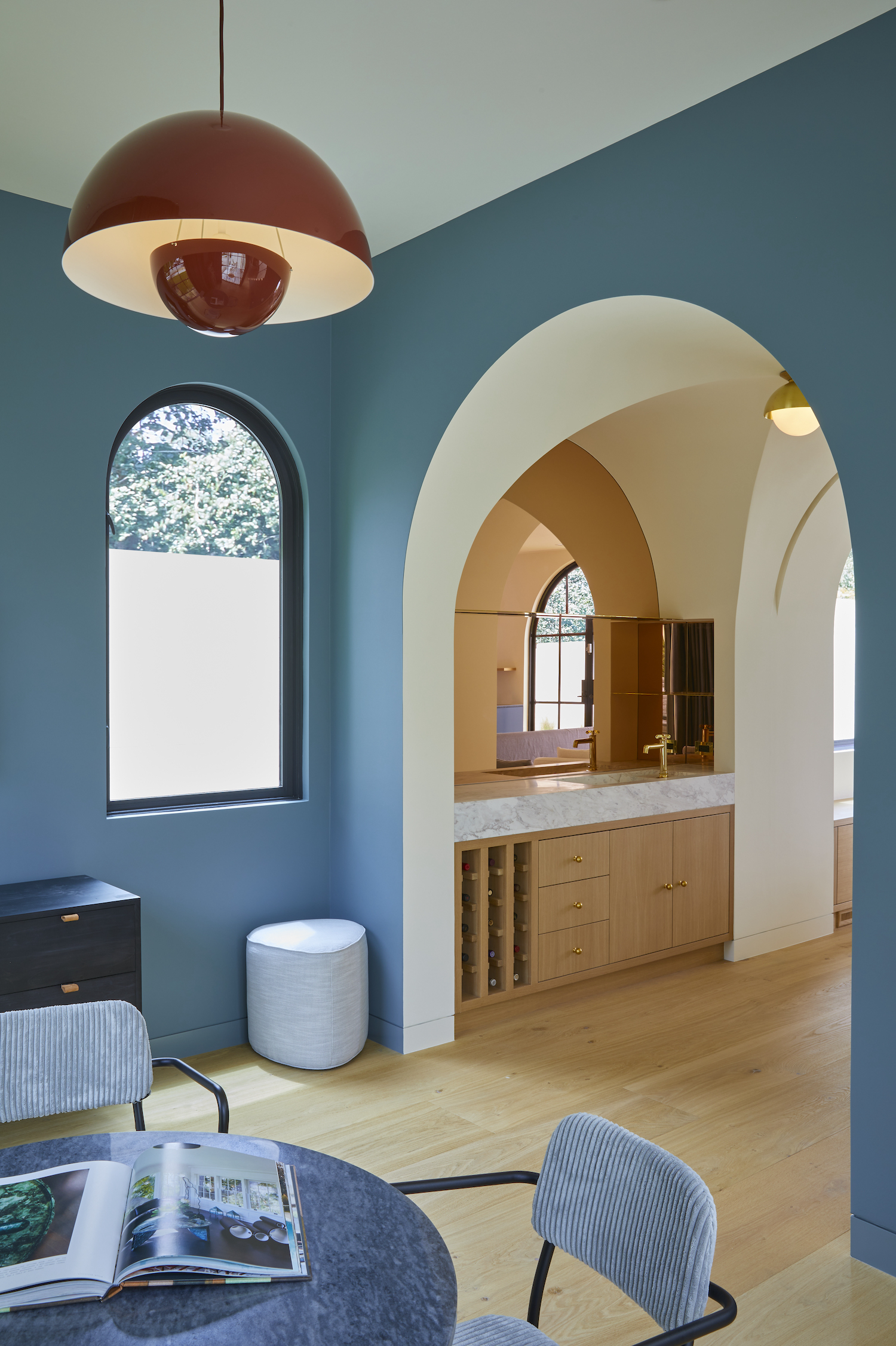
The answer to this one is more straightforward: yes! And that’s no bad thing. 'Will it be dated at some point? Probably,' says Ritz. 'You shouldn’t base a color decision on what you think will or will not age well. Color isn’t about practicality, it’s about feeling and mood. All good things age and position themselves in time eventually.'
In a similar vein, Ritz says she also often hears 'What if we don’t like it in 5 years?' Once again her advice is to go for it anyway. 'Take the risk and see if it brings you joy,' she says. 'In the end, it’s just paint and as soon as you tire of it, we can choose a new color that fits your latest mood.'
3. “What is an undertone and how do I identify one?”
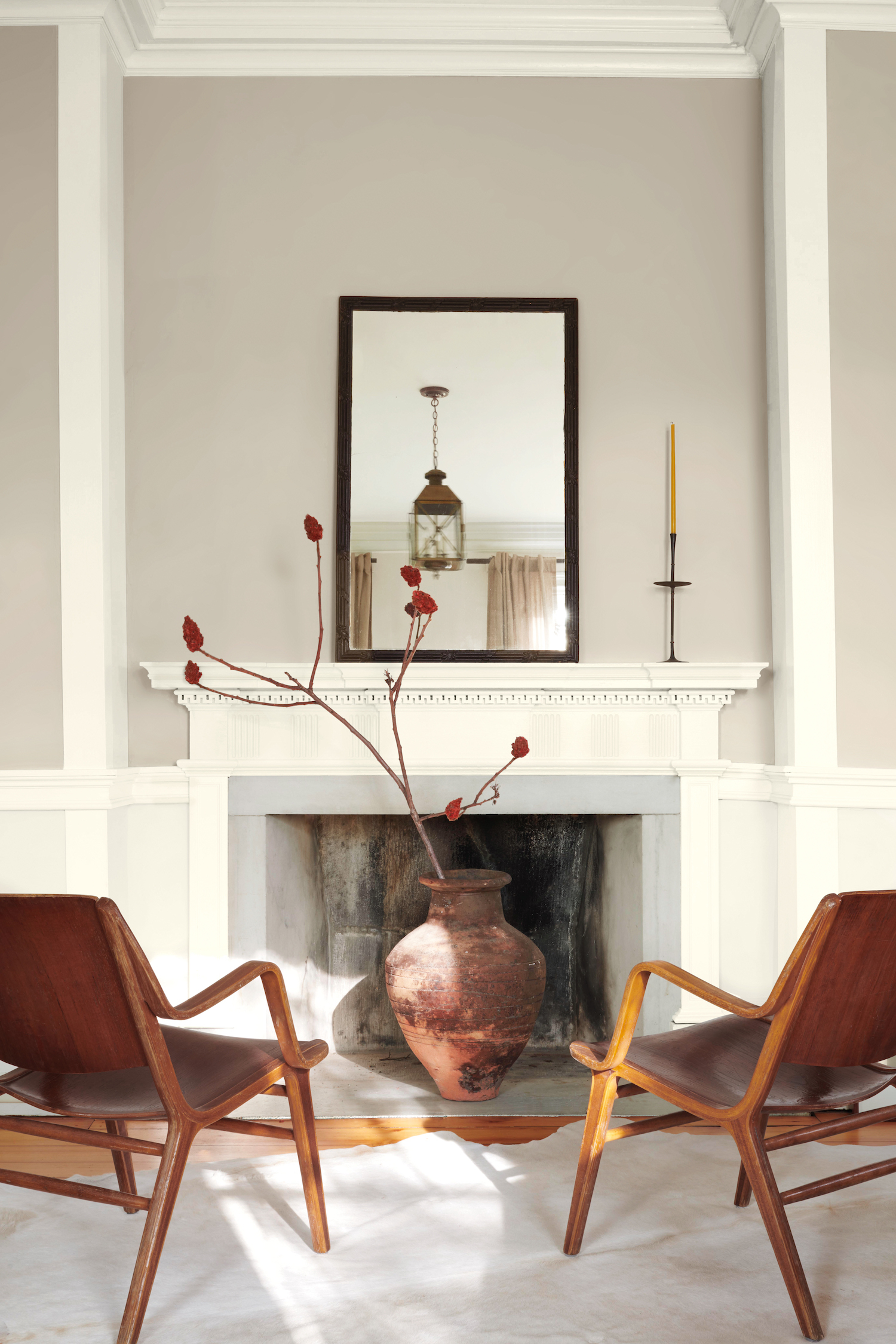
This question gets more technical, and is one of the most common questions designers hear at paint brand Benjamin Moore.
You may have heard the term undertone before, and have a vague idea of what it means, but identifying one can be another matter entirely. 'If you’ve ever experienced what you thought was a perfect grey looking slightly blue or yellow, you’re not alone,' says Hannah Yeo, a color expert at Benjamin Moore. 'That slightest hint of blue or yellow is called an undertone. An undertone is the subtle layer of color under the main color.'
Yeo continues: 'The best way to identify the undertone is to hold it up next to hues from the same color family. For instance, pull three to four other grays and place them side by side. The undertone of each hue becomes more apparent.'
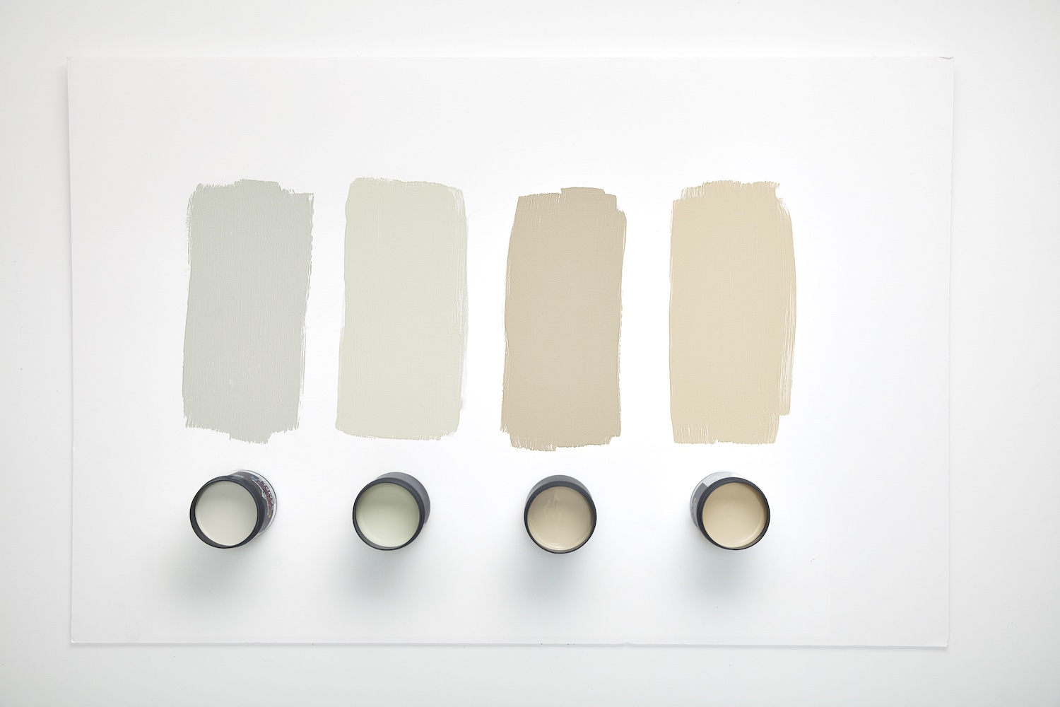
Identifying the undertone of a color is key when it comes to combining colors effectively. In fact, "How do I create a good color combination?” is the number one question Yeo gets asked. 'Homeowners often struggle with colors that go with other hues in the room,' she says. 'We often advise them to look for colors that share similar undertones. For instance, if they have a blue wall, we advise them to look for off-whites with a cooler undertone for the trim.'
4. “Should walls and trim be the same or different colors?”
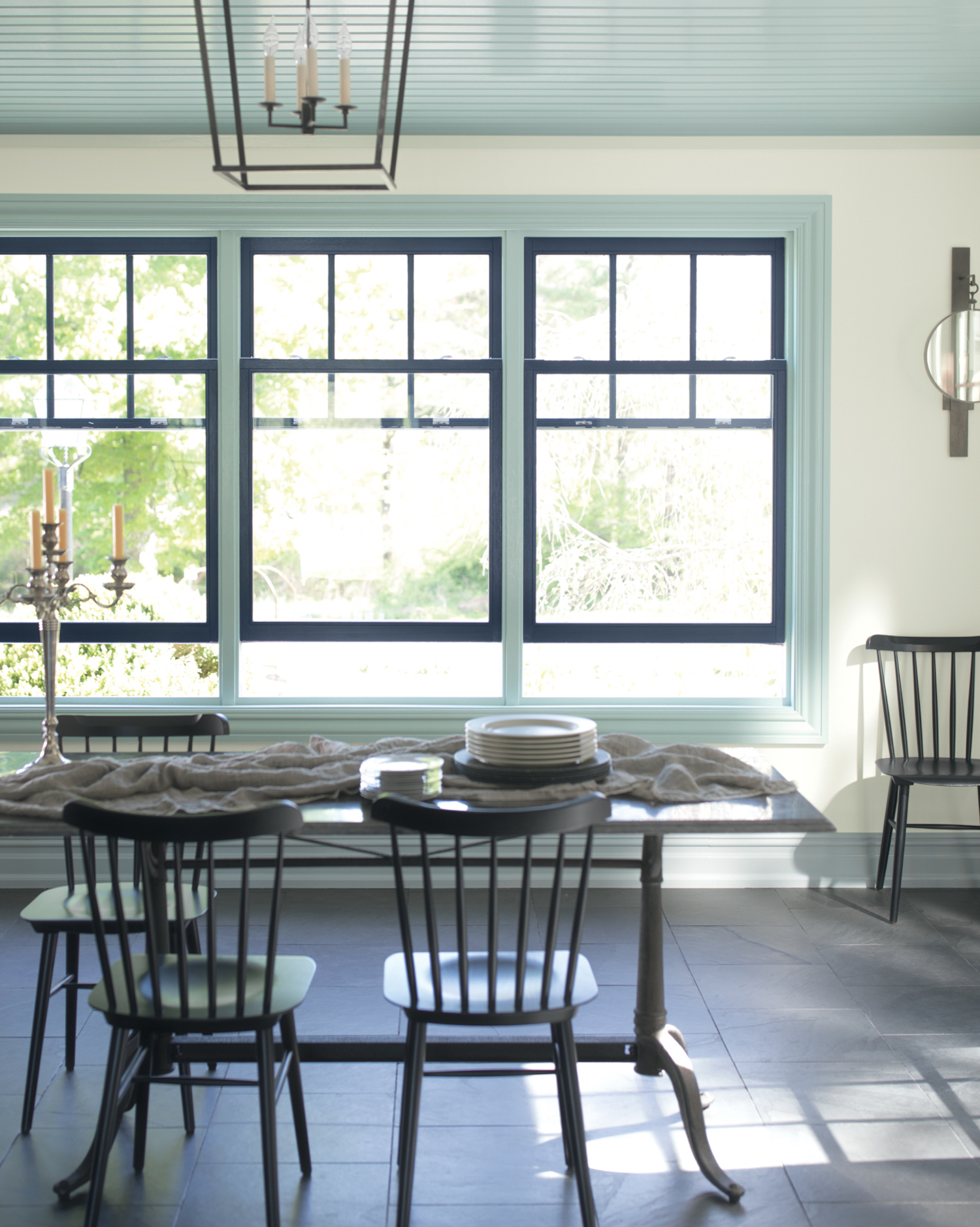
This brings us onto Yeo’s next most commonly heard question: “Should walls and trim be the same or different colors?”
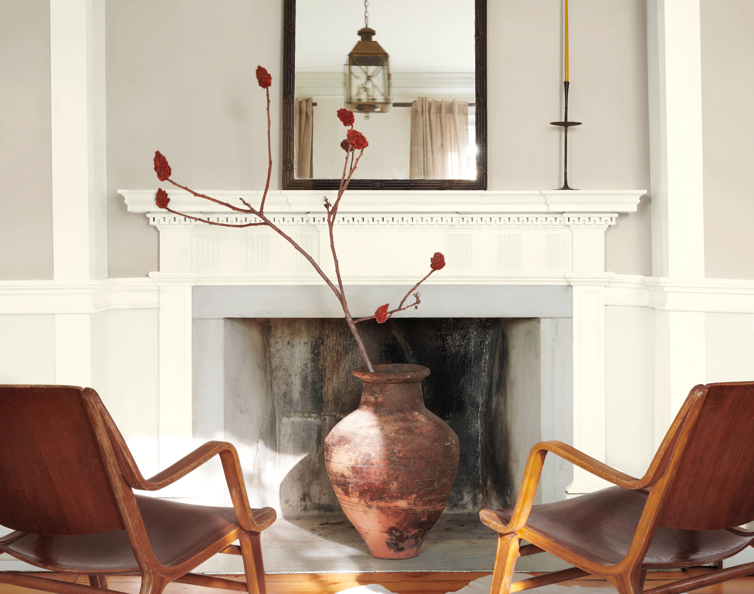
Once again, the answer to this question depends on the look you’re trying to create. The above design by Benjamin Moore proves that contrasting colors for wall and trim can work beautifully. 'Trim should never be overlooked as it holds major design power,' says Benjamin Moore’s Yeo. 'For a pop of color, you may want to make a statement with a colorful window trim by using a bolder hue against a neutral wall. If you opt to play it safe, but classic, with a white trim, look at the undertone of your wall. This will help you create a more cohesive look if the paint colors are a part of the same family.'
However, choosing the same color for walls and door trim can also be very effective. 'If you want to go even bolder, look towards color drenching—where the walls, ceiling and trim are all painted the same color,' says Yeo. 'This can help make a small space feel even larger as it blurs the edge of a room and tricks the eye.'
5. “How do I narrow down options and make a decision?”
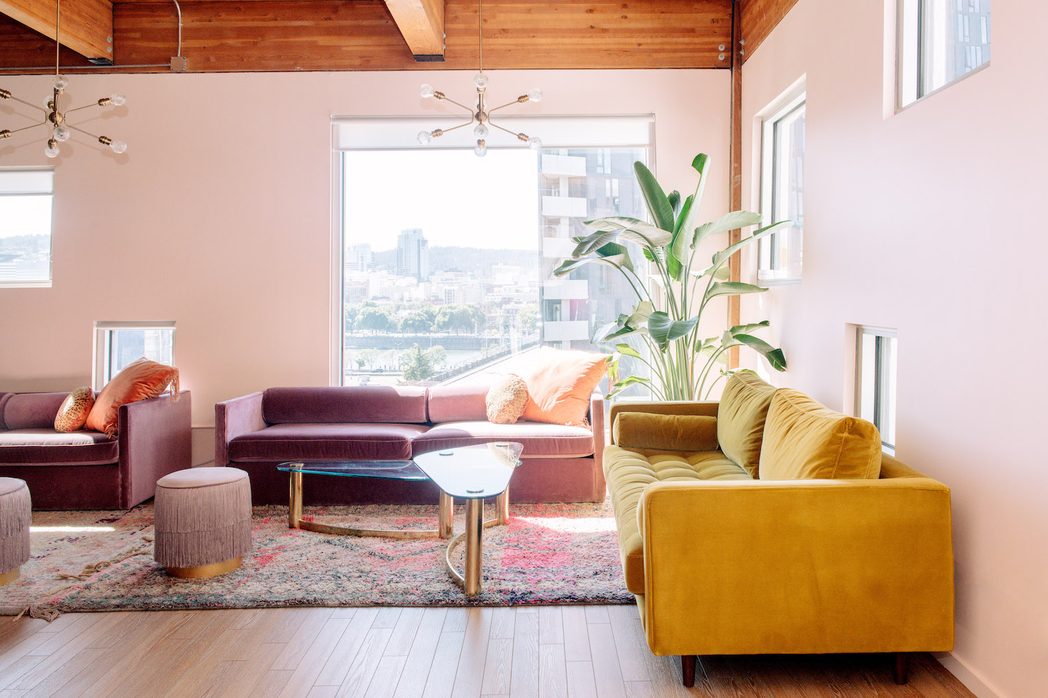
Maybe you’ve fallen in love with four or five different paint colors—how are you supposed to choose between them? Interior Designer Mandy Riggar often gets asked this question. She says: 'Insider secret: Order ‘draw downs’ from your local paint shop of your top two to three options. Draw downs are actual painted swatches made by the paint shop, usually around $5. Seeing these large real painted swatches in your space quickly helps differentiate the true color in the paint and is infinitely easier to visualize than tiny color strips.'
Kate Hollowood is a freelance journalist who writes about a range of topics for Marie Claire UK, from current affairs to features on health, careers and relationships. She is a regular contributor to Livingetc, specializing in reporting on American designers and global interiors trends. Based in London, Kate has also written for titles like the i paper, Refinery29, Cosmopolitan and It’s Nice That.
