These Are the 13 Most Popular Benjamin Moore Paint Colors People Are Decorating With Right Now
These designer-approved Benjamin Moore paint shades will breathe new life into your space, and they're a great way to embrace some key color trends too

The Livingetc newsletters are your inside source for what’s shaping interiors now - and what’s next. Discover trend forecasts, smart style ideas, and curated shopping inspiration that brings design to life. Subscribe today and stay ahead of the curve.
You are now subscribed
Your newsletter sign-up was successful
Creating a shortlist of the best Benjamin Moore paint colors in no mean feat. With such a vast catalog of classic shades, there's a hue for every decorating project out there, which makes choosing the cream of the crop a tricky business.
From calming neutrals and pretty pastels, to bright saturated tones or smoky undertones, Benjamin Moore can cater to your every need. They also have a wide variety of finishes to choose from, too, so whether you're just giving your walls a refresh or you want to switch up the color of your kitchen cabinets, there's a Benjamin Moore paint on hand to help.
But, in order for that paint to have full effect, you have to choose the right shade for your space. 'As an interior designer, I've learned that the right paint color can transform a space, setting the tone for everything that follows,' explains Isy Jackson of Cheltenham Interiors. 'And Benjamin Moore consistently delivers an array of inspiring hues that elevate interiors.'
Article continues belowTo help you decide, we asked designers and Benjamin Moore's team about the most popular Benjamin Moore paint color ideas, we've gathered some options that have been hand-picked by designers. Here are 13 trendy yet timless shades guaranteed to inspire your next decorating project.
1. Revere Pewter

If you're looking for neutral paint colors that designers use, Revere Pewter is a great place to start. 'Revere Pewter HC-172 is one of our most popular colors and has topped the best sellers list for years,' says Arianna Barone, a color expert at Benjamin Moore. 'With unrivaled versatility, it effortlessly bridges warm and cool as a beautiful neutral hue. It is a true chameleon color that can work in any space and with any design style. I personally love to use it in common spaces like living rooms, kitchens and dining rooms for a laidback, welcoming wall color.'
Isy Jackson of Cheltenham Interiors says this classic greige shade can balance a room beautifully if you want walls that are understated yet elegant. 'It makes a popular choice for open floor plans, providing a seamless transition between rooms,' she says. 'This versatile shade also adapts well to different lighting conditions, making it a reliable option for any space. Designers love its ability to ground a room while allowing other elements to shine, giving the space a cozy and cohesive feel.'
Be sure to use this Benjamin Moore paint shade alongside pops of color in your furniture and surrounding decor to bring personality into your space.
The Livingetc newsletters are your inside source for what’s shaping interiors now - and what’s next. Discover trend forecasts, smart style ideas, and curated shopping inspiration that brings design to life. Subscribe today and stay ahead of the curve.
2. White Dove
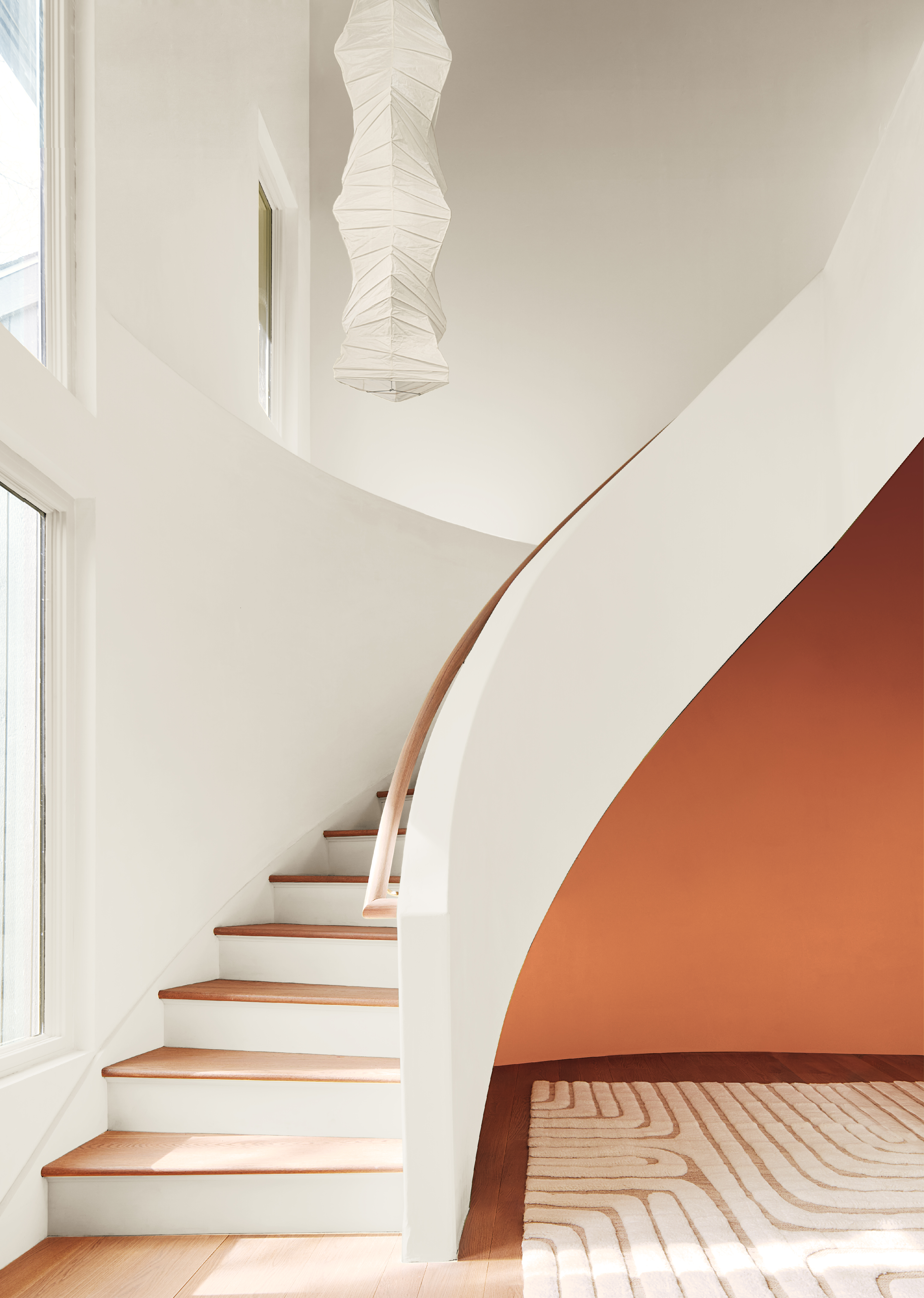
White will always be among the most popular shades, and one of the best white paints for interior walls is undoubtedly White Dove OC-17 by Benjamin Moore. This classic off-white has just the right amount of yellow in it to bring warmth to your space without feeling too buttery, and it looks especially beautiful in bright, south-spacing rooms where those undertones can really sing.
'It's a timeless favorite for designers due to its versatility and enduring charm,' explains Isy. 'This soft, creamy white creates a serene and sophisticated backdrop, bringing a sense of calm and warmth to any room. Whether you're updating a living room or a kitchen, White Dove provides a neutral canvas that complements modern and traditional décor. Its subtle warmth makes it a popular choice for walls, trim, and ceilings, imparting a tranquil and harmonious ambiance.'
3. Hale Navy
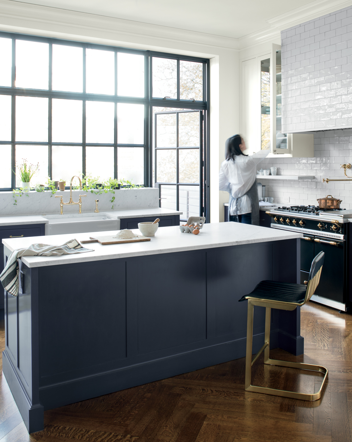
Blue is one of the biggest color trends of late, and dark, moody blues will always have a particular allure that's classic and timeless. And when it comes to the best Benjamin Moore paint colors, a great choice for the job is Hale Navy HC-154. 'It's bold, yet versatile and whether on cabinets or all four walls, it's always a stunning addition to a color palette,' says Arianna.
She suggests using this color on kitchen islands or cabinets for a striking splash of color. 'Given its gray undertone, it pairs well with a variety of finishes and surfaces often found in kitchens,' she adds.
This inky blue can also make a real statement as an accent wall or when painted on furniture. 'A designer's dream is to add drama to a space without overwhelming it,' explains Isy. 'This bold color works beautifully as an accent wall in living rooms or as a striking choice for cabinetry, creating a sense of sophistication and boldness.' Her advice is to pair this Benjamin Moore paint color with crisp whites or warm metallics to create a balanced and inviting atmosphere.
4. Gentleman’s Gray

For something a little more dynamic than Hale Navy and less overbearing on your walls, try Gentleman’s Gray 2062-20. 'This is a handsome shade of blue-green tempered by a touch of gray,' Arianna says. 'It playfully blends the tranquil notes of blues and greens with the intriguing qualities of deeper hues to make a statement-making shade.'
We love this color in a bedroom where it makes for a super cozy sleep sanctuary, but it works equally well as an accent color in living rooms, kitchens, or entryways for a slightly nautical feel. And if you really want to envelop a space, try color-drenching the walls, ceiling, and woodwork in this captivating, night-sky shade for a rich, cocooning feel.
5. Kendall Charcoal
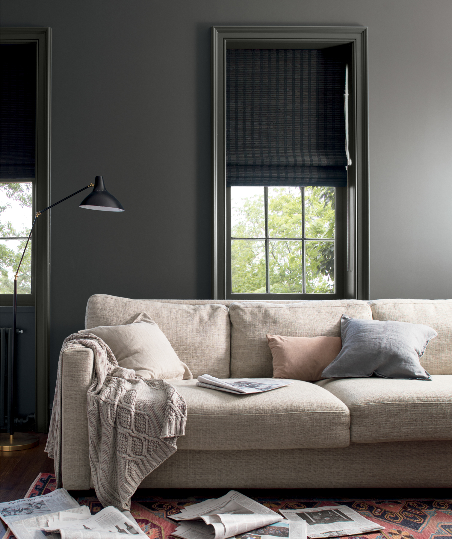
Gray certainly hasn't had its day just yet, and this chic modern shade can actually work brilliantly as an all-over color on your walls and woodwork. One of the best Benjamin Moore paint colors loved by designers is of course Kendall Charcoal (HC-166), a light tone that won't overwhelm your space. If you're looking for a livable gray, this is the one to choose.
'Kendall Charcoal is a sophisticated gray that adds depth and richness to any space,' notes Isy. 'Its dark, moody undertones make it an excellent choice for creating an intimate and cozy environment.' She goes on to say that designers often use this hue as an accent on walls, built-in bookshelves, or cabinetry to add a touch of drama and elegance.
And if you're wondering what colors go with gray, the options are virtually endless thanks to the versatility of this shade. 'Pair it with lighter neutrals or vibrant colors for a striking contrast, giving the room a sense of depth and comfort,' Isy suggests. Or, you could use it alongside sumptuous browns or darker grays for a more tonal scheme.
6. Stonington Gray
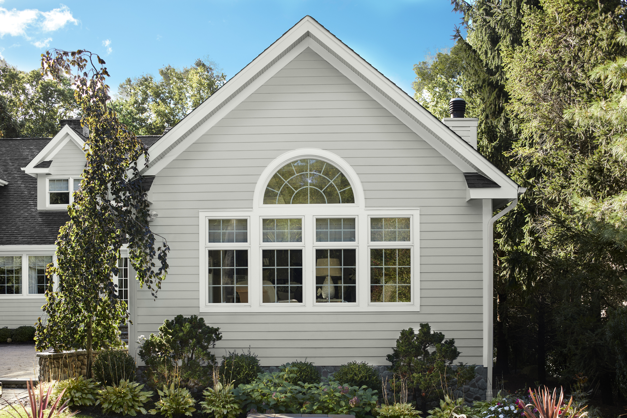
Stonington Gray HC-170 is also a chic gray that works just as well as a gray living room idea as it does an exterior paint color. It's cool, stone-like effect makes it an especially beautiful accompaniment to white for a sophisticated color pairing.
'This essential cool gray is a go-to of mine when people are looking for a soft but elegant gray paint color,' says Arianna. 'It feels sophisticated without being too cold and works in many different settings, but I love to use it on exteriors for a classic look with major curb appeal.'
7. Wythe Blue
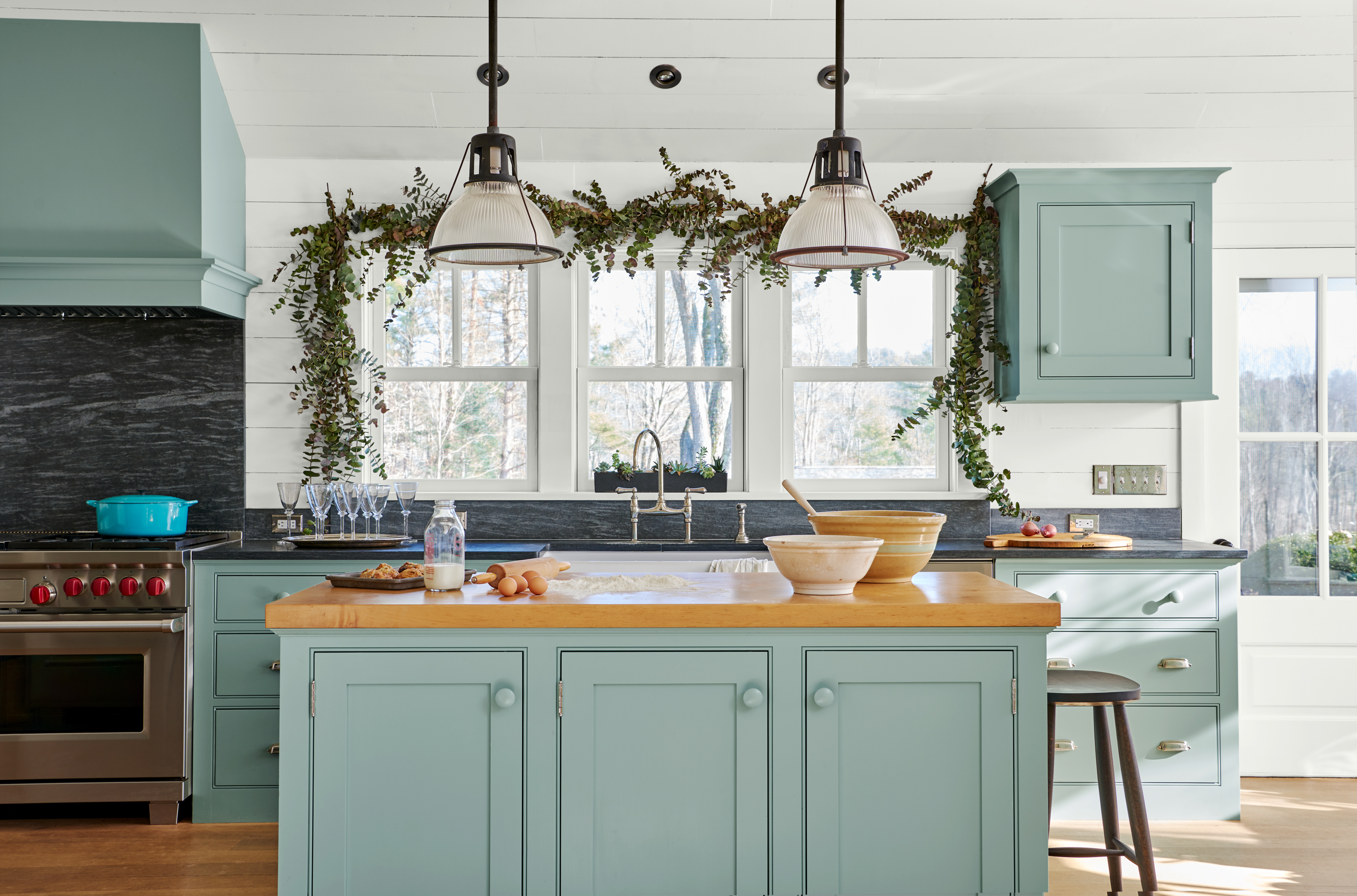
Blue shades are seriously enjoying a moment in the spotlight. Calming, uplifting, and versatile, it's easy to see why this hue is being embraced across all areas of the home, and Benjamin Moore's Wythe Blue (HC-143) perfectly encapsulates those much-loved characteristics.
'This timeless, historic color has charmed designers for decades,' says Isy. 'The muted blue-green shade is perfect for adding a touch of vintage charm to a space and is often used in kitchens, dining rooms, and entryways to create a welcoming and nostalgic atmosphere.' The shade has a subtle gray cast which makes it feel seriously chic, and with so many colors that go with blue, building a color palette around this Benjamin Moore paint shade is so easy.
8. Wrought Iron

As this list proves, the best Benjamin Moore colors aren't necessarily the brightest and most garish within the brand's catalog. In fact, dark color trends crop up a lot. Deep grays - such as Wrought Iron 2124-10- are more stylish and versatile than a black, but still bring enough drama to your space, making it a popular choice among designers.
'It can cast as more of a charcoal or black paint color depending on the lighting and other design elements in the space,' explains Arianna. 'We find people reach for this color when looking for a sharp contrast of color but not too severe. Wrought Iron brings the drama of a black paint color without the edge and it can work to create a cozy enclave in a bedroom or study, or create a chic, modern exterior.'
9. Palladian Blue

To inject a light, refreshing, and airy feel into your home, Palladian Blue (HC-144) by Benjamin Moore is one of the best paint colors you can choose. This oh-so-calming shade is a light blue paint color that designers love. It looks great on walls or as an accent on trim, and we suggest pairing it with neutral tones if you want it to be the star of the show.
'Palladian Blue is a serene and soothing color that brings a touch of tranquility to any room,' says Isy. 'This soft blue with green undertones is reminiscent of a clear sky or calm sea, making it ideal for bedrooms and bathrooms. Designers often use Palladian Blue to create a spa-like retreat or infuse a space with calm and relaxation. It's perfect for making any room feel peaceful and rejuvenating.'
10. October Mist

October Mist 1495 is the type of paint color that's hard to pin down. Somewhere between a green and a gray, this fresh paint color is an unusual yet effective choice for your walls, and it's one the best Benjamin Moore shades for a relaxing space.
Arianna describes the hue as a 'gently shaded sage with beautiful adaptability'. 'It quietly anchors a space giving you the opportunity to bring in more playful colors through accents,' she says. 'It is a wonderful connector color and can help tie a palette together. We continue to see people reach for greens as an alternative to grays and neutrals and this harmonious hue allows you to bring a soft touch of color to your space without overwhelming it.'
It's this idea of bridging the gap that makes October Mist such a popular choice, so consider using it in a palette alongside darker greens or zesty pinks where it will act as a grounding neutral.
11. Gray Owl

Another color that bridges gaps is Gray Owl (OC-52). Falling somewhere between gray and taupe, it's one of the best Benjamin Moore paint colors to use in a soft palette or as an exterior wall color for understated appeal. It also pairs well with almost everything, which is why it's one of the paint colors that designs have in their own homes.
'This stunning light gray color has a touch of warmth, making it perfect for transforming any space into a modern and inviting environment,' Isy explains. 'Its ability to complement various lighting settings has made it a favorite among designers.'
She goes on to say that this tone works especially well at enhancing open floor plans, making the area look unified and balanced. 'This versatile shade harmonizes with cool and warm color palettes, offering endless possibilities for any decor theme while creating a clean and sophisticated ambiance,' she adds.
12. Smoke
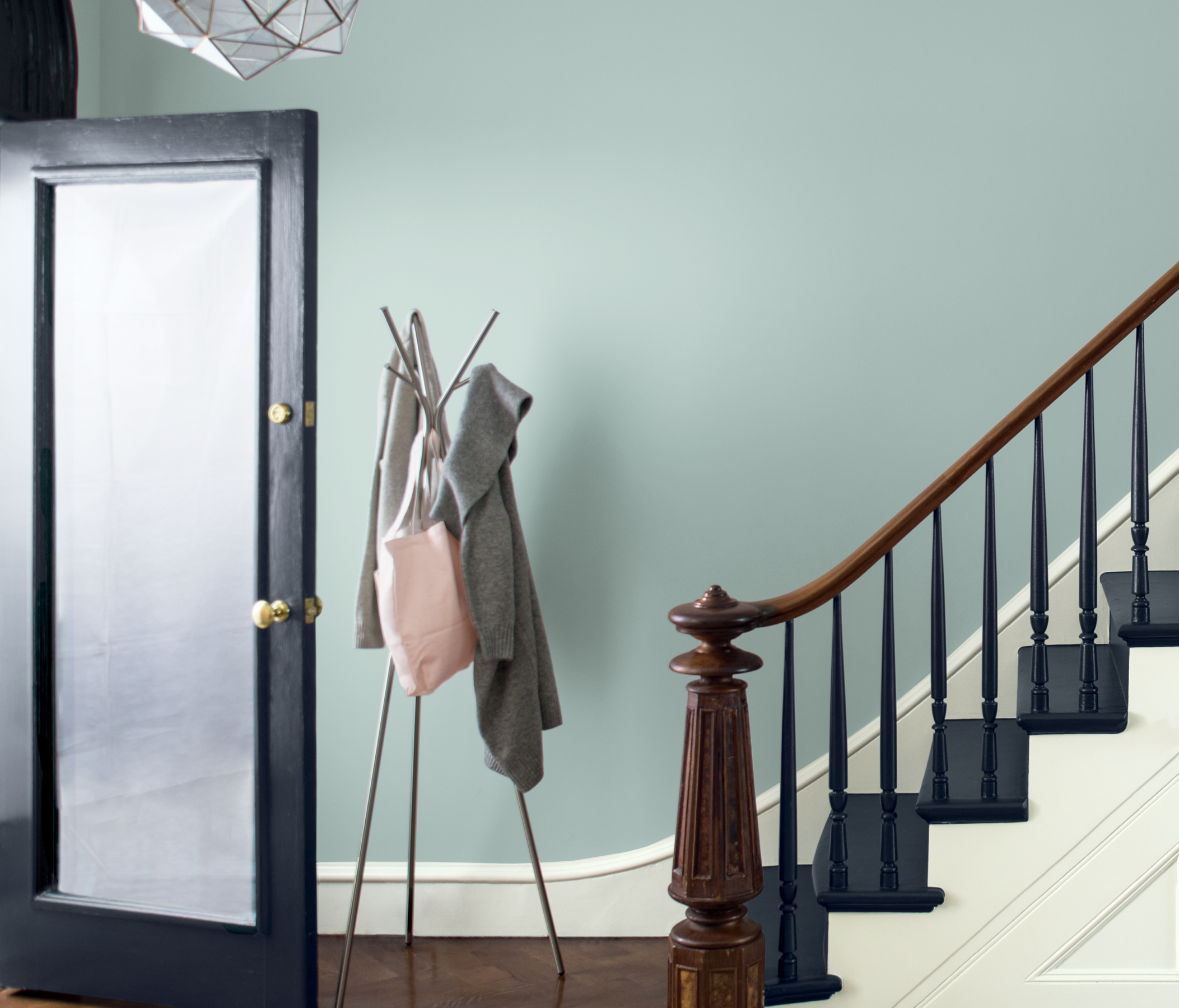
Smoke 2122-40 is, by all accounts, another gray. But this Benjamin Moore shade has a strong blue-green undertone that makes it immensely versatile and adaptable depending on your room's lighting. We love it when used alongside contrasting dark shades which allow its breeziness to really come through. It's also a good idea to look at color theory ideas to create a palette around this unique paint color.
'It can bring just the right amount of color to a space, and pairs beautifully with warm and cool colors to create a tranquil room,' says Arianna of the hue. 'Calm, relaxing, and welcoming are words people often use to describe their homes, making Smoke 20122-40 a great option to consider. This color works beautifully in entryways as a warm welcome to guests, and is a great transitional color for hallways and stairways that connect multiple rooms in a home.'
13. Caliente
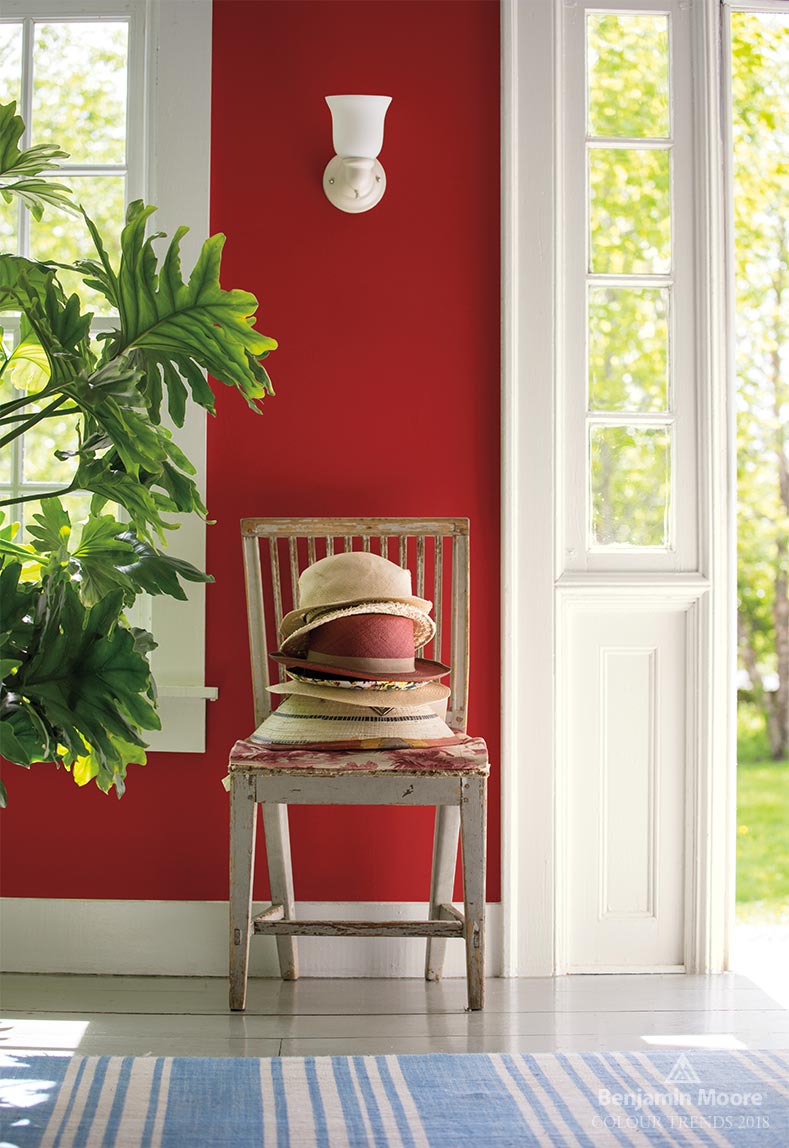
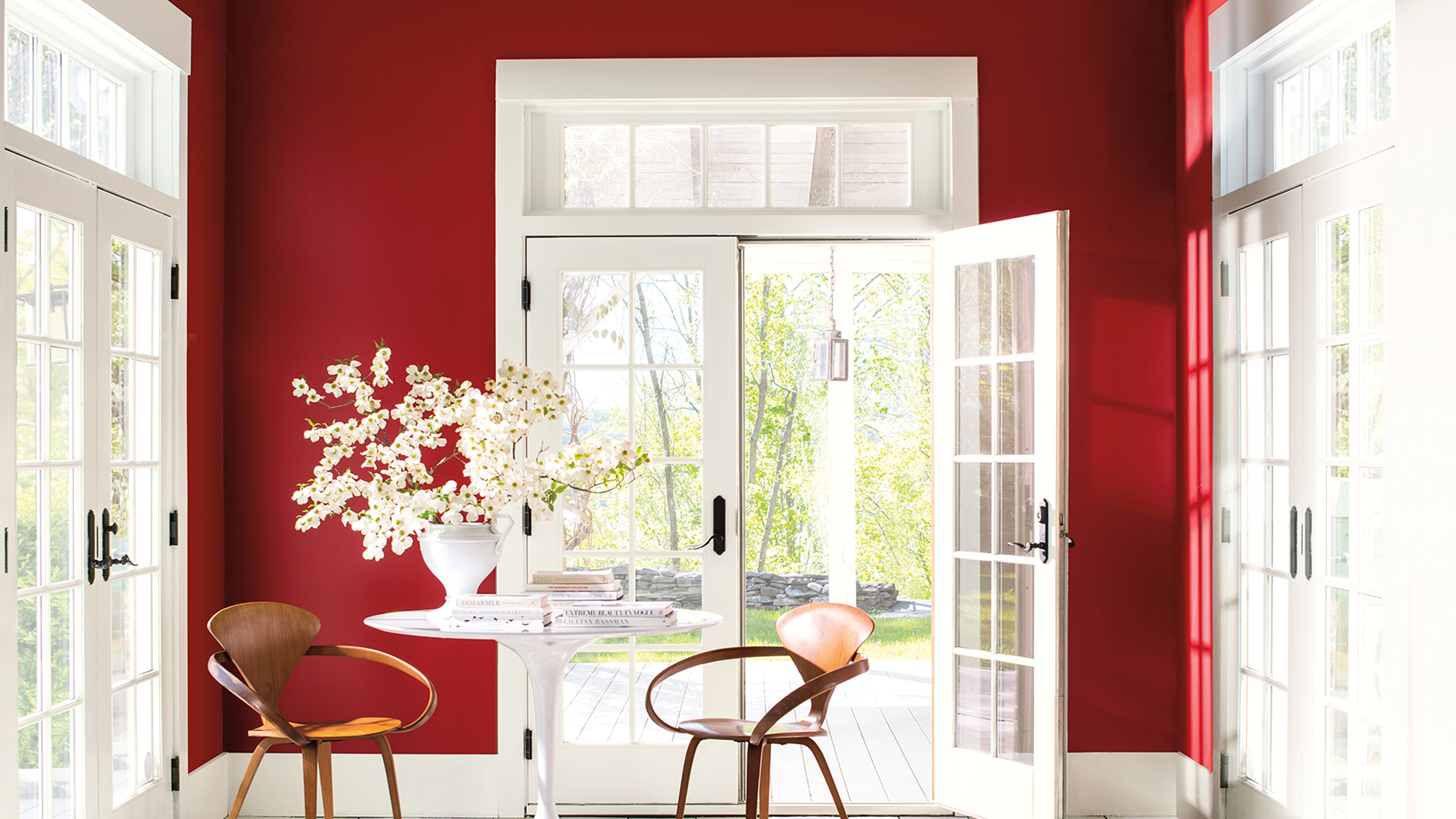
The unexpected red theory has proved a hugely popular color trend lately. The idea goes that pops of bright, primary-like red peppered into a space can instantly elevate your design, and - naturally - Benjamin Moore's Caliente (AF-290) is one of the best paint colors to embrace the look.
'It's an intense and vibrant shade of red that captures the eye and exudes energy,' says Isy. 'Its bold presence makes it ideal for making a striking statement in any space, injecting a sense of drama and invigoration.' This fiery color is best used in small doses (as does the unexpected red theory), so consider it as an accent on trim, furniture, or doors in your next decorating project.
When used in this way, Isy says the shade can introduce captivating focal points that enhance a room with warmth and character. 'When paired with neutral tones or complementary shades, Caliente can also achieve a harmonious and lively ambiance, bringing a sense of dynamism and vitality to any room,' she adds.
If you want to give your home a dose of new color, a fresh lick of paint is undoubtedly the way forward. And you can trust these Benjamin Moore colors to make your space look design-led and timelessly elegant. Find your shade, pick up the paint brush, and get decorating.

Lilith Hudson is a freelance writer and regular contributor to Livingetc. She holds an MA in Magazine Journalism from City, University of London, and has written for various titles including Homes & Gardens, House Beautiful, Advnture, the Saturday Times Magazine, Evening Standard, DJ Mag, Metro, and The Simple Things Magazine.
Prior to going freelance, Lilith was the News and Trends Editor at Livingetc. It was a role that helped her develop a keen eye for spotting all the latest micro-trends, interior hacks, and viral decor must-haves you need in your home. With a constant ear to the ground on the design scene, she's ahead of the curve when it comes to the latest color that's sweeping interiors or the hot new style to decorate our homes.


