What Are the Most Popular Behr Paint Colors? These Hand-Picked Shades Promise to Bring Your Walls to Life
These paint colors from Behr are cult classics and come hand-chosen by experts to guarantee designer-worthy decorating

The Livingetc newsletters are your inside source for what’s shaping interiors now - and what’s next. Discover trend forecasts, smart style ideas, and curated shopping inspiration that brings design to life. Subscribe today and stay ahead of the curve.
You are now subscribed
Your newsletter sign-up was successful
Behr's paints are some of the best in the business. For excellent adhesion, easy application, and long-lasting color, you can't go wrong by opting for their range. But, while redecorating your home with Behr's paints might be simple, choosing the perfect color to grace your walls isn't.
If you're struggling to settle on a decision, a glance at their most popular shades is a great place to start. From soft and liveable neutrals to soothing blues, there's plenty of on-trend colors among the cream of the crop, all of which promise to breathe new life into your space. "When looking at the popularity of our colors, consumers are leaning towards sophisticated neutrals from beige to taupe, white and gray," explains Erika Woelfel, VP of Color and Creative Services at Behr. "These colors offer more room for versality within the home and can be used to build upon with furniture and décor for the perfect living environment."
Whether you want to drench all four walls in color or add a fiery accent by painting furniture or trim, Behr's hues have you covered. Here, we asked experts which paint color ideas they're using from the brand this year (and beyond) to bring designer worthy decorating to your next paint project. This is what they chose.
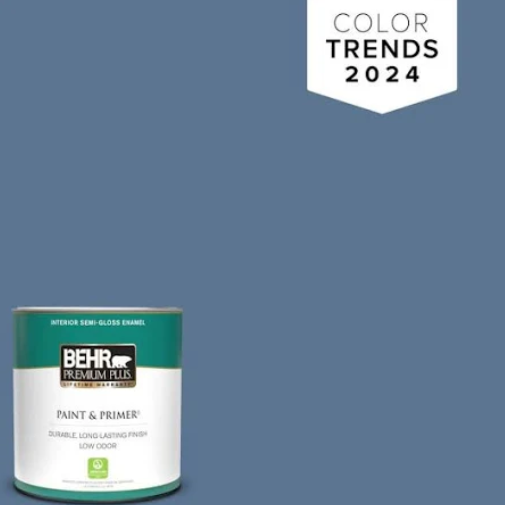
1. Laguna Blue
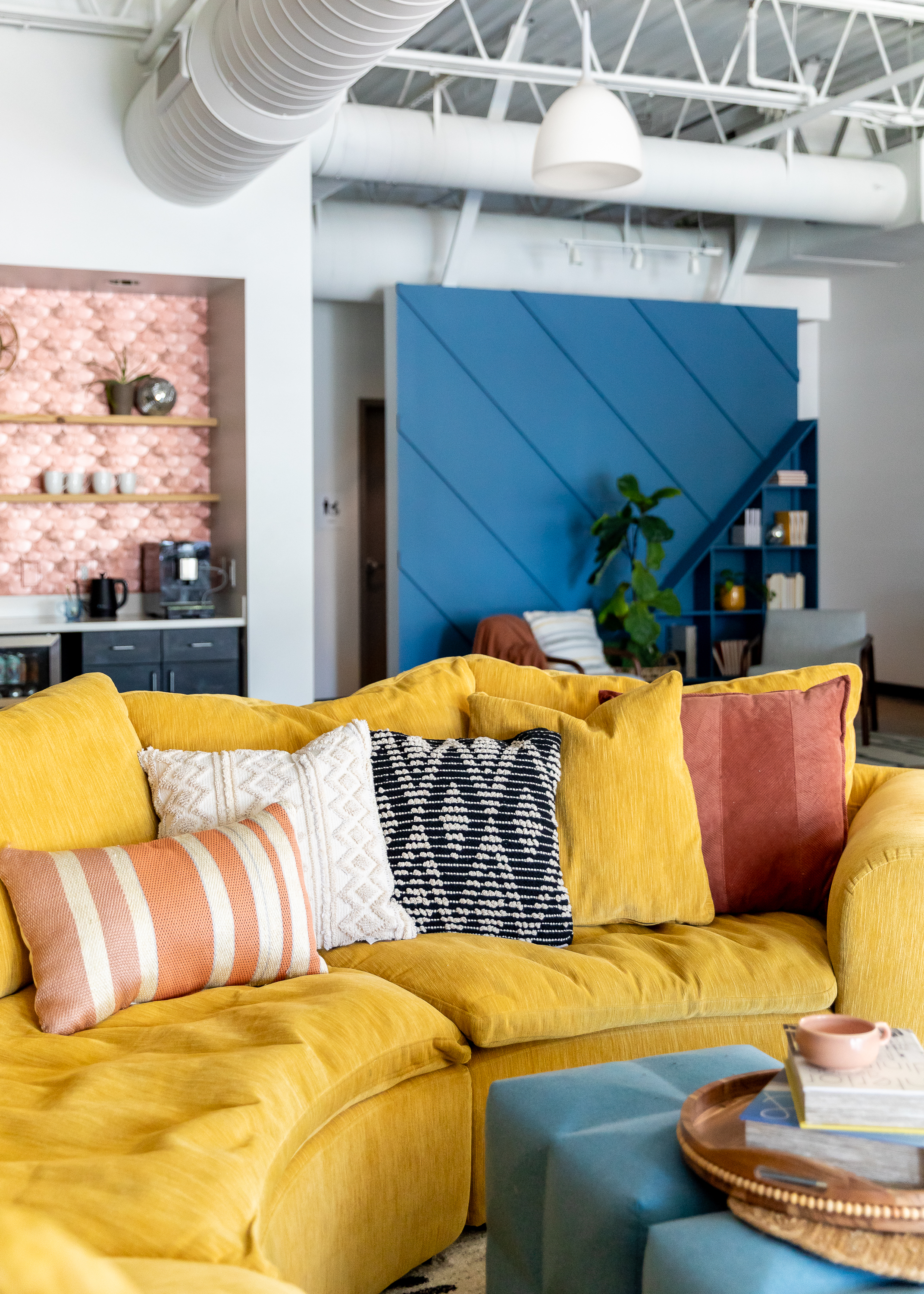
Blues are by far one of the biggest color trends of 2024. The soothing properties of this nature-inspired shade make it an excellent choice for living rooms and bedroom where it instantly creates a relaxing vibe, and one of the best paint colors for the job is Behr's Laguna Blue.
Article continues belowAs the name suggests, this mid-tone blue transports your to a tropical lagoon. Whether used for kitchen cabinets, bright accents, or all-over color, it feels uplifting and optimistic. If you want to bring a summery feel into your space, this color has you covered.
"Laguna Blue PPU14-18 is a wonderful saturated inky blues for accents, cabinetry, trim and furniture," explains Heather Thompson, Principal and Owner of Fulton Park Designs. "Paired with a black and white base color scheme and pops of burnished gold and rust accents, it give us beachy California vibes in this palette. Imagine ocean meets desert in this upbeat, relaxed bohemian trend."
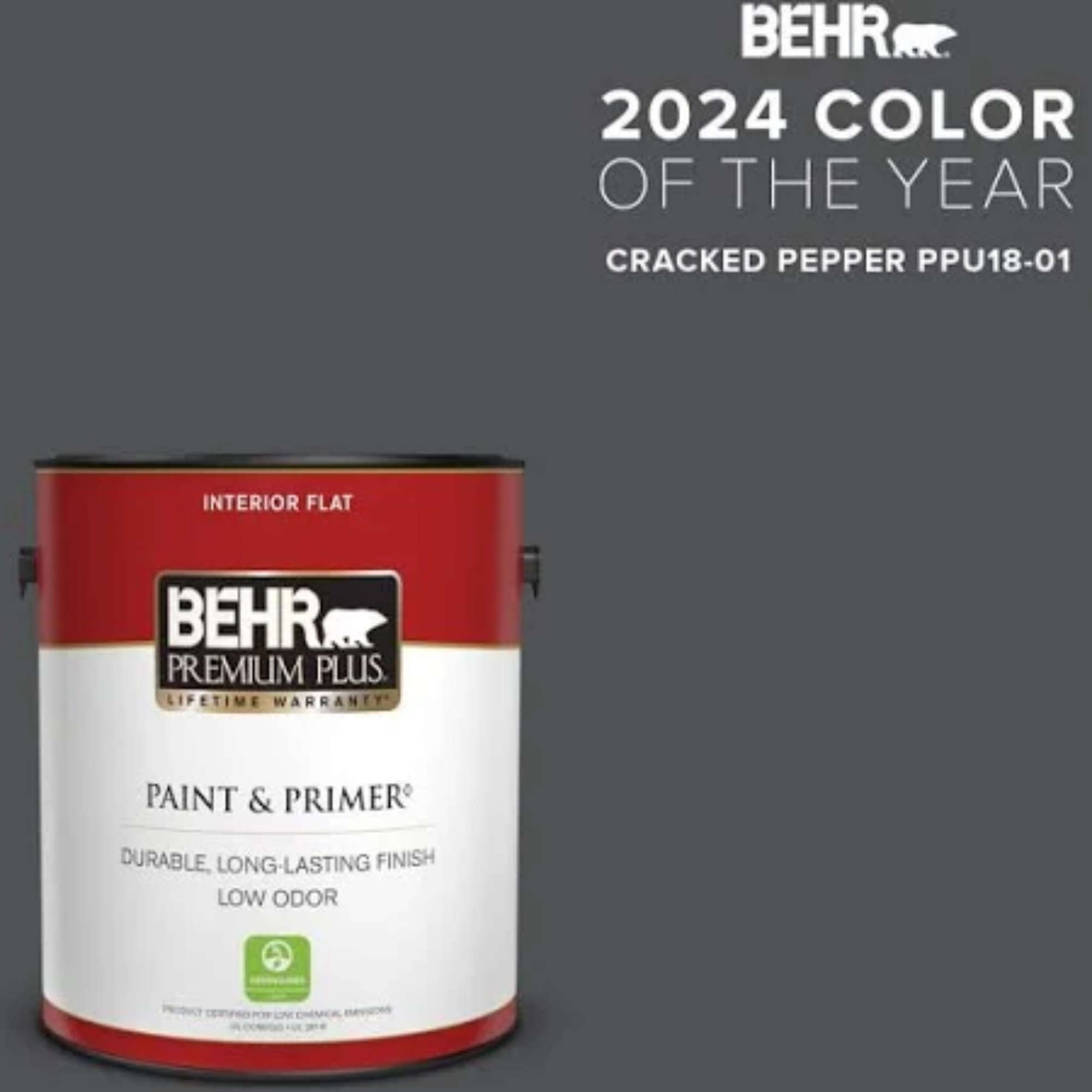
2. Cracked Pepper
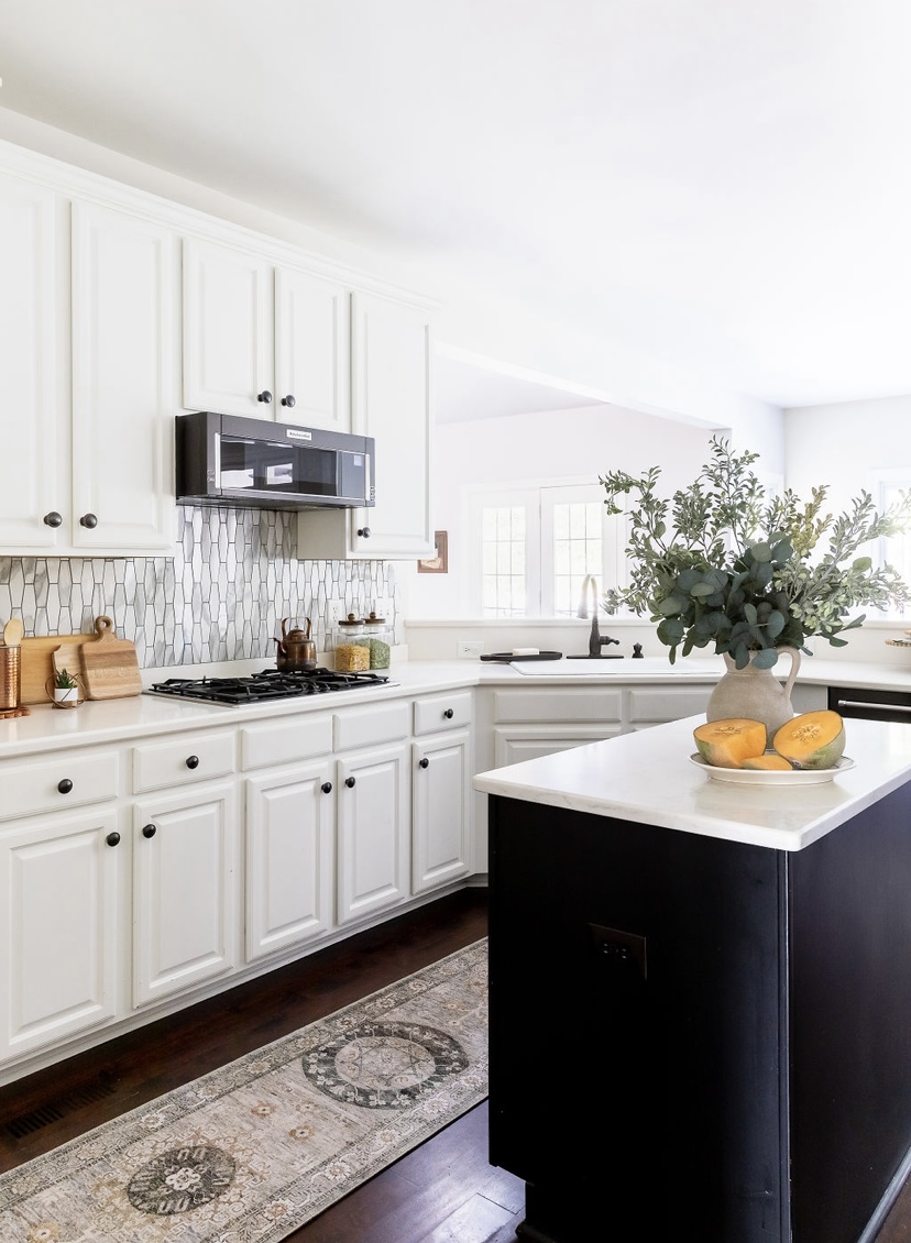
Cracked Pepper was Behr's color of the year 2024, but we're certain the popularity of this classic moody tone won't fade any time soon. This timeless black works perfectly as a contrasting tone in lighter schemes - as seen in the kitchen above where it's used alongside another Behr shade called Bit of Sugar - or as an all-over color if you're feeling daring.
Erika Woelfel from Behr called Cracked Pepper "a versatile soft black". "It will instantly elevate not only the room you’re in, but the way you feel in it," she says. "Both timeless and modern, this infinite hue accentuates the livable spaces we create life moments in."
The Livingetc newsletters are your inside source for what’s shaping interiors now - and what’s next. Discover trend forecasts, smart style ideas, and curated shopping inspiration that brings design to life. Subscribe today and stay ahead of the curve.
Don't be put off by the intensity of this black paint color, either. Instead, think carefully about how a splash of black can complement an existing scheme. "When it comes to the best blacks and whites, (we know how overwhelming it can be with so many choices), we like to stay neutral," says Heather, who designed the space above. "We steer our clients toward true neutrals - whites and blacks with very little undertones - these are whites that don’t lean too cool or too warm. Our favorite blacks are true black without brown or violet undertones."
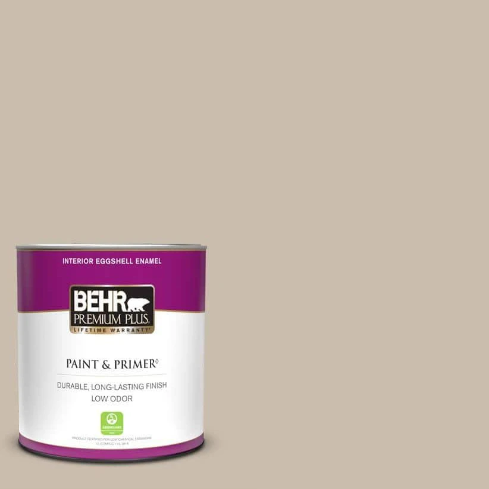
3. Creamy Mushroom
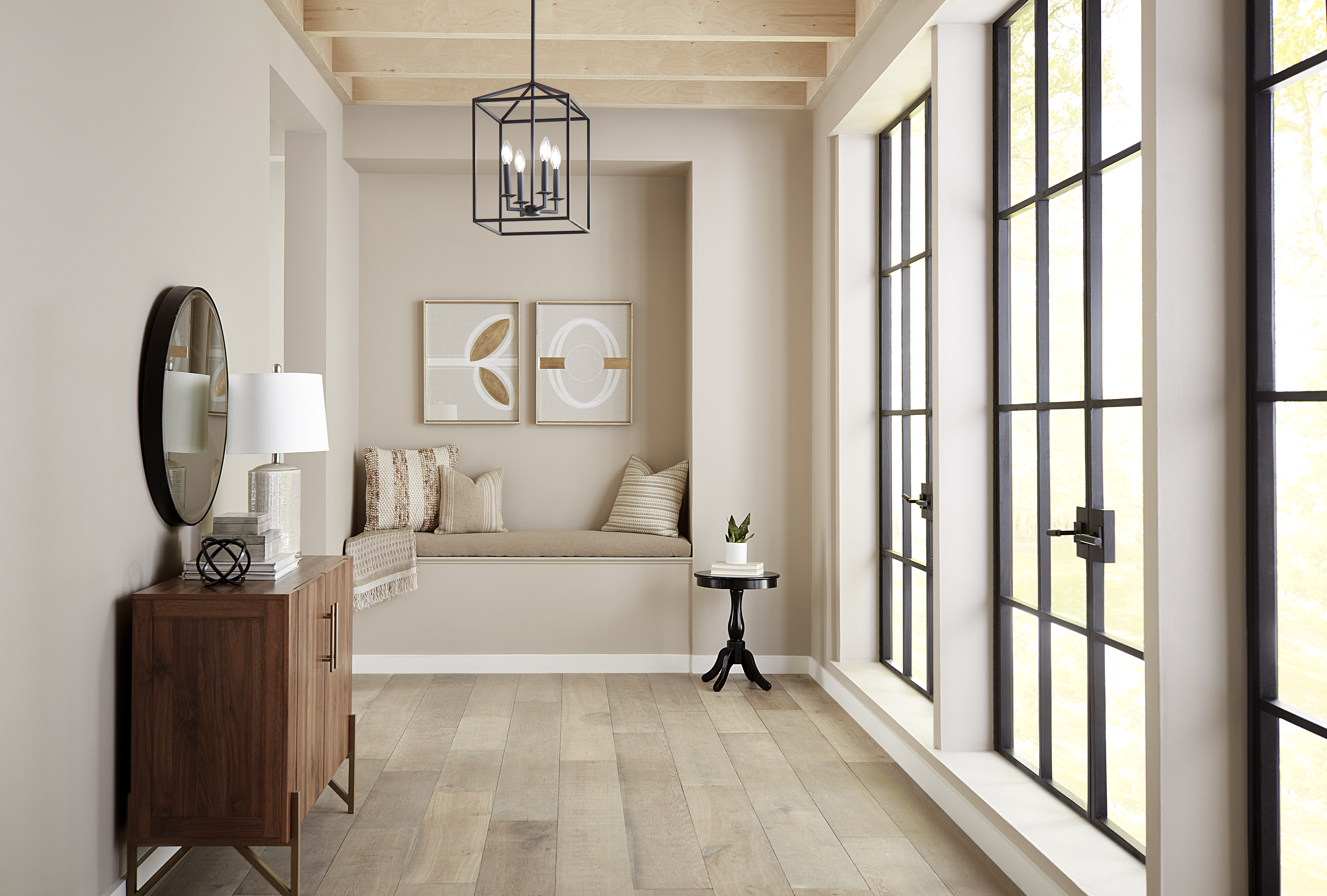
Neutral color schemes are universally loved for their versatility and timelessness, so it's hardly surprising that one of Behr's most popular paint colors is Creamy Mushroom, a soft and gentle creamy shade. Erika calls this color "a calming, earthy tone of gray that is both relaxing and inviting", qualities that make it perfect for a minimalist space. That said, it works just as well as a foundational base for more experimental colors.
For understated elegance, try gracing your walls with this shade. "Behr's Creamy Mushroom is a versatile neutral that adds warmth and sophistication to any room," notes Erika. "Pair it with earthy tones, such as Toffee Crunch, and natural textures for a cozy, inviting space." We also love the effect it has when used with black accents, as seen above with the Crittall-style windows.
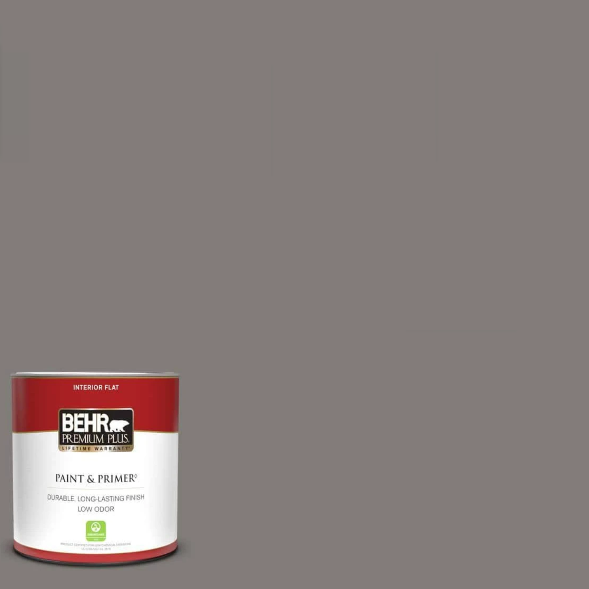
4. Greyhound
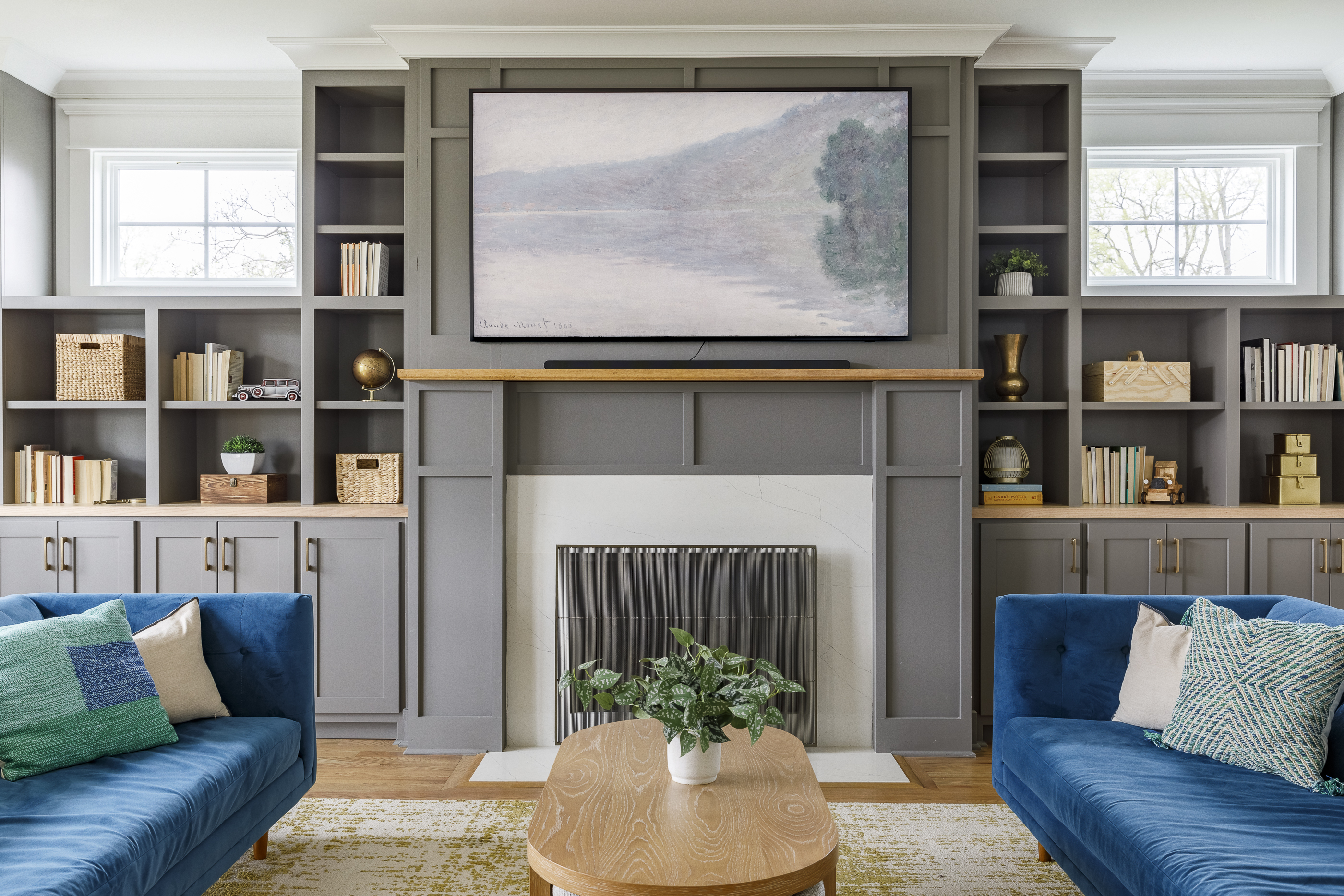
If you're not a fan of beige but still prefer toned-down schemes, Greyhound by Behr is a beautiful shade to choose. This soft gray is one of the most popular paint colors from the brand and has just enough warmth in it to make it suitable for relaxing living spaces like bedrooms or living rooms. It also pairs perfectly with taupes and wood finishes, and with so many colors that go with gray, the possibilities for color pairings really are endless.
"This year our favorite grays are warmer, deeper, earthier tones like Elephant Skin, Greyhound or Burnished Pewter," explains Heather. "A color like Greyhound is the perfect transitional color for those stepping away from the gray tones trend of the last decade but carries enough warmth and gravitas that pairs well with whites, lighter wood finishes and pops of jewel-tone colored accents. It is sophisticated, classic and works well on walls, trim, ceilings, interior and exterior."
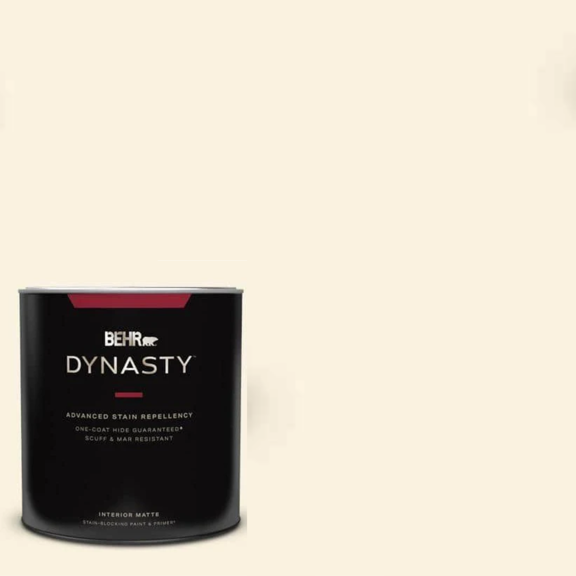
5. Blank Canvas
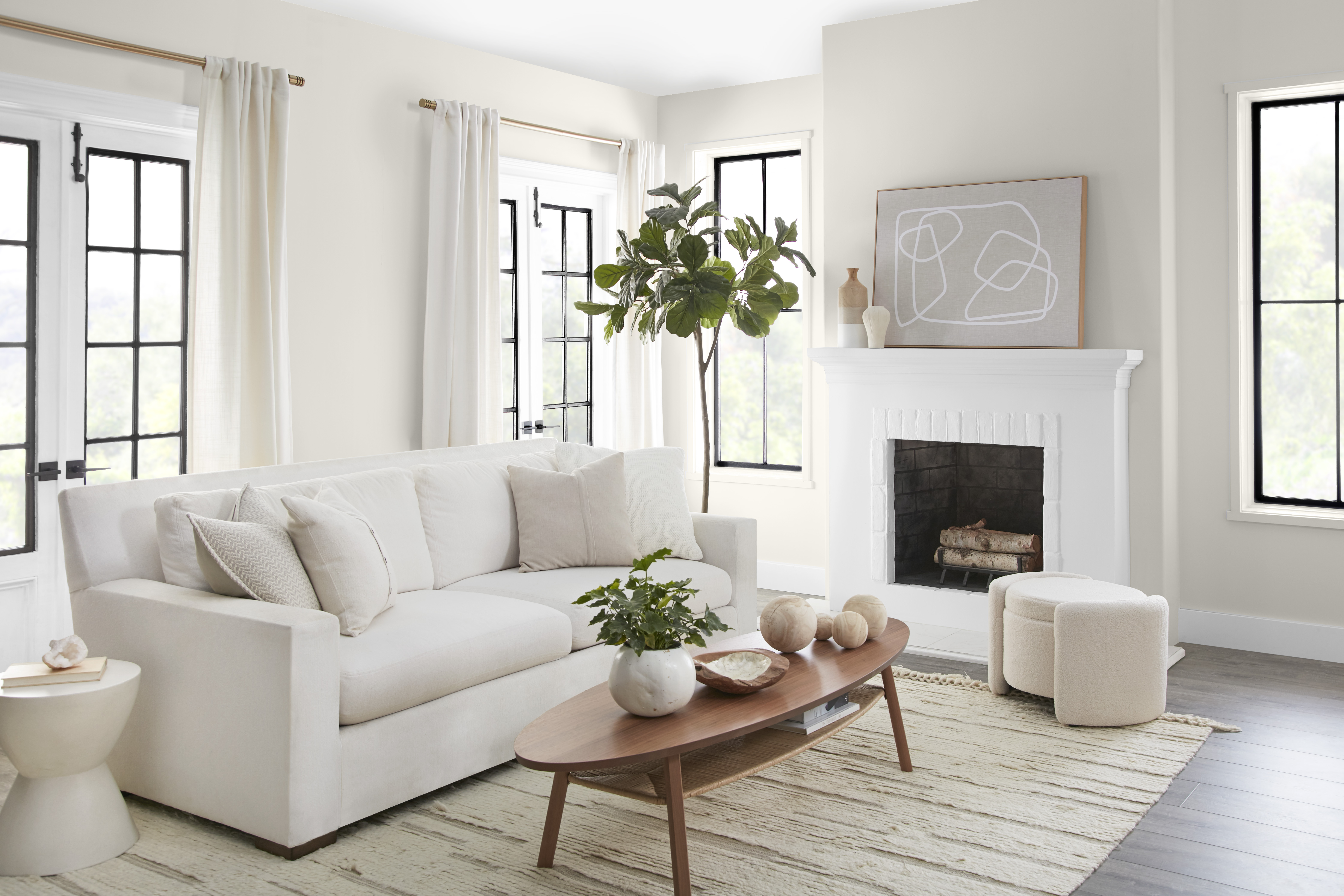
Of course, we can't talk about the most popular paint colors without mentioning white. This classic shade offers a versatile foundation inside the home, but recently we've moved away from pure stark whites in favor of more creamy off-white tones. And, if you want to tap into the trend, Behr's Blank Canvas is an ideal choice.
This buttery white was Behr’s Color of the Year for 2023, but it's popularity certainly isn't waning. According to Erika, this is largely to do with the color's versatility. "It's the perfect backdrop that is easy to build upon to highlight other features in the home," she says. "It's a warm, welcoming white with the transformative power to offer limitless design opportunities." As one of the neutral paint colors designers always use, this shade is guaranteed to bring a professional-worthy finish to your walls.
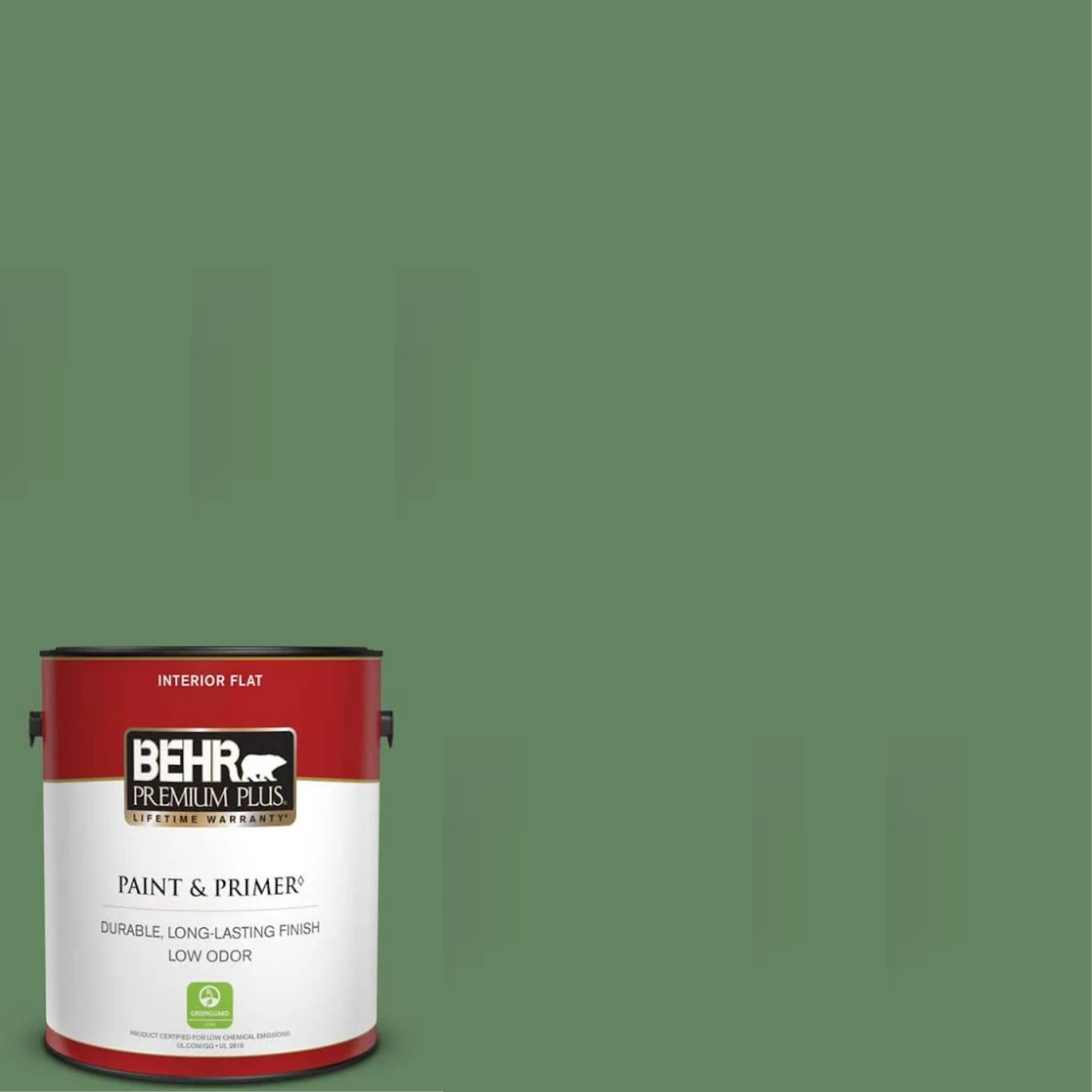
6. Tuscan Herbs
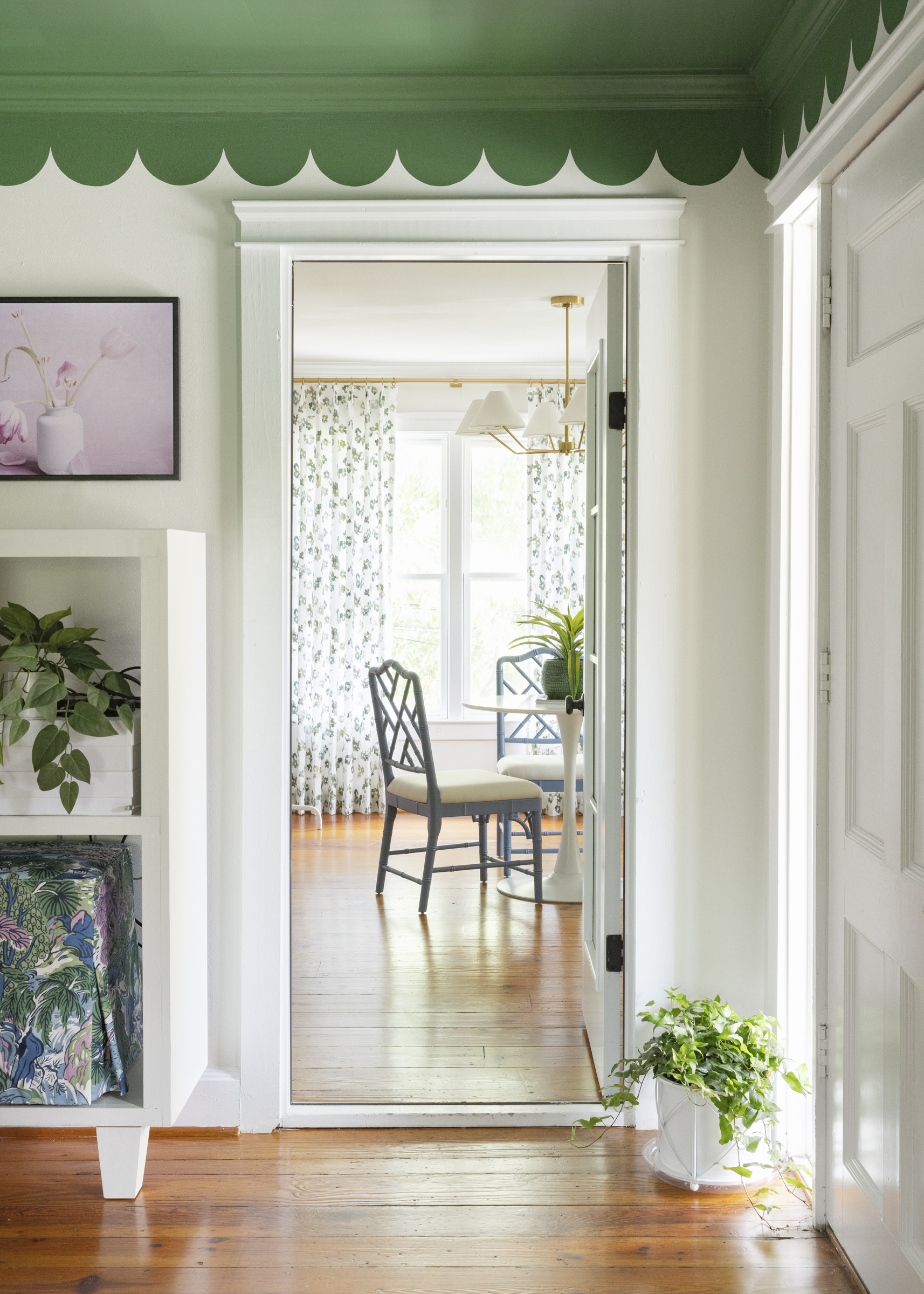
Greens will always have a worthy place inside our homes but recently, sage greens have been replaced by more saturated mid-tone greens reminiscent of forest floors. Reflecting this move is one of Behr's most popular paint colors, Tuscan Herbs, a delightful shade that - as the name suggests - shares similarities with the natural color of oregano and rosemary.
Heather and the team at Fulton Park Designs love decorating with greens. "Fresh greenery instantly breathes life into a white room," she says. "Tuscan Herbs offers the freshness and hint of warmth that makes a room instantly bloom. It is wonderful on trim, cabinetry or an accent wall (or ceiling). We pair it with a warm white like Blank Canvas to keep it feeling like a sunny day - always brining the outdoors in." We see this combination working well as a living room paint color idea, especially where creative paint techniques are used to add visual interest, just like the scalloped trim design seen above.
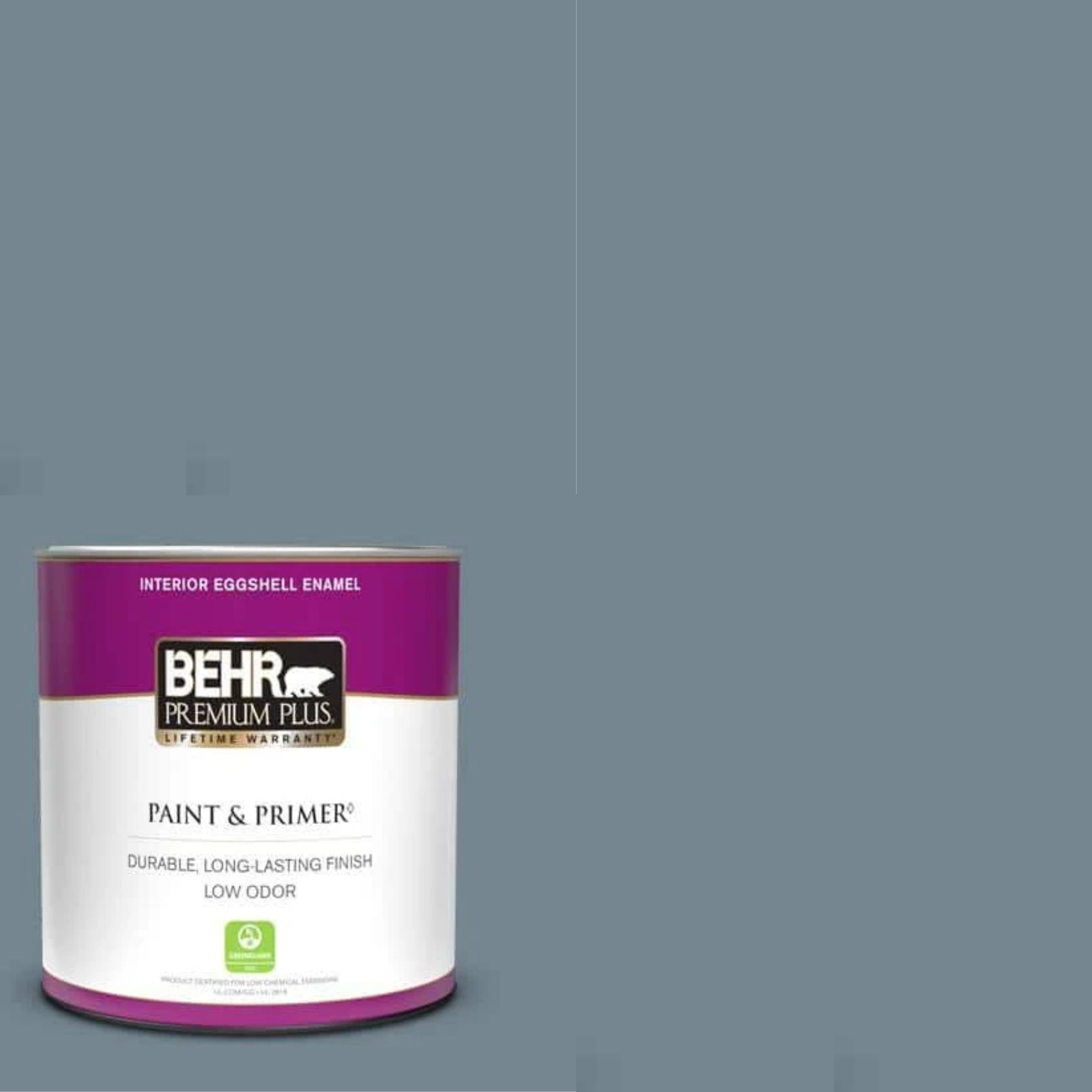
7. Adirondack Blue
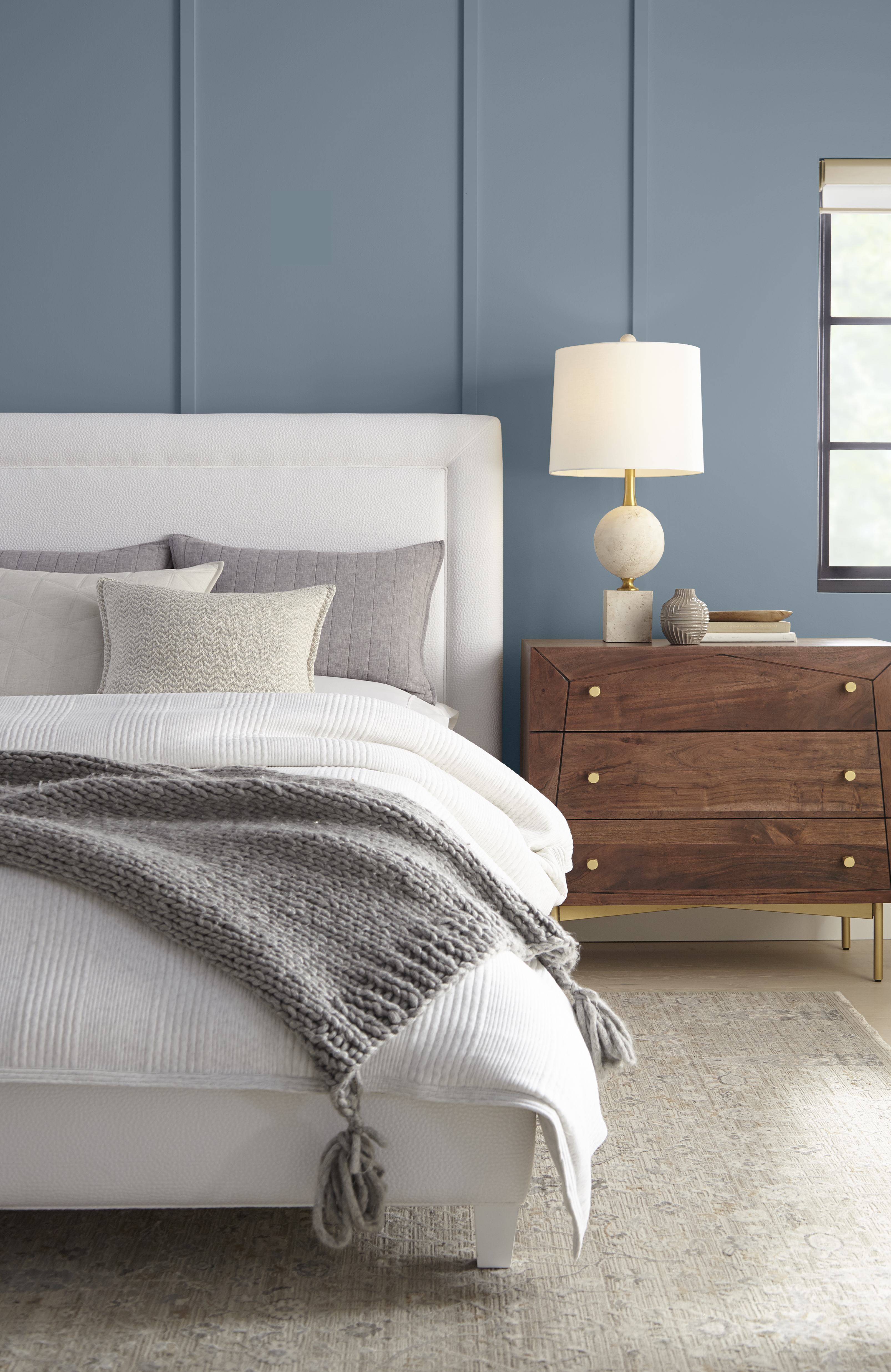
Adirondack Blue from Behr’s Designer Collection, is a reassuring slate blue that feels seriously calming. The smoky undertones are seriously on-trend, and the gray-like qualities mean it will pair well with virtually everything. "It serves as a perfect accent color that adds timeless sophistication to a space," says Erika.
With so many colors that go with blue, the opportunities to decorate with this popular shade inside the home are limitless, but Adirondack Blue is especially useful if you want to instil a relaxing theme. "Adirondack Blue brings a calm and serene feel, perfect for bedrooms and living areas," notes Erika. "Complement it with crisp whites, such as Ultra Pure White, and soft grays, like Chic Gray, for a refreshing and modern look."
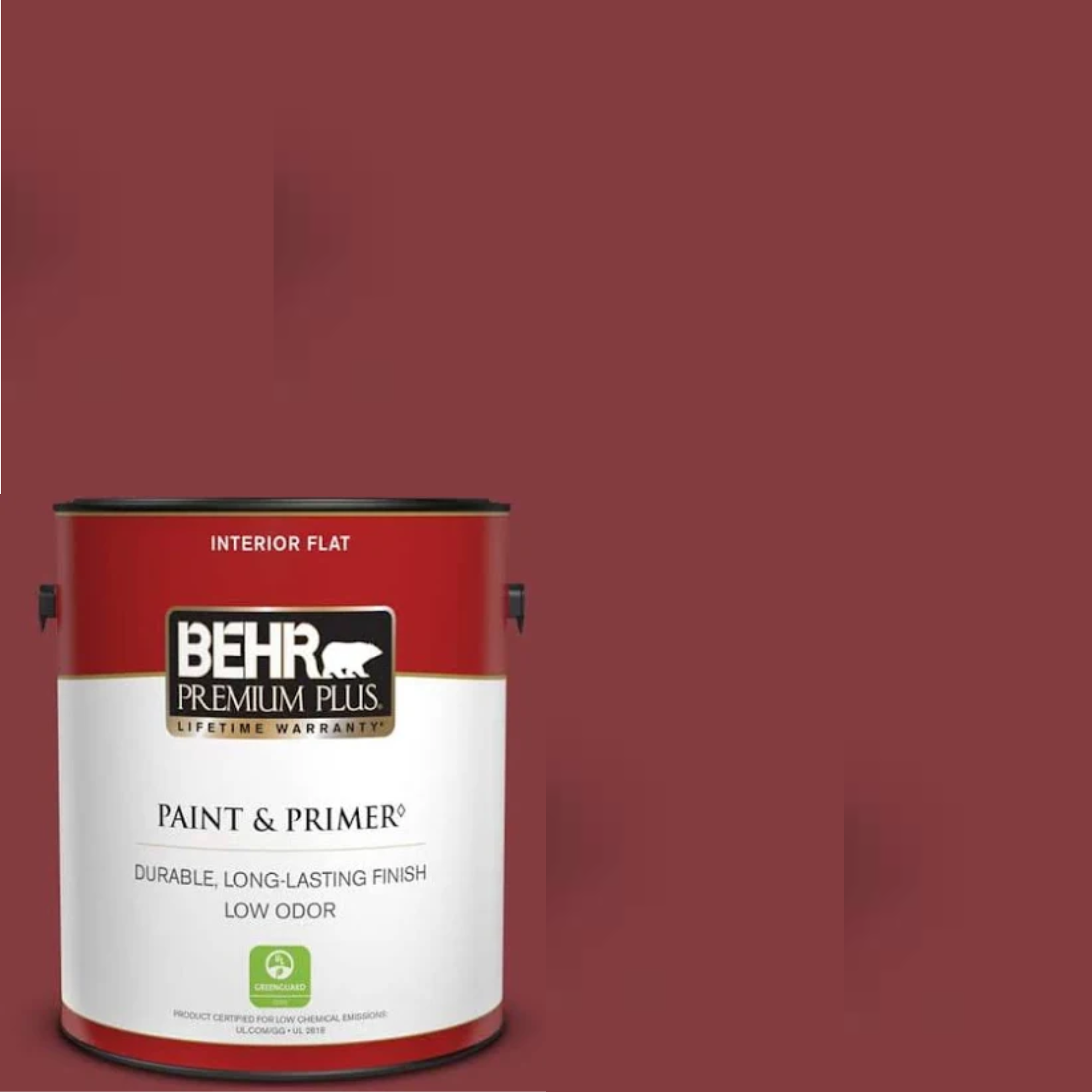
8. Dark Crimson
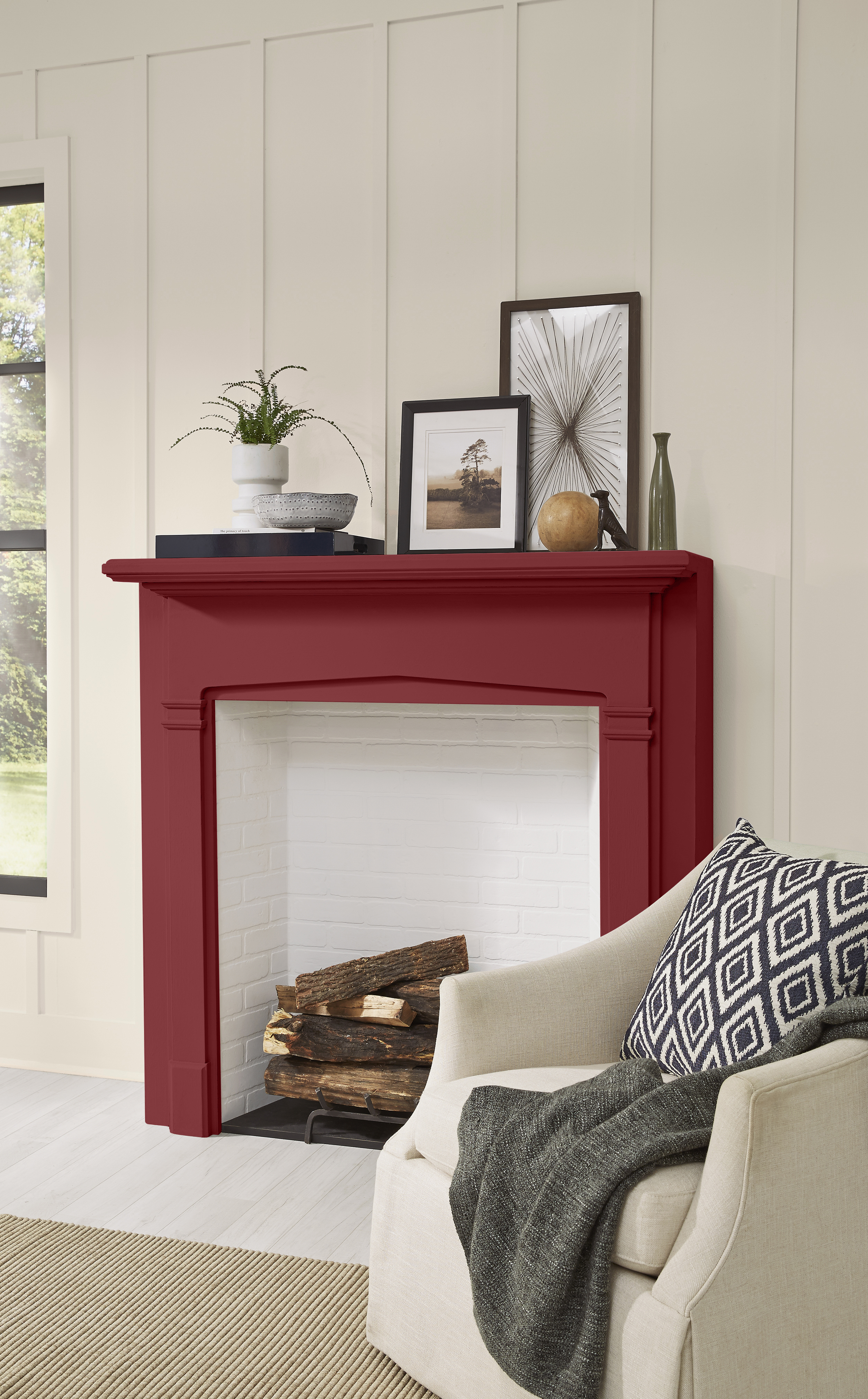
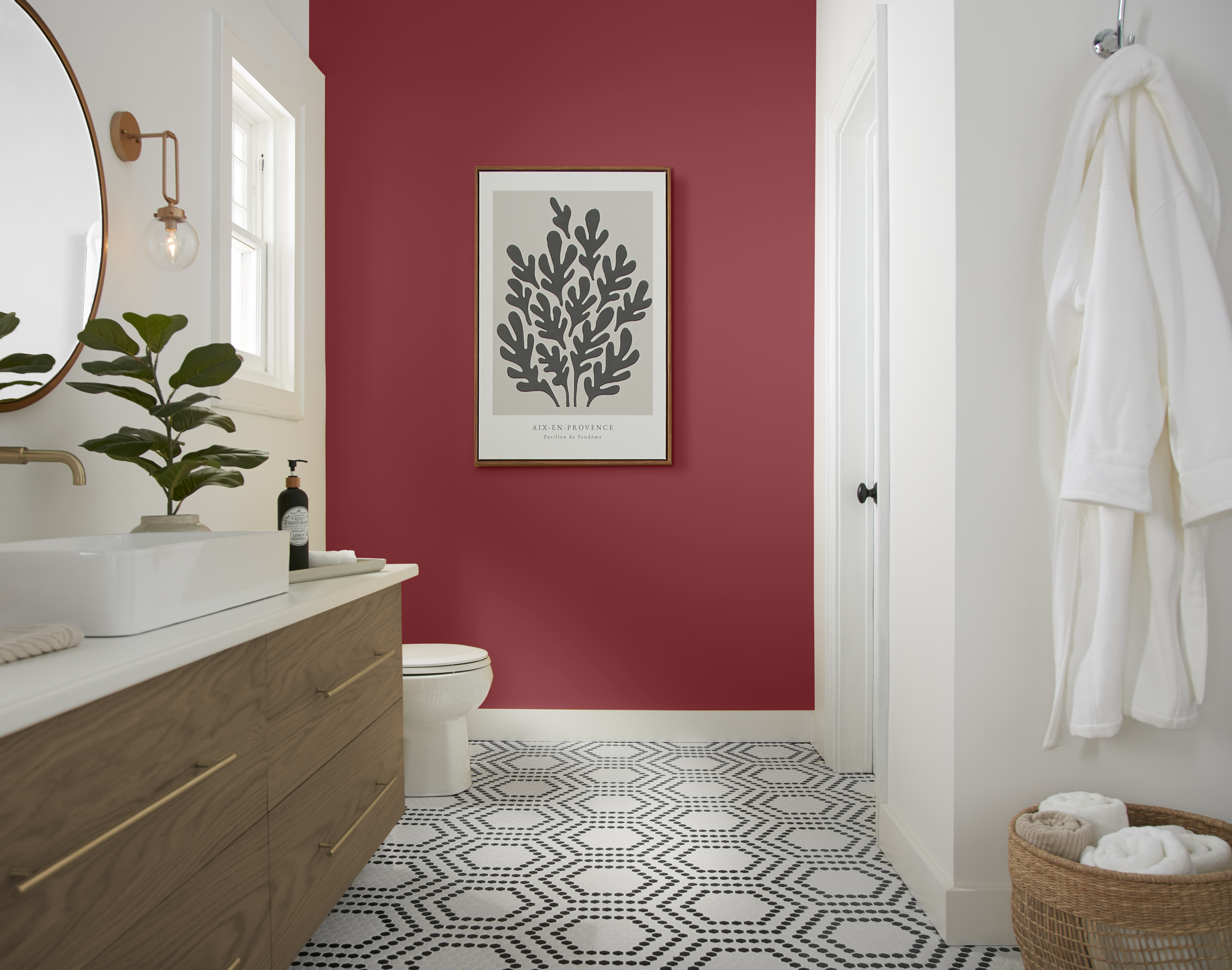
Fiery reds might not seem like the most liveable shades, but they've been soaring in popularity this year thanks to the "Unexpected Red" theory. The trend claims that small doses of saturated reds in a color scheme can instantly elevate a room, and shades like Dark Crimson by Behr channel exactly that. This magenta-like hue might be deeper than a primary red, but that only gives it a more sumptuous feel that works beautifully as an accent.
"Dark Crimson is a deep and exquisite red that adds a note of elegant luxe to a home," explains Erika. Try pairing it with soft taupes and other neutrals to make it the star of the show, or use alongside deep navy hues and other jewel-tones to bring a refined elegance to any room.
With Behr's catalog of colors, you really are spoilt for choice. If you need a helping hand, pick from these most popular shades and you're guaranteed to have a professional-worthy paint project and an on-trend color scheme that endures for years to come.

Lilith Hudson is a freelance writer and regular contributor to Livingetc. She holds an MA in Magazine Journalism from City, University of London, and has written for various titles including Homes & Gardens, House Beautiful, Advnture, the Saturday Times Magazine, Evening Standard, DJ Mag, Metro, and The Simple Things Magazine.
Prior to going freelance, Lilith was the News and Trends Editor at Livingetc. It was a role that helped her develop a keen eye for spotting all the latest micro-trends, interior hacks, and viral decor must-haves you need in your home. With a constant ear to the ground on the design scene, she's ahead of the curve when it comes to the latest color that's sweeping interiors or the hot new style to decorate our homes.
