6 Colors That Don't go With Blue, According to Designers — And What to Choose Instead for a Harmonious Scheme
Interior designers warn against pairing these shades with blue if you want a room to look beautifully balanced

The Livingetc newsletters are your inside source for what’s shaping interiors now - and what’s next. Discover trend forecasts, smart style ideas, and curated shopping inspiration that brings design to life. Subscribe today and stay ahead of the curve.
You are now subscribed
Your newsletter sign-up was successful
Personally, blue is my favorite color to decorate with and design around. It's such a versatile hue and the many shades on its spectrum offer the most tranquil of vibes. However, pair the wrong color with blue and it transforms this lovely shade from tantalizing to tasteless, and it's a danger many of us aren't aware of.
While there are plenty of colors that go with blue, there are a couple of shades that just don't bring out the beauty of this hue, either. Alongside the wrong color, this oceanic shade can look drained and tired instead of rich and lively.
Why bring this gorgeous color into your home, only to let it down by placing it amidst a sea of colors that simply don't couple? Instead, take a note from our favorite interior designers and avoid these six shades that don't do blue justice.
Article continues belowColors to avoid pairing with blue
While the specific shade and saturation of a color plays a huge role in whether it pairs well with blue, there are certain hues that are best avoided unless you know your way around color theory. After some deliberation, these are the six tones that interior designers say are best avoided alongside a more complementary counterpart.
1. Bright yellow
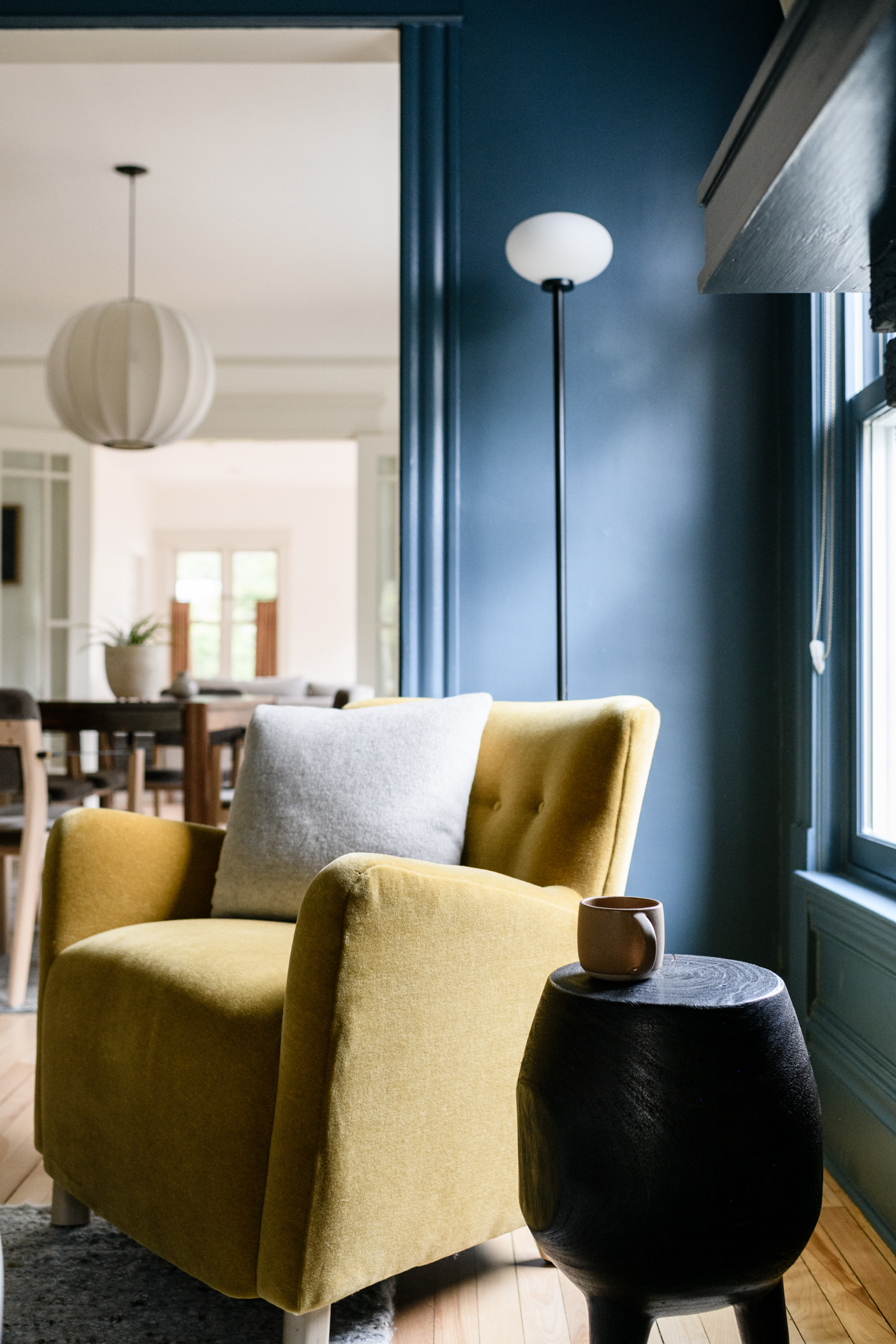
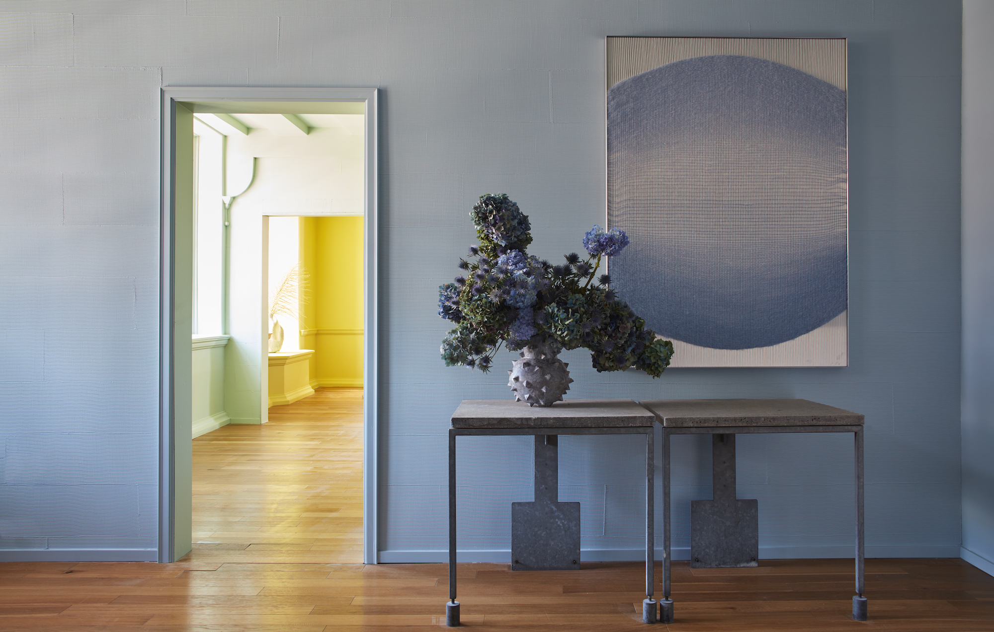
A sunny yellow might seem like an obvious pairing for blue when you look up to the sky, but that doesn't necessarily translate to a liveable space. Isy Jackson, founder of Cheltenham Interiors, calls attention to the unfulfilling combination of yellow and blue. 'The combination can sometimes feel too bright and childlike, mainly if both colors are used in their brightest forms,' notes Isy. 'These colors can quickly take over a space and make it feel unbalanced.'
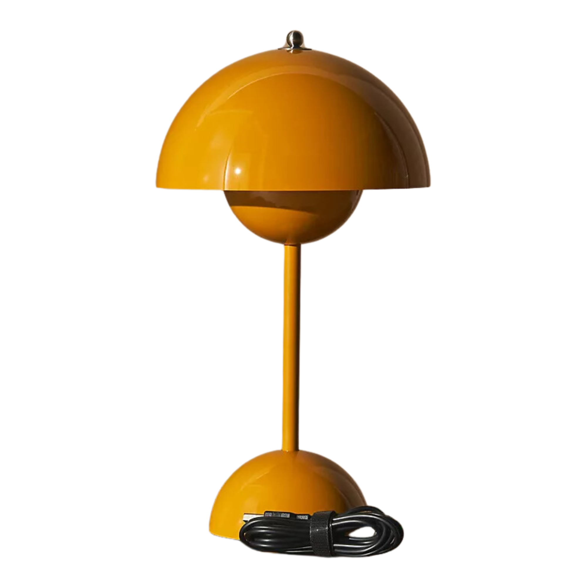
Instead of forcing bright yellow with blue, Isy suggests toning it down with a mustard to create a color palette. 'Mustard yellow has an earthy undertone that pairs well with blue, offering warmth without overpowering the space,' she says. 'This combination is trendy and timeless, adding a touch of sophistication and depth to your interior design.'
Interior designer Nina Lichtenstein is also a strong believer in using mustard to replace striking yellow hues for a more attractive color palette. 'A subdued hue of mustard complements blue’s cool tones, creating a balanced and harmonious look,' says Nina.
The Livingetc newsletters are your inside source for what’s shaping interiors now - and what’s next. Discover trend forecasts, smart style ideas, and curated shopping inspiration that brings design to life. Subscribe today and stay ahead of the curve.
2. Bold Greens
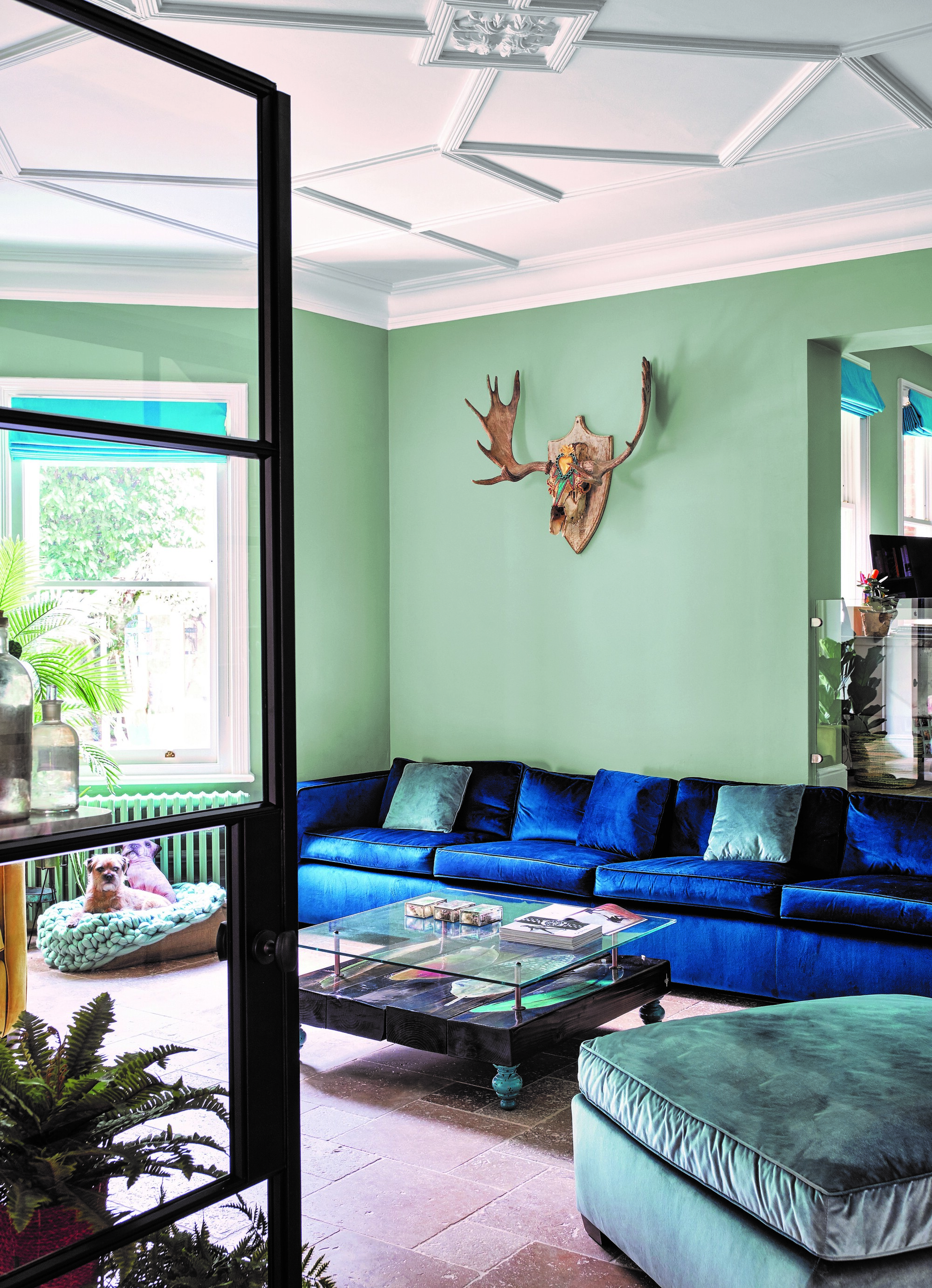
In a sea of color trends, a cocktail of blue and green is perhaps the most trendy combination of all. They're commonly connected and we find that it's the organic earthiness of these shades that draws them together.
However, Nina explains that pairing blue with bold green shades like lime is a decor faux pas. 'Lime green’s sharp, bright undertones often clash with blue, especially if the blue is of a darker shade,' she says. 'This combination can be too visually aggressive and difficult to balance.'
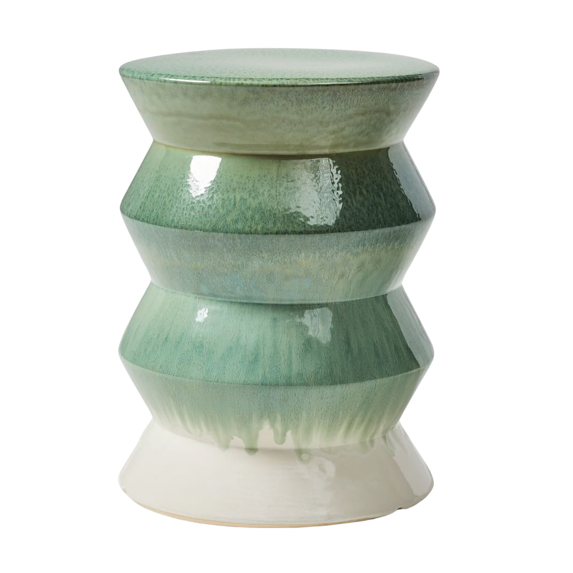
As an alternative, Nina recommends interspersing hues of sage green instead, as seen in the living room above. 'Sage green offers a muted, earthy tone that pairs beautifully with blue,' she notes. 'Its subtlety allows the blue to stand out while adding a bit of nature-inspired tranquility to the space.'
Isy shares a similar sentiment to Nina and also stands behind sage green being the perfect replacement for other vivid shades of the color. 'With its grey undertone, sage green provides the perfect contrast with blue,' she says. 'And this contemporary yet timeless combination adds depth and dimension to any space.'
3. Saturated reds
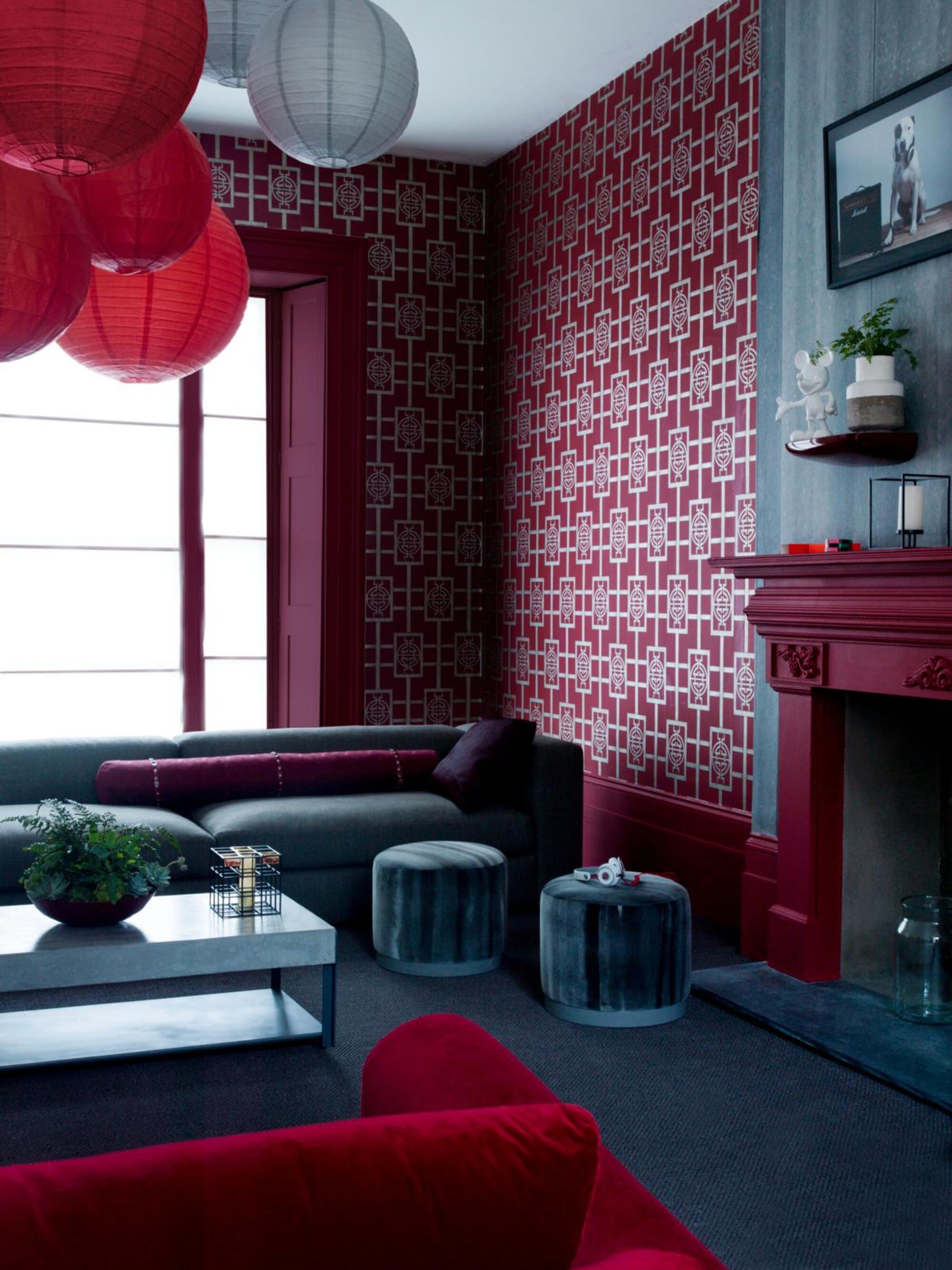
When decorating with color, especially deep shades like blue, you have to curate a palette that doesn't come off as flashy and incohesive. Unfortunately, certain bold hues of red are often guilty of doing so.
Isy points out that combining blue and red can create a striking look, evoking nautical or patriotic themes. She explains that this high-contrast pairing can be overwhelming and challenging to harmonize, making it unsuitable for all interior styles. Meanwhile, interior designer Christine Zippert explains that it's important to pay attention to the undertones. 'If your blue has a green undertone, pairing it with bright red will make it look like a Christmas tree,' she warns.
However if you love the undertones of red and are keen on pairing them with blues, Isy suggests giving burgundy a try. 'As a rich and subdued shade of red, burgundy beautifully complements blue,' she says, as demonstrated in the space above. 'Its warm and elegant properties enhance the coolness of blue, resulting in a balanced and luxurious feel with burgundy's contrast.'
4. Tangerine Orange

On paper, spirited shades of orange should work perfectly with docile shades of blue. But in play, these two shades don't really mix well. Instead of coming together for a playful theme, they tend to throw the entire ambiance off-balance.
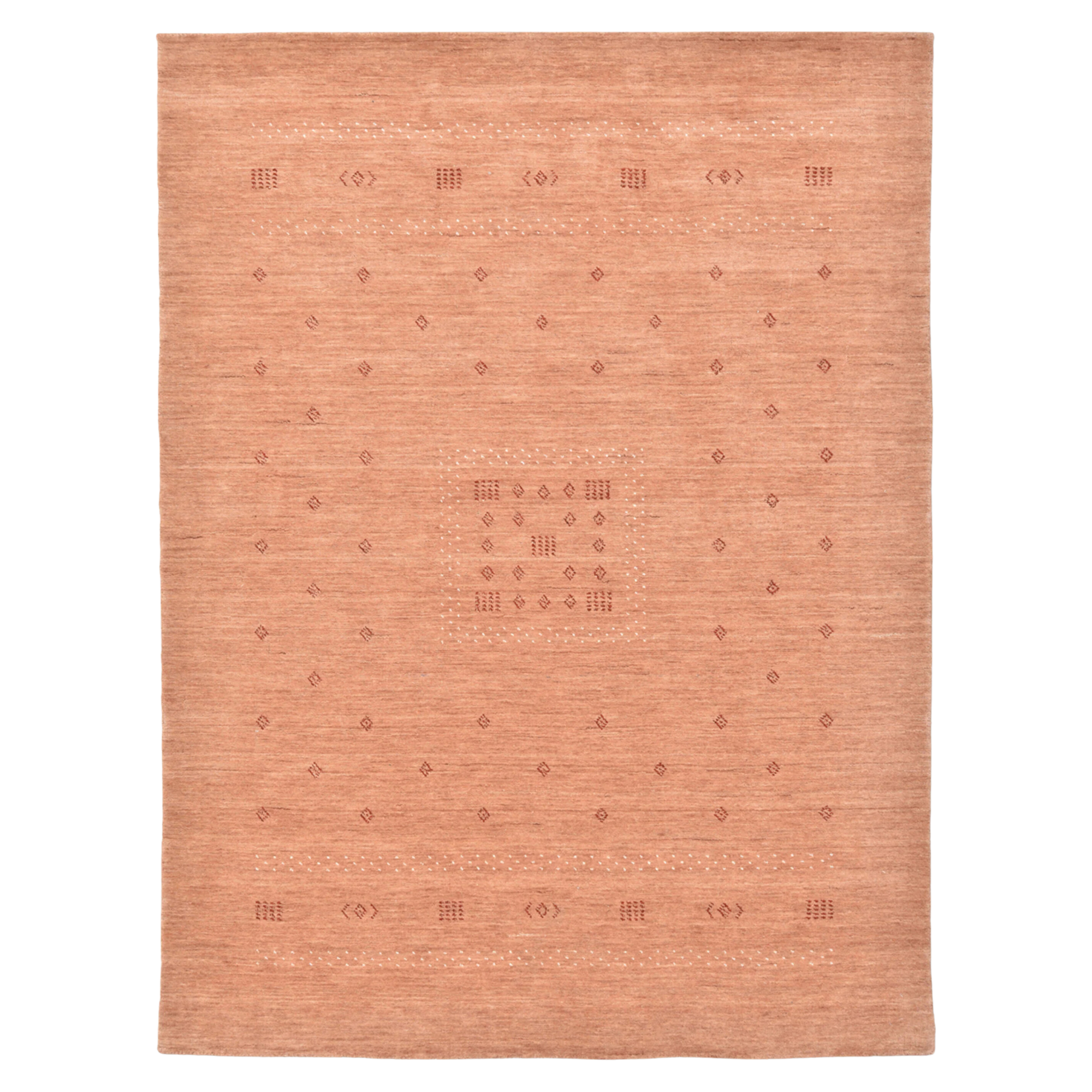
Although blue and orange are complementary in color theory, Isy explains that their bold and contrasting nature can sometimes clash, creating a jarring and overly intense look. So, in its place, Isy recommends adding splashes of soft peachy hues. 'This gentle tone harmonizes with blue effortlessly, eschewing stark contrasts,' says Isy. 'Soft peach imbues a space with warmth and finesse, fostering a harmonious and welcoming ambiance that's easier on the eyes and exudes sophistication.'
And if you're still keen on mixing in a more orangey shade, Nina suggests adding in accents of terracotta. 'Terracotta introduces a warm, earthy tone that blends well with blue,' she says. And, likewise, blue is a color that complements terracotta perfectly. 'Its richness adds depth and warmth to the color scheme, making the overall look more sophisticated and cohesive.'
5. Vivid Purples
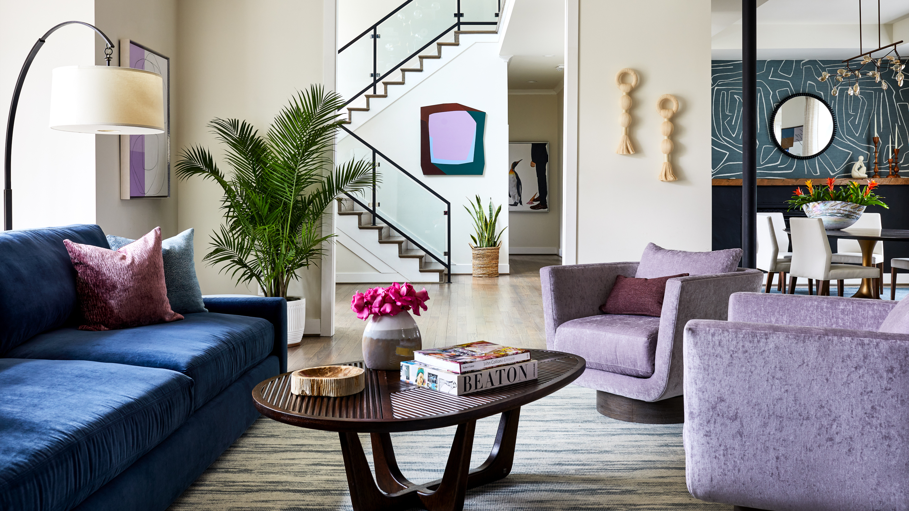
According to Revkah Gordon, founder of Revkah Design, blue and purple make for a challenging pairing. She explains that the undertones are far too striking, making the colors look garish together.
Nina is also not a fan of solid purples and bold blues mingling in the same living space. 'Vivid purple can be too strong and competitive when paired with blue, leading to a visually jarring and disjointed effect,' she explains. 'This combination can make the space feel chaotic and uncoordinated.'
As an alternative to the more jarring shades of this color, Nina recommends reaching for lovely lavender hues. 'Lavender provides a gentler approach, offering a harmonious blend with blue,' she notes. 'Its light, airy quality complements blue’s coolness, creating a serene and cohesive look that’s perfect for relaxation.' All it takes is one glance at the purple and blue living room above to see how well they work.
6. Rich browns
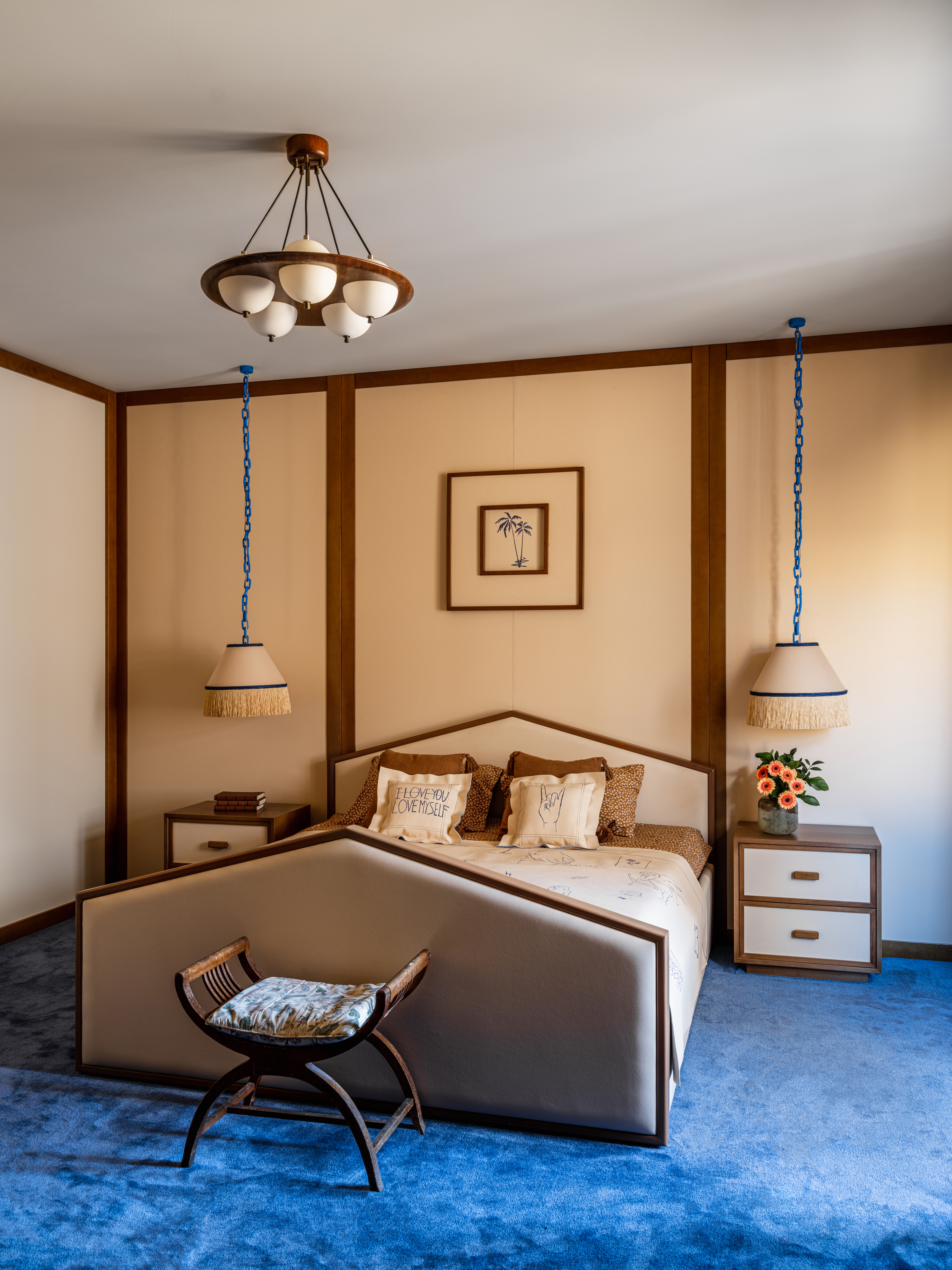
It seems to be a renewed year of life for brown but it remains to be one of the popular shades that simply doesn't mesh with blue. Isy informs us that combining brown and blue can sometimes create a dated or overly earthy feel, especially if the brown shades are dark and the blue is light. She finds that this pairing can often feel heavy and uninspired, lacking the vibrancy needed to enliven a space.
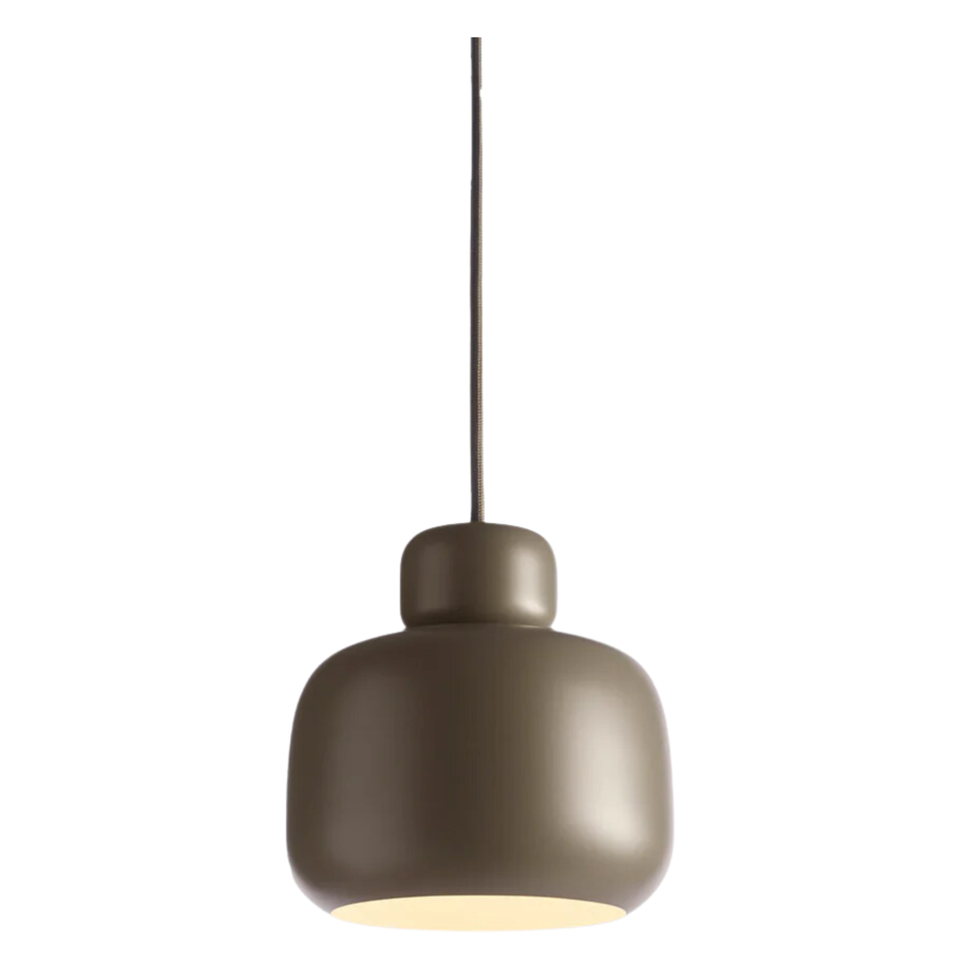
So instead of jamming the two colors into one space, Isy recommends swapping out woody browns for its trendier counterpart in the shade of taupe. As a lighter and more neutral shade of brown, Isy explains that taupe pairs wonderfully with blue.
'It adds a touch of elegance and sophistication, offering a neutral backdrop that allows blue to stand out without the heaviness that darker browns can bring,' she says. Isy tells us that this pairing can gift any space a refined finish and we couldn't think of a better combo to grace the inside of a modern home.

Amiya is a Home Wellness Writer at Livingetc. She recently graduated with a Masters Degree in Magazine Journalism from City, University of London, and has lent her words to beauty, fashion, and health sections of lifestyle publications including Harper’s Bazaar and Women’s Health. Her experience as a research analyst has equipped her with an eye for emerging trends. When she’s off the clock, she can be found reading, listening to music, or overanalyzing her latest Co-Star update.
