4 Bathroom Colors That Are Going Out of Style in 2025 — Don't Say We Didn't Warn You
If you're redecorating your bathroom this year, our design experts suggest you avoid these outdated colors

The Livingetc newsletters are your inside source for what’s shaping interiors now - and what’s next. Discover trend forecasts, smart style ideas, and curated shopping inspiration that brings design to life. Subscribe today and stay ahead of the curve.
You are now subscribed
Your newsletter sign-up was successful
We don't want to be the bearer of bad news, but your bathroom color choice may officially be passé.
In the pursuit of the perfect bathroom color idea, we've become familiar with the fast-moving trend cycle in the design world. As hot as a shade may be, one year on it can just as easily be distinctively... not.
Color trends in bathroom design tend to be a little slower, but they do reflect the wider movements and shifts in interiors, especially when it comes to color. So what's out for 2025? Well, when searching for comfort in our homes, we're waving goodbye to cool, harsh tones and materials and welcoming natural materials and earthy shades with open arms.
Article continues belowAs Romain Freychet, co-founder of Trone Paris, says, "We believe color is the simplest way to shift the bathroom from purely functional to truly emotional." So, here's how to get it right for this year.
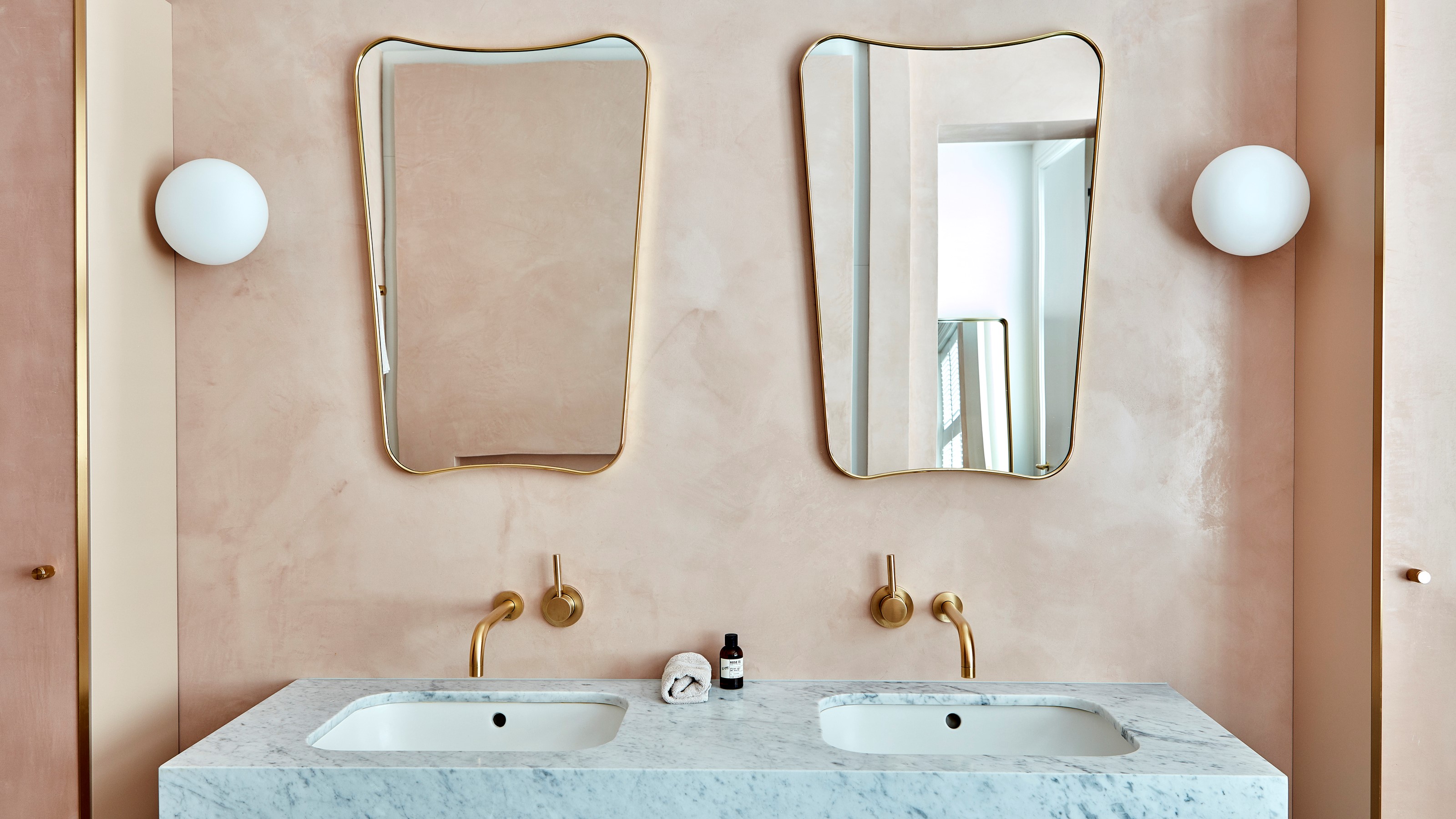
1. Pastel Pink
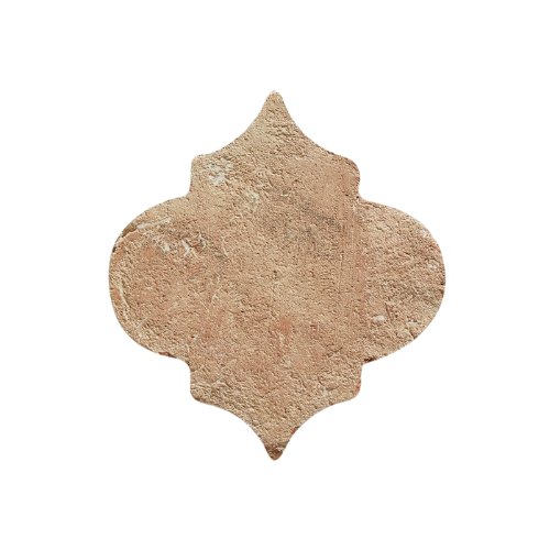
DO INSTEAD: "Terracotta is taking center stage, not just as a colour, but as a material that adds instant character. It brings a sun-baked warmth and an earthy richness that feels both grounding and elevated," says Grazzie Wilson from Ca'Pietra.
If there was one color that encapsulated the cultural mood of the 2010s for bathroom ideas, it's baby pink. The sweet-as-sugar, Pepto Bismol shade was hard to escape, so much so that it earned the title 'millennial pink'. But now, a decade on from the peak of pastel supremacy, our experts are ready to see a new color take its place.
"Pink had a beautiful run in bathroom design, soft, romantic, and undeniably Instagrammable," begins Grazzie Wilson, head of creative at Ca'Pietra, "but in 2025, we’re seeing a clear move away from pastels in bathroom design."
Despite all the gorgeous pink bathroom ideas we've seen over the past few years, we can't help but feel that the trend might be past its prime. Two years on from the Barbie-core obsession that gripped the nations, pink has lost its shock factor, instead becoming somewhat expected.
The Livingetc newsletters are your inside source for what’s shaping interiors now - and what’s next. Discover trend forecasts, smart style ideas, and curated shopping inspiration that brings design to life. Subscribe today and stay ahead of the curve.
The color is also at odds with the renewed interest in natural materials. Homeowners and interior designers alike are placing an increased importance on showcasing beautiful, natural materials within their bathroom designs. And as fun as pink can be, it is anything but natural.
Grazzie Wilson is the head of creative at Ca'pietra, one of the UK's leading tile brands, specializing in natural stone and trend-led tiles. Releasing new collections throughout the seasons, Ca'pietra curates a beautiful selection of stylish designs to delight and inspire.
2. Navy Blue
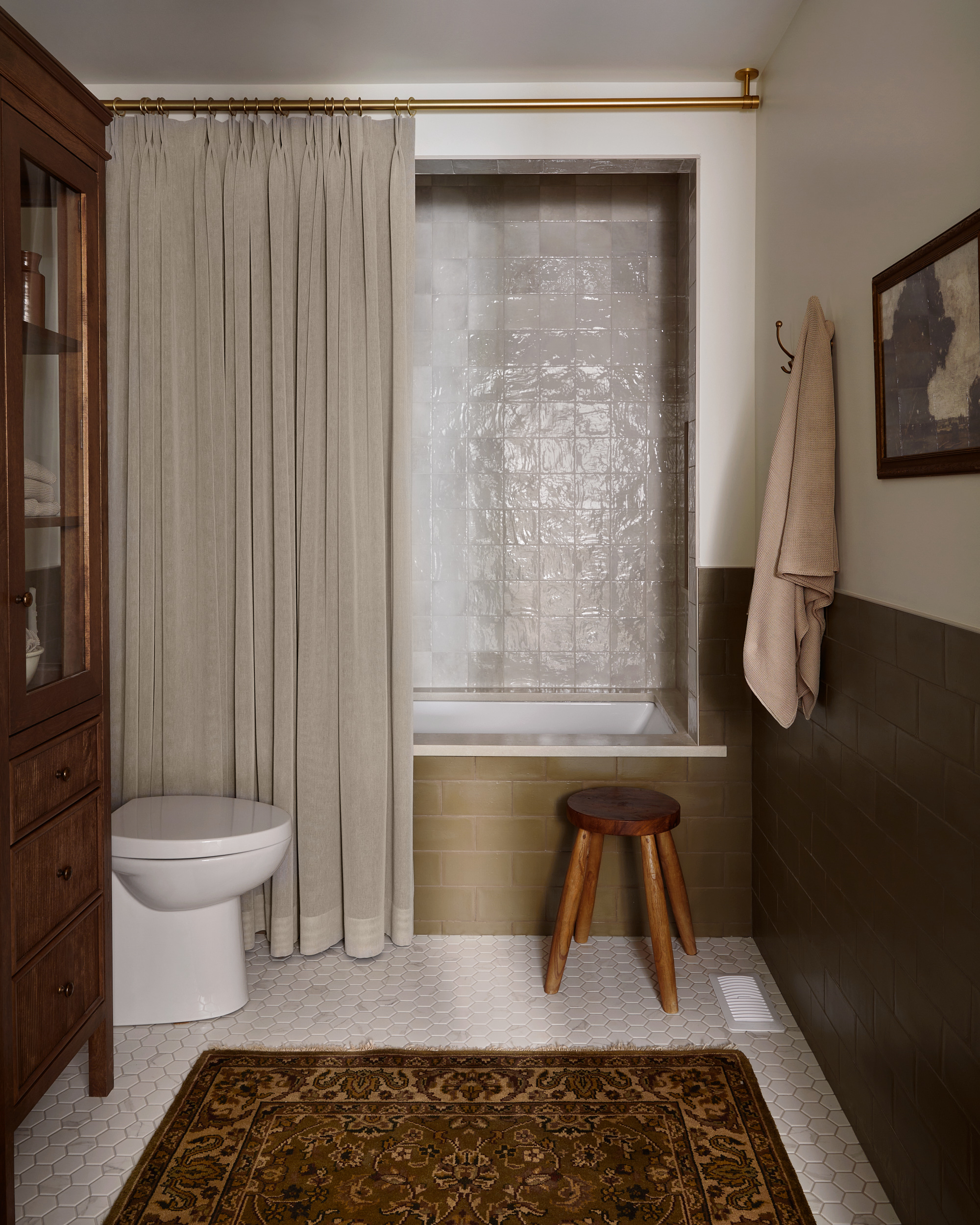
DO INSTEAD: "The deep blues that once dominated are giving way to a palette rooted in nature: think earthy greens, sunbaked browns, and soft, silvery purples. These tones bring a sense of calm and comfort, wrapping the space in quiet elegance," Sally Bettinson explains.
"Navy had its moment and for good reason, it is bold, brooding, and effortlessly chic," says Sally Bettison, design manager at Tissino. "But in 2025, bathroom design is moving in a warmer, more grounded direction," she explains.
While experts have celebrated this deep, inky blue shade, especially beloved for small bathroom ideas, due to its ability to create a jewel-box feel in a petite space, experts believe that our shift towards earthier, natural tones will see us leave this color in the past.
Instead, Sally predicts we'll be painting our bathrooms in tones that reflect the natural world, creating a more relaxed, grounded feel in your home. "If you're planning a refresh, step away from the cool and consider a color story that feels lived-in, layered, and deeply inviting," Sally says.
With over 25 years of experience under their belt, Tissino are one of the most reputable bathroom brands in the UK. The Italian-inspired brand is led by their motto: "designed to inspire, made to experience."
3. High-Shine Black
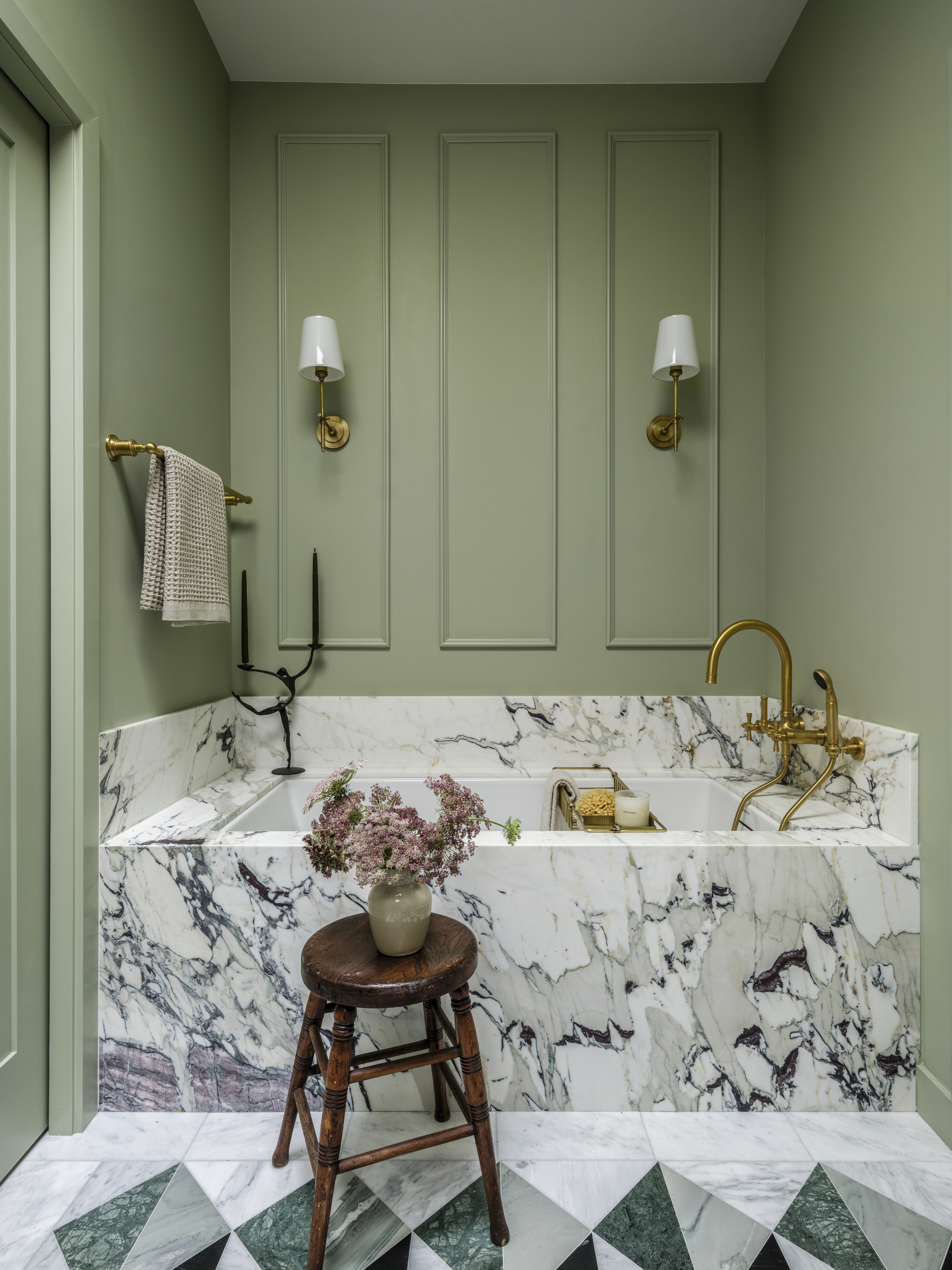
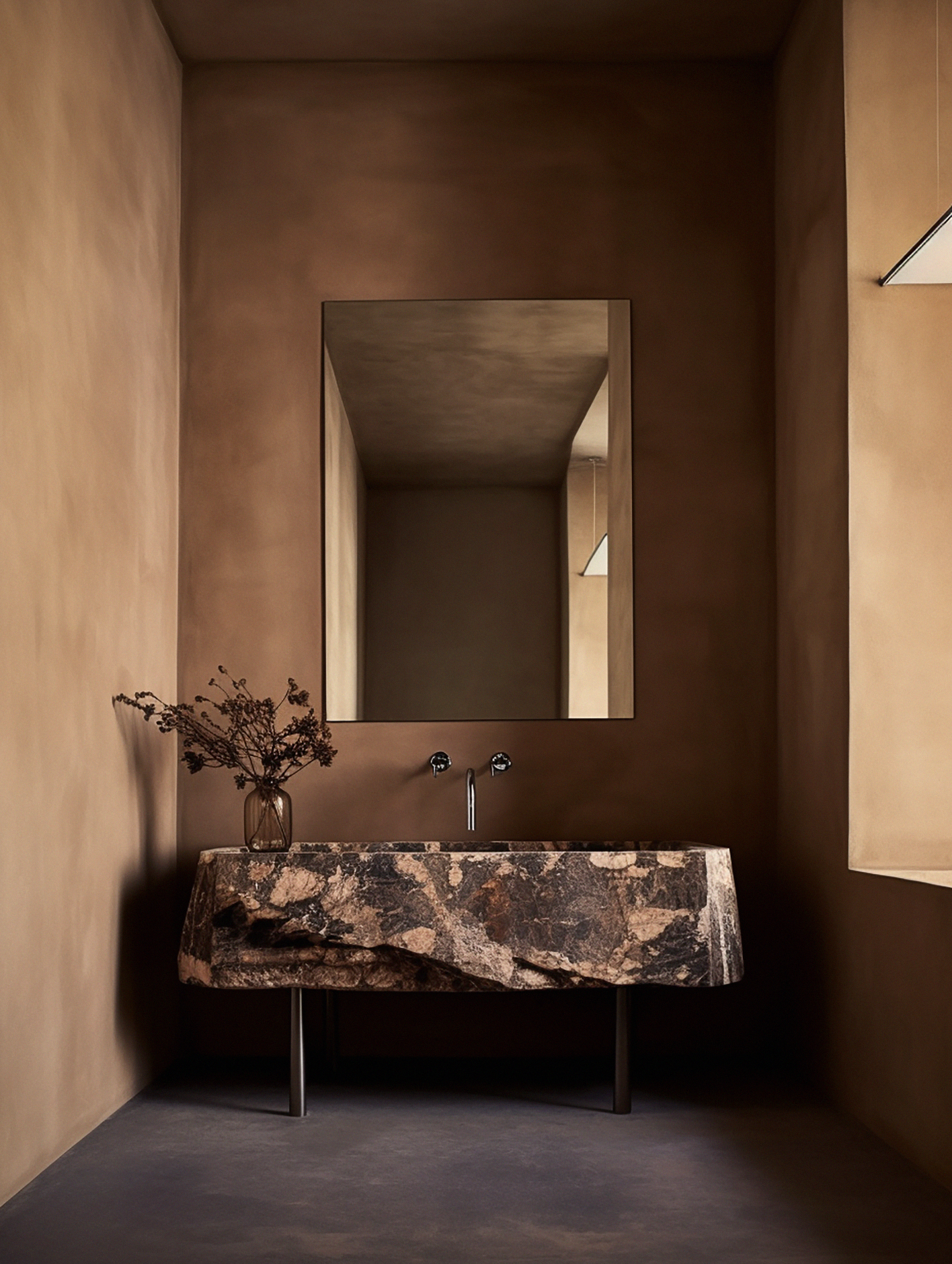
DO INSTEAD: "Color wise we’re seeing dark browns and olive shades that offer an alternative," says Lidia
Another victim of the cultural shift towards warmer, soft tones, our experts do not expect to see any shiny, black bathrooms popping up in many designs this year.
"Not just a color but a finish too, glossy black is definitely a color we are saying goodbye to in 2025," says Lidia Kane, design manager at Multipanel. "High shine is out and instead homeowners are craving drama with a softer finish, which is why matte, textural surfaces are rising in popularity," she explains.
Natural materials, like marble or granite, are naturally rich in texture and add a beautifully tactile element to your bathroom. "These finishes offer the same depth and moodiness as black, but with a more grounded, tactile feel. It’s less about high-gloss contrast and more about creating a space that feels considered, cocooning, and effortlessly contemporary," says Lidia.
4. All White Everything
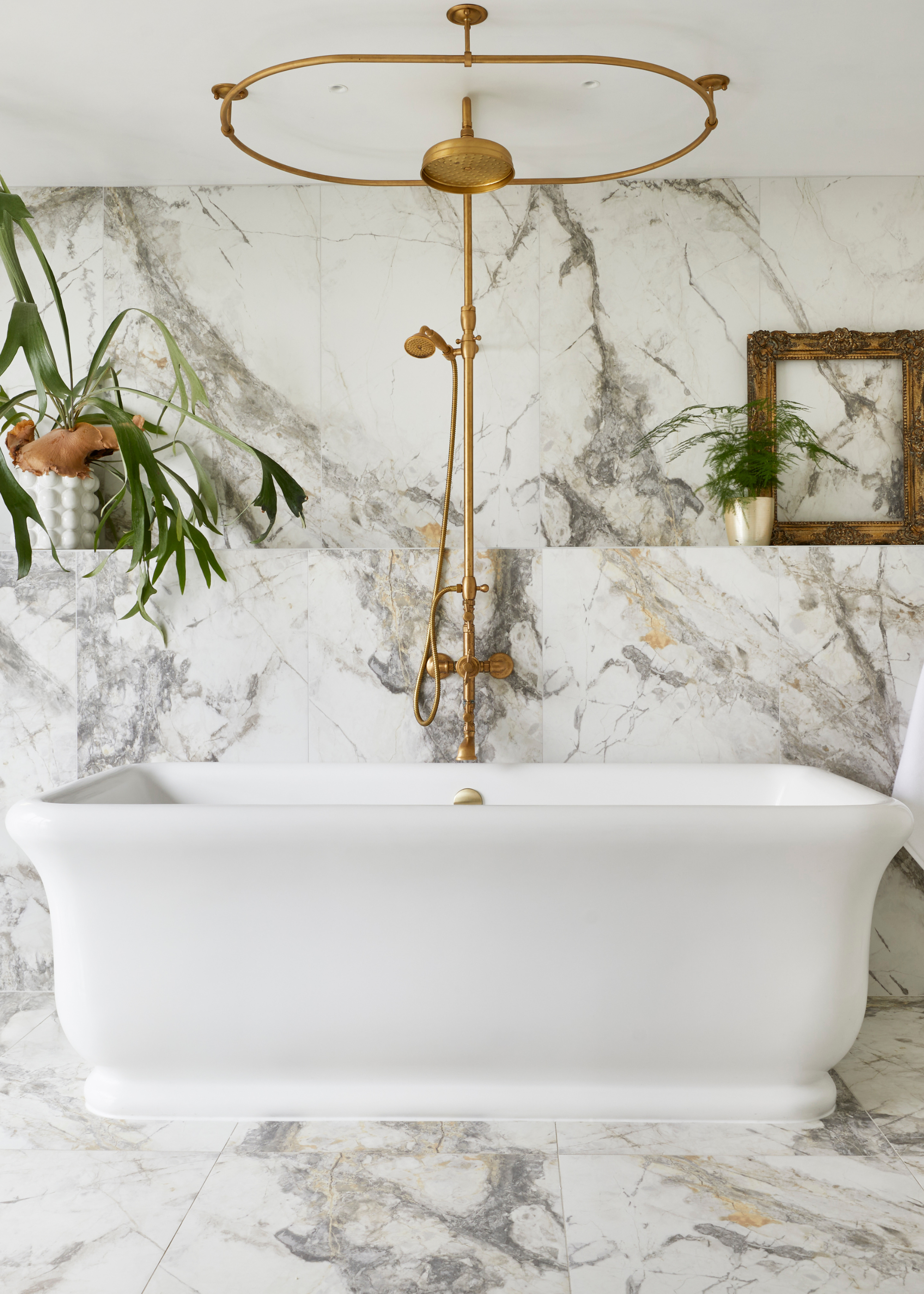
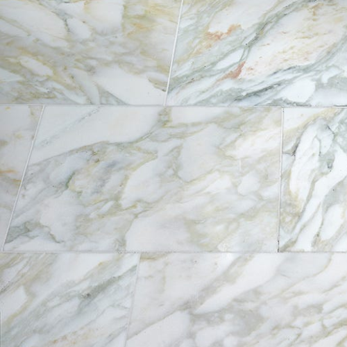
DO INSTEAD: "If you're still drawn to the freshness of white, consider using it as a subtle base — think marble tiles with bold veining, where creamy backdrops are interlaced with honeyed or deep brown tones. It's an elegant way to retain brightness while adding depth and nuance to your scheme," says Keeley Sutcliffe.
Perhaps one of the most hotly debated design styles, our experts predict that 2025 will see the official downfall of all white bathrooms. Loved by some for the sleek minimalism it offers, and hated by others for its tendency to look sterile, either way, monochromatic white bathrooms became the blueprint for bathroom design throughout the 2000s.
"As we move through 2025, the era of stark, bright white bathrooms is giving way to spaces that feel warmer, richer, and more characterful," argues Keeley Sutcliffe, design manager at BC Designs. "While white has traditionally been prized for its clean, minimalist look, it can often come across as cold and clinical — particularly in smaller bathrooms, where its cool undertones can actually flatten the space rather than open it up," she explains.
Romain, master of the colorful bathroom, agrees, saying, "The all-white, purely functional bathroom is losing ground, and that’s a good thing. It’s time to bring emotion, personality, and beauty into this space, too often overlooked."
He continues, "Some shades do feel less relevant today. Cold grays or ultra-clinical whites tend to strip away character. In contrast, we’re seeing a growing appetite for richer, more expressive colours."
While our experts have designated these colors officially outdated, don't lose all hope. Some classic bathroom designs can never go out of style, like an elegant spa bathroom, or, for something a bit different, we are obsessed with the step-up bath trend at the moment.
Maya Glantz is a Design Writer at Livingetc, covering all things bathrooms and kitchens. Her background in Art History informed her love of the aesthetic world, and she believes in the importance of finding beauty in the everyday. She recently graduated from City University with a Masters Degree in Magazine Journalism, during which she gained experience writing for various publications, including the Evening Standard. A lover of mid-century style, she can be found endlessly adding to her dream home Pinterest board.
