The Livingetc newsletters are your inside source for what’s shaping interiors now - and what’s next. Discover trend forecasts, smart style ideas, and curated shopping inspiration that brings design to life. Subscribe today and stay ahead of the curve.
You are now subscribed
Your newsletter sign-up was successful
HOW DID YOU BREAK INTO DESIGN?
I knew I wanted to be a designer from a young age – I was drawing all the time and after seeing the film Funny Face when I was about eight, I knew that’s how I wanted my life to be. After working with fashion designers such as Jean Rémy Daumas and Michel Klein, I met Christian Lacroix in the early Nineties and started working with him right up until his departure 18 years later.
WHAT MAKES CHRISTIAN LACROIX'S PATTERNS SO UNIQUE?
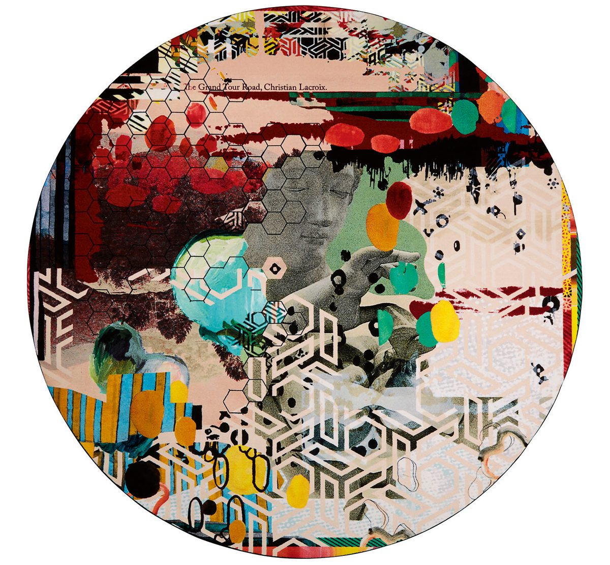
Article continues belowWith the homeware collection, we’ve always aimed to reinterpret the magical DNA of the Lacroix universe, inspired by the archive of Christian’s haute couture collections, which are distinctive for prints infused with flowers and butterflies and a joie de vivre, colourful and lavish spirit. Christian taught me to stop thinking in terms of right and wrong and to have an open mind.
HOW DO YOU APPROACH DESIGNING A NEW PATTERN?
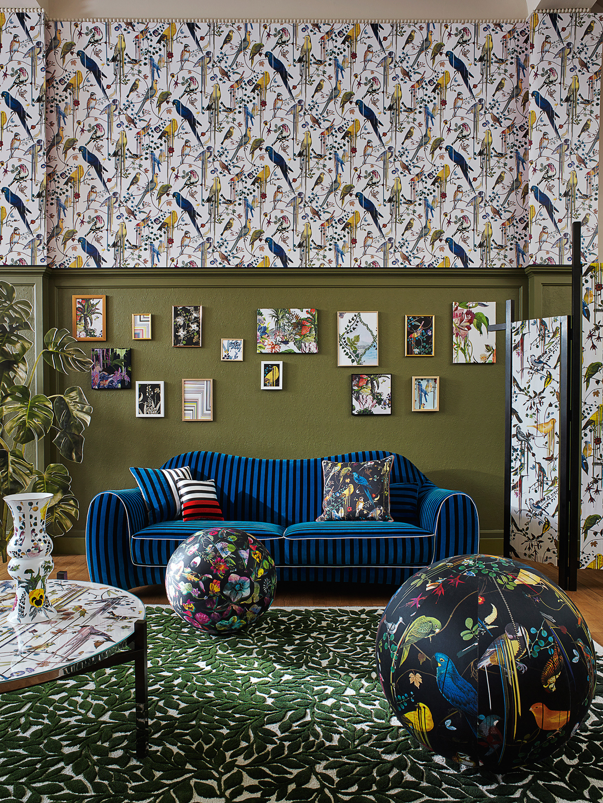
Normally, when you think of Lacroix, you think of putting at least three, if not four or five, designs all together, but this season, I decided to combine just two designs so it might bring it back down to earth a little. Lacroix is famous for florals, so there’s always a flower in a mix, but for me, it comes with a twist. I like to mix them up with foliage and animals, play with their scale and colouration. In our latest collection, launchedat Maison&Objet in January, I added solarised accents around petal edges to give a neon glow, or wove flowers in and out of optical stripes for dramatic effect. For a three-metre wall panel, I created a surrealist fantasy of a crazy garden, complete with overscaled flowers and mushrooms. I think of it as less Alice in Wonderland and more Pink Floyd on LSD.
WHAT DO YOU LOVE SO MUCH ABOUT STRIPES?
The Livingetc newsletters are your inside source for what’s shaping interiors now - and what’s next. Discover trend forecasts, smart style ideas, and curated shopping inspiration that brings design to life. Subscribe today and stay ahead of the curve.
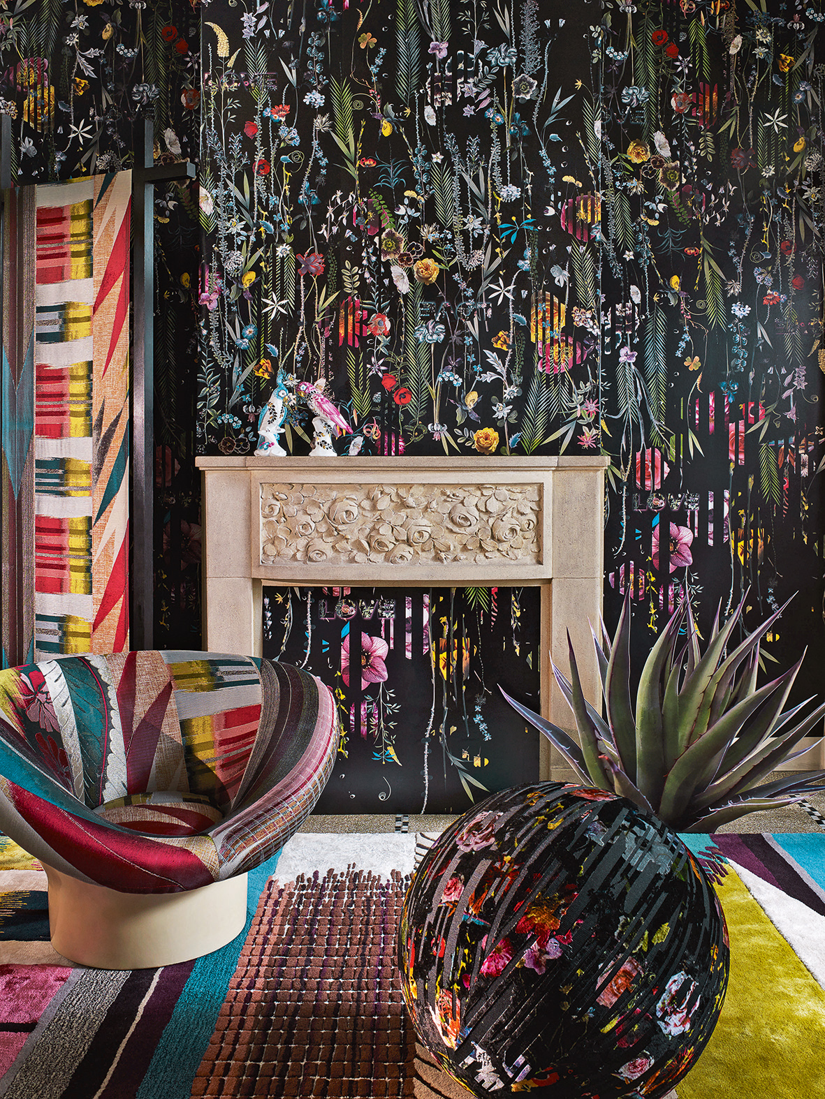
From my first lifestyle collection, there have always been stripes, inspired by Christian’s first haute couture collection in 1987 (where he sent a model down the catwalk in a poufy black-and-white-striped taffeta skirt).Stripes are very close to my own taste – I have them everywhere at home. They lend softness and can act like a neutral, but it’s still interesting because the stripe can be in something refined like a beautifully woven velvet.
HOW DO YOU STRIKE THE RIGHT BALANCE WHEN USING PATTERN?
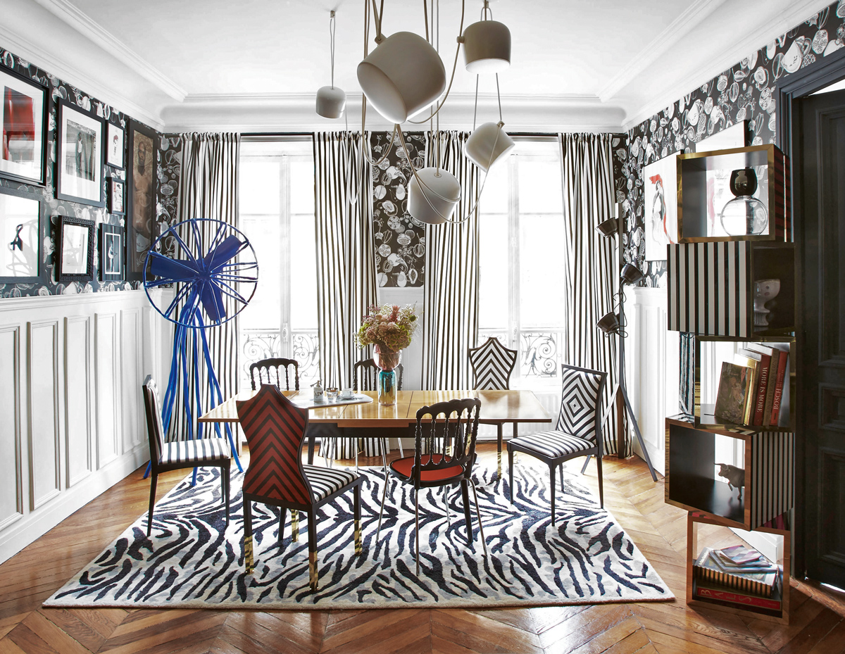
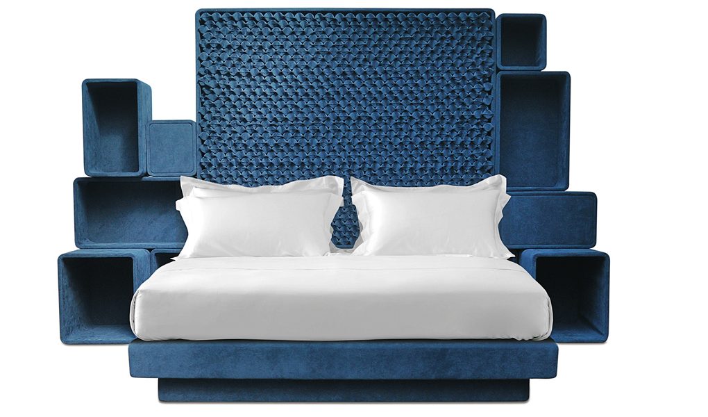
I like it when you have a grand motif and then calm it down with a monochromatic stripe or a textured plain. It helps the eye to travel around the room, moving gradually from something strong to something soft. If you’re feeling less brave, play with plains, which have patterns within them (woven like bouclé or embossed like jacquard). Pattern doesn’t have to always be obvious – it can just be in some crazy piping around the edges of a chair’s cushions. For a daybed, I’ve recently designed for Savoir Beds, one ofthe mattress layers is in a subtle print, tucked in between layers of textured plains – it lends intrigue and curiosity without detracting from the overall design. Simple doesn’t need to be dull.
HOW DO YOU APPROACH DESIGNING A ROOM WITH PATTERN?
In my Paris apartment, I treated the rooms like boxes, creating a neutral backdrop of painted ceilings, cornicing and woodwork in white and grey. Then I added colour with vivid pattern on the walls, upholstered furniture, check or striped curtains and decorative rugs. On the walls of my dining room, the upper half is papered with a bold print of fruits in black and white and painted wooden panelling below. You can create the same effect with painted dado rails – it helps to frame the pattern, giving the overall effect some breathing space.
WHAT IF YOU REALLY WANT TO GO CRAZY?
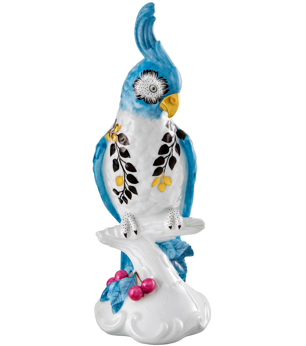
I helped one client create his dream of a ‘baroque boudoir’ – he wanted a sophisticated bedroom in fuchsia and black, but I knew he’d get bored with it quickly. So, I suggested black and gold instead – not exactly revolutionary, but it was more masculine and equally as dramatic. We did two walls with a black and gold marbled wallpaper, the other two walls in black and gold stripes; the same colour theme extended across all the furnishings. It’s a very rich room, but it works!
See more of Sacha’s work at christian-lacroix.com
The homes media brand for early adopters, Livingetc shines a spotlight on the now and the next in design, obsessively covering interior trends, color advice, stylish homeware and modern homes. Celebrating the intersection between fashion and interiors. it's the brand that makes and breaks trends and it draws on its network on leading international luminaries to bring you the very best insight and ideas.