Pantone Color of the Year 2022 – interior experts react to the dynamic lavender shade
Very Peri is set to make waves across the industry – but what do those in the know think?


Global authority Pantone has spoken, and color enthusiasts have listened. The powerhouse has named its Color of the Year 2022 as named Very Peri – 'a periwinkle shade of blue' that proves energy and excitement through its red undertones.
Combining the faithfulness of blue with the vibrancy of red, Very Peri is the warmest of blue tones designed by forecasters. They expect this 'empowering mix of newness' to be in demand following another turbulent year. But what do the interior experts think? Here, those in the know respond to the shade that will reset color trends for the year ahead.

Natasha Bradley, Head of Color at Lick
If anybody knows about colored interior design trends, it is Lick’s, Natasha Bradley. The paint master revealed that she was excited to see Pantone had chosen a purple hue for 2022 as she already predicted that purple would become to new pink.

‘Very Peri[includes] a lot of blue, which is known to be really calming and good for the mind, making it the perfect color for decorating your hallway, bedroom, or home office, she says. However, she would avoid bringing the hue into the kitchen as it can ‘suppress the appetite.’
Natasha continues: ‘Very Peri is going to be a big trend in the year ahead. People are going to be inspired to use purple, opting for different shades and tones. Consumers are likely to gravitate towards a duskier or more blue-based purple, which will give more home-decorators the confidence to use the color.’

Pip Rich, Editor at Livingetc
While some designers look to interpret Very Peri in their future paint ideas, Livingetc's Editor, Pip Rich, is indifferent. 'I think this is a really difficult color to live with. It's not soothing, it's not elegant, and it doesn't fit with any of the interior design trends I've seen coming through for 2022,' he says.
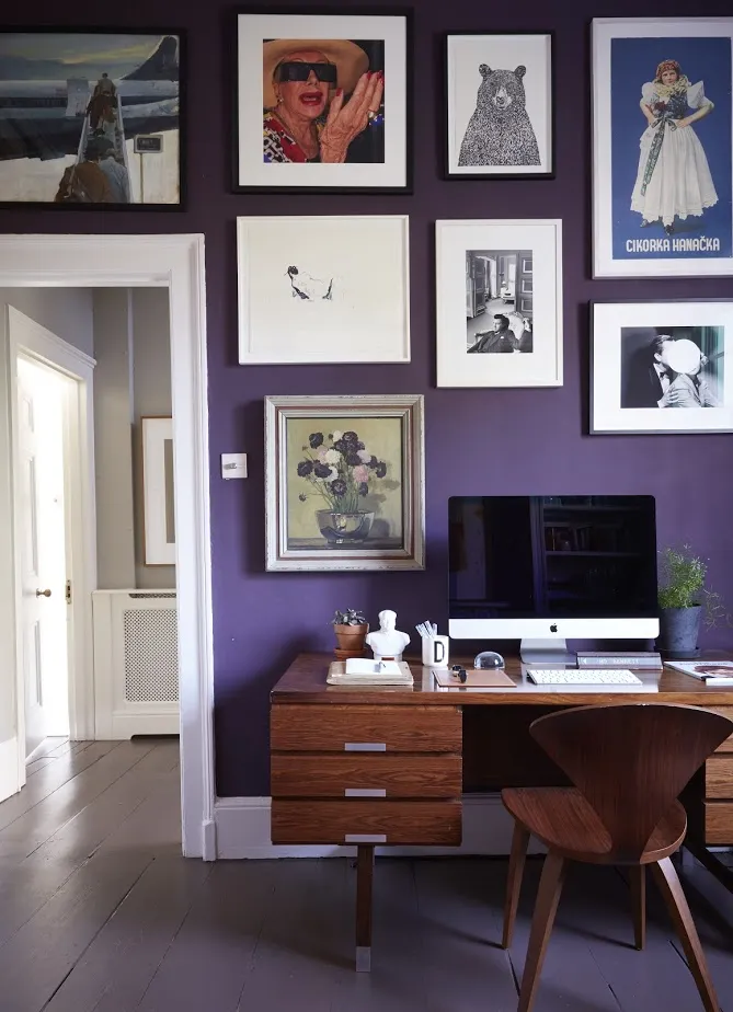
'The mood of smart serenity is what I believe most people are after right now, and Very Peri is neither of those things. That said, I have seen a similar shade used in a home office before (as seen below), and I can see it being an energizing uplifting tone that could help with creativity....maybe'
Clive Lonstein, Interior Designer
Manhattan-based designer Clive Lonstein shares that he is not surprised by Pantone's selection – as he is currently using a similar hue in a project in the city.
'We are currently making a custom striped fabric where this color is the base for an upholstered bed. The color is an evolution of the pinks and blush colors that have been around for a while now,' he says. Plus, following this announcement, we expect this hue will stick around for seasons to come. Modern decorating ideas for 2022 begin right now.
