Dunn-Edwards has announced its Color of the Year 2024 and the "serene" shade is perfect for a seasonal uplift
This optimistic hue could be exactly what you need to design a surprisingly cozy living room this winter


The Livingetc newsletters are your inside source for what’s shaping interiors now - and what’s next. Discover trend forecasts, smart style ideas, and curated shopping inspiration that brings design to life. Subscribe today and stay ahead of the curve.
You are now subscribed
Your newsletter sign-up was successful
Our editors have been harking on about steely blue for what seems like forever, and finally, this staple shade has been recognized by Dunn-Edwards as their Color of the Year. Fall marks an important time in the design sphere with color forecasting taking center stage, and of course we've been anticipating what the brand has to say about the shade that best speaks to the mood of 2024 - and let me tell you, their answer did not disappoint.
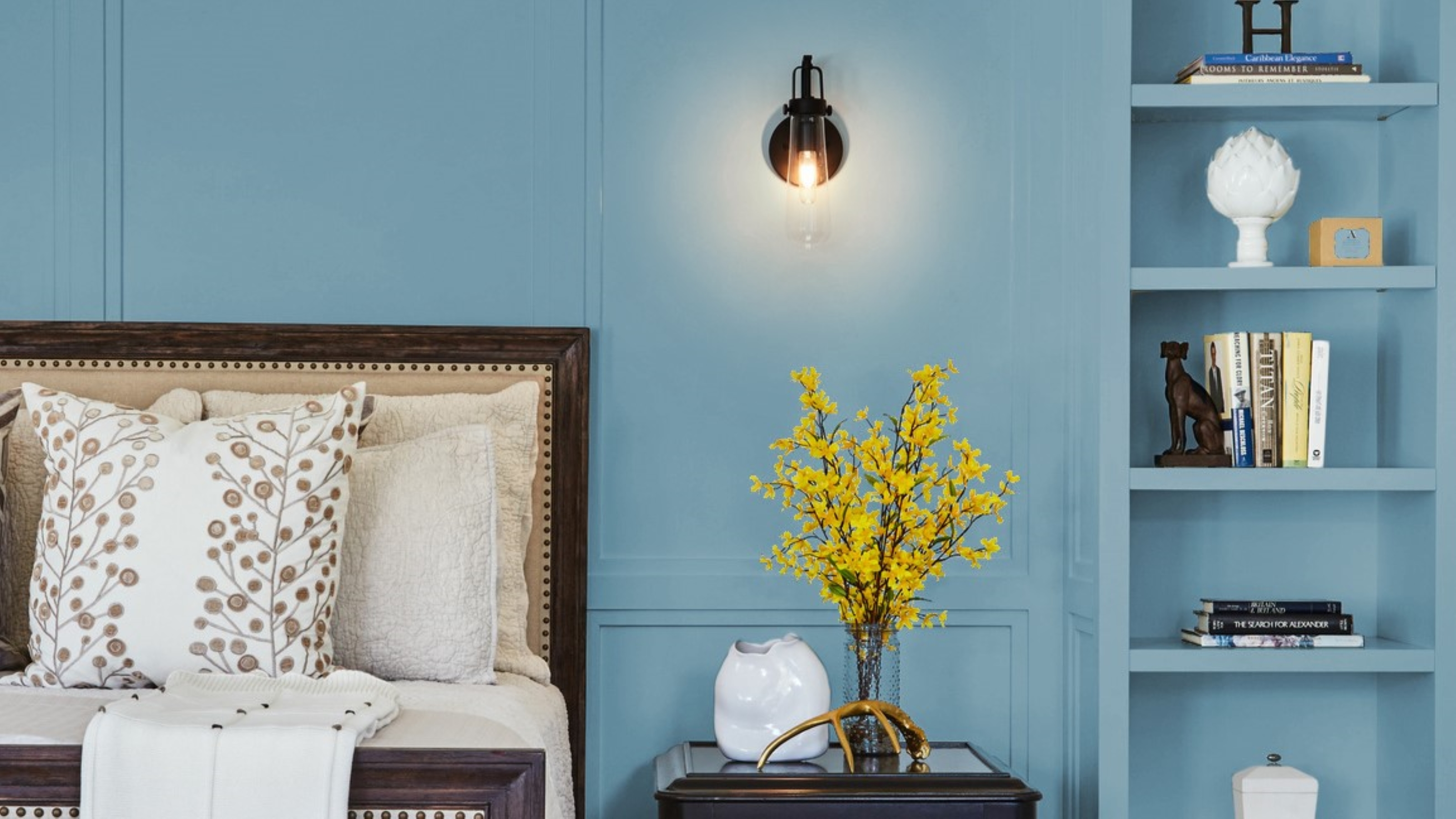
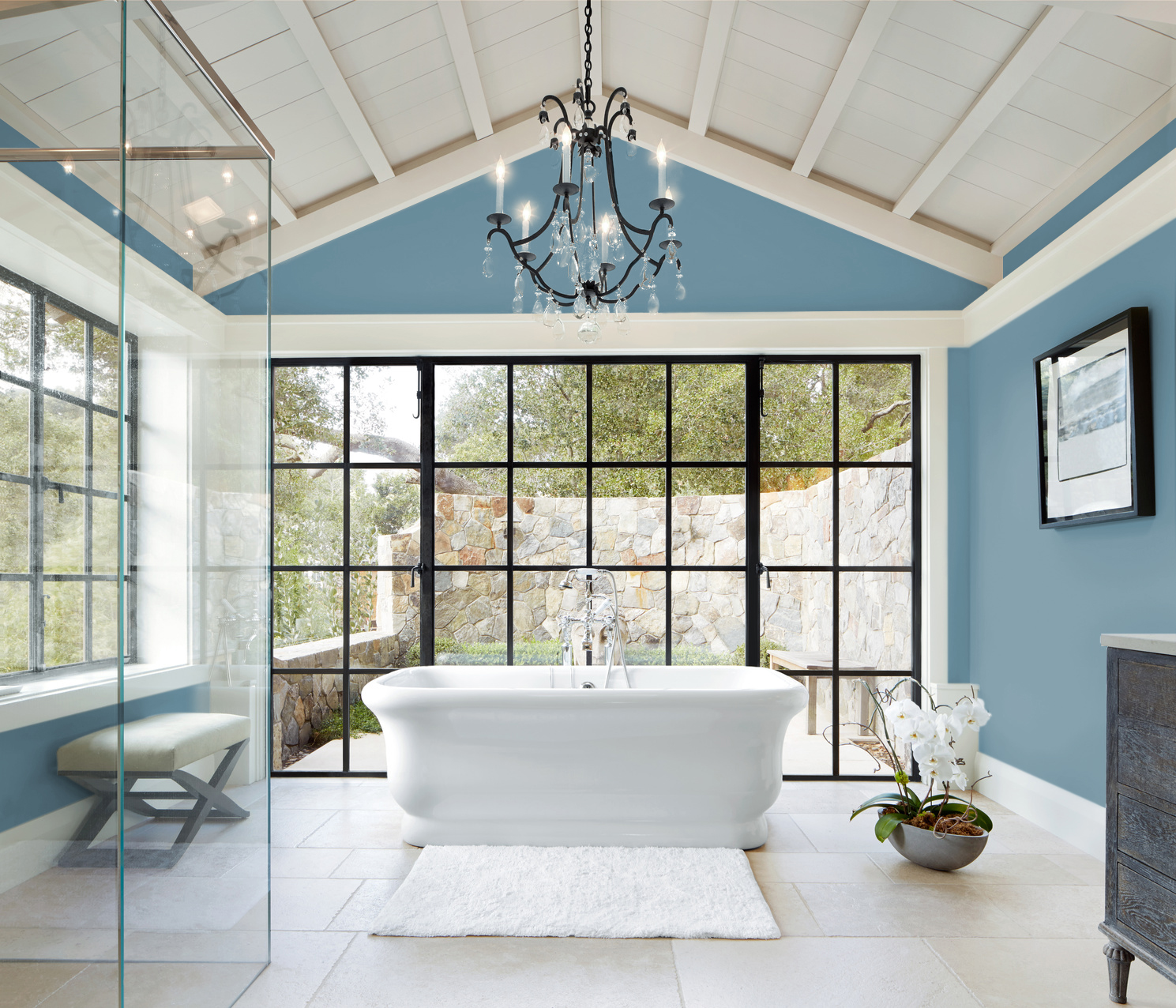
Blue is slowly re-emerging as a popular color choice, and this chosen shade is no exception. 'Skipping Stones' is described as, 'a serene and steely blue with hints of green and grey that emulates the meditative, yet energizing feeling of the sea'. This regenerative shade mimics the change in pace of our lives to help us achieve balance and tranquility in our homes.
It also follows the trend we've seen towards cooler tones with an uplifting sentiment, making it ideal for relaxing and social spaces. 'This blue is timeless and versatile, fresh and serene,' says DeMing Carpenter, color expert at Dunn Edwards. 'Skipping Stones feels like a daydream and can add a sense of mystery and thoughtfulness to any space.'
Dunn-Edwards color of the year definitely aligns with the 2024 color trends we see dominating the interior game in the year to come. Take a look at the way you could incorporate this shade into your home, as well as some more insights into the shade you're sure to be seeing all over walls very soon.
How should I decorate with Skipping Stones?

For too long we've been afraid of cool-toned blue with the fear that it appears too cold or harsh. Instead, we've favored tried and tested warm-toned shades that make us feel comfortable and are generally considered safer decorating colors. This is despite the fact there are many colors that go with blue, and it's actually an easier color to work with than you might think.
This blue is a move away from the more vibrant colors we've seen gain prominence in the past few years, DeMing Carpenter explains. 'It’s part of the resurgence of blue and represents a shift away from the bold, warm-toned colors we’ve seen gain popularity over the past few years,' she says.
We're also seeing more and more designers focusing on creating calming environments in their furniture choices and color palettes, something Skipping Stones is conducive to. It can be used to encourage a moment's reflection as an accent color to warmer earthier tones, or used to color drench a room for a more enveloping feel.
The Livingetc newsletters are your inside source for what’s shaping interiors now - and what’s next. Discover trend forecasts, smart style ideas, and curated shopping inspiration that brings design to life. Subscribe today and stay ahead of the curve.
It's versatile enough to be used in a range of spaces, too. This soothing shade would work just as well for a blue living room idea as it would for a modern spa bathroom. Or, to lean into the Coastal Grandmother aesthetic, pepper it throughout your home in small doses.
What should I pair Skipping Stones with?

If you're reluctant to dive in head first and cover your home in steely blue, take a look at the helpful color palette Dunn-Edwards has put together to help you visualize the possibilities. Skipping Stones is included in the New Dawn color palette within the brand's 2024 Color and Design trends, and pairing the cool shade with warmer tones can help to harmonize your space (and makes for a perfect living room paint idea).
The palette as a whole reflects the multitude of ways in which you could utilize the shade in your home. 'It's made up of ethereal pastels, misted mid-tones with grounded earth shades, and colors that feel like glimmering sunlight,' says DeMing. 'The nature-inspired palette that creates space for quiet reflection amidst the chaos of an always-on world.'
We love how the shades Rich Mocha and Wildflower Honey complement the Skipping Stones and make it far more usable. Try the color within a pared-back neutral space and see how it instantly uplifts your room. We can already see it taking off as we head into 2024.
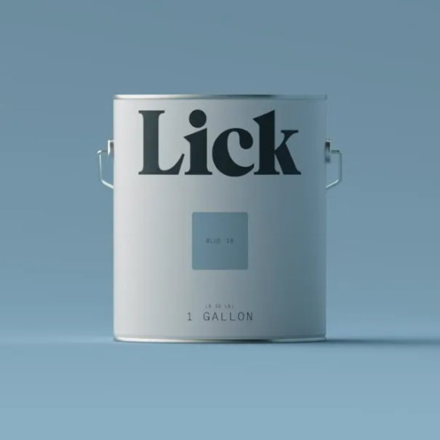
3 of the best 'steely' blue paint colors

Formerly a news writer for Livingetc, Amy completed an MA in Magazine Journalism at City, University of London, and has experience writing for Women’s lifestyle publications across arts, culture, and beauty. She has a particular love for the minimalist aesthetic mixed with mid-century furniture, especially combining unique vintage finds with more modern pieces. Her previous work in luxury jewellery has given her a keen eye for beautiful things and clever design, that plays into her love of interiors. As a result, Amy will often be heard justifying homeware purchases as 'an investment', wise words to live by.


