These are the biggest color mistakes you can make when decorating (plus how to avoid them)
The biggest color scheme mistakes to watch out for and the color theory to follow when designing your interiors

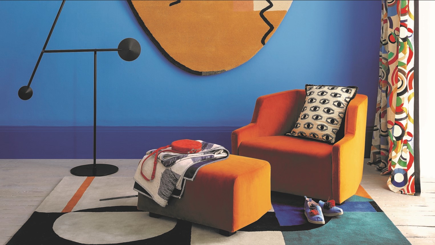
When it comes to the biggest color scheme mistakes, there are many pitfalls and traps you might fall into when designing your home. From not distributing color in well-thought-out parts, to not considering how light and shadow plays a role on the colors of your walls, when you drill down into color theory, it's quite a science, and there are so many things to be mindful of.
'For many, the process of choosing colors is highly emotional and people choose the colors they’re drawn to,' says interior designer Nicole Gibbons, founder of Clare paint company. 'But for the person who needs a framework to help guide their choices, color theory can be a really effective tool to help with color selection.'
We speak to the interior designers to get to grips with how to manage color in your interiors, have color theory explained, and learn about the biggest color scheme mistakes to make note of.
Article continues belowWhat are the biggest color scheme mistakes?
Color theory is a great set of principals upon which to base your interior design. With a handy color wheel to show you what colors match what, and decorating rules and color schemes, you can really apply science to design and not rely on pure taste, meaning you'll get your scheme exactly right. We've spoken to the designers to find out what the biggest color scheme mistakes people make are to help you with your creative interiors journey.
Oonagh is an interiors writer and editor. She spends her days interviewing leading interiors industry experts to bring the latest ideas to her readers. For this piece, she spoke to the designers who adopt color theory in their work to find out just how the color wheel can impact our interior choices.
1. Creating a scheme that is too cool
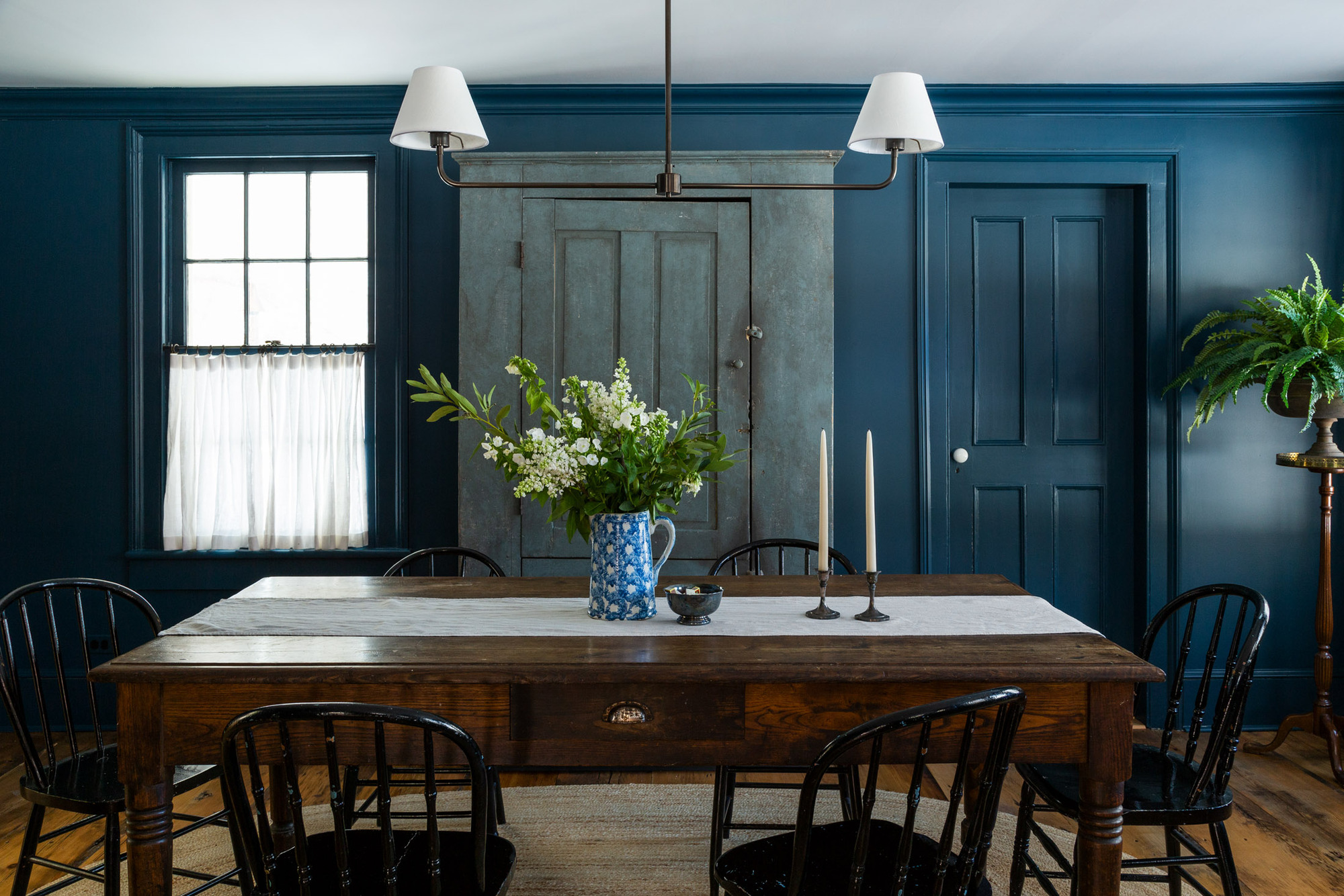
One mistake people often make is creating a cool color scheme that is too cold, using all the colors from the cooler side of the color wheel and creating a look that brings a chill to a room. The colors to look out for are blues, greens and deep purples, and should be treated with care. This 1850s farmhouse is designed by White Arrow, and the designers used a dark blue indigo on the walls.
At risk of this room being too cool and giving off a cold look, the designers brought warmth through the Shaker cabinetry and the warmth of rustic hardwood flooring, bringing the scheme to life and making this kitchen more homely. Alternatively, warm a dark blue, cool color scheme up by using the color wheel, introducing a pop of yellow or orange. 'Cool colors are great for contrasting against brighter shades to knock them back,' explains Charlotte Cosby, head of creative at Farrow & Ball.
2. Not distributing color carefully
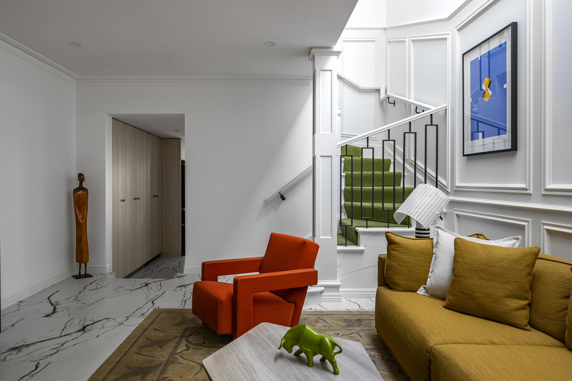
The distribution of color is another thing you really have to consider when designing a room. Look at the weight of colors and really think about whether your paint is evenly distributed, or if one color is particularly overwhelming the space. This can really create disharmony in a scheme, and by simply toning down how one color is used, and by simply introducing another color in its place, a room can really come together.
The Livingetc newsletters are your inside source for what’s shaping interiors now - and what’s next. Discover trend forecasts, smart style ideas, and curated shopping inspiration that brings design to life. Subscribe today and stay ahead of the curve.
One decorator's rule that might help you distribute color in the correct way is the 60-30-10 rule. Ultimately, the rule is that 60 percent of the room should be one color, 30 percent should be a second color, and 10 percent should be a third accent color. ‘Applied to interior design the golden rule can be a great tool to use in creating a cohesive and comforting living area,' says Martin Waller of Andrew Martin.
3. Not looking to color theory to match colors
When it comes to matching colors in your interiors, look to the wheel for inspiration and learn the color rules. This simple wheel is the ultimate in color theory, and by studying and understanding the wheel, and applying it to your interiors, you can create dramatic clashes and contrasts that will add real impact.
The wheel is made of primary colors including red, yellow, and blue, secondary colors, which are a mix of two primary colors, and tertiary colors, a mix of primary and secondary colors. The wheel also shows where undertones and muted versions of these bold tones sit on the wheel and the colors they sit opposite on the spectrum.
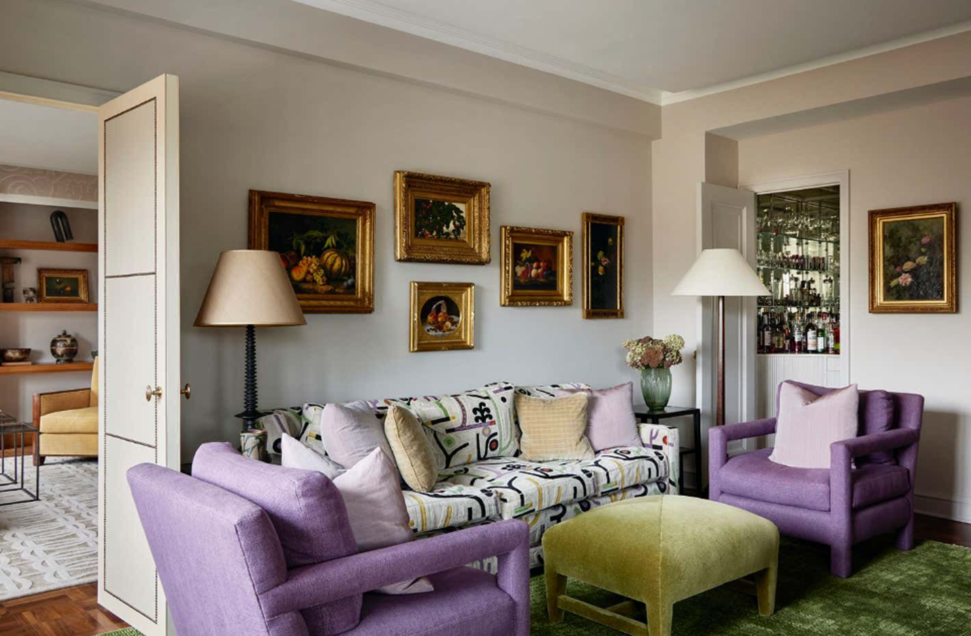
Complementary colors are colors that sit directly opposite each other on the color wheel and used together can help each color to really pop. In this scheme from interior designer, Robert Coutoutier, purple and green are hues that sit at opposing ends of the color wheel and create a beautiful harmony.
4. Forgetting how a dark room can impact size
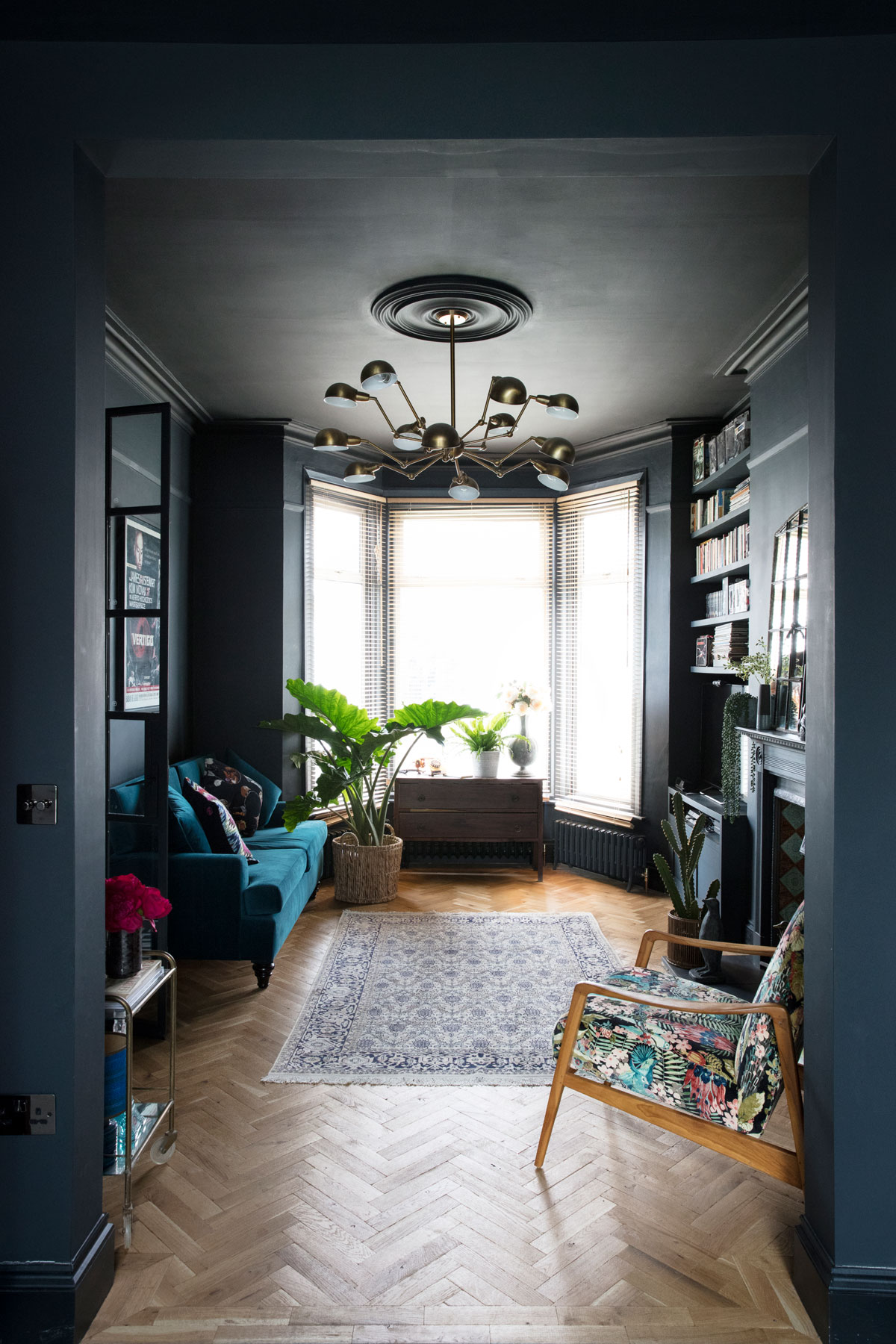
Paler and muted colors are the go-to for most people decorating smaller spaces, as they can create a more open and larger feel to a room which is lacking in size. Meanwhile, dark colors can absorb light and create an optical illusion that a room is a lot smaller than it actually is.
Embracing a dark scheme can work for a smaller space too, but remember that this will give the room a certain cocoon-like feeling of coziness. So if this is not the mood you're looking to go for, really consider if a dark shade is the tone for your small space.
5. Going too vivid with color
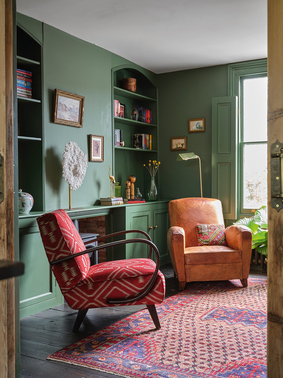
Be careful when planning your interiors that you don't go too vivid with your choice in color, or if you do, you do it carefully. This can create a high-intensity scheme and not the most relaxing space, whereas a muted color scheme will use a lighter and fresher hue of said color, creative a more peaceful-looking room.
'Problems often arise when the wrong shade of colors are paired together,' explains co-founder and creative director of YesColours, Emma Bestley.
'For example, red and green sit opposite each other on the color wheel, but a bright red and vivid green will make you instantly think of a Christmas scene. However, if you were to pair a muted burgundy red together with a warm olive, the look is more refined and beautiful.'
'Another trick when decorating with vibrant colors is to allow one color to dominate. In this example, the red chair works as an accent here to the backdrop of the larger expanse of painted walls,' adds designer Fiona Campbell.
6. Not considering how color psychology impacts your interiors
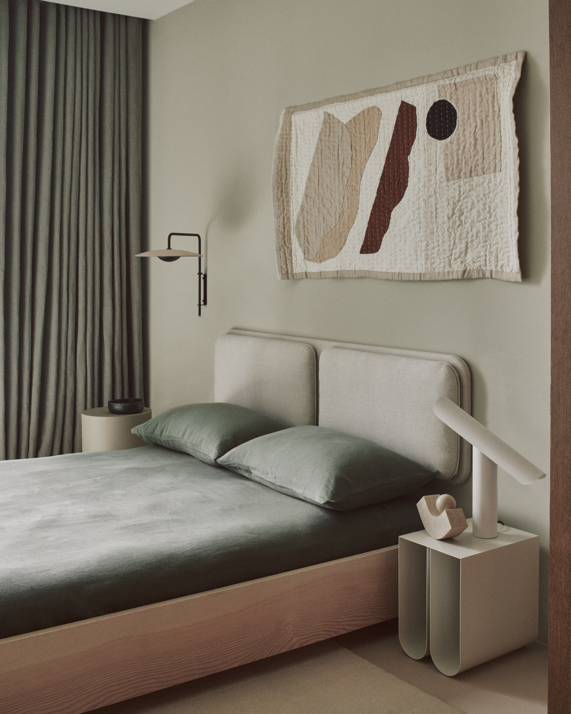
Sometimes, as much as color theory can help you design your scheme, it's all about how colors impact you and make you individually feel. Often, going for a bright and garish primary scheme can give an intense feel and might not suit how you feel on a day-to-day basis, where going for a more pared-back and neutral color scheme will bring a sense of peace and serenity. Think about the colors you find comforting, like shades of browns and green that ground you to nature.
One design house who have mastered the serene color scheme is House of Grey. The interior design studio take on a holistic approach to interiors, considering how calming environments impact you and your mental health, and what the home and how we live has to do with our mental wellbeing and happiness.
'At House of Grey, we use a range of different hues and tones to create a visual narrative with our color schemes. This often includes greens,' says Louisa Grey of House of Grey. 'Greens are interesting as they have a calming yet uplifting and nurturing effect on a space. To complement a green shade, I would combine it with an earthy brown, light ash neutral tone or a rust color to add warmth. These palettes work well when we're designing a city dwelling as it provides a grounding connection to the natural environment and a sense of being outdoors in an organic landscape.'
7. Not considering lighting and shadows
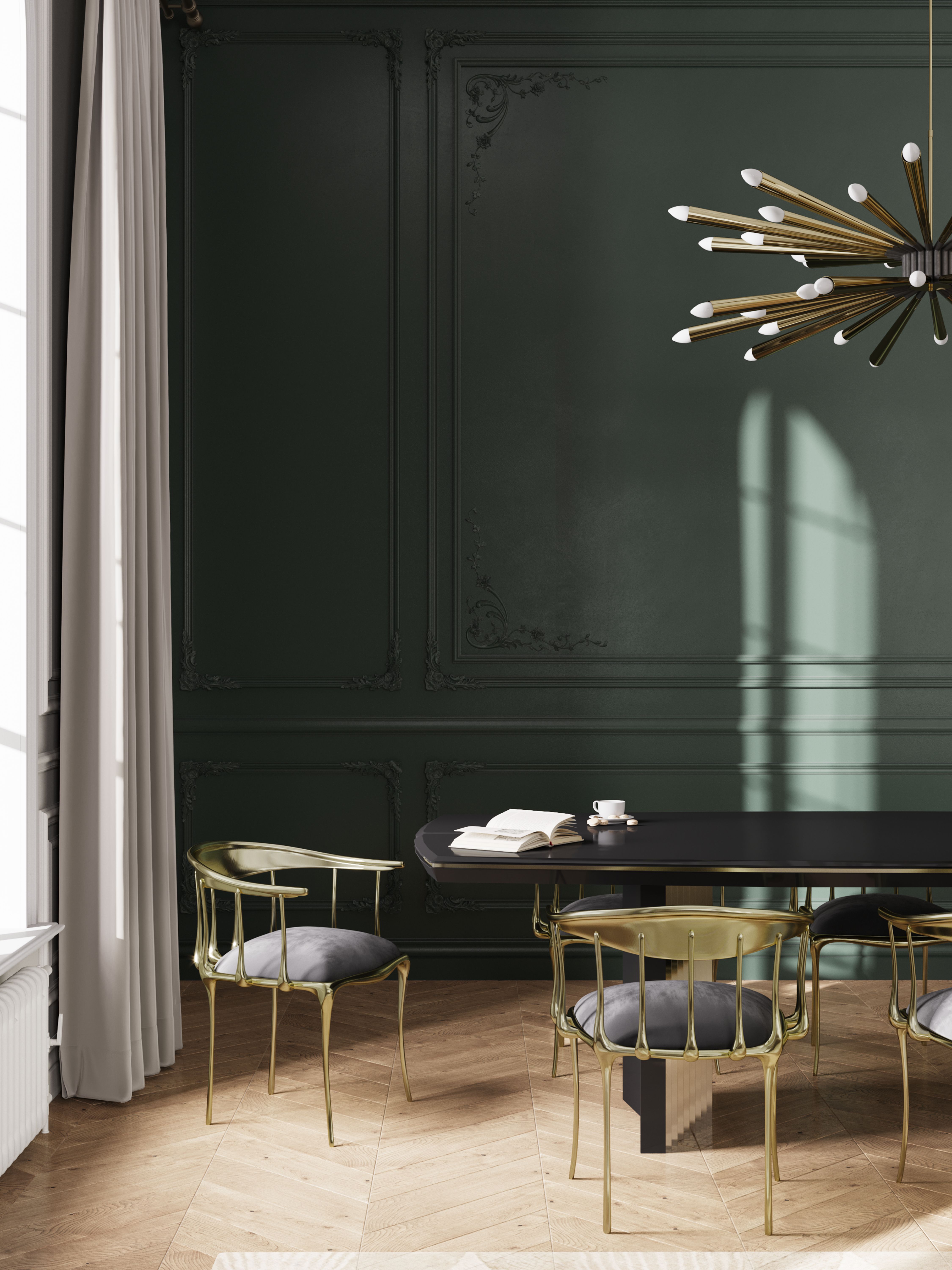
One simple rule to remember when using color in your interiors, and often something that people forget about is to do with natural lighting. Remember that the color of your room will change throughout the day, depending on the size of your windows, which direction your room faces, and how much morning light floods in in the mornings, and how much the room is in shadow.
Before deciding on a color, test out all these variables and take note of your chosen wall color and how it changes throughout the day.
8. Not trusting your instinct
Despite all the rules and theory, you should also go for what you like and what you're drawn to. 'Have fun playing with color - the beauty of interior design is that nothing is permanent and that you can always change up your space if you have outgrown your current design. There are no absolute rules, only rough guidelines, and what might work for you might not be to someone else's taste whatsoever. The key is to enjoy the process, and not take it too seriously! You might well surprise yourself if you stay more open-minded when it comes to choosing colors for your home,' says Cigal Kaplan of Cigal Kaplan Interiors.
What are neutral colors?
Neutral colors are a set of hues that lack color, not just muted forms of bolder colors found on the color wheel. They are used across the world of interior design to create a calming mood. Typically made up of beige, shades of white, brown, grey and black, used together, with an absence of primary colors, a neutral scheme can really create harmony and sernity in a space.
Pure neutral colors are black, brown, grey and white. They are pure in that they don't have any hue undertones or underlying colors. Conversely, near-neutrals are close to pure neutrals but carry weight in undertones of other colors, created by mixing a primary color with a pure neutral, toning down the color with a glimmer of the primary in a subtle way.

Former content editor at Livingetc.com, Oonagh is an expert at spotting the interior trends that are making waves in the design world. She has written a mix of everything from home tours to news, long-form features to design idea pieces, as well as having frequently been featured in the monthly print magazine. She is the go-to for design advice in the home. Previously, she worked on a London property title, producing long-read interiors features, style pages and conducting interviews with a range of famous faces from the UK interiors scene, from Kit Kemp to Robert Kime. In doing so, she has developed a keen interest in London's historical architecture and the city's distinct tastemakers paving the way in the world of interiors.