4 Outdated Colors Designers say you Should Steer Clear of When Decorating a Living Room
They might have been popular once, but it’s time to let these outdated living room colors go once and for all and opt for better alternatives
The Livingetc newsletters are your inside source for what’s shaping interiors now - and what’s next. Discover trend forecasts, smart style ideas, and curated shopping inspiration that brings design to life. Subscribe today and stay ahead of the curve.
You are now subscribed
Your newsletter sign-up was successful
We’ve seen the rise and fall in popularity of many living room color trends, some more enduring than others. While personal style and taste plays the most important role in making sure you love your space, there are certain colors that really say ‘outdated’ more than others and it’s time to move on from.
Don’t be discouraged if you see your favorite color on the list, as there are alternatives that will tell the same story of your style, but in a more current way, more relevant to today’s modern home aesthetic, that you’re sure to love. So, without further ado, here’s what’s not making it onto the living room color trends list of 2024 and we’re saying goodbye to…
1. Beige
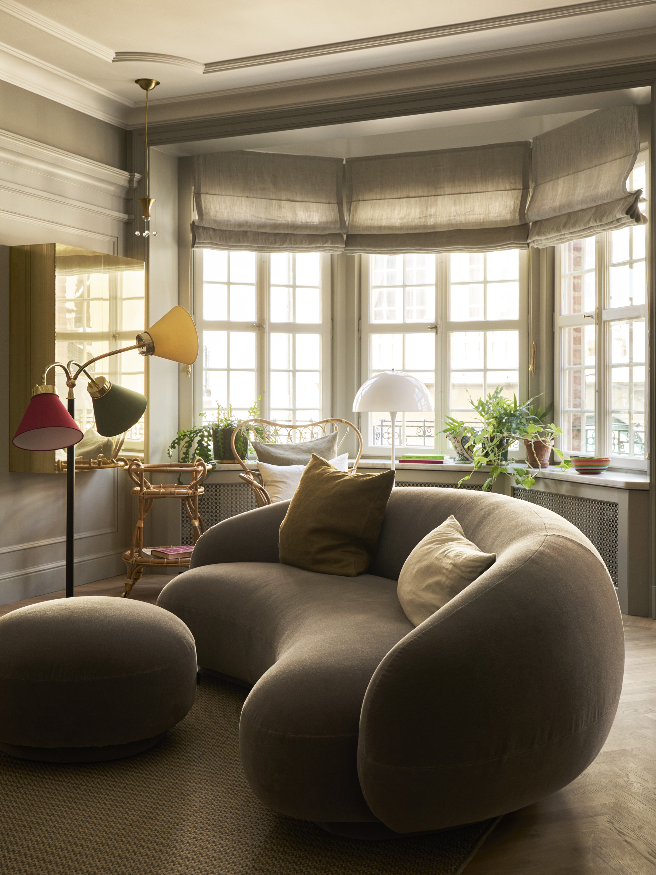
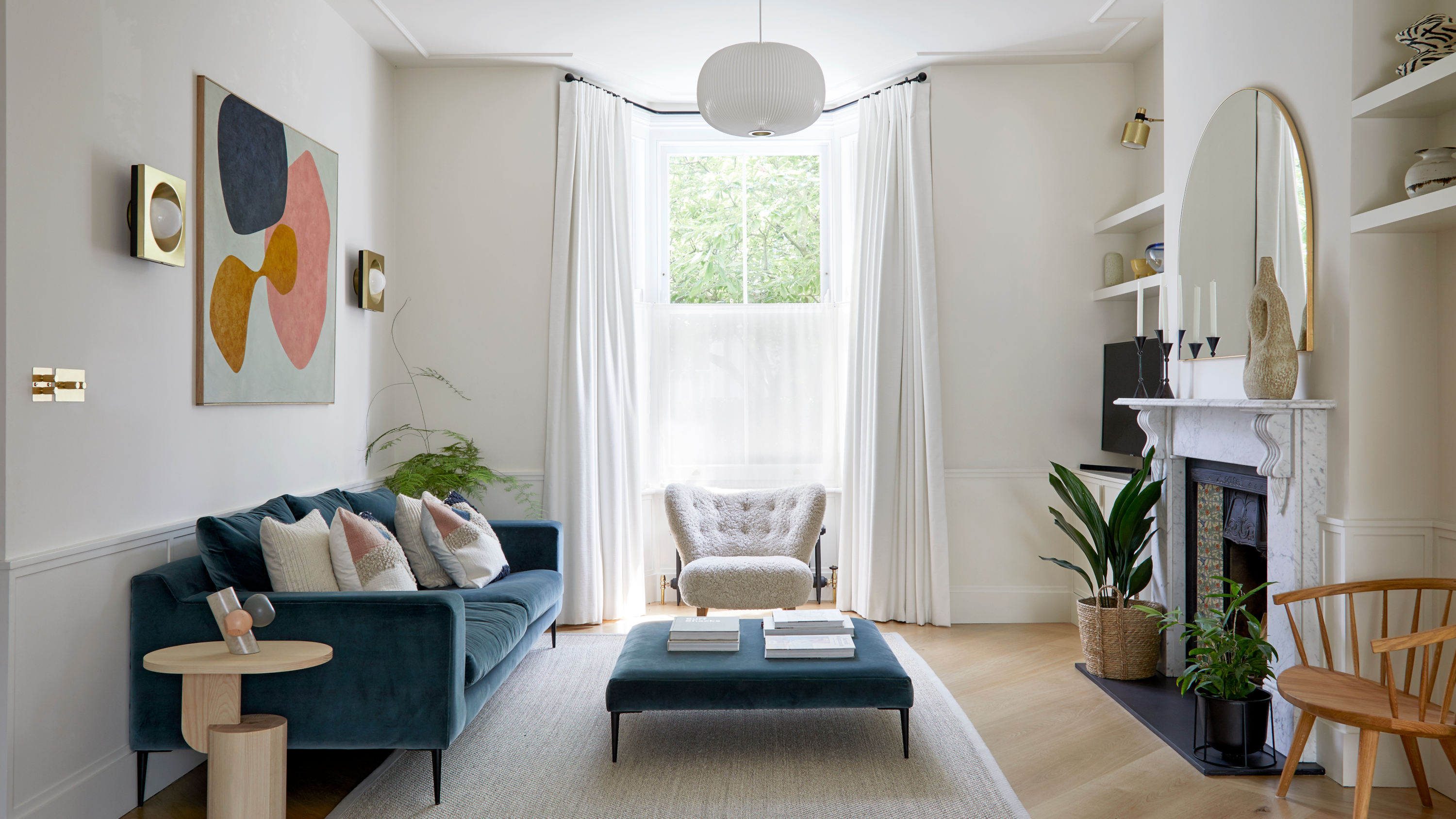
Designer Martha Franco suggests choosing 'greiges' like the above living room, instead of a classic beige.
Beige has been an enduring living room color trends. Pleasant to live in, relaxing, easy to decorate around. But architect and interior designer Martha Franco thinks there are better, more modern alternatives out there. ’Beige was once a popular neutral, but it can often create a bland and uninspiring atmosphere,’ she says.
A once favorite of the minimalist movement, we are seeing more and more living room designs that focus on showcasing personality through complex color choices, making beige seem a bit underwhelming.
What to do instead: But that doesn’t mean you should deviate too far. ‘Its lack of character has led to a shift towards more modern neutrals like warm greys or greiges (gray-beige). These alternatives offer a versatile backdrop with added sophistication, enhancing the overall aesthetic of any space,’ she says.
2. Deep mustard
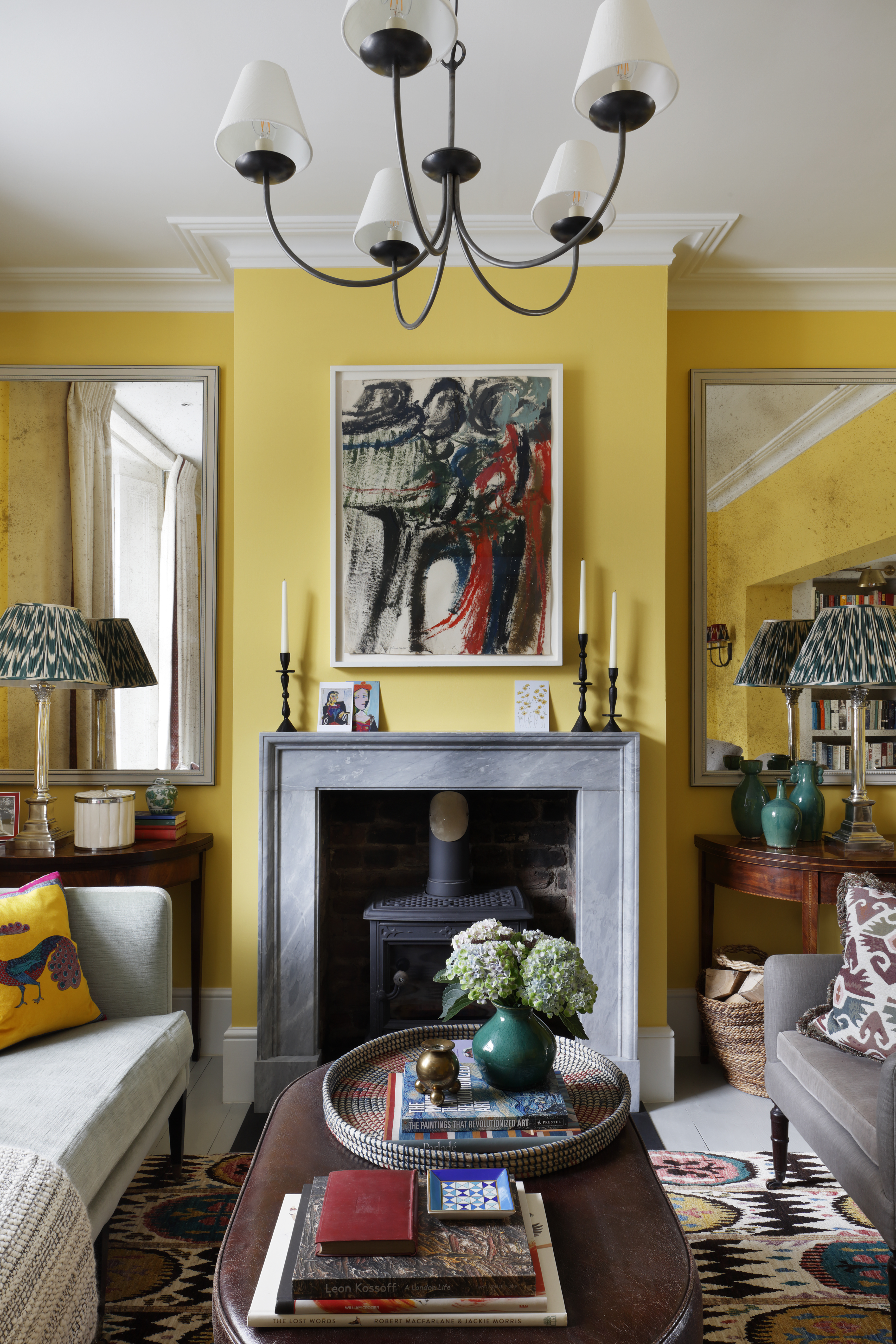
Bold yellows can feel a little intense for a space you want to be as calming as a living room.
Taking the conversation to the complete opposite end of the spectrum in terms of character, mustard definitely has plenty. Soo much character, in fact, that it maybe was consumed and gotten over too quickly.
‘Deep mustard, while trendy at one point, can sometimes be overpowering, potentially making a space feel dated. These bold colors may also clash with many types of furnishings,’ Martha tells me.
The Livingetc newsletters are your inside source for what’s shaping interiors now - and what’s next. Discover trend forecasts, smart style ideas, and curated shopping inspiration that brings design to life. Subscribe today and stay ahead of the curve.
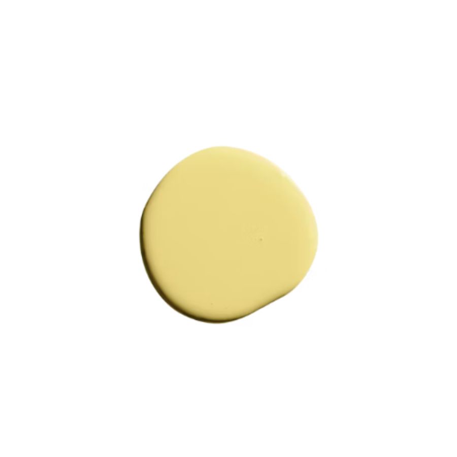
What to do instead: ‘Opting for soft, muted yellows or light gold tones can instead add a touch of warmth to a room without overwhelming it,’ she advises.
Don’t think cream tones, but actual light, soft yellow living room colors. ‘Shades of yellow can be very inviting as they evoke happiness, and are energizing,’ says interior designer Ellen Holt of MDI Interior Design. ‘If you combine warm yellows with grays or beige neutrals, you can achieve a sophisticated look in your living room,’ she adds.
3. Pastel mint
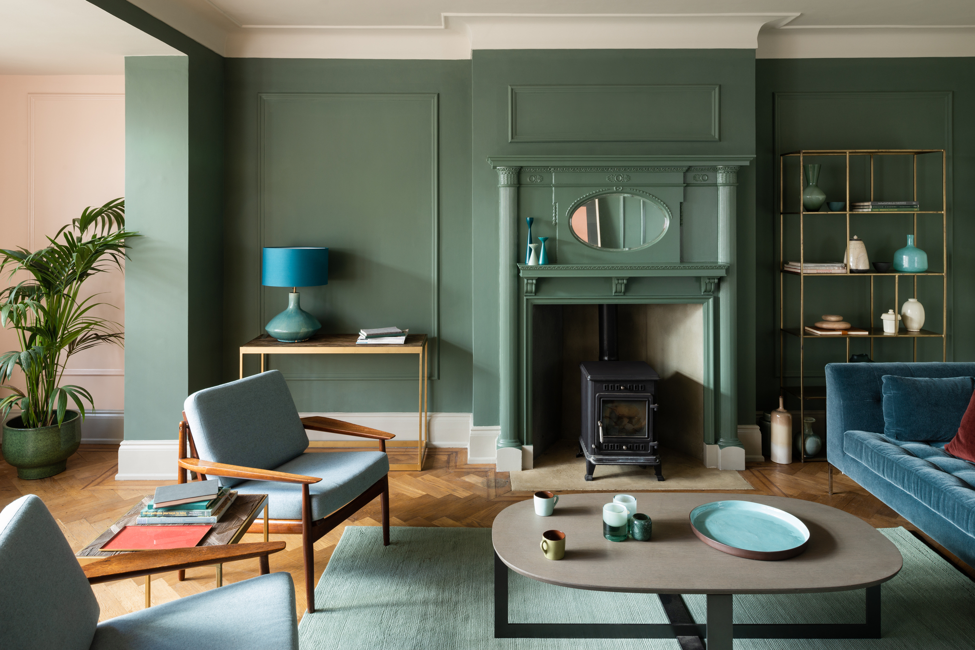
A more mature sage green is a better option for sophisticated spaces.
While decorating with pastels can feel refreshing in certain environments, and might look good in a kid's room, Martha thinks they should be avoided in a living room, especially when there are so many other, more natural and welcoming alternatives to opt for instead.
‘Pastel mint is considered outdated as it doesn’t evoke a welcoming ambiance, instead giving off a bathroom-like feel,’ she tells me.
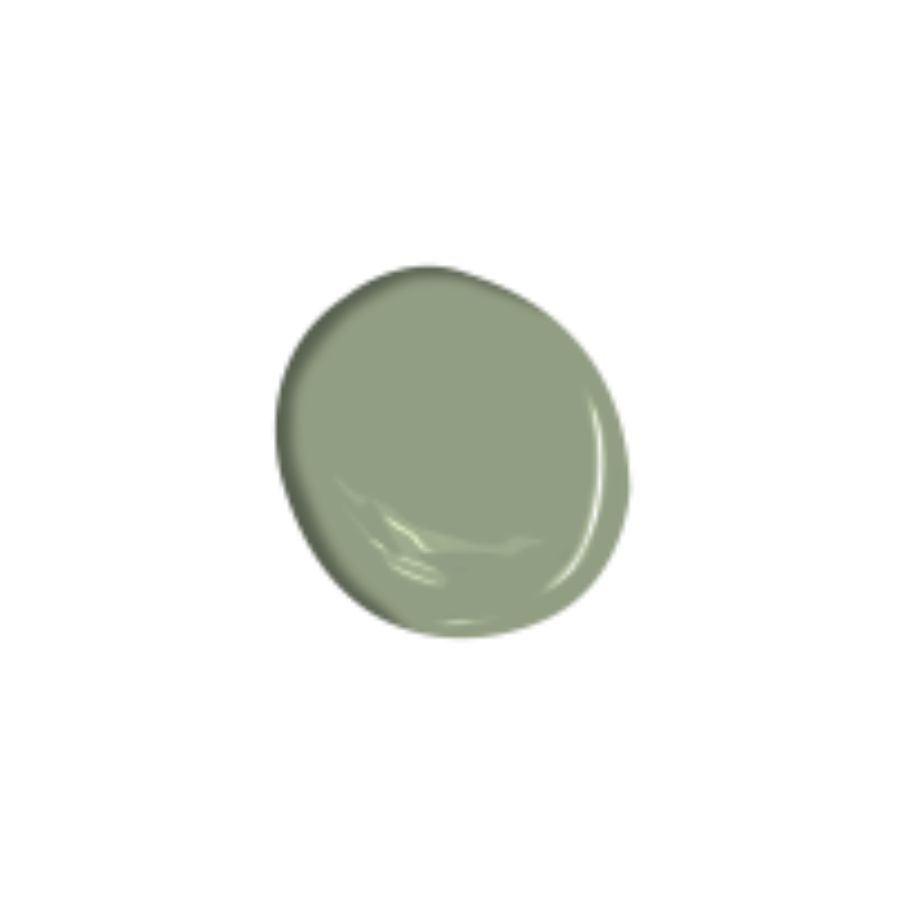
What to do instead: ‘A more contemporary choice would be sage green or a muted, earthy green. These shades bring a touch of nature into the space, offering a fresher and more modern aesthetic,’ explains the design expert.
4. Pure white
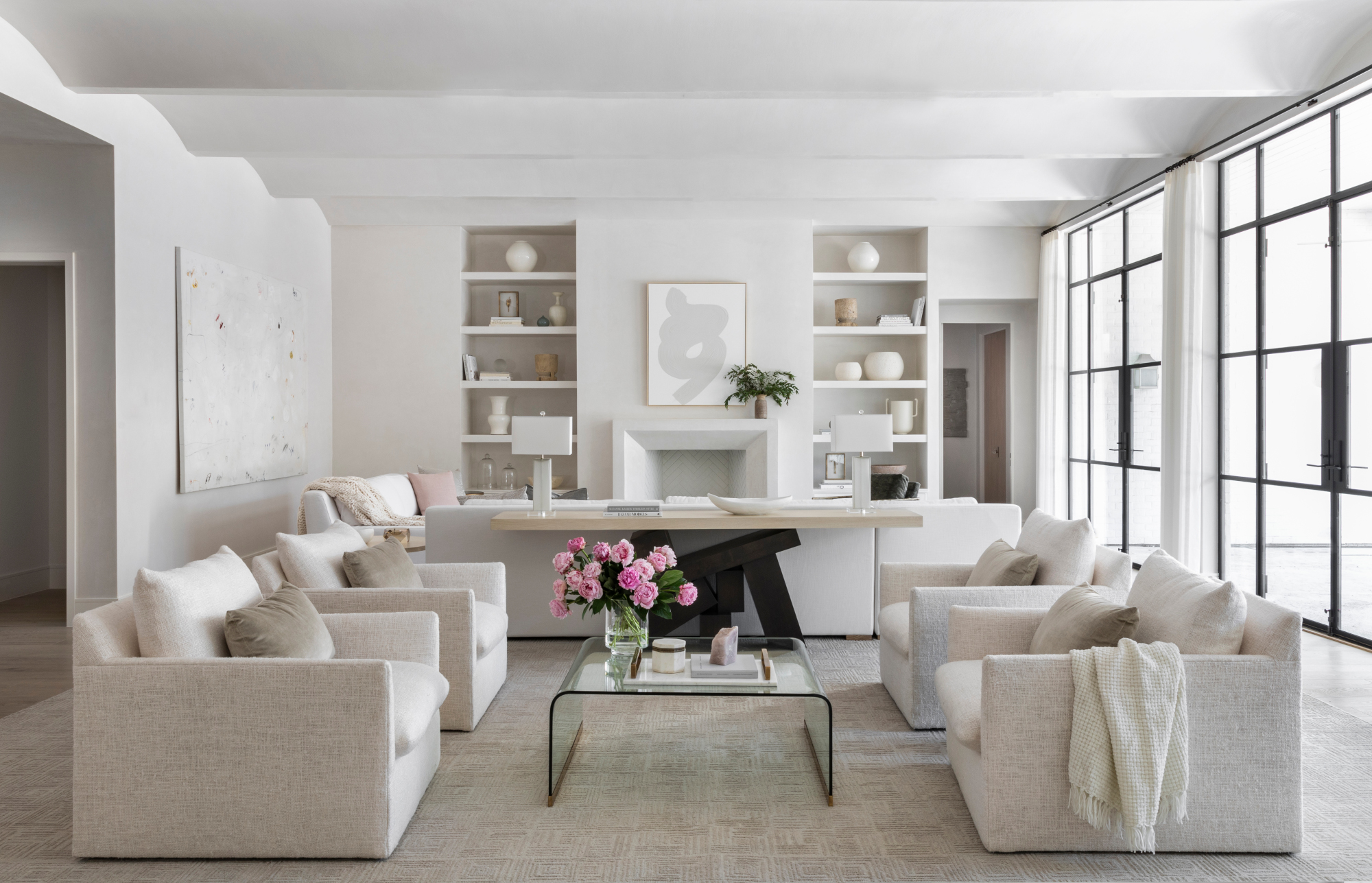
Avoid Brilliant White for something a little softer, like in this living room by Marie Flanigan
There was a time when a crisp, sparkling white was the epitome of modernity. Now it’s only reserved for trims or ceilings, and even then, a softer white usually with a tinted base picked up from the color scheme around it is much preferred.
‘While white is a classic color, using pure, stark white for all walls can create a clinical and sterile feel. This is a trend that has since passed,’ states Martha.
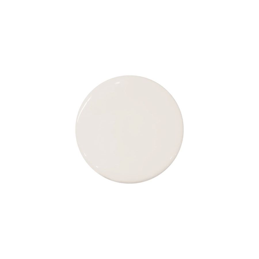
What to do instead: ‘Warm whites with subtle undertones, such as ivory or cream, add depth and warmth to a room while maintaining a clean and timeless aesthetic,’ advises the designer.
Warm, off-whites are having a real moment in design, and you’ll be spoilt for choice when looking for the perfect one. With so many sophisticated options out there it’s virtually impossible to get it wrong. Just make sure to pick the best white paint with the undertone that complements your living room’s overall color palette.
Raluca formerly worked at Livingetc.com and is now a contributor with a passion for all things interior and living beautifully. Coming from a background writing and styling shoots for fashion magazines such as Marie Claire Raluca’s love for design started at a very young age when her family’s favourite weekend activity was moving the furniture around the house ‘for fun’. Always happiest in creative environments in her spare time she loves designing mindful spaces and doing colour consultations. She finds the best inspiration in art, nature, and the way we live, and thinks that a home should serve our mental and emotional wellbeing as well as our lifestyle.
