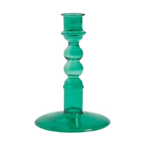
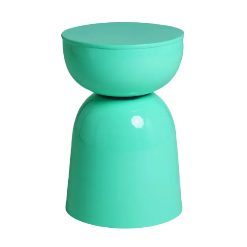
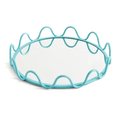
Scientists Have 'Discovered' a Brand New Color — Meet Olo, the Most Unnatural (and Most Saturated) Color in the World
It doesn't exist in nature, and it's not visible with the naked eye, so what *actually* is Olo? And what does it mean for interior design? Let's discuss

The Livingetc newsletters are your inside source for what’s shaping interiors now - and what’s next. Discover trend forecasts, smart style ideas, and curated shopping inspiration that brings design to life. Subscribe today and stay ahead of the curve.
You are now subscribed
Your newsletter sign-up was successful
By now you may have already heard that a group of scientists in Northern California discovered a completely new color. No — you won't find it on the color wheel, and definitely not in nature. So, what is this Olo color? And how do you just discover a new color in 2025?
Perhaps, unsurprisingly, it involved a scientific lab and laser beams. "Scientists recently discovered this new shade during a study in which they manipulated the human eye," explains Michael Rolland, paint color expert and managing director of The Paint Shed.
During the experiment, scientists managed to isolate the 'M' cone (one of the three cone cells in the retina responsible for perceiving color), and stimulated it with a laser beam. The result? It allowed participants to observe a color that will never be visible in natural vision. Hence, a 'new' color.
Article continues belowSo, what color is Olo? It's a shade of blue-green, perhaps bolder than any we've ever seen before. Professor Ren Ng, one of the researchers, described the color Olo as "more saturated than any color you can see in the real world," says Michael.
Could Olo (or something Olo-inspired) be the next biggest color trend for interiors? I asked designers, below.
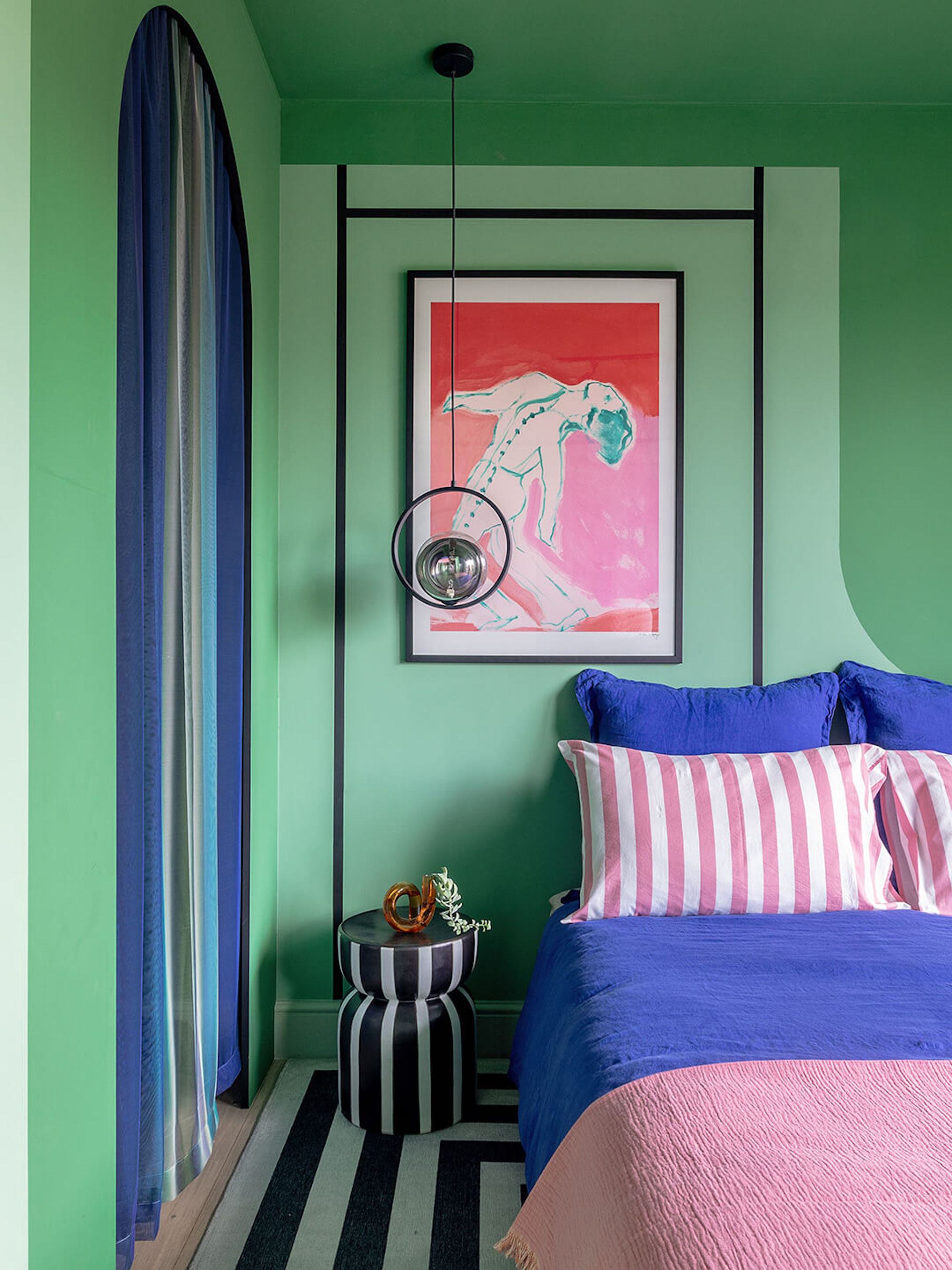
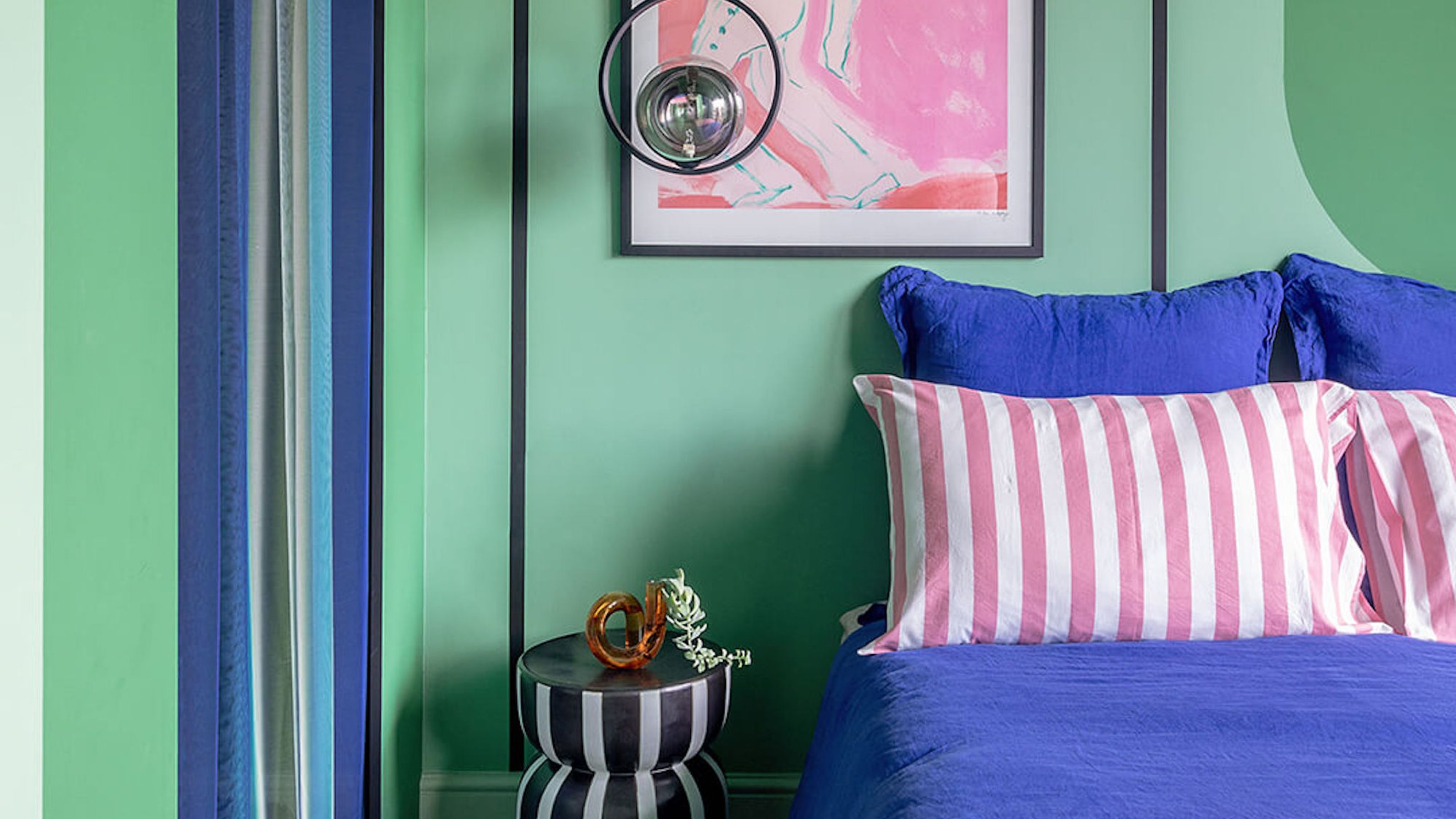
A combination of bright mint and teal, like on the walls of this bedroom, is the closest existing shade to Olo.
Considering Olo hasn't technically existed until now, how to incorporate it (or, at least, be inspired by it) when it comes to our interiors is completely open for interpretation. It's a color with no connotations.
But of course, it doesn't actually exist in nature, so you can't actually style it in your home. You can, however, be inspired by it. You can treat it "almost akin to a very vivid and deeply saturated turquoise," says interior designer Kathy Kuo, founder of Kathy Kuo Homes.
The Livingetc newsletters are your inside source for what’s shaping interiors now - and what’s next. Discover trend forecasts, smart style ideas, and curated shopping inspiration that brings design to life. Subscribe today and stay ahead of the curve.
It's bright, it's bold, and makes you think of the cyan-colored waters of the Maldives, or the electric-pops on peacock features. As such, I'd recommend styling it in small doses... very small doses — perhaps just through decor, rather than large swathes of paint.
But if you are feeling brave, while there are no exact paint shades on the market (and there never will be), Michael Rolland says he thinks "the color most similar to Olo on the market is the formula S 1050-B80G by NCS Color."

Michael is the Managing Director of The Paint Shed — the fourth generation of his family to lead a business within the paint and coatings industry. He has worked at The Paint Shed for eight years and led it for the last seven, meaning he has a wealth of knowledge regarding all things paint and renovations.
Other Olo-Inspired Paint Colors
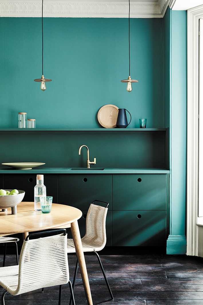
Aquamarine and deeper teals are lovely, softer alternatives that still capture the out-of-this-world aesthetic of Olo.
But, of course, "Highly-saturated shades like Olo can bring difficulties with them, chiefly being too bold and brash, especially in spaces that should be cozy and calm," says Michael.
So, use it as a feature, and pair it with complementary shades to make it feel more subdued. "Due to the saturation, it’s best to use shades inspired by Olo alongside neutral color schemes or very light gray-blues," says Michael.
Tones like Pale Powder by Farrow & Ball or Linnet White from the DuluxHeritage Range are a few go-to's he recommends.
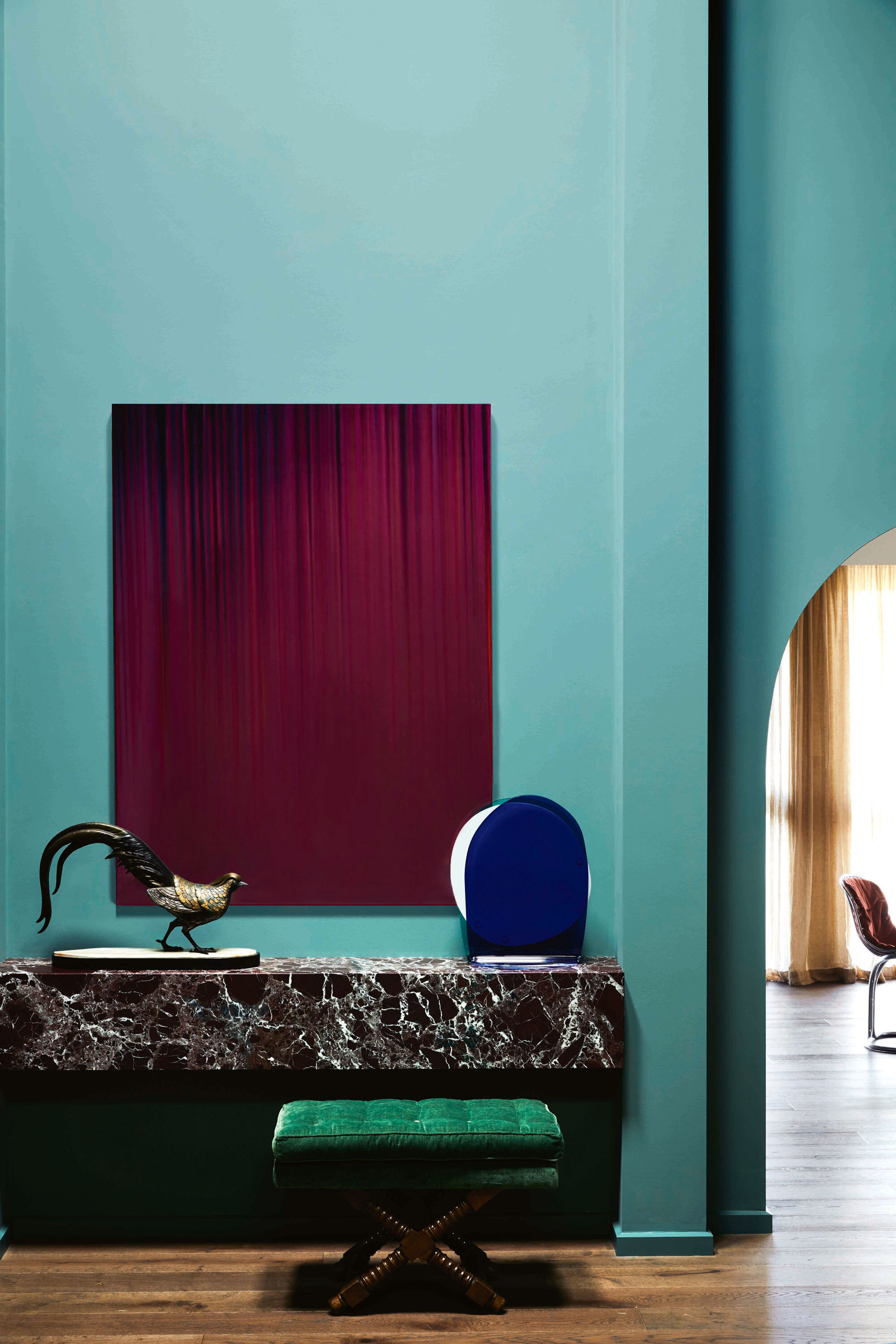
Here a bright Olo-inspired teal takes on a luxurious feel next to an intricate marble desk and deep magenta painting.
"Whilst Olo is an exciting discovery for science, I think it’s best for homeowners to stay away from this kind of shade in the home," admits Michael. "This kind of saturation can cause color overload — even amongst maximalists!"
But if you really love it, stick to something a little softer on the eye. Something tells me we're about to see a lot more people decorating with teal in the coming years...

Olivia Wolfe is a Design Writer at Livingetc. She recently graduated from University of the Arts London, London College of Communication with a Masters Degree in Arts and Lifestyle Journalism. In her previous experience, she has worked with multiple multimedia publications in both London and the United States covering a range of culture-related topics, with an expertise in art and design. At the weekends she can be found working on her oil paintings, reading, or antique shopping at one of London's many vintage markets.


