This unexpected combination is the next big color trend – it's creative, fun and brings nature's warmth to your home
We're loving these bold decorating schemes that use a surprising color palette you don't often see outside of nature

The sunset color palette is the latest color trend to bring the warmth of summer into your home. Taking cues from nature, enlisting the help of a sunset color palette is a way to introduce an ethereal, dream-like scheme into a room. Think dusky Renaissance clouds and the feeling of a balmy summer evening at golden hour.
Color affects us psychologically, so introducing the vivid tones of the sunset color palette through paint or decor is a way to bring an optimistic and happy energy into a space.
;The colors of the sunset are also the colors of the earth which are very close to our history, after all they are the first to be used to paint in caves, there is something almost ancestral more linked to the dawn of civilization,' says studio's founder, Francesca Venturoni. 'That's why we feel them so ours, almost alive, human. From a chromatic point of view they are a sort of new neutral better than white, on which the accent tones such as the light blue of the sky stand out naturally.'
Here, I look to interior-designed spaces where a sunset color palette has lifted the interior, to find out what the pillars of this trend are and how to replicate the look in our own homes.
What is the sunset color palette trend?
The sunset color palette trend is a great way to add warmth to a room, enlisting the help of bright, bold colors that make you feel happy and energetic, while bringing a sense of calm.
Color is light energy that we absorb not only through our eyes but also through our skin, color psychologist and holistic designer, Suzy Chiazzari tells me. ’Color affects us psychologically, especially when they have symbolic meaning and we link them to something we love in nature.
'For example, yellow reminds us of bright sunny days, while orange creates the feeling of warmth and comfort we feel when watching the flames of a fire.'
The Livingetc newsletters are your inside source for what’s shaping interiors now - and what’s next. Discover trend forecasts, smart style ideas, and curated shopping inspiration that brings design to life. Subscribe today and stay ahead of the curve.
‘Bright warm colors stimulate blood flow feeding our muscles. Deep red and orange encourage physical movement while yellow and gold are known to encourage mental alertness.'
‘Studies have shown that the color red stimulates the flow of oxygen in the blood. This raises our pulse and blood pressure, making us more active and energetic.’
Which rooms should you use a sunset palette in?
As well as the psychological impact using the sunset color palette might have on a room, the sunset color palette is a great way to enhance a home's location.
Think about the direction your room faces, you might want to bring a sunset color palette into a room that doesn't receive so much natural light and sunshine, to counteract the darkness using color. A west-facing room always gets sunset lighting and that golden hour glow, so if you have a darker, east-facing room that doesn't get that sunset glow, or a north-facing room that tends to be darker throughout the year, introducing pops of sunset coloring into the space is a great way to combat this inherent darkness.
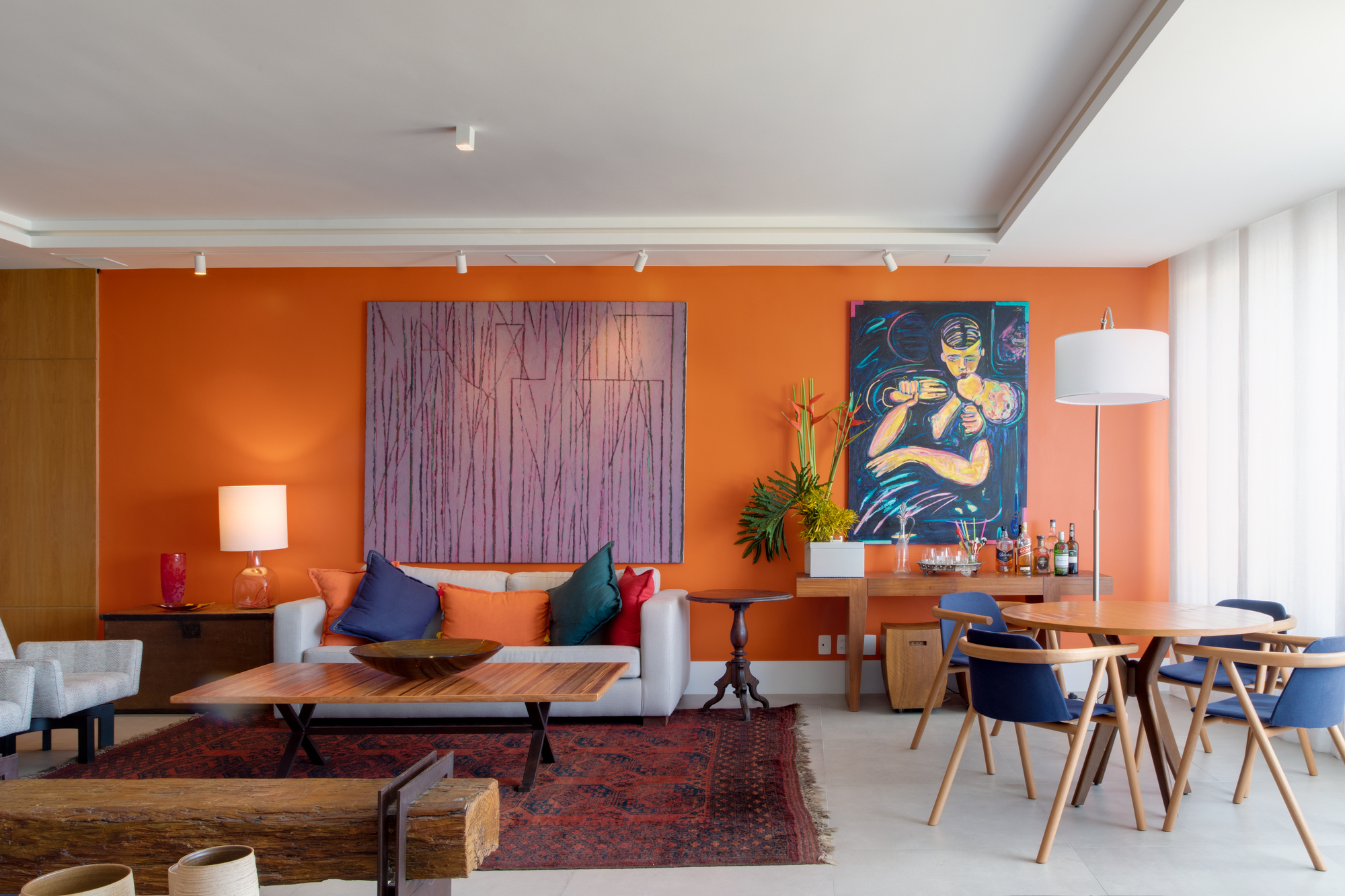
In this example by Chicô Gouvêa Architecture, architect Chicô Gouvêahas brought in a sunset color palette to reflect the geographical location of a seaside setting. Blues, purples, reds and oranges mimic the color you might find in a seaside sunset view and give a great sense of place.
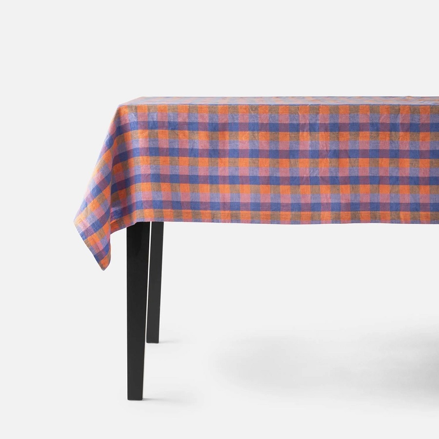
I like the way this 100 percent linen tablecloth incorporates sunset colors of blue, orange and pink, bringing a playfulness to your tablescape.

Hand-dipped candles in a buttery yellow shade, dotting these around the room will bring a bright addition to your styling. Each candle burns for approximately eight hours.
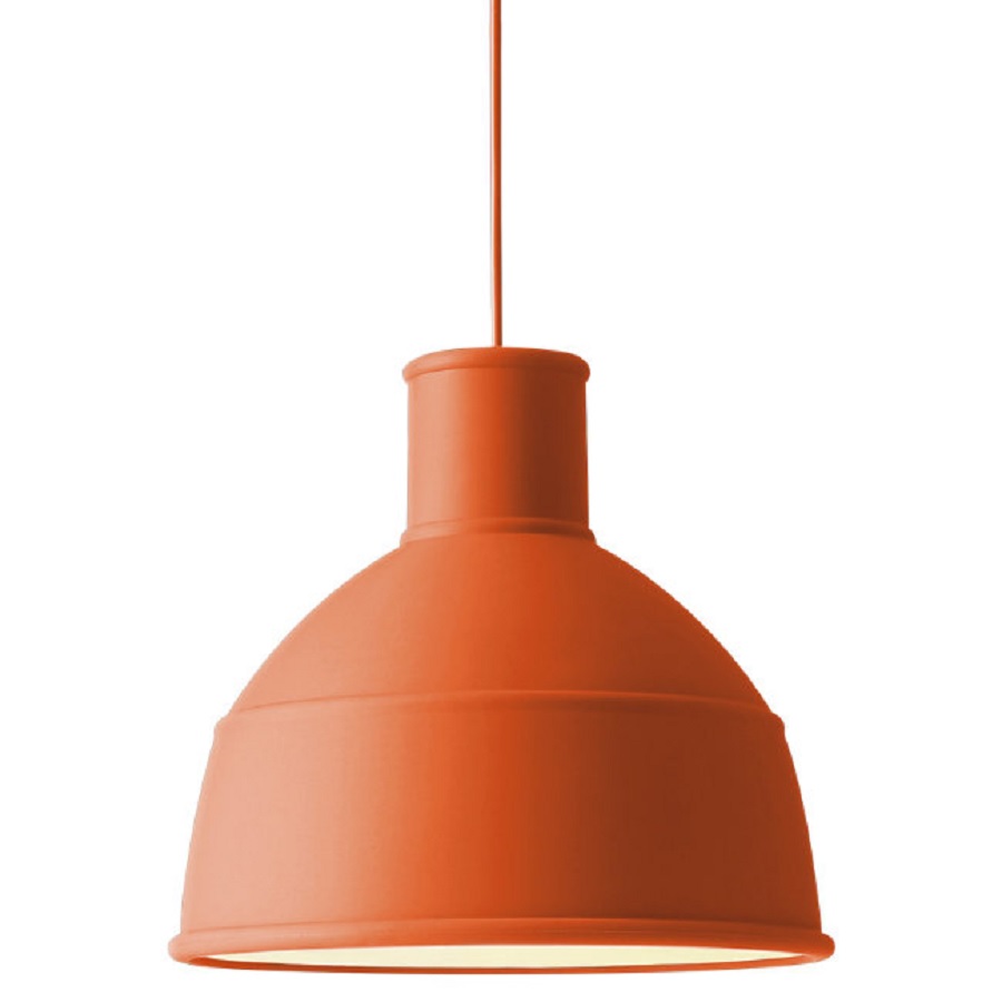
A light fixture is a great way to bring a bright color to your room. I like this bold orange color, bringing a sunset shade to a kitchen or hanging above an island.
What colors make up the sunset color palette?
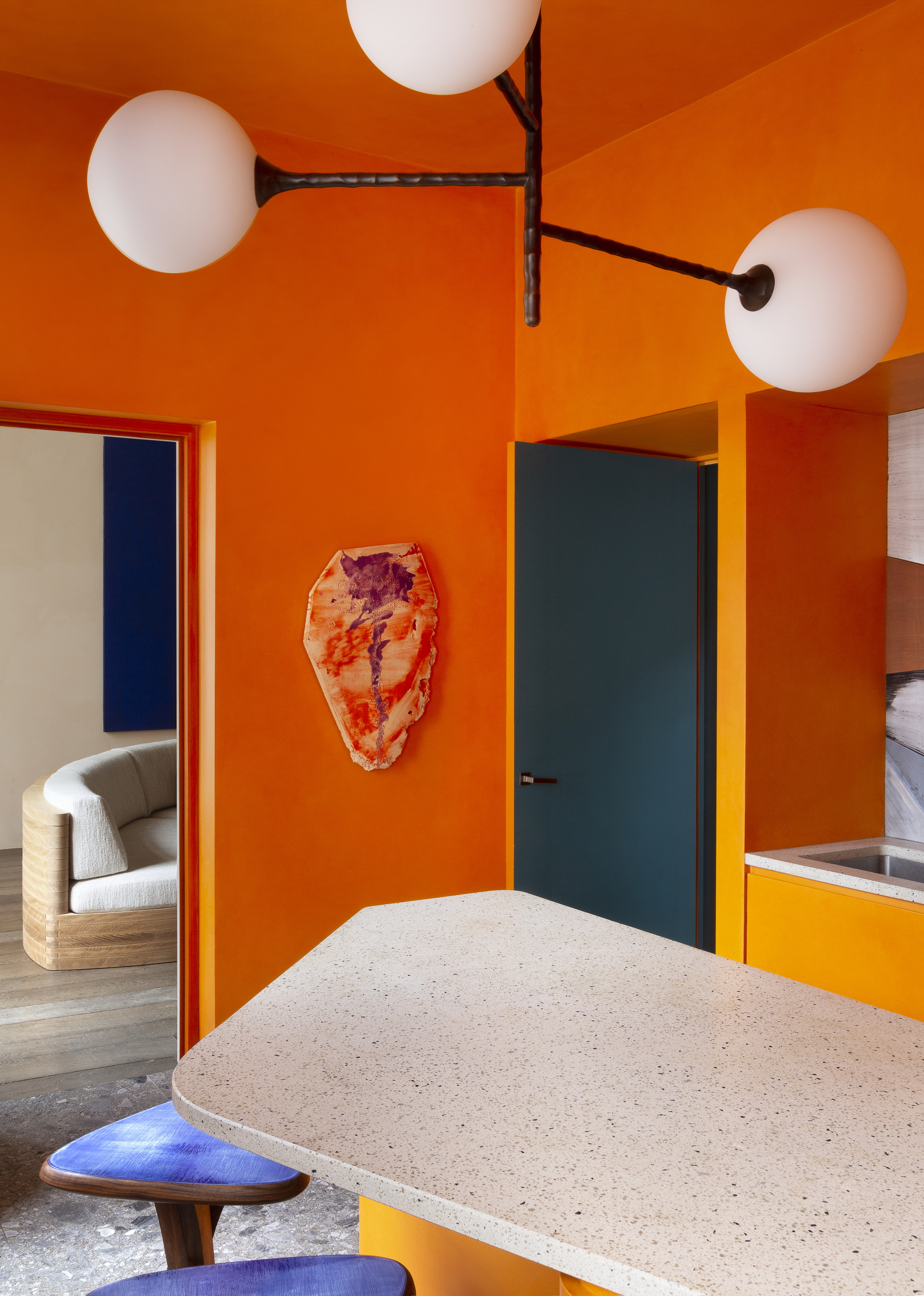
The sunset color palette isn't just about bringing oranges and sunshine yellows into your room. Look hard at the other colors you see in a sunset. On the spectrum of a sunset, you also get oranges and pinks blending into violets and deeper blues, so make sure you bring blue into your scheme for extra wow-factor.
Orange and blue also sit opposite each other on the color wheel, so they work in harmony together. 'The sky and sea at sunset is actually a wide range of colors mixed with orange and blue,' says Chicô.
'Though orange and blue are intense and vibrant colors, the combination with the colors of sunset radiates peace and calm.'
This room is designed by Pierre Yavanovitch - an interior designer who brings a great sense of playfulness when it comes to color. These bold oranges and blues are tones taken from a sunset view and deconstructed, and bring that same warmth that you feel when looking at a beautiful sunset view.
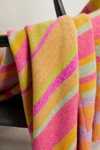
Elder Statesman cashmere blanket, Net-a-Porter
This beautifully luxury cashmere blanket is the perfect way to introduce this trending color scheme to your couch or bed in a small way.
How to introduce the sunset color palette?
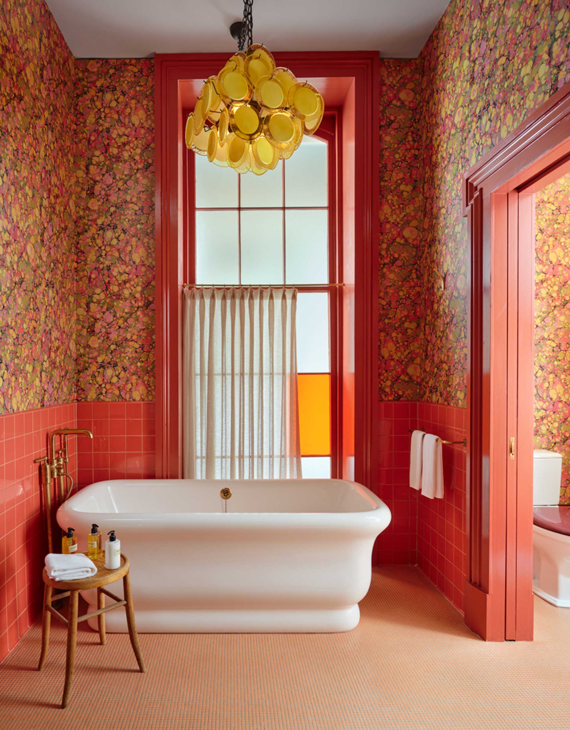
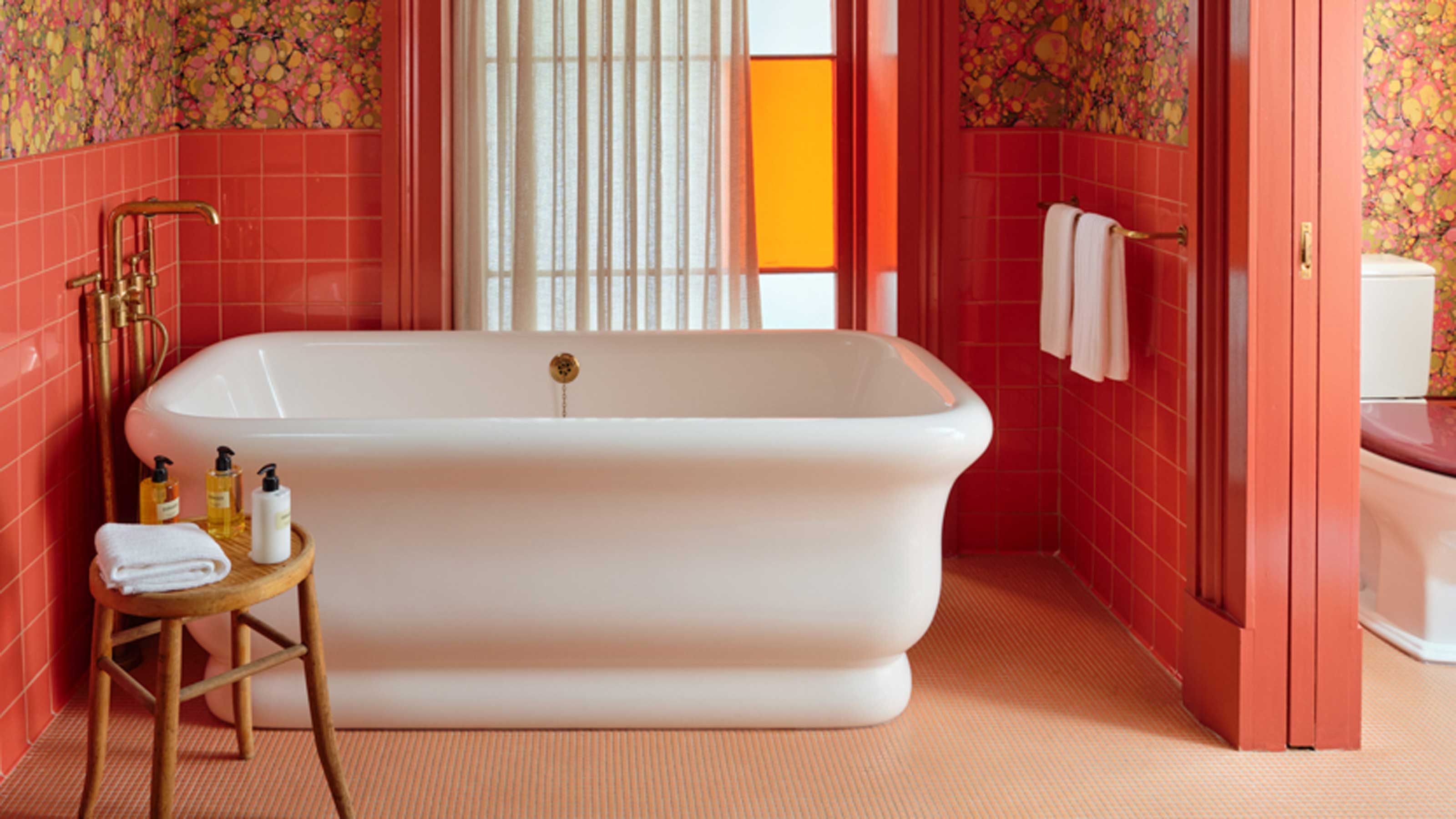
The most obvious way to introduce a sunset color palette into your home is by embracing color on the walls. Be brave and give your home a new lick of paint with a sunshine yellow or zesty orange. A wallpaper is another way to build out your palette, and the likes of the wallpaper used in the bathroom of the Hotel Saint Vincent in New Orleans, designed by Lambert Mcguire Design, which includes pinks, yellows and oranges, everything need to build out a sunset palette. Follow the 60-30-10 color rule, dividing the prominent colors in your room proportionately.
Another way to embrace the sunset color palette is by getting decorative. If you have a relatively neutral room that is in need of some sunshine, you have a great foundation on which to introduce color. Think yellow and orange cushions on a lackluster sofa in need of some attention, a light fitting that casts a golden glow, or a simple rich, red throw to bring a feeling of indulgence.

Former content editor at Livingetc.com, Oonagh is an expert at spotting the interior trends that are making waves in the design world. She has written a mix of everything from home tours to news, long-form features to design idea pieces, as well as having frequently been featured in the monthly print magazine. She is the go-to for design advice in the home. Previously, she worked on a London property title, producing long-read interiors features, style pages and conducting interviews with a range of famous faces from the UK interiors scene, from Kit Kemp to Robert Kime. In doing so, she has developed a keen interest in London's historical architecture and the city's distinct tastemakers paving the way in the world of interiors.

