This 'poison color' trick is the secret to elevated decorating schemes - I'll never look at a room's palette in the same way
This color theory goes to prove that there can be nuance in choosing a contrast hue for your scheme


The Livingetc newsletters are your inside source for what’s shaping interiors now - and what’s next. Discover trend forecasts, smart style ideas, and curated shopping inspiration that brings design to life. Subscribe today and stay ahead of the curve.
You are now subscribed
Your newsletter sign-up was successful
Do you remember the ‘color pop’ phenomenon? It was a time where a love for colour was seeping back into interior design, but before we reached the bold saturation of spaces we’re seeing inform interior design trends in the present day. The idea is a simple one - you bring some life and energy to your color scheme by introducing an accent ‘pop’, usually a bright complimentary shade, that ensures your overall palette doesn’t feel flat. The most classic example is probably grey and yellow - a color combination that at one time had a grip on our homes, but has now, through overuse, fallen out of fashion.
It’s fair to say the approach to using colour in the home has grown more sophisticated in the 2020s. Color palettes have become more nuanced, creative and experimental, and the fear of using an abundance of colour (for concerns over a home’s resale value) has faded over time. However, the one constant is the desire for a room’s color scheme to feel energized, not flat. But without falling back into bad habits like a clumsy color pop, how do you approach making an unexciting color palette come to life?
To elevate a colour palette with more subtlety, there’s an idea, originating in art and color theory, called the "poison color". 'If you've spent a long time carefully picking out colors for a room, but your color scheme feels slightly flat or boring, you need a few drops of bitterness to really make the sweetness sing,' explains Karie Westermann, the textile designer and color expert that introduced me to the concept, but what exactly gives a color this poisonous quality? And how can we find and use one to elevate our home's color palette? I asked the experts to find out.
Article continues below
Hugh is Livingetc.com's deputy editor and an experienced homes and interiors journalists. He talked to color experts about a trending phenomenon in interiors which helps create more nuanced color palettes.
What is a 'poison color'?
There’s an instinctual nature to choosing a poison color, Karie Westermann explains, that depends on the palette you’re working with. 'The poison color is not a contrast nor can you just pick out a complementary color on the color scheme,' she tells us. 'I try to experiment because it depends upon the color palette I'm using and the location of the room. If it's a harmonious scheme, you'll want a different poison than if you have a color scheme that works on contrasts.'
'If it's a harmonious scheme, you'll want a different poison than if you have a color scheme that works on contrasts,' she continues. 'If your room is full of earthy tones, try introducing a small amount of neon; if you have opted for a beachy feel with pale blues and pale browns, you might want to introduce a splash of black or even peach.'
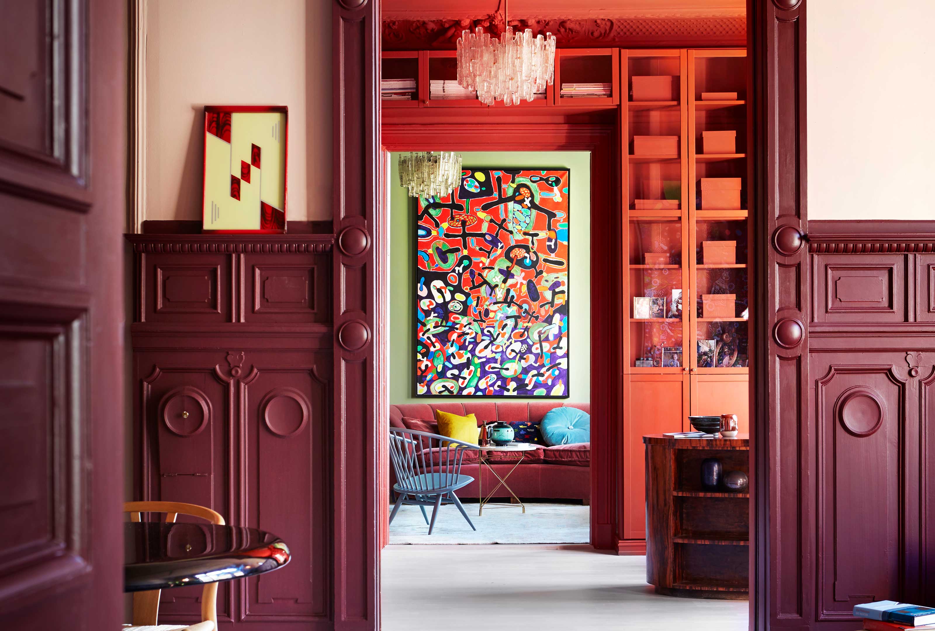
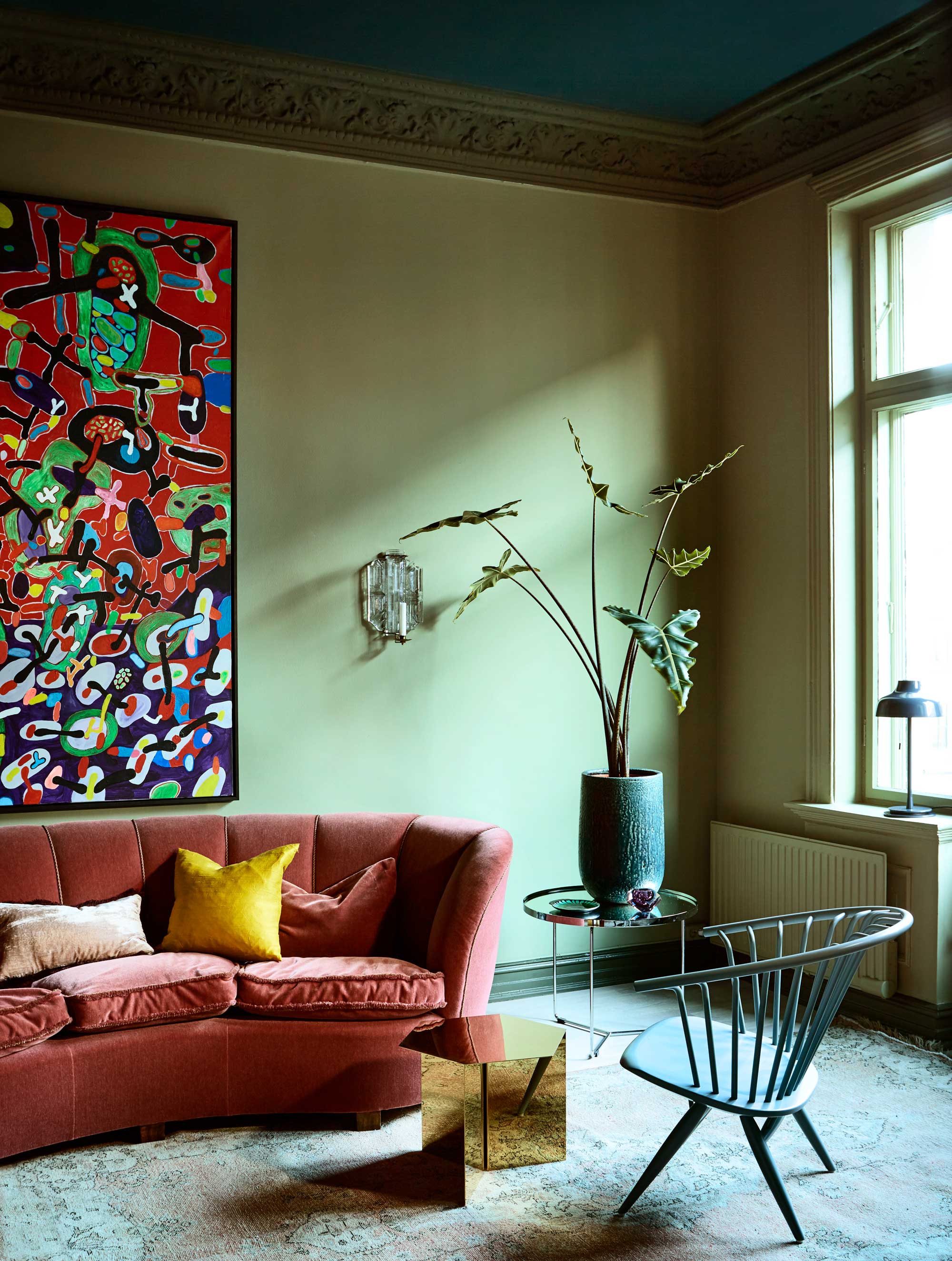
There’s a je ne sais quoi you have to contend with in finding a poison color, but I like to think of it less of a contrast in terms of looking at complimentary tones on a color wheel, and more about choosing a contrast that speaks a different ‘language’ to the rest of your scheme. A playfully unexpected pastel in a muted palette, the receding neutral that calms down a riot of color, or even a dark cloud on the horizon of an otherwise sugary sweet scheme. 'A poison color can be so subtle you don't notice it,' Karie explains, 'but you'd notice it if it were not there.'

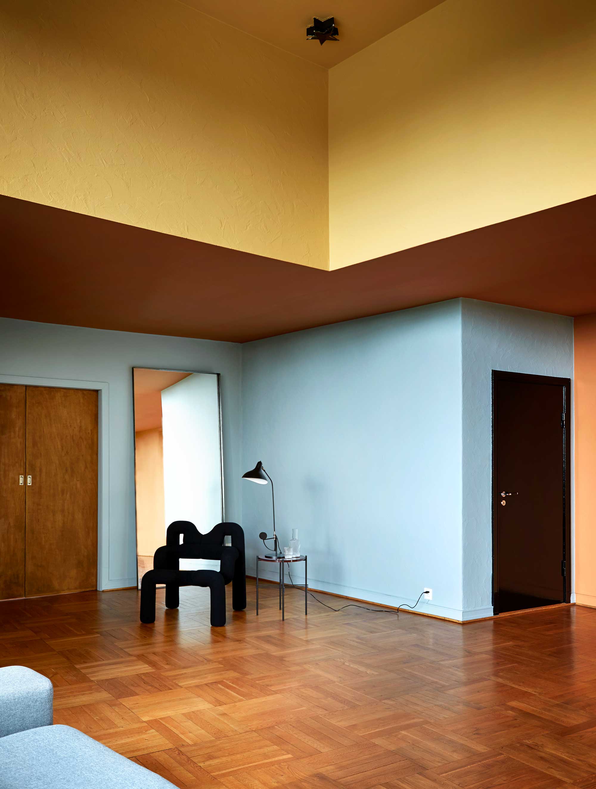
It’s an idea that informs the work of color expert Dagny Thurmann-Moe, a color designer and creative director of KOI Colour Studio, too. 'The role of the contrast color in a KOI palette is to move the rest of the scheme out of balance,' Dagny explains. 'When building a palette, we often work with base colors, accent colors and a contrasting color. While the base and accent colors usually follow traditional theoretical rules, and can be categorized as a split complimentary, triangular, analogue scheme, etc, the contrast color is the rule breaker,' she adds.
The Livingetc newsletters are your inside source for what’s shaping interiors now - and what’s next. Discover trend forecasts, smart style ideas, and curated shopping inspiration that brings design to life. Subscribe today and stay ahead of the curve.
That means, if your contrast is complying to some element of color theory in rounding out your palette, it’s probably not achieving exactly what you want from a poison color.
How do I use a 'poison color' to decorate my home?

So, once you’ve found your poison, how do you use it? For Dagny, following classic color ideas like the 60-30-10 rule is the most effective way. 'One or two base colors cover the larges surfaces, like walls, ceiling and floor, and will be about 60% of the surfaces you can see in the design,' she explains. 'The role of the accent color is to enhance the base color(s) in a harmonious way. In other words, they should not clash with the larger surfaces. The accent colors usually cover about 30% of the surfaces you can see in a room. There are usually 5-9 accent colours in a strong palette.'
'The contrast, or poison, color should be unexpected and surprising,' Dagny adds. 'It is usually a smaller object or detail, and covers maximum 10% of the surfaces you can see in the design.'
'A simple way to use the poison color trick is with pillows,' Karie adds. 'If I have three pillows, two of them will work with the overall color scheme and one will act as my poison. Something like a subdued terracotta linen pillow between two mustard velvet pillows can look amazing. Don't be afraid to use texture as a supplement to your poison, too.'
The poison color is an idea that not only helps you veer away from less-sophisticated color pops as the contrast for your designs, but also feeds into the trend for expressive, unexpected palettes that are being pioneered by some of the world’s top designers. That je ne sais quoi element you feel when you see a complex yet perfectly pitched room might just be down to a perfectly picked poison color, after all.

Hugh is Livingetc.com’s editor. With 8 years in the interiors industry under his belt, he has the nose for what people want to know about re-decorating their homes. He prides himself as an expert trend forecaster, visiting design fairs, showrooms and keeping an eye out for emerging designers to hone his eye. He joined Livingetc back in 2022 as a content editor, as a long-time reader of the print magazine, before becoming its online editor. Hugh has previously spent time as an editor for a kitchen and bathroom magazine, and has written for “hands-on” home brands such as Homebuilding & Renovating and Grand Designs magazine, so his knowledge of what it takes to create a home goes beyond the surface, too. Though not a trained interior designer, Hugh has cut his design teeth by managing several major interior design projects to date, each for private clients. He's also a keen DIYer — he's done everything from laying his own patio and building an integrated cooker hood from scratch, to undertaking plenty of creative IKEA hacks to help achieve the luxurious look he loves in design, when his budget doesn't always stretch that far.