How to use bold color in the bathroom - the expert guide to making a little go a long way
If you know how to use bold color in the bathroom you can update your decor easily and make a big design splash


The Livingetc newsletters are your inside source for what’s shaping interiors now - and what’s next. Discover trend forecasts, smart style ideas, and curated shopping inspiration that brings design to life. Subscribe today and stay ahead of the curve.
You are now subscribed
Your newsletter sign-up was successful
Knowing how to use bold color in the bathroom can be a hard design idea to get your head around. Often small spaces, sometimes windowless, the natural direction to go in would tend to be light and bright. But there are plenty of ways to make a little bold color go a long way, adding flair, personality and panache to your bathroom decor.
'Never be afraid to go bold!' says Sarah Ellison, creative director at the interior design studio Frank & Faber. 'As a general rule, bold color can work in large and small bathrooms alike. We often choose to use richer and warmer bold colors in smaller spaces with an absence of natural light because the color becomes a feature of the space, while cooler colors can feel lifeless and dull.'
Updating what we thought we knew about modern bathroom ideas, Sarah's design advice for getting color right is invaluable.
Article continues belowHow to use bold color in the bathroom

Design by Frank & Faber
1. Create a balance
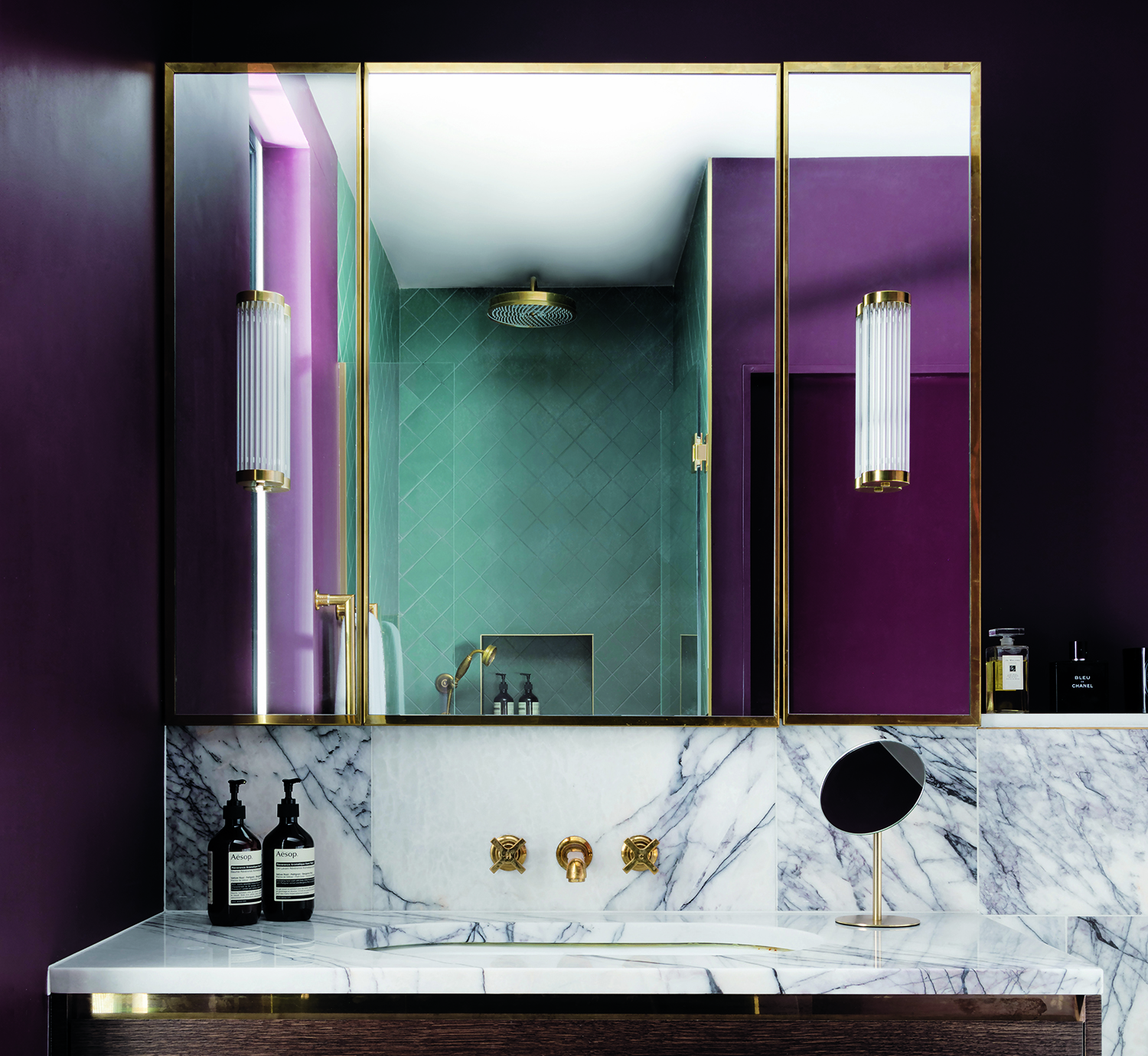
For this windowless, master en-suite on the lower ground floor, the owners were very open to dramatic color. 'They didn’t take much convincing to embrace Farrow & Ball’s Brinjal in a bold way,' Sarah says. 'It’s a fantastically rich color with impressive depth.'
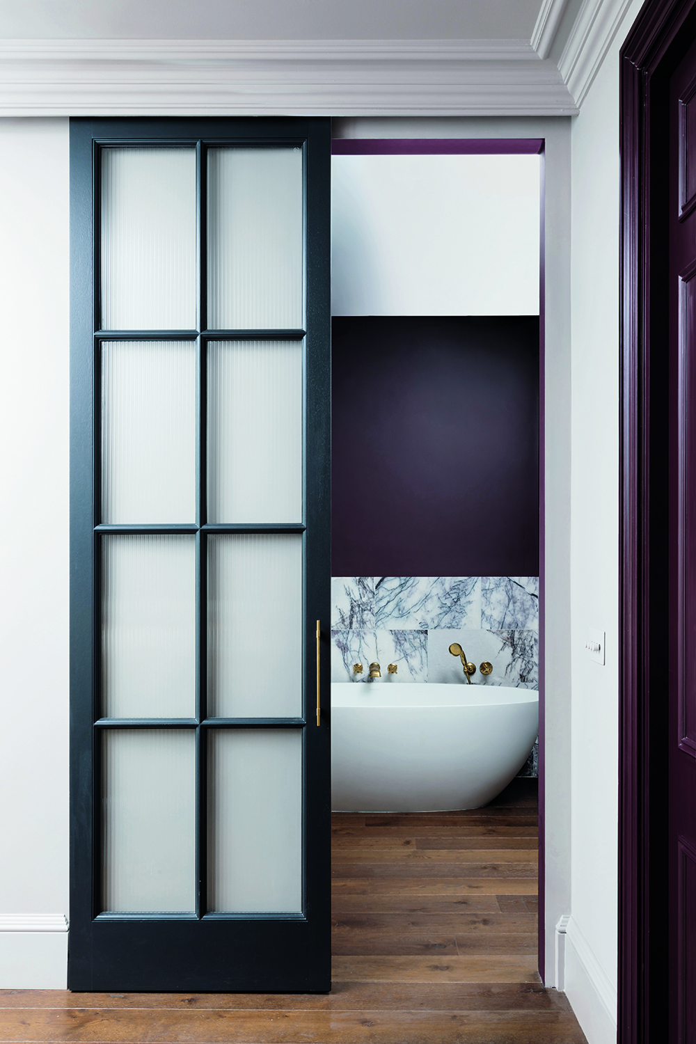
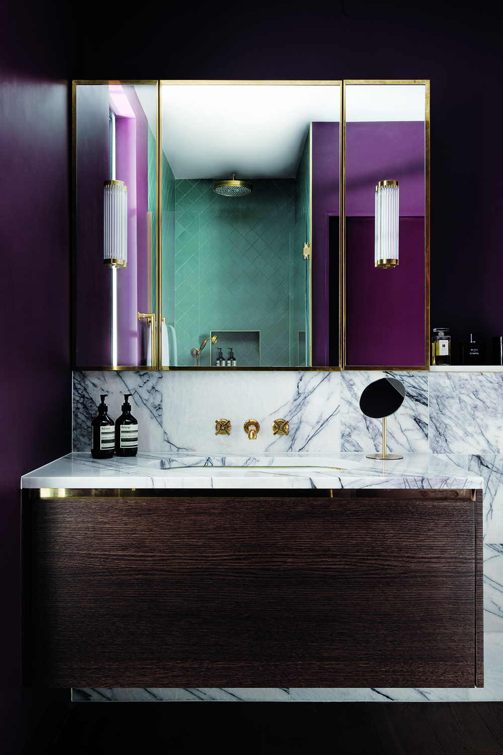
Sarah warns there are caveats when using such a vivid hue. 'With any bold shade, it’s important to get the balance right so that the color supports other finishes in the room and doesn’t overpower,' she says. 'The Calacatta Viola marble used here, for example, has a strong aubergine marble veining that balances with the Brinjal – a paler, more delicate marble would have been lost in the space.'
2. Pick aged brass fittings

Design by Frank & Faber
Sarah was keen to find ways to bring touchs of light to these small bathroom ideas, using materials that provided just the right gleam. 'The unlacquered brass finish on all the metal elements brings a similar warmth and will naturally age with time, which is a great way to add character,' she says.
3. Use color seen elsewhere in the home

Design by Frank & Faber
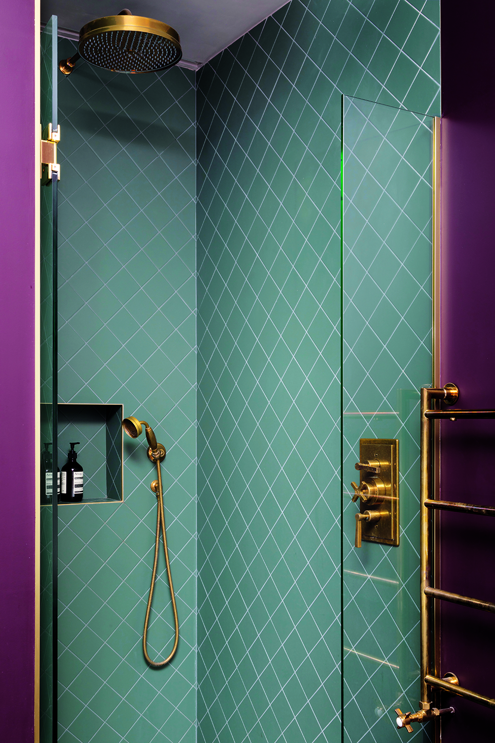
As with any walk-in shower ideas, this area needed tiling, and was a chance to offer some relief to the purple seen elsewhere. 'The shower tiles are a rich but muted green, which sits virtually opposite aubergine on the colour wheel, making it the perfect accent color,' Sarah says.
The Livingetc newsletters are your inside source for what’s shaping interiors now - and what’s next. Discover trend forecasts, smart style ideas, and curated shopping inspiration that brings design to life. Subscribe today and stay ahead of the curve.
'It also reflects other green accents used in this home, which is another important point when making brave color choices,' she continues. 'They work best when considered as part of a wider, cohesive color scheme. Used in isolation, the surprise can be too jarring.'
4. Opt for warm lighting
Bathroom lighting ideas truly make all the difference, particularly when using bold colors. 'We always opt for warm lighting – 2700k minimum – in bathrooms,' Sarah says. 'Nobody needs cold, harsh lighting in a space filled with cold, hard materials.'
With no natural light, getting the lighting design right was even more essential in this space. 'And so we installed multiple circuits to allow different lighting scenes through the day,' Sarah adds. 'We always avoid too many spotlights, as they have a harsher quality, whereas the wall lights here really bring the Brinjal to life, making it even warmer and richer.'
5. Keep the palette fuss-free
Finally, Sarah advises that you try to keep things relatively fuss free when using strong colors. 'A refined palette with minimal color changes means the eye is not drawn into many directions,' she says. 'For example, we often use the same finish on the walls and ceilings, as well as skirtings, architraves and doors. The simplicity of palette creates a more calming overall aesthetic.' A useful adage to remember when considering small bathroom color ideas.

Linda is a freelance journalist who has specialized in homes and interiors for more than two decades, and now writes full-time for titles like Homes & Gardens, Livingetc, Ideal Home, and Homebuilding & Renovating. She lives in Devon with her cabinetmaker husband, two daughters, and far too many pets, and is currently honing her DIY and decorating skills on their fourth (and hopefully final) major home renovation.