How to choose paint colors that flow from room to room - architects on how to create a perfect palette
Whether combining bold colors or tonal shades, experts explain their insider tips for a seamless paint scheme

If you’re repainting your home, and pondering how best to choose paint colors that flow from room to room, then consider this expert advice from Paint & Paper Library’s creative director Andy Greenall: 'When deciding on your color palette, rather than assessing each room separately, focus on how you want to feel as you move through the different spaces.’
Andy recommends paying focussing the bulk of your paint ideas on places where separate areas connect, such as open-plan layouts, doorways and corridors. 'If you’re looking to create continuity and harmony within a home, opt for graduated shades. Combining subtle nuances of one shade will create a tranquil atmosphere, while pairing the deepest hue with the palest will deliver an impactful, tonal scheme.’
For a more dramatic approach, combining contrasting colors that complement each other will emphasize transitions between rooms. This is why – contrary to age-old advice – using strong shades in a small home can actually help to make a space feel bigger, as each room is given its own distinct identity.
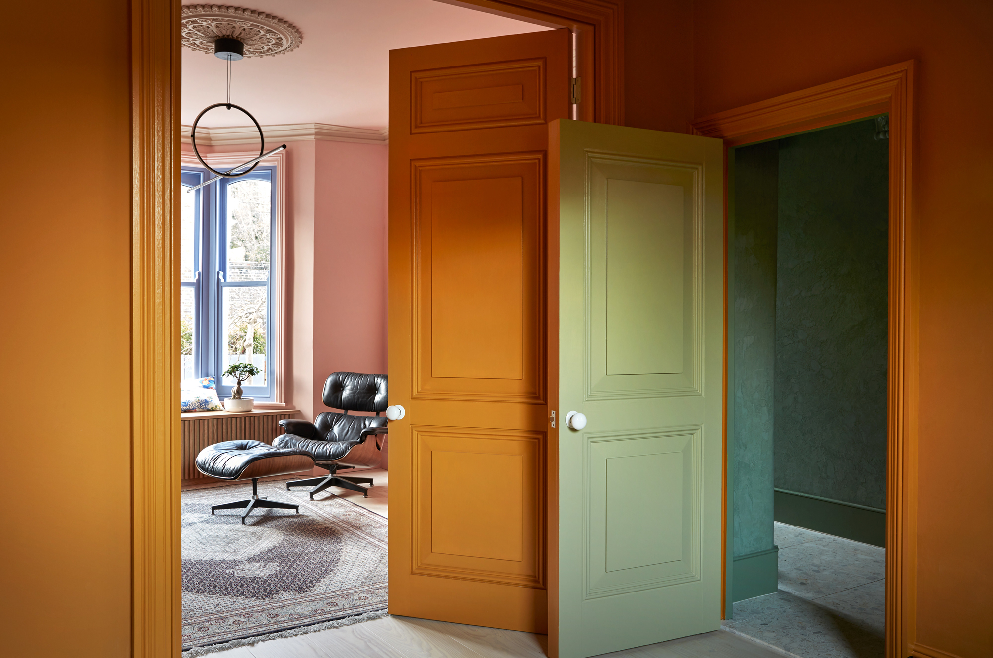
Article continues belowBolder hues are also ideal for period properties. 'In a Victorian home, the rooms are often compact, and the hallways narrow, so the views through rooms, and into the adjacent spaces, are an important design aspect,' says Siri Zanelli of Collective works. 'Combining warm and cold colours, rather than keeping to one side of the color wheel, can really enhance a space.'
For more expert paint scheme tips for spaces large and small, read on.
1. DEFINE DIFFERENT AREAS WITH CONTRASTING SHADES

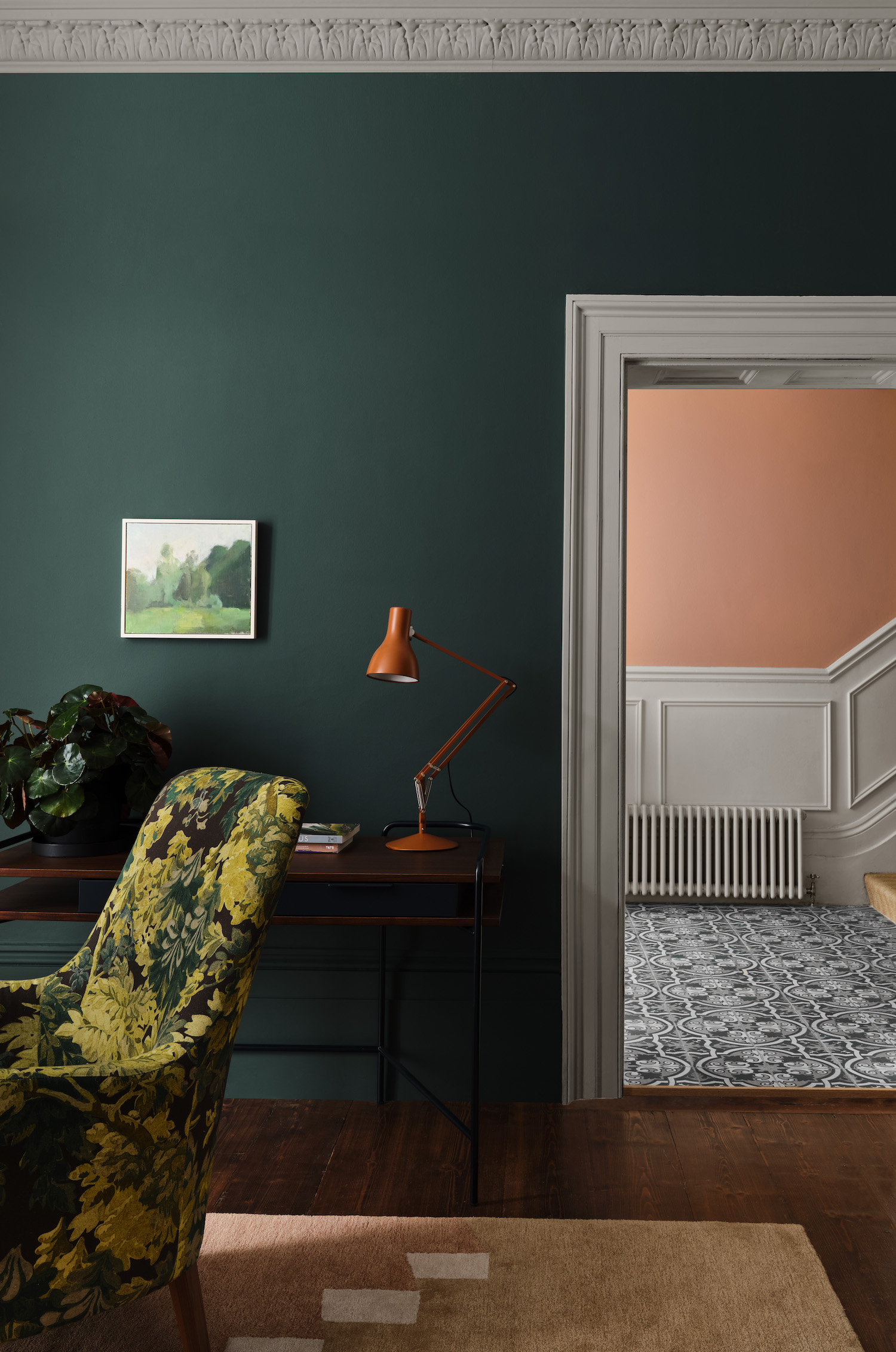
'A warm, peachy hue seen from a room painted in a deep teal such as this is a dynamic and surprising combination,' says Paint & Paper Library's creative director Andy Greenall of this space, a prime example of current living room color trends, painted in the brand's 'Nori' shade. It leads through to a entryway in 'Roben's Honour'.
'Entryways are often visible from multiple rooms, so consider how the colors will interact together and the resulting atmosphere it will create,' he adds. Juxtaposing strong colors like these not only creates contrast, it helps define the mood of different spaces throughout the house.
The Livingetc newsletters are your inside source for what’s shaping interiors now - and what’s next. Discover trend forecasts, smart style ideas, and curated shopping inspiration that brings design to life. Subscribe today and stay ahead of the curve.
If you're aiming for a more understated palette, then consider using complementary tonal shades. 'Our Architectural Colors have been individually formulated using different strengths of the same pigments to achieve subtle shade differentiations,' says Andy of the collection, where each color is numbered according to its tonal weight, making them incredibly easy to combine. 'They can be used together to create subtle design interest or more dramatic color pairings. This means you can layer colors to emphasize architectural features, and even emulate them where they're lacking using thoughtful paint combinations.'
2. USE A COHESIVE PALETTE THROUGHOUT THE HOUSE

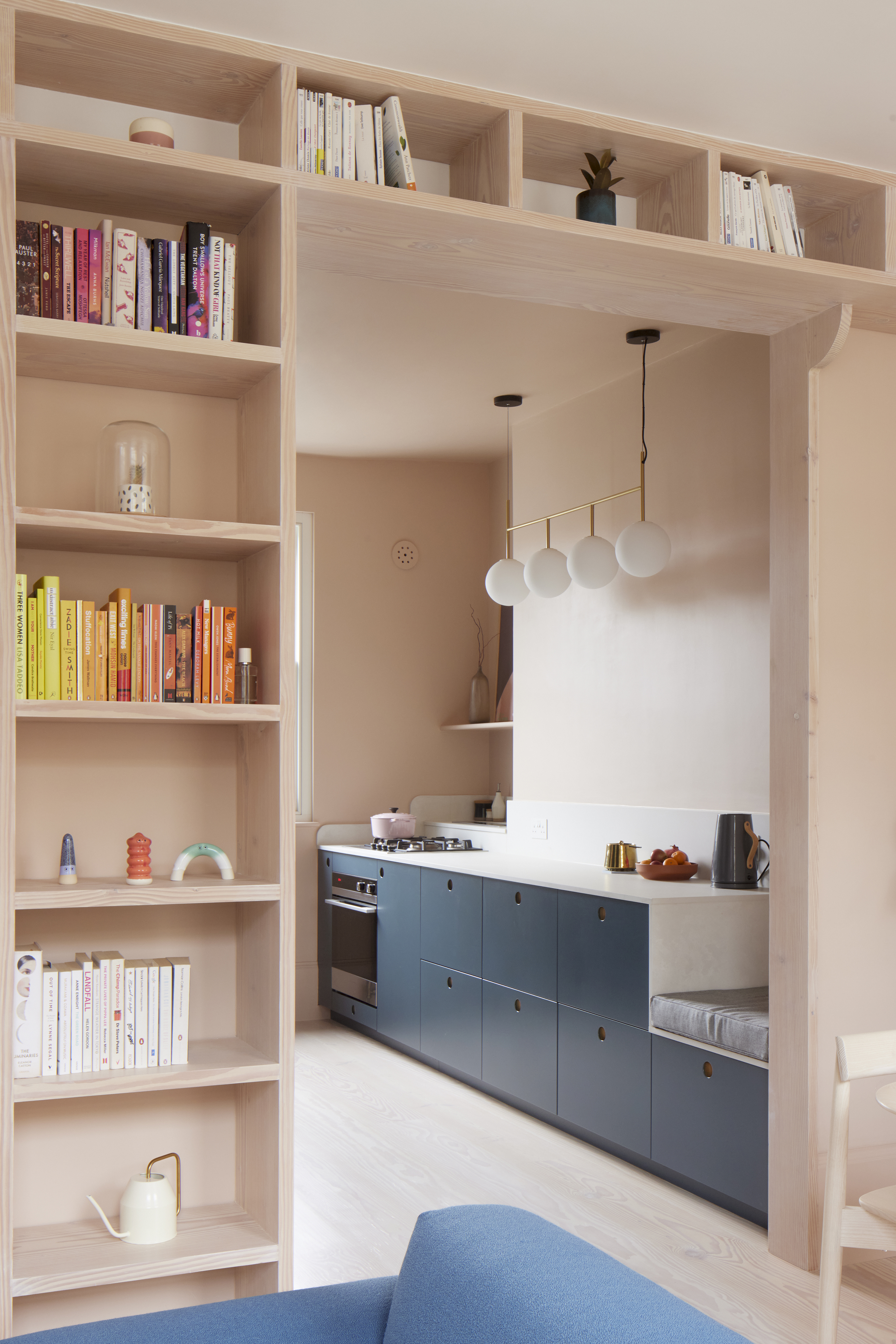
In this home by Studio Merlin, a harmonious blend of blush tones and rich blues of varying shades unify the entire interior. 'For me, choosing the palette for a project is like selecting the ingredients for a great recipe,' says architect Josh Piddock, who combined pastel-pink walls with Douglas fir joinery in the living room to create space that's warm yet minimal.
'The palette for the living area harmonizes three-quarters of the building's floor plan. The pink-hued Douglas Fir timber is the glue for this scheme, and sits comfortably with Farrow & Ball's 'Setting Plaster' paint color,' Josh continues. The result is a relaxed, restful space that's an ideal backdrop for bolder accents and personal touches.
Josh added in a select few white elements – such as the kitchen countertop and living room ceiling – to lift the space, enhance the color choices and and capitalize on natural light. 'The deep-blue kitchen makes a bold impression as a color-blocking element, and also hides the door to the stairs,' he explains. On the floor above, the scheme expands slightly, encompassing a chalky blue bedroom reached by stairs that feature a half-height wall in teal green.
3. CHOOSE AN ACCENT COLOUR TO LINK EACH SPACE

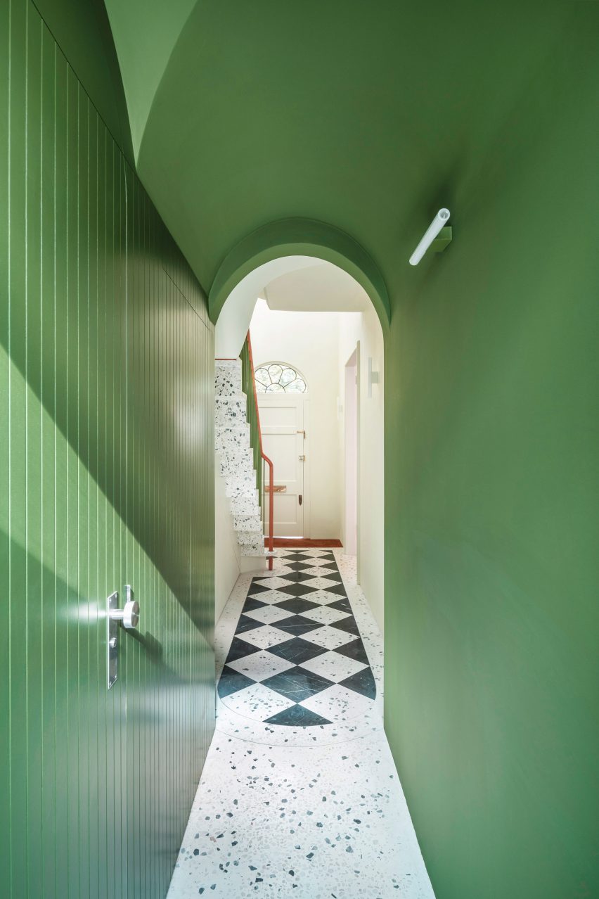
Part of a terrace of 1970s neo-Georgian houses built on the site of some demolished Victorian villas, this home was gutted and redesigned by Gundry + Ducker architects. After stripping the entire interior back to just the external walls and the roof, they inserted a modern interpretation of a Georgian home. The design is centered around a cantilevered staircase that sits in a triple-height space, with the upper rooms accessed directly off the stairs.
The architects used an eye-catching shade of bright green to link the ground floor, staircase and corridors. 'The green was chosen as highlight color throughout the house and is picked up in details like the color of the hallway, the window surrounds and the skirting boards,' says architect Christian Ducker. 'This use of color helps pull all these disparate elements together as a whole,' he explains.
This striking accent color was also used on the kitchen units - a practical choice for cabinetry, notes Christian - stair railings and bedroom doors. It's immediately visible on entering the house and even extends to the garden, where a green-painted metal screen acts as a trellis for plants.
Where to shop for paint online
Tessa Pearson is an interiors and architecture journalist, formerly Homes Director at ELLE Decoration and Editor of ELLE Decoration Country. When she's not covering design and decorative trends for Livingetc, Tessa contributes to publications such as The Observer and Table Magazine, and has recently written a book on forest architecture. Based in Sussex, Tessa has a keen interest in rural and coastal life, and spends as much time as possible by the sea.


