Why does my home's color scheme feel flat? This is exactly what your lackluster palette is missing
To create more sophisticated color schemes for your home, the key lies in bringing nuance through accent colors, says Dagny Thurmann-Moe

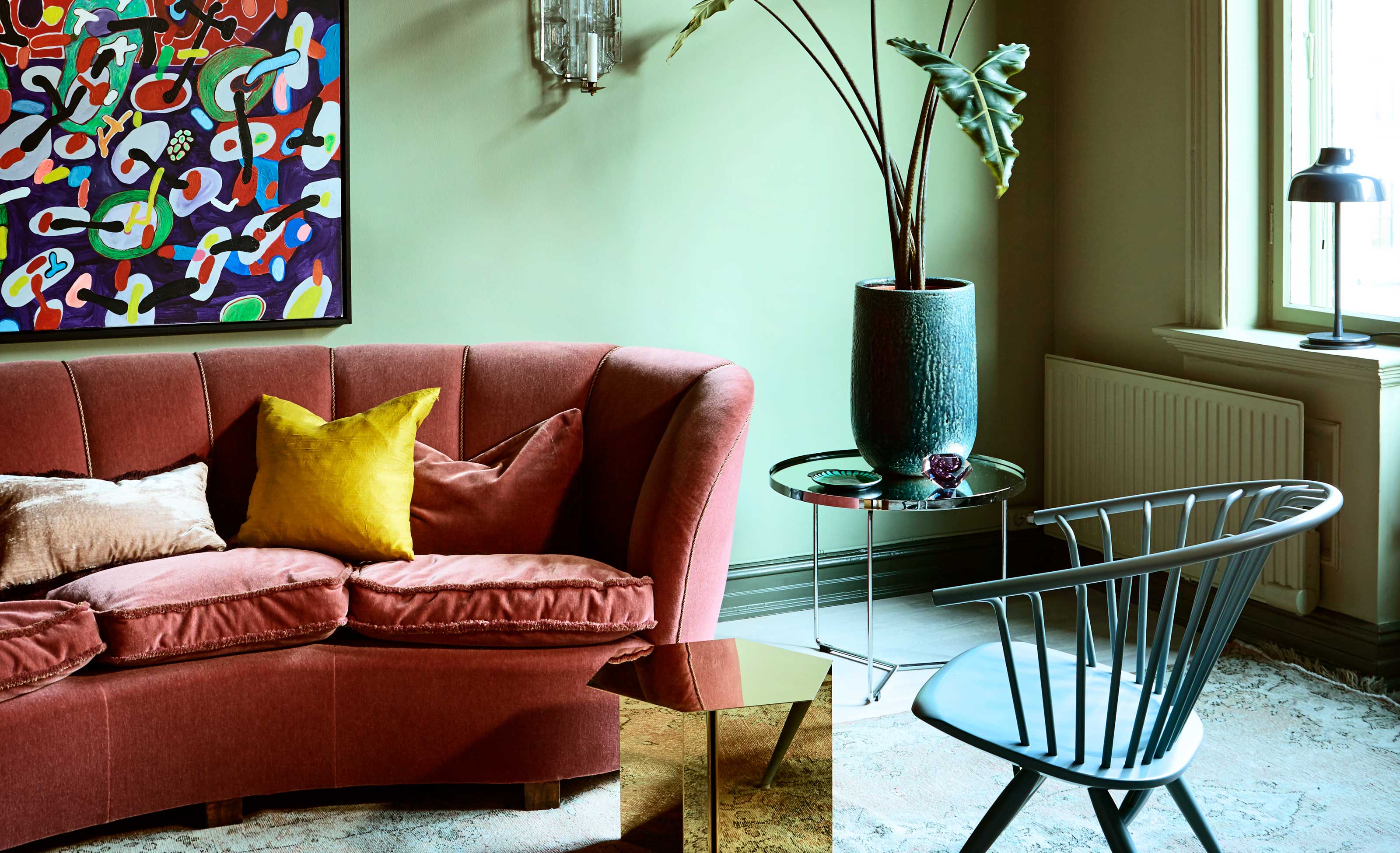
The Livingetc newsletters are your inside source for what’s shaping interiors now - and what’s next. Discover trend forecasts, smart style ideas, and curated shopping inspiration that brings design to life. Subscribe today and stay ahead of the curve.
You are now subscribed
Your newsletter sign-up was successful
Have you ever tried to recreate a color scheme you've seen in an interiors magazine or on Pinterest, but in real life, it doesn't quite feel so impactful. Creating a color palette is an incredibly nuanced skill and even the slightest shifts in the ratio of colors, the tones you select or even the room you put them in can completely change how a room's scheme hangs together.
However, one of the worst feelings when you've enacted a new color scheme for your space is when it just feels "flat". It's a feeling where you can't necessarily pinpoint the problem. Something's missing, sure, but what? Even if you've followed all the rules of color theory to create a color palette, there's often still an unknown quantity at play.
To get to the bottom of what actually makes a color scheme feel flat, I spoke to one of my favorite color experts, Dagny Thurmann-Moe - a self-professed color nerd who is known for creating intriguing, complex color palettes that you could never accuse of feeling lackluster.
Article continues below
Dagny is a color consultant and founder of Koi Colour Studio, Norway’s first multidisciplinary color studio. She is best known for creative, nuanced color palettes, helping brands curate color palettes, as well as designing interiors for commercial and residential spaces.
The power of the accent color
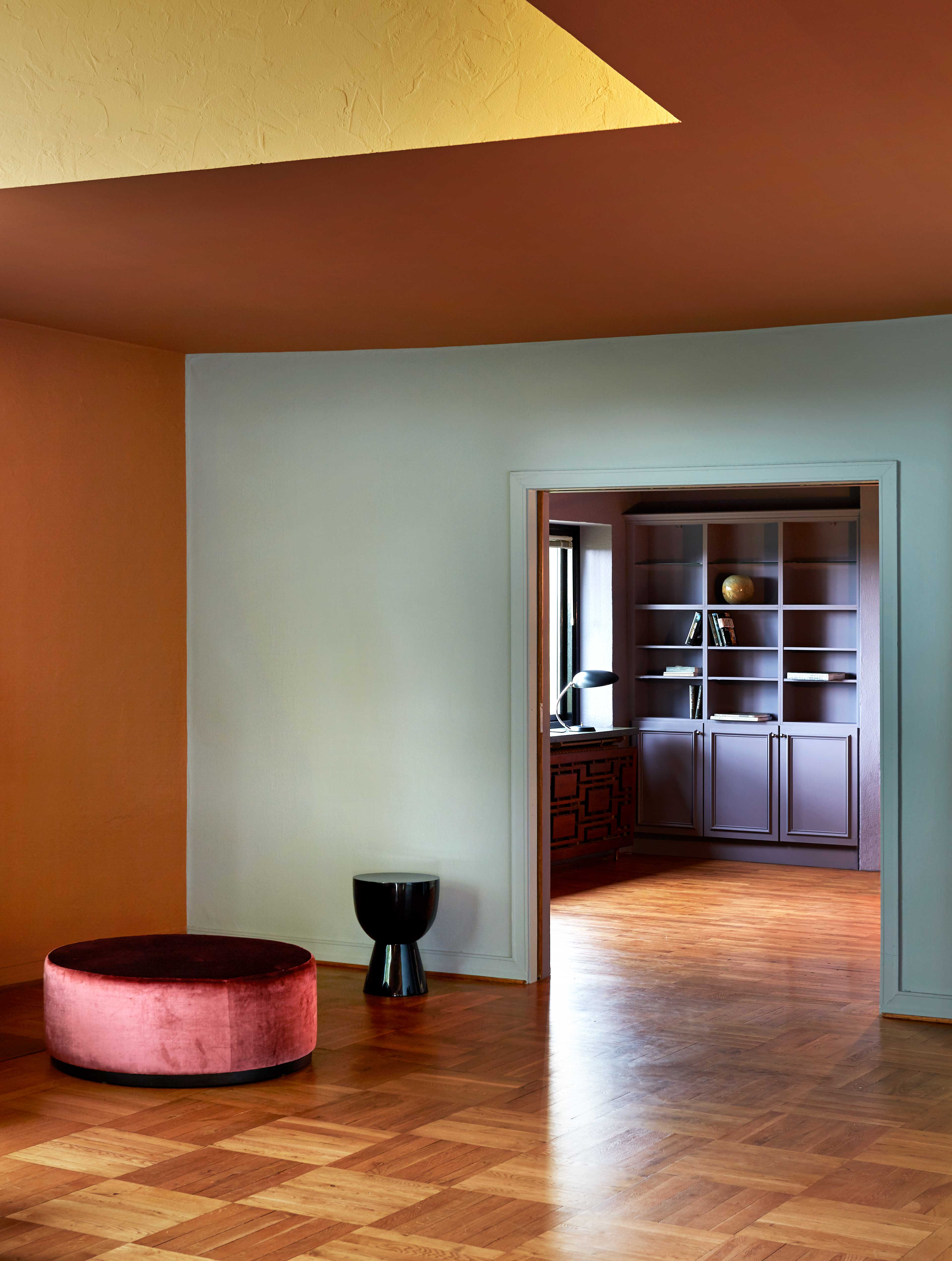
There's a common misconception about what an accent color in interior design actually is, as often words are used interchangeably around the elements of how to create a color palette. You might think of an accent as that final contrasting pop, but for Dagny Thurmann-Moe of Koi Colour Studio, that's more accurately referred to as a contrast.
'The role of the accent color is to enhance the base color(s) in a harmonious way. In other words, they should not clash with the larger surfaces,' Dagny tells us. In a way, the clue is in the name. These colors should be helping to accentuate the most significant portion of your color scheme, a subtlety that is easy to overlook when planning your palette.
And this, as Dagny explains, is likely to be the cause of your scheme feeling "flat". 'The problem, when a color palette feels flat, is very often that the designer (or homeowner) has too few accent colors,' Dagny says.
How many accents should you include in a color scheme?
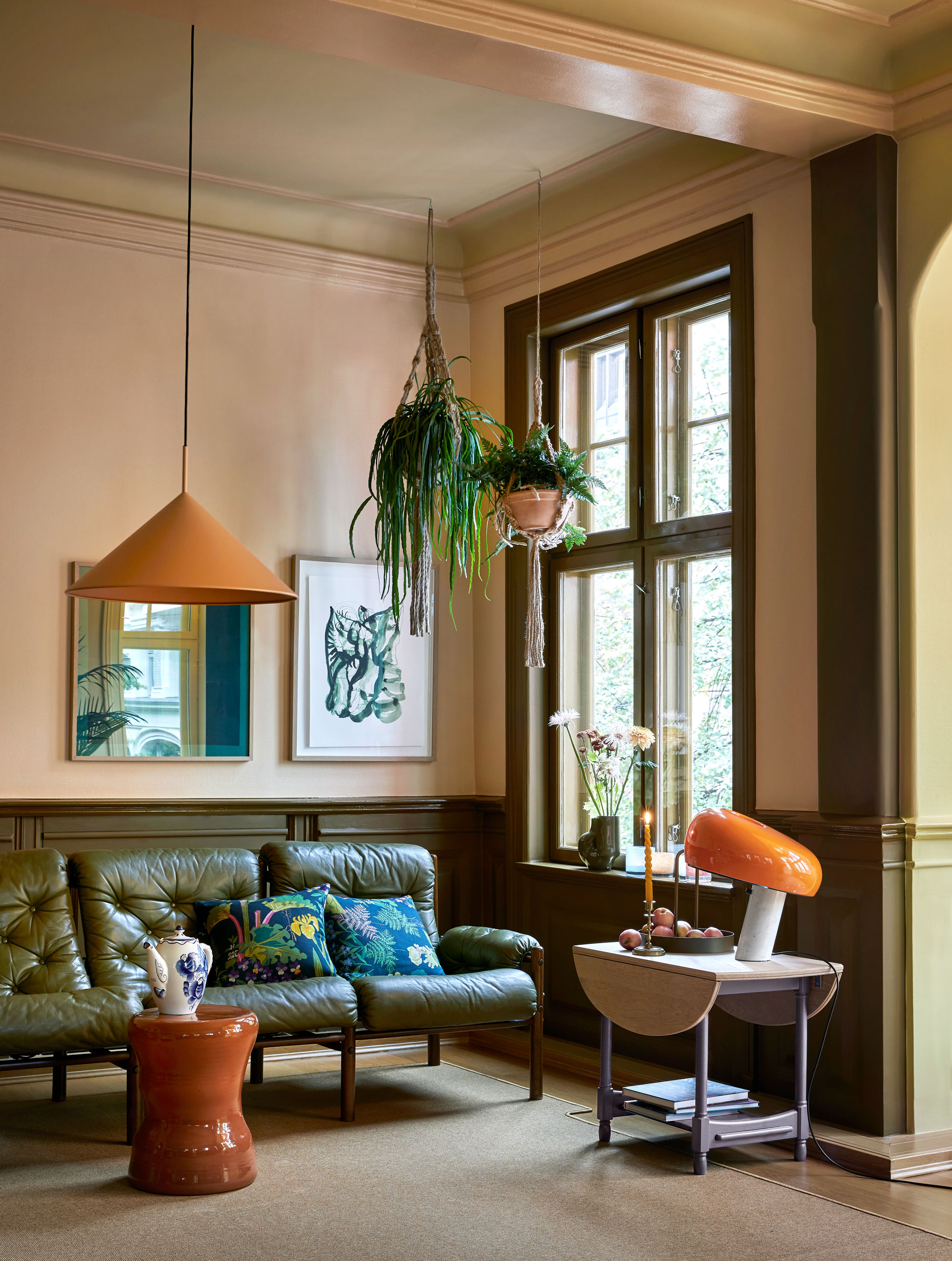
Accent colors should take up more space in your color scheme than a standard contrast or color pop should, too. 'The accent colors usually cover about 30% of the surfaces you can see in a room,' Dagny explains. 'There are usually 5-9 accent colors in a strong palette.'
The Livingetc newsletters are your inside source for what’s shaping interiors now - and what’s next. Discover trend forecasts, smart style ideas, and curated shopping inspiration that brings design to life. Subscribe today and stay ahead of the curve.
Finding the right accents is a different story, but something that should be relatively easy if you arm yourself with a color wheel and a little color theory. Just remember that accents are supposed to be harmonious, so consider how they complement your room's base color and avoid the sort of stark contrasts you get in a complementary color scheme using opposing shades on the color wheel - you can always save that color for a contrast at the end.
Consider instead using an analogous color scheme to help define your base and accents. Or you could even look to a color idea like a split complementary palette, which utilizes the two shades on either side of a color combination's complementary shade. Use these two shades as a basis for your base and accents, playing with tonal variations, and the complementary shade as a contrast. 'I really think that nuanced rich split complementary palettes often end up surprisingly chic,' Dagny tells us.
To bring depth to a color scheme, Dagny will introduce clever ideas that play off subtlety and nuance. In the living room scheme above, for example, a peachy-pink wall color has been paired with a beige-tone ceiling with slightly more yellow tones, Pure & Original's Pale Terracotta Licetto and Daybreak Classico respectively. It's a detail that's easy to miss, but without it, the room's palette would feel flatter and less interesting.
Elder Statesman cashmere blanket, Net-a-Porter
For a shortcut to an elevated, harmonious and full color scheme, look to textiles and prints that particularly appeal to you. This blanket design by The Elder Statesman, for example, contains a sunset-inspired palette, with extra harmonious accents like lilac which bring the color scheme to life.
The 'greyscale' problem
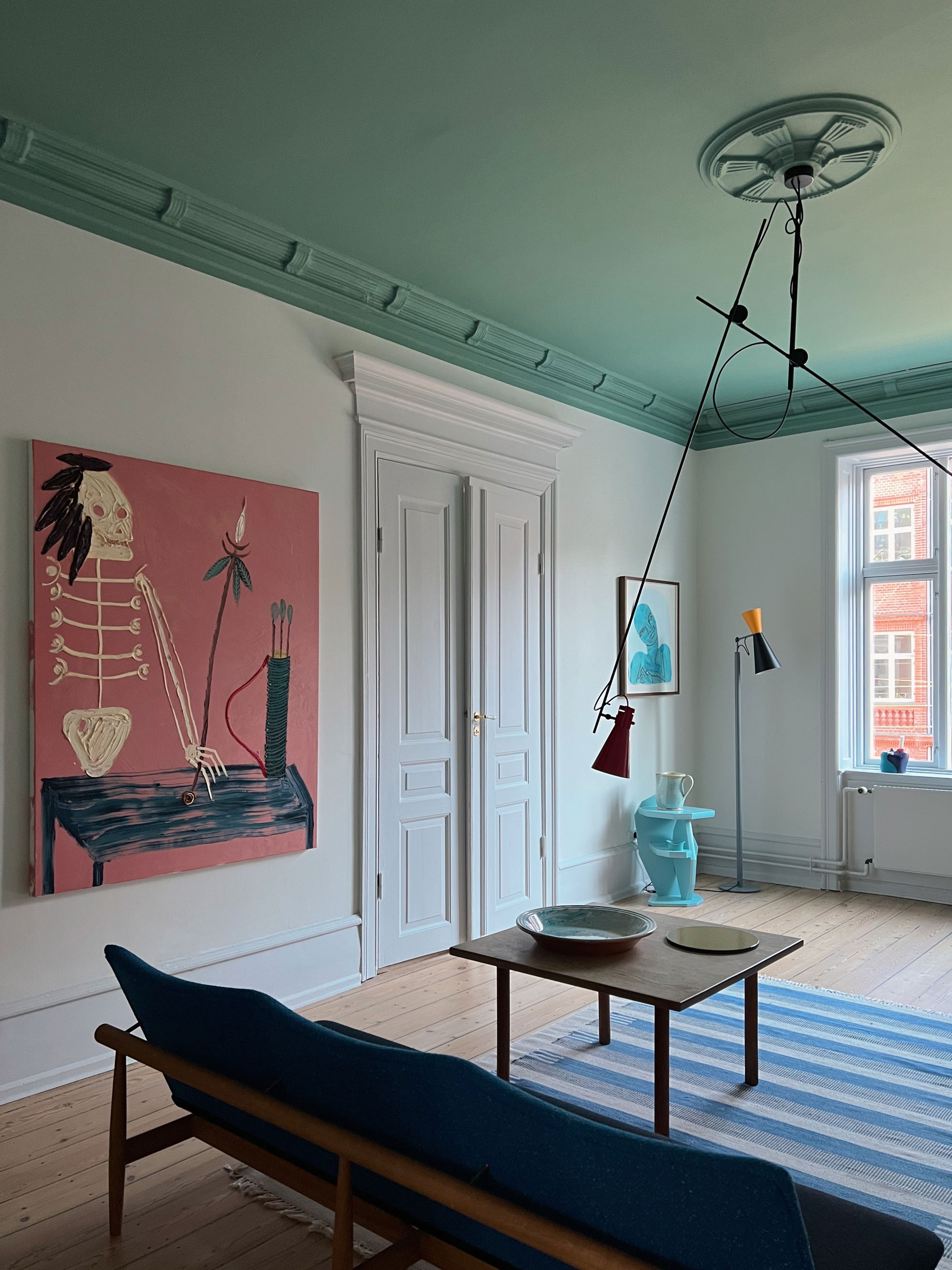
One question you may have when deciding on a color scheme is how to approach decorating a room with white walls, or in a scheme where white, grey or black as your base color - after all, these shades don't appear on the color wheel.
'If you have white or grey-scale walls (anything that exists on the grey spectrum), it is really difficult to succeed with depth, because the only accent colors you can use are those greyscales,' Dagny advises. 'Colors towards white or grey, will always be contrasting, which makes the design look messy, and every color you add to a white room, will be a new contrast.'
It's the reason that Koi Colour Studio largely avoids using whites and greys as the base for a color palette. 'With colors, you have so much more to work with, since all colors are connected,' Dagny says.
So how do you make a room with a greyscale base work? 'Greyscale is a separate entity, and you can only achieve harmony if you blend the greyscale and colors of the color wheel together.' This means keeping your accent colors limited to more muted shades with grey tones if you want to achieve a harmonious scheme.

Hugh is Livingetc.com’s editor. With 8 years in the interiors industry under his belt, he has the nose for what people want to know about re-decorating their homes. He prides himself as an expert trend forecaster, visiting design fairs, showrooms and keeping an eye out for emerging designers to hone his eye. He joined Livingetc back in 2022 as a content editor, as a long-time reader of the print magazine, before becoming its online editor. Hugh has previously spent time as an editor for a kitchen and bathroom magazine, and has written for “hands-on” home brands such as Homebuilding & Renovating and Grand Designs magazine, so his knowledge of what it takes to create a home goes beyond the surface, too. Though not a trained interior designer, Hugh has cut his design teeth by managing several major interior design projects to date, each for private clients. He's also a keen DIYer — he's done everything from laying his own patio and building an integrated cooker hood from scratch, to undertaking plenty of creative IKEA hacks to help achieve the luxurious look he loves in design, when his budget doesn't always stretch that far.
