Color combinations to avoid – using these 4 pairings when color blocking can be "jarring", say experts
Color clashing has long been a loved paint technique to create eye-catching interiors. But some combinations can look garish, and not in tune with a modern home
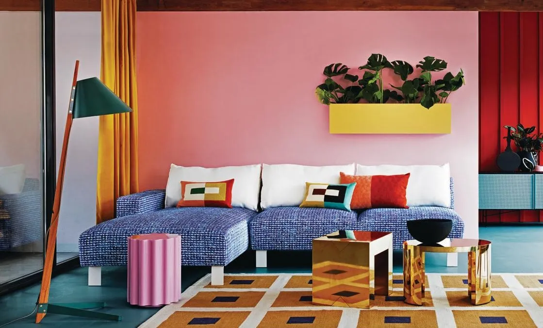
People are becoming more confident and creative when it comes to pairing colors together in the home, especially when 'color blocking' rooms. Bold, unexpected combinations can really make your scheme come alive,
But, while pairing different colors together, regardless of how bold you want your room to look, you want to make sure they're cohesive and easy on the eye.
To help you understand which paint ideas work, and ones that don't, when color blocking a room, we asked interior designers what they avoid, and what they'd use instead.
1. Red and green

If you're wondering do red and green go together, the answer is yes and no. It depends entirely on the shade, intensity, and how they are used in combination.
'These two colors are best avoided when it comes to color blocking as they are more often than not associated with Christmas and so it can pose a real challenge to execute this combination well,' says Charlie Morrison from Topology. 'Moreover, this vibrant pairing isn't particularly inviting outside the holiday period; the effect they create is known as 'simultaneous contrast' which is when two colors side-by-side interact with each other in such a way it changes our perception of them, making them appear more vibrant than they are. The result can appear discomforting; the opposite feeling to what we typically want to achieve. '
Your standard red and green tones can seem Christmassy, but richer hues of these colors, used in different intensities, can look quite sophisticated, like in the dining room above by Kingston Lafferty Designs. Consider creating a color block with furniture and wallpaper to add some depth to the scheme as well. Think tones such as burgundy and forest green, or a terracotta red with a sage green.

Type: Wipeable
Price: $190 for 1 roll
Want to add green to your interiors but with some texture and dimension? Consider this printed wallpaper in forest green, perfect for spaces in need of natural drama.
2. Yellow and white

Yellow and white is another pairing experts warn against when color blocking walls – and for a good reason.
'Yellow and white is another combination that can appear a little problematic when color blocking as it can be difficult for the eye to differentiate the blocking, thus causing us to strain as we gaze at it,' says Charlie. 'Think of adding yellow highlighted text on a white background. It's unusual to see this for good reason, as it's pretty much illegible.'
To add more interest to this weak color block, consider adding a third hue such as grey, pink, or green. All these tones go well with yellow and will create a more upbeat look in the space.
3. Red and purple

While there are many colors that go with red, in combination with purple, these hues can be a little intense.
'Red and purple is a challenging combination to pull off, because both hues are super intense and, when paired, can be potentially overwhelming,' says Bethany Adams of Bethany Adams Interiors.
Since both are deep tones, their use, especially in smaller spaces, needs to be limited and sparing. If you worry about the kind of appeal they would create, consider adding in a softer tone such as beige or cream to diffuse some of these shades' intensity.

Material: Velvet
Price: $17
Consider this throw pillow in purple to add a dose of color to your sofa and interiors. Pair it with a red pillow for an eye-catching color block.
4. Florescent yellow and pink

When it comes to colors to avoid in a small living room, bedroom, or kitchen, fluorescents rank high. These tones are stark and high-energy, that can create a bit of distress to the eyes and throw the room's aesthetics off.
'Color is a mood enhancer,' says Kellie Burke, founder and principal designer of Kellie Burke Interiors. 'Fluorescents like yellow or pink are energetic, stimulate the appetite, but tire the eye and can evoke anger and agitation, so let’s keep that color out of the home and settle for something more soothing.'
If you still love this combination, perhaps consider them in their pastel incarnations that are softer. Or you could add these in transitional spaces such as the hallway or the staircase, as seen in this space designed by London-based studio Office S&M. That way, you don't have to spend long hours being surrounded by these colors, but in turn, these hues uplift these oft-forgotten spaces.
