The Livingetc newsletters are your inside source for what’s shaping interiors now - and what’s next. Discover trend forecasts, smart style ideas, and curated shopping inspiration that brings design to life. Subscribe today and stay ahead of the curve.
You are now subscribed
Your newsletter sign-up was successful
Emily Williams and Shayne Brady co-founded BradyWilliams in early 2013, having previously worked together for RPW Design, an architectural practice specialising in hotels. Their design remit, with an emphasis on sumptuous luxury, now covers everything from the glamorous ground-floor shoe, handbag and beauty departments of Fenwick’s London flagship store to houses in the Hamptons. And let’s not forget restaurants such as Fischer’s and Bellanger for Corbin & King, and the Wright Brothers South Kensington restaurant and its basement bar The Mermaid. Here the duo share theirdesign inspirations.
WHAT FIRST SPARKED YOUR INTEREST IN DESIGN?
S: After my degree at the Dublin Institute of Technology, I worked as a junior designer in an architectural firm for two years before moving to London when I was 23.
Article continues belowE: I come from a family of creatives, so I always liked design, but Dad insisted I go to university first so I studied Frenchwith management in London for four years before training at Kensington and Chelsea College in interior design. My first job was as librarian at RPW before landing a job as a junior designer a few months later.
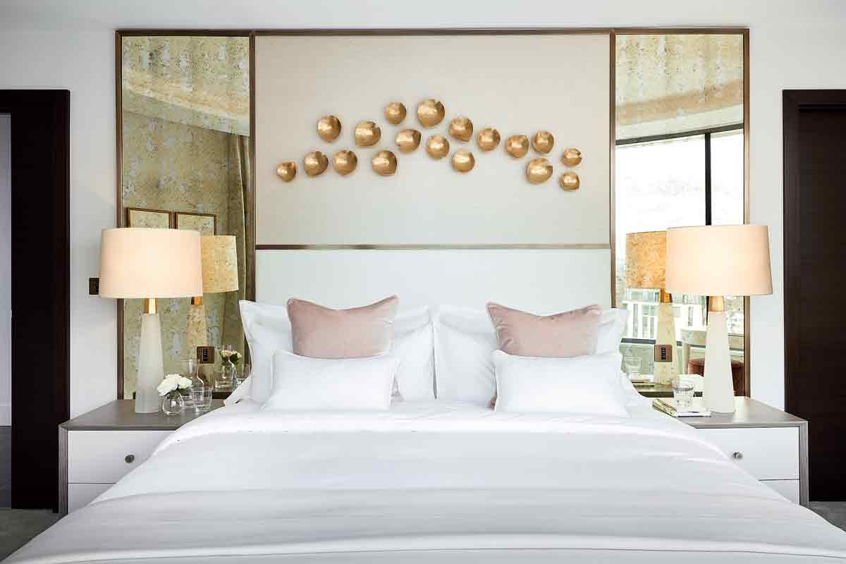
WHY DID YOU GO OUT ON YOUR OWN?
S: Working at RPW for many years was an amazing training ground, but eventually we wanted to be more creative. I went to work for David Collins Studio, heading up the restaurant team, and Emily worked for Louise Bradley. Westayed friends and joked about starting something of our own.
E: At the end of 2012, we decided to do it – if we’d thought about what we were doing, we would have never done it!What was your big break?
The Livingetc newsletters are your inside source for what’s shaping interiors now - and what’s next. Discover trend forecasts, smart style ideas, and curated shopping inspiration that brings design to life. Subscribe today and stay ahead of the curve.
S: Jeremy King, who I’d worked with at David Collins, recommended us to the head of Fenwick who was looking for a young designer to revamp its ground floor. Then Jeremy asked us to work on Fischer’s restaurant.
DESCRIBE YOUR STYLE?
S: Our work reflects the things we really value in design: attention to detail, a clean, simple and pared-back style, a sculptural element and a love for materials, inspired by nature and art.
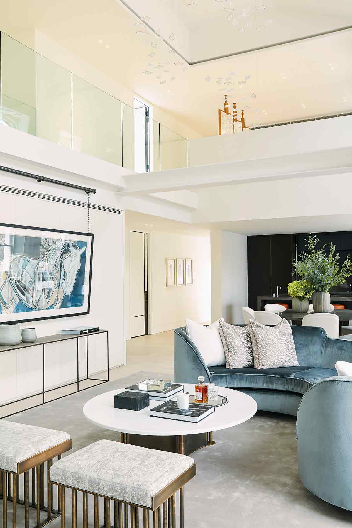
IS YOUR APPROACH DIFFERENT FROM HOMES TO RESTAURANTS?
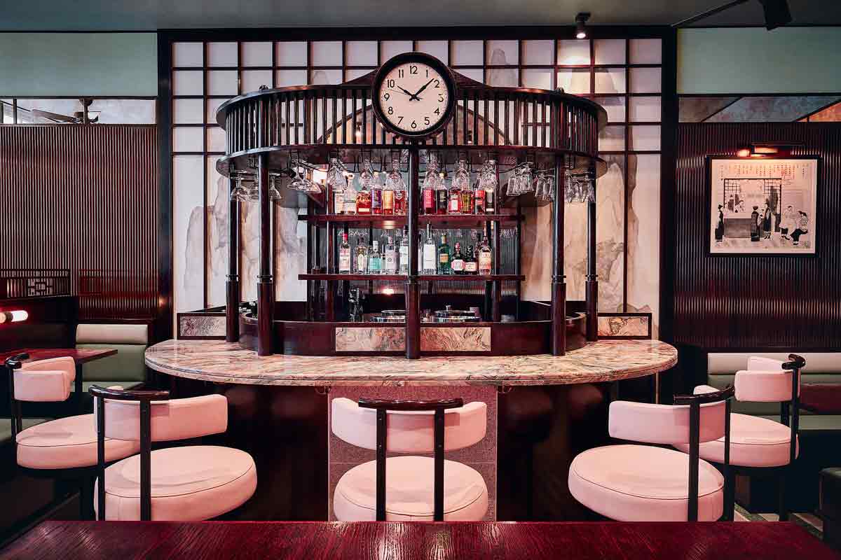
S: For restaurants, it’s certainly more dramatic and moody. When we are designing residential projects, the look is lighter and fresher and much more about the owner telling their own story.
HOW DO YOU APPROACH A SPACE?
E: First we get the layout right – a space has to properly suit a client’s daily needs. Then we look at the period of the property and bring back or take away the details right for its architectural period and geographic location. The final step is choosing fixtures, furnishings and accessories.
HOW ABOUT ARCHITECTURAL DETAILS?
E: We love a high skirting board – it makes walls look cleaner and gives a lovely sense of grandeur to a room.
S: I recently realised that as a child, when I drew or painted things, I would always go around things with an outline to make it very defined – it’s what I now do in a room. There’ll always be a line, be it a brass edging or a timber bead. I just feel it tightens the whole space and pulls it together.
WHY ARE YOU DRAWN TO BESPOKE?
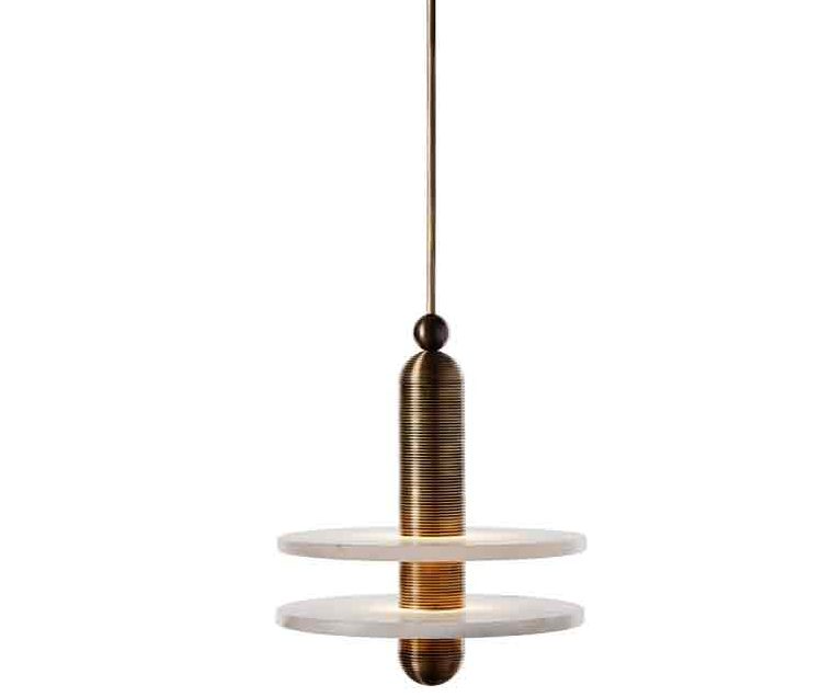
S: I struggle with seeing great pieces at furniture fairs but knowing we won’t be able to use them because soon they’ll be seen everywhere. As our design approach to a job is often a complete vision, down to the books on someone’s coffee table or the staff uniforms and menus at a restaurant, bespoke gets the exact size, finish and proportion that’s relevant to the design story. If we’re not making ourown pieces, then we love things like Apparatus’ Median Mono light – it’s the perfect balance of nature through a futurist lens.

ANY OTHER LIGHTING TRICKS?
E: I’ve just discovered Philips’ new Hue system, where you can control the dimming of a bulb via an app on your phone. You can even connect it to Alexa!
S: At home, I prefer a room to be lit by table and floor lamps, but for restaurants (or rooms with big, high ceiling spaces) pendant lighting is perfect for filling that weird void of space that needs something of interest in it or it just falls flat.
WHAT ABOUT FABRICS?
E: Graphic and bold prints such as Christopher Farr’s Capri outdoor range add contrast to our favourite neutral tones, while creating interest in themselves.
ANY FAVOURITE PAINT PALETTES?
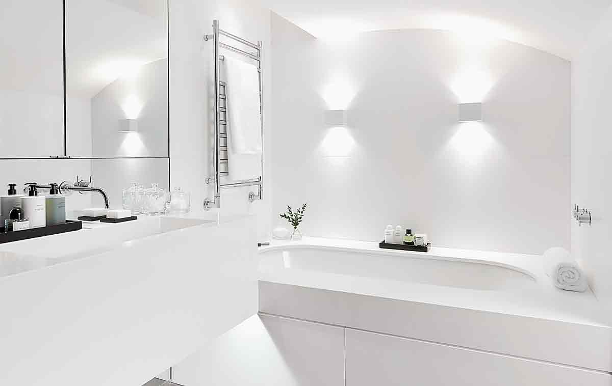
E: I’m always drawn to heritage colours because they suit the history of houses in the UK, and I’m currently obsessed with Farrow & Ball’s Strong White paint – it works inany light and its light grey undertone works well with contrasting dark woods. It’s also a strong neutral base that can accentuate more interesting tactile, artisanal elements.
S: I don’t do white! I go by the rule that a wall for arestaurant or bar needs to be darker so that everyone looks good against it.
HOW ABOUT PLAYING WITH SCALE?
S: For the Hempel Gardens project, Emily decided to go with petite bedside lamps as opposed to over-scaled ones – it was cute to turn expectation on its head.
E: Take cues from antique pieces of furniture if you’re not sure about the size and scale of a sofa and chest of drawers – they always seemed to be the right proportions.
WHAT MATERIALS ARE YOU DRAWN TO?
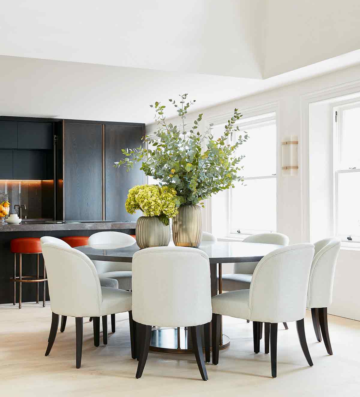
S: We always balance light and dark. For residential projects, it gives a room structure, accentuating period features.
E: Materials with texture make a space feel unique. Hammered bronze is tactile and refined; polished plaster gives extra texture and reflection to a wall. Faux shagreen works as an inlay on cabinets and side tables; we like both honed and polished marble, and recently we used Diespeker’s terrazzo in a mix of brown, beige, pink and red hues for the flooring at Fischer’s.


HOW ABOUT FLOORS?
S: For timber, we like blonde oak from Dinesen or Amtico as a lighter departure from the recent trends for dark timbers. We like to play with wide planks or over-scaled herringbone and chevron patterns to create drama.
ANY FAVOURITE FINISHING TOUCHES?
E: Investing in a handle you love to touch can really set the tone of a whole room. We’re drawn to Joseph Giles’ qualityfinishes for door and cabinet handles. Matt brassware is a favourite for bathrooms, in black and burnished bronze. Dornbracht’s Tara basin mixers in black are similar to ones we used in a recent project.
AND HOW ABOUT ACCESSORISING?
E: A low-lying coffee table is perfect for stacking with books, candles and flowers. We also love William Yeoward’s crystal – mixing and matching one of his beautiful crystal decanters or a set of champagne coupes or Martini glasses with more affordable glassware creates an eclectic look.
WHAT INSPIRED YOUR NEW FURNITURE COLLECTION?
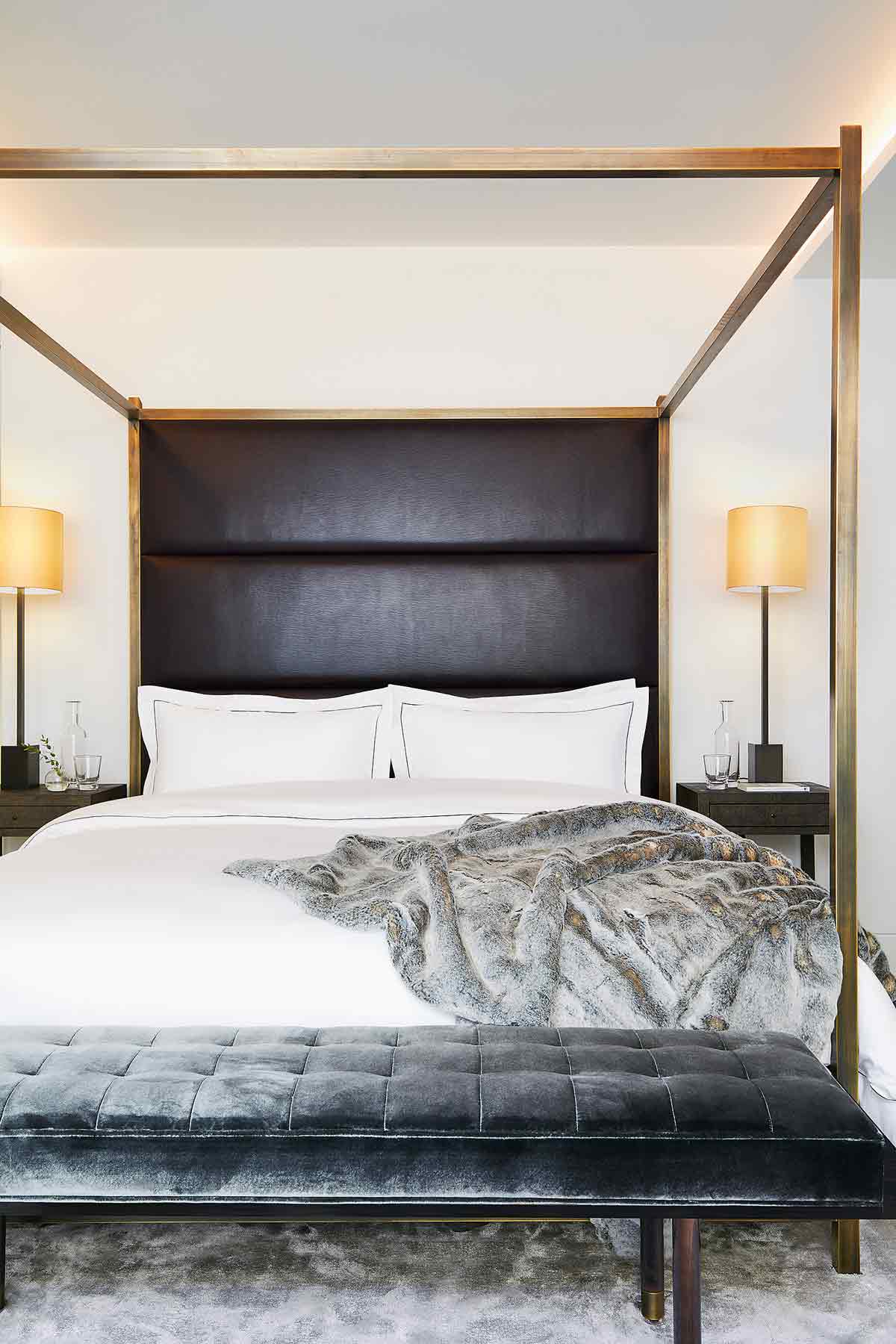
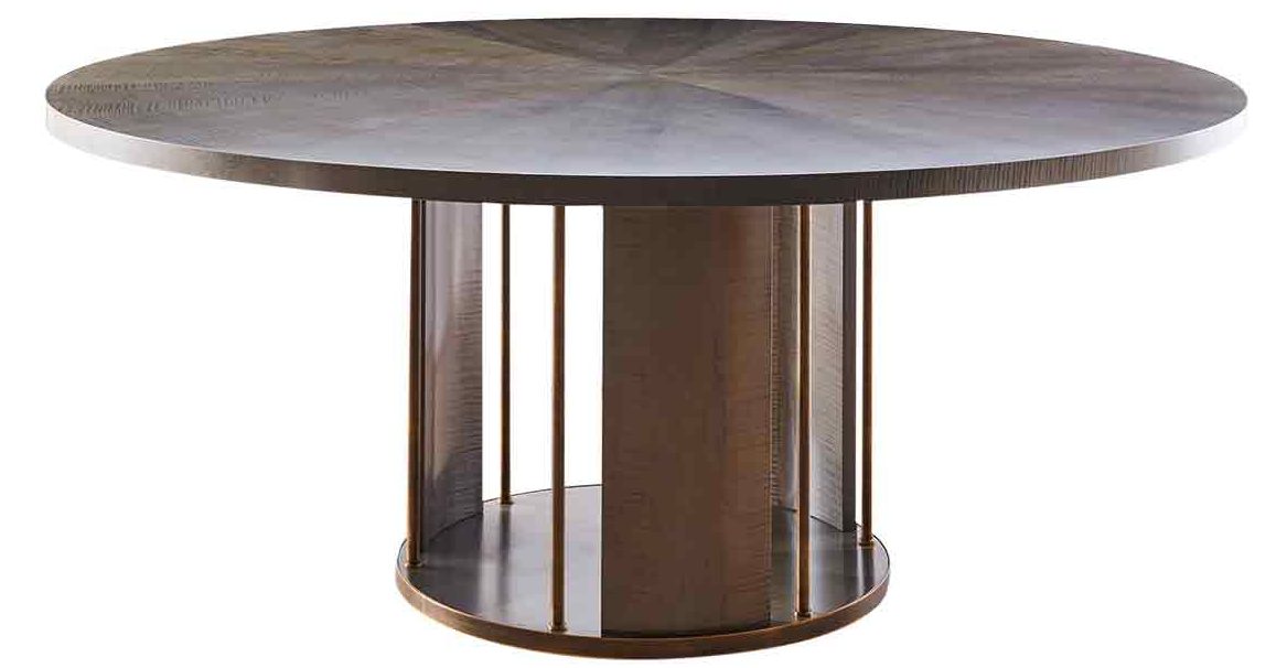
S: For the Hempel Gardens apartments development we were pretty much given carte blanche on the design, so it was the perfect chance to prototype our own collection of pieces, including sofas, a four-poster bed, side tables, stools and a bar cabinet. The furniture comes in a range of finishes, all made to order.
WHAT HAVE YOU BEEN UP TO LATELY?
E: We’ve designed the show apartments at The Corniche, a new residential development on the Albert Embankment, and the Hempel Gardens apartments. We worked on the opening of XU restaurant last year, and Brigadiers in the Bloomberg Arcade. The Café Wolseley at Bicester Village just opened, and we’re now working on another new restaurant for Jeremy King in St John’s Wood. There’s also a small hotel in Zurich and a few glam bars around London which can’t yet be named!
Bradywilliamsstudio.com
The homes media brand for early adopters, Livingetc shines a spotlight on the now and the next in design, obsessively covering interior trends, color advice, stylish homeware and modern homes. Celebrating the intersection between fashion and interiors. it's the brand that makes and breaks trends and it draws on its network on leading international luminaries to bring you the very best insight and ideas.