Farrow & Ball Down Pipe – how to use this popular dark grey in every room
'Downpipe has achieved cult status - like Madonna and Kylie you need only say its name for everyone to know instantly that you are talking about a particular shade of dark grey paint'

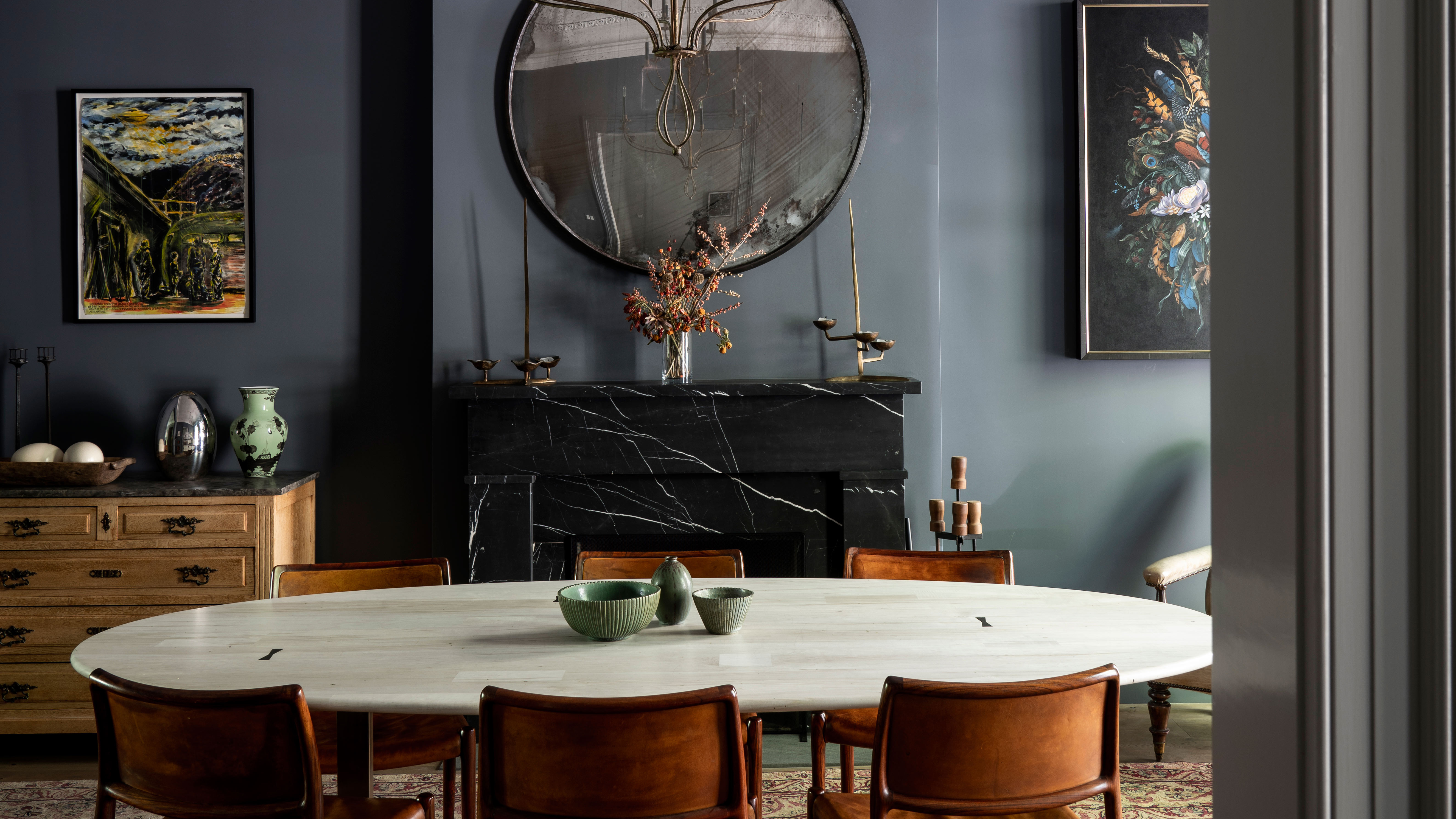
Farrow & Ball paints have long been loved by both interior designers and home decor enthusiasts the world over. And while we may sarcastically question their... whimsical choice in paint names (Brocolli Brown, Dead Salmon, Elephant's Breath, need we go on?) there is no denying the quality, richness and complexity of the colors are hard to beat.
And that, perhaps, is why certain shades earn almost a cult following. Appearing in every room on Instagram, gaining its own impressive hashtag and having writers dedicate whole articles to using this one popular hue. Down Pipe is one such shade.
As Kate Watson-Smyth, a.k.a writer and creator of Mad About The House, perfectly puts it, 'Downpipe has achieved cult status - like Madonna and Kylie you need only say its name for everyone to know instantly that you are talking about a particular shade of dark grey paint made by Farrow & Ball. No other description is necessary.'
Article continues below- Feeling inspired already? Find more grey living room ideas in our gallery.
1. Use Down Pipe as backdrop for brighter colors
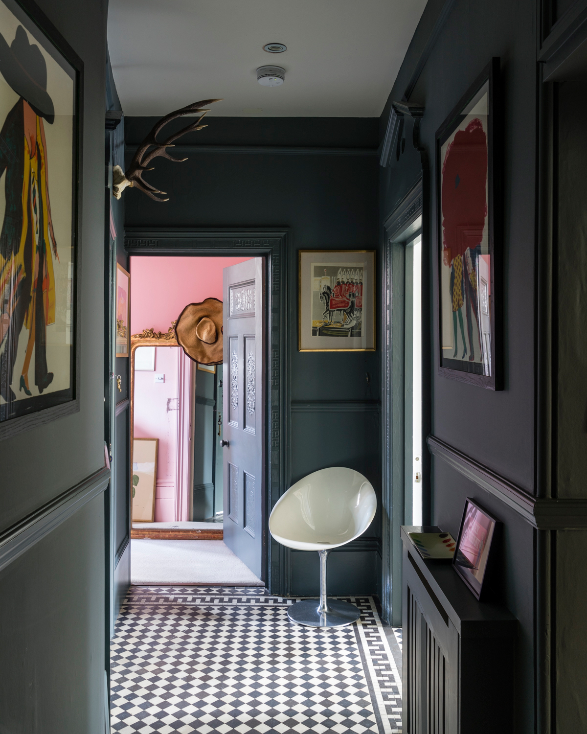
Dark greys like Down Pipe were made to mix with bright shades and they are the ideal backdrop for bold artwork, brightly colored furniture, or as can be seen here a way to make the walls in adjoining rooms pop. Even the more muted colors of the vintage artwork hung in this hallway seem more vivid against the deep lead grey of the walls.
'Downpipe loves every other color on the spectrum and works beautifully in both natural and electric light, something you must always consider when choosing any color by the way.' advises Kate Watson-Smyth.
'It has a warm green undertone and loves to be paired with all the pinks, soft silvery greens and even neon. Slather it over your walls and watch your artwork pop out in a way it will never do against white.'
2. Soften it with beige hues
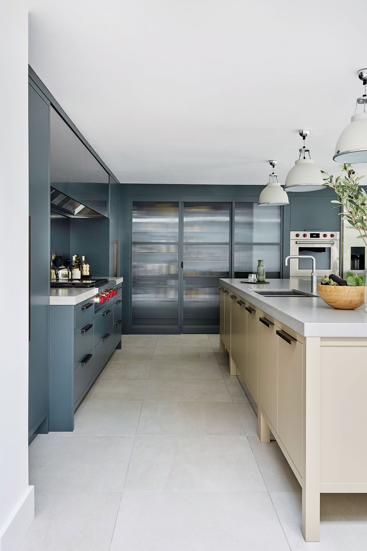
And if you prefer a softer, more subtle look you can easily tone down the drama of Down Pipe by pairing it with a warm beige tone. When sat next to straight-up white, it can look very dark and stark, but with a softer, creamier neutral shade like Stony Ground, it transforms into this warm, rich, rustic shade that feels much more liveable and works perfectly on kitchen cabinetry as can be seen here.
The Livingetc newsletters are your inside source for what’s shaping interiors now - and what’s next. Discover trend forecasts, smart style ideas, and curated shopping inspiration that brings design to life. Subscribe today and stay ahead of the curve.
3. Warm up Down Pipe with brown tones
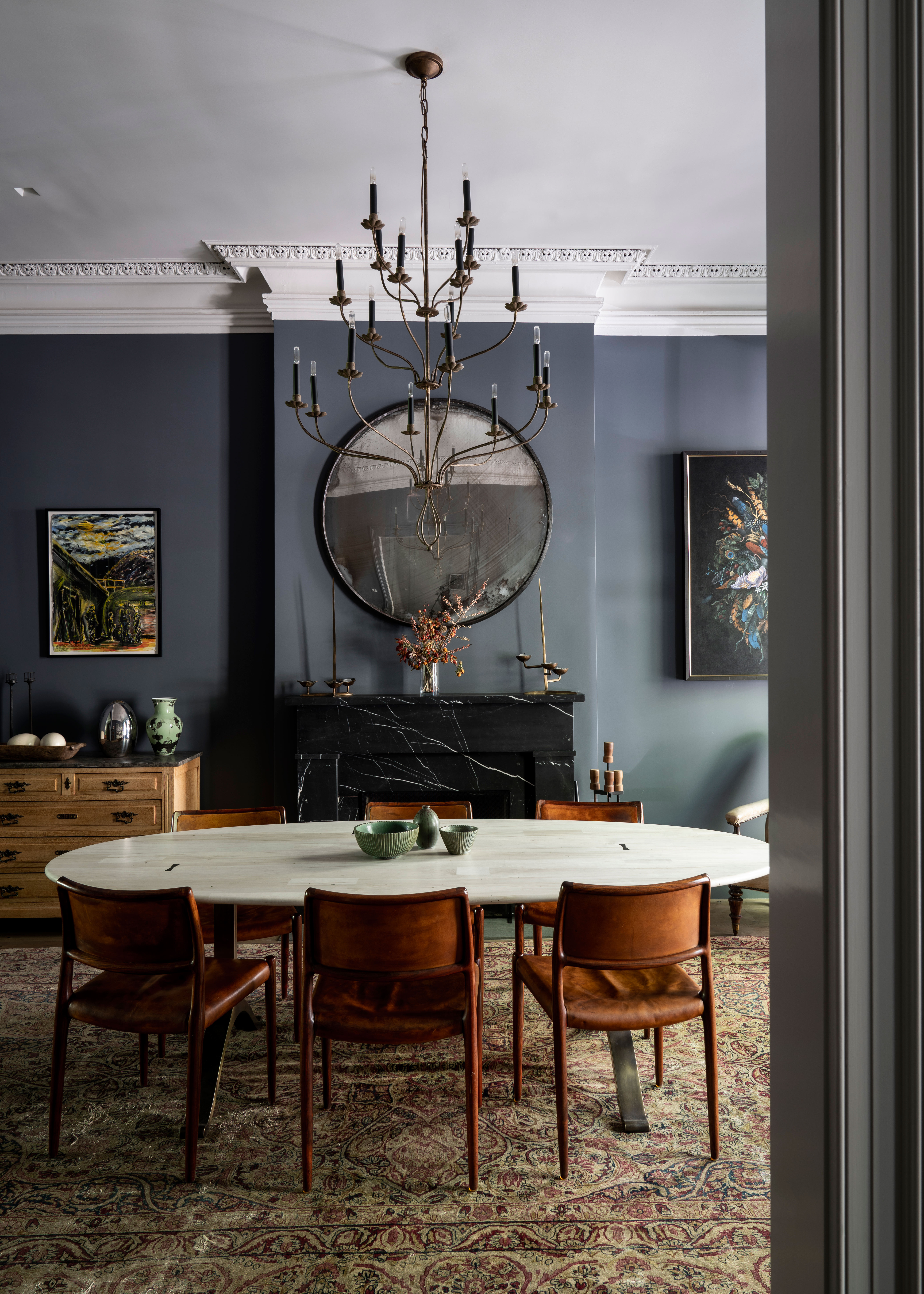
If you plan on painting a room that doesn't get a ton of natural light with Down Pipe, then go for it, stronger greys work really well in darker space creating a more intimate, cozy feel.
'The old adage is that you use a dark color in a light room 'because it can take it'. But why make a light room darker? We think dark colors actually work really well in darker spaces, like a north-facing room or a W/C. Instead of hiding a potentially negative feature you actually turn it into a positive and can add a real sense of coziness.' says Adele Lonergan Co-Founder & Creative Director of Covet & Noir.
However, you will want to consider how you will warm up the room as the blue undertones of Down Pipe do risk making a room, especially one that lacks natural light, feel cold.
The solution is simple, add in some rich warms tones like terracotta or even browns. Furniture is an obvious way to do this, brown leather pieces or light orange-toned woods really tone down the cool tones of the paint, as you can see in this dining room. Those rich hues in the rug add extra warmth too, and Down Pipe just gives this quite traditional space a modern edge.
4. Go all over for a dramatic look
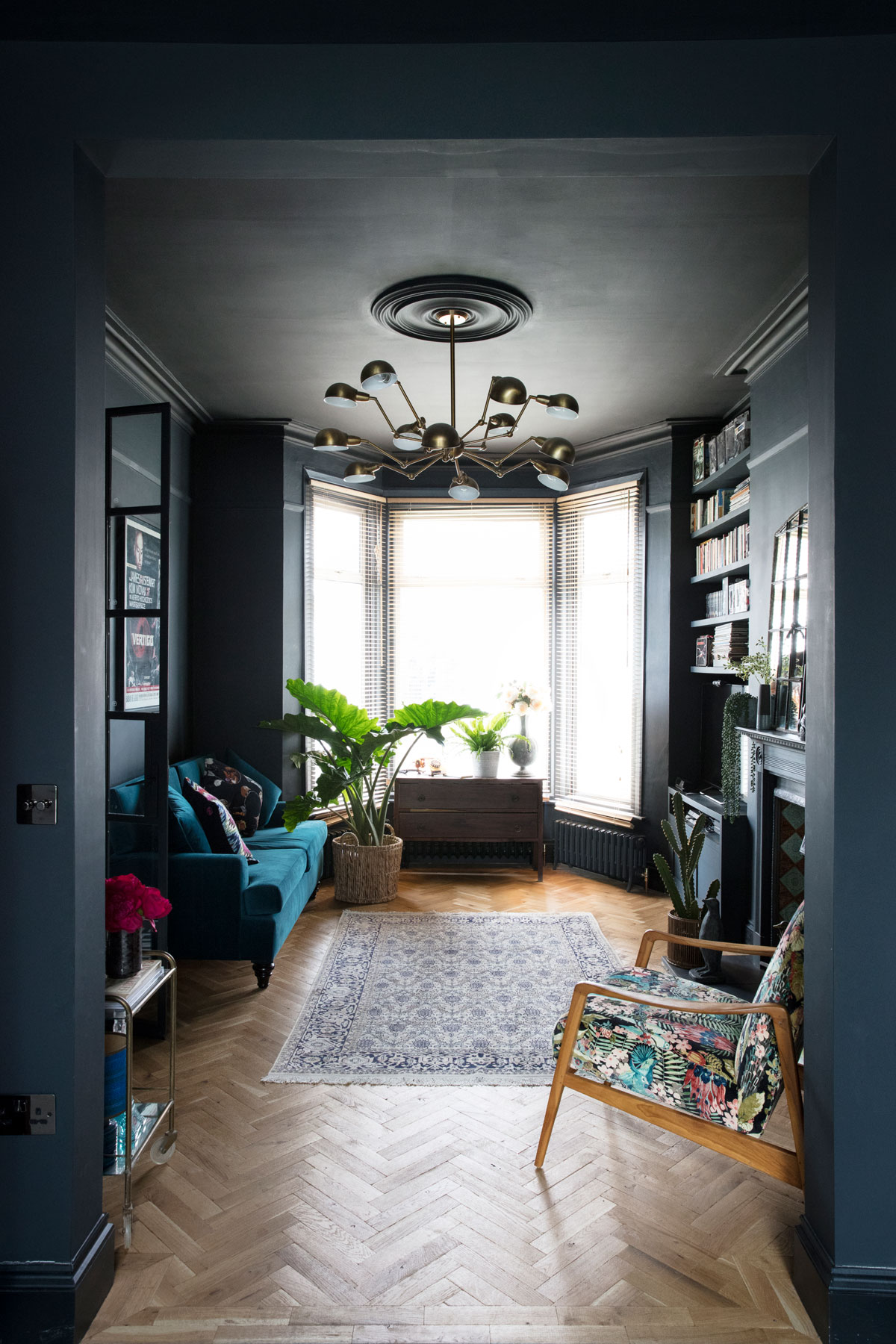
How gorgeous is this dark living room? Sometimes the best way to go with a dark grey, especially in smaller spaces is all over the, ceiling too if you want a really cocooning look. We know it's a truth universally acknowledge that lighter colors expand rooms but darker colors can do much the same as they blur the boundaries of the room and trick the eye into thinking the room goes on and on.
'If you want to make it look really modern though you shouldn't pair Down Pipe with white which will be too high contrast.' recommends Kate Watson-Smyth. 'Paint the woodwork to match - this will make your walls look taller and your ceilings higher and use a soft barely-there pink on the ceiling. In the same way you don't wear a white top with everything in your wardrobe, don't default to white woodwork when you have spent so much time and money searching for the right color for your walls.'
5. Paint the floor with Down Pipe
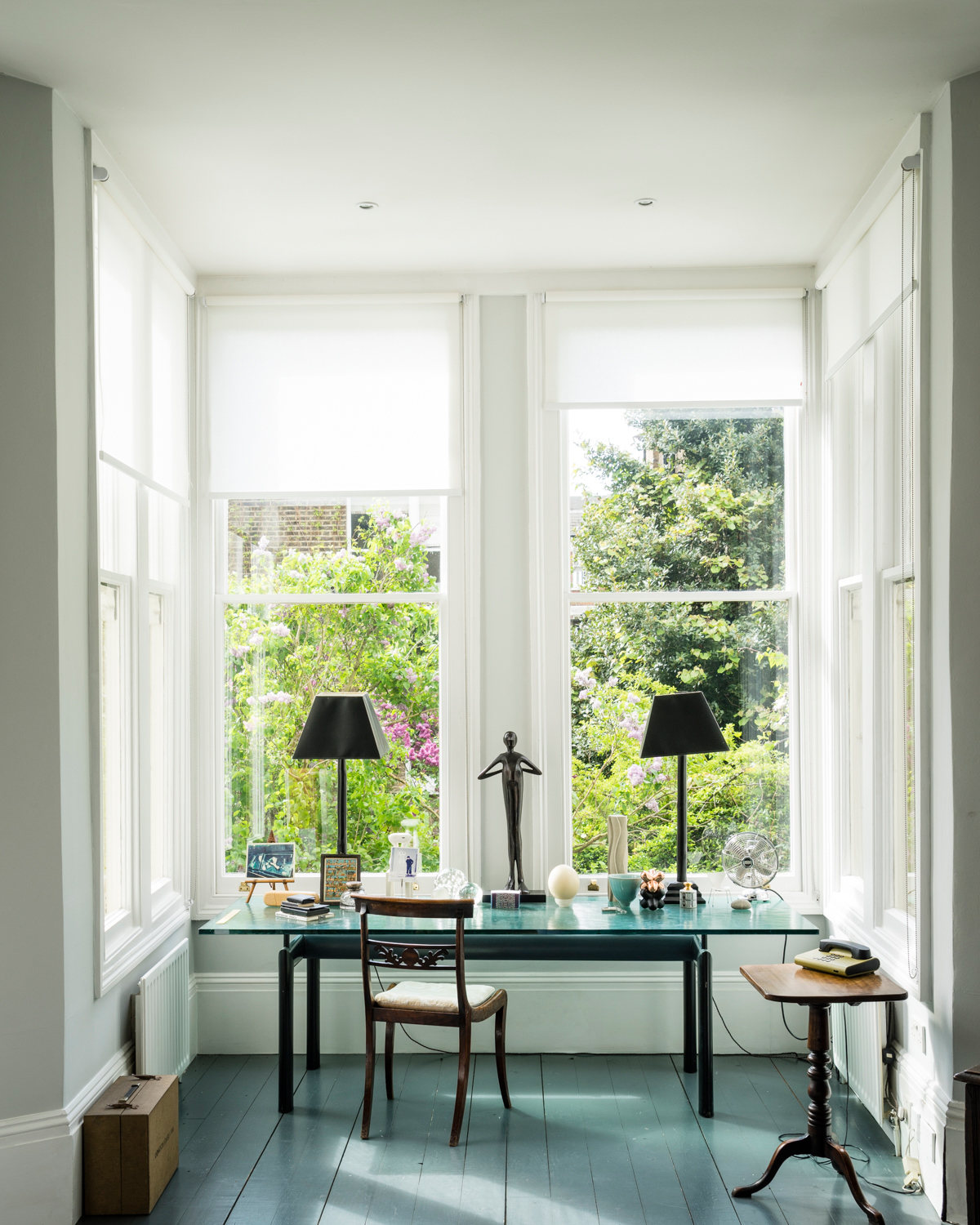
And if all four walls and the ceiling is going to be too much, bring Down Pipe onto the floor. It is of course a practical choice for flooring and will hide any wear and tear but it also adds depth to a room without totally overwhelming the space or becoming the sole focal point.
In this light-filled home office, it has been paired with Dimpse, the palest of greys on the walls, and All White on the skirting. The overall feel is fresh and bright, proving Down Pipe doesn't always have to bring the drama it's known for.
6. Bring it onto one wall in the bedroom
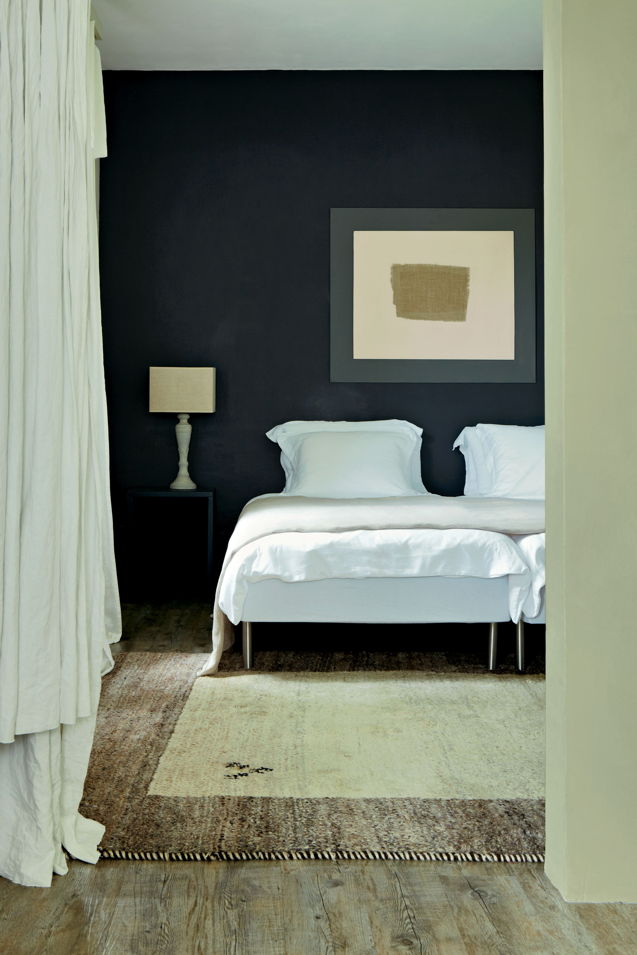
Dark bedrooms always look so sophisticated and moody, and we love the enveloping feeling they can have, but if you're not ready to commit to going all over with a daringly deep hue, try a feature wall. We know they aren't the trend du jour they used to be, but there's still a place for feature walls, and for us, that's with bold deep shades.
Down Pipe is used on the main wall in this bedroom, and yet the room feels in no way dark. It's light and open thanks to all those crisp whites and creams that seem to take the darkness of the shade.
As Charlotte Cosby, Farrow & Ball Head of Creative, explains, 'a deeper grey such as this is perfect for a room only used at night, it creates a space that feels both chic and tranquil and sits harmoniously with much lighter tones such as Blackened or Strong White.'
7. Embrace a dark space
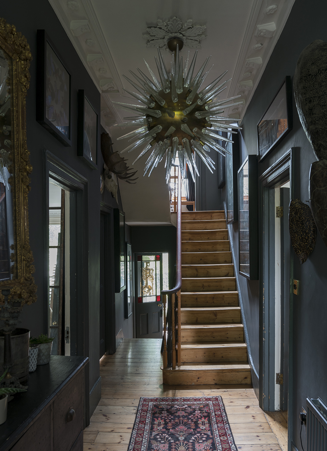
Down Pipe is the perfect color for hallways, in fact, we see it in hallways more than any other room, because it works so well in small, light-starved rooms. In this space painting all the woodwork, as well as the walls, creates that optical allusion of the room being much larger and longer than it actually is.
'When using a dark color like Downpipe it's important to commit! If you're using the color on your walls we always think it looks more premium to continue it onto the woodwork as well. Not only does this achieve a really impactful look, but it actually gives the illusion of a higher ceiling height, as you're not cutting the height of the all off with a white skirting board.' explains Adele Lonergan.
Anna Burles, Creative Director of Run For The Hills agrees; 'It’s a misnomer that dark colors make a room feel gloomy and smaller. They can do the complete opposite, making a room feel ultra-cozy, soft and expansive, by creating light and shade with the natural light coming into the space and the textures and tones of the furniture you pair with the wall, floor or ceiling color. Moody paint shades shouldn’t just be for the bold and the brave, give them a try!'
8. Go for a clean contemporary feel
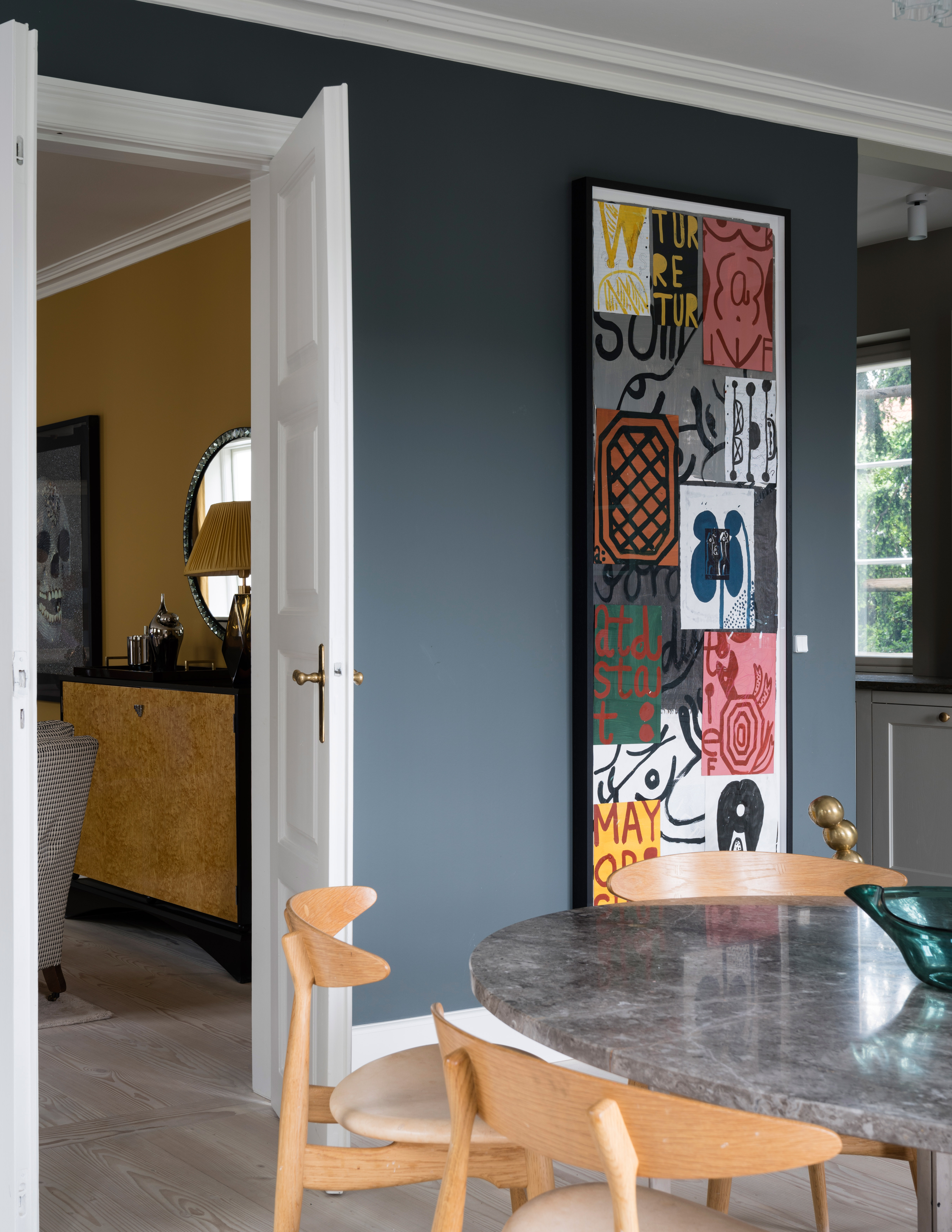
If you want a very clean and obvious contrast, pairing Down Pipe with a true white gives a very crisp look that works well with all styles in all sizes of room. Plus this simple scheme provides the ideal backdrop for adding more colors in the form of artwork and decor.
In this open-plan dining space, the reams of natural light turns Down Pipe almost into a blue Mid-grey rather than the inky charcoal seen in the other rooms, perfect for adding a touch of drama to a room that sees a lot of use.
9. Layer up similar tones
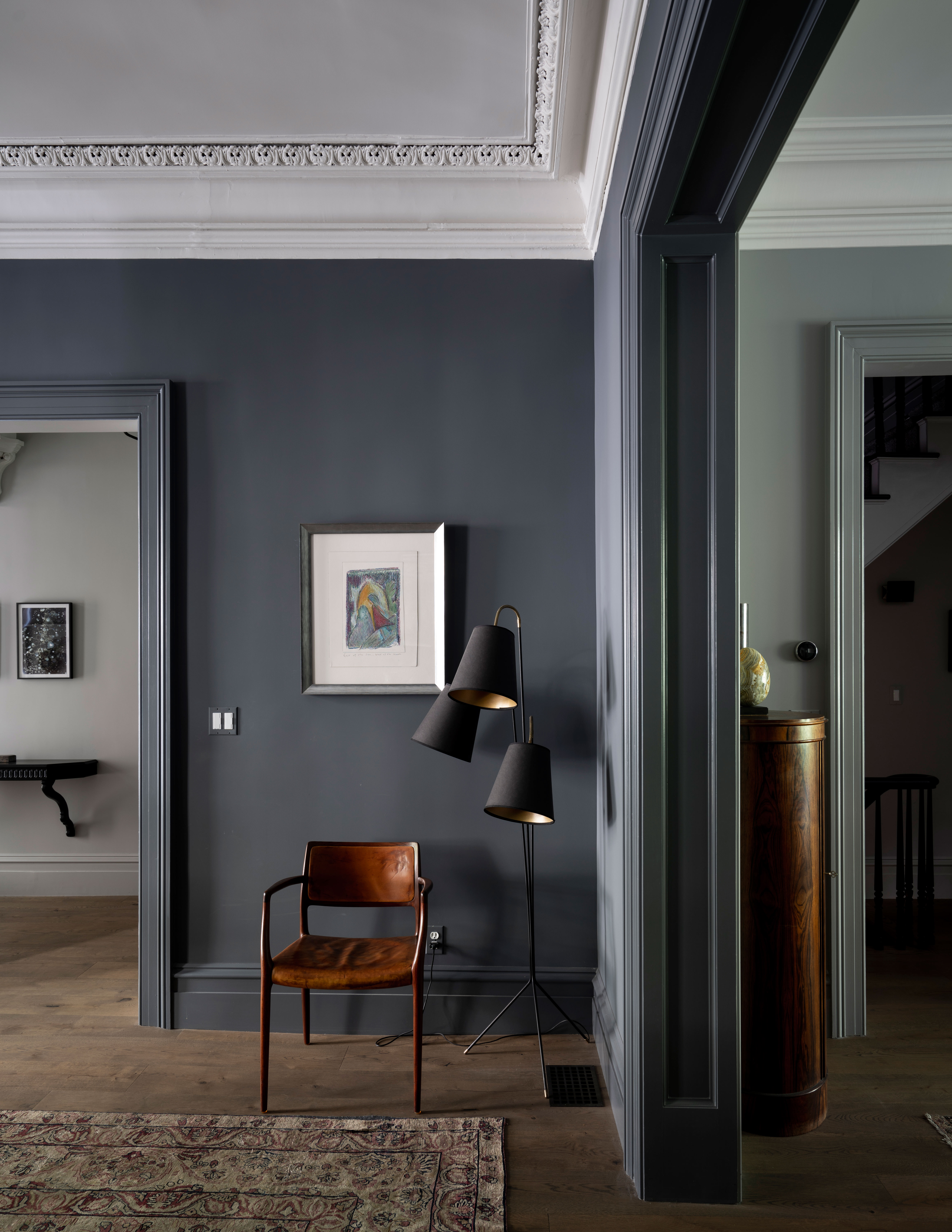
For a really moody look layer up lots of smokey grey tones, using Down Pipe as a base and bring in lighter greys that have similar undertones. Here to adjoining rooms, one painted in Down Pipe and the other in a smokey green-grey, create a very atmospheric space.
10. Test out Down Pipe in your own space
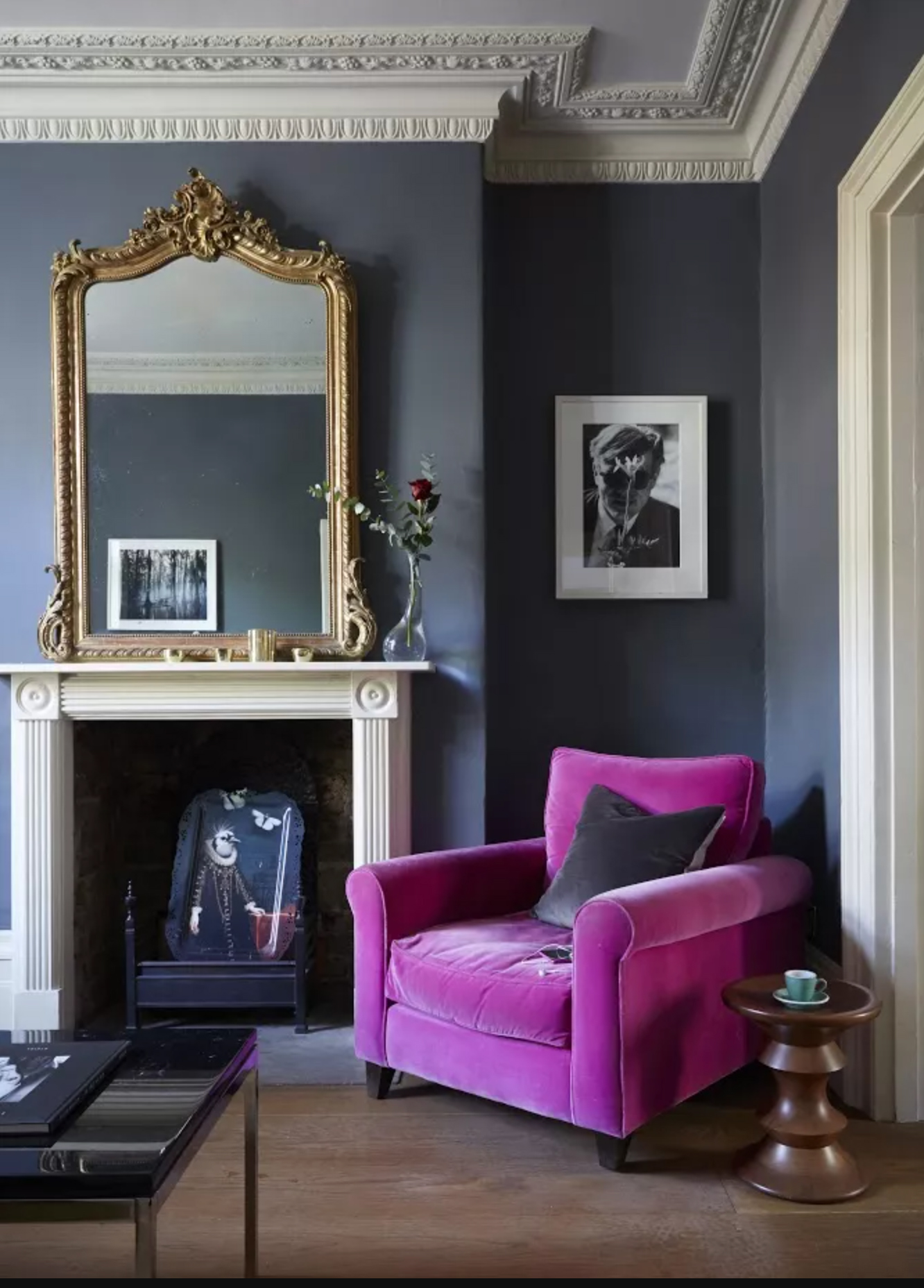
Now before you go and start painting every wall in your home with Down Pipe, word of warning; what makes Farrow & Ball paints so beautiful and unique is that they shift. Because the paints are blended with rich pigments and light-reflecting titanium dioxide they change in different light and can also change depending on what colors you fill the room with too.
So swatches are a must. Test out Down Pipe in your space and see how it changes throughout the day. How does it look in natural light? And in the evening when the artificial lights go on how does it change? Make sure you are happy with both before committing to painting any walls.
'Before decorating a space, I always start by considering the natural light. In this case, it is really important to figure out whether the room is south-facing or north-facing. South-facing rooms tend to get a warmer light, which means some colors can show up a bit on the yellow side.' advises Kelly Wearstler 'To counteract this, I recommend using a dark colour with a cool base. Meanwhile, north-facing rooms are a lot darker. But, this doesn’t mean you can’t use a dark color for decorating! Dark colors are a great way to create a cozy space, just use a dark colour with a red base to add some warmth to the room.'
What colors go with Farrow & Ball Down Pipe?
Down Pipe is a really versatile deep grey and can pretty much handle any shade you throw at it. The white shade that's recommended by Farrow & Ball color specialist is Dimpse, which is very very very light grey, when paired with Down Pipe those grey tones do come out though. This can create a very cool space, which is totally fine if you are decorating a south-facing room, but for a room that lacks natural light, you may want to go with something warmer with a creamier undertone.
'There are plenty of colors that work beautifully with deep greys; but it all comes down to the base behind the grey. For example, a deep grey with a red base pairs really well against warm shades such as the pink-hued Faded Terracotta paint in my California Collection with Farrow & Ball.' says Kelly Wearstler. 'Meanwhile, Down Pipe has a blue base, and so is nicely complimented by cooler shades, such as greens and blues. And of course, grey and yellow. This duo is a timeless reliable combination, with the brightness of the yellow bringing life to muted greys, whilst the grey quietens the potentially garishness in the yellow.'

Formerly the Digital Editor of Livingetc, Hebe is currently the Head of Interiors at sister site Homes & Gardens; she has a background in lifestyle and interior journalism and a passion for renovating small spaces. You'll usually find her attempting DIY, whether it's spray painting her whole kitchen, don't try that at home, or ever-changing the wallpaper in her entryway. She loves being able to help others make decisions when decorating their own homes. A couple of years ago she moved from renting to owning her first teeny tiny Edwardian flat in London with her whippet Willow (who yes she chose to match her interiors...) and is already on the lookout for her next project.