These 4 front door colors will set the wrong tone for your home, say experts – here's what shade to paint it instead
Make sure to avoid these shades if you want first impressions of your front door to count

The Livingetc newsletters are your inside source for what’s shaping interiors now - and what’s next. Discover trend forecasts, smart style ideas, and curated shopping inspiration that brings design to life. Subscribe today and stay ahead of the curve.
You are now subscribed
Your newsletter sign-up was successful
When it comes to curb appeal, nailing the color of your front door is an absolute must, and yet, it's often the last place we consider when it comes to curating a cohesive color scheme. What you probably don't know is that there are some shades experts avoid using at all costs if you want the exterior of your home to be as beautiful as the interior.
We spend hours, days - sometimes even months - testing paint samples on our interior walls to find the perfect color, so why do we disregard our front door, the first thing that greets our guests or catches the eye of passersby? Get it wrong and you can negatively impact the way others see your home, get it right and they instantly feel welcome.
While you should be free to choose the color you desire for your front door, there are some particular shades experts consider a no-go. We've asked some color experts and real estate agents for their insight on the colors to avoid painting your front door if you want your home to make the best impression possible.

Lilith is an expert at following news and trends across the world of interior design. She regularly shares color stories with readers to help them keep up-to-date with ever-changing trends that promise to add personality into the home, as well as those you ought to avoid. For this piece, she spoke with designers and color experts to learn which colors you shouldn't paint your front door and why
1. Hot pink
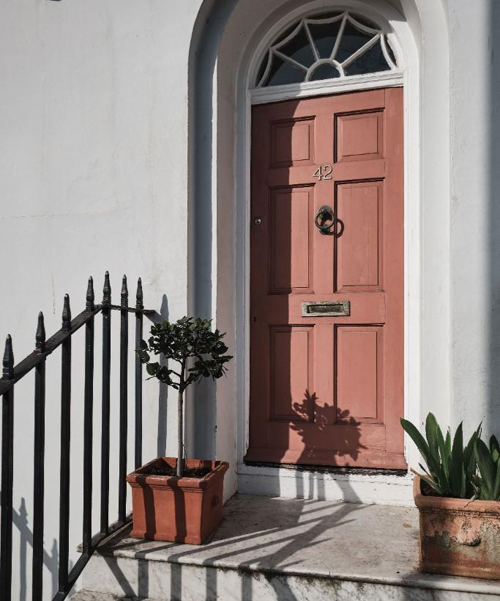
Many of us think opting for a bright, vibrant front door color is the best welcome for guests, but certain garish shades like hot pink can actually be off-putting.
'The colors you'll want to avoid for your front door can vary based on what color your home is, along with your overall design scheme,' says Andre Kazimierski, CEO of Improovy Painters Denver. 'You can get away with some pretty "out there" colors if it suits your home's aesthetic, style, and exterior paint job, but generally, you might want to avoid extremely garish shades like hot pink which you'll have a hard time matching to your home no matter what.'
Instead, if you want to go for a pink front door, try a more powdery tone with a slightly cooler undertone. Dusty pink or a pale pastel will offer a more understated look while still making your front porch look pretty as a picture.
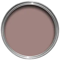
"Sulking room pink" exterior eggshell paint, Farrow & Ball
This mid-tone pink is the perfect muted tone for a front door, offering a more pared-down approach to other vibrant pink shades. The dusty rose hue is incredibly soft, bringing warmth to your front porch for an instantly inviting feel. Pretty in pink, but understated and elegant all at once.
2. Gloss black
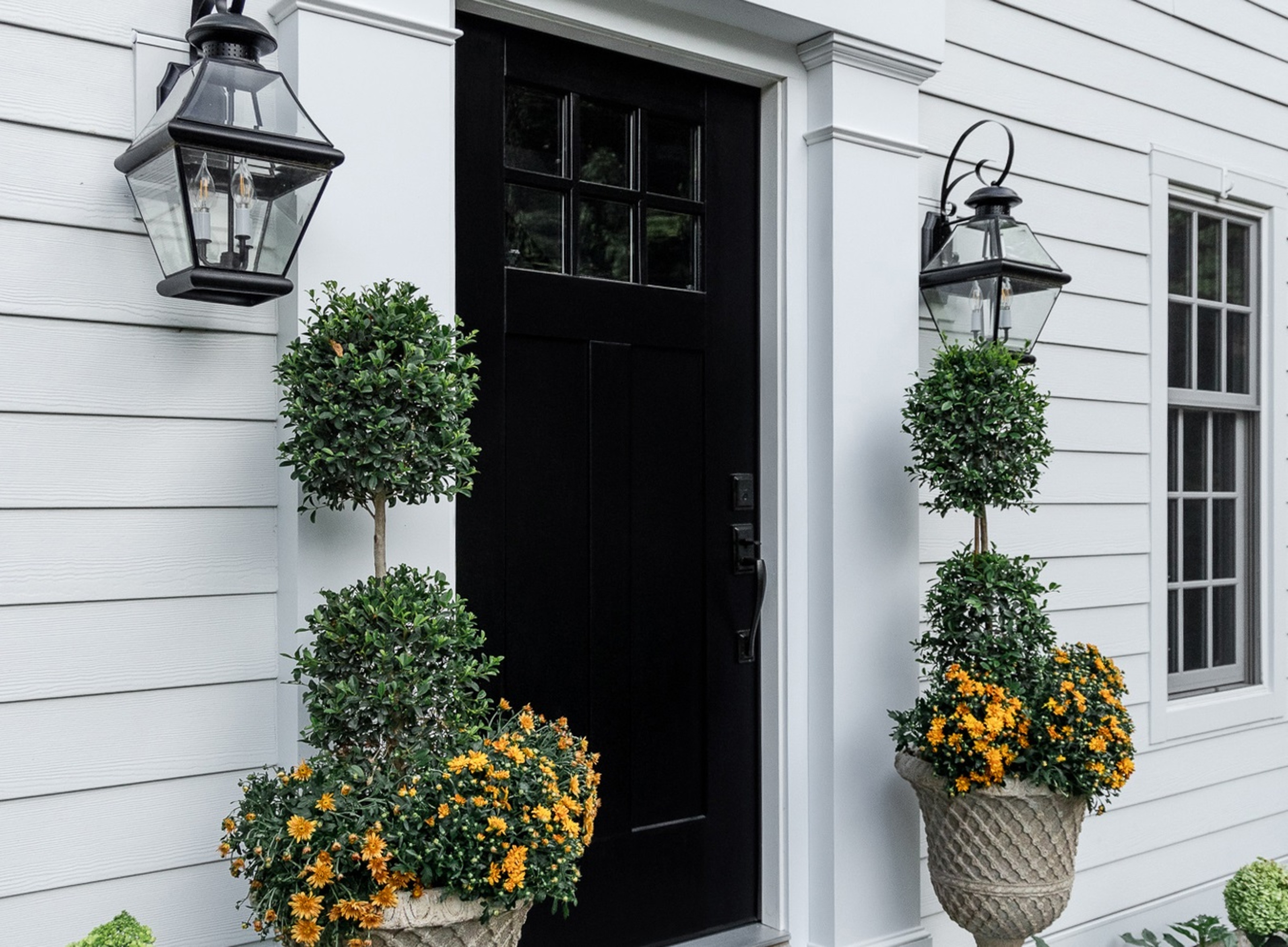
You might think black seems like an obvious choice for a front door - after all, it's the color most show homes choose - and surely it's an uncontroversial shade, right? The thing is, ultra-glossy black doors can be too overbearing, especially if you have a white clapboard house that it would contrast with.
The Livingetc newsletters are your inside source for what’s shaping interiors now - and what’s next. Discover trend forecasts, smart style ideas, and curated shopping inspiration that brings design to life. Subscribe today and stay ahead of the curve.
'Black can appear too serious on the front of a home, while lighter options such as tan or beige can make the house look undistinguished,' says color expert, Inez Stanway. 'Instead of choosing overly distinct shades like these, opt for natural tones like light blues or muted greys that will add subtle character to your house without taking away from its appeal.'
'Ultimately,' she adds, 'it’s better to take a more edited approach when deciding on the right color for your front door – something timeless that won’t go out of style soon after painting'.
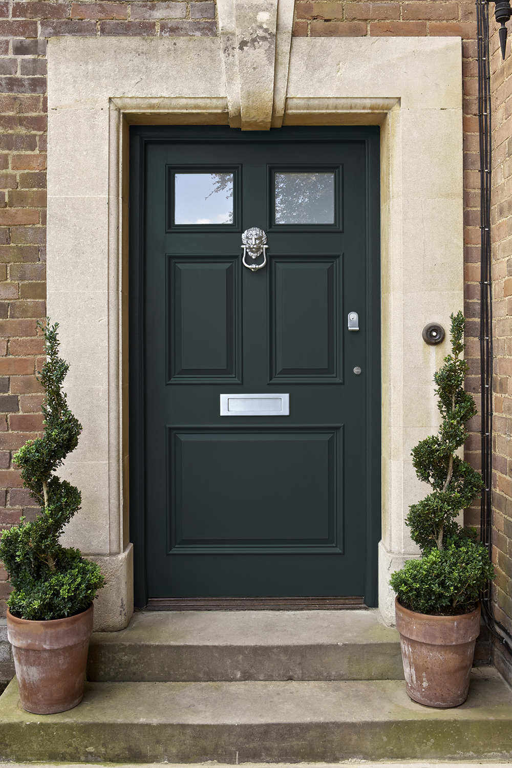
If you want to go for a darker feel that isn't too overbearing, try a deep navy or a charcoal grey. These will give the illusion of being black in certain lightings, but without being too stark and severe. You could also go for a matte or eggshell paint finish if you want to mute the tone slightly.
3. Bright orange
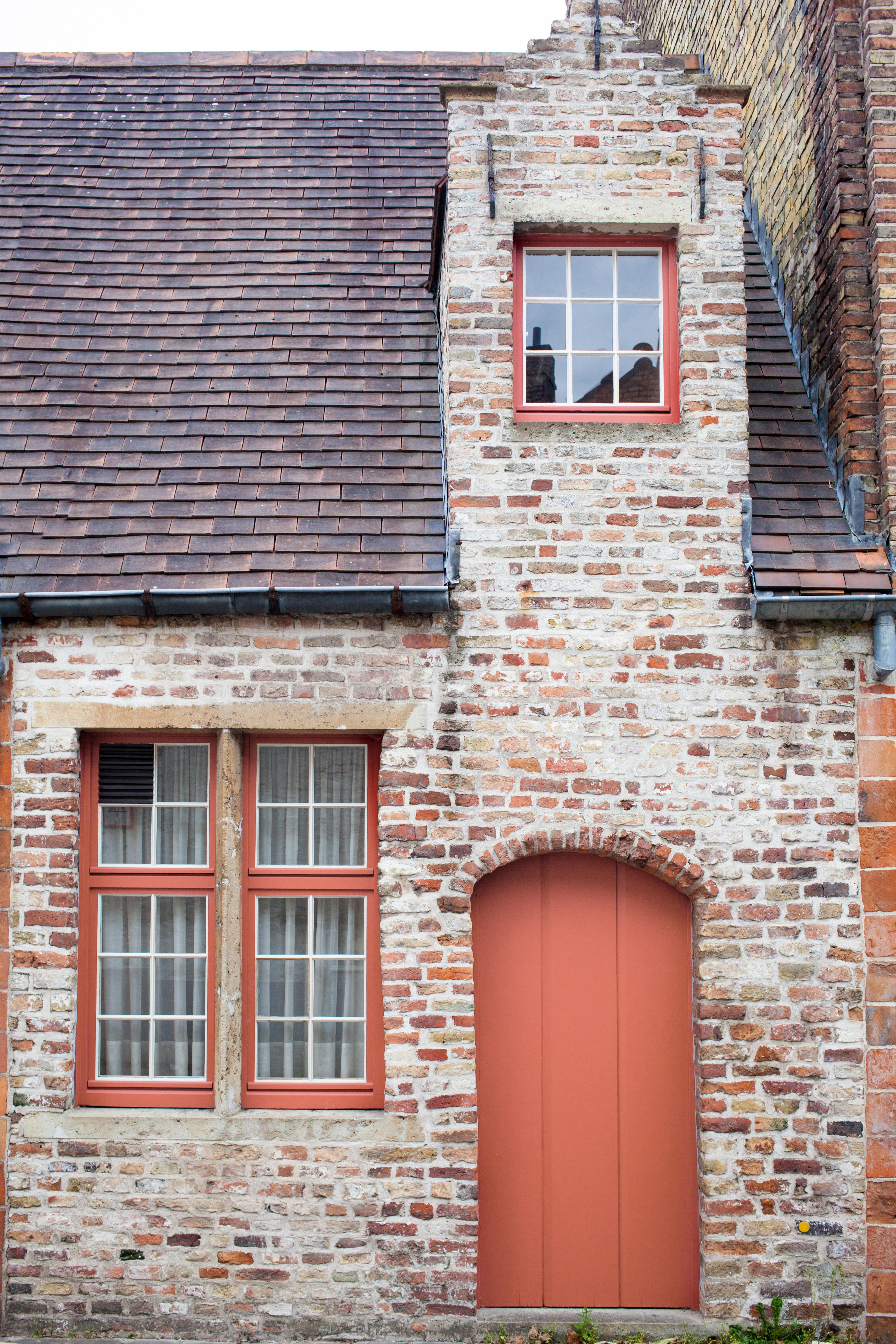
As mentioned, bright colors may seem appealing on a color swatch but, as a high energy color, a true tangerine orange might not be the best option. As an advancing color it will cause your front porch to really stand out but in an overly lurid way.
'A bright orange door can be jarring and off-putting which isn't ideal in a spot that you want to feel welcoming,' says interior designer Allison Garrison of Allito spaces. 'For something more inviting, try a soft coral or a moody terracotta instead.'
In general, the deeper the shade you choose, the more cocooning it will feel. If you want to go for a cozy feel right from the threshold of your home, go for a deep burnt orange to promote comfort and warmth the second your guests step for inside.
KILZ 'Terra cotta' semi-gloss exterior paint, Walmart
For an orange tone that's on the more welcoming side, try a warm terracotta like this one, available at Walmart. The soft undertones make this shade a perfect choice for injecting some color and vibrancy to your front door without seeming overwhelming.
4. Crisp White
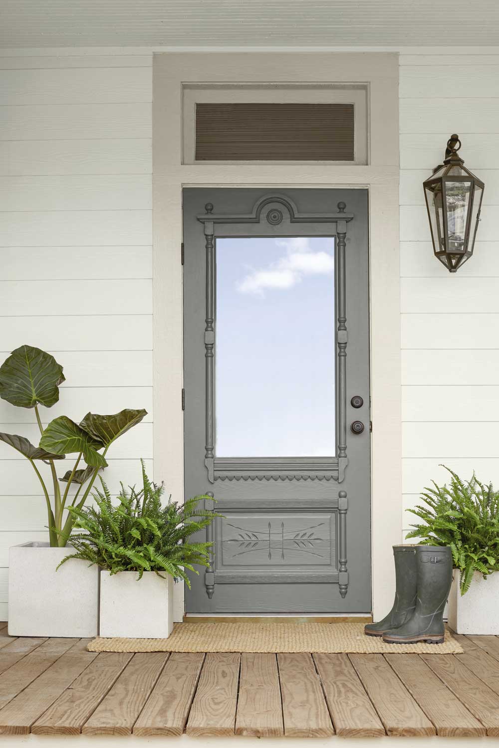
Like black, white seems like an unproblematic choice for a front door. Although it's a neutral shade that will pair with anything and suit any design, it's not the most practical color for a high-traffic area.
'White is such a classic color that I don't think people will regret it for the shade itself, however, I would advise against painting a front door this color,' says Matt Stone, decorator and color expert at Hometown Painting OKC.
It might also cause issues for your home's curb appeal. 'White paint not only shows dirt more easily, but it will also show scuffs,' Matt adds. 'Because the font door is the first impression many people will have of your home, you want it to be a color that won't look worn or dirty so quickly.'
If you don't want to find yourself touching up your paint every season, then it's probably best to avoid white altogether. If you do want a paler shade, a subtle sky blue or lavender will give the same effect with a cool, crisp tone. For a warmer hue, a very pale yellow will give an off-white appearance that you might find more inviting.

Lilith Hudson is a freelance writer and regular contributor to Livingetc. She holds an MA in Magazine Journalism from City, University of London, and has written for various titles including Homes & Gardens, House Beautiful, Advnture, the Saturday Times Magazine, Evening Standard, DJ Mag, Metro, and The Simple Things Magazine.
Prior to going freelance, Lilith was the News and Trends Editor at Livingetc. It was a role that helped her develop a keen eye for spotting all the latest micro-trends, interior hacks, and viral decor must-haves you need in your home. With a constant ear to the ground on the design scene, she's ahead of the curve when it comes to the latest color that's sweeping interiors or the hot new style to decorate our homes.
