'It's definitely surprised us!' C2's Color of the Year proves 2024 is going to be the year of "light blue"
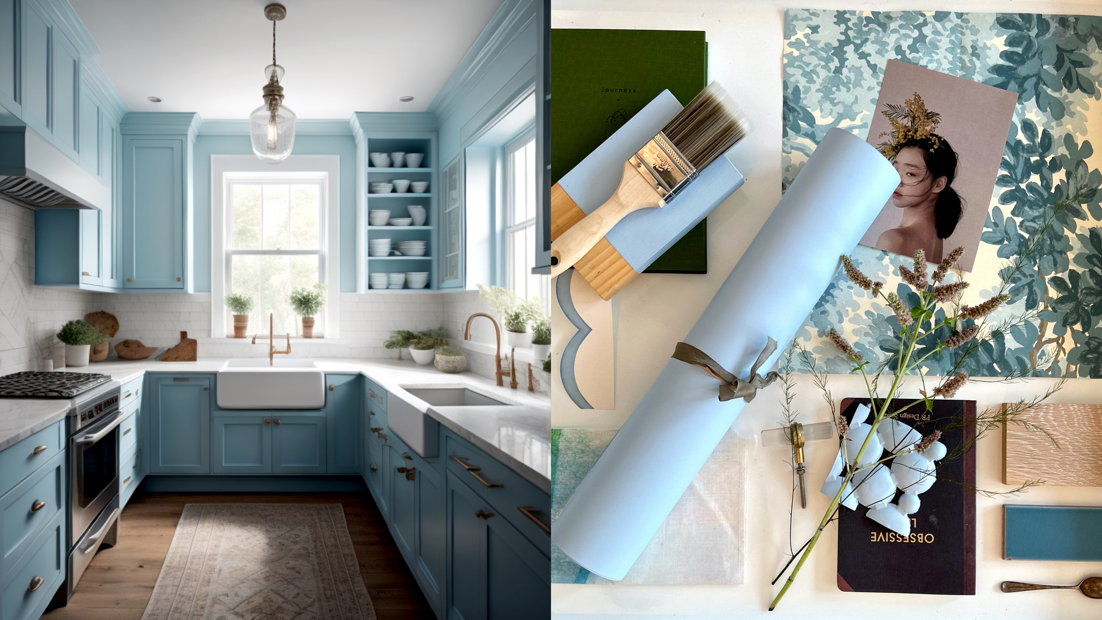
This latest Color of the Year announcement cements light blue as one of the color trends to watch for 2024

The Livingetc newsletters are your inside source for what’s shaping interiors now - and what’s next. Discover trend forecasts, smart style ideas, and curated shopping inspiration that brings design to life. Subscribe today and stay ahead of the curve.
You are now subscribed
Your newsletter sign-up was successful
We're only half way through September, and we've already had a huge array of 'Colors of the Year' for 2024, but it's not over yet. The latest trend prediction is from paint brand C2, which has named Thermal #752 as its Color of the Year.
This isn't the first light blue we've seen cropping up as a color trend for 2024, either. Valspar also opted for a lighter blue as its color prediction for next year, and it's definitely surprised us. These lighter blues had fallen out of favor in recent years - a little too twee, or coastal, or cottage-y, but they appear to be returning with a nw modernity.
'When done correctly, light blue can be an incredibly soothing color,' says Allison Lind, design director at Allison Lind Interiors. 'There's something built into our collective DNA to love that soft, happy tone. When looking for colors to pair with it, consider hanging multiple swatches on the wall to see which holds up best in all forms of light.'
Article continues belowThis blue tone encapsulates elements of air and water and, acts as a bridge between the indoors and outdoors, inspiring you embrace the beauty of nature inside. Sounds good, right? Here's what you need to know about it.
What is the C2 Paint Color of the Year?
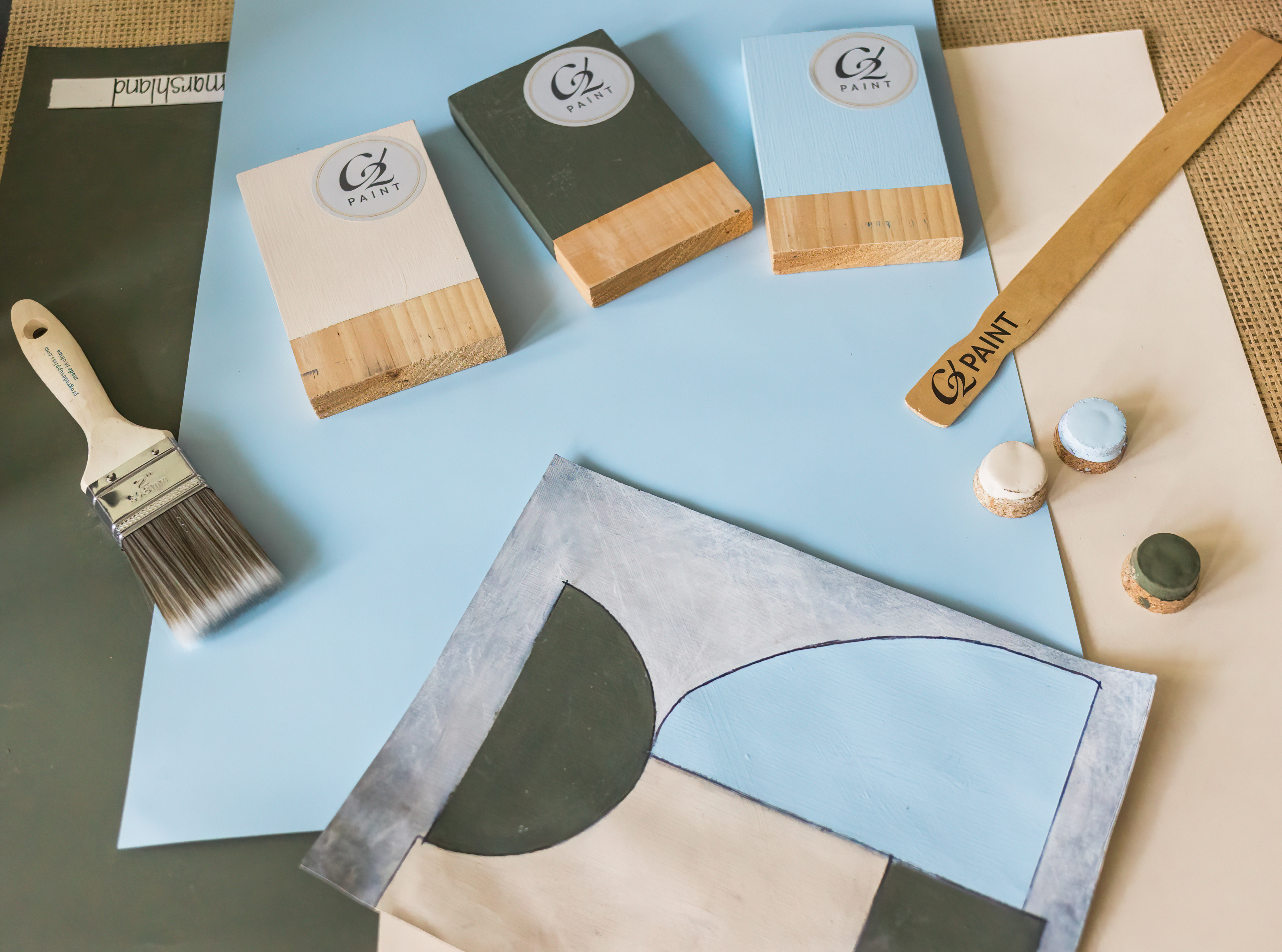
The paint company's Color of the Year for 2024 is a simple yet instantly pleasing and refreshing pale blue that can uplift and energize its surroundings. It also stands for sustainability in our daily lives, along with prompting us to discard negativity, making way for an optimistic future.
'C2 Thermal reminds us of a vast blue sky and the infinite array of blue hues nature offers to help restore and redefine our mood,' says Philippa Radon, interior designer and C2 Paint Color Specialist. 'This bespoke pale yet punchy blue is poised for adventure and is brimming with hope, evoking feelings of loyalty, trust, and confidence. Its contradictory nature has the dual ability to uplift us and provide a sense of calm and tranquility.'
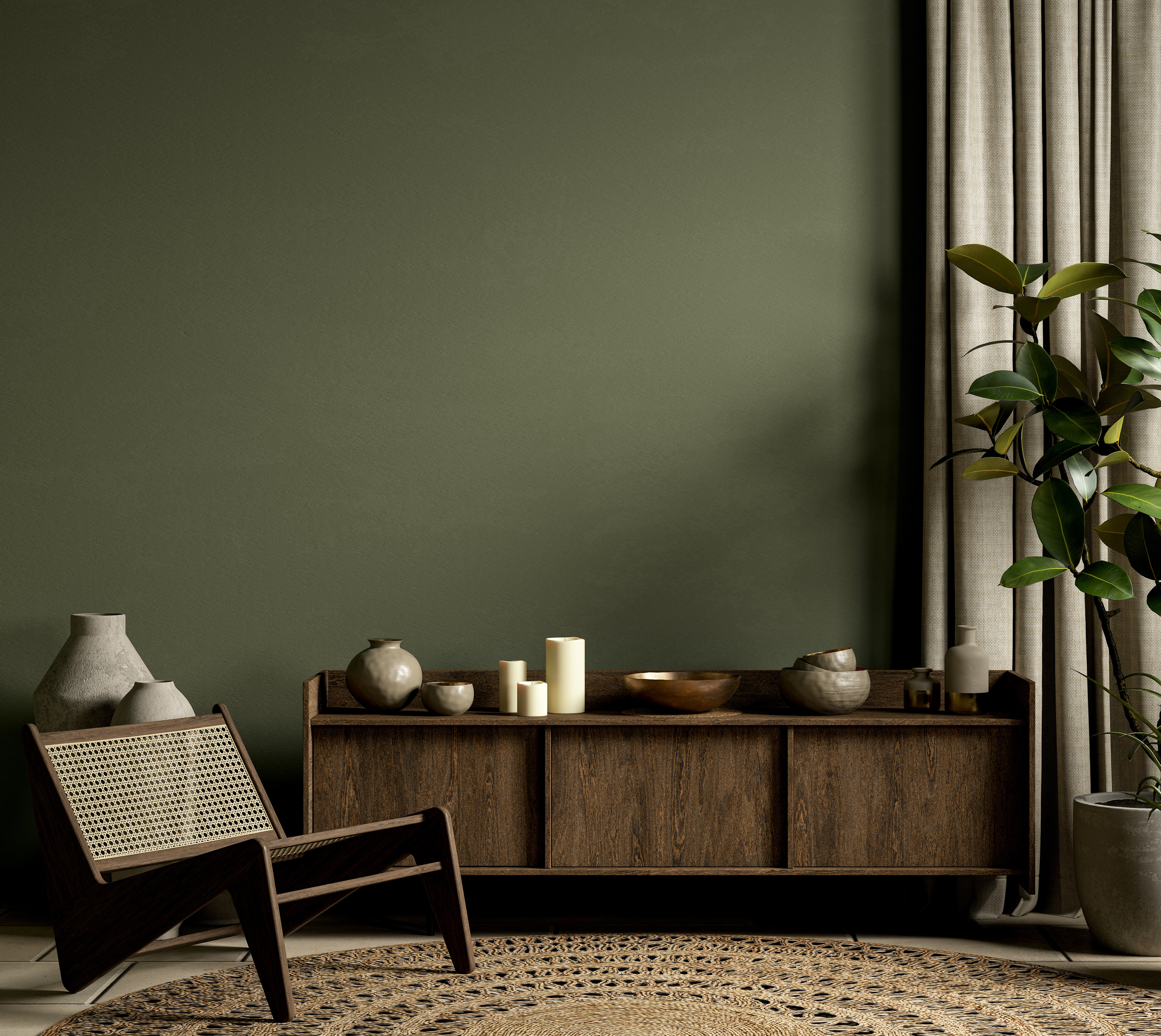
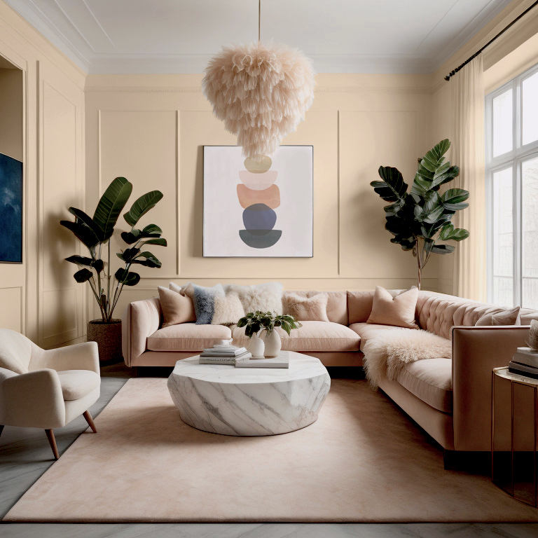
As part of their Color Capsule for 2024, the brand has also introduced two additional complimentary hues – C2 Brulee #546 which is a soft apricot with a honeyed vanilla tone - and, C2 Marshland #918 which is a mid-olive green - both perfect colors that go with light blue.
The Livingetc newsletters are your inside source for what’s shaping interiors now - and what’s next. Discover trend forecasts, smart style ideas, and curated shopping inspiration that brings design to life. Subscribe today and stay ahead of the curve.
How to use pale blue in minimalistic interiors
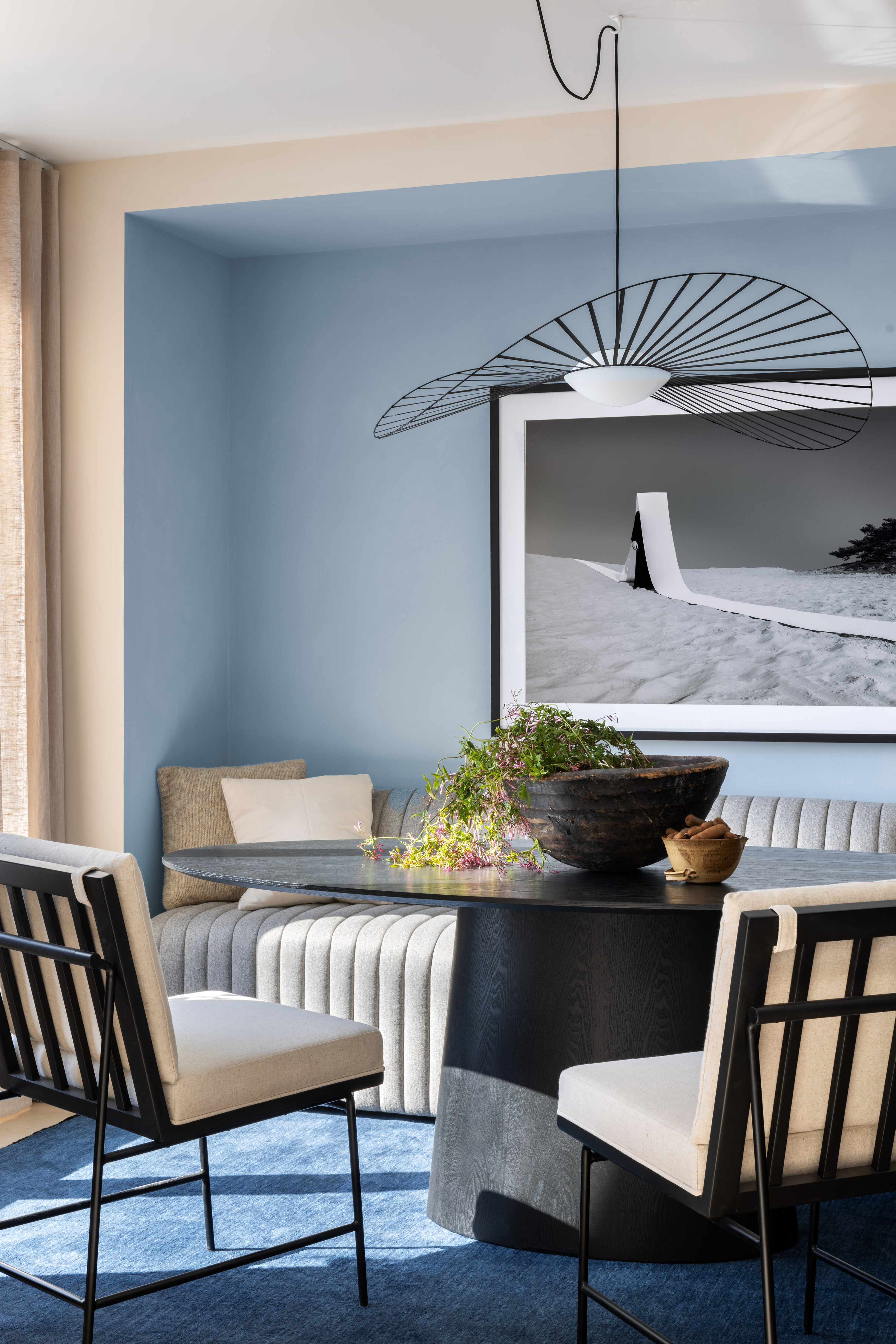
If it is a minimaluxe space you're interested in designing, then this light, pale blue tone is ideal. The color can easily fill spaces without looking overwhelming. It also exudes more character than plain white or beige.
One of the best ways to use this color is on woodwork. Consider drenching window and door frames in this tone and change an otherwise all-white room. The shade can be taken across the ceiling and skirting boards to save it from feeling drab or cold. For more layering, you could bring in the honeyed and green tones, for the most peaceful, and calming setting.
'Color is never seen in isolation,' says Philippa. 'Just look out the window and see how many colors interact with each other. Our annual capsule tells a story where our colors become the characters: the lead being Thermal, with Brulee and Marshland as support roles.'
What colors go with pale blue?
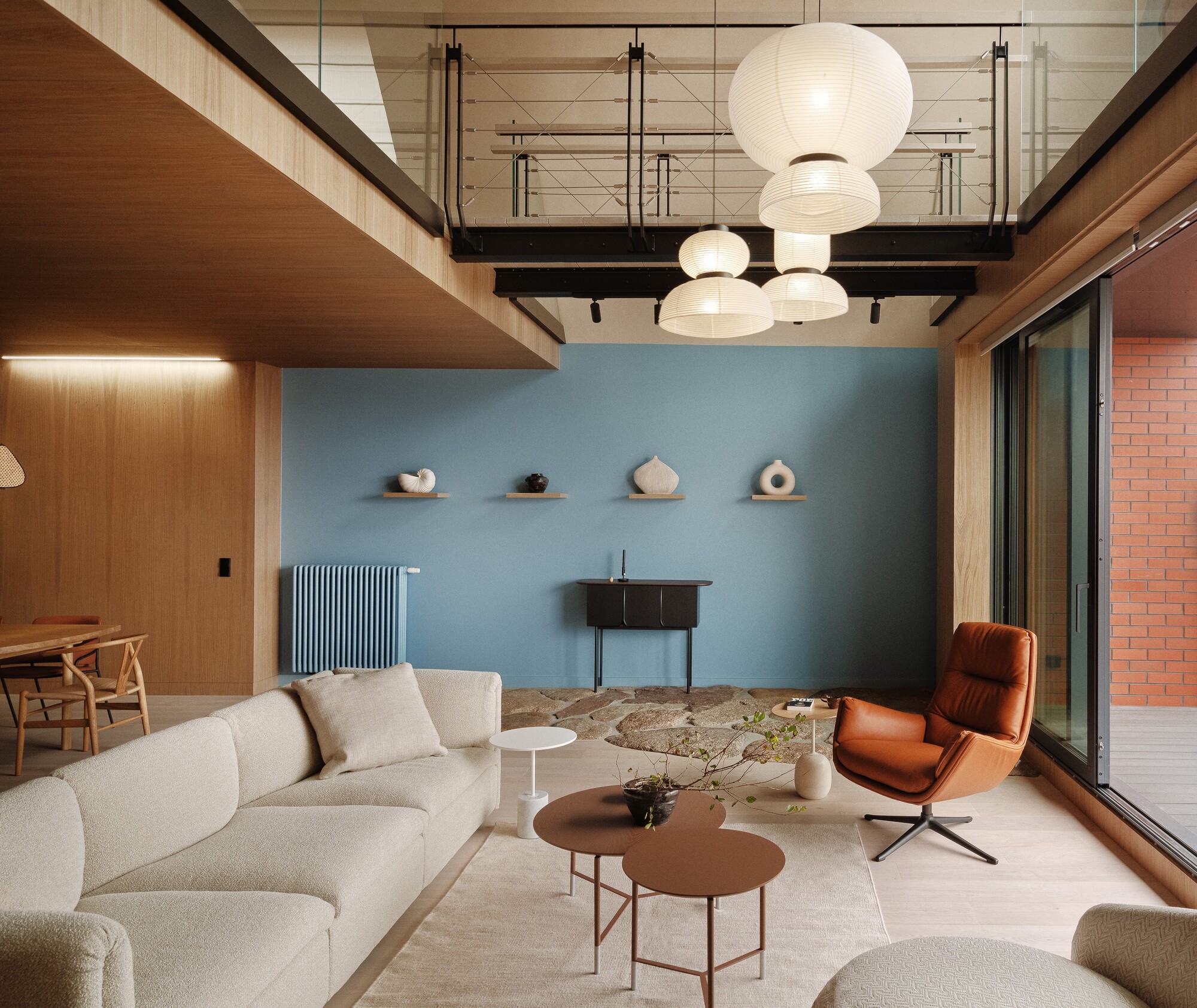
Just like any other muted tone, decorating with neutrals such as pale blue is rather simple. Think pink, off-white, muted yellow, gold, orange, and green. To add depth to a space, you can even layer a dark, royal blue with this pale blue.
Another advantage of this shade of blue is that it's very zen, and great to use in spaces that encourage pause. Choose this color in a meditation or reading room; also great for a nursery.
Aditi Sharma Maheshwari started her career at The Address (The Times of India), a tabloid on interiors and art. She wrote profiles of Indian artists, designers, and architects, and covered inspiring houses and commercial properties. After four years, she moved to ELLE DECOR as a senior features writer, where she contributed to the magazine and website, and also worked alongside the events team on India Design ID — the brand’s 10-day, annual design show. She wrote across topics: from designer interviews, and house tours, to new product launches, shopping pages, and reviews. After three years, she was hired as the senior editor at Houzz. The website content focused on practical advice on decorating the home and making design feel more approachable. She created fresh series on budget buys, design hacks, and DIYs, all backed with expert advice. Equipped with sizable knowledge of the industry and with a good network, she moved to Architectural Digest (Conde Nast) as the digital editor. The publication's focus was on high-end design, and her content highlighted A-listers, starchitects, and high-concept products, all customized for an audience that loves and invests in luxury. After a two-year stint, she moved to the UK and was hired at Livingetc as a design editor. She now freelances for a variety of interiors publications.
