Interior designers choose these 5 colors to paint small bedrooms – they're shades that feel calm, even in tiny spaces
Consider these calming colors for small bedrooms that will ensure you are deeply relaxed and perfectly at peace


Picking a color for a small bedroom can be a tough job, but the best approach is often to use color psychology to create a cozy and inviting interior. One that coaxes you into bed and immediately puts you to sleep or in a deeply relaxed state. You'll be surprised how far colors can go to change the vibe and atmosphere of a room.
If you are looking to redecorate or redesign your space, then these bedroom color ideas are a good choice if you want to achieve a calm space.
Surprising yet stylish and calming, consider these tones and have yourself the bedroom of your dreams.
5 calming colors for small bedrooms
Colors can be used to influence mood, emotions, and behaviors. Certain tones can even evoke a physical reaction such as hunger, aggression, or sleep. For a cozy bedroom, choose shades carefully so that you don't create an interior that is too stimulating.
'Creating a sanctuary for your bedroom will help to calm and relax you – it should be somewhere you feel happy and safe and choosing the right color scheme is imperative for this,' says Lisa Artis, deputy CEO, of The Sleep Charity.
We asked interior designers for their top choices for small sleeping spaces - here's what they picked.
1. Burgundy

If you want to sleep better or be more relaxed in your bedroom, a calming paint color is key. While reds are generally not considered calm in color theory, a dark, muted burgundy has an inherently warm and moody feel. When used in its deeper tones (more brown than red), it can make you feel like curling up with a warm cup of cocoa or tea, and disappear for a while.
The Livingetc newsletters are your inside source for what’s shaping interiors now - and what’s next. Discover trend forecasts, smart style ideas, and curated shopping inspiration that brings design to life. Subscribe today and stay ahead of the curve.
'This room was meant to be dark and cozy to accompany the adjoining bathroom which is swathed in navy blue tiles,' says Heidi Caillier, founder of Heidi Caillier Design. 'The burgundy feels fresh and makes the other elements in the room pop, and makes the dweller relaxed.'
This color invites a bit of mystery and moody elegance, so it goes well, especially in more vintage or old-style interiors. Pair it with gold or other metallic tones and you have a luxe, timeless space.
2. Terracotta red

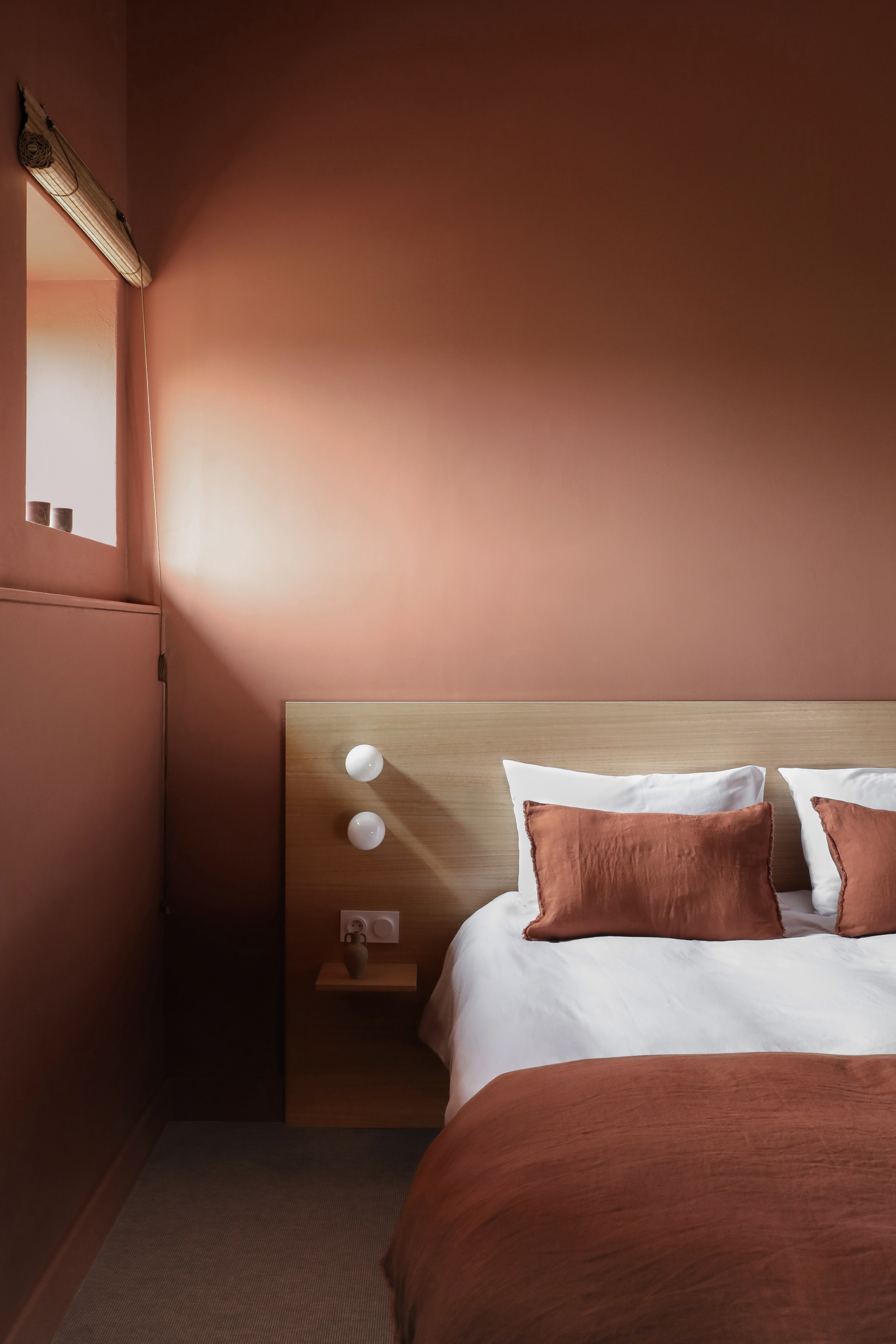
Who would have imagined that a red tone could be calming? This color is usually associated with high energy and stimulation. The secret lies in its undertone. A deeper shade of red, say a rust or a crimson, carmine, red ochre, mahogany, or maroon has a more anchoring effect in a space, making the colorful bedroom feel cocooning and cozy. This hue especially pairs well with rich wood details, warming up the space even more.
This tone goes well with creams, beiges, yellows, and warm whites. It also looks lovely with charcoal grey, which slightly tames the color.
'In this bedroom, we wanted to create a timeless look that never dates and is easy to live with,' says Hélène Pinaud, founder of Heju. 'For that, we chose Aubusson Red HC 123 from Ressource, which is a more earthy hue. For the finish, we chose Satin Velouté which is not too matte and not too brilliant and that you can easily clean. It doesn't reflect too much light making the interior not feel too bright, and easy to sleep in.'
Choose this burnt tone that has a warming feel, and earthy look, making your bedroom the ultimate cozy sanctuary.
3. Deep blue

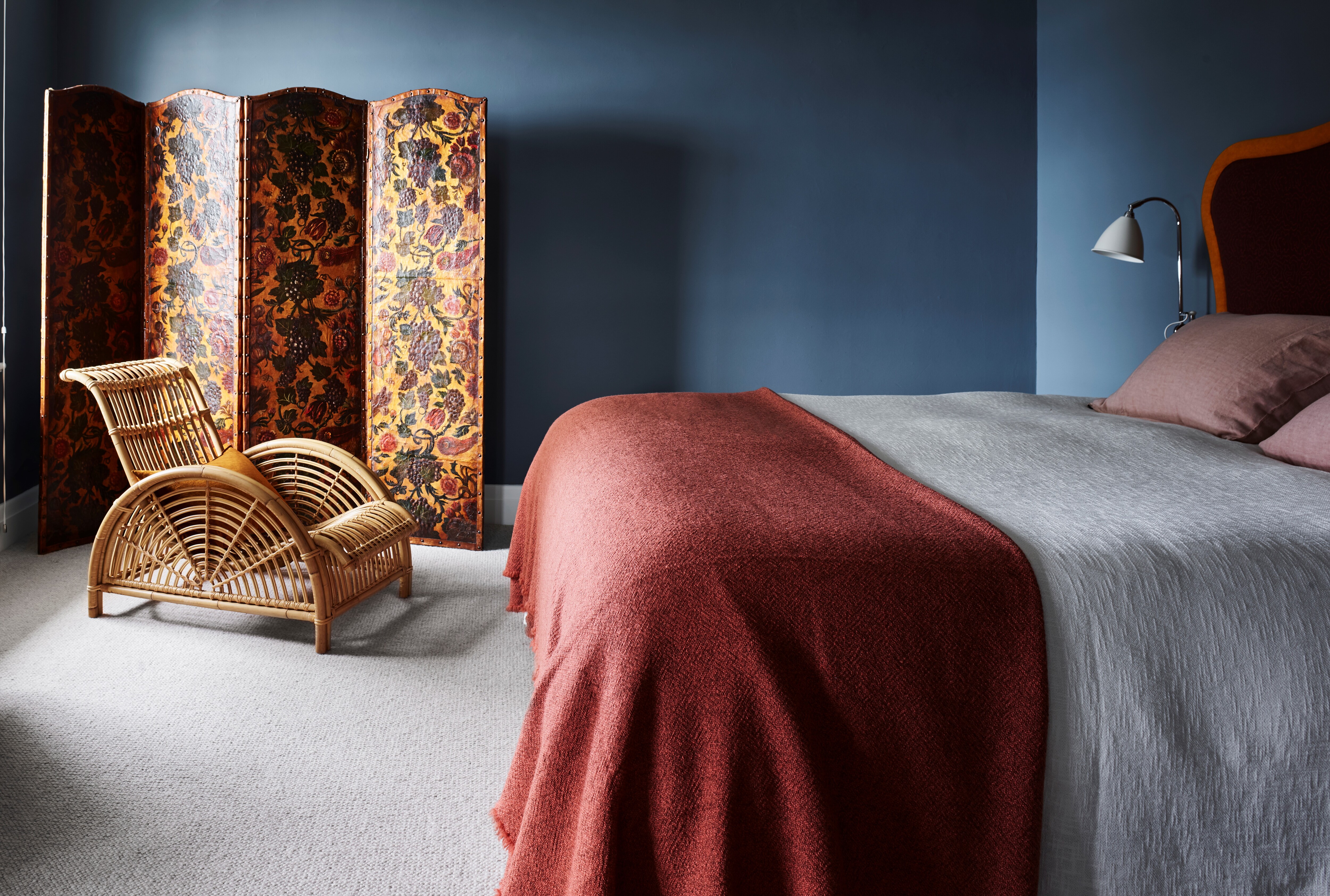
Blue is a versatile color and its many variations can create different looks. To create a moody, meditative space, a dark blue bedroom can be rich and sumptuous. Not only is the color visually appealing and calming,it also creates a breezy look, as if you're lying down outdoors, relaxed and at peace.
'The top shades for calming bedrooms are blues, greens, all colors in between (green blues and blue-greens) and neutrals like greys and whites,' says Amy Krane, architectural color consultant and founder of Amy Krane Color. 'Blues are associated with the sky and water, both calming and meditative to peer at. Keeping your walls monotone as opposed to combining different ones will be most restful.'
While this bedroom (above) isn't a small one, with ceilings as generous as 5.3 x 4.3m proportions, the 19th century embossed and painted Spanish leather screen is introduced to create an intimate moment in the otherwise vast space. The key was to bring warmth into the bedroom with the screen as it complements the extra high bed draped with sumptuous linen in rich tones and natural textures, all perfectly paired with Arne Jacobsen’s Paris chair. 'It is the apartment’s heritage that was used as a cue to the design and decorate elements,' say Juliette Arent and Sarah-Jane Pyke, founders of Arent&Pyke. 'A series of rooms, including the bedroom, was reimagined as a private sanctuary with relaxing paint tones.'
Choose this inky blue paint for a rich and modern interior for a timeless and cocooning look. When used in well-lit areas of the home it will appear much bluer.
4. Dusky pink

Pink bedrooms come in many different guises. It can be sweet and stark but it can also be grounding and warm.
A mid-tone pink or one with a brown undertone is the perfect bet for a calming bedroom. The tone hinges more towards an organic, earthy setting... one that reminds you of sand and stones. This pink is also reminiscent of the setting sun, when the colors outside become subdued, and the mood is sleepy and almost melancholic.
'We chose Rouge II from Paint and Paper Library for the walls in this bedroom to create a cozy, moody feel,' says Grace King, design director of Studio Rey. 'We love this color as it is a warm, dusky pink with a hint of lilac which prevents it from feeling drab and adds a sense of drama. We added graphic cushions and playful textile artwork to create a contemporary feel.'
5. Warm aqua

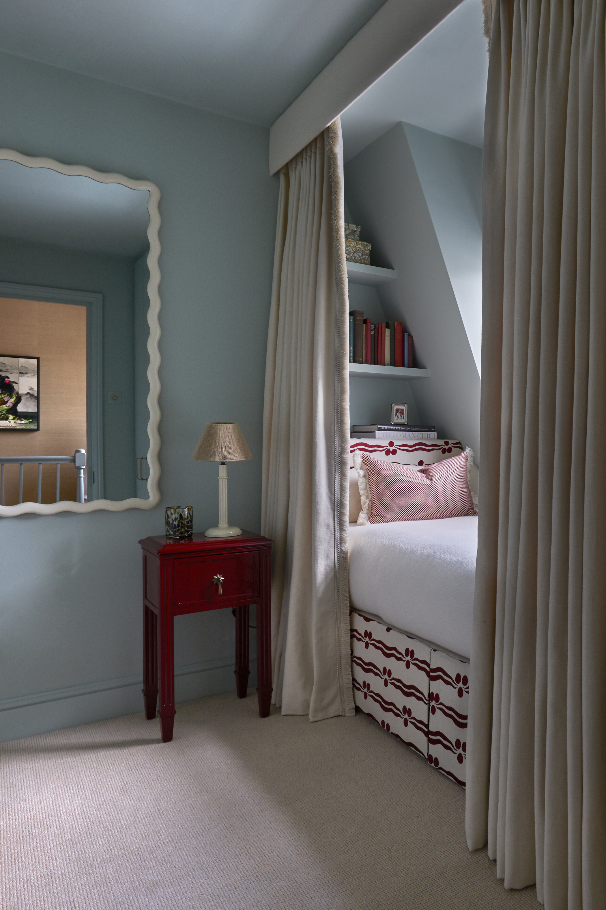
A warm aqua or turquoise with a brown or grey undertone can remind you of sea glass and driftwood, pebbles, and the night sky. Combining two wonderfully refreshing colors of the wheel – green and blue – this mix with a deep base can give the room an organic touch that is modern yet tranquil.
Due to its rooted visual, this shade can also double as a wonderful neutral, allowing other brighter tones to shine. If you don't mind being experimental, you could bring in shades of red, orange, or pink to create interesting pops of colors in your bedroom. This will add layering to the room and even depth to the blue and green bedroom scheme.
'For this playful little ‘eaves’ guest bedroom, we chose a fresh green/blue on the walls (Teresa’s Green by Farrow & Ball) and contrasted this with a punchy pillar box red bedside table from our Trove by Studio Duggan range,' says Tiffany Duggan, director of Studio Duggan. 'We opted for a heavy cream curtain with matching fringing for a luxurious and cozy vibe. Red, white, and blue is such a classic color scheme and always feels so fresh and invigorating.'

Aditi Sharma Maheshwari started her career at The Address (The Times of India), a tabloid on interiors and art. She wrote profiles of Indian artists, designers, and architects, and covered inspiring houses and commercial properties. After four years, she moved to ELLE DECOR as a senior features writer, where she contributed to the magazine and website, and also worked alongside the events team on India Design ID — the brand’s 10-day, annual design show. She wrote across topics: from designer interviews, and house tours, to new product launches, shopping pages, and reviews. After three years, she was hired as the senior editor at Houzz. The website content focused on practical advice on decorating the home and making design feel more approachable. She created fresh series on budget buys, design hacks, and DIYs, all backed with expert advice. Equipped with sizable knowledge of the industry and with a good network, she moved to Architectural Digest (Conde Nast) as the digital editor. The publication's focus was on high-end design, and her content highlighted A-listers, starchitects, and high-concept products, all customized for an audience that loves and invests in luxury. After a two-year stint, she moved to the UK and was hired at Livingetc as a design editor. She now freelances for a variety of interiors publications.

