No more, no less! This is the exact number of colors you should have in a room – have you got it right?
We ask interior designers for the golden number for a color scheme - here's how many you should be aiming for
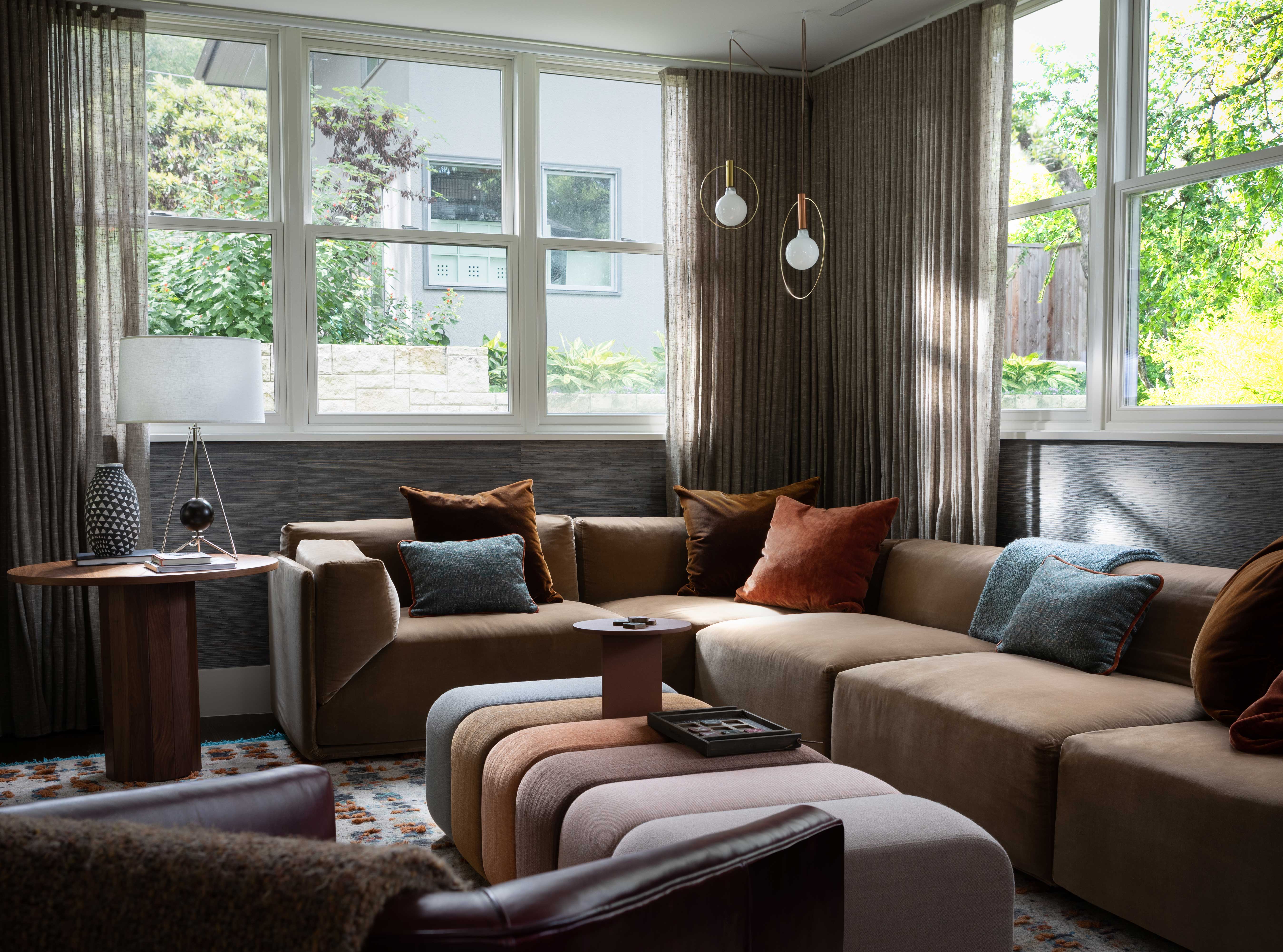
Mankind’s fixation with the perfect number is a longstanding obsession. While philosophers, mathematicians, and poets have long debated the formula for beauty, rules like the golden ratio or divine proportion have shown us that even nature presents a pattern for harmony in its objects. Science says that this ratio or numerical presentation is easier for our minds to accept and therefore consider more visually pleasing. So, it’s only natural to ask the question of how this applies in the realm of interior design.
After much debate and discussion with interior designers, 4.5 seems to be the golden number. The experts agree that 4 to 5 colors allow you to create enough visual depth and drama but still feel structured enough for the eyes to accept with ease. As we explore the following examples, the experts offer their advice and insight into how best to implement this hack for a harmonious interior.
1. Choose a base color for your sofa
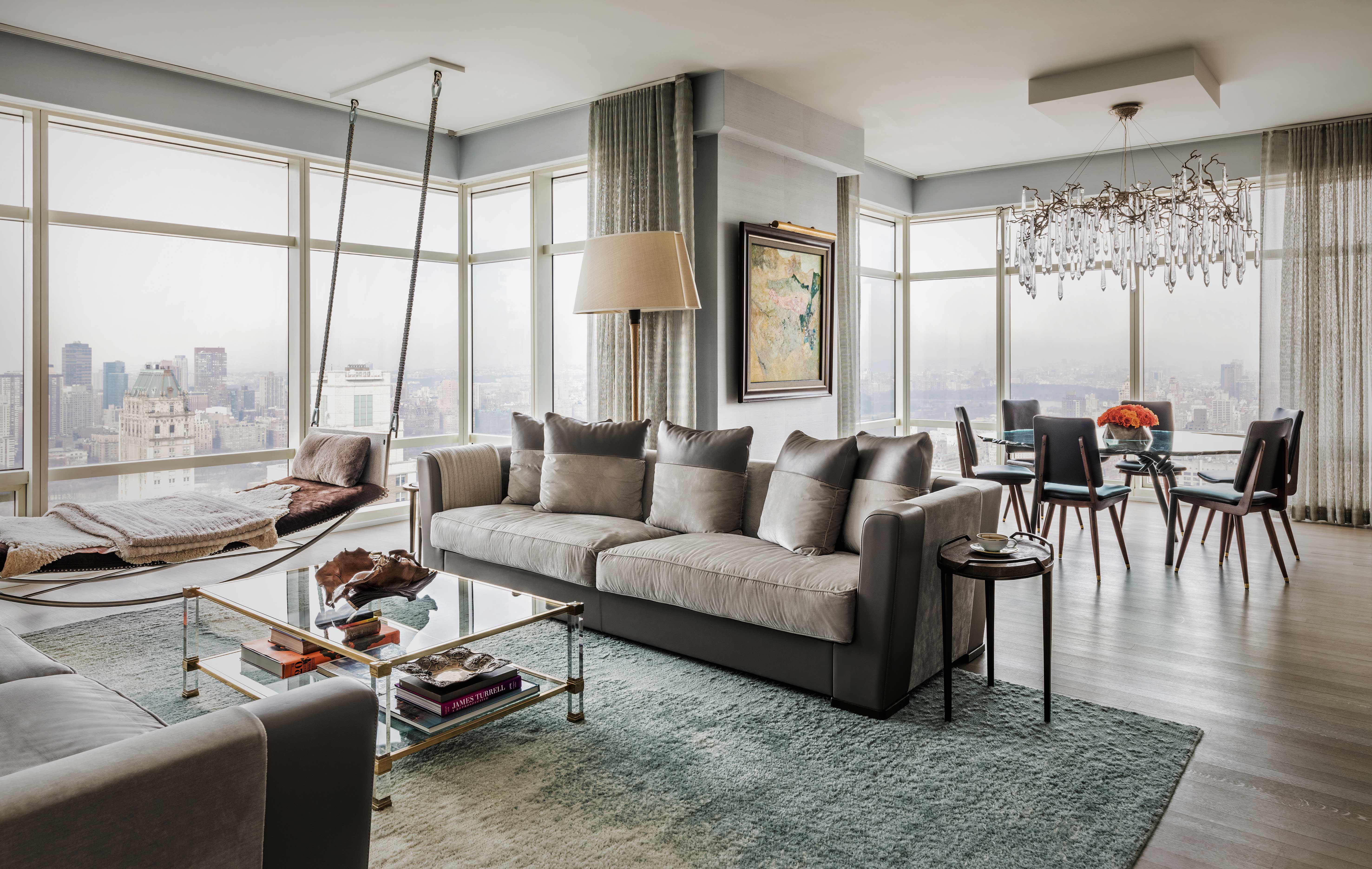
'A good number of colors for a room is 4 with a couple of timber tones and metal accents,' says interior designer Shalini Misra. 'You can choose a color and work with a few lighter and darker tones of it to add depth of color to the space.'
Her advice focuses on the large and grounding use of color being your sofa which then is balanced by the more vibrant accents you complement it with. 'For example, you could choose a base color for a sofa and a darker or lighter tone for the throw cushions, then add an accent color for some of the cushions. A good mix of light and dark, strong and muted tones, and balancing cold colors with warm colors,' adds Shalini.
This New York apartment designed by Shalini features a cohesive use of color across an expansive and open-plan space. The living room sofa in its soft ecru hue acts as an anchoring shade for the rest of the scheme, allowing the rest of the tones to feel connected.
2. Add contrasting accents around the room
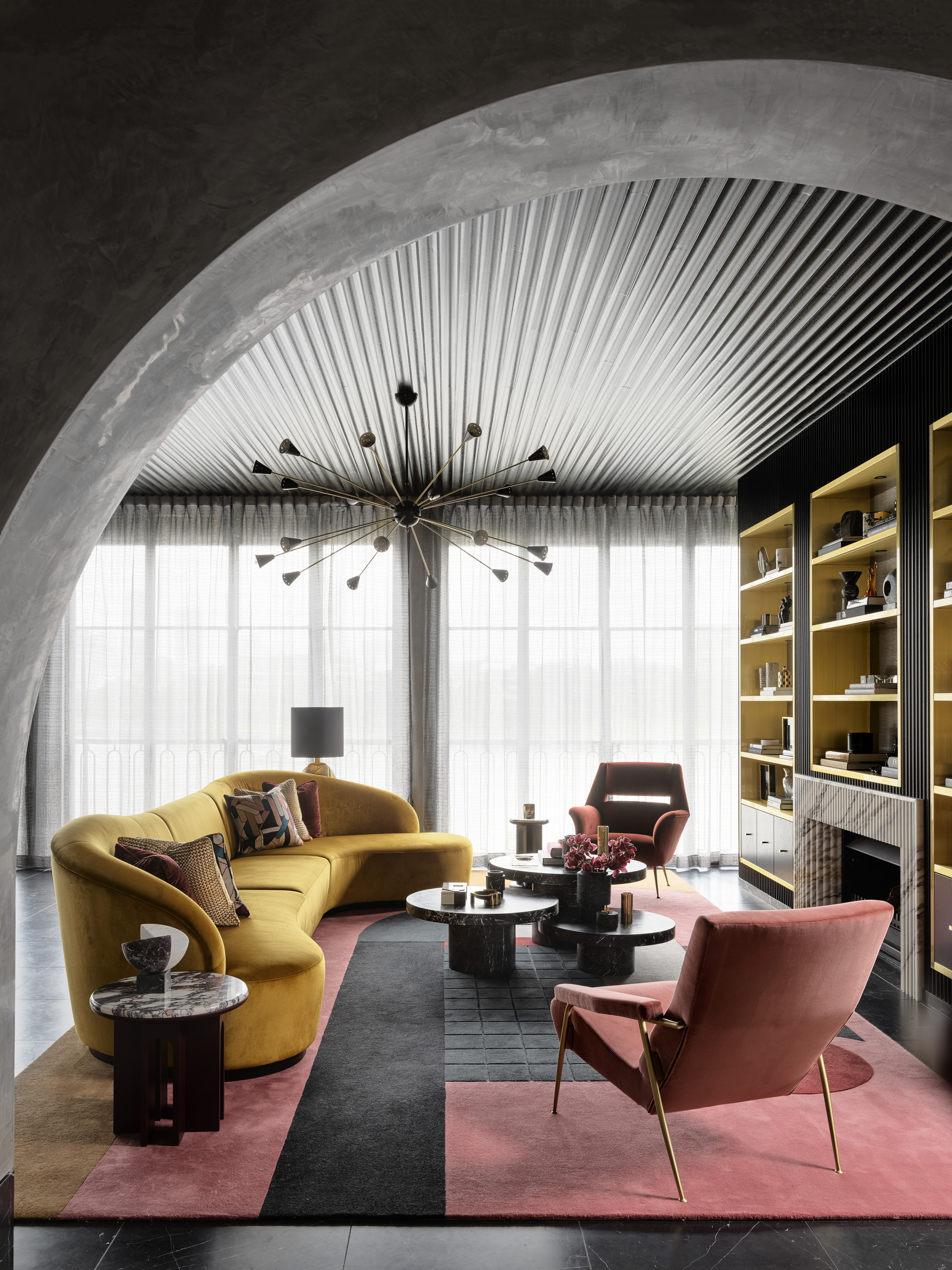
Enigmatic and engaging, this powerful project from Australian interior designer, Greg Natale showcases how vibrant hues can be used and still feel balanced when presented in the right way.
Natale’s advice for a harmonious interior focuses on being brave with your choice of colors and creating just enough contrast. 'The golden number for a harmonious color scheme is 5 to create an endearing level of clash,' Greg says. 'For this living space in the East Brisbane home, I’ve used grey, mustard, black, pink, and red brick to create stylish contrast.'
The Livingetc newsletters are your inside source for what’s shaping interiors now - and what’s next. Discover trend forecasts, smart style ideas, and curated shopping inspiration that brings design to life. Subscribe today and stay ahead of the curve.
The pink and red feel tonal but share the warmth and joy of the spiced mustard, all coming together in the living room rug. Grey and black serve as grounding actors in this scene and help tie everything together.
3. Bring in warm & cool colors

Austin-based practice, Cuppett Kilpatrick Architects showcases how 5 colors can come together to create a calm and inviting interior. Their Castle Hill project presents warming caramel and russet tones alongside cooling teal, and grays. When asked about his golden number for a harmonious interior, founder Tim Cuppett highlights the importance of variety.
'I would say 5 minimum so that I can include different shades,' says Tim. He also takes inspiration from the natural world. 'As in nature, the most comfortable color palette consists of warm and cool colors. Broken down further, various shades of one color add depth and interest... by themselves I think those would qualify as multiple colors,' he adds. Cuppett’s advice is a good color rule when choosing your 5 final hues to ensure a visually balanced interior.
4. Go tonal with a trio of shades
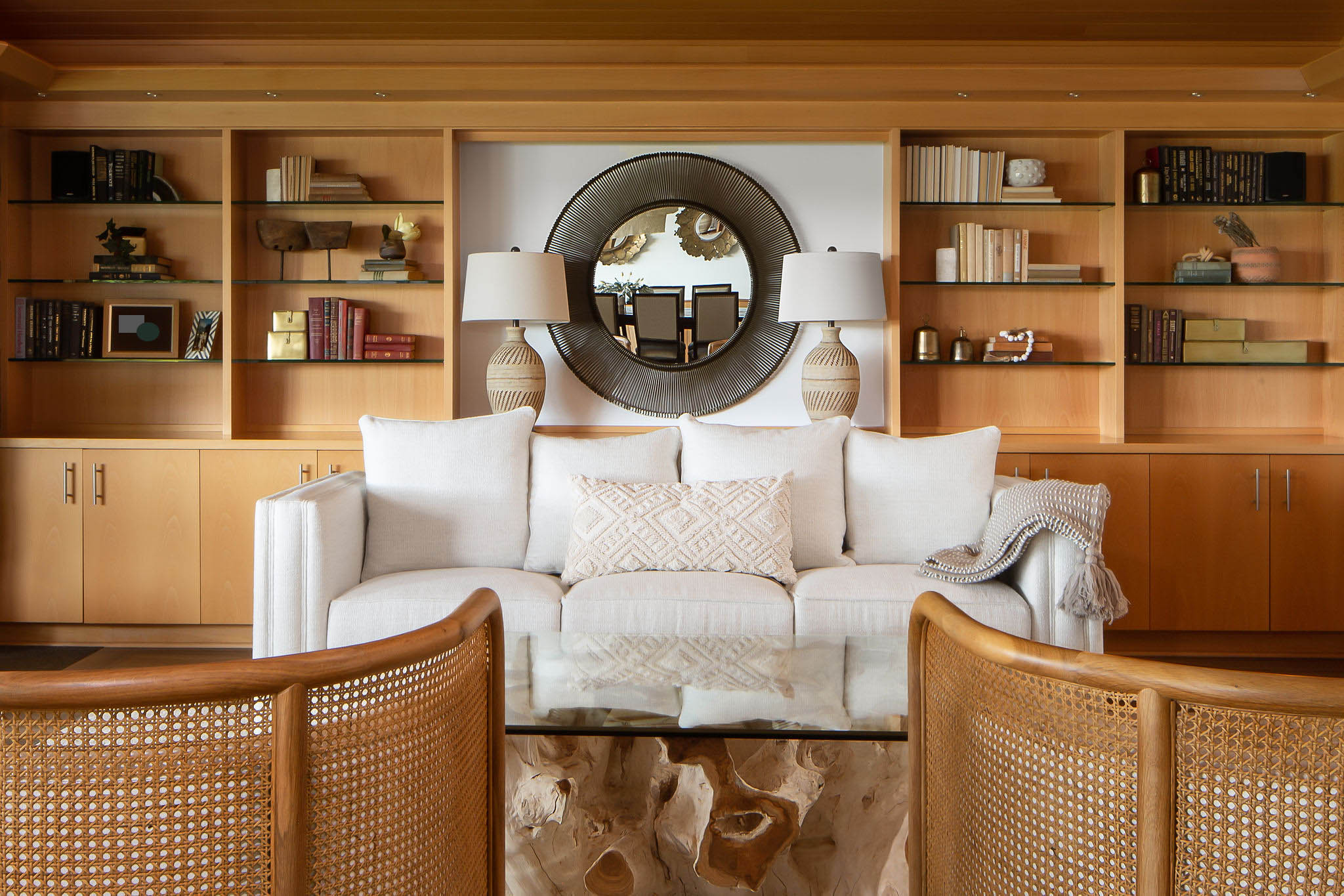
Neutral spaces also benefit from this visual formula for success as demonstrated by this organic and sleek space designed by Allison Lind Interiors. 'Best to keep it to 3-4 variations of the same color as to not confuse the eye – you want it to feel intentionally tonal vs. a hodgepodge after-thought,' says Allison Lind, Design Director of Allison Lind Interiors.
By taking this tonal approach, not only is your interior guaranteed to feel cohesive but any awkward clashing colors are carefully avoided. Allison’s advice for those seeking a more pared-back palette is to focus not just on the choice of colors but also on the interplay of textures in the room. 'In this case, the millwork provided all the richness and color we needed, and so a palette of tone-on-tone creams and whites, mixed with assorted textures to bring depth and warmth to the space. Filling the bookshelves with some neutral but more deeply colored (think deep reds, dark greens, browns, etc.) helped the space from falling too flat,' reveals Allison.
Writer and design expert Faaizah Shah is the founder of The Interiors Consultancy. She has worked with designers such as Staffan Tollgard and design houses such as Sanderson to help them understand and communicate their narratives. She is known for crafting engaging stories and imaginative content, and understanding great decor from her years alongside some of the best creatives in the industry. She is also a contributor to Livingetc.