Trending: This Month's 10 Most Popular Posts On Instagram

If September's most popular Instagram posts are anything to go by, we're ready to dive into deep, dramatic blues.
Vibrant Inky Blues and electric Turkish Blues are fast overtaking the summer's lighter, cooler shades like Swimming Pool Blue and Sky Blue, leaving us longing for dark blue kitchens, darker hallways and dark and moody living rooms.
These are the 10 images you've loved most.

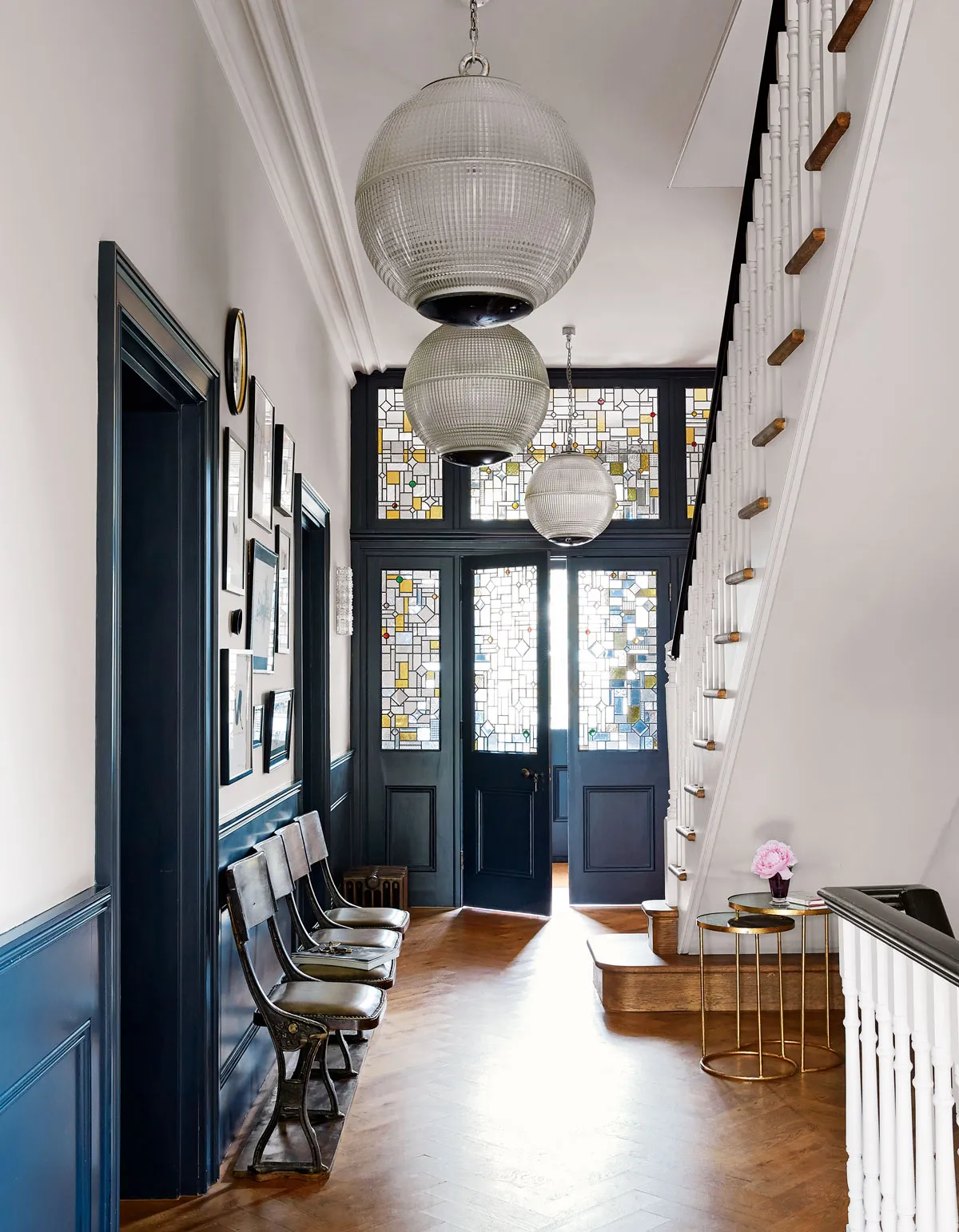
1. STATEMENT HALLWAY
This statement hallwaydemonstrates how dramatic dados and door frames pair perfectly with crisp white walls. The stained glass, tall ceiling, white walls and stairs prevent the space from feeling too dark.
2. INTO THE DEEP
Wall-to-wall deep blue offers the perfect backdrop to make neon details pop.
3. INKY IKAT
Another space that beautifully showcases the timeless colour pairing of navy blues offset by crisp whites. The navy and white Ikat rug helps tie the whole look together.
4. TEAL APPEAL
Continuing the blue trend, this lush blue space feels cosy and inviting – perfect for curling up in on dreary, wet evenings.
5. TRIPPY TABLEWARE
Love pretty, decorative plates? You'll love Bethan Gray's Lustre collection that she launched at Decorex last month...
6. PALM SPRING BRIGHTS
Bright pops of yellow and turquoise create a zesty yet glamorous mood in this Palm Springs inspired living space.
7. COSY NOOK
Taking a breather from dark, dramatic hues, this rustic, English country kitchen offers the perfect window spot for reading the papers on a rainy morning.
8. NEUTRALS
Another pared-back scheme, this soft palette of autumn neutralscreates a restful living room, livened up with pops of green and faux flowers.
9. VELVET BED
Haven't been seduced by a velvet bed yet? Maybe this dark blue number will change your mind – with matching textural bedspread and sumptuous stonewashed linen bedding. Divine.
10. PRETTY PATTERN
Ombre curtains, wall-to-wall pattern and pops of pink are pulled together seamlessly in this co-ordinated colour scheme.
