The Livingetc newsletters are your inside source for what’s shaping interiors now - and what’s next. Discover trend forecasts, smart style ideas, and curated shopping inspiration that brings design to life. Subscribe today and stay ahead of the curve.
You are now subscribed
Your newsletter sign-up was successful
Since starting design studio No.12 in 2015, Katie Earl and Emma Rayner have worked on everything from small apartments to vast penthouses, female-only member’s club The AllBright in London’s Fitzrovia to prominent new residential developments suchas The Gasholders in King’s Cross. Here, they share their design inspirations…
HOW DID YOU GET STARTED?
Emma: I have a background in furniture design – after studying a BA at Kingston University, I went to work for a furniture designer and upholsterer in Bath, learning the ins and outs of both the craft and trade. Katie: I studied interior architecture at Manchester University. I’d wanted to be an interior designer since I was 12 – every month, I made my mum take me to B&Q, so I could repaint and restyle my bedroom. On holiday, I used to take graph paper with me, so I could reorganise the places we stayed in. I was obsessed.
Article continues below 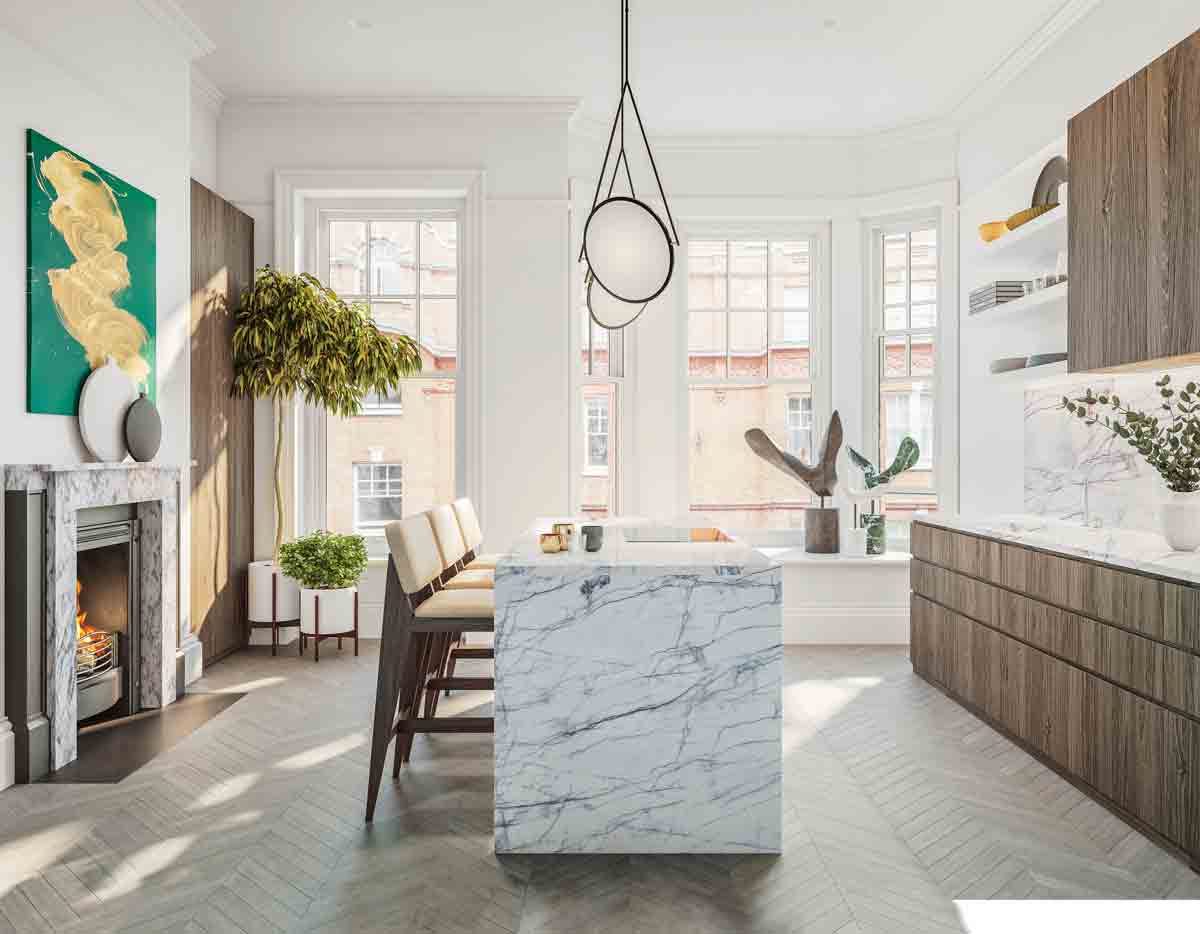
WHERE DID YOU MEET?
Emma: We both went from working in a team of 70 at the design studio 1508 London to a small practice of just eight, including us. It’s where our mutual style was really cementedtogether, but we were working so hard, it made us wonder why we shouldn’t do it for ourselves instead.
WHAT WAS YOUR FIRST BIG BREAK?
Emma: Joining forces with Wilkinson Eyre to design the interiors of apartments at The Gasholders really kick-started the practice. The AllBright club put us on the map.
The Livingetc newsletters are your inside source for what’s shaping interiors now - and what’s next. Discover trend forecasts, smart style ideas, and curated shopping inspiration that brings design to life. Subscribe today and stay ahead of the curve.
DESCRIBE YOUR STYLE?
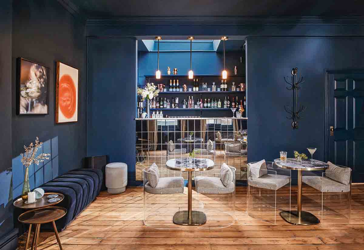
Emma: As female designers, it’s inherently quite masculine. Katie: It’s funny because people assume the opposite – super-luxxy, pretty spaces. Instead, it’s always very bold, simple and clean. For example, for The AllBright club – just because it’s for women, didn’t mean it needed to be pink.
WHAT'S YOUR STARTING POINT?
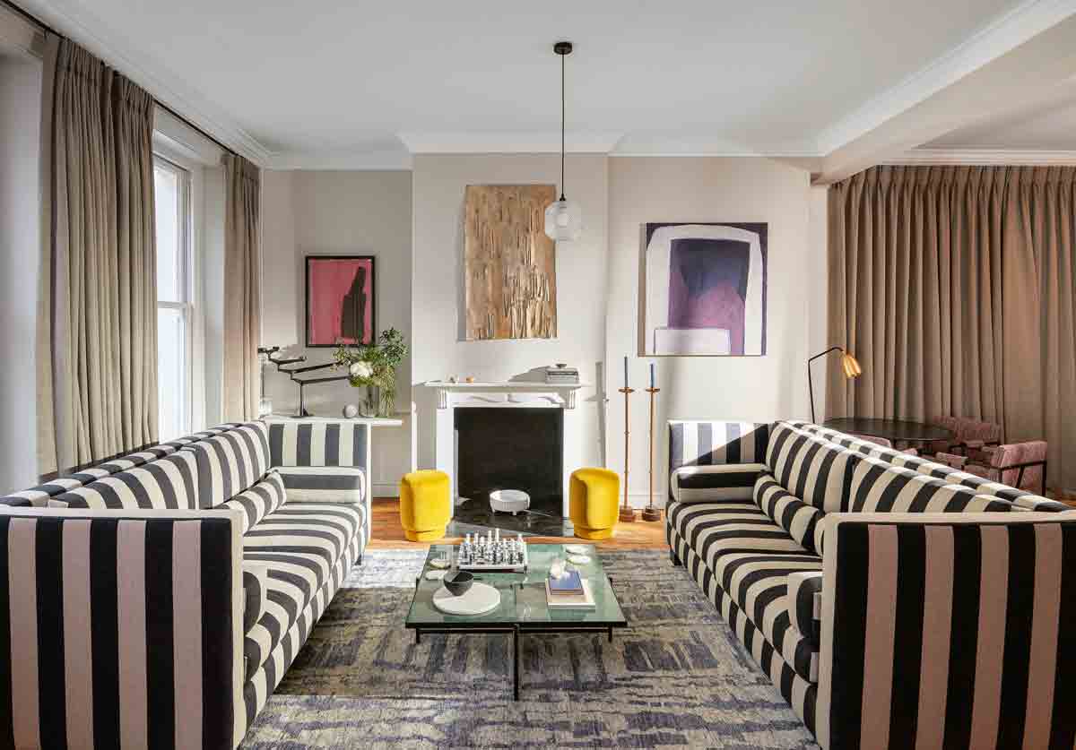
Katie: The design for each project starts with the building – we dig into its history, who lived there, or for a new build, what happened around the area before it was built. For The AllBright in Fitzrovia, we drew on the art of Vanessa Bell of the Bloomsbury set as a reference for colour. It’s never just about what we like – it needs to have more reason than that.
DESCRIBE YOUR DESIGN PROCESS?
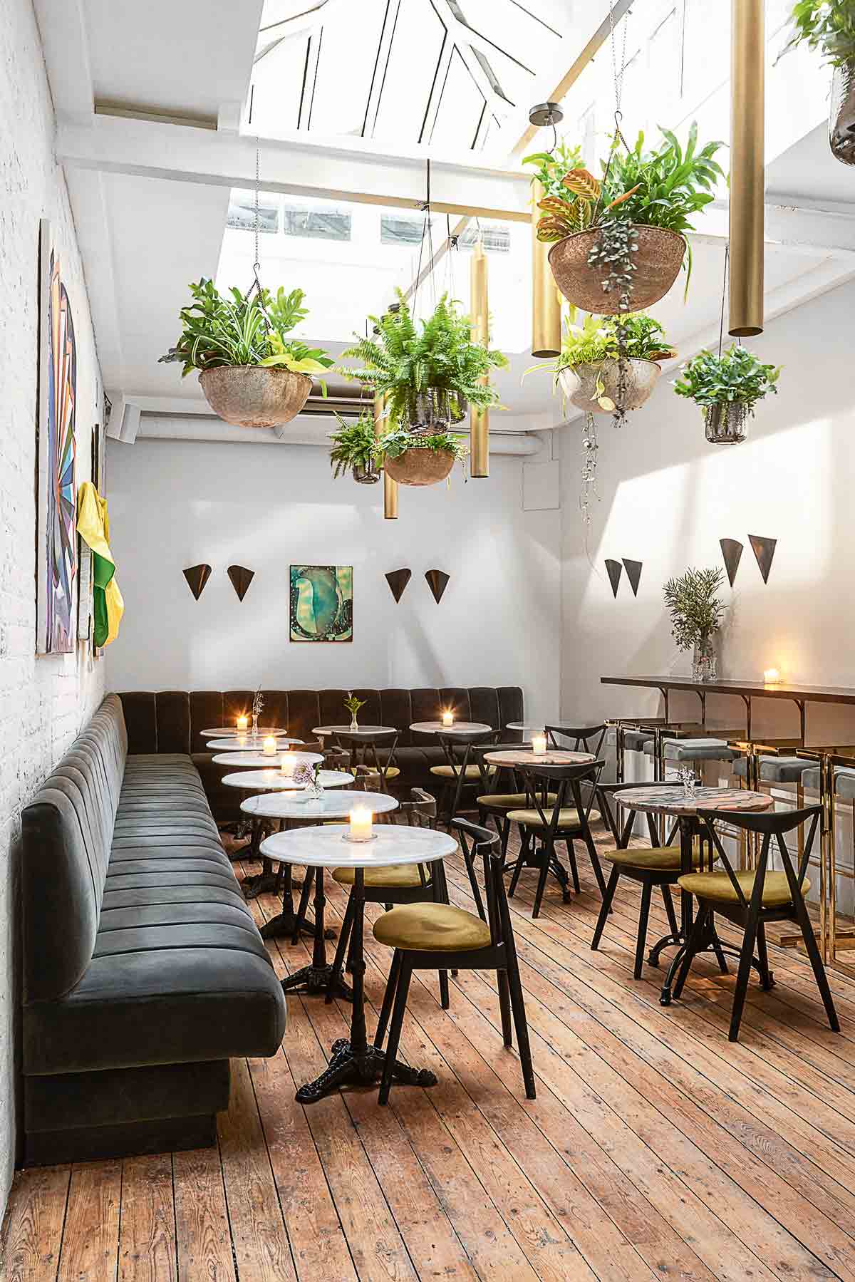
Emma: We don’t believe stylish means more layers, more adornment, more ‘show’. We think the biggest luxuries are calm, space, light and beauty. We appreciate when things are made properly. Katie: We like celebrating the detail: the beautiful weave within a fabric, the way joinery interlocks on a piece of cabinetry. We strip it all back – we like proving that simplicity can be as much of a statement as adornment.

WHAT PIECES ARE YOU DRAWN TO?
Emma: It isn’t about the era or heritage, it’s about the feeling one piece gives off when sitting next to another piece. Wehappily mix old and new, but never with too much of the same material – it unbalances the mood of a room.
WHAT'S YOUR COLOUR PALETTE?
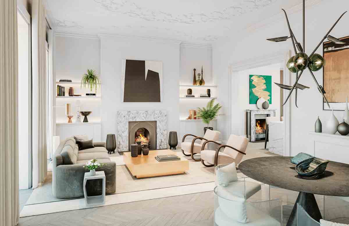
Emma: We like very rich, desaturated tones in green, blue, mustard, black, white and grey, warm not cold. Katie: We use red quite a lot too, but never in a telephone or post-box red – it would be a claret or burgundy because it’s richer, deeper and stronger.
HOW DO YOU DECIDE ON THE PIECES FOR A ROOM?
Katie: We print out pictures of every piece we’d like to use and group them together by room – we never look at each piece on its own – and then lay all the rooms out to see how it feels as a whole. You don’t want to walk into one room with a mid-century Scandi vibe and then walk into another that’s all shabby chic. It helps discern which pieces stay and how to achieve consistency throughout.
WHAT ABOUT LIGHTING?
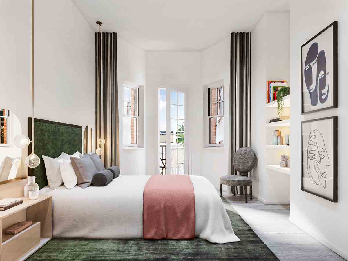
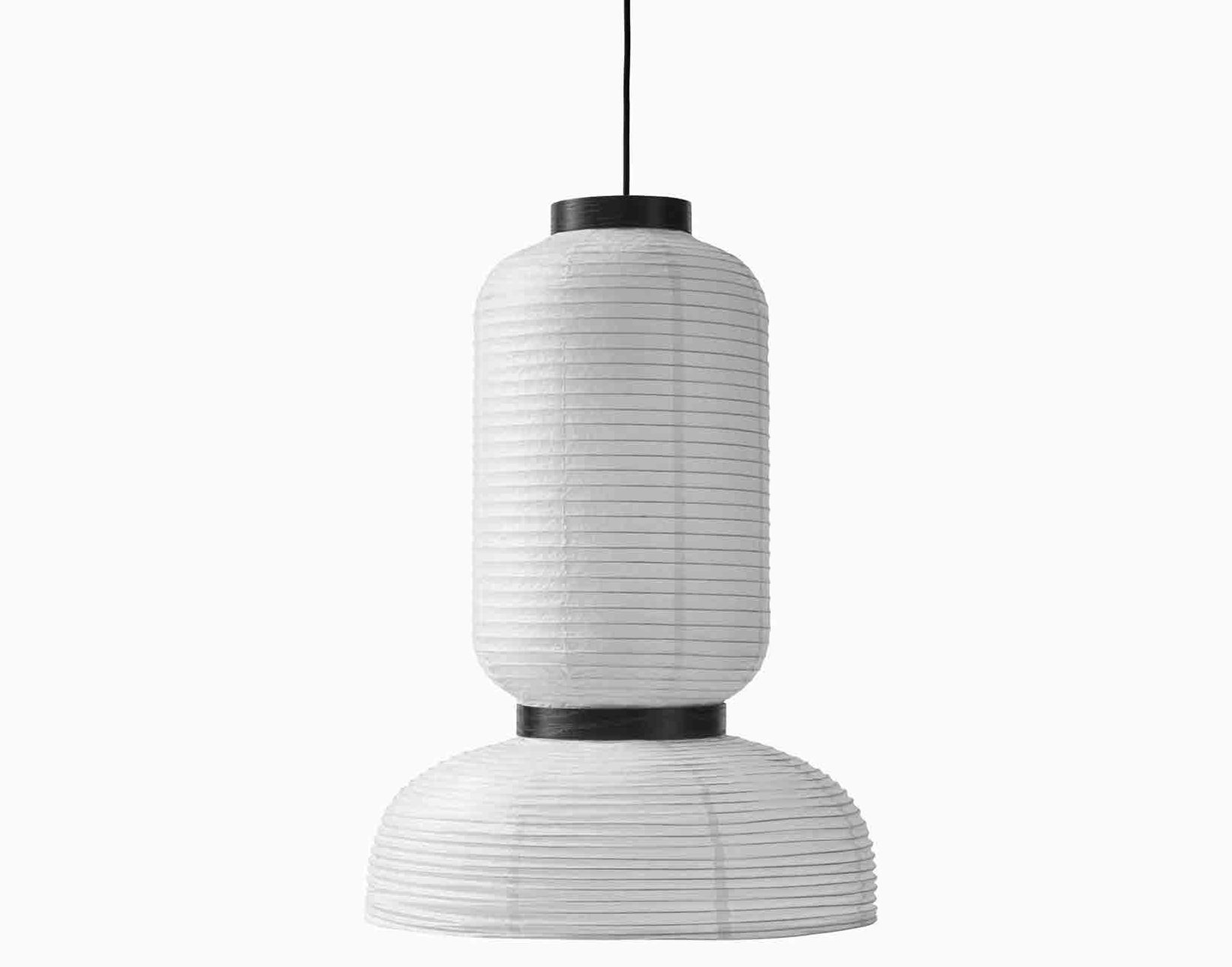
Emma: Warm white bulbs make a spacefeel comfortable and make people look good. For bedrooms, we alternate lighting to add a point of difference to the hierarchyof rooms – if we use pendants in the master bedroom, we’ll use table lamps or wall lights in a guest room. In living rooms, we play with varied heights ofmulti-drop pendants, like Jaime Hayon’s Formakami designs for &Tradition, to connect higher ceilings to furniture at lower levels.
IS TEXTURE IMPORTANT?
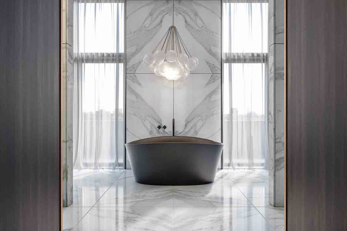
Emma: We celebrate the quality of materials – seeing the grain of a timber, the weave in a linen, the vein of a stone or marble. We use texture rather than colour to keep things as pure as possible. Katie: We never use faux materials, for example, a printed tile to look like stone or a laminate.
Emma: If you love timber, say an exotic wenge, but can’t afford it, stain a solid wood like oak dark rather than use a laminate. Rugs are also a great way to bring in added depth – we use Holland & Sherry for the interesting textures and mix of materials like leather, wool and jute.

HOW ELSE DO YOU LEND DEPTH TO A ROOM?
Katie: Artwork doesn’t have to just be a framed photograph or painting – play with pieces like a tapestry (rodded and hung or box framed), ceramics and glass. We also like hanging strips of wallpaper, like Kelly Wearstler’s Jubilee, in place of artwork.
WHAT ABOUT IF YOU'RE ON A BUDGET?
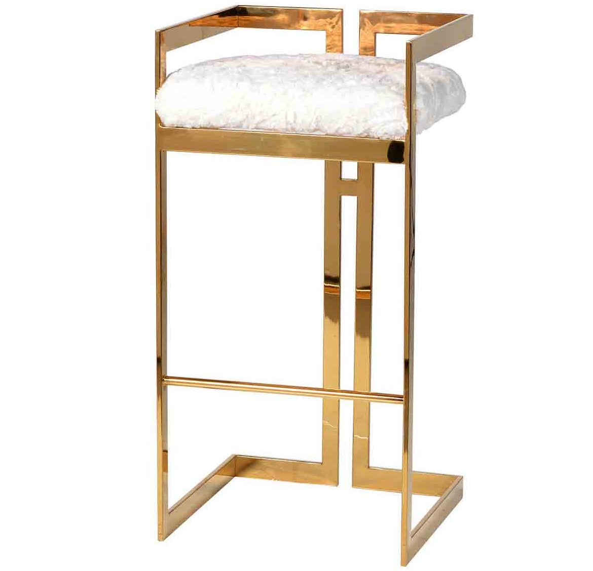
Emma: If you can’t afford to have lots of one beautiful material, use a small bit well. We transformed Seventies-style gold bar stools from Out There Interiors by reupholstering the seats in a grey velvet from Northcroft Fabrics.
WHERE DO YOU SOURCE YOUR FAVOURITE PIECES?
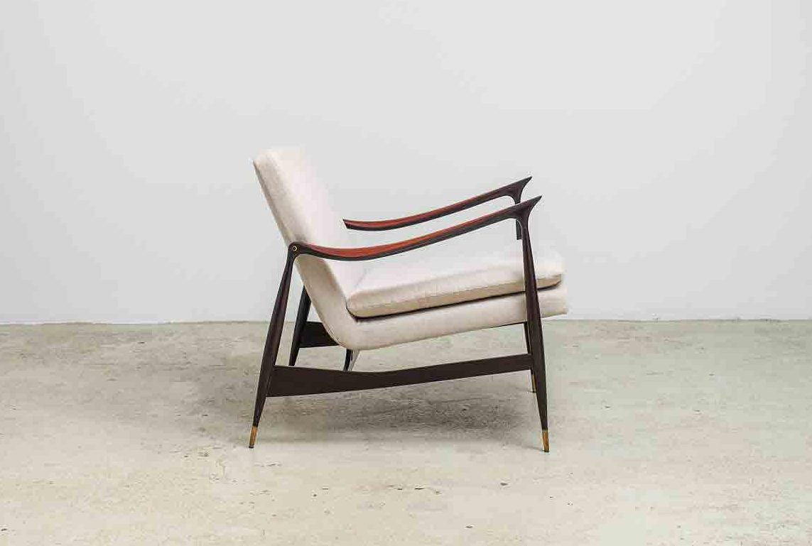
Katie: We love eBay – what we don’t know about what’s on eBay isn’t worth knowing. We’ve recently been looking at pre-mid-century pieces with inlay and marquetry details. Emma: For something modern, Espasso’s Dinemaquesa armchair by Jorge Zalszupin never fails to impress.
WHAT DOES HOME MEAN TO YOU?
Emma: It needs to be an extension of yourself – you have to love everything in it, it doesn’t matter if anybody else likes it.
For more info on No.12, check out No12studio.com
The homes media brand for early adopters, Livingetc shines a spotlight on the now and the next in design, obsessively covering interior trends, color advice, stylish homeware and modern homes. Celebrating the intersection between fashion and interiors. it's the brand that makes and breaks trends and it draws on its network on leading international luminaries to bring you the very best insight and ideas.