Dulux Color of the Year 2022 - interior experts react to the color trend for the year ahead
The Dulux Colour of the Year 2022 Bright Skies promises to be a breath of fresh air for our homes
The Livingetc newsletters are your inside source for what’s shaping interiors now - and what’s next. Discover trend forecasts, smart style ideas, and curated shopping inspiration that brings design to life. Subscribe today and stay ahead of the curve.
You are now subscribed
Your newsletter sign-up was successful
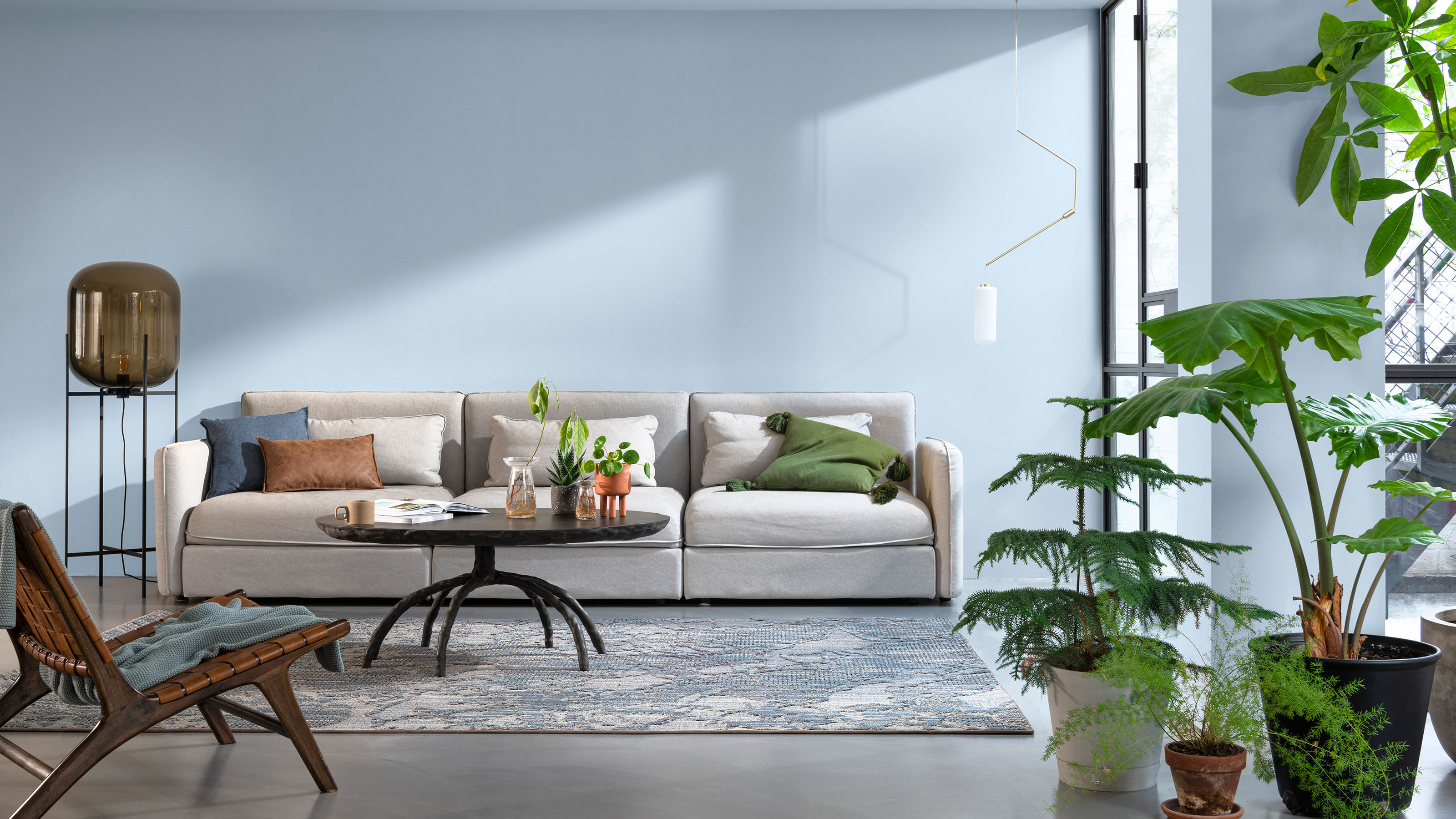
In a year that has seen many of us indulge in a grounding color palette of green and beige, Dulux Color of the Year 2022 Bright Skies came as a bit of a shock.
Bright Skies is an airy light blue designed to feel optimistic, like a breath of fresh air in your home. The paint shade that could shape home decor color trends in 2022, was created in response to two years of countless lockdowns confining us indoors.
'Right now, people want to feel revitalized and enjoy the freedoms that are returning to them, to look out and bring in new ideas. What better inspiration can we take than the endless skies around us?' explains Marianne Shillingford, Creative Director of Dulux UK.
Article continues below 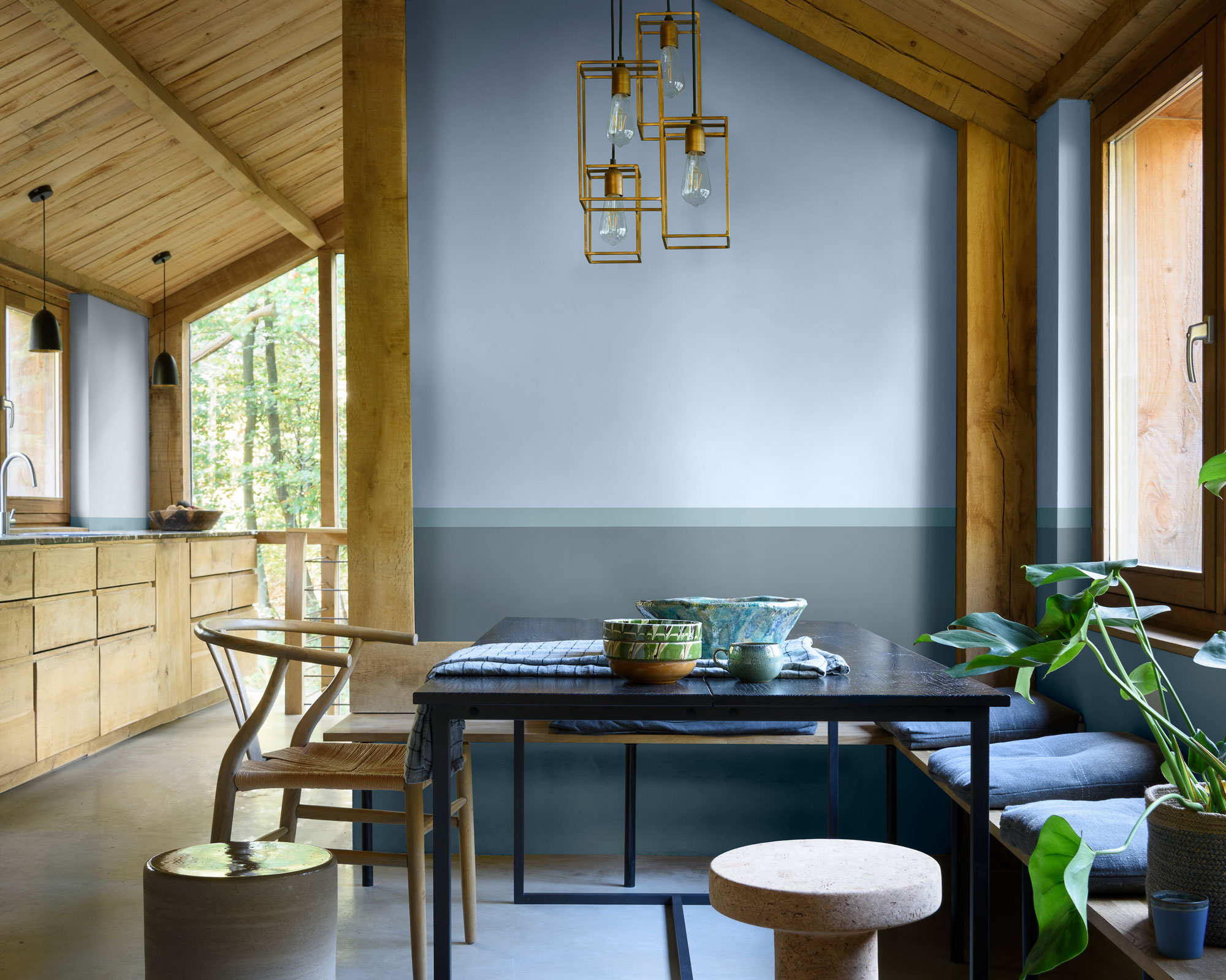
However, while blue bedroom ideas continue to be a smart move when creating a peaceful place to sleep, decorating with light blue isn't the easiest task.
The cool shade has drawn mixed reactions from interiors experts. We asked a few of our favorite interior designers and Livingetc color experts for their reaction to Bright Skies and how they'll be using it.
Eva Sonaike
Designer Eva Sonaike has built her brand around bold color palettes and can't wait to embrace the new Dulux Color of the Year 2022.
'I love Bright Skies and feel that is the best color choice for the forthcoming year,' she says. 'Our homes have become more important than ever for us over the last years and we are all in desperate need of a bright and airy shade that signifies hope and a new beginning.'
The Livingetc newsletters are your inside source for what’s shaping interiors now - and what’s next. Discover trend forecasts, smart style ideas, and curated shopping inspiration that brings design to life. Subscribe today and stay ahead of the curve.
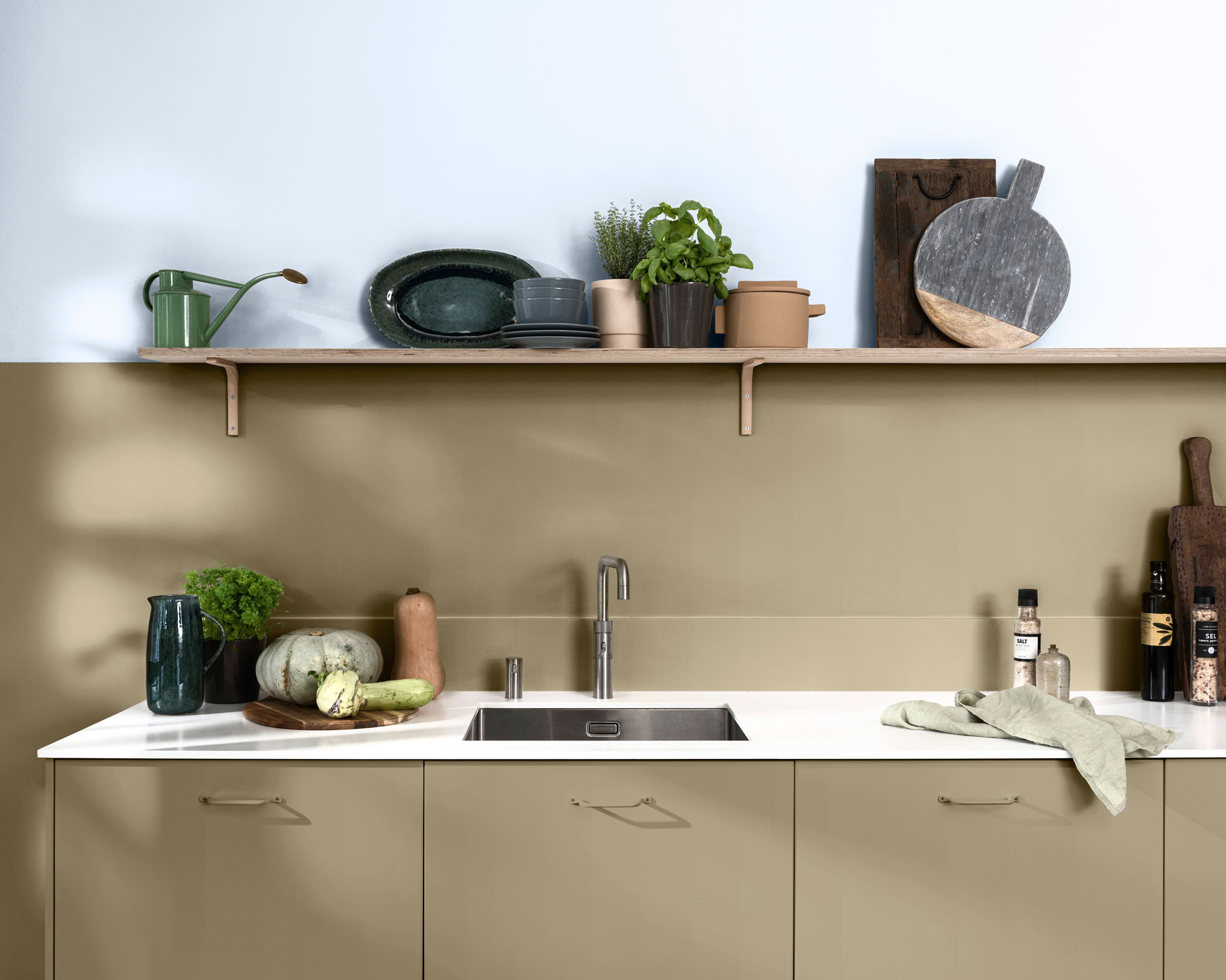
Eva praises the versatility of the new shade. 'It truly breathes new life into any space and as it is such a light and easy color to work with that it can be combined with an array of other hues to either make a statement or blend into the background.'
The creative director suggests mixing it with neutral living room ideas for a modern twist. 'Despite being from the cooler color spectrum, Bright Skies still has a warm feeling to it. I love combining it with neutral tones and patterned soft furnishings for an elegant look.'
Kit Kemp
Interior designer Kit Kemp is no stranger to color. Rich oranges and blues fill the Firmdale Hotels and Kit Kemp Design Studio where she is Founder and Creative Director.
However, despite blue being one of the designer's favorite colors to use, she is hesitant about the warmth of Bright Skies.
'It is always exciting to hear the new color of the year. Blue is a perennial favorite, but for me, Bright Skies is cool rather than a warm blue,' she says.
'In fact, the whole color palette is all cool shades. I love warmth and brightness so I personally will not be using these colors in a hurry.'
Pip Rich
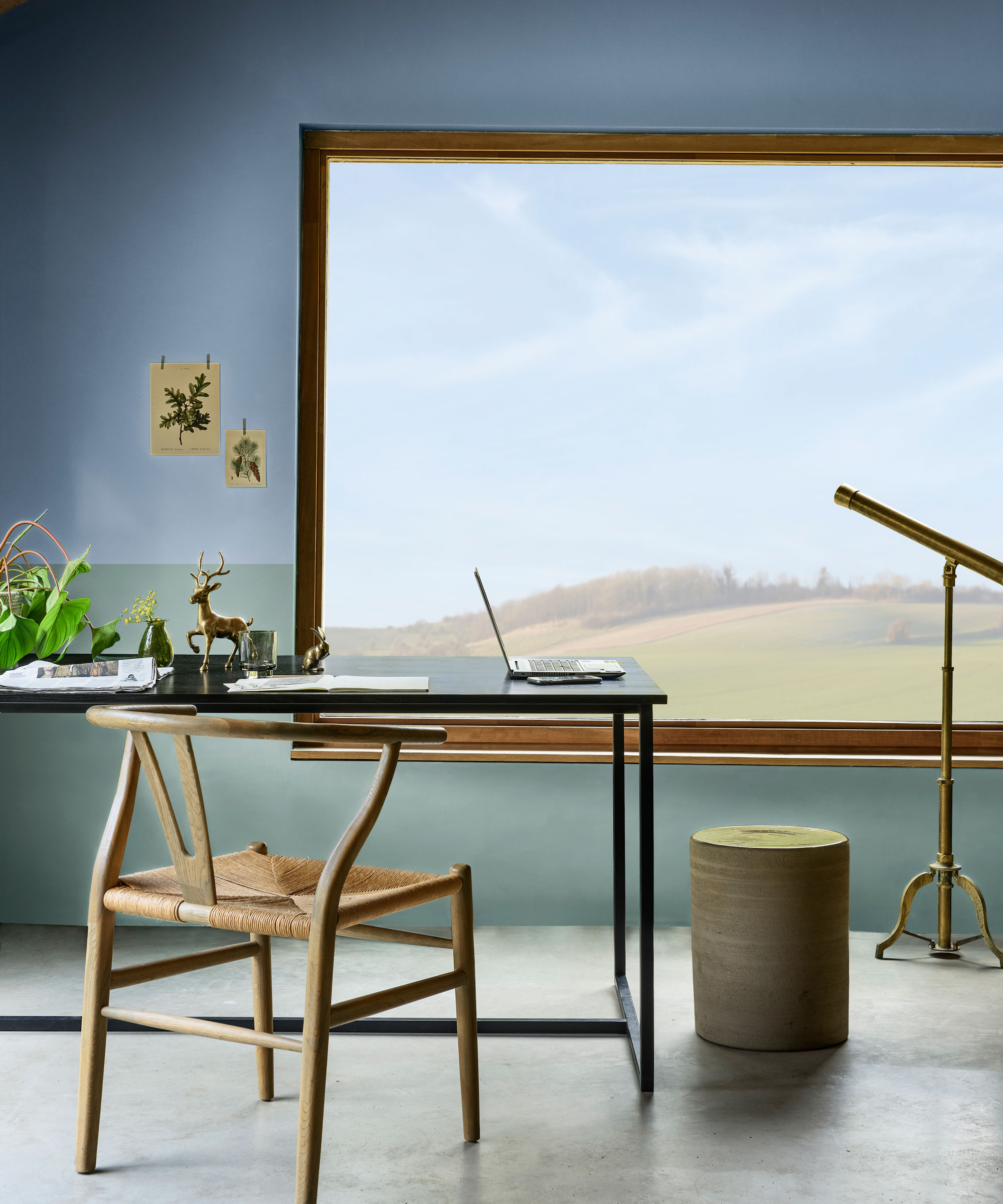
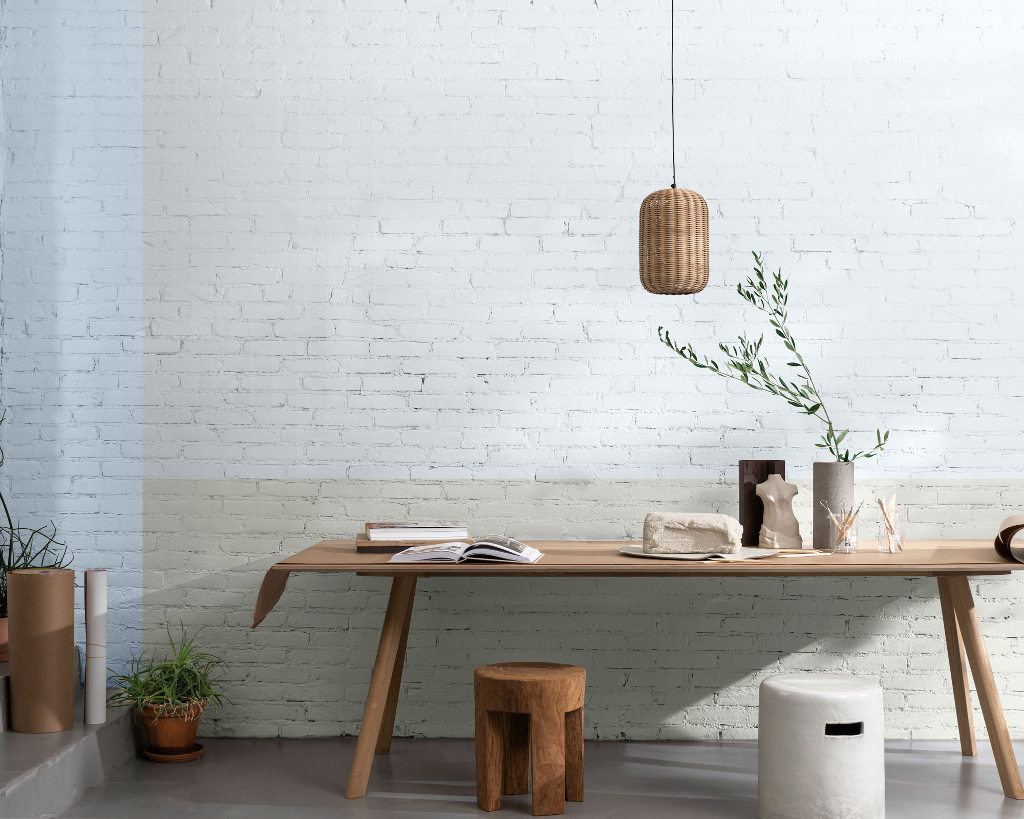
Pip Rich, Livingetc Editor, admits that while blue isn't in his usual color palette he can see Bright Skies shining in a bright room.
'I don't find blue the easiest color to decorate with - I prefer the softer tones of green and grey and off-whites,' Pip explains. 'But because this particular shade of blue is more knocked back than you might expect, it's not as vivid as its name suggests.'
'I'd use it in a well-lit room - I think it could have the tendency to look cool otherwise - with greyed-out yellows, wood, and travertine. A modern take on shades found on a sunny day at the beach.'
Busola Evans
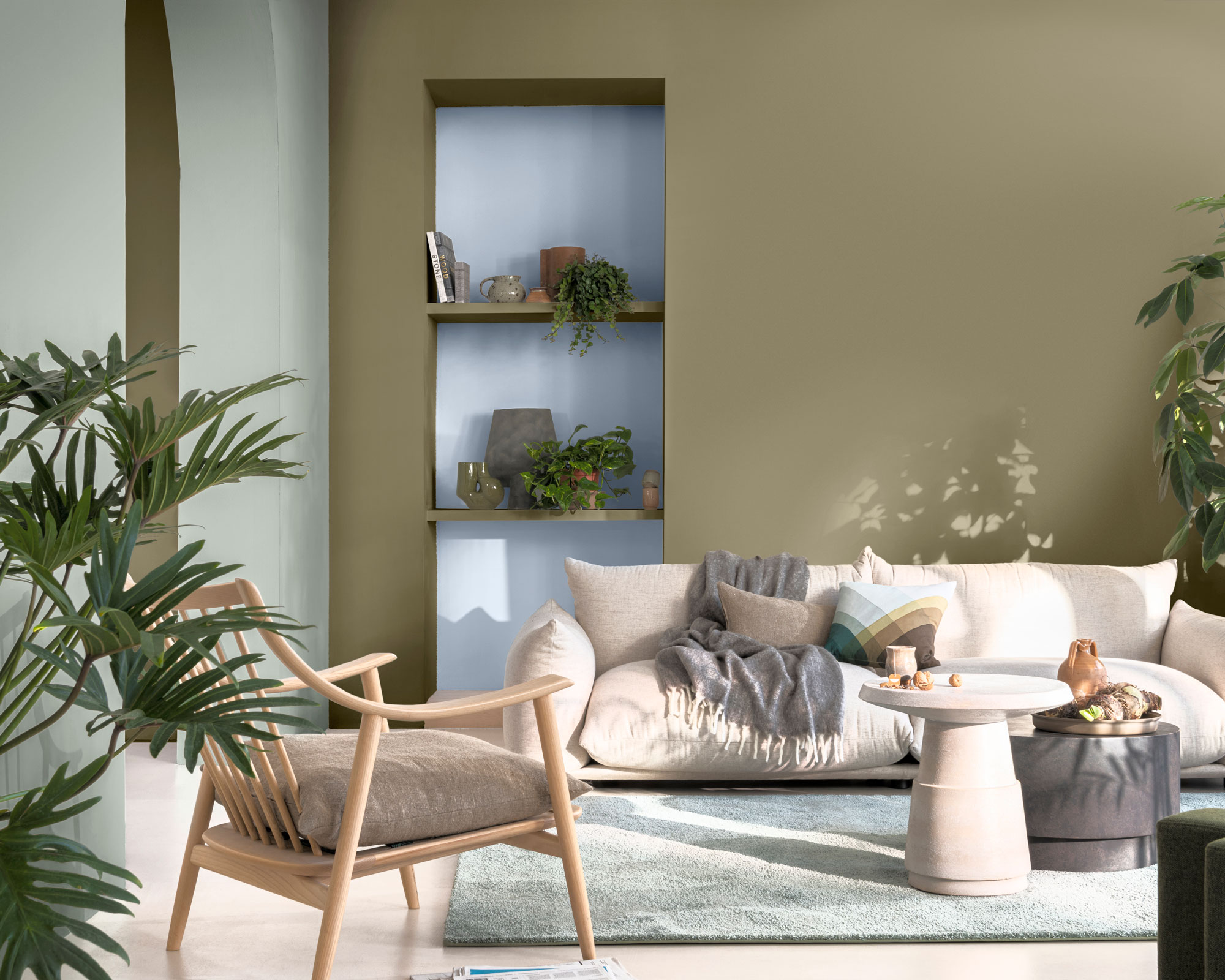
Livingetc's Associate Editor, Busola Evans, praises Bright Skies' versatility for pairing with bright pink and red accents.
'It's a versatile blue and the gentle design palette cleanser that many of us need after a challenging 18 months,' Busola explains.
'Not only does it have an obvious connection to nature which makes it feel incredibly soothing, it also has grey undertones which makes it work well with punchier colors like pinks and reds.'
Nicky Mudie
Nicky Mudie, founder of West London interior design studio Violet & George, believes Dulux has really tapped into what people want from their homes in 2022 with Bright Skies.
'Our clients are becoming more and more confident with color which is exciting for us,' Nicky explains. 'Where they once would ask for grey walls they are now asking for soft, easy colors that they won't tire of, such as millennial pink or pale blues.'
'This warm, gentle blue is a great blue that we can see our clients feeling very confident with. It is neutral and will work with most colors as it has a tint of red to it so is warm and won't clash.'
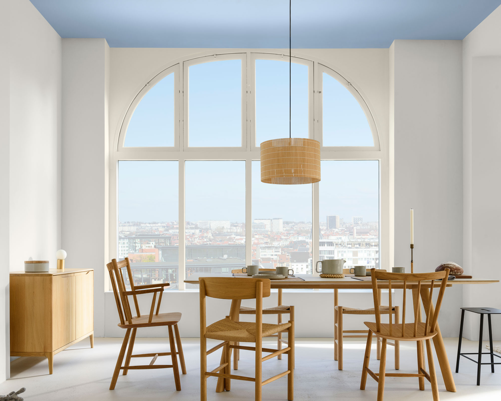
Many of us used the past year to bring a range of natural biophilic shades into our homes (those green and beiges again). Marianne Shillingford explains that this light blue is the missing piece in bringing the indoors inside.
'We're used to bringing green into our homes in plants, we're not so used to bringing the sky into our home, other than through the window.'
Whether you love the color, hate it, or are still on the fence, Marianne has one bold suggestion for using a color that isn't a painted wall idea. And it could just change your mind - paint it on the ceiling.
Could light blue really be the new hue of 2022?
Rebecca was the former News Editor on Livingetc.com. She has worked as an interiors journalist since graduating with a Masters in Magazine Journalism from City, University of London in 2018. She started out her career working on women's weekly magazines but made the shift to digital journalism in 2019 to join the Ideal Home website team as a news and features writer.
During that time, she nurtured her love of interiors and trends and received a nomination as AOP Digital Publishing Rising Star 2020. Outside of work, she loves to sew, knit, and try her hand at a range of new crafts, she is also currently dabbling in ceramics. She can't think of a better way to spend her weekend than browsing a haberdashery or antiques fair for hidden design treasures.