WHAT INSPIRES EACH NEW COLLECTION?
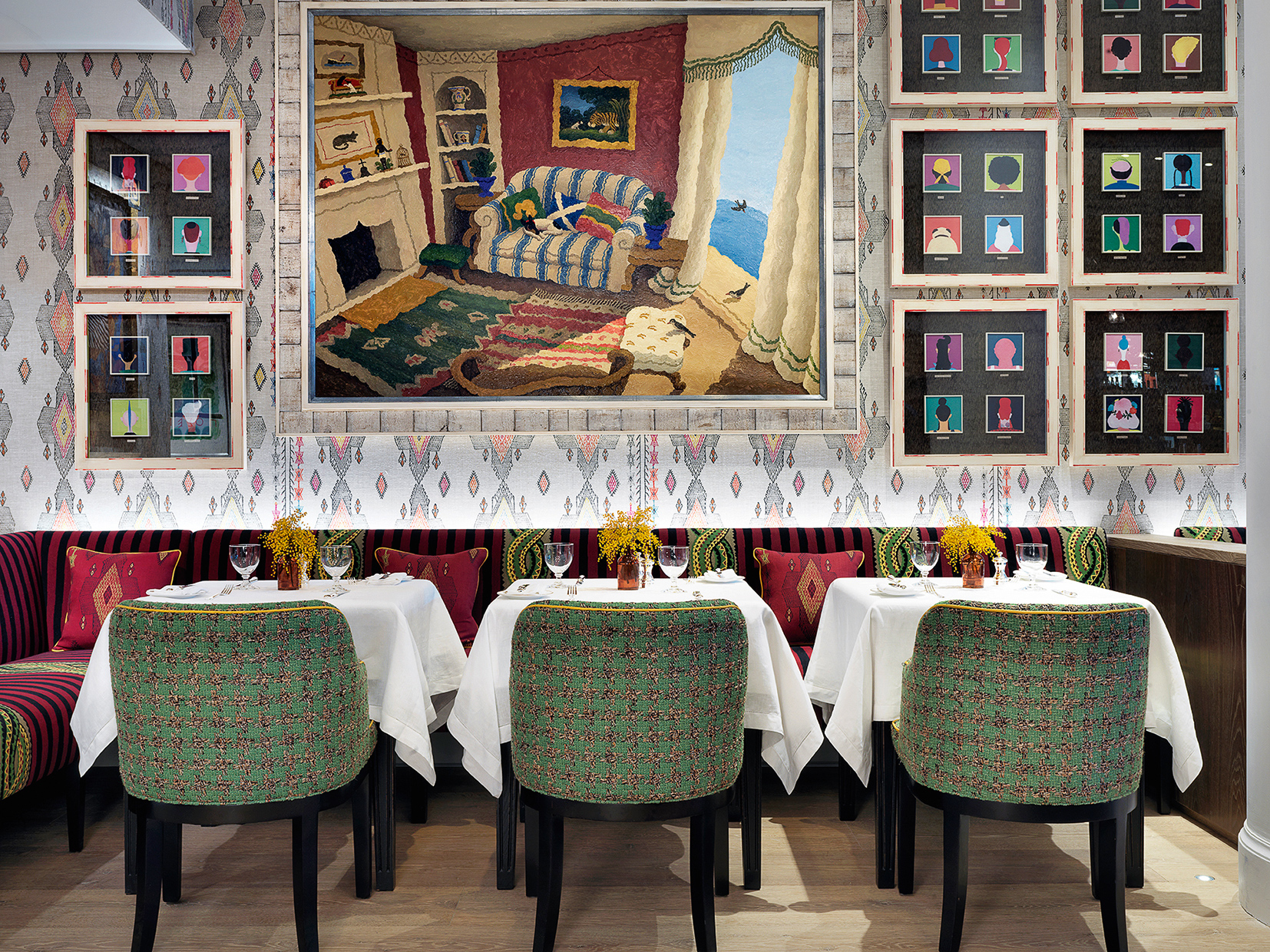
When people think of Christopher Farr, they think of our colours – hot pink, indigo, emerald green and yellow. We don’t follow trends and there’s never really a precise starting point – our design process is very organic. There’s never a deadline, launches can be big or small – we’re not under pressure to create 30 new designs in five colourways every season, so what we create is something we truly love.

WHERE DO YOUR IDEAS COME FROM?
Article continues belowWhen working with a designer like Kit Kemp, she often starts with something like an old piece of fabric, a piece of trim she found in India or the intricate stitch of a Peruvian blanket. We’ll then elaborate and transform it into something else. For new wallpapers, we might take a pattern that’s been doing well as a fabric and try it on an interesting material like grass cloth to see how it works.
WHAT MAKES YOUR PRINTS SO SPECIAL?
We work with a small screen printer outside of London – there’s something very authentic about hand-printing, I love the imperfections that come with the softness and movement of a hand spreading colour across a screen.I embrace the mistakes and nuances from one production to the next – something you can’t produce digitally.
WHAT'S BEEN YOUR MOST SUCCESSFUL PATTERN?
The Livingetc newsletters are your inside source for what’s shaping interiors now - and what’s next. Discover trend forecasts, smart style ideas, and curated shopping inspiration that brings design to life. Subscribe today and stay ahead of the curve.
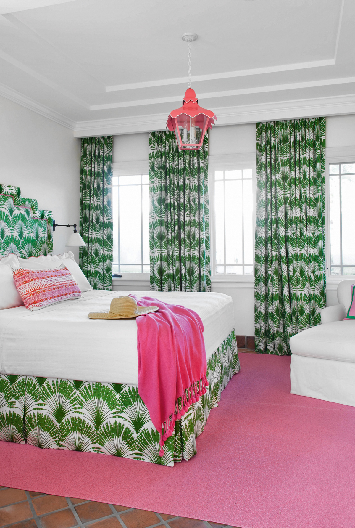
Michael Szell’s Carnival – at the end of every year, I see the figures for what’s sold the most and every year, I hope maybe something new will be at the top of the list, but sure enough, it’s always Michael’s Carnival in green. I don’t know what makes it so great – maybe it’s because it first came out at a time when small florals were popular, or just that it’s a happy pattern in bold colours you can build a room around. The fact that you can’t define it is what makes it so interesting.
WHAT'S A GOOD STARTING POINT WITH PATTERN?
Colour and pattern are so personal – if you don’t feel comfortable, start slow. Do a neutral room with one chair that has some patterned personality or do a row of really great big pillows across the sofa or bed. As you start to get used to it, find patterns that help tell your story. It’s like clothing – you might dress all in black, but it’s the way you team it with a beautiful piece of jewellery that makes you look interesting. Pattern helps to create much more personal, unique spaces.
HOW DO YOU KNOW WHICH PATTERNS WILL WORK BEST?
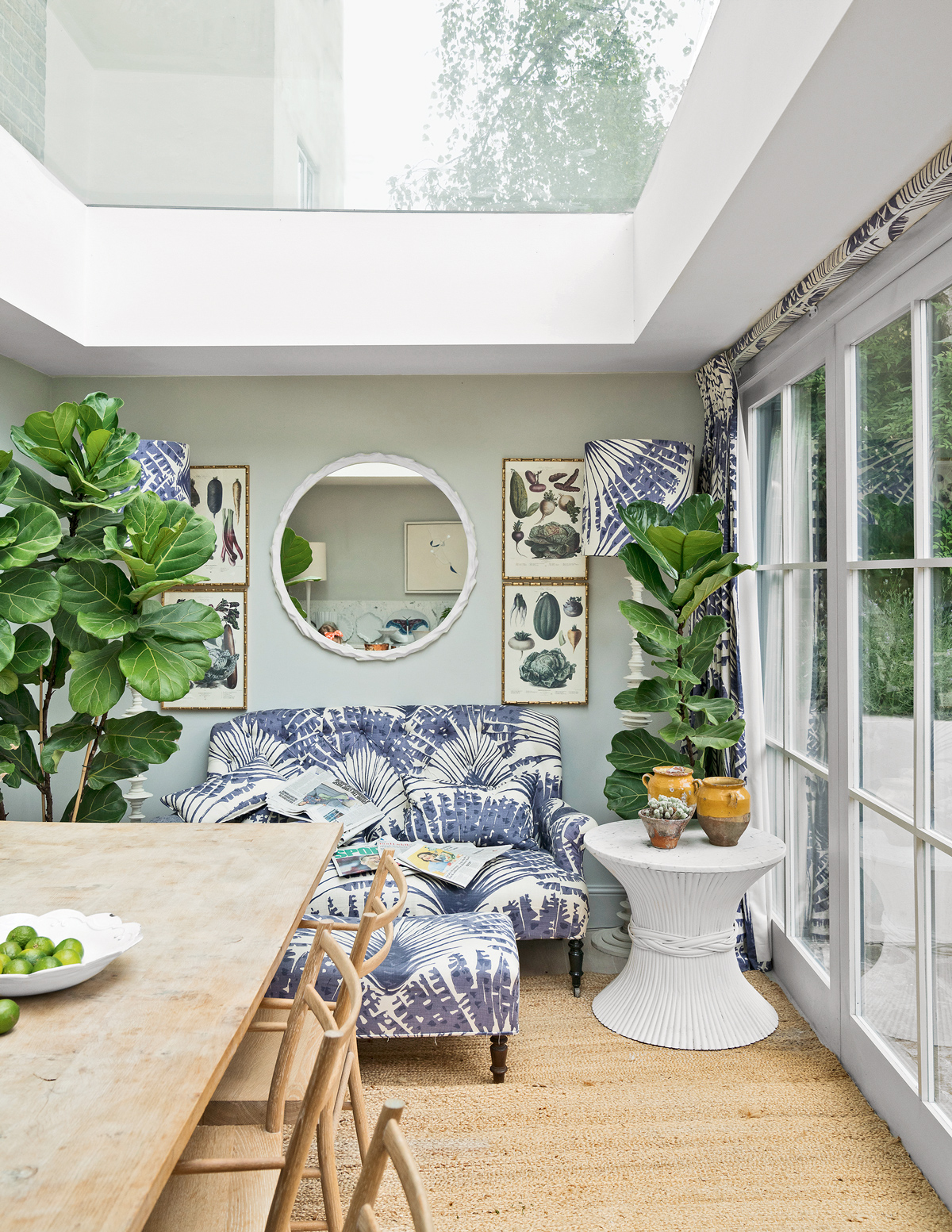
Start with one you particularly like and then experiment – hang a large sample piece on a wall or over a sofa and then move the rest of the furniture in the room around until it looks right. Working with pattern is trial and error – live with it for a few days and really listen to your voice.
HOW DO YOU MAKE ARCHIVE PRINTS FEEL CONTEMPORARY?
I look for traditional patterns with a twist. It’s how I found the work of Raoul Dufy, the early-mid 20th century French Fauvist painter, almost four years ago – there’s something about the freehand style and movement of scale that reminds me of Matisse – I fell immediately in love with his La Foret design, it was like an abstract painting. When we work with an archival collection, we stay true to its roots by not changing the pattern, scale or repeat, but we do change the base cloth and the colours to make them more relevant for today.
HOW DO YOU BALANCE PATTERN?
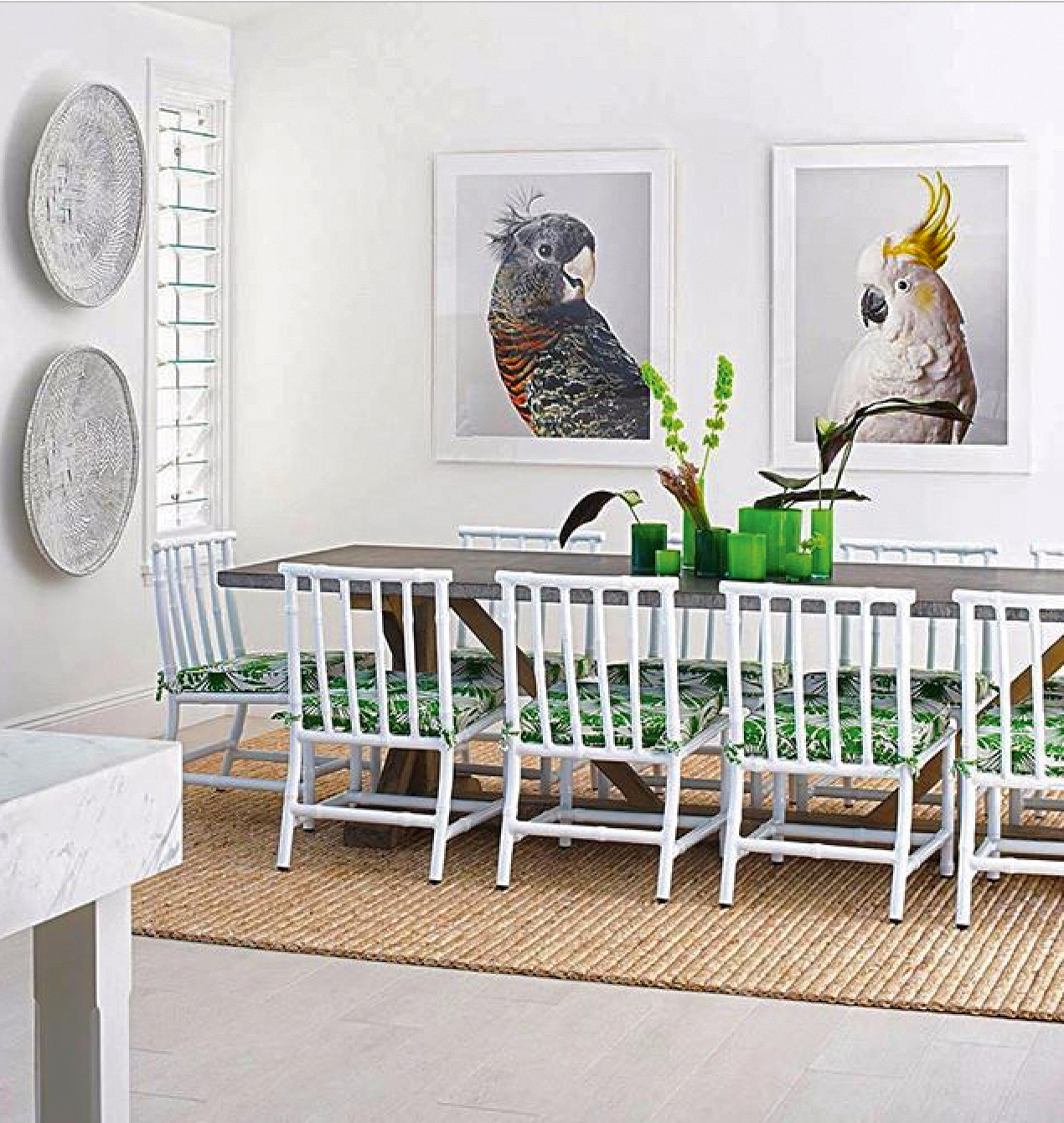
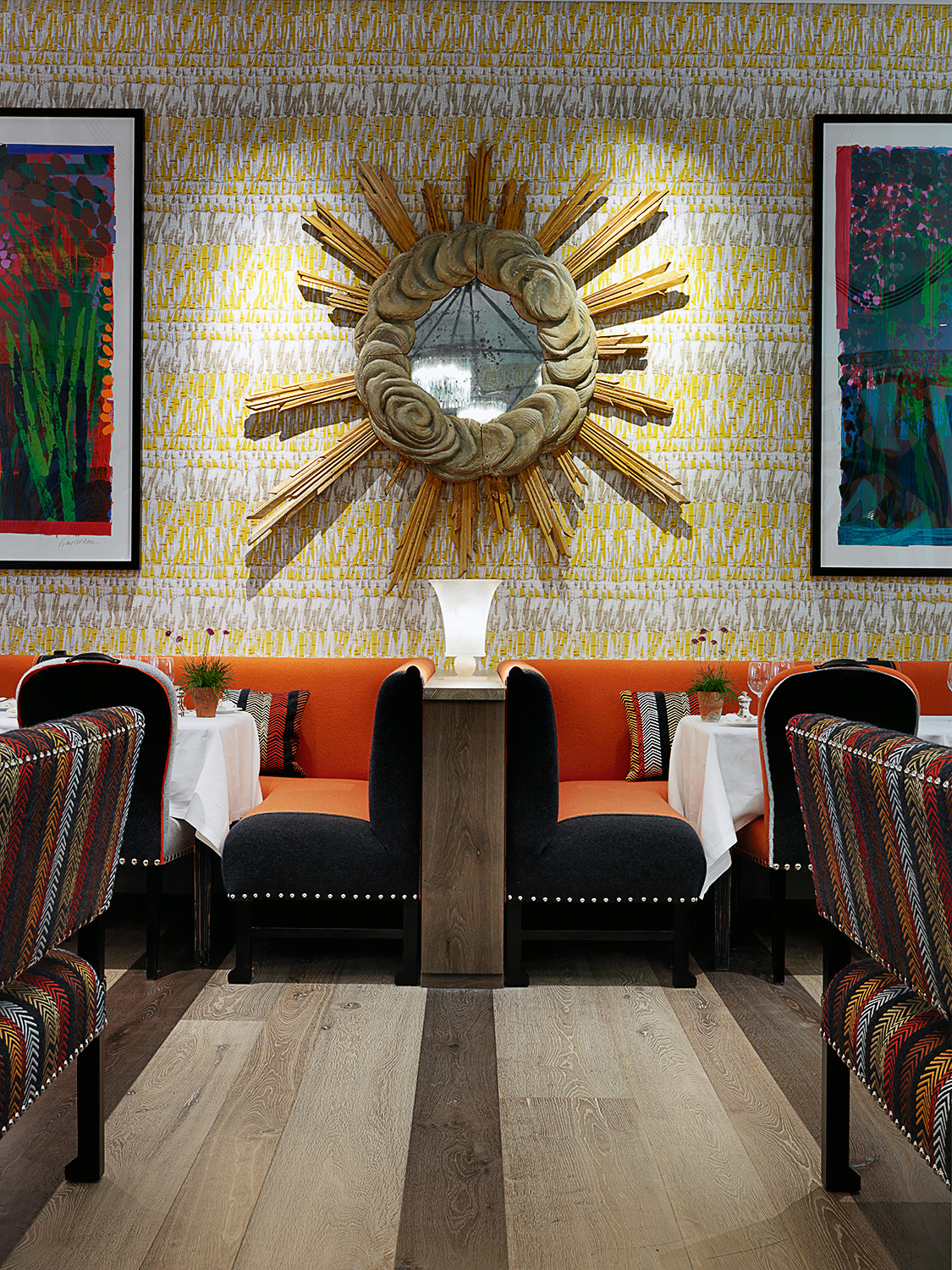
Working with different scales of the same pattern is a great way to create interest without overwhelming a room. For example, if you use an oversized pattern for upholstery and curtains, create balance by using the same pattern in a smaller scale for details like the cushions and bed valance.
HOW DO YOU USE PATTERN IN YOUR HOME?
Ironically, at home I use it very sparingly because I’m surrounded by it all day at work. I want home to feel minimal and clean, with a few key pieces of furniture like my iconic 111 Wink chaise longue designed by Toshiyuki Kita in 1980 for Cassina and definitely no tchotchkes [ornaments]. If I was going to do pattern seriously, I’d do it all over, matching pattern on walls, floors and upholstery!
For more info, visit christopherfarrcloth.com
The homes media brand for early adopters, Livingetc shines a spotlight on the now and the next in design, obsessively covering interior trends, color advice, stylish homeware and modern homes. Celebrating the intersection between fashion and interiors. it's the brand that makes and breaks trends and it draws on its network on leading international luminaries to bring you the very best insight and ideas.