3 paint colors minimalists love - and how designers use them to soothe
Three hues that designers reach for to create a stylish minimalist schemes, and exactly how to pair them for calming rooms

The Livingetc newsletters are your inside source for what’s shaping interiors now - and what’s next. Discover trend forecasts, smart style ideas, and curated shopping inspiration that brings design to life. Subscribe today and stay ahead of the curve.
You are now subscribed
Your newsletter sign-up was successful
A timeless, pared-back scheme that evokes restorative tranquility and calm are key components to a minimalist color palette.
So what colors are often used in a minimalist scheme? 'Neutrals and muted color tones are normally associated with a minimalist look,' explains Linda Hayslett, Principal, LH. Designs.
'So, creams, tans, browns, gray, and black are the neutral version for minimalists. However, a minimal palette can also have color, but it will be a dark color or hint of a color. So, instead of a yellow, it would be a dark mustard color. For a red it would be a more merlot version. Minimal isn't lack of color, it's just subdued hues.'
Article continues below3 paint colors minimalists love
Two designers reveal their favorite paint colors for a minimalist scheme below, and share how to use them in a pared-back space for a less-is-more look that's still inviting and cozy.
1. Benjamin Moore's Super White

White is often a hue associated with a minimalism in interior design thanks to its clarity and clean aesthetic.
It's a stripped back hue that acts as the core of the space, a canvas for light and shadow to work its magic and allows purposeful, well-made pieces of furniture to shine.
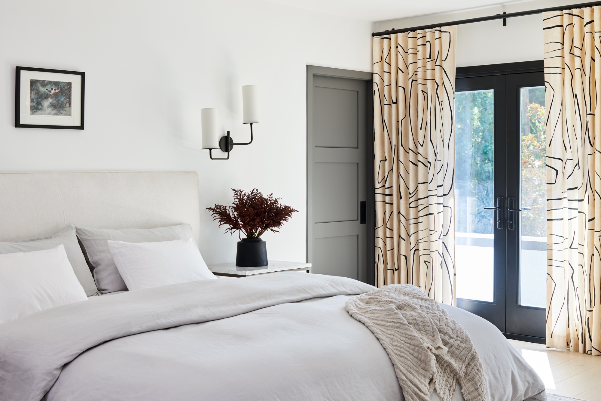
A favorite white of designer Linda Hayslett to use in a minimalist scheme is Benjamin Moore Super White, as seen in the bedroom above. And she will often pair this with Sherwin Williams Tricorn Black to create contrast in a space.
The Livingetc newsletters are your inside source for what’s shaping interiors now - and what’s next. Discover trend forecasts, smart style ideas, and curated shopping inspiration that brings design to life. Subscribe today and stay ahead of the curve.
2. Sherwin Williams' Tricorn Black

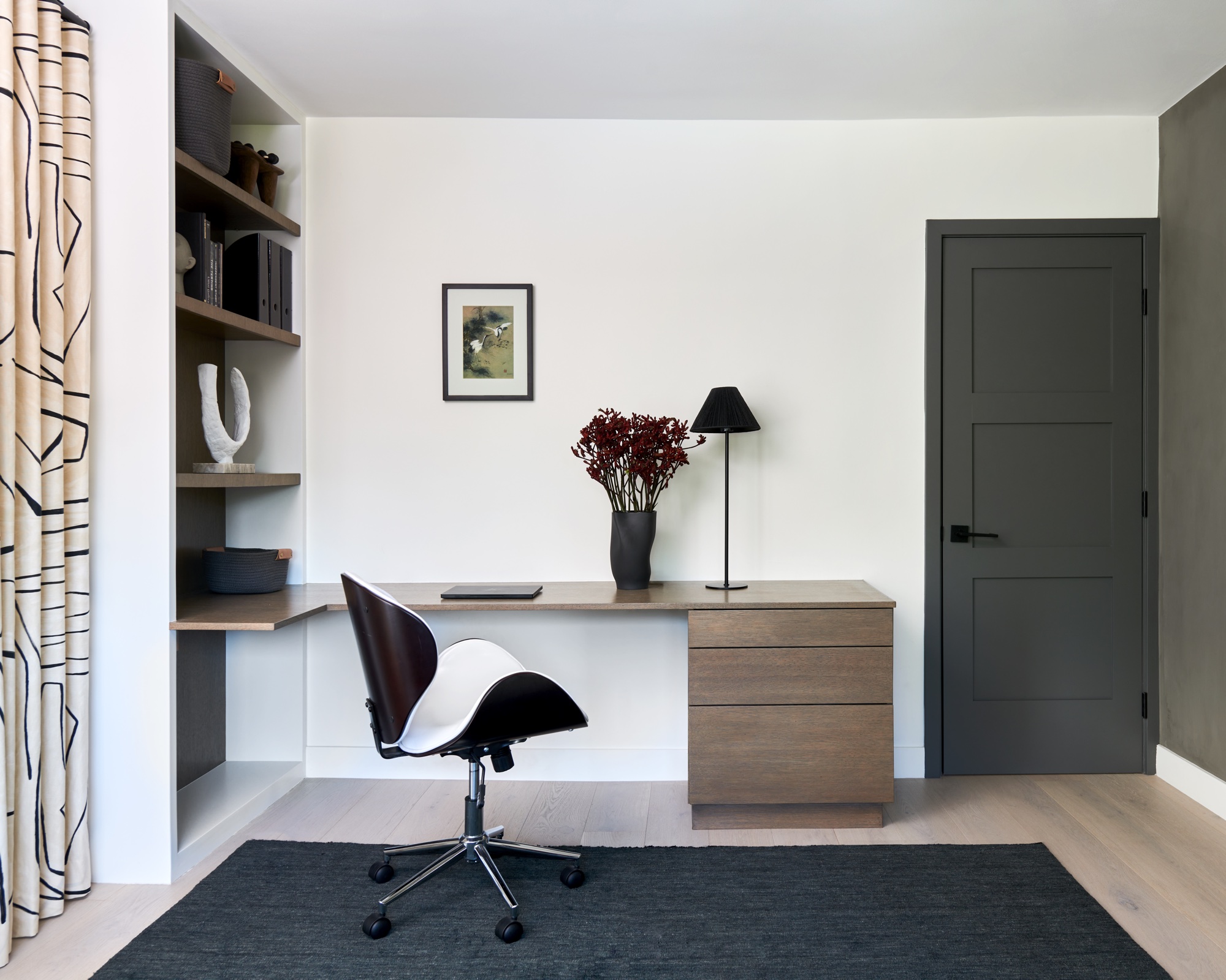
'Sherwin Williams Tricorn Black is my go-to color for a minimalist scheme,' says Linda. 'I've used it many times in minimal and contemporary spaces, in areas such as kitchens, bedrooms, doors, mouldings, exterior, etc. It is great for that calming feeling. It doesn't have too many undertones of other colors, so it reads perfectly for a minimal home.'
Linda adds: 'Deeper hues can be minimal. They bring a sense of calm and deep thought, so a darker color can be minimalist in a well thought out space.'
And Helen Shaw, color expert at Benjamin Moore, says: 'Classic black hues elevate minimalist style. Combine crisp white paint colors with intense, inky hues for a dramatic yet streamlined look.'
And if you don't want to use black? Helen says: 'Alternatives to black paint color include rich, dark shades—think royal purples, moody browns and deep ocean blues. Like black, these enigmatic, darkly glamourous hues sync effortlessly with fresh whites.' Benjamin Moore Super White is ideal.
3. Farrow & Ball Dead Salmon

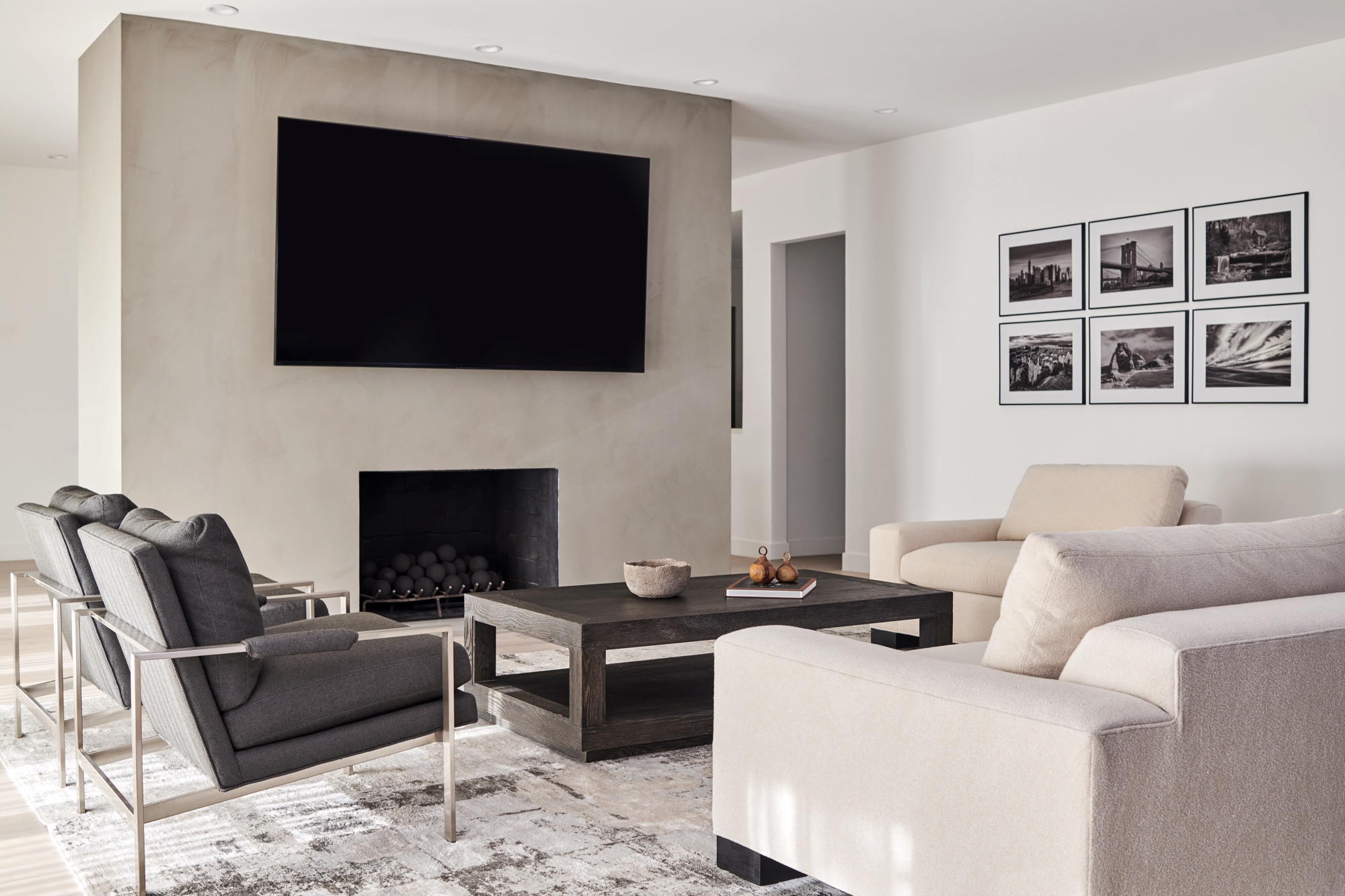
While white is a go-to color for a back-to-basics minimalist scheme, there are other colors that can reflect the barely-there style that minimalists embrace, including earthy browns and taupes.
Brown is an on-trend paint color for 2024 and will add warmth to a scheme without taking anything away from the form and function of the other pieces in the room - an essential part of a minimalist color palette.
'Color in general is a major part of creating a minimalist scheme because being minimalistic is to invoke a sense of your surroundings in a calm manner,' says LH. Designs' Linda Hayslett.
'A minimalist doesn't want a lot of distractions, so the color palette or paint used will always exude a calming sense and warmth. People don't realize that a lot of minimal spaces have warmth in their colors. They skew away from cool colors because a minimalist likes to feel the warmth of a room without feel like they are in an ice box.'
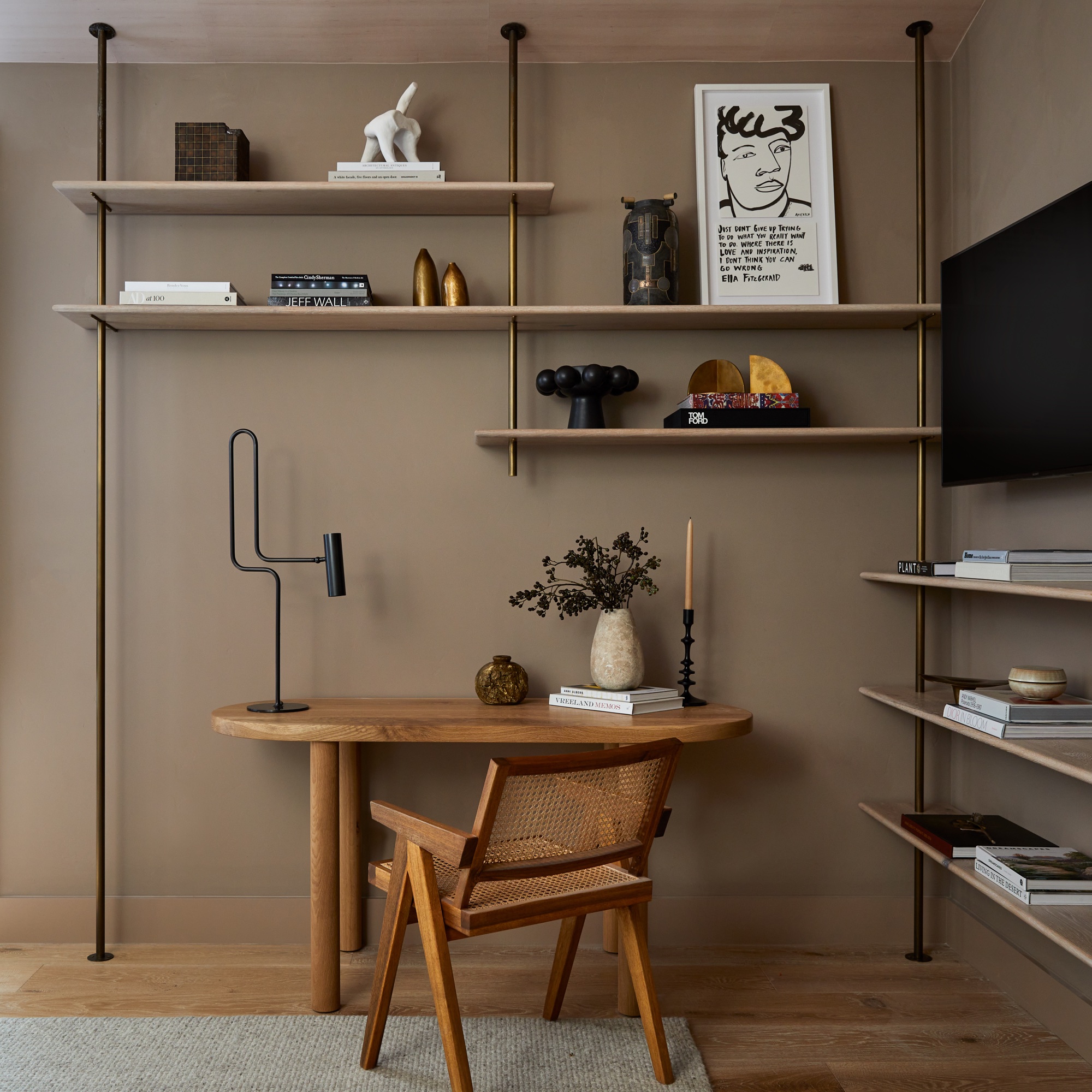
One shade that's perfect for creating a minimalist palette with warmth is Farrow and Ball's Dead Salmon, a favorite of Kristen Pena of K Interiors.
'My new favorite neutral has got a silly name, Farrow & Ball’s Dead Salmon, but delivers on an amazing vibe,' says Kristen, continuing: 'Yes, vibe. Paint can do that when you get it right. Who doesn’t want to hang in a space like this? I use it outside and inside and it reads differently in every space, but always cozy, inviting and a bit luxe.'
Ruth Doherty is a lifestyle journalist based in London. An experienced freelance digital writer and editor, she is known for covering everything from travel and interiors to fashion and beauty. She regularly contributes to Livingetc, Ideal Home and Homes & Gardens, as well as titles like Prima and Red. Outside of work, her biggest loves are endless cups of tea, almond croissants, shopping for clothes she doesn’t need, and booking holidays she does.