Repeating themes: the surprising rules designers use for restful schemes, according to Livingetc's color expert
Little Greene's creative director Ruth Mottershead on how to bring together different colors and still create a serene scheme

The Livingetc newsletters are your inside source for what’s shaping interiors now - and what’s next. Discover trend forecasts, smart style ideas, and curated shopping inspiration that brings design to life. Subscribe today and stay ahead of the curve.
You are now subscribed
Your newsletter sign-up was successful
Introducing a statement piece of furniture, with stripes or pattern or in multi-colors, can feel daunting. Especially if the living room vibe you're trying to create is sophisticated, serene and soothing.
But it's not impossible, as the fantastic use of color seen in this space shows. When we featured the whole house in Hollywood, designed by LALA Reimagined, we were struck by how cleverly the designers had woven bold designs into their scheme - it takes a lot to include this table by Patricia Urquiola and for it not to jar.
And so we asked color expert Ruth Mottershead, the Creative Director of Little Greene, to decode exactly why it works, providing plenty of guidance for using color at home yourself.
Article continues belowFind a repeating theme
The strong patterns work because they create direct links throughout the space – finding ways to connect colors in a vivid design is a natural way to make it feel like a fully cohesive scheme
Ruth Mottershead

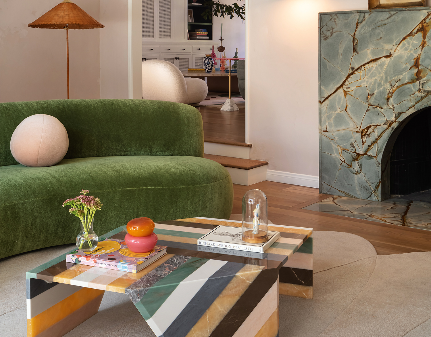
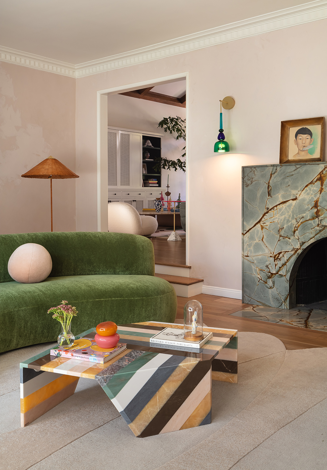
Living room designed by LALA Reimagined. The fireplace is made from Azul Mary Quartzite; sofa is from Pierre Augustin Rose; wall light is from Giopato & Coombes; floor lamp by Gubi; rug by Liesel Plambeck; coffee table by Patricia Urquiola
for Artemest
It’s the stripy table by Patricia Urquiola that first catches the eye in this living room. But at a second glance, notice how the rest of the colours either match or complement it perfectly. Green is a repeating theme within the space and the tone of the greens within the table are picked up in the fireplace, along with the brown as a geometric scar in the marble.
The strong patterns work because they create direct links throughout the space – finding ways to connect colours in a vivid design is a natural way to make it feel like a fully cohesive scheme. The rich browns are reflected in the room’s wooden elements as well as the marble fireplace. The subtle orange shines in the rattan lampshade
and the warmth of the floor.
Colors can be hand-picked from bold patterns, but the proportion of each colour used is an important consideration. The chosen color with the largest presence
will determine the overall atmosphere. Once you pick the main color, use other hues from other key elements in the design on a repeating basis to create harmony and balance.
Use balanced neutrals

China Clay Mid by Little Greene
Here, the balance comes from the shade of pink used on the walls. Perfectly pale, it behaves like a white but without the cooler tones. This is a natural, red ochre pink that has none of the sweetness of those containing violet – a truly smart and sophisticated choice. The white trim creates gentle contrast, highlighting the architectural features within the room, while the space’s strong geometric lines chime with the striped coffee table – another clever link. The pink adorns this room but also the adjoining space, providing a natural, soft transition.
The Livingetc newsletters are your inside source for what’s shaping interiors now - and what’s next. Discover trend forecasts, smart style ideas, and curated shopping inspiration that brings design to life. Subscribe today and stay ahead of the curve.
The subtle warmth within the room is a result of the use of pale pink and the soft rug. By contrast, a white wall color – which is often used as the leading tone – would create a much harsher, colder environment. The chosen neutrals harmonise thanks to their related pigmentation. These natural colors automatically generate a sensation of warmth.
Pick out opposite shades

Hopper absolute matt emulsion by Little Greene
Green – the second most used color in the room – is an apparent opposite to pink (on the color wheel usd in color theory, at least). And the great difference in strength and power between the two is what makes it beautiful. Pink and green is a natural combination, like flower and leaf. It’s easy on the eye in this formal setting and provides a level of gentleness and tranquillity, supported by the strong contrasting colours in some of the other elements.
Within this scheme, neutral shades represent about 70% of the color space – this is the correct order of balance. Always use unbalanced colour proportions,
such as 80/20 or 70/30, so your colours do not fight for dominance. Whether you choose strong shades or neutral tones as your major, a 50/50 ratio should never be employed as the focus of the space becomes confused. The most common example
of this is a major neutral backdrop with minor strong contrasting colors, as represented here.
Ruth Mottershead is the Creative Director of Little Greene, and one of the most renowned experts on exactly how to use color now. At Little Greene she has pioneered the way the brand thinks about color and pattern, creating new palettes, new pigments, and becoming the force behind sustainable paint offshoot Re:mix. She is also a regular contributor to Livingetc, as someone we turn to when we want to decode exactly how to put colors together.