The Livingetc newsletters are your inside source for what’s shaping interiors now - and what’s next. Discover trend forecasts, smart style ideas, and curated shopping inspiration that brings design to life. Subscribe today and stay ahead of the curve.
You are now subscribed
Your newsletter sign-up was successful
WHERE DOES YOUR LOVE OF COLOUR COME FROM?
My mother was a big champion of using colour in our family home when I was growing up, as well as wearing print and colour herself. I’m sure this rubbed off on me and it’s partly why I’m drawn to bright, bold and expressive colour combinations that lift the spirit. My tropical palette is inspired by travels to Mexico, Costa Rica and India.
WHAT IMPACT DOES COLOUR MAKE?
Article continues belowWithout doubt, colour affects your mood. It’s such a powerful tool for both fashion and interiors. To keep things contemporary yet uplifting, I team classic colours with a pop of neon or an unexpected contrasting tone. My favourite wall colours are Farrow & Ball’s Dix Blue, Green Blue and Dove Tale. For acid neon colours, I go to Bristol Paint. For hot pink paint, I tend to swatch match my own with Dulux.
HOW DO YOU KNOW WHICH COLOURS WILL WORK TOGETHER?
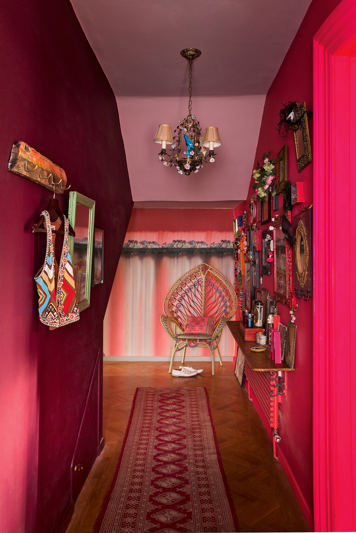
I always refer to the theory of the colour wheel, especially when looking at the use of warm and cool tones together in the same room. For example, I always offset a cool green wall with hot pink accessories to create a complementary contrast. Bolder, warmer tones evoke fun and energy, while cooler tones tend to have a calming, more serene quality.
HOW DO YOU INFUSE THE EMOTIONAL MOOD OF COLOUR INTO A ROOM?
The Livingetc newsletters are your inside source for what’s shaping interiors now - and what’s next. Discover trend forecasts, smart style ideas, and curated shopping inspiration that brings design to life. Subscribe today and stay ahead of the curve.
I’m much happier in a room of colour than when in a white,clinical space, so I think about how I want to feel in a particular room – if it’s calm and relaxing, I choose cool tones from blue to green and then work with a few extra tones similar to this base colour to dress the space with larger items. This creates a chic and harmonious feel. If I’m feeling brave, I might throw in some fuchsia-pink velvet cushions, for example, or painta picture frame neon orange.
WHAT'S YOUR STARTING POINT WITH COLOUR?
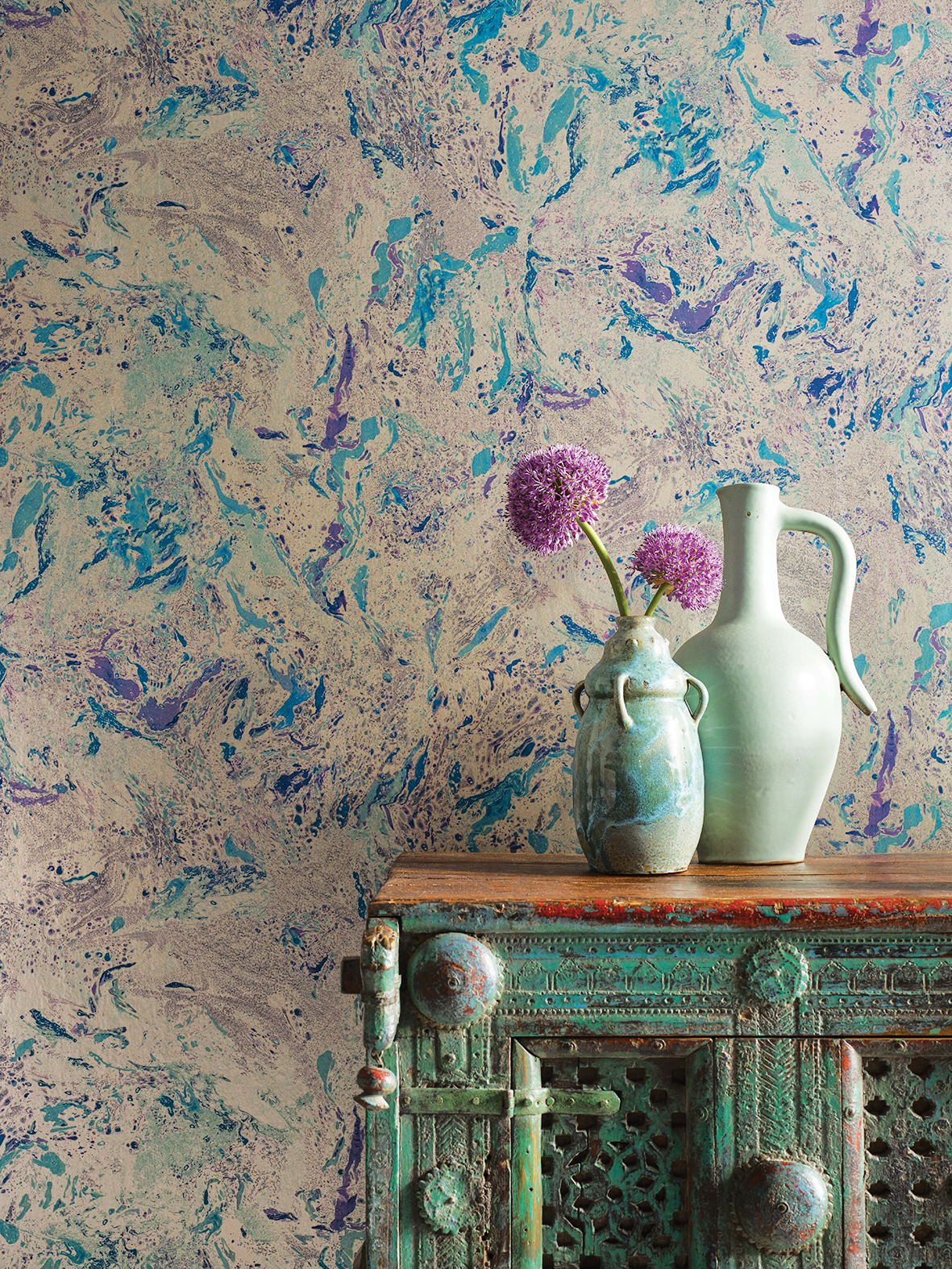
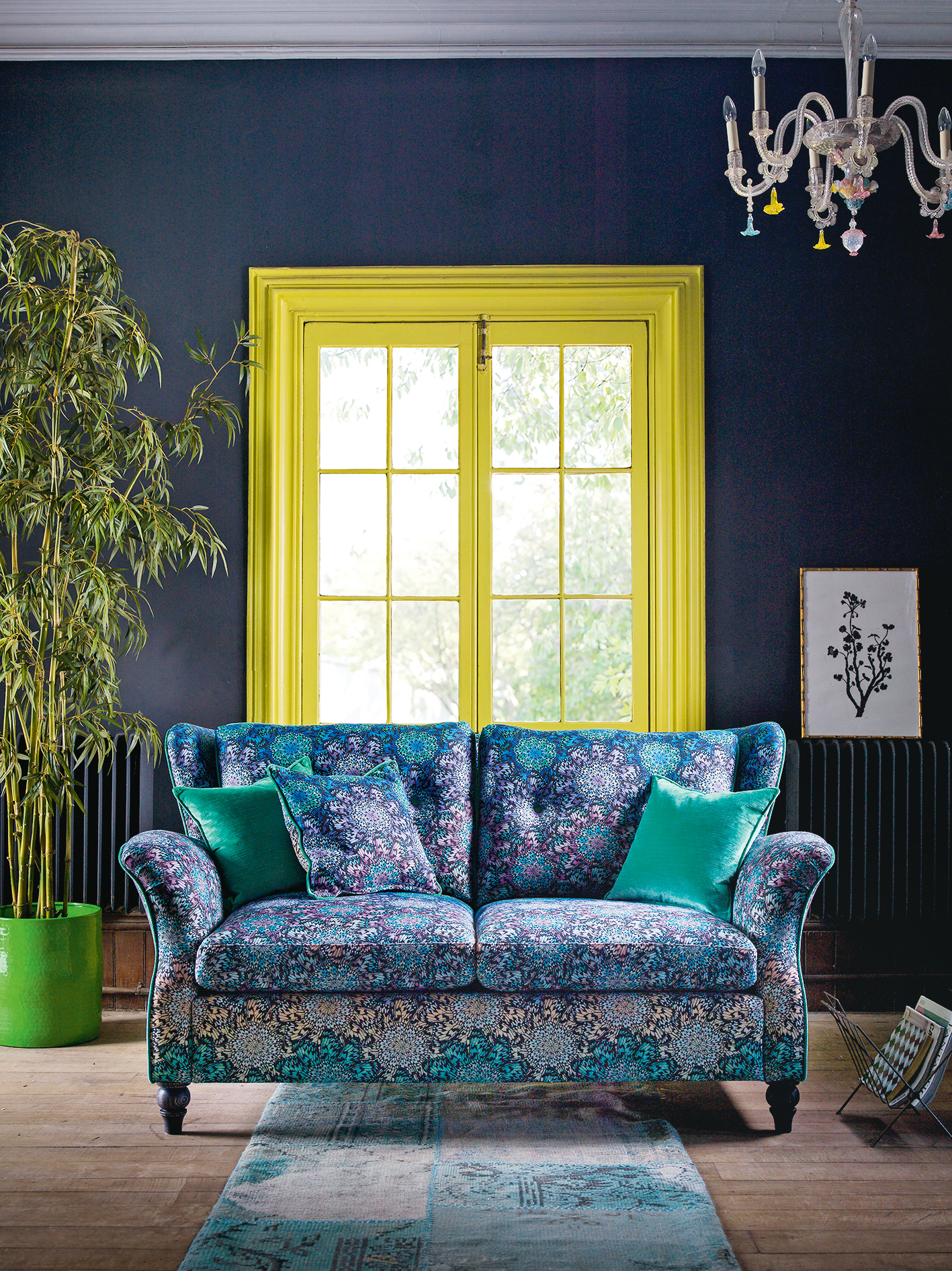
I always start with the floor in any room, which is usually the most expensive aspect too, so it’s worth getting right. I like natural tones and materials for the floor because it needs to last – at home, all the rooms are either wood or ceramic tiled. In the lounge area of my home, a classic herringbone-parquet oak floor is teamed with soft grey-green walls with deeper tones of these two colours reflected in the rug and key pieces of furniture. This reasonably strict palette anchors the space.
WHAT'S THE NEXT STEP WHEN DECORATING?
I like to treat a room like an envelope (starting with walls and floor) to create a solid base and then I have fun with the things I put in the envelope. It’s at this point you can give a room character by reflecting your own personality. Wall art, piles of books, cushions and candles are where I like to inject contrasting hot tones – and, as they’re smaller pieces, you can let go a little bit and afford to experiment with mixing colour and pattern to suit your taste.
WHAT ARE YOUR FAVOURITE WAYS OF 'LETTING GO WITH COLOUR'?
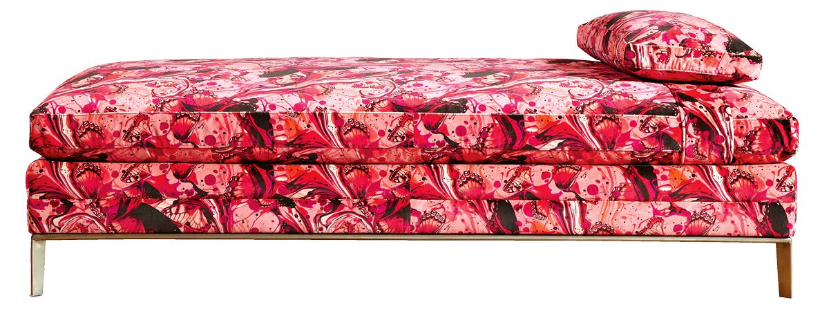
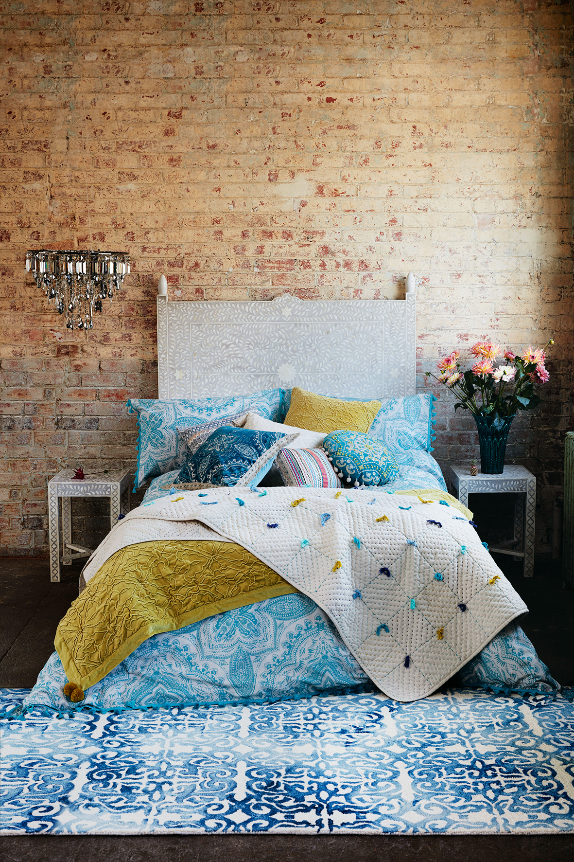
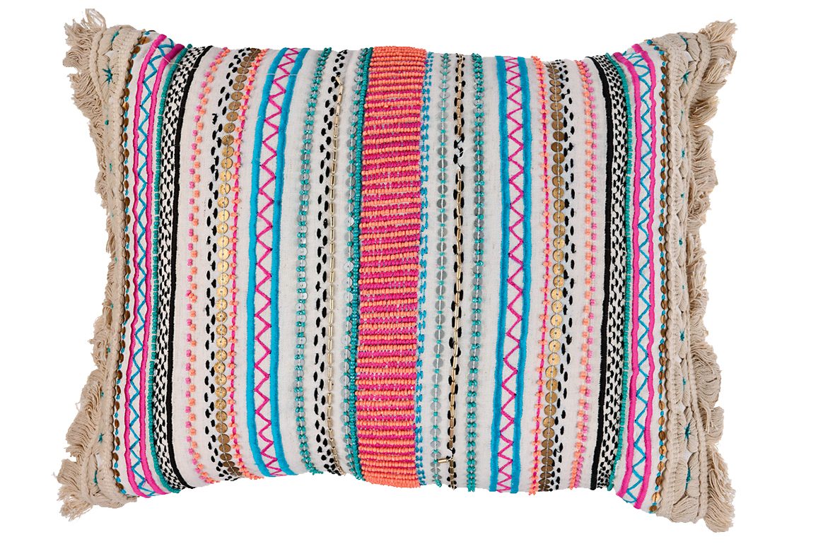
I’ve created highly detailed and exotic wallpaper and fabric designs for Osborne & Little to really explore my love of colour combinations and pattern. In the same way, the bedding sets I’ve designed for Debenhams also provide a fabulous way toinstantly refresh your bedroom with colour, especially when coordinated with the big pompom-edged throws and embroidered cushions.
WHAT ABOUT FURNITURE AND OTHER ITEMS OF HOMEWARE?
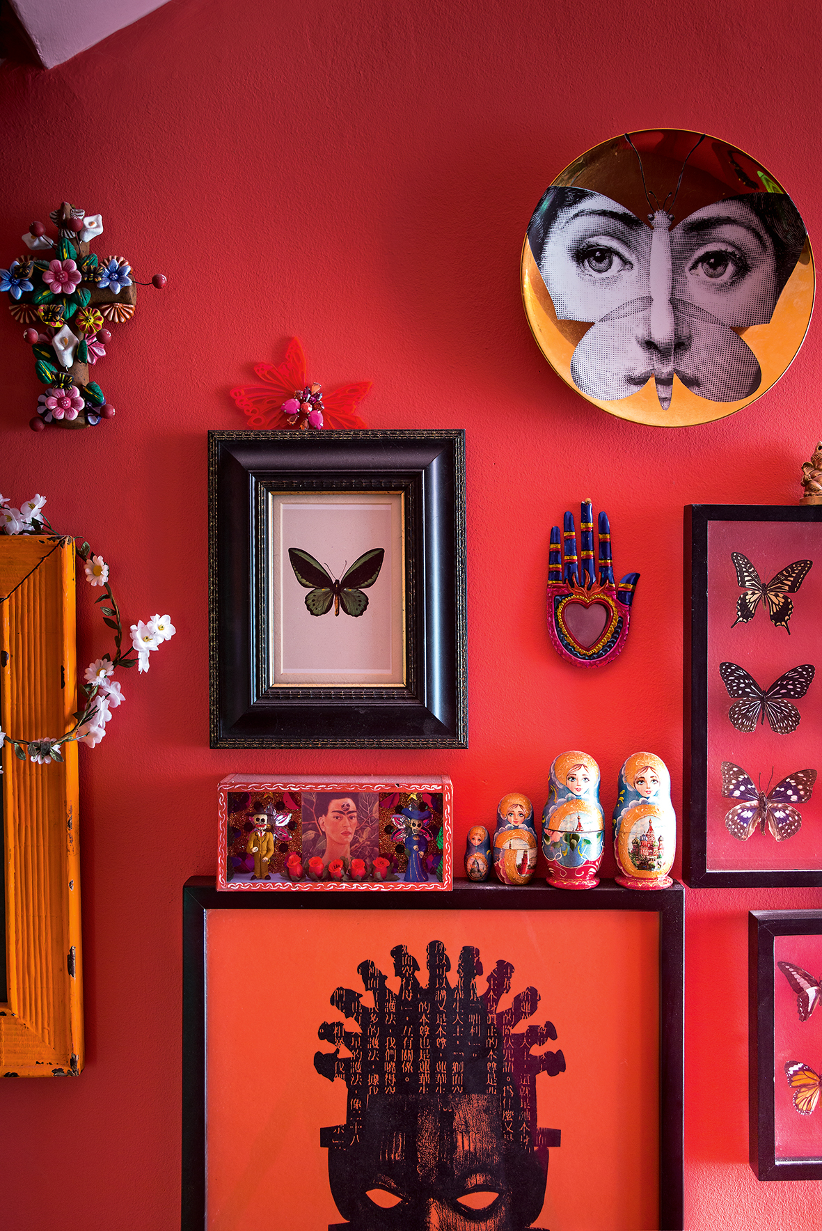
My favourite rooms always contain a mix of styles, such as vintage pieces from markets, which feel romantic, poetic and tell a story, alongside elements of nature – from framed butterflies and hand-thrown ceramics to flowers. If a striking modern piece catches my eye in a wonderful colour and material, it can always find a place in my home.
HOW DO YOU CREATE A SENSE OF BALANCE IN SUCH A VIBANT PALETTE?
In my own home, I even out the vibrancy with neutrals, such as using the calming tone of eau de nil – a soft, aged green-grey – as a base, because, for me, it’s the equivalent of white or beige.
WHAT IF SOMEONE FINDS COLOUR RATHER SCARY?
If it’s a little daunting at first, remember, walls can easily be painted over. Take small steps, building on the layers of hot and cold tones, so you always feel comfortable. Right now, I’m loving a mix of neutrals and neons – it’s a very satisfying combination that doesn’t seem to date. Dove grey with acid yellow or a soft pinky nude with neon orange are two of my favourite combinations.
FINALLY, DO YOU HAVE ANY FIRM COLOUR RULES?
My only interior design rule is... Do you love it? Does it make you smile? If yes, then it’s just right for you. I don’t believe in forcing things you don’t really love just because it’s supposedly on-trend.
For more info about Matthew Williamson’s fashion and interiors work, visit matthewwilliamson.com
The homes media brand for early adopters, Livingetc shines a spotlight on the now and the next in design, obsessively covering interior trends, color advice, stylish homeware and modern homes. Celebrating the intersection between fashion and interiors. it's the brand that makes and breaks trends and it draws on its network on leading international luminaries to bring you the very best insight and ideas.